How to Set Matplotlib Colorbar Size to Match Graph
Set Matplotlib colorbar size to match graph is an essential skill for data visualization enthusiasts and professionals alike. In this comprehensive guide, we’ll explore various techniques and best practices to set Matplotlib colorbar size to match graph, ensuring your visualizations are both informative and aesthetically pleasing. We’ll cover everything from basic concepts to advanced techniques, providing you with the knowledge and tools you need to create stunning data visualizations with perfectly sized colorbars.
Understanding the Importance of Setting Matplotlib Colorbar Size to Match Graph
Before we dive into the specifics of how to set Matplotlib colorbar size to match graph, it’s crucial to understand why this aspect of data visualization is so important. When you set Matplotlib colorbar size to match graph, you create a harmonious and balanced visual representation of your data. A well-sized colorbar not only enhances the overall appearance of your plot but also improves the readability and interpretation of the information presented.
When you set Matplotlib colorbar size to match graph, you ensure that:
- The colorbar doesn’t overpower or detract from the main plot
- The colorbar is large enough to be easily readable
- The overall composition of the figure is balanced and visually appealing
- The relationship between the colorbar and the plot is clear and intuitive
Now that we understand the importance of setting Matplotlib colorbar size to match graph, let’s explore some basic techniques to achieve this goal.
Basic Techniques to Set Matplotlib Colorbar Size to Match Graph
1. Using the aspect Parameter
One of the simplest ways to set Matplotlib colorbar size to match graph is by using the aspect parameter when creating the colorbar. This parameter controls the ratio of the colorbar’s width to its height.
Here’s a basic example of how to set Matplotlib colorbar size to match graph using the aspect parameter:
import matplotlib.pyplot as plt
import numpy as np

# Create sample data
data = np.random.rand(10, 10)

# Create the plot
fig, ax = plt.subplots(figsize=(8, 6))
im = ax.imshow(data, cmap='viridis')

# Set Matplotlib colorbar size to match graph
cbar = plt.colorbar(im, aspect=10)

# Add labels and title
ax.set_title('How to Set Matplotlib Colorbar Size to Match Graph')
ax.set_xlabel('X-axis')
ax.set_ylabel('Y-axis')

# Add text to show how2matplotlib.com
plt.text(0.5, -0.15, 'how2matplotlib.com', transform=ax.transAxes, ha='center')

plt.show()
Output:
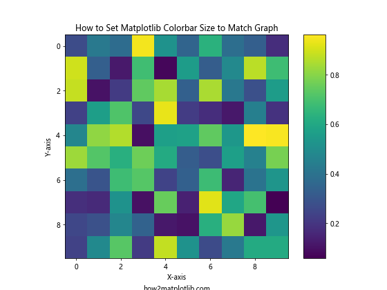
In this example, we use aspect=10 to set Matplotlib colorbar size to match graph. The aspect parameter determines the ratio of the colorbar’s width to its height. Adjusting this value allows you to fine-tune the colorbar’s size relative to the main plot.
2. Using shrink Parameter
Another way to set Matplotlib colorbar size to match graph is by using the shrink parameter. This parameter allows you to scale the colorbar’s size relative to the main plot.
Here’s an example of how to set Matplotlib colorbar size to match graph using the shrink parameter:
import matplotlib.pyplot as plt
import numpy as np

# Create sample data
x = np.linspace(0, 10, 100)
y = np.linspace(0, 10, 100)
X, Y = np.meshgrid(x, y)
Z = np.sin(X) * np.cos(Y)

# Create the plot
fig, ax = plt.subplots(figsize=(8, 6))
im = ax.contourf(X, Y, Z, cmap='coolwarm')

# Set Matplotlib colorbar size to match graph
cbar = plt.colorbar(im, shrink=0.8)

# Add labels and title
ax.set_title('Set Matplotlib Colorbar Size to Match Graph')
ax.set_xlabel('X-axis')
ax.set_ylabel('Y-axis')

# Add text to show how2matplotlib.com
plt.text(0.5, -0.15, 'how2matplotlib.com', transform=ax.transAxes, ha='center')

plt.show()
Output:
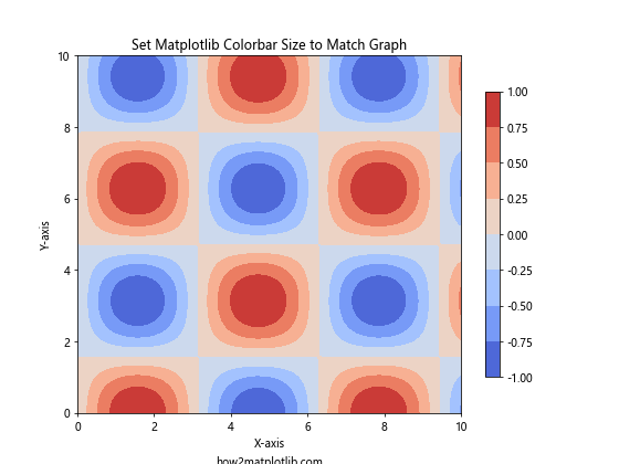
In this example, we use shrink=0.8 to set Matplotlib colorbar size to match graph. The shrink parameter scales the colorbar’s size relative to the main plot. A value less than 1 makes the colorbar smaller, while a value greater than 1 makes it larger.
Advanced Techniques to Set Matplotlib Colorbar Size to Match Graph
Now that we’ve covered the basics, let’s explore some more advanced techniques to set Matplotlib colorbar size to match graph.
1. Using make_axes_locatable
For more precise control over colorbar placement and size, you can use the make_axes_locatable function from mpl_toolkits.axes_grid1. This approach allows you to set Matplotlib colorbar size to match graph with greater flexibility.
Here’s an example of how to use make_axes_locatable to set Matplotlib colorbar size to match graph:
import matplotlib.pyplot as plt
import numpy as np
from mpl_toolkits.axes_grid1 import make_axes_locatable

# Create sample data
data = np.random.rand(20, 20)

# Create the plot
fig, ax = plt.subplots(figsize=(8, 6))
im = ax.imshow(data, cmap='plasma')

# Set Matplotlib colorbar size to match graph
divider = make_axes_locatable(ax)
cax = divider.append_axes("right", size="5%", pad=0.1)
cbar = plt.colorbar(im, cax=cax)

# Add labels and title
ax.set_title('Set Matplotlib Colorbar Size to Match Graph')
ax.set_xlabel('X-axis')
ax.set_ylabel('Y-axis')

# Add text to show how2matplotlib.com
plt.text(0.5, -0.15, 'how2matplotlib.com', transform=ax.transAxes, ha='center')

plt.show()
Output:
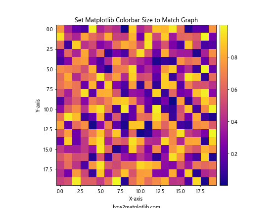
In this example, we use make_axes_locatable to create a new axis for the colorbar. The size="5%" parameter sets the width of the colorbar to 5% of the main plot’s width, allowing you to precisely set Matplotlib colorbar size to match graph.
2. Using GridSpec
Another advanced technique to set Matplotlib colorbar size to match graph is by using GridSpec. This approach gives you fine-grained control over the layout of your plot and colorbar.
Here’s an example of how to use GridSpec to set Matplotlib colorbar size to match graph:
import matplotlib.pyplot as plt
import numpy as np
from matplotlib.gridspec import GridSpec

# Create sample data
data = np.random.rand(15, 15)

# Create the plot
fig = plt.figure(figsize=(10, 8))
gs = GridSpec(1, 2, width_ratios=[20, 1])

ax = fig.add_subplot(gs[0])
im = ax.imshow(data, cmap='viridis')

# Set Matplotlib colorbar size to match graph
cax = fig.add_subplot(gs[1])
cbar = plt.colorbar(im, cax=cax)

# Add labels and title
ax.set_title('Set Matplotlib Colorbar Size to Match Graph')
ax.set_xlabel('X-axis')
ax.set_ylabel('Y-axis')

# Add text to show how2matplotlib.com
plt.text(0.5, -0.15, 'how2matplotlib.com', transform=ax.transAxes, ha='center')

plt.tight_layout()
plt.show()
Output:
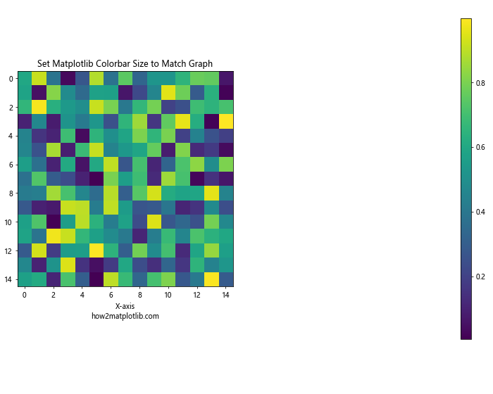
In this example, we use GridSpec to create a layout with two columns. The main plot occupies 20 parts of the width, while the colorbar occupies 1 part. This allows you to precisely set Matplotlib colorbar size to match graph by adjusting the width_ratios parameter.
Fine-tuning Colorbar Appearance When Setting Matplotlib Colorbar Size to Match Graph
When you set Matplotlib colorbar size to match graph, it’s also important to consider the overall appearance of the colorbar. Here are some techniques to fine-tune the colorbar’s appearance:
1. Adjusting Colorbar Ticks
You can customize the colorbar ticks to improve readability when you set Matplotlib colorbar size to match graph. Here’s an example:
import matplotlib.pyplot as plt
import numpy as np

# Create sample data
data = np.random.rand(10, 10)

# Create the plot
fig, ax = plt.subplots(figsize=(8, 6))
im = ax.imshow(data, cmap='coolwarm', vmin=0, vmax=1)

# Set Matplotlib colorbar size to match graph
cbar = plt.colorbar(im, aspect=20)

# Customize colorbar ticks
cbar.set_ticks([0, 0.25, 0.5, 0.75, 1])
cbar.set_ticklabels(['0%', '25%', '50%', '75%', '100%'])

# Add labels and title
ax.set_title('Set Matplotlib Colorbar Size to Match Graph')
ax.set_xlabel('X-axis')
ax.set_ylabel('Y-axis')

# Add text to show how2matplotlib.com
plt.text(0.5, -0.15, 'how2matplotlib.com', transform=ax.transAxes, ha='center')

plt.show()
Output:
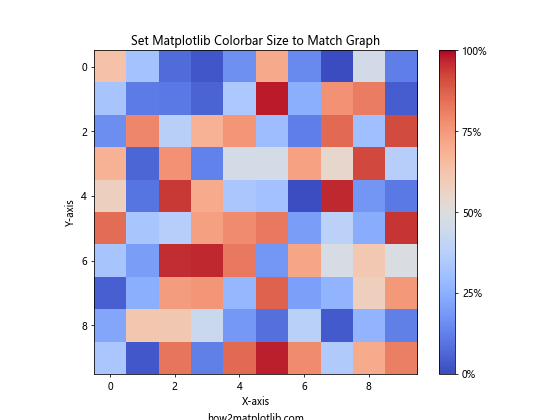
In this example, we use cbar.set_ticks() and cbar.set_ticklabels() to customize the colorbar ticks and labels, enhancing the readability of the colorbar after setting its size to match the graph.
2. Adding a Colorbar Label
When you set Matplotlib colorbar size to match graph, adding a label to the colorbar can provide additional context. Here’s how you can do it:
import matplotlib.pyplot as plt
import numpy as np

# Create sample data
x = np.linspace(0, 10, 100)
y = np.linspace(0, 10, 100)
X, Y = np.meshgrid(x, y)
Z = np.sin(X) * np.cos(Y)

# Create the plot
fig, ax = plt.subplots(figsize=(8, 6))
im = ax.contourf(X, Y, Z, cmap='viridis')

# Set Matplotlib colorbar size to match graph
cbar = plt.colorbar(im, aspect=30)
cbar.set_label('Value', rotation=270, labelpad=15)

# Add labels and title
ax.set_title('Set Matplotlib Colorbar Size to Match Graph')
ax.set_xlabel('X-axis')
ax.set_ylabel('Y-axis')

# Add text to show how2matplotlib.com
plt.text(0.5, -0.15, 'how2matplotlib.com', transform=ax.transAxes, ha='center')

plt.show()
Output:
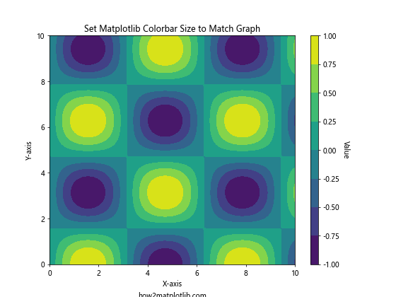
In this example, we use cbar.set_label() to add a label to the colorbar after setting its size to match the graph. The rotation and labelpad parameters help position the label correctly.
Handling Multiple Colorbars When Setting Matplotlib Colorbar Size to Match Graph
In some cases, you may need to set Matplotlib colorbar size to match graph for multiple colorbars in a single figure. Here’s how you can handle this scenario:
import matplotlib.pyplot as plt
import numpy as np
from mpl_toolkits.axes_grid1 import make_axes_locatable

# Create sample data
data1 = np.random.rand(10, 10)
data2 = np.random.rand(10, 10)

# Create the plot
fig, (ax1, ax2) = plt.subplots(1, 2, figsize=(12, 5))

# Plot first dataset
im1 = ax1.imshow(data1, cmap='viridis')
ax1.set_title('Dataset 1')

# Plot second dataset
im2 = ax2.imshow(data2, cmap='plasma')
ax2.set_title('Dataset 2')

# Set Matplotlib colorbar size to match graph for both plots
for ax, im in zip([ax1, ax2], [im1, im2]):
    divider = make_axes_locatable(ax)
    cax = divider.append_axes("right", size="5%", pad=0.1)
    plt.colorbar(im, cax=cax)

# Add overall title
fig.suptitle('Set Matplotlib Colorbar Size to Match Graph for Multiple Plots')

# Add text to show how2matplotlib.com
plt.text(0.5, -0.15, 'how2matplotlib.com', transform=fig.transFigure, ha='center')

plt.tight_layout()
plt.show()
Output:
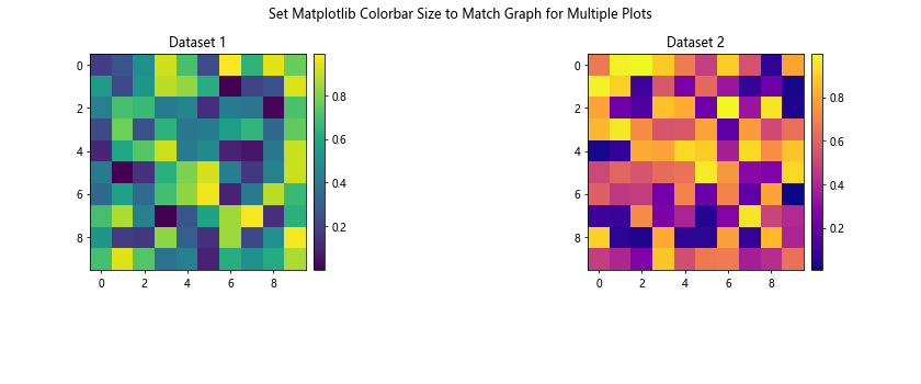
In this example, we use a loop to set Matplotlib colorbar size to match graph for both plots. The make_axes_locatable function is used to create consistent colorbar sizes for each subplot.
Adjusting Colorbar Position When Setting Matplotlib Colorbar Size to Match Graph
Sometimes, you may want to adjust the position of the colorbar after setting its size to match the graph. Here’s an example of how to do this:
import matplotlib.pyplot as plt
import numpy as np
from mpl_toolkits.axes_grid1 import make_axes_locatable

# Create sample data
data = np.random.rand(15, 15)

# Create the plot
fig, ax = plt.subplots(figsize=(8, 6))
im = ax.imshow(data, cmap='coolwarm')

# Set Matplotlib colorbar size to match graph
divider = make_axes_locatable(ax)
cax = divider.append_axes("top", size="5%", pad=0.5)
cbar = plt.colorbar(im, cax=cax, orientation="horizontal")

# Adjust colorbar ticks position
cax.xaxis.set_ticks_position("top")

# Add labels and title
ax.set_title('Set Matplotlib Colorbar Size to Match Graph')
ax.set_xlabel('X-axis')
ax.set_ylabel('Y-axis')

# Add text to show how2matplotlib.com
plt.text(0.5, -0.15, 'how2matplotlib.com', transform=ax.transAxes, ha='center')

plt.tight_layout()
plt.show()
Output:
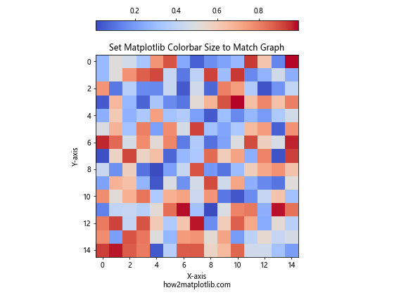
In this example, we set Matplotlib colorbar size to match graph and position the colorbar at the top of the plot. The orientation="horizontal" parameter is used to create a horizontal colorbar, and cax.xaxis.set_ticks_position("top") ensures that the ticks are displayed on the top side of the colorbar.
Creating Custom Colormaps When Setting Matplotlib Colorbar Size to Match Graph
When you set Matplotlib colorbar size to match graph, you might also want to use a custom colormap to better represent your data. Here’s an example of how to create and use a custom colormap:
import matplotlib.pyplot as plt
import numpy as np
from matplotlib.colors import LinearSegmentedColormap

# Create sample data
data = np.random.rand(20, 20)

# Create custom colormap
colors = ['#1a9850', '#91cf60', '#d9ef8b', '#fee08b', '#fc8d59', '#d73027']
n_bins = 100
cmap = LinearSegmentedColormap.from_list('custom_cmap', colors, N=n_bins)

# Create the plot
fig, ax = plt.subplots(figsize=(8, 6))
im = ax.imshow(data, cmap=cmap)

# Set Matplotlib colorbar size to match graph
cbar = plt.colorbar(im, aspect=30)

# Add labels and title
ax.set_title('Set Matplotlib Colorbar Size to Match Graph with Custom Colormap')
ax.set_xlabel('X-axis')
ax.set_ylabel('Y-axis')

# Add text to show how2matplotlib.com
plt.text(0.5, -0.15, 'how2matplotlib.com', transform=ax.transAxes, ha='center')

plt.show()
Output:
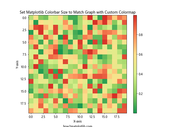
In this example, we create a custom colormap using LinearSegmentedColormap.from_list() before setting Matplotlib colorbar size to match graph. This allows you to use colors that are specifically tailored to your data visualization needs.
Handling Discrete Colorbars When Setting Matplotlib Colorbar Size to Match Graph
Sometimes, you may want to use a discrete colorbar instead of a continuous one. Here’s how to set Matplotlib colorbar size to match graph with a discrete colorbar:
import matplotlib.pyplot as plt
import numpy as np
from matplotlib.colors import BoundaryNorm
from matplotlib.ticker import MaxNLocator

# Create sample data
np.random.seed(42)
Z = np.random.rand(20, 20) * 100

# Set up discrete colormap
levels = MaxNLocator(nbins=10).tick_values(Z.min(), Z.max())
cmap = plt.get_cmap('viridis')
norm = BoundaryNorm(levels, ncolors=cmap.N, clip=True)

# Create the plot
fig, ax = plt.subplots(figsize=(8, 6))
im = ax.pcolormesh(Z, cmap=cmap, norm=norm)

# Set Matplotlib colorbar size to match graph
cbar = plt.colorbar(im, aspect=30)
cbar.set_label('Value', rotation=270, labelpad=15)

# Add labels and title
ax.set_title('Set Matplotlib Colorbar Size to Match Graph with Discrete Colorbar')
ax.set_xlabel('X-axis')
ax.set_ylabel('Y-axis')

# Add text to show how2matplotlib.com
plt.text(0.5, -0.15, 'how2matplotlib.com', transform=ax.transAxes, ha='center')

plt.show()
Output:
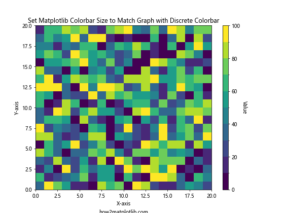
In this example, we use BoundaryNorm to create discrete color boundaries. When we set Matplotlib colorbar size to match graph, the colorbar displays these discrete levels instead of a continuous gradient.
Handling Colorbar Orientation When Setting Matplotlib Colorbar Size to Match Graph
You can change the orientation of the colorbar when setting its size to match the graph. Here’s an example of how to create a horizontal colorbar:
import matplotlib.pyplot as plt
import numpy as np

# Create sample data
data = np.random.rand(15, 15)

# Create the plot
fig, ax = plt.subplots(figsize=(8, 6))
im = ax.imshow(data, cmap='coolwarm')

# Set Matplotlib colorbar size to match graph with horizontal orientation
cbar = plt.colorbar(im, orientation='horizontal', aspect=30, pad=0.15)

# Add labels and title
ax.set_title('Set Matplotlib Colorbar Size to Match Graph (Horizontal)')
ax.set_xlabel('X-axis')
ax.set_ylabel('Y-axis')

# Add text to show how2matplotlib.com
plt.text(0.5, -0.25, 'how2matplotlib.com', transform=ax.transAxes, ha='center')

plt.show()
Output:
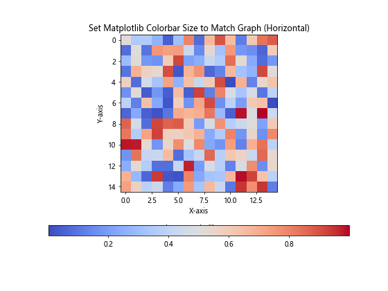
In this example, we use orientation='horizontal' when creating the colorbar to set its orientation. The pad parameter is adjusted to provide space between the plot and the colorbar.
Best Practices for Setting Matplotlib Colorbar Size to Match Graph
When setting Matplotlib colorbar size to match graph, keep these best practices in mind:
- Consistency: Maintain consistent colorbar sizes across multiple plots in the same figure or document.
- Readability: Ensure that the colorbar is large enough to be easily readable but not so large that it overpowers the main plot.
- Aspect ratio: Consider the aspect ratio of your main plot when setting the colorbar size.
- Labeling: Always include clear labels for your colorbar to provide context for the colors.
- Color choice: Use appropriate color schemes that are accessible to colorblind individuals.
- Scale: Choose the appropriate scale (linear, logarithmic, or discrete) based on your data distribution.
- Position: Consider the best position for your colorbar (right, left, top, or bottom) based on your plot layout.
By following these best practices, you can effectively set Matplotlib colorbar size to match graph and create visually appealing and informative data visualizations.
Troubleshooting Common Issues When Setting Matplotlib Colorbar Size to Match Graph
Even when following best practices, you may encounter some issues when trying to set Matplotlib colorbar size to match graph. Here are some common problems and their solutions:
- Colorbar too small or too large:
- Adjust the
aspectorshrinkparameters. - Use
make_axes_locatablefor more precise control.
- Adjust the
- Colorbar overlapping with plot:
- Increase the
padparameter when creating the colorbar. - Adjust the figure size or subplot layout.
- Increase the
- Inconsistent colorbar sizes in subplots:
- Use a loop to apply the same sizing method to all subplots.
- Consider using
GridSpecfor more complex layouts.
- Colorbar ticks not visible:
- Customize tick locations and labels using
set_ticks()andset_ticklabels(). - Adjust the colorbar size to accommodate all ticks.
- Customize tick locations and labels using
- Colorbar label cut off:
- Increase the
labelpadwhen setting the colorbar label. - Adjust the figure size to provide more space for the label.
- Increase the
By addressing these common issues, you can ensure that you successfully set Matplotlib colorbar size to match graph in all your visualizations.
Conclusion
Setting Matplotlib colorbar size to match graph is an essential skill for creating effective and visually appealing data visualizations. Throughout this comprehensive guide, we’ve explored various techniques and best practices for achieving this goal. From basic methods like using the aspect and shrink parameters to more advanced techniques involving make_axes_locatable and GridSpec, you now have a toolkit of approaches to set Matplotlib colorbar size to match graph in any scenario.