How to Set Y-Axis Range in Matplotlib Histogram: A Comprehensive Guide to plt.hist
plt.hist y axis range is a crucial aspect of data visualization when working with histograms in Matplotlib. This article will provide an in-depth exploration of how to effectively set the y-axis range in histograms using plt.hist, offering practical examples and explanations to help you master this essential technique.
Understanding plt.hist and Y-Axis Range
plt.hist is a powerful function in Matplotlib used to create histograms. When working with histograms, controlling the y-axis range is often necessary to focus on specific parts of the data distribution or to ensure consistent visualization across multiple plots. The y-axis range in a histogram typically represents the frequency or count of data points falling within each bin.
Let’s start with a basic example of creating a histogram and then explore how to manipulate its y-axis range:
import matplotlib.pyplot as plt
import numpy as np

# Generate sample data
data = np.random.normal(0, 1, 1000)

# Create a histogram
plt.hist(data, bins=30, edgecolor='black')
plt.title('Histogram with Default Y-Axis Range - how2matplotlib.com')
plt.xlabel('Value')
plt.ylabel('Frequency')
plt.show()
Output:
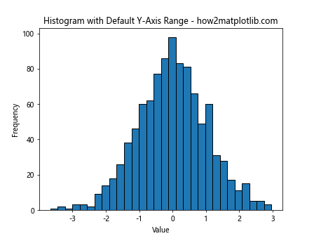
In this example, we create a histogram using plt.hist with default settings. The y-axis range is automatically determined based on the data. However, there are scenarios where you might want to customize this range.
Setting Y-Axis Range with plt.ylim()
One of the most straightforward ways to set the y-axis range in a plt.hist plot is by using the plt.ylim() function. This function allows you to specify the lower and upper limits of the y-axis.
Here’s an example demonstrating how to use plt.ylim():
import matplotlib.pyplot as plt
import numpy as np

data = np.random.normal(0, 1, 1000)

plt.hist(data, bins=30, edgecolor='black')
plt.title('Histogram with Custom Y-Axis Range - how2matplotlib.com')
plt.xlabel('Value')
plt.ylabel('Frequency')
plt.ylim(0, 100)  # Set y-axis range from 0 to 100
plt.show()
Output:

In this example, we set the y-axis range from 0 to 100 using plt.ylim(0, 100). This is useful when you want to focus on a specific range of frequencies or when comparing multiple histograms with different scales.
Adjusting Y-Axis Range Dynamically
Sometimes, you may want to set the y-axis range based on the data itself. For instance, you might want to set the upper limit to be a certain percentage above the maximum frequency. Here’s how you can do that:
import matplotlib.pyplot as plt
import numpy as np

data = np.random.normal(0, 1, 1000)

counts, bins, _ = plt.hist(data, bins=30, edgecolor='black')
max_count = max(counts)
plt.ylim(0, max_count * 1.2)  # Set upper limit to 120% of max frequency
plt.title('Histogram with Dynamic Y-Axis Range - how2matplotlib.com')
plt.xlabel('Value')
plt.ylabel('Frequency')
plt.show()
Output:
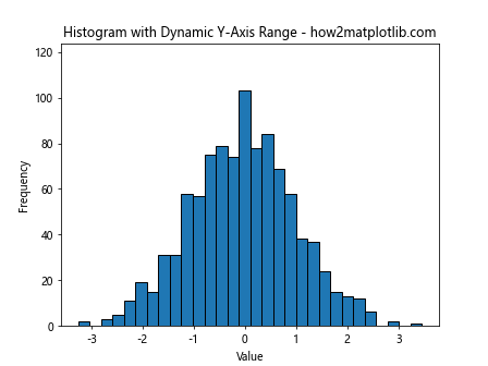
In this example, we first create the histogram and get the count data. Then, we set the y-axis upper limit to 120% of the maximum frequency using plt.ylim(0, max_count * 1.2).
Using plt.axis() for Y-Axis Range
Another method to set the y-axis range is by using the plt.axis() function. This function allows you to set both x and y-axis limits simultaneously.
Here’s an example:
import matplotlib.pyplot as plt
import numpy as np

data = np.random.normal(0, 1, 1000)

plt.hist(data, bins=30, edgecolor='black')
plt.title('Histogram with Y-Axis Range Set Using plt.axis() - how2matplotlib.com')
plt.xlabel('Value')
plt.ylabel('Frequency')
plt.axis([-3, 3, 0, 150])  # [xmin, xmax, ymin, ymax]
plt.show()
Output:
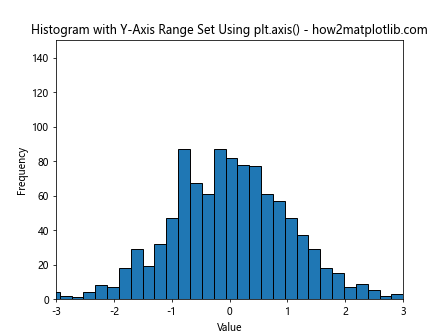
In this example, plt.axis([-3, 3, 0, 150]) sets the x-axis range from -3 to 3 and the y-axis range from 0 to 150.
Setting Y-Axis Range with ax.set_ylim()
When working with subplots or more complex plot structures, you might need to set the y-axis range for a specific Axes object. In such cases, you can use the set_ylim() method of the Axes object.
Here’s an example:
import matplotlib.pyplot as plt
import numpy as np

fig, ax = plt.subplots()

data = np.random.normal(0, 1, 1000)

ax.hist(data, bins=30, edgecolor='black')
ax.set_title('Histogram with Y-Axis Range Set Using ax.set_ylim() - how2matplotlib.com')
ax.set_xlabel('Value')
ax.set_ylabel('Frequency')
ax.set_ylim(0, 120)  # Set y-axis range from 0 to 120
plt.show()
Output:
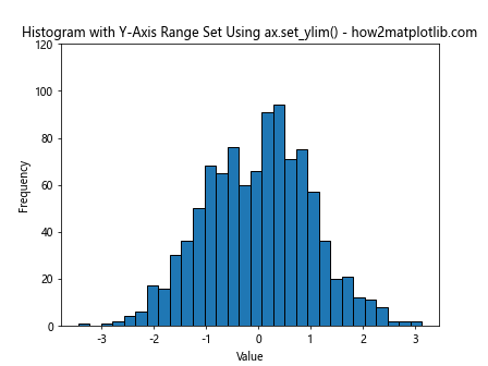
In this example, we create a Figure and Axes object explicitly, then use ax.set_ylim(0, 120) to set the y-axis range.
Logarithmic Y-Axis Scale
In some cases, especially when dealing with data that spans multiple orders of magnitude, it might be useful to set a logarithmic scale for the y-axis. This can be achieved using plt.yscale(‘log’).
Here’s an example:
import matplotlib.pyplot as plt
import numpy as np

data = np.random.lognormal(0, 1, 1000)

plt.hist(data, bins=30, edgecolor='black')
plt.title('Histogram with Logarithmic Y-Axis Scale - how2matplotlib.com')
plt.xlabel('Value')
plt.ylabel('Frequency (log scale)')
plt.yscale('log')
plt.ylim(1, None)  # Set lower limit to 1 to avoid log(0) issues
plt.show()
Output:
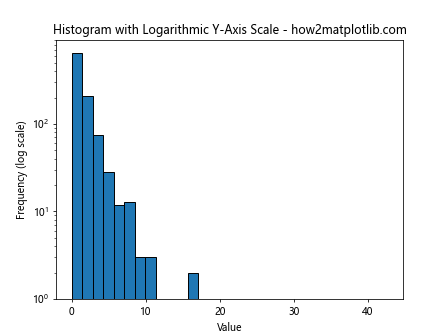
In this example, we use plt.yscale(‘log’) to set a logarithmic scale for the y-axis. Note that we also set the lower y-limit to 1 to avoid issues with log(0).
Normalizing Histogram Data
Sometimes, instead of showing raw counts, you might want to normalize your histogram data to show probabilities or densities. This can affect how you set your y-axis range.
Here’s an example of a normalized histogram:
import matplotlib.pyplot as plt
import numpy as np

data = np.random.normal(0, 1, 1000)

plt.hist(data, bins=30, density=True, edgecolor='black')
plt.title('Normalized Histogram - how2matplotlib.com')
plt.xlabel('Value')
plt.ylabel('Probability Density')
plt.ylim(0, 0.5)  # Set y-axis range appropriate for probability density
plt.show()
Output:
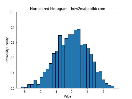
In this example, we use density=True in plt.hist() to normalize the histogram. The y-axis now represents probability density, so we adjust the y-axis range accordingly with plt.ylim(0, 0.5).
Stacked Histograms and Y-Axis Range
When working with stacked histograms, setting the y-axis range becomes even more important to ensure all data is visible.
Here’s an example of a stacked histogram with a custom y-axis range:
import matplotlib.pyplot as plt
import numpy as np

data1 = np.random.normal(0, 1, 1000)
data2 = np.random.normal(2, 1, 1000)

plt.hist([data1, data2], bins=30, stacked=True, label=['Data 1', 'Data 2'])
plt.title('Stacked Histogram with Custom Y-Axis Range - how2matplotlib.com')
plt.xlabel('Value')
plt.ylabel('Frequency')
plt.ylim(0, 250)  # Set y-axis range to accommodate stacked data
plt.legend()
plt.show()
Output:
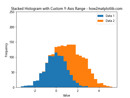
In this example, we create a stacked histogram and set the y-axis range to accommodate the total height of the stacked bars.
Multiple Histograms and Shared Y-Axis Range
When comparing multiple histograms, it’s often useful to set a shared y-axis range to ensure fair visual comparison.
Here’s an example:
import matplotlib.pyplot as plt
import numpy as np

data1 = np.random.normal(0, 1, 1000)
data2 = np.random.normal(2, 1, 1000)

fig, (ax1, ax2) = plt.subplots(1, 2, figsize=(12, 5))

ax1.hist(data1, bins=30, edgecolor='black')
ax1.set_title('Histogram 1 - how2matplotlib.com')
ax1.set_xlabel('Value')
ax1.set_ylabel('Frequency')

ax2.hist(data2, bins=30, edgecolor='black')
ax2.set_title('Histogram 2 - how2matplotlib.com')
ax2.set_xlabel('Value')
ax2.set_ylabel('Frequency')

# Set shared y-axis range
y_max = max(ax1.get_ylim()[1], ax2.get_ylim()[1])
ax1.set_ylim(0, y_max)
ax2.set_ylim(0, y_max)

plt.tight_layout()
plt.show()
Output:
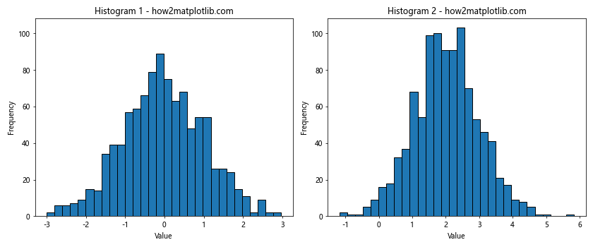
In this example, we create two histograms side by side and set a shared y-axis range based on the maximum y-value across both plots.
Adjusting Y-Axis Range for Better Readability
Sometimes, you might want to adjust the y-axis range to improve the readability of your histogram, especially when dealing with outliers or sparse data.
Here’s an example:
import matplotlib.pyplot as plt
import numpy as np

data = np.random.exponential(2, 1000)

counts, bins, _ = plt.hist(data, bins=30, edgecolor='black')
plt.title('Histogram with Adjusted Y-Axis for Readability - how2matplotlib.com')
plt.xlabel('Value')
plt.ylabel('Frequency')

# Set y-axis range to focus on the main part of the distribution
plt.ylim(0, np.percentile(counts, 95))  # Set upper limit to 95th percentile of counts
plt.show()
Output:
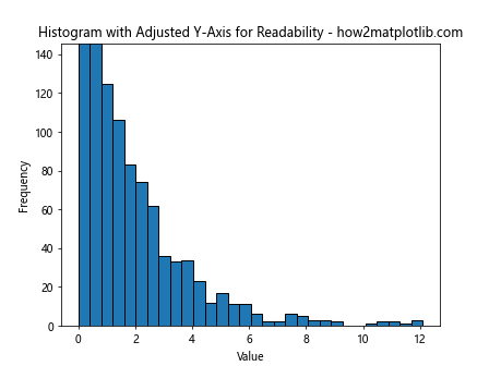
In this example, we set the upper y-limit to the 95th percentile of the count values, which helps focus on the main part of the distribution and improves readability.
Y-Axis Range in Cumulative Histograms
When working with cumulative histograms, the y-axis range typically goes from 0 to the total number of data points (or 1 if normalized).
Here’s an example:
import matplotlib.pyplot as plt
import numpy as np

data = np.random.normal(0, 1, 1000)

plt.hist(data, bins=30, cumulative=True, edgecolor='black')
plt.title('Cumulative Histogram - how2matplotlib.com')
plt.xlabel('Value')
plt.ylabel('Cumulative Frequency')
plt.ylim(0, 1000)  # Set y-axis range from 0 to total number of data points
plt.show()
Output:
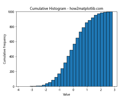
In this example, we create a cumulative histogram and set the y-axis range from 0 to the total number of data points (1000 in this case).
Using plt.hist y axis range with Seaborn
Seaborn is a statistical data visualization library built on top of Matplotlib. It provides a high-level interface for drawing attractive statistical graphics. When using Seaborn’s histplot function, you can still control the y-axis range using Matplotlib’s functions.
Here’s an example:
import matplotlib.pyplot as plt
import seaborn as sns
import numpy as np

data = np.random.normal(0, 1, 1000)

sns.histplot(data, kde=True)
plt.title('Seaborn Histogram with Custom Y-Axis Range - how2matplotlib.com')
plt.xlabel('Value')
plt.ylabel('Count')
plt.ylim(0, 150)  # Set y-axis range
plt.show()
Output:
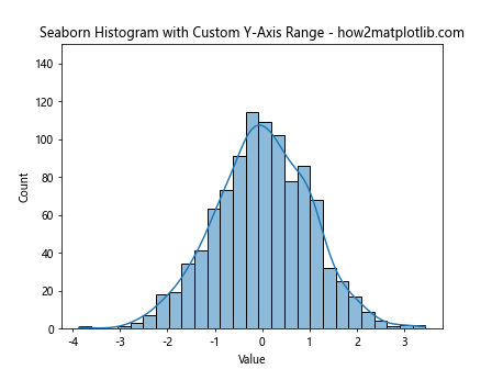
In this example, we create a histogram using Seaborn’s histplot function and then use plt.ylim() to set the y-axis range.
Adjusting Y-Axis Range for Histogram with Error Bars
When adding error bars to your histogram, you might need to adjust the y-axis range to accommodate them.
Here’s an example:
import matplotlib.pyplot as plt
import numpy as np

data = np.random.normal(0, 1, 1000)

counts, bins, _ = plt.hist(data, bins=30, edgecolor='black')
bin_centers = 0.5 * (bins[1:] + bins[:-1])
error = np.sqrt(counts)  # Assuming Poisson distribution for errors

plt.errorbar(bin_centers, counts, yerr=error, fmt='none', ecolor='red')
plt.title('Histogram with Error Bars - how2matplotlib.com')
plt.xlabel('Value')
plt.ylabel('Frequency')

# Adjust y-axis range to accommodate error bars
plt.ylim(0, max(counts + error) * 1.1)
plt.show()
Output:
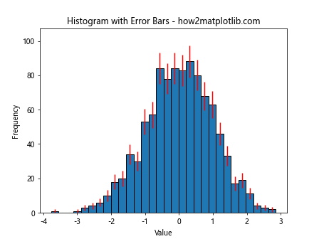
In this example, we add error bars to the histogram and then adjust the y-axis range to ensure all error bars are visible.
Y-Axis Range in 2D Histograms
When working with 2D histograms, the y-axis range refers to one of the data dimensions, while the color scale represents the frequency or density.
Here’s an example:
import matplotlib.pyplot as plt
import numpy as np

x = np.random.normal(0, 1, 1000)
y = np.random.normal(0, 1, 1000)

plt.hist2d(x, y, bins=30, cmap='viridis')
plt.colorbar(label='Frequency')
plt.title('2D Histogram with Custom Y-Axis Range - how2matplotlib.com')
plt.xlabel('X Value')
plt.ylabel('Y Value')
plt.ylim(-3, 3)  # Set y-axis range
plt.show()
Output:
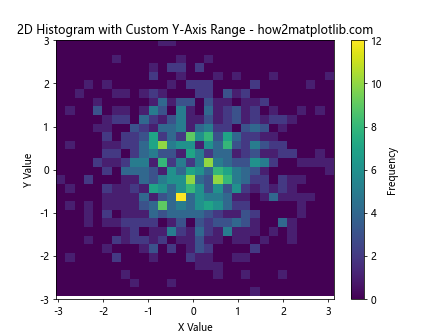
In this example, we create a 2D histogram and set the y-axis range using plt.ylim(-3, 3).
Conclusion
Mastering plt.hist y axis range is crucial for creating effective and informative histograms. By controlling the y-axis range, you can focus on specific aspects of your data distribution, ensure fair comparisons between multiple histograms, and improve the overall readability of your visualizations.
Throughout this article, we’ve explored various techniques for setting and adjusting the y-axis range in histograms, including:
- Using plt.ylim() for basic range setting
- Dynamically adjusting the range based on data
- Utilizing plt.axis() for simultaneous x and y-axis range setting
- Working with ax.set_ylim() for more complex plot structures
- Implementing logarithmic scales with plt.yscale(‘log’)
- Adjusting ranges for normalized histograms
- Handling stacked histograms and multiple histogram comparisons
- Improving readability by focusing on specific parts of the distribution
- Setting ranges for cumulative histograms
- Integrating plt.hist y axis range techniques with Seaborn
- Accommodating error bars in histograms
- Working with 2D histograms
By applying these techniques, you can create more effective and informative histogram visualizations that accurately represent your data and communicate your insights clearly.
Remember that the appropriate y-axis range will depend on your specific data and the story you’re trying to tell with your visualization. Always consider your audience and the key message you want to convey when deciding how to set your plt.hist y axis range.
As you continue to work with Matplotlib and histograms, experiment with different y-axis range settings to find the most effective way to present your data. Practice with various datasets and scenarios to build your intuition for when and how to adjust the y-axis range.
Advanced Techniques for plt.hist Y-Axis Range
As you become more comfortable with basic y-axis range adjustments, you can explore more advanced techniques to further enhance your histograms.
Using Twin Axes for Different Scales
Sometimes, you might want to display two different scales on the same histogram. This can be achieved using twin axes.
import matplotlib.pyplot as plt
import numpy as np

data = np.random.normal(0, 1, 1000)

fig, ax1 = plt.subplots()

n, bins, patches = ax1.hist(data, bins=30, edgecolor='black')
ax1.set_ylabel('Frequency')
ax1.set_ylim(0, 100)

ax2 = ax1.twinx()
ax2.set_ylabel('Cumulative Frequency')
ax2.set_ylim(0, 1000)

cumulative = np.cumsum(n)
ax2.plot(bins[:-1], cumulative, color='red', linewidth=2)

plt.title('Histogram with Twin Y-Axes - how2matplotlib.com')
plt.show()
Output:
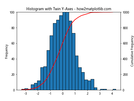
In this example, we create a histogram with two y-axes: one for the regular frequency and another for the cumulative frequency. Each axis has its own range.
Broken Axis for Skewed Distributions
For highly skewed distributions, you might want to use a broken y-axis to show both the bulk of the distribution and the long tail.
import matplotlib.pyplot as plt
import numpy as np

data = np.random.exponential(2, 1000)

fig, (ax1, ax2) = plt.subplots(2, 1, sharex=True, figsize=(8, 6))
fig.subplots_adjust(hspace=0.05)

ax1.hist(data, bins=30, edgecolor='black')
ax2.hist(data, bins=30, edgecolor='black')

ax1.set_ylim(50, 100)  # Top subplot y-axis range
ax2.set_ylim(0, 20)    # Bottom subplot y-axis range

ax1.spines['bottom'].set_visible(False)
ax2.spines['top'].set_visible(False)
ax1.xaxis.tick_top()
ax1.tick_params(labeltop=False)
ax2.xaxis.tick_bottom()

d = .015  # Size of diagonal lines
kwargs = dict(transform=ax1.transAxes, color='k', clip_on=False)
ax1.plot((-d, +d), (-d, +d), **kwargs)
ax1.plot((1 - d, 1 + d), (-d, +d), **kwargs)

kwargs.update(transform=ax2.transAxes)
ax2.plot((-d, +d), (1 - d, 1 + d), **kwargs)
ax2.plot((1 - d, 1 + d), (1 - d, 1 + d), **kwargs)

plt.title('Histogram with Broken Y-Axis - how2matplotlib.com')
plt.xlabel('Value')
fig.text(0.04, 0.5, 'Frequency', va='center', rotation='vertical')
plt.show()
Output:
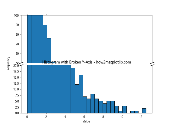
This example creates a histogram with a broken y-axis, allowing you to show both the main part of the distribution and the long tail.
Dynamic Y-Axis Range Based on Data Percentiles
Instead of using fixed values, you can set the y-axis range based on data percentiles for a more data-driven approach.
import matplotlib.pyplot as plt
import numpy as np

data = np.random.lognormal(0, 1, 1000)

counts, bins, _ = plt.hist(data, bins=30, edgecolor='black')
plt.title('Histogram with Y-Axis Range Based on Percentiles - how2matplotlib.com')
plt.xlabel('Value')
plt.ylabel('Frequency')

lower_limit = np.percentile(counts, 5)
upper_limit = np.percentile(counts, 95)
plt.ylim(lower_limit, upper_limit)

plt.show()
Output:
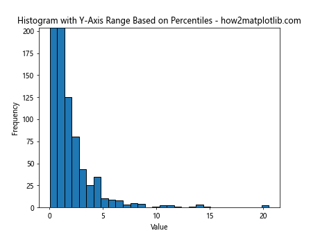
This example sets the y-axis range based on the 5th and 95th percentiles of the count data, focusing on the most informative part of the distribution.
Adjusting Y-Axis Range for Multiple Subplots
When working with multiple subplots, you might want to set a common y-axis range for better comparison.
import matplotlib.pyplot as plt
import numpy as np

fig, axs = plt.subplots(2, 2, figsize=(12, 8))
fig.suptitle('Multiple Histograms with Shared Y-Axis Range - how2matplotlib.com')

data1 = np.random.normal(0, 1, 1000)
data2 = np.random.normal(2, 1, 1000)
data3 = np.random.normal(-1, 1.5, 1000)
data4 = np.random.normal(0, 2, 1000)

axs[0, 0].hist(data1, bins=30, edgecolor='black')
axs[0, 1].hist(data2, bins=30, edgecolor='black')
axs[1, 0].hist(data3, bins=30, edgecolor='black')
axs[1, 1].hist(data4, bins=30, edgecolor='black')

# Find the maximum y-value across all subplots
y_max = max([ax.get_ylim()[1] for ax in axs.flat])

# Set the same y-axis range for all subplots
for ax in axs.flat:
    ax.set_ylim(0, y_max)
    ax.set_xlabel('Value')
    ax.set_ylabel('Frequency')

plt.tight_layout()
plt.show()
Output:
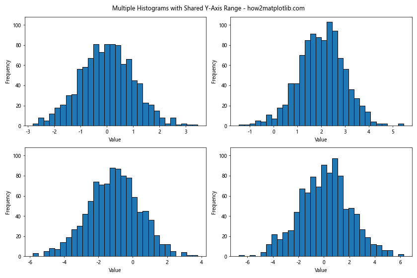
This example creates four histograms and sets a common y-axis range based on the maximum y-value across all subplots.
Y-Axis Range for Weighted Histograms
When working with weighted histograms, you might need to adjust your approach to setting the y-axis range.
import matplotlib.pyplot as plt
import numpy as np

data = np.random.normal(0, 1, 1000)
weights = np.random.uniform(0.5, 1.5, 1000)

counts, bins, _ = plt.hist(data, bins=30, weights=weights, edgecolor='black')
plt.title('Weighted Histogram with Custom Y-Axis Range - how2matplotlib.com')
plt.xlabel('Value')
plt.ylabel('Weighted Frequency')

plt.ylim(0, max(counts) * 1.1)  # Set y-axis range to 110% of max weighted count
plt.show()
Output:
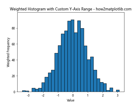
In this example, we create a weighted histogram and set the y-axis range based on the maximum weighted count.
Best Practices for plt.hist Y-Axis Range
When working with plt.hist y axis range, keep these best practices in mind:
- Consider your data: The appropriate y-axis range will depend on your specific dataset. Always examine your data distribution before deciding on a range.
Focus on the important parts: Set the y-axis range to highlight the most important aspects of your data distribution. This might mean focusing on the bulk of the distribution or highlighting specific features.
Maintain context: While focusing on specific parts of the distribution can be useful, make sure you’re not losing important context by cutting off too much of the data.
Be consistent: When comparing multiple histograms, use consistent y-axis ranges to ensure fair comparisons.
Use appropriate scales: For data spanning multiple orders of magnitude, consider using a logarithmic scale for the y-axis.
Label clearly: Always clearly label your axes and include units if applicable.
Consider your audience: The appropriate y-axis range might depend on your audience and the story you’re trying to tell with your data.
Experiment: Don’t be afraid to try different y-axis ranges to find the most effective way to present your data.
Troubleshooting Common Issues with plt.hist Y-Axis Range
When working with plt.hist y axis range, you might encounter some common issues. Here are some troubleshooting tips: