How to Use plt.hist with Color in Matplotlib
plt.hist color is a powerful combination in Matplotlib that allows you to create visually appealing and informative histograms. This article will dive deep into the various aspects of using plt.hist with color options, providing you with a thorough understanding of how to leverage these features in your data visualization projects.
Introduction to plt.hist and Color in Matplotlib
plt.hist is a function in Matplotlib that creates histograms, which are graphical representations of the distribution of numerical data. When combined with color options, plt.hist becomes an even more versatile tool for data visualization. The color parameter in plt.hist allows you to customize the appearance of your histograms, making them more visually appealing and easier to interpret.
Let’s start with a basic example of using plt.hist with color:
import matplotlib.pyplot as plt
import numpy as np

data = np.random.randn(1000)
plt.hist(data, bins=30, color='skyblue', edgecolor='black')
plt.title('Basic Histogram with Color - how2matplotlib.com')
plt.xlabel('Value')
plt.ylabel('Frequency')
plt.show()
Output:
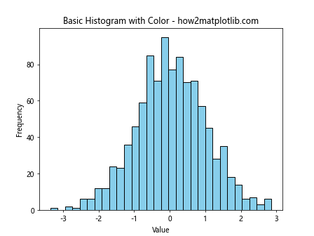
In this example, we create a histogram of random data using plt.hist. The color parameter is set to ‘skyblue’, which fills the bars with a light blue color. The edgecolor parameter is set to ‘black’ to provide a clear outline for each bar.
Understanding Color Options in plt.hist
When using plt.hist with color, you have several options for specifying colors. You can use:
- Color names (e.g., ‘red’, ‘blue’, ‘green’)
- Hexadecimal color codes (e.g., ‘#FF0000’ for red)
- RGB tuples (e.g., (1, 0, 0) for red)
- RGBA tuples (e.g., (1, 0, 0, 0.5) for semi-transparent red)
Let’s explore these options with examples:
import matplotlib.pyplot as plt
import numpy as np

data = np.random.randn(1000)

fig, ((ax1, ax2), (ax3, ax4)) = plt.subplots(2, 2, figsize=(12, 10))

ax1.hist(data, bins=30, color='red')
ax1.set_title('Color Name - how2matplotlib.com')

ax2.hist(data, bins=30, color='#00FF00')
ax2.set_title('Hexadecimal Color - how2matplotlib.com')

ax3.hist(data, bins=30, color=(0, 0, 1))
ax3.set_title('RGB Tuple - how2matplotlib.com')

ax4.hist(data, bins=30, color=(1, 0, 1, 0.5))
ax4.set_title('RGBA Tuple - how2matplotlib.com')

plt.tight_layout()
plt.show()
Output:
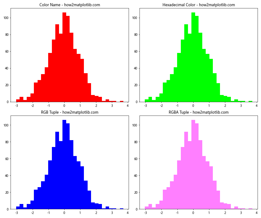
This example demonstrates four different ways to specify colors in plt.hist. Each subplot uses a different color specification method, showcasing the flexibility of color options in Matplotlib.
Using Multiple Colors in plt.hist
plt.hist allows you to use multiple colors for different parts of your histogram. This can be particularly useful when you want to highlight specific ranges or categories within your data.
Here’s an example of using multiple colors in a single histogram:
import matplotlib.pyplot as plt
import numpy as np

data = np.random.randn(1000)
n, bins, patches = plt.hist(data, bins=30, edgecolor='black')

# Color bins based on their position
for i in range(len(patches)):
    if i < 10:
        patches[i].set_facecolor('lightblue')
    elif i < 20:
        patches[i].set_facecolor('lightgreen')
    else:
        patches[i].set_facecolor('lightcoral')

plt.title('Multi-color Histogram - how2matplotlib.com')
plt.xlabel('Value')
plt.ylabel('Frequency')
plt.show()
Output:
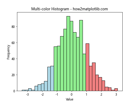
In this example, we create a histogram and then color the bars based on their position. The first 10 bars are colored light blue, the next 10 are light green, and the rest are light coral. This technique can be useful for highlighting different ranges or categories within your data.
Customizing Histogram Appearance with plt.hist and Color
plt.hist offers various parameters that allow you to customize the appearance of your histogram beyond just the color. Let's explore some of these options:
import matplotlib.pyplot as plt
import numpy as np

data = np.random.randn(1000)
plt.hist(data, bins=30, color='lightblue', edgecolor='black',
         linewidth=1.5, alpha=0.7, rwidth=0.9)
plt.title('Customized Histogram - how2matplotlib.com')
plt.xlabel('Value')
plt.ylabel('Frequency')
plt.grid(True, linestyle='--', alpha=0.7)
plt.show()
Output:
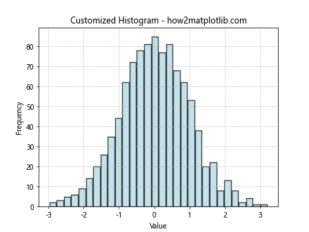
In this example, we've customized several aspects of the histogram:
- color: Sets the fill color of the bars
- edgecolor: Sets the color of the bar edges
- linewidth: Sets the width of the bar edges
- alpha: Sets the transparency of the bars
- rwidth: Sets the relative width of the bars
- grid: Adds a grid to the plot for better readability
These customization options allow you to create histograms that are not only informative but also visually appealing.
Creating Stacked Histograms with plt.hist and Color
plt.hist can be used to create stacked histograms, which are useful for comparing multiple datasets or categories. The stacked parameter in plt.hist allows you to stack multiple histograms on top of each other.
Here's an example of creating a stacked histogram:
import matplotlib.pyplot as plt
import numpy as np

data1 = np.random.normal(0, 1, 1000)
data2 = np.random.normal(2, 1, 1000)
data3 = np.random.normal(-2, 1, 1000)

plt.hist([data1, data2, data3], bins=30, stacked=True,
         color=['lightblue', 'lightgreen', 'lightcoral'],
         label=['Data 1', 'Data 2', 'Data 3'])
plt.title('Stacked Histogram - how2matplotlib.com')
plt.xlabel('Value')
plt.ylabel('Frequency')
plt.legend()
plt.show()
Output:
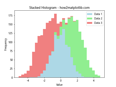
In this example, we create three datasets and plot them as a stacked histogram. Each dataset is assigned a different color, making it easy to distinguish between them. The legend helps identify which color corresponds to which dataset.
Creating 2D Histograms with plt.hist2d and Color
plt.hist2d is a function that creates two-dimensional histograms, which are useful for visualizing the joint distribution of two variables. Color plays a crucial role in 2D histograms, as it represents the frequency or density of data points.
Here's an example of creating a 2D histogram:
import matplotlib.pyplot as plt
import numpy as np

x = np.random.randn(1000)
y = np.random.randn(1000)

plt.hist2d(x, y, bins=30, cmap='viridis')
plt.colorbar(label='Count')
plt.title('2D Histogram - how2matplotlib.com')
plt.xlabel('X Value')
plt.ylabel('Y Value')
plt.show()
Output:
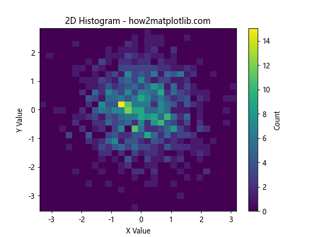
In this example, we create a 2D histogram using plt.hist2d. The color map 'viridis' is used to represent the density of data points, with darker colors indicating higher density. The colorbar provides a reference for interpreting the colors.
Normalizing Histograms with plt.hist and Color
Normalizing histograms can be useful when comparing datasets of different sizes or when you want to represent probabilities instead of raw counts. plt.hist provides options for normalization, and color can be used to distinguish between different normalized histograms.
Here's an example of creating normalized histograms:
import matplotlib.pyplot as plt
import numpy as np

data1 = np.random.normal(0, 1, 1000)
data2 = np.random.normal(2, 1, 2000)

plt.hist(data1, bins=30, alpha=0.5, color='lightblue',
         density=True, label='Data 1')
plt.hist(data2, bins=30, alpha=0.5, color='lightgreen',
         density=True, label='Data 2')
plt.title('Normalized Histograms - how2matplotlib.com')
plt.xlabel('Value')
plt.ylabel('Probability Density')
plt.legend()
plt.show()
Output:
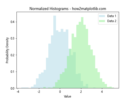
In this example, we create two normalized histograms using the density parameter. The alpha parameter is used to make the histograms semi-transparent, allowing us to see the overlap between the two distributions.
Using plt.hist with Categorical Data and Color
While plt.hist is typically used for continuous data, it can also be adapted for categorical data. In these cases, color can be used to distinguish between different categories.
Here's an example of using plt.hist with categorical data:
import matplotlib.pyplot as plt
import numpy as np

categories = ['A', 'B', 'C', 'D', 'E']
values = [23, 45, 56, 78, 32]
colors = ['red', 'green', 'blue', 'yellow', 'purple']

plt.bar(categories, values, color=colors)
plt.title('Categorical Data Histogram - how2matplotlib.com')
plt.xlabel('Category')
plt.ylabel('Value')
plt.show()
Output:
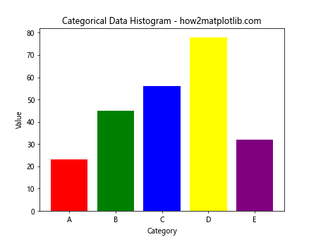
In this example, we use plt.bar instead of plt.hist to create a bar chart for categorical data. Each category is assigned a different color, making it easy to distinguish between them.
Combining plt.hist with Other Matplotlib Features
plt.hist can be combined with other Matplotlib features to create more complex and informative visualizations. Let's explore some examples:
Adding a Kernel Density Estimate (KDE) to a Histogram
import matplotlib.pyplot as plt
import numpy as np
from scipy import stats

data = np.random.normal(0, 1, 1000)

plt.hist(data, bins=30, density=True, alpha=0.7, color='lightblue')
kde = stats.gaussian_kde(data)
x_range = np.linspace(data.min(), data.max(), 100)
plt.plot(x_range, kde(x_range), 'r-', label='KDE')
plt.title('Histogram with KDE - how2matplotlib.com')
plt.xlabel('Value')
plt.ylabel('Density')
plt.legend()
plt.show()
Output:
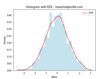
In this example, we add a Kernel Density Estimate (KDE) curve to the histogram. The histogram is colored light blue, while the KDE curve is red.
Creating a Histogram with Error Bars
import matplotlib.pyplot as plt
import numpy as np

data = np.random.normal(0, 1, 1000)
n, bins, _ = plt.hist(data, bins=30, color='lightblue', edgecolor='black')
bin_centers = 0.5 * (bins[1:] + bins[:-1])
error = np.sqrt(n)

plt.errorbar(bin_centers, n, yerr=error, fmt='none', ecolor='black', capsize=3)
plt.title('Histogram with Error Bars - how2matplotlib.com')
plt.xlabel('Value')
plt.ylabel('Frequency')
plt.show()
Output:
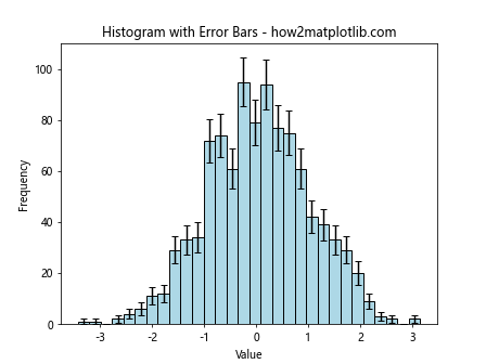
This example adds error bars to the histogram, representing the statistical uncertainty in each bin. The histogram bars are light blue, while the error bars are black.
Advanced Color Techniques in plt.hist
Let's explore some advanced color techniques that can be used with plt.hist:
Creating a Gradient Color Effect
import matplotlib.pyplot as plt
import numpy as np

data = np.random.randn(1000)
n, bins, patches = plt.hist(data, bins=30)

# Create a gradient color effect
cm = plt.cm.get_cmap('coolwarm')
for i, p in enumerate(patches):
    plt.setp(p, 'facecolor', cm(i/len(patches)))

plt.title('Histogram with Gradient Color Effect - how2matplotlib.com')
plt.xlabel('Value')
plt.ylabel('Frequency')
plt.show()
Output:
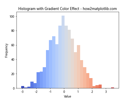
This example creates a gradient color effect across the histogram bars using the 'coolwarm' colormap.
Best Practices for Using plt.hist with Color
When using plt.hist with color, it's important to follow some best practices to ensure your visualizations are effective and accessible:
- Choose appropriate colors: Use colors that are visually distinct and appropriate for your data and audience.
Consider color blindness: Use color-blind friendly palettes when possible.
Use color consistently: If you're comparing multiple datasets, use consistent colors across your visualizations.
Add labels and legends: Always include clear labels and legends to explain what the colors represent.
Use color to highlight important information: Use color strategically to draw attention to key aspects of your data.
Here's an example that demonstrates these best practices: