How to Optimize plt.hist Bin Width for Effective Data Visualization with Matplotlib
plt.hist bin width is a crucial parameter in Matplotlib’s histogram plotting function that significantly impacts the visual representation and interpretation of data distributions. The bin width determines the size of each interval or “bin” into which data points are grouped, directly affecting the histogram’s appearance and the insights it provides. In this comprehensive guide, we’ll explore various aspects of plt.hist bin width, its importance, and how to optimize it for effective data visualization using Matplotlib.
Understanding plt.hist and Bin Width
plt.hist is a powerful function in Matplotlib used to create histograms, which are graphical representations of data distributions. The bin width in plt.hist determines the width of each bar in the histogram, influencing the level of detail and smoothness in the visualization. Proper selection of bin width is essential for accurately representing the underlying data distribution and avoiding misleading interpretations.
Let’s start with a basic example to illustrate the concept of plt.hist bin width:
import matplotlib.pyplot as plt
import numpy as np

# Generate sample data
data = np.random.normal(0, 1, 1000)

# Create histogram with default bin width
plt.hist(data, bins=30, edgecolor='black')
plt.title('Histogram with Default Bin Width - how2matplotlib.com')
plt.xlabel('Value')
plt.ylabel('Frequency')
plt.show()
Output:
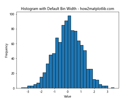
In this example, we create a histogram using plt.hist with a default bin width. The ‘bins’ parameter is set to 30, which means Matplotlib automatically calculates the bin width based on the range of the data and the number of bins specified.
The Importance of Bin Width in Data Visualization
The choice of bin width in plt.hist can significantly impact the visual representation of data and the insights derived from it. A bin width that is too large may oversimplify the data distribution, hiding important details and patterns. Conversely, a bin width that is too small may introduce noise and make it difficult to discern the overall trend in the data.
To demonstrate the impact of different bin widths, let’s compare histograms with varying bin widths:
import matplotlib.pyplot as plt
import numpy as np

# Generate sample data
data = np.random.normal(0, 1, 1000)

# Create subplots
fig, (ax1, ax2, ax3) = plt.subplots(1, 3, figsize=(15, 5))

# Histogram with small bin width
ax1.hist(data, bins=50, edgecolor='black')
ax1.set_title('Small Bin Width - how2matplotlib.com')

# Histogram with medium bin width
ax2.hist(data, bins=20, edgecolor='black')
ax2.set_title('Medium Bin Width - how2matplotlib.com')

# Histogram with large bin width
ax3.hist(data, bins=5, edgecolor='black')
ax3.set_title('Large Bin Width - how2matplotlib.com')

plt.tight_layout()
plt.show()
Output:
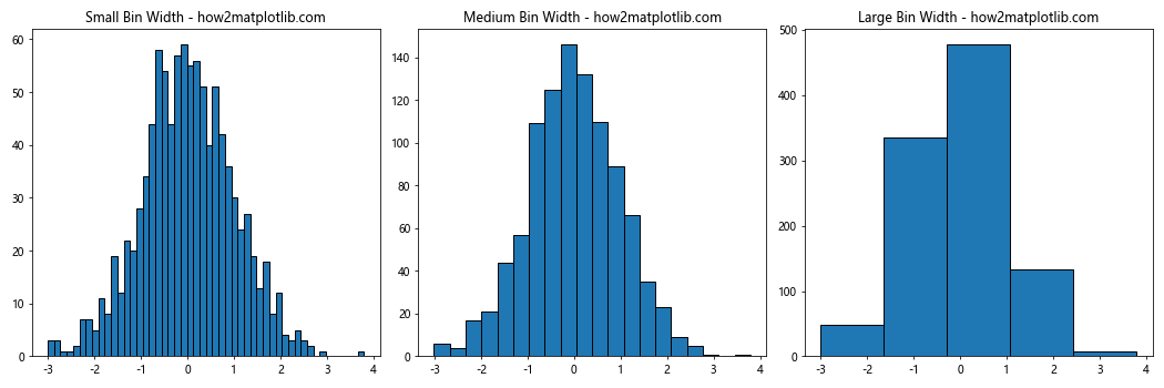
This example creates three histograms with different bin widths to illustrate how the choice of bin width affects the visualization of the same dataset.
Methods for Determining Optimal Bin Width
Several methods exist for determining the optimal bin width in plt.hist. These methods aim to balance the trade-off between detail and smoothness in the histogram. Let’s explore some common approaches:
1. Sturges’ Rule
Sturges’ Rule is a simple method for calculating the number of bins, which indirectly determines the bin width. The formula is:
number of bins = 1 + log2(n)
where n is the number of data points.
Here’s an example implementing Sturges’ Rule:
import matplotlib.pyplot as plt
import numpy as np

# Generate sample data
data = np.random.normal(0, 1, 1000)

# Calculate number of bins using Sturges' Rule
n_bins = int(1 + np.log2(len(data)))

# Create histogram
plt.hist(data, bins=n_bins, edgecolor='black')
plt.title('Histogram with Sturges\' Rule - how2matplotlib.com')
plt.xlabel('Value')
plt.ylabel('Frequency')
plt.show()
Output:
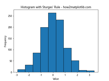
This example uses Sturges’ Rule to determine the number of bins for the histogram.
2. Scott’s Rule
Scott’s Rule is another method for determining bin width, which takes into account the standard deviation of the data. The formula for Scott’s Rule is:
bin width = 3.5 * σ / (n^(1/3))
where σ is the standard deviation of the data and n is the number of data points.
Let’s implement Scott’s Rule:
import matplotlib.pyplot as plt
import numpy as np

# Generate sample data
data = np.random.normal(0, 1, 1000)

# Calculate bin width using Scott's Rule
bin_width = 3.5 * np.std(data) / (len(data) ** (1/3))

# Calculate number of bins
n_bins = int((np.max(data) - np.min(data)) / bin_width)

# Create histogram
plt.hist(data, bins=n_bins, edgecolor='black')
plt.title('Histogram with Scott\'s Rule - how2matplotlib.com')
plt.xlabel('Value')
plt.ylabel('Frequency')
plt.show()
Output:
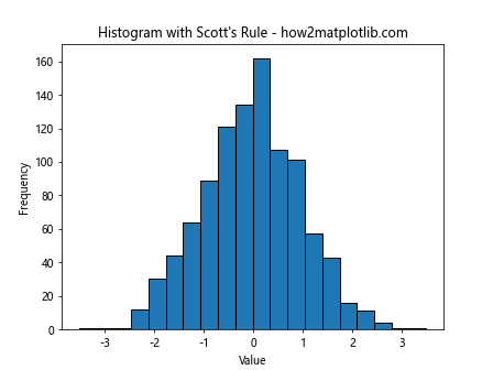
This example uses Scott’s Rule to determine the bin width and subsequently the number of bins for the histogram.
3. Freedman-Diaconis Rule
The Freedman-Diaconis Rule is a robust method for determining bin width, which is less sensitive to outliers compared to Scott’s Rule. The formula is:
bin width = 2 * IQR / (n^(1/3))
where IQR is the interquartile range of the data and n is the number of data points.
Here’s an implementation of the Freedman-Diaconis Rule:
import matplotlib.pyplot as plt
import numpy as np

# Generate sample data
data = np.random.normal(0, 1, 1000)

# Calculate bin width using Freedman-Diaconis Rule
q75, q25 = np.percentile(data, [75, 25])
iqr = q75 - q25
bin_width = 2 * iqr / (len(data) ** (1/3))

# Calculate number of bins
n_bins = int((np.max(data) - np.min(data)) / bin_width)

# Create histogram
plt.hist(data, bins=n_bins, edgecolor='black')
plt.title('Histogram with Freedman-Diaconis Rule - how2matplotlib.com')
plt.xlabel('Value')
plt.ylabel('Frequency')
plt.show()
Output:
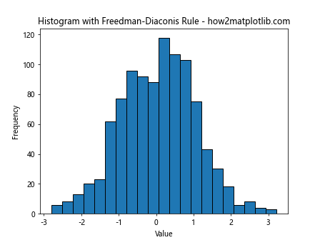
This example demonstrates the use of the Freedman-Diaconis Rule to determine the bin width for the histogram.
Customizing Bin Width in plt.hist
Matplotlib’s plt.hist function offers various ways to customize the bin width. Let’s explore some of these options:
1. Specifying the Number of Bins
The simplest way to control bin width is by specifying the number of bins:
import matplotlib.pyplot as plt
import numpy as np

# Generate sample data
data = np.random.normal(0, 1, 1000)

# Create histogram with specified number of bins
plt.hist(data, bins=25, edgecolor='black')
plt.title('Histogram with 25 Bins - how2matplotlib.com')
plt.xlabel('Value')
plt.ylabel('Frequency')
plt.show()
Output:
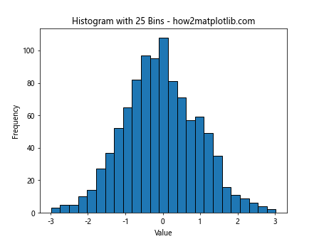
In this example, we set the number of bins to 25, allowing Matplotlib to automatically calculate the bin width.
2. Specifying Bin Edges
You can have more precise control over bin width by specifying the bin edges:
import matplotlib.pyplot as plt
import numpy as np

# Generate sample data
data = np.random.normal(0, 1, 1000)

# Specify bin edges
bin_edges = np.arange(-4, 4.5, 0.5)

# Create histogram with specified bin edges
plt.hist(data, bins=bin_edges, edgecolor='black')
plt.title('Histogram with Custom Bin Edges - how2matplotlib.com')
plt.xlabel('Value')
plt.ylabel('Frequency')
plt.show()
Output:
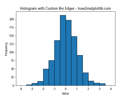
This example creates a histogram with custom bin edges, effectively controlling the bin width.
3. Using ‘auto’ for Automatic Bin Width Selection
Matplotlib offers an ‘auto’ option for bin width selection:
import matplotlib.pyplot as plt
import numpy as np

# Generate sample data
data = np.random.normal(0, 1, 1000)

# Create histogram with 'auto' bin width
plt.hist(data, bins='auto', edgecolor='black')
plt.title('Histogram with Auto Bin Width - how2matplotlib.com')
plt.xlabel('Value')
plt.ylabel('Frequency')
plt.show()
Output:
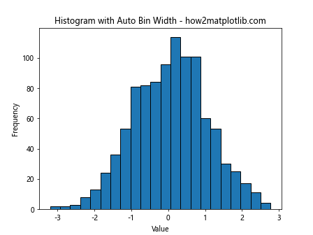
The ‘auto’ option uses a method similar to Sturges’ Rule to determine the number of bins.
Advanced Techniques for Optimizing plt.hist Bin Width
Beyond the basic methods, there are more advanced techniques for optimizing bin width in plt.hist. Let’s explore some of these approaches:
1. Using numpy.histogram_bin_edges
NumPy provides a function histogram_bin_edges that can be used to calculate optimal bin edges:
import matplotlib.pyplot as plt
import numpy as np

# Generate sample data
data = np.random.normal(0, 1, 1000)

# Calculate optimal bin edges
bin_edges = np.histogram_bin_edges(data, bins='auto')

# Create histogram with optimal bin edges
plt.hist(data, bins=bin_edges, edgecolor='black')
plt.title('Histogram with Optimal Bin Edges - how2matplotlib.com')
plt.xlabel('Value')
plt.ylabel('Frequency')
plt.show()
Output:
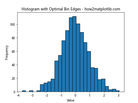
This example uses NumPy’s histogram_bin_edges function to determine optimal bin edges for the histogram.
2. Kernel Density Estimation
Kernel Density Estimation (KDE) can be used alongside histograms to provide a smoother representation of the data distribution:
import matplotlib.pyplot as plt
import numpy as np
from scipy import stats

# Generate sample data
data = np.random.normal(0, 1, 1000)

# Create histogram
plt.hist(data, bins='auto', density=True, alpha=0.7, edgecolor='black')

# Calculate KDE
kde = stats.gaussian_kde(data)
x_range = np.linspace(data.min(), data.max(), 100)
plt.plot(x_range, kde(x_range), 'r-', label='KDE')

plt.title('Histogram with KDE - how2matplotlib.com')
plt.xlabel('Value')
plt.ylabel('Density')
plt.legend()
plt.show()
Output:
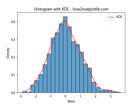
This example combines a histogram with a KDE plot to provide a more comprehensive view of the data distribution.
3. Adaptive Bin Width
Adaptive bin width methods adjust the bin width based on local data density. While Matplotlib doesn’t have a built-in function for this, we can implement a simple version:
import matplotlib.pyplot as plt
import numpy as np

def adaptive_hist(data, n_bins):
    counts, bin_edges = np.histogram(data, bins=n_bins)
    bin_widths = np.diff(bin_edges)
    bin_centers = (bin_edges[:-1] + bin_edges[1:]) / 2

    adaptive_widths = 1 / (1e-6 + np.sqrt(counts))
    adaptive_widths = adaptive_widths / np.sum(adaptive_widths) * np.sum(bin_widths)

    new_edges = np.cumsum(np.concatenate(([bin_edges[0]], adaptive_widths)))
    return new_edges

# Generate sample data
data = np.concatenate([np.random.normal(-2, 0.5, 1000), np.random.normal(2, 0.5, 1000)])

# Create histogram with adaptive bin width
adaptive_edges = adaptive_hist(data, n_bins=30)
plt.hist(data, bins=adaptive_edges, edgecolor='black')
plt.title('Histogram with Adaptive Bin Width - how2matplotlib.com')
plt.xlabel('Value')
plt.ylabel('Frequency')
plt.show()
Output:
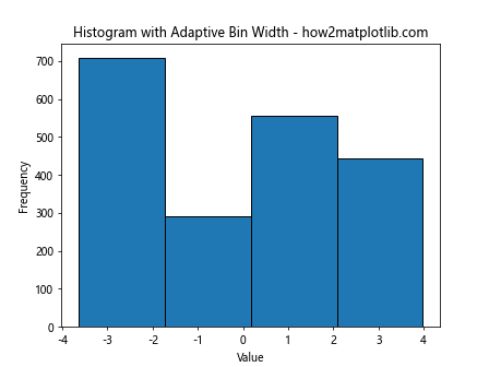
This example implements a simple adaptive bin width method, where bin widths are adjusted based on the local density of data points.
Comparing Different Bin Width Selection Methods
To better understand the impact of different bin width selection methods, let’s compare them side by side:
import matplotlib.pyplot as plt
import numpy as np
from scipy import stats

# Generate sample data
data = np.random.normal(0, 1, 1000)

# Create subplots
fig, ((ax1, ax2), (ax3, ax4)) = plt.subplots(2, 2, figsize=(12, 10))

# Sturges' Rule
n_bins_sturges = int(1 + np.log2(len(data)))
ax1.hist(data, bins=n_bins_sturges, edgecolor='black')
ax1.set_title('Sturges\' Rule - how2matplotlib.com')

# Scott's Rule
bin_width_scott = 3.5 * np.std(data) / (len(data) ** (1/3))
n_bins_scott = int((np.max(data) - np.min(data)) / bin_width_scott)
ax2.hist(data, bins=n_bins_scott, edgecolor='black')
ax2.set_title('Scott\'s Rule - how2matplotlib.com')

# Freedman-Diaconis Rule
q75, q25 = np.percentile(data, [75, 25])
iqr = q75 - q25
bin_width_fd = 2 * iqr / (len(data) ** (1/3))
n_bins_fd = int((np.max(data) - np.min(data)) / bin_width_fd)
ax3.hist(data, bins=n_bins_fd, edgecolor='black')
ax3.set_title('Freedman-Diaconis Rule - how2matplotlib.com')

# KDE
kde = stats.gaussian_kde(data)
x_range = np.linspace(data.min(), data.max(), 100)
ax4.hist(data, bins='auto', density=True, alpha=0.7, edgecolor='black')
ax4.plot(x_range, kde(x_range), 'r-')
ax4.set_title('KDE with Auto Bins - how2matplotlib.com')

plt.tight_layout()
plt.show()
Output:
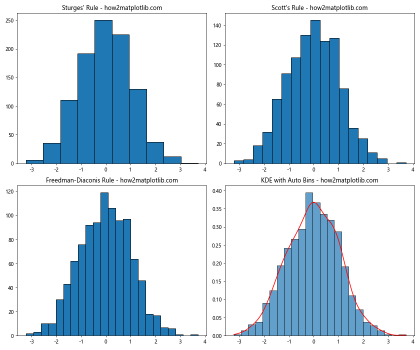
This example creates a side-by-side comparison of different bin width selection methods, allowing for easy visual comparison of their effects on the histogram.
Best Practices for Selecting plt.hist Bin Width
When working with plt.hist bin width, consider the following best practices:
- Understand your data: The nature of your data should guide your bin width selection. For example, continuous data might benefit from different bin width strategies compared to discrete data.
Consider the sample size: Larger datasets generally allow for more bins (smaller bin widths) without introducing excessive noise.
Experiment with different methods: Try various bin width selection methods and compare the results to find the most appropriate representation for your data.
Use domain knowledge: Incorporate domain-specific knowledge when selecting bin widths. Some fields may have standard practices or meaningful interval sizes.
Balance detail and clarity: Aim for a bin width that reveals the underlying structure of the data without introducing unnecessary complexity.
Be consistent: When comparing multiple datasets, use consistent bin widths to ensure fair comparisons.
Consider the purpose of the visualization: The intended audience and the key message of your visualization should influence your bin width choice.
Let’s implement some of these best practices in an example: