How to Optimize plt.hist Bin Size for Effective Data Visualization with Matplotlib
plt.hist bin size is a crucial parameter when creating histograms using Matplotlib’s plt.hist function. The bin size determines how the data is grouped and displayed in the histogram, significantly impacting the visual representation and interpretation of your data. In this comprehensive guide, we’ll explore various aspects of plt.hist bin size, including its importance, different methods for selecting the optimal bin size, and practical examples to help you master histogram creation with Matplotlib.
Understanding plt.hist and Bin Size
plt.hist is a powerful function in Matplotlib used to create histograms. A histogram is a graphical representation of the distribution of numerical data, where the data is divided into bins or intervals. The bin size in plt.hist refers to the width of these intervals, which plays a crucial role in determining the appearance and effectiveness of the histogram.
Let’s start with a basic example to illustrate the concept of plt.hist bin size:
import matplotlib.pyplot as plt
import numpy as np

# Generate sample data
data = np.random.normal(0, 1, 1000)

# Create a histogram with default bin size
plt.hist(data, bins=10)
plt.title('Histogram with Default Bin Size - how2matplotlib.com')
plt.xlabel('Value')
plt.ylabel('Frequency')
plt.show()
Output:
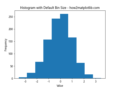
In this example, we create a histogram using plt.hist with a default bin size (10 bins). The bin size affects how the data is grouped and displayed in the histogram.
The Importance of Choosing the Right plt.hist Bin Size
Selecting the appropriate plt.hist bin size is crucial for several reasons:
- Data representation: The bin size affects how accurately the histogram represents the underlying data distribution.
- Visual clarity: An optimal bin size helps in identifying patterns and trends in the data more easily.
- Avoiding misleading interpretations: Incorrect bin sizes can lead to misinterpretation of the data, either by obscuring important features or creating artificial patterns.
Let’s compare histograms with different bin sizes to illustrate these points:
import matplotlib.pyplot as plt
import numpy as np

# Generate sample data
data = np.random.normal(0, 1, 1000)

# Create subplots
fig, (ax1, ax2, ax3) = plt.subplots(1, 3, figsize=(15, 5))

# Histogram with too few bins
ax1.hist(data, bins=5)
ax1.set_title('Too Few Bins - how2matplotlib.com')

# Histogram with appropriate number of bins
ax2.hist(data, bins=30)
ax2.set_title('Appropriate Bins - how2matplotlib.com')

# Histogram with too many bins
ax3.hist(data, bins=100)
ax3.set_title('Too Many Bins - how2matplotlib.com')

plt.tight_layout()
plt.show()
Output:
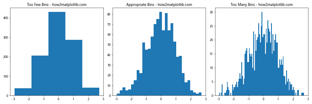
This example demonstrates how different plt.hist bin sizes can affect the visualization of the same dataset.
Methods for Determining Optimal plt.hist Bin Size
There are several methods and rules of thumb for determining the optimal plt.hist bin size. Let’s explore some of the most common approaches:
1. Square Root Rule
The square root rule suggests using the square root of the number of data points as the number of bins. This method is simple and works well for many datasets.
import matplotlib.pyplot as plt
import numpy as np

# Generate sample data
data = np.random.normal(0, 1, 1000)

# Calculate number of bins using square root rule
num_bins = int(np.sqrt(len(data)))

# Create histogram
plt.hist(data, bins=num_bins)
plt.title(f'Histogram with Square Root Rule ({num_bins} bins) - how2matplotlib.com')
plt.xlabel('Value')
plt.ylabel('Frequency')
plt.show()
Output:
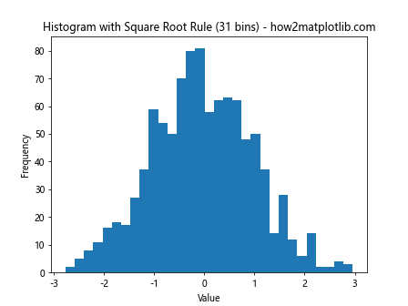
This example uses the square root rule to determine the number of bins for the histogram.
2. Sturges’ Rule
Sturges’ rule is another popular method for determining the number of bins. It’s defined as:
number of bins = 1 + log2(n)
Where n is the number of data points.
import matplotlib.pyplot as plt
import numpy as np

# Generate sample data
data = np.random.normal(0, 1, 1000)

# Calculate number of bins using Sturges' rule
num_bins = int(1 + np.log2(len(data)))

# Create histogram
plt.hist(data, bins=num_bins)
plt.title(f"Histogram with Sturges' Rule ({num_bins} bins) - how2matplotlib.com")
plt.xlabel('Value')
plt.ylabel('Frequency')
plt.show()
Output:
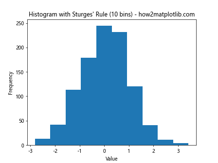
This example demonstrates how to use Sturges’ rule to determine the plt.hist bin size.
3. Freedman-Diaconis Rule
The Freedman-Diaconis rule is a more robust method that takes into account the spread of the data. It’s defined as:
bin width = 2 IQR n^(-1/3)
Where IQR is the interquartile range and n is the number of data points.
import matplotlib.pyplot as plt
import numpy as np

# Generate sample data
data = np.random.normal(0, 1, 1000)

# Calculate bin width using Freedman-Diaconis rule
iqr = np.subtract(*np.percentile(data, [75, 25]))
bin_width = 2 * iqr * len(data)**(-1/3)
num_bins = int((max(data) - min(data)) / bin_width)

# Create histogram
plt.hist(data, bins=num_bins)
plt.title(f'Histogram with Freedman-Diaconis Rule ({num_bins} bins) - how2matplotlib.com')
plt.xlabel('Value')
plt.ylabel('Frequency')
plt.show()
Output:
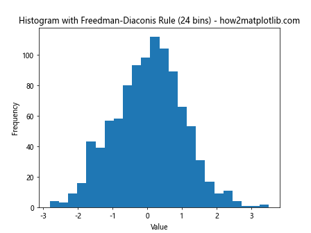
This example shows how to implement the Freedman-Diaconis rule for determining the plt.hist bin size.
Advanced Techniques for plt.hist Bin Size Selection
While the methods mentioned above provide good starting points, there are more advanced techniques for selecting the optimal plt.hist bin size. Let’s explore some of these approaches:
1. Cross-Validation
Cross-validation is a statistical method that can be used to select the optimal bin size by minimizing the integrated mean squared error (IMSE) between the histogram and the true underlying distribution.
import matplotlib.pyplot as plt
import numpy as np
from sklearn.model_selection import KFold

def cv_histogram(data, bins_range):
    kf = KFold(n_splits=5)
    imse_scores = []

    for num_bins in bins_range:
        imse = 0
        for train_index, test_index in kf.split(data):
            train_data, test_data = data[train_index], data[test_index]

            hist, bin_edges = np.histogram(train_data, bins=num_bins, density=True)
            bin_width = bin_edges[1] - bin_edges[0]

            for x in test_data:
                bin_index = np.digitize(x, bin_edges) - 1
                if 0 <= bin_index < len(hist):
                    imse += (hist[bin_index] - 1/bin_width)**2

        imse_scores.append(imse / len(data))

    return bins_range[np.argmin(imse_scores)]

# Generate sample data
data = np.random.normal(0, 1, 1000)

# Find optimal bin size using cross-validation
bins_range = range(10, 100, 5)
optimal_bins = cv_histogram(data, bins_range)

# Create histogram with optimal bin size
plt.hist(data, bins=optimal_bins)
plt.title(f'Histogram with Cross-Validation ({optimal_bins} bins) - how2matplotlib.com')
plt.xlabel('Value')
plt.ylabel('Frequency')
plt.show()
Output:
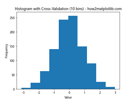
This example demonstrates how to use cross-validation to determine the optimal plt.hist bin size.
2. Bayesian Information Criterion (BIC)
The Bayesian Information Criterion (BIC) can be used to select the optimal number of bins by balancing the goodness of fit with model complexity.
import matplotlib.pyplot as plt
import numpy as np
from scipy.stats import norm

def bic_histogram(data, bins_range):
    n = len(data)
    bic_scores = []

    for num_bins in bins_range:
        hist, bin_edges = np.histogram(data, bins=num_bins)
        bin_width = bin_edges[1] - bin_edges[0]

        log_likelihood = np.sum(hist * np.log(hist / (n * bin_width) + 1e-10))
        bic = -2 * log_likelihood + num_bins * np.log(n)
        bic_scores.append(bic)

    return bins_range[np.argmin(bic_scores)]

# Generate sample data
data = np.random.normal(0, 1, 1000)

# Find optimal bin size using BIC
bins_range = range(10, 100, 5)
optimal_bins = bic_histogram(data, bins_range)

# Create histogram with optimal bin size
plt.hist(data, bins=optimal_bins)
plt.title(f'Histogram with BIC ({optimal_bins} bins) - how2matplotlib.com')
plt.xlabel('Value')
plt.ylabel('Frequency')
plt.show()
Output:
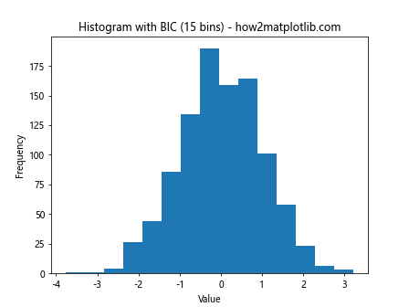
This example shows how to use the Bayesian Information Criterion to determine the optimal plt.hist bin size.
Customizing plt.hist Bin Size
Matplotlib's plt.hist function offers various ways to customize the bin size and appearance of histograms. Let's explore some of these options:
1. Specifying Bin Edges
Instead of specifying the number of bins, you can provide an array of bin edges to plt.hist:
import matplotlib.pyplot as plt
import numpy as np

# Generate sample data
data = np.random.normal(0, 1, 1000)

# Specify custom bin edges
bin_edges = np.arange(-4, 4.5, 0.5)

# Create histogram with custom bin edges
plt.hist(data, bins=bin_edges)
plt.title('Histogram with Custom Bin Edges - how2matplotlib.com')
plt.xlabel('Value')
plt.ylabel('Frequency')
plt.show()
Output:
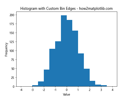
This example demonstrates how to create a histogram with custom bin edges using plt.hist.
2. Using String Aliases for Bin Size
Matplotlib provides string aliases for common bin size determination methods:
import matplotlib.pyplot as plt
import numpy as np

# Generate sample data
data = np.random.normal(0, 1, 1000)

# Create subplots
fig, (ax1, ax2, ax3) = plt.subplots(1, 3, figsize=(15, 5))

# Histogram with 'auto' bins
ax1.hist(data, bins='auto')
ax1.set_title("'auto' Bins - how2matplotlib.com")

# Histogram with 'sturges' bins
ax2.hist(data, bins='sturges')
ax2.set_title("'sturges' Bins - how2matplotlib.com")

# Histogram with 'fd' bins (Freedman-Diaconis rule)
ax3.hist(data, bins='fd')
ax3.set_title("'fd' Bins - how2matplotlib.com")

plt.tight_layout()
plt.show()
Output:
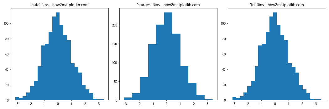
This example shows how to use string aliases for common bin size determination methods in plt.hist.
3. Adjusting Bin Size for Multiple Datasets
When comparing multiple datasets in a single histogram, it's important to use consistent bin sizes:
import matplotlib.pyplot as plt
import numpy as np

# Generate sample data
data1 = np.random.normal(0, 1, 1000)
data2 = np.random.normal(2, 1.5, 1500)

# Determine overall range and bin size
data_range = (min(np.min(data1), np.min(data2)), max(np.max(data1), np.max(data2)))
bin_width = 0.5
num_bins = int((data_range[1] - data_range[0]) / bin_width)

# Create histogram
plt.hist([data1, data2], bins=num_bins, alpha=0.7, label=['Dataset 1', 'Dataset 2'])
plt.title('Histogram of Multiple Datasets - how2matplotlib.com')
plt.xlabel('Value')
plt.ylabel('Frequency')
plt.legend()
plt.show()
Output:
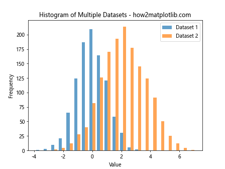
This example demonstrates how to adjust the plt.hist bin size when comparing multiple datasets in a single histogram.
Impact of plt.hist Bin Size on Different Types of Distributions
The choice of plt.hist bin size can have varying effects on different types of distributions. Let's explore how bin size affects the visualization of various common distributions:
1. Normal Distribution
import matplotlib.pyplot as plt
import numpy as np

# Generate normal distribution data
data = np.random.normal(0, 1, 10000)

# Create subplots
fig, (ax1, ax2, ax3) = plt.subplots(1, 3, figsize=(15, 5))

# Histogram with few bins
ax1.hist(data, bins=10)
ax1.set_title('Normal Distribution (10 bins) - how2matplotlib.com')

# Histogram with moderate bins
ax2.hist(data, bins=50)
ax2.set_title('Normal Distribution (50 bins) - how2matplotlib.com')

# Histogram with many bins
ax3.hist(data, bins=200)
ax3.set_title('Normal Distribution (200 bins) - how2matplotlib.com')

plt.tight_layout()
plt.show()
Output:
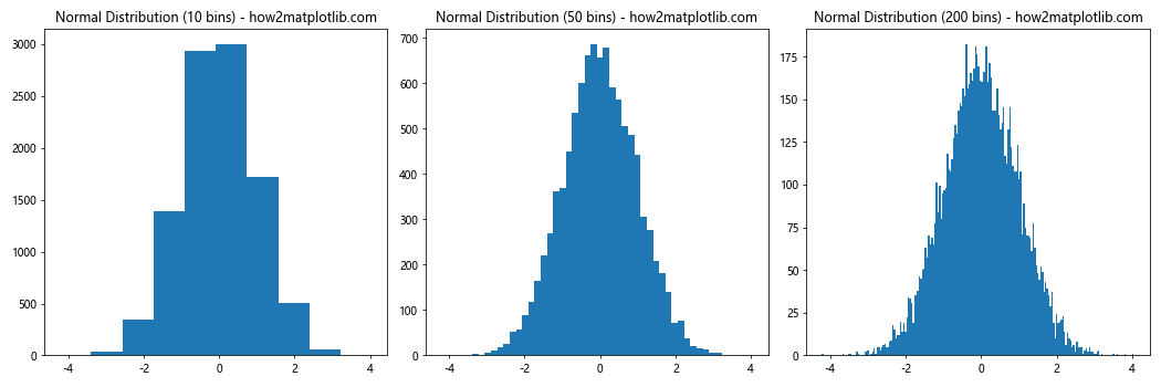
This example shows how different plt.hist bin sizes affect the visualization of a normal distribution.
2. Uniform Distribution
import matplotlib.pyplot as plt
import numpy as np

# Generate uniform distribution data
data = np.random.uniform(0, 10, 10000)

# Create subplots
fig, (ax1, ax2, ax3) = plt.subplots(1, 3, figsize=(15, 5))

# Histogram with few bins
ax1.hist(data, bins=10)
ax1.set_title('Uniform Distribution (10 bins) - how2matplotlib.com')

# Histogram with moderate bins
ax2.hist(data, bins=50)
ax2.set_title('Uniform Distribution (50 bins) - how2matplotlib.com')

# Histogram with many bins
ax3.hist(data, bins=200)
ax3.set_title('Uniform Distribution (200 bins) - how2matplotlib.com')

plt.tight_layout()
plt.show()
Output:
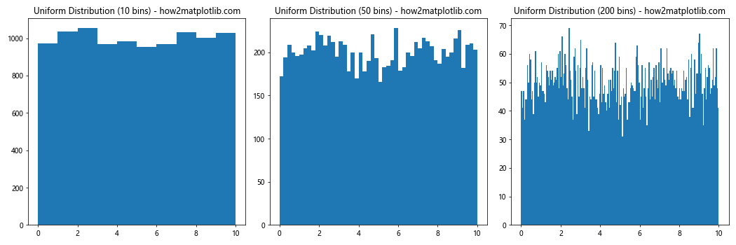
This example demonstrates the effect of plt.hist bin size on the visualization of a uniform distribution.
3. Bimodal Distribution
import matplotlib.pyplot as plt
import numpy as np

# Generate bimodal distribution data
data1 = np.random.normal(-2, 1, 5000)
data2 = np.random.normal(2, 1, 5000)
data = np.concatenate([data1, data2])

# Create subplots
fig, (ax1, ax2, ax3) = plt.subplots(1, 3, figsize=(15, 5))

# Histogram with few bins
ax1.hist(data, bins=10)
ax1.set_title('Bimodal Distribution (10 bins) - how2matplotlib.com')

# Histogram with moderate bins
ax2.hist(data, bins=50)
ax2.set_title('Bimodal Distribution (50 bins) - how2matplotlib.com')

# Histogram with many bins
ax3.hist(data, bins=200)
ax3.set_title('Bimodal Distribution (200 bins) - how2matplotlib.com')

plt.tight_layout()
plt.show()
Output:
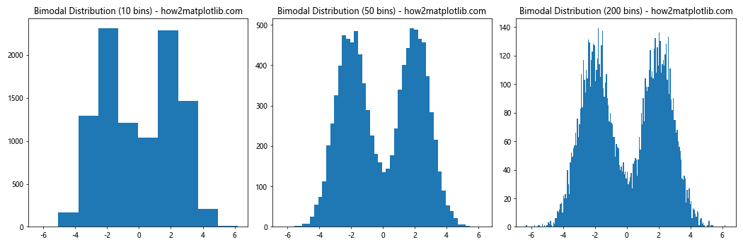
This example shows how plt.hist bin size affects the visualization of a bimodal distribution.
Optimizing plt.hist Bin Size for Specific Data Characteristics
When working with real-world data, it's important to consider the specific characteristics of your dataset when choosing the plt.hist bin size. Let's explore some common scenarios and how to optimize bin size for each:
1. Skewed Data
Skewed data can be challenging to visualize effectively with histograms. In such cases, using a logarithmic scale or adjusting the bin size can help:
import matplotlib.pyplot as plt
import numpy as np

# Generate skewed data
data = np.random.lognormal(0, 1, 10000)

# Create subplots
fig, (ax1, ax2) = plt.subplots(1, 2, figsize=(12, 5))

# Regular histogram
ax1.hist(data, bins=50)
ax1.set_title('Skewed Data (Linear Scale) - how2matplotlib.com')
ax1.set_xlabel('Value')
ax1.set_ylabel('Frequency')

# Histogram with logarithmic x-axis
ax2.hist(data, bins=50)
ax2.set_xscale('log')
ax2.set_title('Skewed Data (Log Scale) - how2matplotlib.com')
ax2.set_xlabel('Value (log scale)')
ax2.set_ylabel('Frequency')

plt.tight_layout()
plt.show()
Output:
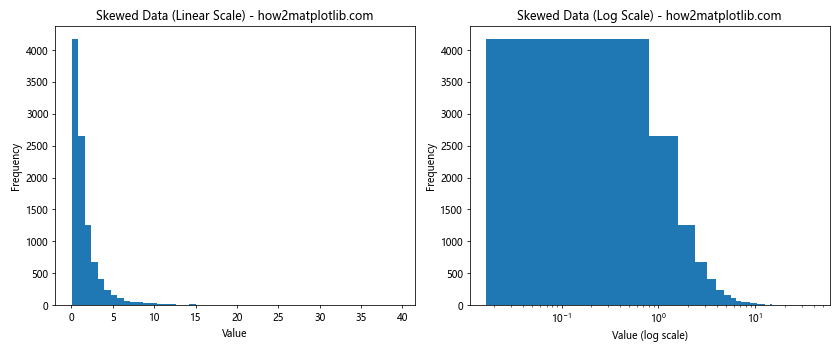
This example demonstrates how to optimize the plt.hist bin size for skewed data using a logarithmic scale.
2. Discrete Data
When dealing with discrete data, it's often best to set the bin edges to align with the discrete values:
import matplotlib.pyplot as plt
import numpy as np

# Generate discrete data
data = np.random.randint(1, 11, 1000)

# Create histogram with bins aligned to discrete values
plt.hist(data, bins=np.arange(0.5, 11.5, 1), align='mid')
plt.title('Histogram of Discrete Data - how2matplotlib.com')
plt.xlabel('Value')
plt.ylabel('Frequency')
plt.xticks(range(1, 11))
plt.show()
Output:
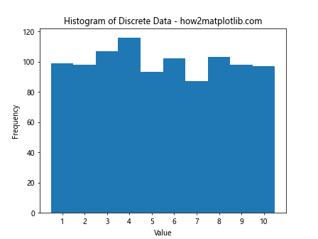
This example shows how to set the plt.hist bin size and alignment for discrete data.
3. Multimodal Data
For multimodal data, it's crucial to choose a bin size that reveals the underlying structure:
import matplotlib.pyplot as plt
import numpy as np

# Generate multimodal data
data1 = np.random.normal(-3, 1, 3000)
data2 = np.random.normal(0, 0.5, 5000)
data3 = np.random.normal(3, 1, 2000)
data = np.concatenate([data1, data2, data3])

# Create subplots
fig, (ax1, ax2) = plt.subplots(1, 2, figsize=(12, 5))

# Histogram with too few bins
ax1.hist(data, bins=20)
ax1.set_title('Multimodal Data (20 bins) - how2matplotlib.com')
ax1.set_xlabel('Value')
ax1.set_ylabel('Frequency')

# Histogram with appropriate number of bins
ax2.hist(data, bins=100)
ax2.set_title('Multimodal Data (100 bins) - how2matplotlib.com')
ax2.set_xlabel('Value')
ax2.set_ylabel('Frequency')

plt.tight_layout()
plt.show()
Output:
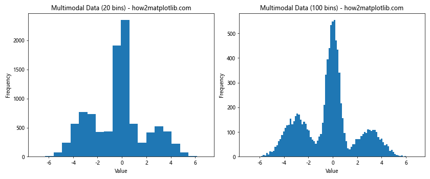
This example demonstrates how to choose an appropriate plt.hist bin size for multimodal data.
Advanced plt.hist Techniques
Let's explore some advanced techniques for using plt.hist to create more informative and visually appealing histograms:
1. Stacked Histograms
Stacked histograms are useful for comparing multiple datasets:
import matplotlib.pyplot as plt
import numpy as np

# Generate sample data
data1 = np.random.normal(0, 1, 1000)
data2 = np.random.normal(1, 1, 1000)
data3 = np.random.normal(2, 1, 1000)

# Create stacked histogram
plt.hist([data1, data2, data3], bins=30, stacked=True, alpha=0.7,
         label=['Dataset 1', 'Dataset 2', 'Dataset 3'])
plt.title('Stacked Histogram - how2matplotlib.com')
plt.xlabel('Value')
plt.ylabel('Frequency')
plt.legend()
plt.show()
Output:
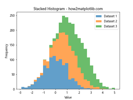
This example shows how to create a stacked histogram using plt.hist.
2. Cumulative Histograms
Cumulative histograms can be useful for understanding the distribution of data:
import matplotlib.pyplot as plt
import numpy as np

# Generate sample data
data = np.random.normal(0, 1, 1000)

# Create cumulative histogram
plt.hist(data, bins=30, cumulative=True, density=True)
plt.title('Cumulative Histogram - how2matplotlib.com')
plt.xlabel('Value')
plt.ylabel('Cumulative Frequency')
plt.show()
Output:
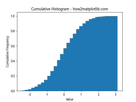
This example demonstrates how to create a cumulative histogram using plt.hist.
3. 2D Histograms
2D histograms are useful for visualizing the relationship between two variables:
import matplotlib.pyplot as plt
import numpy as np

# Generate sample data
x = np.random.normal(0, 1, 10000)
y = np.random.normal(0, 1, 10000)

# Create 2D histogram
plt.hist2d(x, y, bins=50, cmap='viridis')
plt.colorbar(label='Frequency')
plt.title('2D Histogram - how2matplotlib.com')
plt.xlabel('X Value')
plt.ylabel('Y Value')
plt.show()
Output:
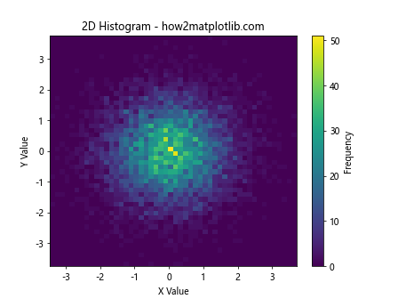
This example shows how to create a 2D histogram using plt.hist2d.
Best Practices for plt.hist Bin Size Selection
When working with plt.hist and selecting bin sizes, keep these best practices in mind:
- Start with a reasonable default: Use methods like the square root rule or Sturges' rule as a starting point.
- Experiment with different bin sizes: Try a range of bin sizes to see how they affect the visualization.
- Consider the nature of your data: Take into account whether your data is continuous, discrete, skewed, or multimodal.
- Use domain knowledge: Incorporate your understanding of the data and its context when choosing bin sizes.
- Be consistent: When comparing multiple datasets, use consistent bin sizes.
- Avoid overfitting: Be cautious about using too many bins, which can lead to overfitting and noise in the visualization.
- Use automated methods: Consider using cross-validation or information criteria for more objective bin size selection.
plt.hist bin size Conclusion
Mastering plt.hist bin size selection is crucial for creating effective and informative histograms with Matplotlib. By understanding the impact of bin size on different types of distributions, exploring various methods for bin size determination, and applying advanced techniques, you can create histograms that accurately represent your data and convey important insights.
Remember that the optimal plt.hist bin size often depends on the specific characteristics of your data and the story you want to tell. Experiment with different approaches, consider the context of your data, and always aim for clarity and accuracy in your visualizations.