How to Master Formatting Axis Tick Labels: From Numbers to Thousands and Millions with Matplotlib
Formatting axis tick labels: from numbers to thousands and millions is an essential skill for data visualization using Matplotlib. This comprehensive guide will explore various techniques and best practices for formatting axis tick labels, ranging from simple numeric representations to more complex formats like thousands and millions. We’ll cover everything you need to know about formatting axis tick labels, from basic concepts to advanced techniques, with plenty of practical examples along the way.
Understanding the Importance of Formatting Axis Tick Labels
Formatting axis tick labels: from numbers to thousands and millions plays a crucial role in creating clear and informative data visualizations. Properly formatted tick labels can greatly enhance the readability and interpretability of your plots, making it easier for viewers to understand the scale and magnitude of the data being presented.
When working with large numbers or data spanning multiple orders of magnitude, formatting axis tick labels becomes even more critical. By converting raw numbers into more human-readable formats like thousands or millions, you can make your plots more accessible and easier to comprehend at a glance.
Let’s start with a basic example of formatting axis tick labels using Matplotlib:
import matplotlib.pyplot as plt
import numpy as np

# Generate sample data
x = np.linspace(0, 10, 11)
y = x ** 2

# Create the plot
plt.figure(figsize=(10, 6))
plt.plot(x, y, label='y = x^2')
plt.title('Basic Plot with Default Tick Labels - how2matplotlib.com')
plt.xlabel('X-axis')
plt.ylabel('Y-axis')
plt.legend()

# Show the plot
plt.show()
Output:
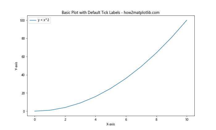
In this example, we’ve created a simple plot without any custom formatting for the axis tick labels. As we progress through this article, we’ll explore various techniques to enhance the presentation of these labels.
Basic Formatting Techniques for Axis Tick Labels
When it comes to formatting axis tick labels: from numbers to thousands and millions, Matplotlib offers several built-in functions and methods that can help you achieve the desired results. Let’s explore some of these basic formatting techniques.
Using set_major_formatter()
One of the most common ways to format axis tick labels is by using the set_major_formatter() method. This method allows you to apply a custom formatter to the major tick labels of an axis.
Here’s an example of how to use set_major_formatter() to display tick labels with two decimal places:
import matplotlib.pyplot as plt
import numpy as np
from matplotlib.ticker import FuncFormatter

def format_func(value, tick_number):
    return f'{value:.2f}'

# Generate sample data
x = np.linspace(0, 10, 11)
y = x ** 2

# Create the plot
fig, ax = plt.subplots(figsize=(10, 6))
ax.plot(x, y, label='y = x^2')
ax.set_title('Formatted Tick Labels with Two Decimal Places - how2matplotlib.com')
ax.set_xlabel('X-axis')
ax.set_ylabel('Y-axis')
ax.legend()

# Apply the formatter to both axes
ax.xaxis.set_major_formatter(FuncFormatter(format_func))
ax.yaxis.set_major_formatter(FuncFormatter(format_func))

# Show the plot
plt.show()
Output:
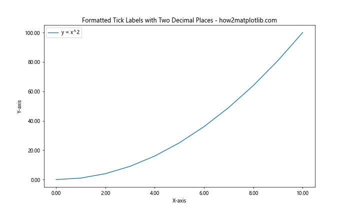
In this example, we define a custom formatting function format_func() that formats the tick labels to display two decimal places. We then use FuncFormatter() to create a formatter object and apply it to both the x and y axes using set_major_formatter().
Using StrMethodFormatter
Another useful technique for formatting axis tick labels is the StrMethodFormatter. This formatter allows you to use Python’s string formatting syntax to customize the appearance of your tick labels.
Here’s an example of using StrMethodFormatter to display tick labels with thousands separators:
import matplotlib.pyplot as plt
import numpy as np
from matplotlib.ticker import StrMethodFormatter

# Generate sample data
x = np.linspace(0, 10000, 11)
y = x ** 2

# Create the plot
fig, ax = plt.subplots(figsize=(10, 6))
ax.plot(x, y, label='y = x^2')
ax.set_title('Formatted Tick Labels with Thousands Separators - how2matplotlib.com')
ax.set_xlabel('X-axis')
ax.set_ylabel('Y-axis')
ax.legend()

# Apply the formatter to both axes
ax.xaxis.set_major_formatter(StrMethodFormatter('{x:,.0f}'))
ax.yaxis.set_major_formatter(StrMethodFormatter('{x:,.0f}'))

# Show the plot
plt.show()
Output:
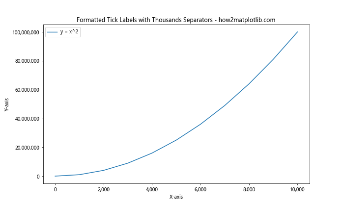
In this example, we use the StrMethodFormatter with the format string '{x:,.0f}' to display tick labels with thousands separators and no decimal places.
Advanced Formatting Techniques for Axis Tick Labels
As we delve deeper into formatting axis tick labels: from numbers to thousands and millions, let’s explore some more advanced techniques that can help you create even more sophisticated and informative visualizations.
Using FuncFormatter for Custom Formatting
The FuncFormatter class in Matplotlib allows you to define custom formatting functions for your tick labels. This is particularly useful when you need to apply complex formatting logic or when you want to display tick labels in a specific format, such as scientific notation or with custom units.
Here’s an example of using FuncFormatter to display tick labels in scientific notation:
import matplotlib.pyplot as plt
import numpy as np
from matplotlib.ticker import FuncFormatter

def scientific_notation(x, pos):
    return f'{x:.2e}'

# Generate sample data
x = np.logspace(0, 10, 11)
y = x ** 2

# Create the plot
fig, ax = plt.subplots(figsize=(10, 6))
ax.plot(x, y, label='y = x^2')
ax.set_title('Tick Labels in Scientific Notation - how2matplotlib.com')
ax.set_xlabel('X-axis')
ax.set_ylabel('Y-axis')
ax.legend()

# Apply the formatter to both axes
ax.xaxis.set_major_formatter(FuncFormatter(scientific_notation))
ax.yaxis.set_major_formatter(FuncFormatter(scientific_notation))

# Set log scale for both axes
ax.set_xscale('log')
ax.set_yscale('log')

# Show the plot
plt.show()
Output:
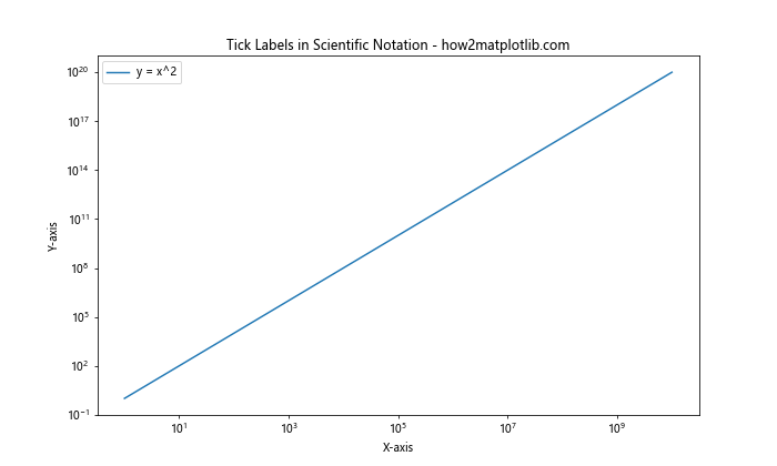
In this example, we define a custom function scientific_notation() that formats numbers in scientific notation. We then use FuncFormatter to apply this function to both the x and y axes.
Formatting Tick Labels with Units
When working with data that has specific units, it’s often helpful to include these units in your tick labels. Here’s an example of how to format tick labels with units using FuncFormatter:
import matplotlib.pyplot as plt
import numpy as np
from matplotlib.ticker import FuncFormatter

def format_with_units(x, pos):
    if x >= 1e6:
        return f'{x/1e6:.1f}M'
    elif x >= 1e3:
        return f'{x/1e3:.1f}K'
    else:
        return f'{x:.0f}'

# Generate sample data
x = np.linspace(0, 10, 11)
y = np.exp(x)

# Create the plot
fig, ax = plt.subplots(figsize=(10, 6))
ax.plot(x, y, label='y = e^x')
ax.set_title('Tick Labels with Units - how2matplotlib.com')
ax.set_xlabel('X-axis')
ax.set_ylabel('Y-axis')
ax.legend()

# Apply the formatter to the y-axis
ax.yaxis.set_major_formatter(FuncFormatter(format_with_units))

# Show the plot
plt.show()
Output:
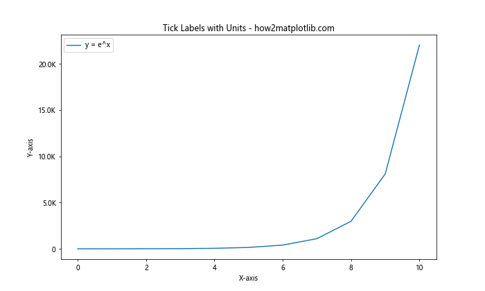
In this example, we define a custom function format_with_units() that formats numbers with appropriate units (M for millions, K for thousands) based on their magnitude. We then apply this formatter to the y-axis using FuncFormatter.
Formatting Axis Tick Labels for Different Data Types
When it comes to formatting axis tick labels: from numbers to thousands and millions, it’s important to consider the different types of data you might be working with. Let’s explore how to format tick labels for various data types, including dates, currencies, and percentages.
Formatting Date Tick Labels
When working with time series data, formatting date tick labels correctly is crucial for creating clear and informative visualizations. Matplotlib provides several tools for handling date formatting, including the DateFormatter class.
Here’s an example of how to format date tick labels:
import matplotlib.pyplot as plt
import numpy as np
from matplotlib.dates import DateFormatter
import datetime

# Generate sample data
start_date = datetime.datetime(2023, 1, 1)
dates = [start_date + datetime.timedelta(days=i) for i in range(365)]
values = np.cumsum(np.random.randn(365))

# Create the plot
fig, ax = plt.subplots(figsize=(12, 6))
ax.plot(dates, values)
ax.set_title('Time Series Data with Formatted Date Labels - how2matplotlib.com')
ax.set_xlabel('Date')
ax.set_ylabel('Value')

# Format the date labels
date_formatter = DateFormatter("%Y-%m-%d")
ax.xaxis.set_major_formatter(date_formatter)

# Rotate and align the tick labels so they look better
plt.gcf().autofmt_xdate()

# Show the plot
plt.show()
Output:
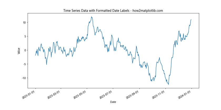
In this example, we use the DateFormatter class to format the x-axis tick labels as “YYYY-MM-DD”. We also use plt.gcf().autofmt_xdate() to automatically rotate and align the date labels for better readability.
Formatting Currency Tick Labels
When working with financial data, it’s often necessary to format tick labels as currency values. Here’s an example of how to format tick labels as US dollars:
import matplotlib.pyplot as plt
import numpy as np
from matplotlib.ticker import FuncFormatter

def currency_formatter(x, pos):
    return f'${x:,.2f}'

# Generate sample data
x = np.linspace(0, 10, 11)
y = 1000 * np.exp(x)

# Create the plot
fig, ax = plt.subplots(figsize=(10, 6))
ax.plot(x, y)
ax.set_title('Financial Data with Currency Formatted Labels - how2matplotlib.com')
ax.set_xlabel('Time')
ax.set_ylabel('Value (USD)')

# Apply the currency formatter to the y-axis
ax.yaxis.set_major_formatter(FuncFormatter(currency_formatter))

# Show the plot
plt.show()
Output:
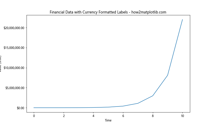
In this example, we define a custom currency_formatter() function that formats numbers as US dollar amounts with thousands separators and two decimal places. We then apply this formatter to the y-axis using FuncFormatter.
Formatting Percentage Tick Labels
When working with data represented as percentages, it’s important to format the tick labels accordingly. Here’s an example of how to format tick labels as percentages:
import matplotlib.pyplot as plt
import numpy as np
from matplotlib.ticker import FuncFormatter

def percentage_formatter(x, pos):
    return f'{x:.1f}%'

# Generate sample data
x = np.linspace(0, 1, 11)
y = x ** 2

# Create the plot
fig, ax = plt.subplots(figsize=(10, 6))
ax.plot(x, y)
ax.set_title('Data with Percentage Formatted Labels - how2matplotlib.com')
ax.set_xlabel('X-axis')
ax.set_ylabel('Y-axis')

# Apply the percentage formatter to both axes
ax.xaxis.set_major_formatter(FuncFormatter(percentage_formatter))
ax.yaxis.set_major_formatter(FuncFormatter(percentage_formatter))

# Show the plot
plt.show()
Output:
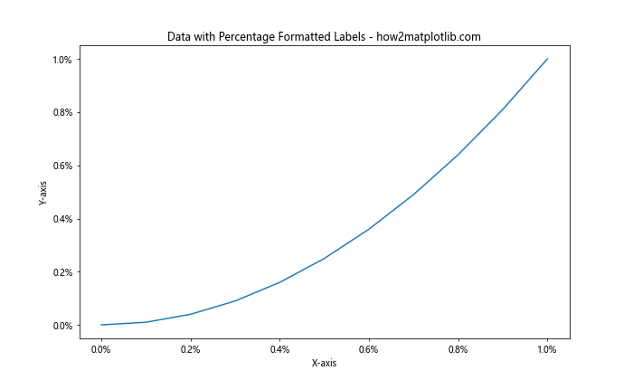
In this example, we define a custom percentage_formatter() function that formats numbers as percentages with one decimal place. We then apply this formatter to both the x and y axes using FuncFormatter.
Handling Large Numbers: Thousands and Millions
When dealing with large numbers, formatting axis tick labels: from numbers to thousands and millions becomes particularly important. Let’s explore some techniques for handling large numbers effectively in your visualizations.
Using ScalarFormatter with Offset
The ScalarFormatter class in Matplotlib provides an option to use an offset for large numbers, which can help simplify the tick labels. Here’s an example:
import matplotlib.pyplot as plt
import numpy as np
from matplotlib.ticker import ScalarFormatter

# Generate sample data
x = np.linspace(0, 10, 11)
y = 1e6 * x ** 2

# Create the plot
fig, ax = plt.subplots(figsize=(10, 6))
ax.plot(x, y)
ax.set_title('Large Numbers with Offset - how2matplotlib.com')
ax.set_xlabel('X-axis')
ax.set_ylabel('Y-axis')

# Configure ScalarFormatter with offset
formatter = ScalarFormatter(useOffset=True)
formatter.set_scientific(False)
ax.yaxis.set_major_formatter(formatter)

# Show the plot
plt.show()
Output:
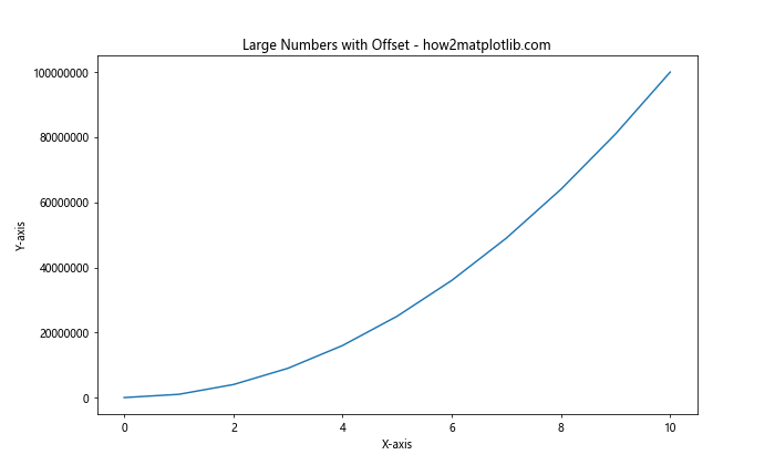
In this example, we use ScalarFormatter with useOffset=True to display an offset for the y-axis, making the tick labels more manageable for large numbers.
Custom Formatting for Thousands and Millions
For even more control over how large numbers are displayed, you can create a custom formatter that converts numbers to thousands (K) or millions (M) notation. Here’s an example:
import matplotlib.pyplot as plt
import numpy as np
from matplotlib.ticker import FuncFormatter

def format_large_numbers(x, pos):
    if abs(x) >= 1e6:
        return f'{x/1e6:.1f}M'
    elif abs(x) >= 1e3:
        return f'{x/1e3:.1f}K'
    else:
        return f'{x:.0f}'

# Generate sample data
x = np.linspace(0, 10, 11)
y = 1e6 * x ** 2

# Create the plot
fig, ax = plt.subplots(figsize=(10, 6))
ax.plot(x, y)
ax.set_title('Large Numbers Formatted as K and M - how2matplotlib.com')
ax.set_xlabel('X-axis')
ax.set_ylabel('Y-axis')

# Apply the custom formatter to the y-axis
ax.yaxis.set_major_formatter(FuncFormatter(format_large_numbers))

# Show the plot
plt.show()
Output:
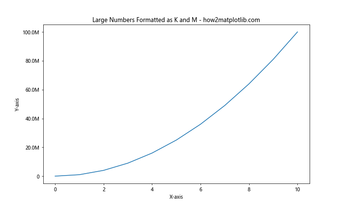
In this example, we define a custom format_large_numbers() function that converts large numbers to K (thousands) or M (millions) notation. We then apply this formatter to the y-axis using FuncFormatter.
Formatting Axis Tick Labels for Logarithmic Scales
When working with data that spans multiple orders of magnitude, logarithmic scales can be very useful. Formatting axis tick labels: from numbers to thousands and millions is particularly important in these cases. Let’s explore how to format tick labels for logarithmic scales.
Using LogFormatter
Matplotlib provides the LogFormatter class specifically for formatting tick labels on logarithmic scales. Here’s an example:
import matplotlib.pyplot as plt
import numpy as np
from matplotlib.ticker import LogFormatter

# Generate sample data
x = np.logspace(0, 6, 7)
y = x ** 2

# Create the plot
fig, ax = plt.subplots(figsize=(10, 6))
ax.plot(x, y)
ax.set_title('Logarithmic Scale with Formatted Labels - how2matplotlib.com')
ax.set_xlabel('X-axis')
ax.set_ylabel('Y-axis')

# Set logarithmic scales
ax.set_xscale('log')
ax.set_yscale('log')

# Apply LogFormatter to both axes
formatter = LogFormatter(base=10)
ax.xaxis.set_major_formatter(formatter)
ax.yaxis.set_major_formatter(formatter)

# Show the plotplt.show()
Output:
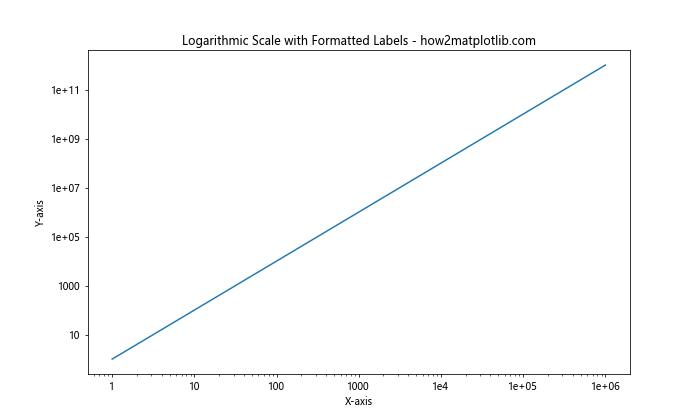
In this example, we use LogFormatter with a base of 10 to format the tick labels on both the x and y axes, which are set to logarithmic scales using set_xscale('log') and set_yscale('log').
Custom Formatting for Logarithmic Scales
For more control over the formatting of tick labels on logarithmic scales, you can create a custom formatter. Here’s an example that combines logarithmic scaling with custom formatting for thousands and millions:
import matplotlib.pyplot as plt
import numpy as np
from matplotlib.ticker import FuncFormatter

def log_format_large_numbers(x, pos):
    if x == 0:
        return '0'
    exp = int(np.log10(abs(x)))
    if exp >= 6:
        return f'{x/1e6:.1f}M'
    elif exp >= 3:
        return f'{x/1e3:.1f}K'
    else:
        return f'{x:.1f}'

# Generate sample data
x = np.logspace(0, 8, 9)
y = x ** 2

# Create the plot
fig, ax = plt.subplots(figsize=(10, 6))
ax.plot(x, y)
ax.set_title('Custom Formatted Logarithmic Scale - how2matplotlib.com')
ax.set_xlabel('X-axis')
ax.set_ylabel('Y-axis')

# Set logarithmic scales
ax.set_xscale('log')
ax.set_yscale('log')

# Apply the custom formatter to both axes
ax.xaxis.set_major_formatter(FuncFormatter(log_format_large_numbers))
ax.yaxis.set_major_formatter(FuncFormatter(log_format_large_numbers))

# Show the plot
plt.show()
Output:
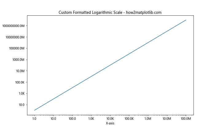
In this example, we define a custom log_format_large_numbers() function that formats numbers on a logarithmic scale, converting large numbers to K (thousands) or M (millions) notation. We then apply this formatter to both axes using FuncFormatter.
Formatting Axis Tick Labels for Multiple Subplots
When creating visualizations with multiple subplots, formatting axis tick labels: from numbers to thousands and millions can become more complex. Let’s explore how to handle tick label formatting across multiple subplots.
Consistent Formatting Across Subplots
To maintain consistency in tick label formatting across multiple subplots, you can define a single formatter and apply it to all relevant axes. Here’s an example:
import matplotlib.pyplot as plt
import numpy as np
from matplotlib.ticker import FuncFormatter

def format_thousands(x, pos):
    return f'{x/1000:.1f}K'

# Generate sample data
x = np.linspace(0, 10, 11)
y1 = 1000 * x
y2 = 1000 * x ** 2
y3 = 1000 * np.exp(x)

# Create the plot with subplots
fig, (ax1, ax2, ax3) = plt.subplots(3, 1, figsize=(10, 15))
fig.suptitle('Multiple Subplots with Consistent Formatting - how2matplotlib.com')

# Plot data and format y-axis for each subplot
ax1.plot(x, y1)
ax1.set_ylabel('Y-axis')
ax1.yaxis.set_major_formatter(FuncFormatter(format_thousands))

ax2.plot(x, y2)
ax2.set_ylabel('Y-axis')
ax2.yaxis.set_major_formatter(FuncFormatter(format_thousands))

ax3.plot(x, y3)
ax3.set_xlabel('X-axis')
ax3.set_ylabel('Y-axis')
ax3.yaxis.set_major_formatter(FuncFormatter(format_thousands))

# Adjust layout and show the plot
plt.tight_layout()
plt.show()
Output:
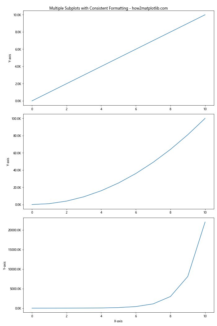
In this example, we define a single format_thousands() function and apply it to the y-axis of each subplot using FuncFormatter. This ensures consistent formatting across all subplots.
Advanced Techniques for Formatting Axis Tick Labels
As we continue to explore formatting axis tick labels: from numbers to thousands and millions, let’s look at some advanced techniques that can help you create even more sophisticated and informative visualizations.
Using EngFormatter for Engineering Notation
The EngFormatter class in Matplotlib is useful for displaying numbers in engineering notation, which uses powers of 1000. Here’s an example:
import matplotlib.pyplot as plt
import numpy as np
from matplotlib.ticker import EngFormatter

# Generate sample data
x = np.logspace(0, 9, 10)
y = x ** 2

# Create the plot
fig, ax = plt.subplots(figsize=(10, 6))
ax.plot(x, y)
ax.set_title('Engineering Notation for Tick Labels - how2matplotlib.com')
ax.set_xlabel('X-axis')
ax.set_ylabel('Y-axis')

# Set logarithmic scales
ax.set_xscale('log')
ax.set_yscale('log')

# Apply EngFormatter to both axes
formatter = EngFormatter(places=1, sep="\N{THIN SPACE}")  # Use thin space as separator
ax.xaxis.set_major_formatter(formatter)
ax.yaxis.set_major_formatter(formatter)

# Show the plot
plt.show()
Output:
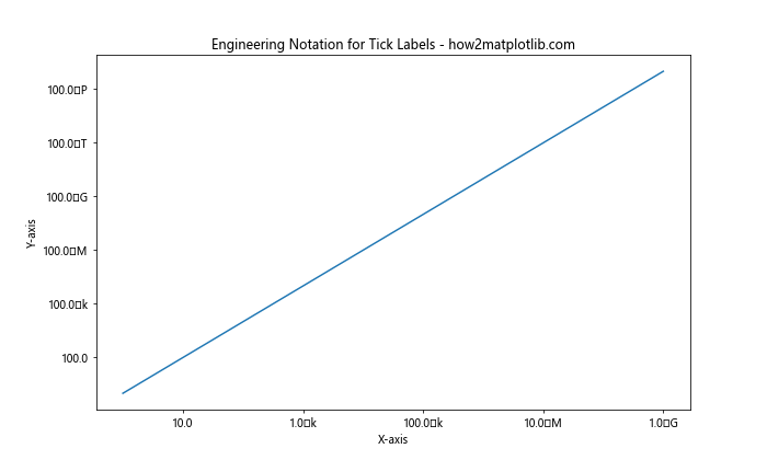
In this example, we use EngFormatter to display tick labels in engineering notation, which can be particularly useful for scientific or engineering data.
Combining Multiple Formatting Techniques
Sometimes, you may need to combine multiple formatting techniques to achieve the desired result. Here’s an example that combines percentage formatting with thousands/millions notation:
import matplotlib.pyplot as plt
import numpy as np
from matplotlib.ticker import FuncFormatter

def format_percent_large(x, pos):
    if abs(x) >= 1e6:
        return f'{x/1e6:.1f}M%'
    elif abs(x) >= 1e3:
        return f'{x/1e3:.1f}K%'
    else:
        return f'{x:.1f}%'

# Generate sample data
x = np.linspace(0, 100, 11)
y = np.exp(x/10) * 100  # Convert to percentage

# Create the plot
fig, ax = plt.subplots(figsize=(10, 6))
ax.plot(x, y)
ax.set_title('Combined Percentage and Large Number Formatting - how2matplotlib.com')
ax.set_xlabel('X-axis')
ax.set_ylabel('Y-axis (Percentage)')

# Apply the custom formatter to the y-axis
ax.yaxis.set_major_formatter(FuncFormatter(format_percent_large))

# Show the plot
plt.show()
Output:
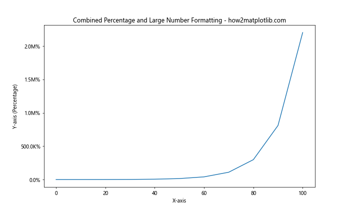
In this example, we define a custom format_percent_large() function that combines percentage formatting with thousands (K) and millions (M) notation for large numbers.
Best Practices for Formatting Axis Tick Labels
When it comes to formatting axis tick labels: from numbers to thousands and millions, there are several best practices to keep in mind to ensure your visualizations are clear, informative, and professional. Let’s explore some of these best practices.
Consistency
Maintain consistency in your tick label formatting across all axes and subplots within a visualization. This helps viewers quickly understand and compare data across different parts of your plot.
Readability
Ensure that your tick labels are easily readable. This may involve:
- Using appropriate font sizes
- Avoiding overcrowding of labels
- Rotating labels if necessary (especially for date labels on the x-axis)
- Using clear and concise number formats
Context-Appropriate Formatting
Choose a formatting style that’s appropriate for your data and audience. For example:
- Use scientific notation for very large or small numbers in scientific contexts
- Use currency symbols and decimal places for financial data
- Use percentage signs for data representing percentages
Avoiding Redundancy
When using techniques like thousands (K) or millions (M) notation, avoid redundancy in your axis labels. For example, if your tick labels use “K” for thousands, your axis label should say “Values (thousands)” rather than “Values (K)”.
Here’s an example that demonstrates these best practices:
import matplotlib.pyplot as plt
import numpy as np
from matplotlib.ticker import FuncFormatter

def format_millions(x, pos):
    return f'{x/1e6:.1f}M'

# Generate sample data
years = np.arange(2010, 2021)
values = np.exp(np.linspace(0, 2, len(years))) * 1e6

# Create the plot
fig, ax = plt.subplots(figsize=(12, 6))
ax.bar(years, values)
ax.set_title('Annual Growth (2010-2020) - how2matplotlib.com', fontsize=16)
ax.set_xlabel('Year', fontsize=12)
ax.set_ylabel('Value (millions)', fontsize=12)

# Apply the custom formatter to the y-axis
ax.yaxis.set_major_formatter(FuncFormatter(format_millions))

# Rotate x-axis labels for better readability
plt.xticks(rotation=45)

# Add grid lines for better readability
ax.grid(True, axis='y', linestyle='--', alpha=0.7)

# Adjust layout and show the plot
plt.tight_layout()
plt.show()
Output:
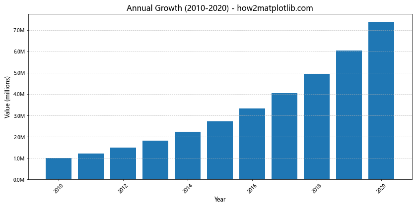
This example demonstrates several best practices:
- Consistent formatting using millions (M) notation for large numbers
- Clear and readable labels with appropriate font sizes
- Rotated x-axis labels to prevent overcrowding
- A descriptive y-axis label that clarifies the unit (millions)
- Grid lines to improve readability of values
Troubleshooting Common Issues in Formatting Axis Tick Labels
When working on formatting axis tick labels: from numbers to thousands and millions, you may encounter some common issues. Let’s explore these issues and their solutions.
Overlapping Labels
One common issue is overlapping tick labels, especially on the x-axis. Here’s how to address this:
import matplotlib.pyplot as plt
import numpy as np

# Generate sample data
x = np.arange(0, 110, 10)
y = x ** 2

# Create the plot
fig, (ax1, ax2) = plt.subplots(2, 1, figsize=(10, 12))
fig.suptitle('Handling Overlapping Labels - how2matplotlib.com', fontsize=16)

# Plot with overlapping labels
ax1.plot(x, y)
ax1.set_title('Overlapping Labels')
ax1.set_xlabel('X-axis')
ax1.set_ylabel('Y-axis')

# Plot with rotated labels to avoid overlapping
ax2.plot(x, y)
ax2.set_title('Rotated Labels')
ax2.set_xlabel('X-axis')
ax2.set_ylabel('Y-axis')
ax2.set_xticklabels(ax2.get_xticks(), rotation=45, ha='right')

plt.tight_layout()
plt.show()
Output:
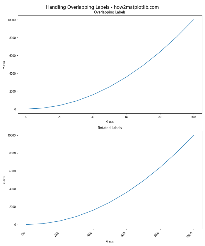
In this example, we demonstrate how rotating x-axis labels can help avoid overlapping.
Incorrect Scale for Large Numbers
Sometimes, when dealing with large numbers, Matplotlib might choose an inappropriate scale. Here’s how to fix this:
import matplotlib.pyplot as plt
import numpy as np
from matplotlib.ticker import FuncFormatter

def format_millions(x, pos):
    return f'{x/1e6:.0f}M'

# Generate sample data
x = np.arange(5)
y = np.array([1e6, 5e6, 10e6, 50e6, 100e6])

# Create the plot
fig, (ax1, ax2) = plt.subplots(2, 1, figsize=(10, 12))
fig.suptitle('Handling Large Number Scales - how2matplotlib.com', fontsize=16)

# Plot with default scaling
ax1.bar(x, y)
ax1.set_title('Default Scaling')
ax1.set_ylabel('Value')

# Plot with custom formatting for millions
ax2.bar(x, y)
ax2.set_title('Custom Scaling in Millions')
ax2.set_ylabel('Value (millions)')
ax2.yaxis.set_major_formatter(FuncFormatter(format_millions))

plt.tight_layout()
plt.show()
Output:
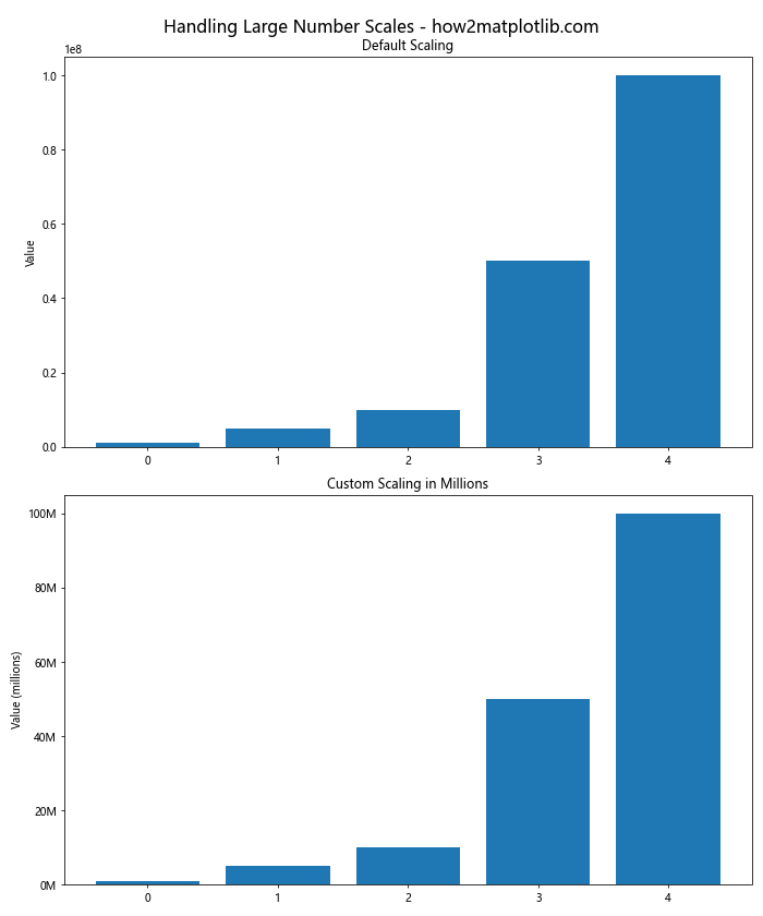
In this example, we show how using a custom formatter can provide a more appropriate scale for large numbers.
Conclusion
Mastering the art of formatting axis tick labels: from numbers to thousands and millions is crucial for creating clear, informative, and professional data visualizations. Throughout this comprehensive guide, we’ve explored a wide range of techniques and best practices for formatting axis tick labels in Matplotlib.
We’ve covered everything from basic formatting techniques to advanced methods for handling different data types, large numbers, logarithmic scales, and multiple subplots. We’ve also discussed important best practices and troubleshooting tips to help you overcome common challenges.
Remember, the key to effective tick label formatting is to choose methods that best suit your data and your audience. Whether you’re working with simple numeric data, dates, currencies, or complex scientific notation, Matplotlib provides the tools you need to create polished and informative visualizations.