How to Plot 2-D Histogram in Python using Matplotlib
Plot 2-D Histogram in Python using Matplotlib is a powerful technique for visualizing the distribution of two-dimensional data. In this comprehensive guide, we’ll explore various aspects of creating 2-D histograms using Matplotlib, one of the most popular data visualization libraries in Python. We’ll cover everything from basic concepts to advanced techniques, providing you with the knowledge and skills to create informative and visually appealing 2-D histograms.
Understanding 2-D Histograms
Before we dive into the specifics of how to plot 2-D histograms in Python using Matplotlib, let’s first understand what a 2-D histogram is and why it’s useful.
A 2-D histogram, also known as a bivariate histogram, is a graphical representation of the joint distribution of two variables. It extends the concept of a traditional histogram to two dimensions, allowing us to visualize the frequency or density of data points in a two-dimensional space.
In a 2-D histogram, the data is divided into bins along both the x and y axes. The color or height of each bin represents the number of data points falling within that bin. This makes 2-D histograms particularly useful for:
- Identifying patterns and relationships between two variables
- Visualizing the density of data points in a 2D space
- Detecting clusters or hotspots in the data
- Comparing distributions across different subsets of data
Now that we understand the basics, let’s explore how to plot 2-D histograms in Python using Matplotlib.
Setting Up the Environment
To plot 2-D histograms in Python using Matplotlib, we first need to set up our environment. Make sure you have Python installed on your system, along with the following libraries:
- Matplotlib
- NumPy (for generating sample data)
You can install these libraries using pip:
pip install matplotlib numpy
Once you have the necessary libraries installed, you’re ready to start creating 2-D histograms.
Basic 2-D Histogram Plot
Let’s start with a basic example of how to plot a 2-D histogram in Python using Matplotlib. We’ll generate some random data and create a simple 2-D histogram.
import matplotlib.pyplot as plt
import numpy as np

# Generate sample data
np.random.seed(42)
x = np.random.normal(0, 1, 1000)
y = np.random.normal(0, 1, 1000)

# Create 2-D histogram
plt.hist2d(x, y, bins=30, cmap='viridis')

# Add colorbar
plt.colorbar(label='Count')

# Set labels and title
plt.xlabel('X-axis - how2matplotlib.com')
plt.ylabel('Y-axis - how2matplotlib.com')
plt.title('Basic 2-D Histogram - how2matplotlib.com')

# Show the plot
plt.show()
Output:
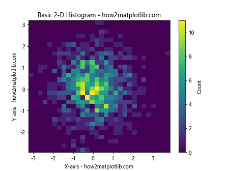
In this example, we first import the necessary libraries: Matplotlib for plotting and NumPy for generating random data. We then create two arrays of random data (x and y) using NumPy’s normal distribution.
The plt.hist2d() function is used to create the 2-D histogram. We specify the x and y data, the number of bins, and a colormap. The plt.colorbar() function adds a colorbar to the plot, which helps interpret the counts in each bin.
Finally, we set labels for the axes and a title for the plot, and display it using plt.show().
Customizing the 2-D Histogram
Now that we’ve created a basic 2-D histogram, let’s explore some ways to customize it to make it more informative and visually appealing.
Adjusting Bin Sizes
The number of bins in a 2-D histogram can significantly affect its appearance and interpretation. Let’s create an example where we compare different bin sizes:
import matplotlib.pyplot as plt
import numpy as np

# Generate sample data
np.random.seed(42)
x = np.random.normal(0, 1, 1000)
y = np.random.normal(0, 1, 1000)

# Create a 2x2 grid of subplots
fig, axs = plt.subplots(2, 2, figsize=(12, 12))

# Plot histograms with different bin sizes
bin_sizes = [10, 20, 50, 100]

for ax, bins in zip(axs.ravel(), bin_sizes):
    h = ax.hist2d(x, y, bins=bins, cmap='viridis')
    ax.set_title(f'{bins}x{bins} bins - how2matplotlib.com')
    plt.colorbar(h[3], ax=ax, label='Count')

# Set overall title
fig.suptitle('2-D Histograms with Different Bin Sizes - how2matplotlib.com', fontsize=16)

# Adjust layout and show the plot
plt.tight_layout()
plt.show()
Output:
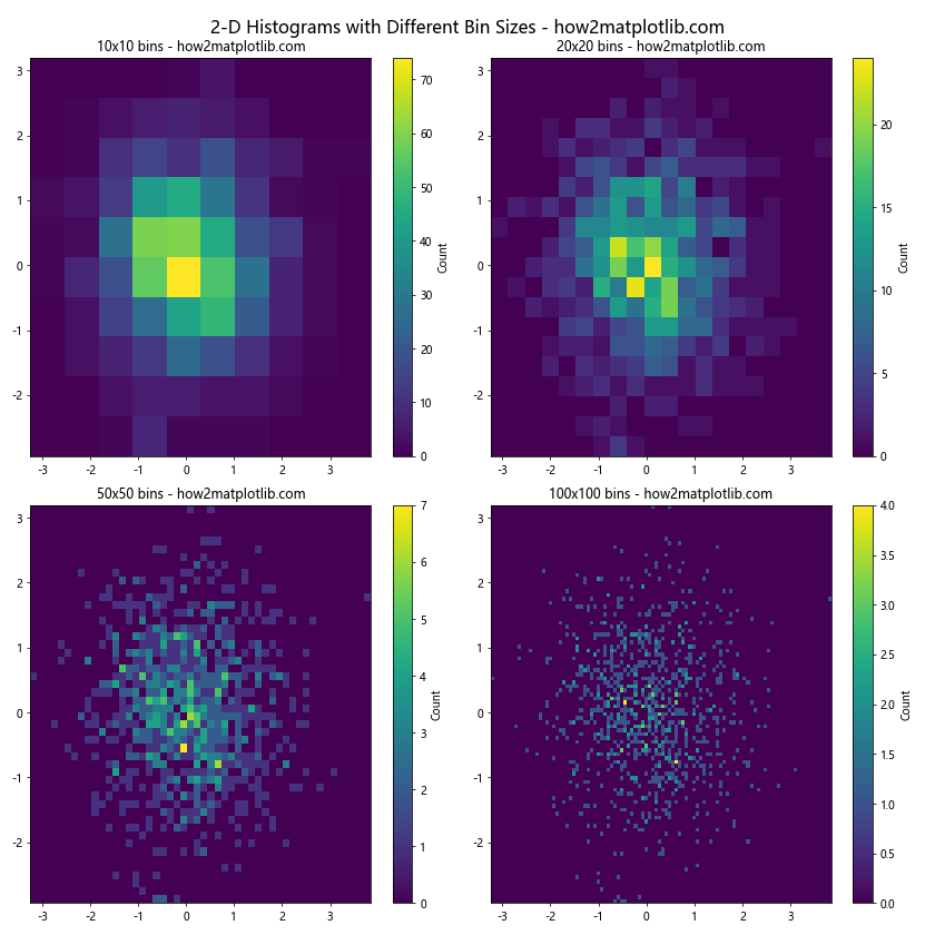
In this example, we create a 2×2 grid of subplots, each showing a 2-D histogram with a different number of bins. This allows us to compare how the choice of bin size affects the visualization of the data distribution.
Changing the Colormap
Matplotlib offers a wide range of colormaps that can be used to represent the counts in a 2-D histogram. Let’s explore some different colormaps:
import matplotlib.pyplot as plt
import numpy as np

# Generate sample data
np.random.seed(42)
x = np.random.normal(0, 1, 1000)
y = np.random.normal(0, 1, 1000)

# Create a 2x2 grid of subplots
fig, axs = plt.subplots(2, 2, figsize=(12, 12))

# Plot histograms with different colormaps
cmaps = ['viridis', 'plasma', 'inferno', 'magma']

for ax, cmap in zip(axs.ravel(), cmaps):
    h = ax.hist2d(x, y, bins=30, cmap=cmap)
    ax.set_title(f'Colormap: {cmap} - how2matplotlib.com')
    plt.colorbar(h[3], ax=ax, label='Count')

# Set overall title
fig.suptitle('2-D Histograms with Different Colormaps - how2matplotlib.com', fontsize=16)

# Adjust layout and show the plot
plt.tight_layout()
plt.show()
Output:
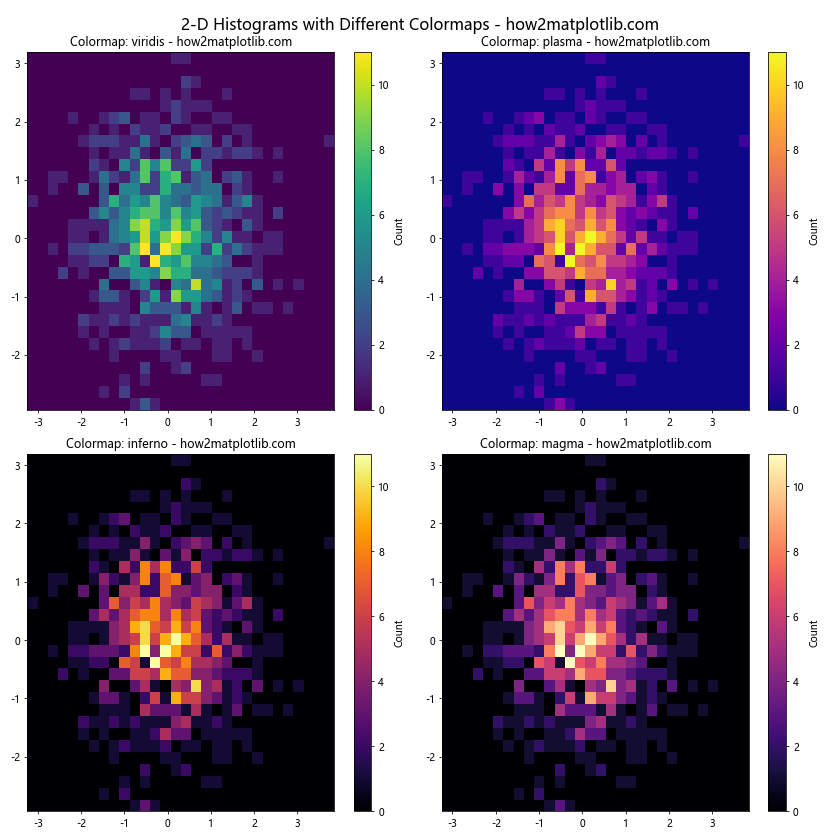
This example demonstrates how different colormaps can affect the visual interpretation of the 2-D histogram. Experiment with various colormaps to find the one that best represents your data.
Normalizing the Histogram
By default, the 2-D histogram shows counts in each bin. However, sometimes it’s useful to normalize the histogram to show probabilities or densities instead. Let’s see how to do this:
import matplotlib.pyplot as plt
import numpy as np

# Generate sample data
np.random.seed(42)
x = np.random.normal(0, 1, 1000)
y = np.random.normal(0, 1, 1000)

# Create a 1x2 grid of subplots
fig, (ax1, ax2) = plt.subplots(1, 2, figsize=(12, 5))

# Plot regular 2-D histogram
h1 = ax1.hist2d(x, y, bins=30, cmap='viridis')
ax1.set_title('Regular 2-D Histogram - how2matplotlib.com')
plt.colorbar(h1[3], ax=ax1, label='Count')

# Plot normalized 2-D histogram
h2 = ax2.hist2d(x, y, bins=30, cmap='viridis', density=True)
ax2.set_title('Normalized 2-D Histogram - how2matplotlib.com')
plt.colorbar(h2[3], ax=ax2, label='Probability Density')

# Adjust layout and show the plot
plt.tight_layout()
plt.show()
Output:
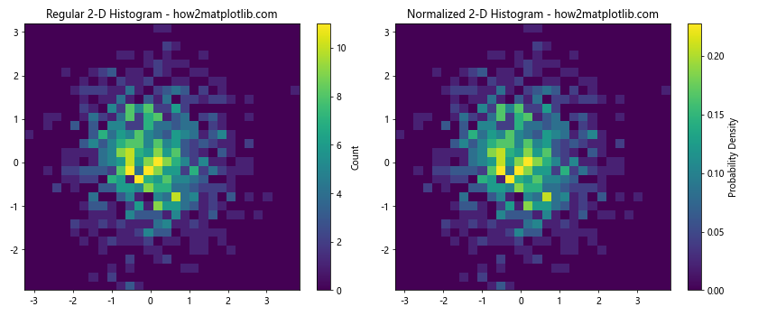
In this example, we create two 2-D histograms side by side. The first is a regular histogram showing counts, while the second is normalized using the density=True parameter. The normalized histogram shows the probability density instead of raw counts.
Advanced Techniques for 2-D Histograms
Now that we’ve covered the basics of plotting 2-D histograms in Python using Matplotlib, let’s explore some more advanced techniques to enhance our visualizations.
Hexbin Plot
An alternative to the rectangular bins of a standard 2-D histogram is the hexbin plot, which uses hexagonal bins. This can sometimes provide a more aesthetically pleasing and less biased representation of the data:
import matplotlib.pyplot as plt
import numpy as np

# Generate sample data
np.random.seed(42)
x = np.random.normal(0, 1, 10000)
y = np.random.normal(0, 1, 10000)

# Create a 1x2 grid of subplots
fig, (ax1, ax2) = plt.subplots(1, 2, figsize=(12, 5))

# Plot regular 2-D histogram
h1 = ax1.hist2d(x, y, bins=50, cmap='viridis')
ax1.set_title('Regular 2-D Histogram - how2matplotlib.com')
plt.colorbar(h1[3], ax=ax1, label='Count')

# Plot hexbin
h2 = ax2.hexbin(x, y, gridsize=20, cmap='viridis')
ax2.set_title('Hexbin Plot - how2matplotlib.com')
plt.colorbar(h2, ax=ax2, label='Count')

# Adjust layout and show the plot
plt.tight_layout()
plt.show()
Output:
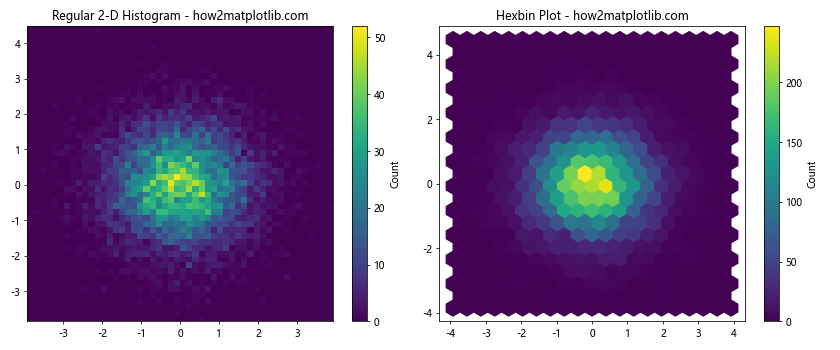
This example compares a regular 2-D histogram with a hexbin plot. The hexbin() function is used to create the hexagonal bin plot, with the gridsize parameter controlling the number of hexagons.
Customizing Axes and Labels
To make our 2-D histograms more informative, we can customize the axes and labels. Let’s explore some techniques for doing this.
Adding Marginal Histograms
One useful addition to a 2-D histogram is to include marginal histograms along the x and y axes. This provides a quick view of the individual distributions of each variable:
import matplotlib.pyplot as plt
import numpy as np

# Generate sample data
np.random.seed(42)
x = np.random.normal(0, 1, 1000)
y = np.random.normal(0, 1, 1000)

# Create the main figure and axes
fig = plt.figure(figsize=(10, 10))
gs = fig.add_gridspec(3, 3)
ax_main = fig.add_subplot(gs[1:, :-1])
ax_top = fig.add_subplot(gs[0, :-1], sharex=ax_main)
ax_right = fig.add_subplot(gs[1:, -1], sharey=ax_main)

# Plot 2-D histogram
h = ax_main.hist2d(x, y, bins=30, cmap='viridis')
plt.colorbar(h[3], ax=ax_main, label='Count')

# Plot marginal histograms
ax_top.hist(x, bins=30, color='skyblue')
ax_right.hist(y, bins=30, orientation='horizontal', color='skyblue')

# Remove ticks from marginal histograms
ax_top.tick_params(axis="x", labelbottom=False)
ax_right.tick_params(axis="y", labelleft=False)

# Set labels and title
ax_main.set_xlabel('X-axis - how2matplotlib.com')
ax_main.set_ylabel('Y-axis - how2matplotlib.com')
ax_main.set_title('2-D Histogram with Marginal Histograms - how2matplotlib.com')

# Adjust layout and show the plot
plt.tight_layout()
plt.show()
Output:
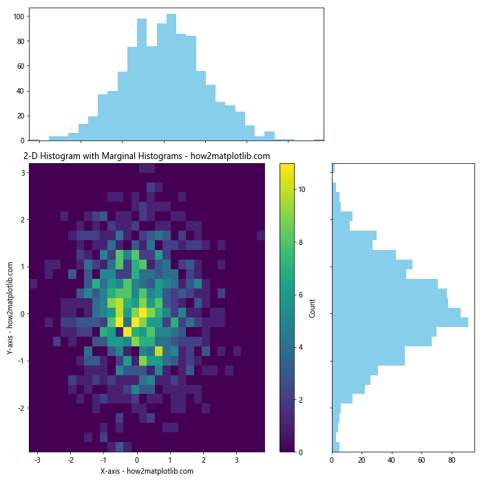
This example creates a main 2-D histogram plot with marginal histograms along the top and right sides. The gridspec module is used to create a layout that accommodates these additional plots.
Custom Tick Labels and Formatting
Sometimes you may want to customize the tick labels on your 2-D histogram. Here’s an example of how to do this:
import matplotlib.pyplot as plt
import numpy as np

# Generate sample data
np.random.seed(42)
x = np.random.normal(0, 1, 1000)
y = np.random.normal(0, 1, 1000)

# Create the plot
fig, ax = plt.subplots(figsize=(10, 8))

# Plot 2-D histogram
h = ax.hist2d(x, y,bins=30, cmap='viridis')
plt.colorbar(h[3], ax=ax, label='Count')

# Customize tick labels
ax.set_xticks([-2, -1, 0, 1, 2])
ax.set_xticklabels(['Very Low', 'Low', 'Medium', 'High', 'Very High'])
ax.set_yticks([-2, -1, 0, 1, 2])
ax.set_yticklabels(['Very Low', 'Low', 'Medium', 'High', 'Very High'])

# Rotate x-axis labels for better readability
plt.setp(ax.get_xticklabels(), rotation=45, ha='right')

# Set labels and title
ax.set_xlabel('X-axis Categories - how2matplotlib.com')
ax.set_ylabel('Y-axis Categories - how2matplotlib.com')
ax.set_title('2-D Histogram with Custom Tick Labels - how2matplotlib.com')

# Show the plot
plt.tight_layout()
plt.show()
Output:
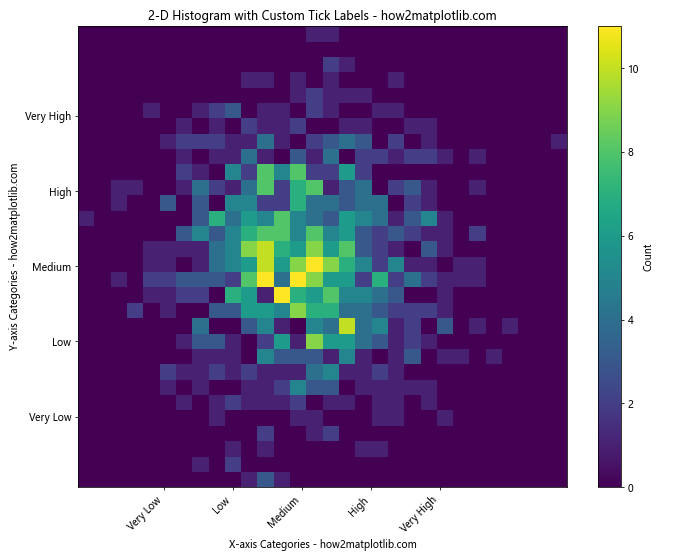
In this example, we customize the tick labels on both axes to use descriptive categories instead of numerical values. We also rotate the x-axis labels for better readability.
Handling Large Datasets
When dealing with large datasets, creating 2-D histograms can become computationally intensive. Here are some techniques to handle large datasets efficiently.
Downsampling
One approach is to downsample the data before creating the histogram:
import matplotlib.pyplot as plt
import numpy as np

# Generate a large sample dataset
np.random.seed(42)
x = np.random.normal(0, 1, 1000000)
y = np.random.normal(0, 1, 1000000)

# Downsample the data
downsample_factor = 10
x_downsampled = x[::downsample_factor]
y_downsampled = y[::downsample_factor]

# Create the plot
fig, (ax1, ax2) = plt.subplots(1, 2, figsize=(15, 6))

# Plot full dataset (this may take a while)
h1 = ax1.hist2d(x, y, bins=100, cmap='viridis')
ax1.set_title('Full Dataset (1,000,000 points) - how2matplotlib.com')
plt.colorbar(h1[3], ax=ax1, label='Count')

# Plot downsampled dataset
h2 = ax2.hist2d(x_downsampled, y_downsampled, bins=100, cmap='viridis')
ax2.set_title(f'Downsampled (1/{downsample_factor}) - how2matplotlib.com')
plt.colorbar(h2[3], ax=ax2, label='Count')

# Adjust layout and show the plot
plt.tight_layout()
plt.show()
Output:
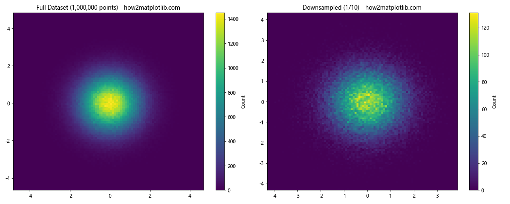
This example demonstrates how downsampling can be used to create a 2-D histogram from a large dataset more quickly, while still preserving the overall distribution.
Using datashader
For extremely large datasets, you might want to consider using the datashader library, which is designed to handle big data visualization:
import matplotlib.pyplot as plt
import numpy as np
import datashader as ds
import datashader.transfer_functions as tf
from datashader.mpl_ext import dsshow

# Generate a large sample dataset
np.random.seed(42)
x = np.random.normal(0, 1, 10000000)
y = np.random.normal(0, 1, 10000000)

# Create the plot
fig, ax = plt.subplots(figsize=(10, 8))

# Use datashader to create the 2-D histogram
ds_plot = dsshow(ax, ds.Point(x, y), ds.count(), cmap='viridis',
                 width=600, height=600, aspect='equal')

# Set labels and title
ax.set_xlabel('X-axis - how2matplotlib.com')
ax.set_ylabel('Y-axis - how2matplotlib.com')
ax.set_title('2-D Histogram using Datashader - how2matplotlib.com')

# Show the plot
plt.colorbar(ds_plot, ax=ax, label='Count')
plt.show()
This example uses datashader to efficiently create a 2-D histogram from a very large dataset. Note that you’ll need to install the datashader library (pip install datashader) to run this example.
Comparing Multiple 2-D Histograms
Sometimes you may want to compare multiple 2-D histograms side by side. Here’s an example of how to do this:
import matplotlib.pyplot as plt
import numpy as np

# Generate sample data for three different distributions
np.random.seed(42)
x1, y1 = np.random.normal(0, 1, (2, 1000))
x2, y2 = np.random.normal(0, 2, (2, 1000))
x3, y3 = np.random.multivariate_normal([0, 0], [[1, 0.5], [0.5, 1]], 1000).T

# Create a 1x3 grid of subplots
fig, (ax1, ax2, ax3) = plt.subplots(1, 3, figsize=(18, 6))

# Plot 2-D histograms
h1 = ax1.hist2d(x1, y1, bins=30, cmap='viridis')
ax1.set_title('Distribution 1 - how2matplotlib.com')
plt.colorbar(h1[3], ax=ax1, label='Count')

h2 = ax2.hist2d(x2, y2, bins=30, cmap='plasma')
ax2.set_title('Distribution 2 - how2matplotlib.com')
plt.colorbar(h2[3], ax=ax2, label='Count')

h3 = ax3.hist2d(x3, y3, bins=30, cmap='inferno')
ax3.set_title('Distribution 3 - how2matplotlib.com')
plt.colorbar(h3[3], ax=ax3, label='Count')

# Set overall title
fig.suptitle('Comparison of Three 2-D Distributions - how2matplotlib.com', fontsize=16)

# Adjust layout and show the plot
plt.tight_layout()
plt.show()
Output:
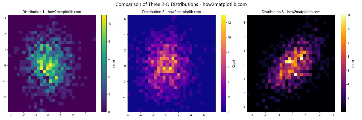
This example creates three different 2-D distributions and plots their histograms side by side for easy comparison.
Animating 2-D Histograms
Animating 2-D histograms can be useful for visualizing how a distribution changes over time or with respect to some parameter. Here’s an example of how to create an animated 2-D histogram:
import matplotlib.pyplot as plt
import numpy as np
from matplotlib.animation import FuncAnimation

# Generate initial sample data
np.random.seed(42)
x = np.random.normal(0, 1, 1000)
y = np.random.normal(0, 1, 1000)

# Create the plot
fig, ax = plt.subplots(figsize=(10, 8))
h = ax.hist2d(x, y, bins=30, cmap='viridis')
plt.colorbar(h[3], ax=ax, label='Count')

# Set labels and title
ax.set_xlabel('X-axis - how2matplotlib.com')
ax.set_ylabel('Y-axis - how2matplotlib.com')
ax.set_title('Animated 2-D Histogram - how2matplotlib.com')

# Animation update function
def update(frame):
    global x, y
    # Update data
    x += np.random.normal(0, 0.1, 1000)
    y += np.random.normal(0, 0.1, 1000)

    # Clear previous histogram and plot new one
    ax.clear()
    h = ax.hist2d(x, y, bins=30, cmap='viridis')

    # Update labels and title
    ax.set_xlabel('X-axis - how2matplotlib.com')
    ax.set_ylabel('Y-axis - how2matplotlib.com')
    ax.set_title(f'Animated 2-D Histogram (Frame {frame}) - how2matplotlib.com')

    return h[3]

# Create animation
anim = FuncAnimation(fig, update, frames=100, interval=100, blit=False)

# Show the animation
plt.show()
Output:
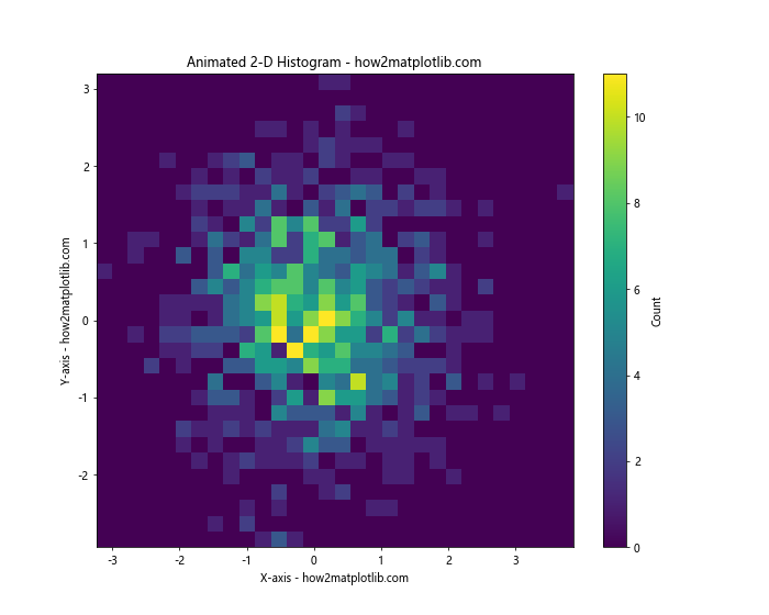
This example creates an animated 2-D histogram where the distribution changes slightly in each frame. The FuncAnimation class from Matplotlib is used to create the animation.
Conclusion
In this comprehensive guide, we’ve explored various aspects of plotting 2-D histograms in Python using Matplotlib. We’ve covered basic techniques, customization options, advanced methods, and ways to handle large datasets. 2-D histograms are powerful tools for visualizing the joint distribution of two variables, and Matplotlib provides a flexible and feature-rich platform for creating these visualizations.
Remember that the key to effective data visualization is choosing the right type of plot for your data and your audience. 2-D histograms are particularly useful when you want to show the relationship between two continuous variables and their frequency distribution.