How to Place Two Different Legends on the Same Graph With Matplotlib
Placing two different legends on the same graph with Matplotlib is a powerful technique that allows you to convey more information in a single visualization. This article will explore various methods and best practices for implementing multiple legends in Matplotlib, providing you with the tools to create informative and visually appealing plots. We’ll cover everything from basic legend placement to advanced customization options, ensuring you have a thorough understanding of how to effectively use multiple legends in your Matplotlib graphs.
Understanding the Importance of Multiple Legends
Before diving into the technical aspects of placing two different legends on the same graph with Matplotlib, it’s crucial to understand why this technique is valuable. Multiple legends can be particularly useful when:
- Visualizing data from different sources or categories
- Comparing multiple datasets with distinct characteristics
- Displaying different types of information (e.g., line styles and data points)
- Creating complex plots with various elements that require explanation
By mastering the art of placing two different legends on the same graph with Matplotlib, you’ll be able to create more informative and visually appealing visualizations that effectively communicate your data’s story.
Basic Legend Placement in Matplotlib
To begin our journey of placing two different legends on the same graph with Matplotlib, let’s start with the basics of legend placement. Matplotlib provides several built-in methods for adding legends to your plots. The most common approach is to use the legend() function.
Here’s a simple example of how to add a basic legend to a plot:
import matplotlib.pyplot as plt
import numpy as np

x = np.linspace(0, 10, 100)
y1 = np.sin(x)
y2 = np.cos(x)

plt.figure(figsize=(10, 6))
plt.plot(x, y1, label='Sine - how2matplotlib.com')
plt.plot(x, y2, label='Cosine - how2matplotlib.com')
plt.xlabel('X-axis')
plt.ylabel('Y-axis')
plt.title('Basic Legend Example - how2matplotlib.com')
plt.legend()
plt.show()
Output:
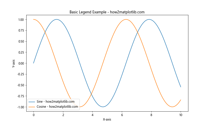
In this example, we create a simple plot with two lines representing sine and cosine functions. The label parameter in the plot() function is used to specify the legend text for each line. The legend() function is then called to display the legend on the plot.
Placing Two Different Legends on the Same Graph
Now that we’ve covered the basics, let’s explore how to place two different legends on the same graph with Matplotlib. There are several approaches to achieve this, each with its own advantages and use cases.
Method 1: Using Multiple legend() Calls
One straightforward method for placing two different legends on the same graph with Matplotlib is to use multiple legend() calls. This approach allows you to create separate legends for different groups of plot elements.
Here’s an example demonstrating this technique:
import matplotlib.pyplot as plt
import numpy as np

x = np.linspace(0, 10, 100)
y1 = np.sin(x)
y2 = np.cos(x)
y3 = np.tan(x)
y4 = x**2

fig, ax = plt.subplots(figsize=(12, 8))

line1, = ax.plot(x, y1, 'r-', label='Sine - how2matplotlib.com')
line2, = ax.plot(x, y2, 'b-', label='Cosine - how2matplotlib.com')
line3, = ax.plot(x, y3, 'g-', label='Tangent - how2matplotlib.com')
line4, = ax.plot(x, y4, 'k-', label='Square - how2matplotlib.com')

first_legend = ax.legend(handles=[line1, line2], loc='upper left', title='Trigonometric Functions')
ax.add_artist(first_legend)

ax.legend(handles=[line3, line4], loc='upper right', title='Other Functions')

plt.xlabel('X-axis')
plt.ylabel('Y-axis')
plt.title('Two Different Legends Example - how2matplotlib.com')
plt.show()
Output:
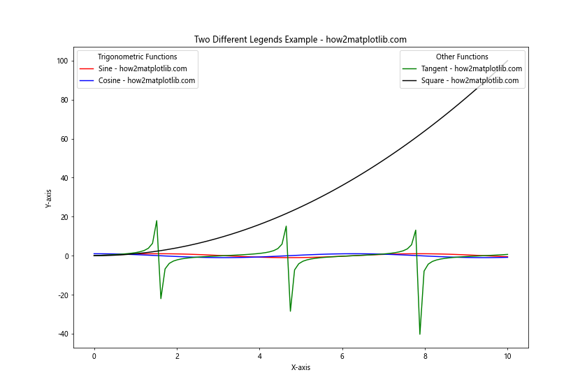
In this example, we create four different lines on the same plot. We then use two separate legend() calls to create two different legends. The first legend is created using ax.legend() and is positioned in the upper left corner. We use ax.add_artist() to ensure that this legend is not overwritten by subsequent legend calls. The second legend is created with another ax.legend() call and is positioned in the upper right corner.
This method allows you to group related plot elements together in separate legends, making it easier for viewers to understand the different components of your visualization.
Method 2: Using legend() with Multiple Columns
Another approach to placing two different legends on the same graph with Matplotlib is to use a single legend() call with multiple columns. This method is particularly useful when you want to organize your legend items into distinct groups while keeping them within a single legend box.
Here’s an example demonstrating this technique:
import matplotlib.pyplot as plt
import numpy as np

x = np.linspace(0, 10, 100)
y1 = np.sin(x)
y2 = np.cos(x)
y3 = np.exp(x)
y4 = np.log(x)

fig, ax = plt.subplots(figsize=(12, 8))

line1, = ax.plot(x, y1, 'r-', label='Sine - how2matplotlib.com')
line2, = ax.plot(x, y2, 'b-', label='Cosine - how2matplotlib.com')
line3, = ax.plot(x, y3, 'g-', label='Exponential - how2matplotlib.com')
line4, = ax.plot(x, y4, 'k-', label='Logarithm - how2matplotlib.com')

ax.legend(handles=[line1, line2, line3, line4],
          loc='upper center',
          bbox_to_anchor=(0.5, -0.05),
          ncol=2,
          title='Function Types',
          title_fontsize='large',
          columnspacing=1.5,
          frameon=True,
          shadow=True,
          fancybox=True)

plt.xlabel('X-axis')
plt.ylabel('Y-axis')
plt.title('Two Different Legends in One Box - how2matplotlib.com')
plt.tight_layout()
plt.show()
Output:
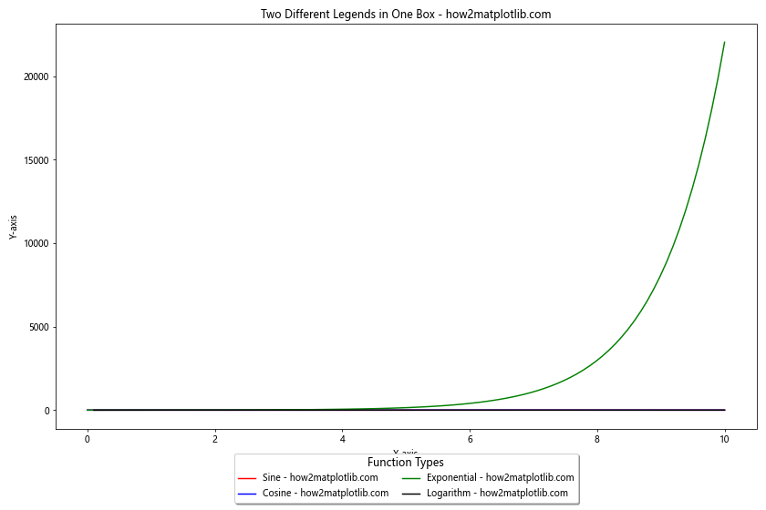
In this example, we create a single legend with two columns using the ncol parameter in the legend() function. We position the legend below the plot using bbox_to_anchor and set loc='upper center' to center it horizontally. The columnspacing parameter is used to adjust the space between the two columns, effectively creating the appearance of two separate legends within a single box.
This method is particularly useful when you want to maintain a cohesive look while still separating different groups of legend items.
Method 3: Using HandlerTuple for Grouped Legend Entries
When placing two different legends on the same graph with Matplotlib, you may want to group related items together within a single legend entry. The HandlerTuple class allows you to achieve this by combining multiple artists into a single legend item.
Here’s an example demonstrating this technique:
import matplotlib.pyplot as plt
import numpy as np
from matplotlib.legend_handler import HandlerTuple

x = np.linspace(0, 10, 100)
y1 = np.sin(x)
y2 = np.cos(x)
y3 = np.tan(x)
y4 = x**2

fig, ax = plt.subplots(figsize=(12, 8))

line1, = ax.plot(x, y1, 'r-', label='Sine - how2matplotlib.com')
line2, = ax.plot(x, y2, 'b-', label='Cosine - how2matplotlib.com')
line3, = ax.plot(x, y3, 'g-', label='Tangent - how2matplotlib.com')
line4, = ax.plot(x, y4, 'k-', label='Square - how2matplotlib.com')

ax.legend([(line1, line2), (line3, line4)],
          ['Trigonometric', 'Other'],
          handler_map={tuple: HandlerTuple(ndivide=None)},
          loc='upper right',
          title='Function Types - how2matplotlib.com')

plt.xlabel('X-axis')
plt.ylabel('Y-axis')
plt.title('Grouped Legend Entries - how2matplotlib.com')
plt.show()
Output:
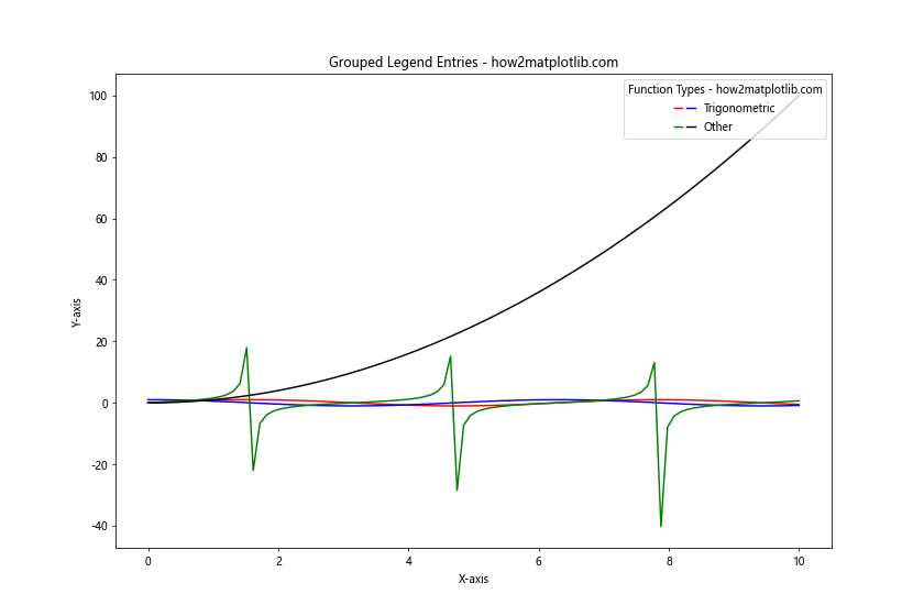
In this example, we use HandlerTuple to group related lines together in the legend. The [(line1, line2), (line3, line4)] argument pairs the sine and cosine lines together, and the tangent and square lines together. The handler_map parameter is used to specify how these tuples should be handled in the legend.
This method is particularly useful when you want to create a compact legend that still conveys the relationships between different plot elements.
Customizing Legend Appearance
When placing two different legends on the same graph with Matplotlib, it’s important to consider the visual appearance of your legends. Matplotlib provides numerous options for customizing legend appearance, allowing you to create visually appealing and informative legends that complement your plot.
Adjusting Legend Size and Position
One key aspect of placing two different legends on the same graph with Matplotlib is controlling their size and position. Here’s an example that demonstrates how to adjust these properties:
import matplotlib.pyplot as plt
import numpy as np

x = np.linspace(0, 10, 100)
y1 = np.sin(x)
y2 = np.cos(x)
y3 = np.exp(x)
y4 = np.log(x)

fig, ax = plt.subplots(figsize=(12, 8))

line1, = ax.plot(x, y1, 'r-', label='Sine - how2matplotlib.com')
line2, = ax.plot(x, y2, 'b-', label='Cosine - how2matplotlib.com')
line3, = ax.plot(x, y3, 'g-', label='Exponential - how2matplotlib.com')
line4, = ax.plot(x, y4, 'k-', label='Logarithm - how2matplotlib.com')

legend1 = ax.legend(handles=[line1, line2],
                    loc='upper left',
                    bbox_to_anchor=(0.05, 0.95),
                    title='Trigonometric Functions',
                    fontsize='small',
                    title_fontsize='medium')

ax.add_artist(legend1)

legend2 = ax.legend(handles=[line3, line4],
                    loc='lower right',
                    bbox_to_anchor=(0.95, 0.05),
                    title='Other Functions',
                    fontsize='small',
                    title_fontsize='medium')

plt.xlabel('X-axis')
plt.ylabel('Y-axis')
plt.title('Customized Legend Size and Position - how2matplotlib.com')
plt.show()
Output:
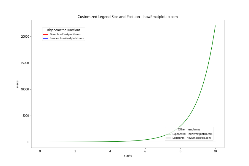
In this example, we create two separate legends and position them in different corners of the plot using the loc and bbox_to_anchor parameters. We also adjust the font size of the legend text and title using the fontsize and title_fontsize parameters.
Styling Legend Boxes
When placing two different legends on the same graph with Matplotlib, you can enhance their visual appeal by styling the legend boxes. Here’s an example that demonstrates various styling options:
import matplotlib.pyplot as plt
import numpy as np

x = np.linspace(0, 10, 100)
y1 = np.sin(x)
y2 = np.cos(x)
y3 = np.tan(x)
y4 = x**2

fig, ax = plt.subplots(figsize=(12, 8))

line1, = ax.plot(x, y1, 'r-', label='Sine - how2matplotlib.com')
line2, = ax.plot(x, y2, 'b-', label='Cosine - how2matplotlib.com')
line3, = ax.plot(x, y3, 'g-', label='Tangent - how2matplotlib.com')
line4, = ax.plot(x, y4, 'k-', label='Square - how2matplotlib.com')

legend1 = ax.legend(handles=[line1, line2],
                    loc='upper left',
                    title='Trigonometric Functions',
                    fancybox=True,
                    shadow=True,
                    framealpha=0.7,
                    edgecolor='red')

ax.add_artist(legend1)

legend2 = ax.legend(handles=[line3, line4],
                    loc='lower right',
                    title='Other Functions',
                    fancybox=True,
                    shadow=True,
                    framealpha=0.7,
                    edgecolor='blue')

plt.xlabel('X-axis')
plt.ylabel('Y-axis')
plt.title('Styled Legend Boxes - how2matplotlib.com')
plt.show()
Output:
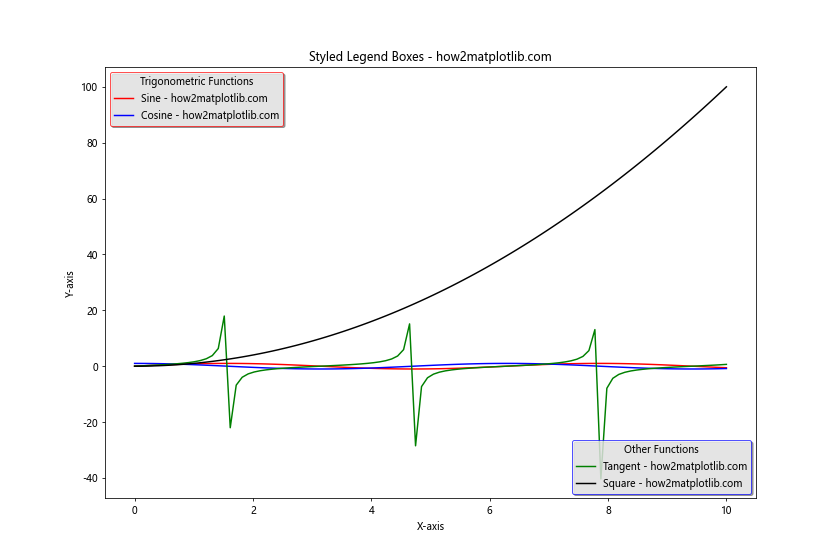
In this example, we apply various styling options to the legend boxes:
fancybox=Truegives the legend a rounded corner appearanceshadow=Trueadds a drop shadow to the legend boxframealpha=0.7sets the transparency of the legend boxedgecolorsets the color of the legend box border
These styling options help distinguish the two legends and make them visually appealing.
Advanced Techniques for Multiple Legends
As you become more proficient in placing two different legends on the same graph with Matplotlib, you may want to explore more advanced techniques to create even more informative and visually striking visualizations.
Using Proxy Artists for Custom Legend Entries
Sometimes, you may want to include legend entries that don’t directly correspond to plot elements. In these cases, you can use proxy artists to create custom legend entries. Here’s an example demonstrating this technique:
import matplotlib.pyplot as plt
import numpy as np
from matplotlib.lines import Line2D

x = np.linspace(0, 10, 100)
y1 = np.sin(x)
y2 = np.cos(x)

fig, ax = plt.subplots(figsize=(12, 8))

ax.plot(x, y1, 'r-')
ax.plot(x, y2, 'b-')

# Create proxy artists for custom legend entries
custom_lines = [Line2D([0], [0], color='r', lw=2),
                Line2D([0], [0], color='b', lw=2),
                Line2D([0], [0], color='g', lw=2, linestyle='--')]

legend1 = ax.legend(custom_lines[:2], ['Sine - how2matplotlib.com', 'Cosine - how2matplotlib.com'],
                    loc='upper left', title='Actual Functions')
ax.add_artist(legend1)

legend2 = ax.legend([custom_lines[2]], ['Imaginary Function - how2matplotlib.com'],
                    loc='lower right', title='Conceptual Function')

plt.xlabel('X-axis')
plt.ylabel('Y-axis')
plt.title('Custom Legend Entries with Proxy Artists - how2matplotlib.com')
plt.show()
Output:
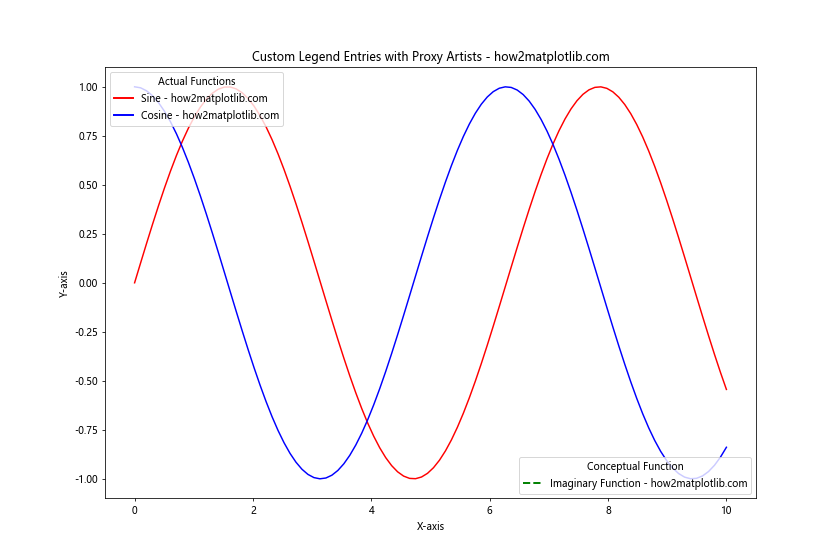
In this example, we create custom Line2D objects to serve as proxy artists for our legend entries. This allows us to include a legend entry for an “Imaginary Function” that doesn’t actually appear in the plot.
Combining Different Types of Plot Elements in Legends
When placing two different legends on the same graph with Matplotlib, you may need to combine different types of plot elements, such as lines, markers, and patches. Here’s an example that demonstrates how to create a legend with mixed element types:
import matplotlib.pyplot as plt
import numpy as np
from matplotlib.patches import Rectangle

x = np.linspace(0, 10, 100)
y1 = np.sin(x)
y2 = np.cos(x)

fig, ax = plt.subplots(figsize=(12, 8))

line1,= ax.plot(x, y1, 'r-', label='Sine - how2matplotlib.com')
line2, = ax.plot(x, y2, 'b-', label='Cosine - how2matplotlib.com')
scatter = ax.scatter(x[::10], y1[::10], c='g', marker='o', label='Data Points - how2matplotlib.com')

# Create a custom patch
custom_patch = Rectangle((0, 0), 1, 1, facecolor='orange', edgecolor='k', label='Custom Area - how2matplotlib.com')
ax.add_patch(custom_patch)

legend1 = ax.legend(handles=[line1, line2], loc='upper left', title='Line Plots')
ax.add_artist(legend1)

legend2 = ax.legend(handles=[scatter, custom_patch], loc='lower right', title='Other Elements')

plt.xlabel('X-axis')
plt.ylabel('Y-axis')
plt.title('Mixed Plot Elements in Legends - how2matplotlib.com')
plt.show()
Output:
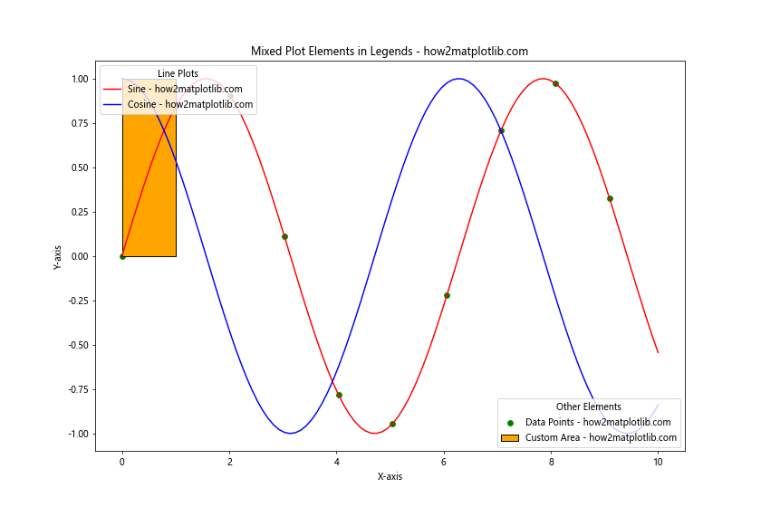
In this example, we combine line plots, scatter plots, and a custom patch in our legends. This demonstrates how you can create comprehensive legends that represent various types of plot elements.
Handling Overlapping Legends
When placing two different legends on the same graph with Matplotlib, you may encounter situations where the legends overlap with each other or with the plot content. Here are some techniques to handle overlapping legends:
Adjusting Legend Locations
One way to avoid overlapping legends is to carefully adjust their locations. Matplotlib provides various location options and fine-tuning parameters:
import matplotlib.pyplot as plt
import numpy as np

x = np.linspace(0, 10, 100)
y1 = np.sin(x)
y2 = np.cos(x)
y3 = np.tan(x)
y4 = x**2

fig, ax = plt.subplots(figsize=(12, 8))

line1, = ax.plot(x, y1, 'r-', label='Sine - how2matplotlib.com')
line2, = ax.plot(x, y2, 'b-', label='Cosine - how2matplotlib.com')
line3, = ax.plot(x, y3, 'g-', label='Tangent - how2matplotlib.com')
line4, = ax.plot(x, y4, 'k-', label='Square - how2matplotlib.com')

legend1 = ax.legend(handles=[line1, line2],
                    loc='upper left',
                    bbox_to_anchor=(0.05, 0.95),
                    title='Trigonometric Functions')
ax.add_artist(legend1)

legend2 = ax.legend(handles=[line3, line4],
                    loc='center left',
                    bbox_to_anchor=(1.05, 0.5),
                    title='Other Functions')

plt.xlabel('X-axis')
plt.ylabel('Y-axis')
plt.title('Non-overlapping Legends - how2matplotlib.com')
plt.tight_layout()
plt.show()
Output:
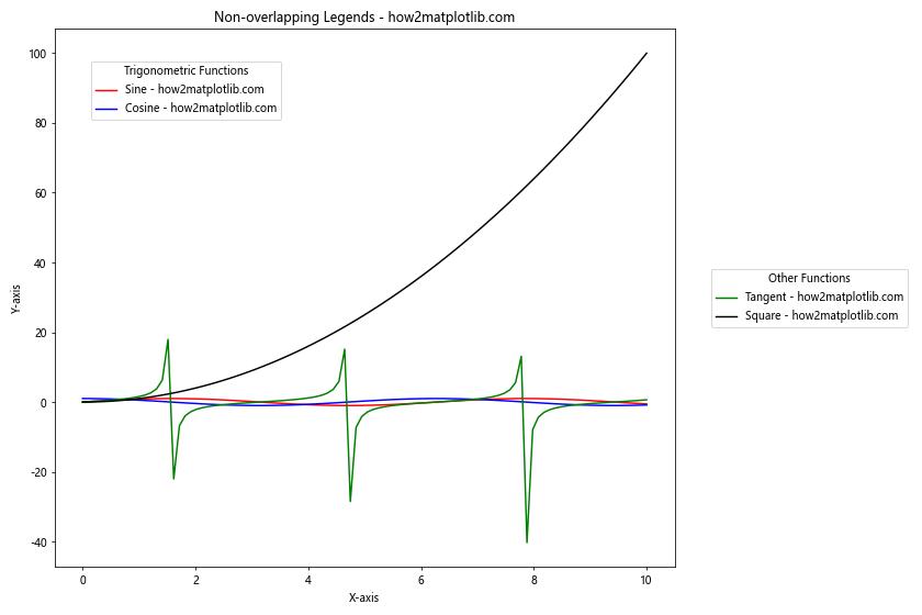
In this example, we position one legend in the upper left corner of the plot area and the other legend outside the plot area on the right side. The bbox_to_anchor parameter is used to fine-tune the legend positions.
Using Legend Transparency
Another technique for handling overlapping legends when placing two different legends on the same graph with Matplotlib is to adjust the transparency of the legend boxes:
import matplotlib.pyplot as plt
import numpy as np

x = np.linspace(0, 10, 100)
y1 = np.sin(x)
y2 = np.cos(x)
y3 = np.exp(x)
y4 = np.log(x)

fig, ax = plt.subplots(figsize=(12, 8))

line1, = ax.plot(x, y1, 'r-', label='Sine - how2matplotlib.com')
line2, = ax.plot(x, y2, 'b-', label='Cosine - how2matplotlib.com')
line3, = ax.plot(x, y3, 'g-', label='Exponential - how2matplotlib.com')
line4, = ax.plot(x, y4, 'k-', label='Logarithm - how2matplotlib.com')

legend1 = ax.legend(handles=[line1, line2],
                    loc='upper right',
                    title='Trigonometric Functions',
                    framealpha=0.5)
ax.add_artist(legend1)

legend2 = ax.legend(handles=[line3, line4],
                    loc='lower right',
                    title='Other Functions',
                    framealpha=0.5)

plt.xlabel('X-axis')
plt.ylabel('Y-axis')
plt.title('Semi-transparent Legends - how2matplotlib.com')
plt.show()
Output:
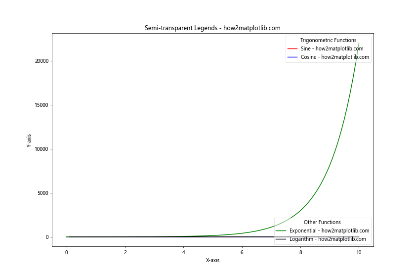
In this example, we set framealpha=0.5 for both legends, making them semi-transparent. This allows the plot content to be visible through the legend boxes, reducing the impact of any overlap.
Creating Interactive Legends
When placing two different legends on the same graph with Matplotlib, you can enhance the user experience by making the legends interactive. This allows users to toggle the visibility of plot elements by clicking on legend items.
Here’s an example of how to create interactive legends:
import matplotlib.pyplot as plt
import numpy as np

x = np.linspace(0, 10, 100)
y1 = np.sin(x)
y2 = np.cos(x)
y3 = np.tan(x)
y4 = x**2

fig, ax = plt.subplots(figsize=(12, 8))

line1, = ax.plot(x, y1, 'r-', label='Sine - how2matplotlib.com')
line2, = ax.plot(x, y2, 'b-', label='Cosine - how2matplotlib.com')
line3, = ax.plot(x, y3, 'g-', label='Tangent - how2matplotlib.com')
line4, = ax.plot(x, y4, 'k-', label='Square - how2matplotlib.com')

legend1 = ax.legend(handles=[line1, line2],
                    loc='upper left',
                    title='Trigonometric Functions')
ax.add_artist(legend1)

legend2 = ax.legend(handles=[line3, line4],
                    loc='lower right',
                    title='Other Functions')

plt.xlabel('X-axis')
plt.ylabel('Y-axis')
plt.title('Interactive Legends - how2matplotlib.com')

# Make legends interactive
for legend in [legend1, legend2]:
    for legline, origline in zip(legend.get_lines(), legend.legendHandles):
        legline.set_picker(5)  # 5 pts tolerance
        legline.set_pickradius(5)  # 5 pts tolerance

def on_pick(event):
    legline = event.artist
    origline = legline.get_legref()
    visible = not origline.get_visible()
    origline.set_visible(visible)
    legline.set_alpha(1.0 if visible else 0.2)
    fig.canvas.draw()

fig.canvas.mpl_connect('pick_event', on_pick)

plt.show()
Output:
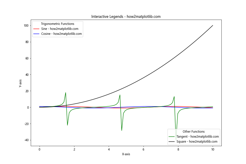
In this example, we create two interactive legends. The on_pick function toggles the visibility of the corresponding plot element when a legend item is clicked. This interactivity allows users to focus on specific elements of the plot by hiding or showing them as needed.
Best Practices for Multiple Legends
When placing two different legends on the same graph with Matplotlib, it’s important to follow some best practices to ensure your visualizations are clear and effective:
- Keep it simple: Only use multiple legends when necessary. If a single legend can effectively convey the information, stick with that.
Use consistent styling: Ensure that the styling of your legends is consistent with the overall plot style.
Choose appropriate locations: Place legends where they don’t obscure important data points or plot features.
Use clear and concise labels: Keep legend labels short and descriptive to avoid cluttering the plot.
Group related items: When using multiple legends, group related items together to make the information easier to understand.
Consider color and contrast: Ensure that legend text and symbols are easily readable against the background.
Use transparency wisely: Adjust legend box transparency to balance visibility with data clarity.
Test for readability: Always check your plot at different sizes and on different devices to ensure legends remain readable.
Troubleshooting Common Issues
When placing two different legends on the same graph with Matplotlib, you may encounter some common issues. Here are some troubleshooting tips: