Comprehensive Guide to Using Matplotlib.pyplot.yscale() in Python for Data Visualization
Matplotlib.pyplot.yscale() in Python is a powerful function that allows you to set the scaling of the y-axis in your plots. This function is an essential tool for data visualization, especially when dealing with data that spans multiple orders of magnitude or when you want to emphasize certain aspects of your data. In this comprehensive guide, we’ll explore the various aspects of Matplotlib.pyplot.yscale(), its usage, and how it can enhance your data visualization capabilities.
Understanding Matplotlib.pyplot.yscale() in Python
Matplotlib.pyplot.yscale() in Python is a function that belongs to the pyplot module of the Matplotlib library. It is used to set the scaling of the y-axis in a plot. The function allows you to change the scale of the y-axis to various types, including linear, logarithmic, symlog (symmetrical logarithmic), and logit scales.
The basic syntax of the Matplotlib.pyplot.yscale() function is as follows:
import matplotlib.pyplot as plt

plt.yscale(scale, **kwargs)
Where scale is a string specifying the type of scale you want to use, and **kwargs are optional keyword arguments that can be used to customize the scaling further.
Let’s dive deeper into each aspect of Matplotlib.pyplot.yscale() in Python and explore its various use cases with examples.
Linear Scale with Matplotlib.pyplot.yscale() in Python
The linear scale is the default scale used in Matplotlib plots. When you use Matplotlib.pyplot.yscale() with the ‘linear’ argument, it ensures that the y-axis is scaled linearly. This means that equal increments on the axis correspond to equal increments in the data values.
Here’s a simple example of using Matplotlib.pyplot.yscale() with a linear scale:
import matplotlib.pyplot as plt
import numpy as np

x = np.linspace(0, 10, 100)
y = x**2

plt.figure(figsize=(8, 6))
plt.plot(x, y, label='y = x^2')
plt.yscale('linear')
plt.title('Linear Scale Example - how2matplotlib.com')
plt.xlabel('X-axis')
plt.ylabel('Y-axis')
plt.legend()
plt.grid(True)
plt.show()
Output:
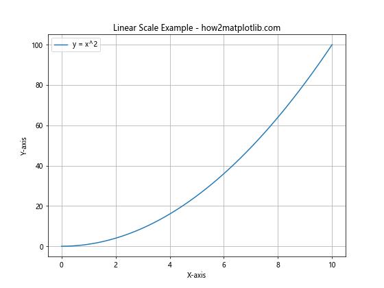
In this example, we’re plotting a quadratic function (y = x^2) using a linear scale for the y-axis. The Matplotlib.pyplot.yscale(‘linear’) call ensures that the y-axis is scaled linearly. This is useful for visualizing data that has a relatively small range of values or when you want to emphasize the absolute differences between data points.
Logarithmic Scale with Matplotlib.pyplot.yscale() in Python
The logarithmic scale is particularly useful when dealing with data that spans multiple orders of magnitude. When you use Matplotlib.pyplot.yscale() with the ‘log’ argument, it scales the y-axis logarithmically. This means that equal distances on the axis represent equal ratios of values.
Here’s an example of using Matplotlib.pyplot.yscale() with a logarithmic scale:
import matplotlib.pyplot as plt
import numpy as np

x = np.linspace(1, 10, 100)
y = 10**x

plt.figure(figsize=(8, 6))
plt.plot(x, y, label='y = 10^x')
plt.yscale('log')
plt.title('Logarithmic Scale Example - how2matplotlib.com')
plt.xlabel('X-axis')
plt.ylabel('Y-axis (log scale)')
plt.legend()
plt.grid(True)
plt.show()
Output:

In this example, we’re plotting an exponential function (y = 10^x) using a logarithmic scale for the y-axis. The Matplotlib.pyplot.yscale(‘log’) call scales the y-axis logarithmically. This is particularly useful for visualizing exponential growth or decay, or when dealing with data that spans several orders of magnitude.
Symmetrical Logarithmic Scale with Matplotlib.pyplot.yscale() in Python
The symmetrical logarithmic (symlog) scale is a hybrid between linear and logarithmic scales. It’s particularly useful when dealing with data that includes both positive and negative values, and when you want to emphasize values close to zero. When you use Matplotlib.pyplot.yscale() with the ‘symlog’ argument, it applies a logarithmic scale to both positive and negative values, with a linear scale around zero.
Here’s an example of using Matplotlib.pyplot.yscale() with a symlog scale:
import matplotlib.pyplot as plt
import numpy as np

x = np.linspace(-10, 10, 1000)
y = x**3 - 100*x

plt.figure(figsize=(8, 6))
plt.plot(x, y, label='y = x^3 - 100x')
plt.yscale('symlog', linthresh=10)
plt.title('Symlog Scale Example - how2matplotlib.com')
plt.xlabel('X-axis')
plt.ylabel('Y-axis (symlog scale)')
plt.legend()
plt.grid(True)
plt.show()
Output:
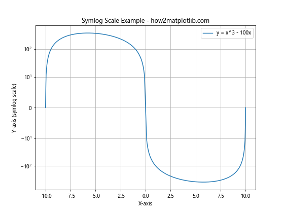
In this example, we’re plotting a cubic function (y = x^3 – 100x) using a symlog scale for the y-axis. The Matplotlib.pyplot.yscale(‘symlog’, linthresh=10) call scales the y-axis using a symmetrical logarithmic scale, with a linear region between -10 and 10. This is useful for visualizing data that has both very large and very small values, including negative values.
Logit Scale with Matplotlib.pyplot.yscale() in Python
The logit scale is particularly useful when dealing with probabilities or proportions. It’s the inverse of the sigmoid function and maps the interval (0, 1) to the real line. When you use Matplotlib.pyplot.yscale() with the ‘logit’ argument, it applies a logit transformation to the y-axis.
Here’s an example of using Matplotlib.pyplot.yscale() with a logit scale:
import matplotlib.pyplot as plt
import numpy as np

x = np.linspace(0.01, 0.99, 100)
y = 1 / (1 + np.exp(-10*(x-0.5)))

plt.figure(figsize=(8, 6))
plt.plot(x, y, label='Sigmoid function')
plt.yscale('logit')
plt.title('Logit Scale Example - how2matplotlib.com')
plt.xlabel('X-axis')
plt.ylabel('Y-axis (logit scale)')
plt.legend()
plt.grid(True)
plt.show()
Output:
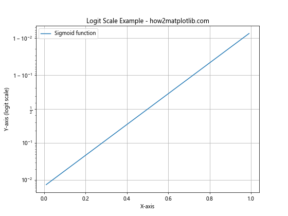
In this example, we’re plotting a sigmoid function using a logit scale for the y-axis. The Matplotlib.pyplot.yscale(‘logit’) call scales the y-axis using a logit transformation. This is particularly useful for visualizing probabilities or proportions, especially when you want to emphasize values near 0 or 1.
Customizing Matplotlib.pyplot.yscale() in Python
Matplotlib.pyplot.yscale() in Python offers various options for customizing the scale of your y-axis. These options can be passed as keyword arguments to the function. Let’s explore some of these customization options:
Base of Logarithm
For logarithmic scales, you can specify the base of the logarithm using the base parameter. By default, the base is 10, but you can change it to any positive number.
import matplotlib.pyplot as plt
import numpy as np

x = np.linspace(1, 100, 100)
y = 2**x

plt.figure(figsize=(8, 6))
plt.plot(x, y, label='y = 2^x')
plt.yscale('log', base=2)
plt.title('Logarithmic Scale (Base 2) - how2matplotlib.com')
plt.xlabel('X-axis')
plt.ylabel('Y-axis (log2 scale)')
plt.legend()
plt.grid(True)
plt.show()
Output:
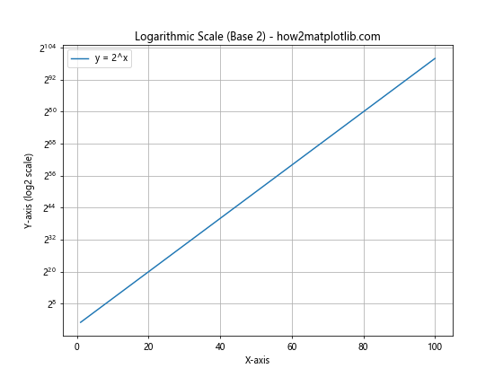
In this example, we’re using a logarithmic scale with base 2. This can be useful when dealing with data that naturally follows powers of 2, such as in computer science applications.
Linear Threshold for Symlog Scale
For the symlog scale, you can specify the linear threshold using the linthresh parameter. This determines the range around zero that will be scaled linearly.
import matplotlib.pyplot as plt
import numpy as np

x = np.linspace(-100, 100, 1000)
y = x**3 - 1000*x

plt.figure(figsize=(8, 6))
plt.plot(x, y, label='y = x^3 - 1000x')
plt.yscale('symlog', linthresh=100)
plt.title('Symlog Scale with Custom Linear Threshold - how2matplotlib.com')
plt.xlabel('X-axis')
plt.ylabel('Y-axis (symlog scale)')
plt.legend()
plt.grid(True)
plt.show()
Output:
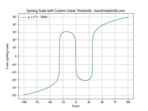
In this example, we’re using a symlog scale with a linear threshold of 100. This means that values between -100 and 100 will be scaled linearly, while values outside this range will be scaled logarithmically.
Customizing Tick Locations
You can also customize the locations of the ticks on the y-axis using the subs parameter for logarithmic scales. This parameter specifies the locations of the minor ticks as a sequence of multiples of the base.
import matplotlib.pyplot as plt
import numpy as np

x = np.linspace(1, 1000, 1000)
y = x**2

plt.figure(figsize=(8, 6))
plt.plot(x, y, label='y = x^2')
plt.yscale('log', base=10, subs=[2, 5])
plt.title('Logarithmic Scale with Custom Tick Locations - how2matplotlib.com')
plt.xlabel('X-axis')
plt.ylabel('Y-axis (log scale)')
plt.legend()
plt.grid(True)
plt.show()
Output:
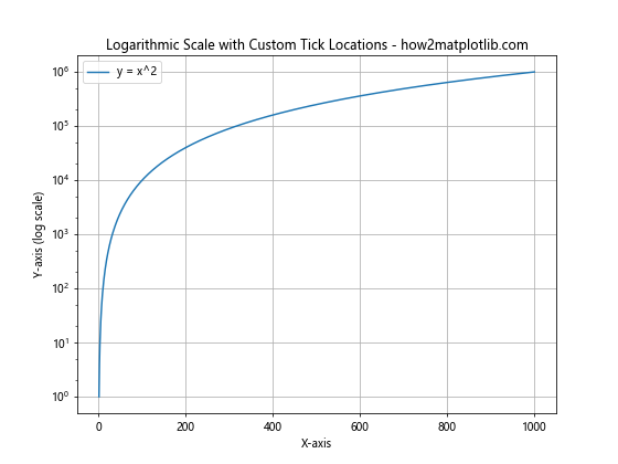
In this example, we’re using a logarithmic scale with base 10 and minor ticks at 2 and 5 times each power of 10. This can help to make the scale more readable and informative.
Combining Matplotlib.pyplot.yscale() with Other Matplotlib Functions
Matplotlib.pyplot.yscale() in Python can be effectively combined with other Matplotlib functions to create more informative and visually appealing plots. Let’s explore some of these combinations:
Using Matplotlib.pyplot.yscale() with Multiple Subplots
You can use Matplotlib.pyplot.yscale() with multiple subplots to compare different scaling options side by side:
import matplotlib.pyplot as plt
import numpy as np

x = np.linspace(0.1, 100, 1000)
y = x**2

fig, (ax1, ax2) = plt.subplots(1, 2, figsize=(12, 5))

ax1.plot(x, y, label='y = x^2')
ax1.set_yscale('linear')
ax1.set_title('Linear Scale - how2matplotlib.com')
ax1.set_xlabel('X-axis')
ax1.set_ylabel('Y-axis')
ax1.legend()
ax1.grid(True)

ax2.plot(x, y, label='y = x^2')
ax2.set_yscale('log')
ax2.set_title('Logarithmic Scale - how2matplotlib.com')
ax2.set_xlabel('X-axis')
ax2.set_ylabel('Y-axis')
ax2.legend()
ax2.grid(True)

plt.tight_layout()
plt.show()
Output:
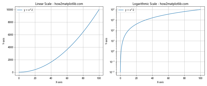
In this example, we’re creating two subplots side by side. The left subplot uses a linear scale, while the right subplot uses a logarithmic scale. This allows for easy comparison of how the same data looks under different scaling options.
Combining Matplotlib.pyplot.yscale() with Color Mapping
You can combine Matplotlib.pyplot.yscale() with color mapping to create more informative visualizations:
import matplotlib.pyplot as plt
import numpy as np

x = np.linspace(0.1, 10, 100)
y = np.linspace(0.1, 10, 100)
X, Y = np.meshgrid(x, y)
Z = X * Y

plt.figure(figsize=(8, 6))
plt.pcolormesh(X, Y, Z, shading='auto', cmap='viridis')
plt.yscale('log')
plt.xscale('log')
plt.colorbar(label='Z values')
plt.title('2D Color Map with Log Scales - how2matplotlib.com')
plt.xlabel('X-axis (log scale)')
plt.ylabel('Y-axis (log scale)')
plt.show()
Output:
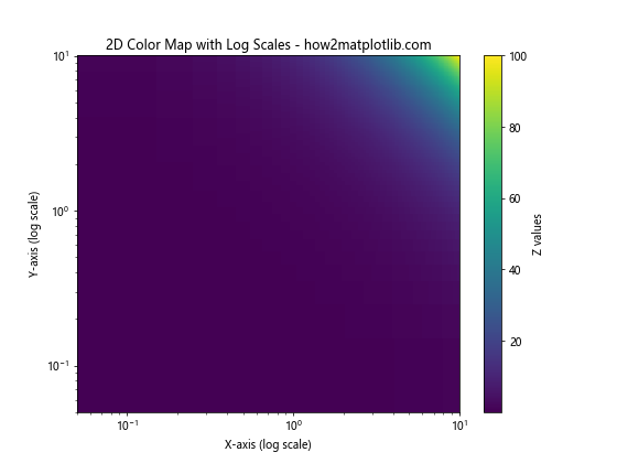
In this example, we’re creating a 2D color map of the function Z = X * Y, with both x and y axes scaled logarithmically. This combination of color mapping and logarithmic scaling can be particularly useful for visualizing data that spans multiple orders of magnitude in both dimensions.
Using Matplotlib.pyplot.yscale() with Error Bars
Matplotlib.pyplot.yscale() can also be effectively combined with error bars to visualize uncertainties in data:
import matplotlib.pyplot as plt
import numpy as np

x = np.linspace(1, 10, 10)
y = 2**x
yerr = y * 0.1  # 10% error

plt.figure(figsize=(8, 6))
plt.errorbar(x, y, yerr=yerr, fmt='o', capsize=5, label='Data with error')
plt.yscale('log')
plt.title('Logarithmic Scale with Error Bars - how2matplotlib.com')
plt.xlabel('X-axis')
plt.ylabel('Y-axis (log scale)')
plt.legend()
plt.grid(True)
plt.show()
Output:
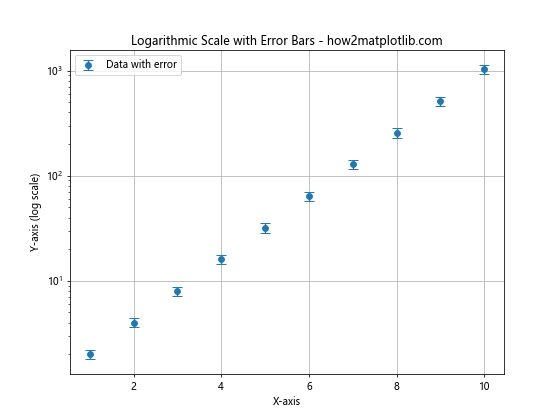
In this example, we’re plotting data points with error bars on a logarithmic y-scale. This can be particularly useful when dealing with experimental data that spans multiple orders of magnitude and has associated uncertainties.
Advanced Applications of Matplotlib.pyplot.yscale() in Python
Matplotlib.pyplot.yscale() in Python can be used in more advanced applications to create sophisticated visualizations. Let’s explore some of these advanced applications:
Using Matplotlib.pyplot.yscale() for Financial Data Visualization
Matplotlib.pyplot.yscale() can be particularly useful for visualizing financial data, such as stock prices or market indices:
import matplotlib.pyplot as plt
import numpy as np
import pandas as pd

# Generate sample stock data
dates = pd.date_range(start='2020-01-01', end='2021-12-31', freq='D')
price = 100 * (1 + np.random.randn(len(dates)).cumsum() * 0.01)
volume = np.random.randint(1000000, 10000000, size=len(dates))

fig, (ax1, ax2) = plt.subplots(2, 1, figsize=(10, 8), sharex=True)

ax1.plot(dates, price, label='Stock Price')
ax1.set_ylabel('Price')
ax1.set_title('Stock Price and Volume - how2matplotlib.com')
ax1.legend()
ax1.grid(True)

ax2.bar(dates, volume, label='Trading Volume')
ax2.set_ylabel('Volume')
ax2.set_yscale('log')
ax2.legend()
ax2.grid(True)

plt.tight_layout()
plt.show()
Output:
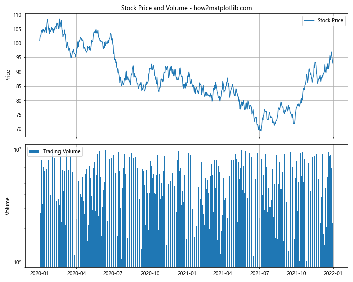
In this example, we’re creating a two-panel plot of stock data. The upper panel shows the stock price on a linear scale, while the lower panel shows the trading volume on a logarithmic scale. This combination allows for effective visualization of both the price trends and the large variations in trading volume.
Using Matplotlib.pyplot.yscale() for Scientific Data Visualization
Matplotlib.pyplot.yscale() is also very useful for scientific data visualization, particularly when dealing with data that spans multiple orders of magnitude:
import matplotlib.pyplot as plt
import numpy as np

# Generate sample data
wavelengths = np.logspace(1, 3,100)
intensity = np.exp(-(wavelengths - 100)**2 / 1000) + 0.1 * np.random.rand(100)

plt.figure(figsize=(10, 6))
plt.plot(wavelengths, intensity, 'o-', label='Spectral Data')
plt.xscale('log')
plt.yscale('log')
plt.title('Spectral Data Visualization - how2matplotlib.com')
plt.xlabel('Wavelength (nm)')
plt.ylabel('Intensity (a.u.)')
plt.legend()
plt.grid(True)
plt.show()
Output:
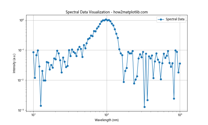
In this example, we’re visualizing spectral data with both x and y axes on logarithmic scales. This is particularly useful for spectroscopy data, where both wavelengths and intensities can span multiple orders of magnitude.
Using Matplotlib.pyplot.yscale() for Population Growth Visualization
Matplotlib.pyplot.yscale() can be effectively used to visualize population growth models:
import matplotlib.pyplot as plt
import numpy as np

def logistic_growth(t, r, K, P0):
    return K / (1 + (K - P0) / P0 * np.exp(-r * t))

t = np.linspace(0, 100, 1000)
K = 1000000  # Carrying capacity
r = 0.1  # Growth rate
P0 = 1000  # Initial population

plt.figure(figsize=(10, 6))
plt.plot(t, logistic_growth(t, r, K, P0), label='Logistic Growth')
plt.yscale('log')
plt.title('Population Growth Model - how2matplotlib.com')
plt.xlabel('Time')
plt.ylabel('Population (log scale)')
plt.legend()
plt.grid(True)
plt.show()
Output:
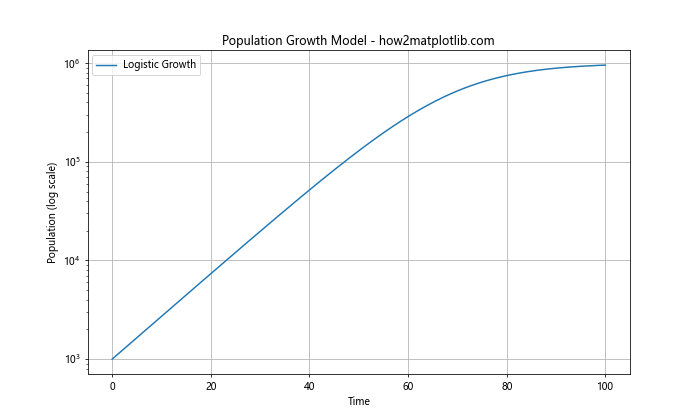
In this example, we’re visualizing a logistic growth model on a logarithmic y-scale. This allows us to see both the initial exponential growth phase and the later saturation phase clearly on the same plot.
Best Practices for Using Matplotlib.pyplot.yscale() in Python
When using Matplotlib.pyplot.yscale() in Python, there are several best practices to keep in mind:
- Choose the appropriate scale: The choice of scale (linear, log, symlog, or logit) should be based on the nature of your data and what aspects you want to emphasize.
Consider your audience: Make sure the chosen scale is appropriate for your target audience. Some scales (like logit) may be less intuitive for non-technical audiences.
Label axes clearly: Always include clear labels for your axes, especially when using non-linear scales.
Use appropriate data ranges: Ensure that your data is appropriate for the chosen scale. For example, logarithmic scales can’t handle zero or negative values.
Combine with other Matplotlib features: Use Matplotlib.pyplot.yscale() in combination with other Matplotlib features like color mapping, error bars, or multiple subplots to create more informative visualizations.
Be consistent: If you’re creating multiple plots for comparison, try to use consistent scales across plots where appropriate.
Consider using symlog for data with both positive and negative values: The symlog scale can be a good choice when your data includes both positive and negative values and spans multiple orders of magnitude.
Use appropriate tick locations: Customize tick locations to make your plot more readable, especially when using logarithmic scales.
Include a legend: Always include a legend to explain what each line or point in your plot represents.
Use grid lines: Grid lines can help readers interpret values on non-linear scales more accurately.
Troubleshooting Common Issues with Matplotlib.pyplot.yscale() in Python
When working with Matplotlib.pyplot.yscale() in Python, you might encounter some common issues. Here are some troubleshooting tips: