Comprehensive Guide to Matplotlib.pyplot.text() Function in Python
Matplotlib.pyplot.text() function in Python is a powerful tool for adding text annotations to plots created using the Matplotlib library. This function allows you to place text at specific coordinates within your plot, making it an essential feature for creating informative and visually appealing data visualizations. In this comprehensive guide, we’ll explore the various aspects of the Matplotlib.pyplot.text() function, including its syntax, parameters, and practical applications.
Understanding the Basics of Matplotlib.pyplot.text()
The Matplotlib.pyplot.text() function is a fundamental component of the Matplotlib library, which is widely used for creating static, animated, and interactive visualizations in Python. This function enables you to add text to your plots at specific x and y coordinates. Let’s start by examining the basic syntax of the Matplotlib.pyplot.text() function:
import matplotlib.pyplot as plt

plt.figure(figsize=(8, 6))
plt.text(0.5, 0.5, "Welcome to how2matplotlib.com", fontsize=16, ha='center')
plt.axis('off')
plt.show()
Output:

In this example, we use the Matplotlib.pyplot.text() function to add the text “Welcome to how2matplotlib.com” at the center of the plot. The first two arguments (0.5, 0.5) represent the x and y coordinates, respectively. The third argument is the text string itself. We also set the font size to 16 and use the ‘ha’ parameter to center-align the text horizontally.
Key Parameters of Matplotlib.pyplot.text()
The Matplotlib.pyplot.text() function offers a wide range of parameters that allow you to customize the appearance and positioning of your text annotations. Let’s explore some of the most important parameters:
- x, y: These are the coordinates where the text will be placed on the plot.
- s: The text string to be displayed.
- fontsize: The size of the font.
- fontweight: The weight of the font (e.g., ‘normal’, ‘bold’, ‘light’).
- color: The color of the text.
- alpha: The transparency of the text (0.0 to 1.0).
- rotation: The angle of rotation for the text.
- ha: Horizontal alignment (‘left’, ‘center’, ‘right’).
- va: Vertical alignment (‘top’, ‘center’, ‘bottom’).
- bbox: A dictionary of properties for drawing a box around the text.
Let’s see an example that demonstrates the use of these parameters:
import matplotlib.pyplot as plt

plt.figure(figsize=(10, 8))
plt.text(0.5, 0.5, "Matplotlib.pyplot.text() at how2matplotlib.com",
         fontsize=18, fontweight='bold', color='blue', alpha=0.8,
         rotation=15, ha='center', va='center',
         bbox=dict(facecolor='yellow', edgecolor='red', alpha=0.3))
plt.axis('off')
plt.show()
Output:

In this example, we use various parameters of the Matplotlib.pyplot.text() function to customize the appearance of our text. We set the font size to 18, make it bold, color it blue, and apply a slight transparency. The text is rotated by 15 degrees and centered both horizontally and vertically. We also add a yellow box with a red edge around the text using the bbox parameter.
Adding Multiple Text Annotations
The Matplotlib.pyplot.text() function can be used multiple times to add several text annotations to a single plot. This is particularly useful when you want to label different parts of your visualization or provide additional information about specific data points. Here’s an example:
import matplotlib.pyplot as plt
import numpy as np

x = np.linspace(0, 10, 100)
y = np.sin(x)

plt.figure(figsize=(12, 8))
plt.plot(x, y)
plt.text(2, 0.8, "Peak", fontsize=14, color='red')
plt.text(5, -0.5, "Trough", fontsize=14, color='blue')
plt.text(8, 0.2, "how2matplotlib.com", fontsize=16, color='green', ha='center')
plt.title("Sine Wave with Text Annotations")
plt.xlabel("X-axis")
plt.ylabel("Y-axis")
plt.grid(True)
plt.show()
Output:
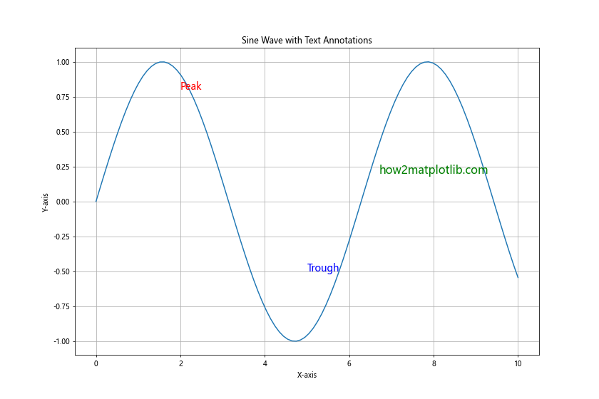
In this example, we create a sine wave plot and use the Matplotlib.pyplot.text() function three times to add different annotations. We label a peak and a trough of the sine wave and add a reference to “how2matplotlib.com” in the plot.
Using Matplotlib.pyplot.text() with Data Coordinates
By default, the Matplotlib.pyplot.text() function uses data coordinates to position the text. This means that the x and y values you provide correspond to the actual data values on your plot. This is particularly useful when you want to annotate specific data points. Let’s see an example:
import matplotlib.pyplot as plt
import numpy as np

x = np.array([1, 2, 3, 4, 5])
y = np.array([2, 4, 1, 5, 3])

plt.figure(figsize=(10, 6))
plt.plot(x, y, 'bo-')
for i, (xi, yi) in enumerate(zip(x, y)):
    plt.text(xi, yi+0.1, f'Point {i+1}: ({xi}, {yi})', ha='center', va='bottom')
plt.text(3, 5.5, "Data from how2matplotlib.com", fontsize=14, ha='center')
plt.title("Using Matplotlib.pyplot.text() with Data Coordinates")
plt.xlabel("X-axis")
plt.ylabel("Y-axis")
plt.ylim(0, 6)
plt.grid(True)
plt.show()
Output:
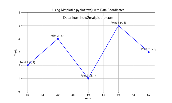
In this example, we create a line plot with data points and use the Matplotlib.pyplot.text() function to label each point with its coordinates. We also add a general text annotation about the data source.
Formatting Text with LaTeX
The Matplotlib.pyplot.text() function supports LaTeX formatting, allowing you to include mathematical equations and symbols in your text annotations. To use LaTeX, you need to enclose the LaTeX code in dollar signs ($). Here’s an example:
import matplotlib.pyplot as plt
import numpy as np

x = np.linspace(-2*np.pi, 2*np.pi, 100)
y = np.sin(x)

plt.figure(figsize=(12, 8))
plt.plot(x, y)
plt.text(0, 0, r'$f(x) = \sin(x)$', fontsize=16)
plt.text(-np.pi, -0.5, r'$\pi$', fontsize=14)
plt.text(np.pi, -0.5, r'$\pi$', fontsize=14)
plt.text(0, 1.1, "Sine Function - how2matplotlib.com", fontsize=14, ha='center')
plt.title("Using LaTeX in Matplotlib.pyplot.text()")
plt.xlabel("X-axis")
plt.ylabel("Y-axis")
plt.grid(True)
plt.show()
Output:
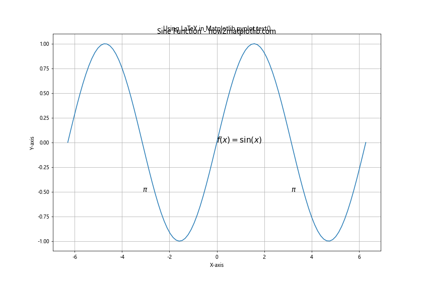
In this example, we use LaTeX formatting to display the equation of the sine function and label the π values on the x-axis. Note the use of the raw string (r’…’) to ensure proper handling of backslashes in LaTeX code.
Adjusting Text Position with Transform
The Matplotlib.pyplot.text() function allows you to use different coordinate systems for positioning text by specifying a transform. The most common transforms are:
- plt.gca().transData: Data coordinates (default)
- plt.gca().transAxes: Axes coordinates (0-1 range)
- plt.gcf().transFigure: Figure coordinates (0-1 range)
Let’s see an example that demonstrates the use of these transforms:
import matplotlib.pyplot as plt

plt.figure(figsize=(10, 8))
plt.plot([0, 1], [0, 1], 'r-')
plt.text(0.5, 0.5, "Data Coordinates", transform=plt.gca().transData)
plt.text(0.5, 0.5, "Axes Coordinates", transform=plt.gca().transAxes)
plt.text(0.5, 0.5, "Figure Coordinates", transform=plt.gcf().transFigure)
plt.text(0.5, 0.9, "Transforms in Matplotlib.pyplot.text()",
         transform=plt.gca().transAxes, ha='center', fontsize=14)
plt.text(0.5, 0.1, "how2matplotlib.com",
         transform=plt.gca().transAxes, ha='center', fontsize=12)
plt.title("Using Different Transforms")
plt.xlabel("X-axis")
plt.ylabel("Y-axis")
plt.grid(True)
plt.show()
Output:
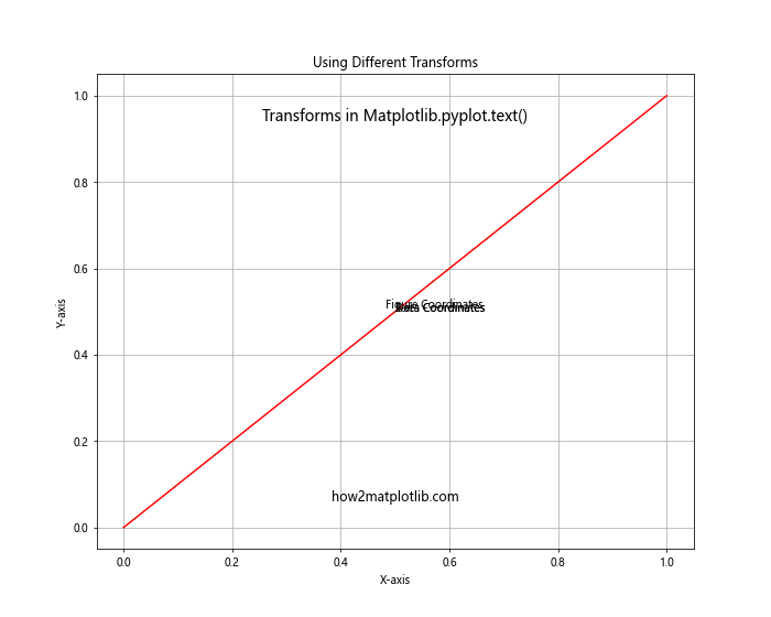
In this example, we add three text annotations using different transforms. The first uses data coordinates, the second uses axes coordinates, and the third uses figure coordinates. This demonstrates how the same (0.5, 0.5) coordinates result in different text positions based on the transform used.
Creating Text Boxes with Matplotlib.pyplot.text()
You can use the bbox parameter of the Matplotlib.pyplot.text() function to create text boxes around your annotations. This is particularly useful for highlighting important information or creating legend-like elements within your plot. Here’s an example:
import matplotlib.pyplot as plt
import numpy as np

x = np.linspace(0, 10, 100)
y = np.sin(x)

plt.figure(figsize=(12, 8))
plt.plot(x, y)
plt.text(5, 0.5, "Key Features:", fontsize=14, fontweight='bold',
         bbox=dict(facecolor='white', edgecolor='black', pad=10))
plt.text(5, 0.3, "1. Periodic\n2. Amplitude: [-1, 1]\n3. Period: 2π",
         fontsize=12, va='top',
         bbox=dict(facecolor='lightyellow', edgecolor='orange', pad=5))
plt.text(5, -0.8, "how2matplotlib.com", fontsize=14, ha='center',
         bbox=dict(facecolor='lightblue', edgecolor='blue', pad=5, alpha=0.8))
plt.title("Sine Wave with Text Boxes")
plt.xlabel("X-axis")
plt.ylabel("Y-axis")
plt.grid(True)
plt.show()
Output:
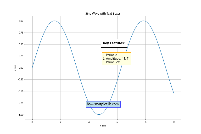
In this example, we create three text boxes using the Matplotlib.pyplot.text() function. The first box serves as a header, the second contains a list of key features, and the third displays the website URL. Each box has different styling to demonstrate the flexibility of the bbox parameter.
Animating Text with Matplotlib.pyplot.text()
The Matplotlib.pyplot.text() function can also be used in animations to create dynamic text annotations. Here’s an example of how to create a simple animation with changing text:
import matplotlib.pyplot as plt
import matplotlib.animation as animation
import numpy as np

fig, ax = plt.subplots(figsize=(10, 6))
x = np.linspace(0, 2*np.pi, 100)
line, = ax.plot(x, np.sin(x))
text = ax.text(np.pi, 0, "", ha='center', va='center', fontsize=16)

def animate(frame):
    line.set_ydata(np.sin(x + frame/10))
    text.set_text(f"Phase: {frame/10:.2f}\nhow2matplotlib.com")
    return line, text

ani = animation.FuncAnimation(fig, animate, frames=100, interval=50, blit=True)
plt.title("Animated Sine Wave with Matplotlib.pyplot.text()")
plt.xlabel("X-axis")
plt.ylabel("Y-axis")
plt.grid(True)
plt.show()
Output:
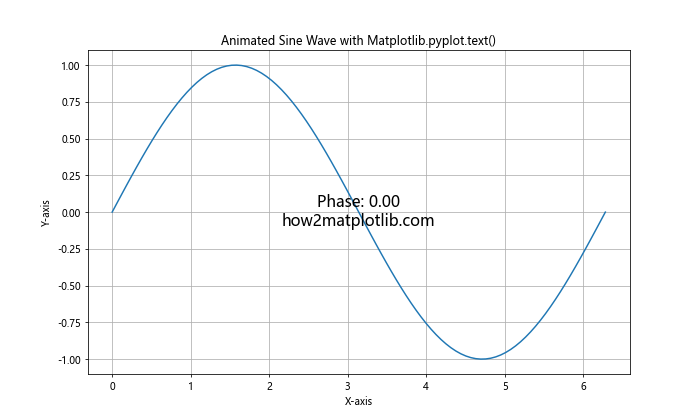
In this example, we create an animation of a sine wave with a phase shift. The Matplotlib.pyplot.text() function is used to display the current phase value, which updates in each frame of the animation.
Using Matplotlib.pyplot.text() for Annotations
The Matplotlib.pyplot.text() function is particularly useful for creating annotations that point to specific features in your plot. You can combine it with arrows or other shapes to create informative visualizations. Here’s an example:
import matplotlib.pyplot as plt
import numpy as np

x = np.linspace(0, 10, 100)
y = np.sin(x)

plt.figure(figsize=(12, 8))
plt.plot(x, y)
plt.text(np.pi/2, 1, "Maximum", fontsize=12, ha='center', va='bottom')
plt.annotate("", xy=(np.pi/2, 1), xytext=(np.pi/2, 1.2),
             arrowprops=dict(facecolor='black', shrink=0.05))
plt.text(3*np.pi/2, -1, "Minimum", fontsize=12, ha='center', va='top')
plt.annotate("", xy=(3*np.pi/2, -1), xytext=(3*np.pi/2, -1.2),
             arrowprops=dict(facecolor='black', shrink=0.05))
plt.text(5, 0.5, "Annotations with\nMatplotlib.pyplot.text()",
         fontsize=14, ha='center', va='center',
         bbox=dict(facecolor='white', edgecolor='red', pad=10))
plt.text(5, -0.5, "how2matplotlib.com", fontsize=12, ha='center')
plt.title("Sine Wave with Annotations")
plt.xlabel("X-axis")
plt.ylabel("Y-axis")
plt.grid(True)
plt.show()
Output:
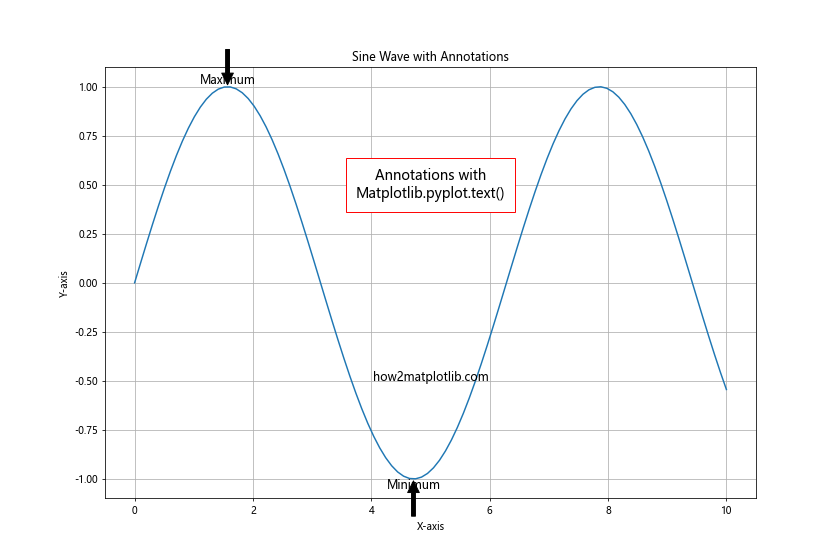
In this example, we use the Matplotlib.pyplot.text() function to label the maximum and minimum points of a sine wave. We combine these labels with arrows created using plt.annotate() to point to the specific features.
Customizing Text Appearance with Font Properties
The Matplotlib.pyplot.text() function allows you to customize the appearance of your text annotations using font properties. You can specify font family, style, weight, and other attributes to achieve the desired look. Here’s an example:
import matplotlib.pyplot as plt
from matplotlib.font_manager import FontProperties

plt.figure(figsize=(12, 8))
normal_font = FontProperties(family='serif', style='normal', weight='normal', size=14)
italic_font = FontProperties(family='sans-serif', style='italic', weight='normal', size=14)
bold_font = FontProperties(family='monospace', style='normal', weight='bold', size=14)

plt.text(0.1, 0.8, "Normal Serif Text", fontproperties=normal_font)
plt.text(0.1, 0.6, "Italic Sans-serif Text", fontproperties=italic_font)
plt.text(0.1, 0.4, "Bold Monospace Text", fontproperties=bold_font)
plt.text(0.1, 0.2, "Default Text (how2matplotlib.com)")

plt.title("Customizing Text with Font Properties in Matplotlib.pyplot.text()")
plt.axis('off')
plt.show()
Output:
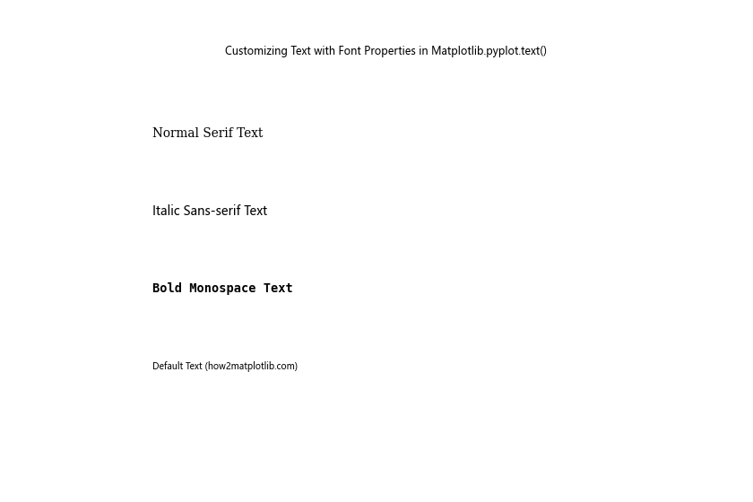
In this example, we create three different FontProperties objects with varying font families, styles, and weights. We then use these font properties with the Matplotlib.pyplot.text() function to display text with different appearances.
Using Matplotlib.pyplot.text() in Subplots
When working with multiple subplots, you can use the Matplotlib.pyplot.text() function to add text annotations to specific subplots or to the entire figure. Here’s an example that demonstrates both approaches:
import matplotlib.pyplot as plt
import numpy as np

fig, (ax1, ax2) = plt.subplots(1, 2, figsize=(12, 6))

x = np.linspace(0, 10, 100)
ax1.plot(x, np.sin(x))
ax1.text(5, 0.5, "Sine Wave", ha='center', va='center', fontsize=14)
ax1.set_title("Subplot 1")

ax2.plot(x, np.cos(x))
ax2.text(5, 0.5, "Cosine Wave", ha='center', va='center', fontsize=14)
ax2.set_title("Subplot 2")

fig.text(0.5, 0.04, "X-axis", ha='center', fontsize=12)
fig.text(0.04, 0.5, "Y-axis", va='center', rotation='vertical', fontsize=12)
fig.text(0.5, 0.95, "Using Matplotlib.pyplot.text() in Subplots", ha='center', fontsize=16)
fig.text(0.5, 0.01, "how2matplotlib.com", ha='center', fontsize=10)

plt.tight_layout()
plt.show()
Output:
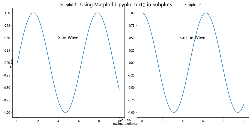
In this example, we create two subplots and use the Matplotlib.pyplot.text() function to add text annotations to each subplot individually. We also use fig.text() to add text to the entire figure, including a title, axis labels, and a reference to the website.
Handling Text Overlap with Matplotlib.pyplot.text()
When adding multiple text annotations to a plot, you may encounter situations where text elements overlap. The Matplotlib.pyplot.text() function provides options to handle such overlaps. One approach is to use the zorder parameter to control the drawing order of text elements. Here’s an example:
import matplotlib.pyplot as plt
import numpy as np

plt.figure(figsize=(10, 8))
x = np.linspace(0, 10, 100)
y = np.sin(x)
plt.plot(x, y)

plt.text(5, 0, "Background Text", fontsize=40, color='lightgray', ha='center', va='center', zorder=1)
plt.text(5, 0, "Foreground Text", fontsize=16, color='red', ha='center', va='center', zorder=2)
plt.text(5, 0.5, "how2matplotlib.com", fontsize=14, ha='center', va='center', zorder=3)

plt.title("Handling Text Overlap with Matplotlib.pyplot.text()")
plt.xlabel("X-axis")
plt.ylabel("Y-axis")
plt.grid(True)
plt.show()
Output:
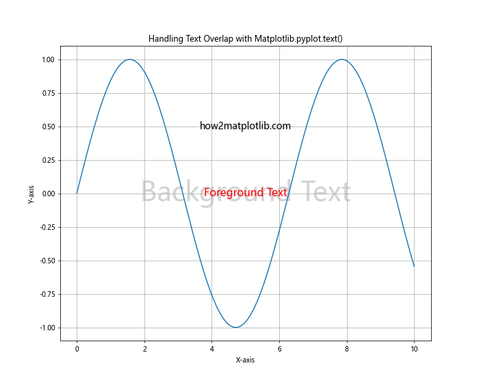
In this example, we add three overlapping text elements with different zorder values. The text with higher zorder values is drawn on top of text with lower zorder values, allowing you to control which text appears in the foreground.
Creating Text Effects with Matplotlib.pyplot.text()
The Matplotlib.pyplot.text() function can be used to create various text effects, such as shadows or outlines. While these effects are not built-in, you can achieve them by layering multiple text elements. Here’s an example of creating a text shadow effect:
import matplotlib.pyplot as plt

plt.figure(figsize=(10, 6))
plt.text(0.5, 0.5, "Shadow Text", fontsize=40, ha='center', va='center', color='gray', alpha=0.3)
plt.text(0.51, 0.51, "Shadow Text", fontsize=40, ha='center', va='center', color='black')
plt.text(0.5, 0.3, "how2matplotlib.com", fontsize=14, ha='center', va='center')

plt.title("Text Shadow Effect with Matplotlib.pyplot.text()")
plt.axis('off')
plt.show()
Output:
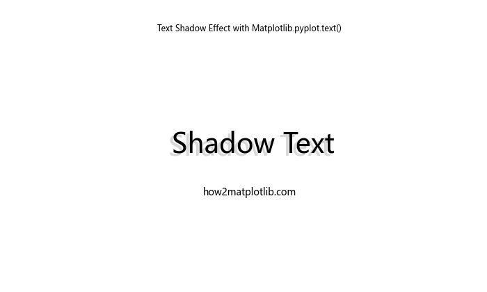
In this example, we create a shadow effect by placing two text elements slightly offset from each other. The first text element serves as the shadow, while the second is the main text.
Using Matplotlib.pyplot.text() for Data Labels
The Matplotlib.pyplot.text() function can be used to add data labels directly to your plots. This is particularly useful for bar charts or scatter plots where you want to display the exact values. Here’s an example:
import matplotlib.pyplot as plt
import numpy as np

categories = ['A', 'B', 'C', 'D', 'E']
values = np.random.randint(10, 100, 5)

plt.figure(figsize=(10, 6))
bars = plt.bar(categories, values)

for bar in bars:
    height = bar.get_height()
    plt.text(bar.get_x() + bar.get_width()/2, height,
             f'{height}',
             ha='center', va='bottom')

plt.text(0.5, -10, "Data from how2matplotlib.com", ha='center', fontsize=12)
plt.title("Bar Chart with Data Labels using Matplotlib.pyplot.text()")
plt.xlabel("Categories")
plt.ylabel("Values")
plt.show()
Output:
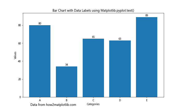
In this example, we create a bar chart and use the Matplotlib.pyplot.text() function to add labels showing the exact value of each bar directly above it.
Conclusion
The Matplotlib.pyplot.text() function is a versatile tool for adding text annotations to your plots in Python. Throughout this comprehensive guide, we’ve explored various aspects of this function, including its basic syntax, key parameters, and practical applications. We’ve seen how to use Matplotlib.pyplot.text() to add simple labels, create text boxes, incorporate LaTeX formatting, handle text overlaps, and even create text effects.
From adding data labels to creating animated text, the Matplotlib.pyplot.text() function offers a wide range of possibilities for enhancing your data visualizations. By mastering this function, you can create more informative and visually appealing plots that effectively communicate your data insights.