Comprehensive Guide to Using matplotlib.pyplot.step() Function in Python for Data Visualization
matplotlib.pyplot.step() function in Python is a powerful tool for creating step plots, which are particularly useful for visualizing discrete changes in data over time or other continuous variables. This function is part of the widely-used Matplotlib library, which provides a MATLAB-like plotting interface for Python. In this comprehensive guide, we’ll explore the matplotlib.pyplot.step() function in depth, covering its syntax, parameters, and various use cases with practical examples.
Understanding the Basics of matplotlib.pyplot.step()
The matplotlib.pyplot.step() function is designed to create step plots, where the data points are connected by horizontal and vertical lines, creating a staircase-like appearance. This type of plot is particularly useful for representing data that changes at discrete intervals, such as stock prices at the end of each trading day or the number of events occurring in specific time periods.
Let’s start with a basic example to illustrate how to use the matplotlib.pyplot.step() function:
import matplotlib.pyplot as plt
import numpy as np

x = np.arange(10)
y = np.random.randint(0, 10, 10)

plt.step(x, y, label='Step Plot')
plt.xlabel('X-axis')
plt.ylabel('Y-axis')
plt.title('Basic Step Plot - how2matplotlib.com')
plt.legend()
plt.show()
Output:
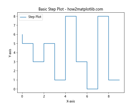
In this example, we create a simple step plot using random data. The matplotlib.pyplot.step() function takes the x and y values as input and creates a step plot. The resulting plot will show the discrete changes in the y values as steps.
Syntax and Parameters of matplotlib.pyplot.step()
To fully utilize the matplotlib.pyplot.step() function, it’s essential to understand its syntax and parameters. The basic syntax of the function is as follows:
matplotlib.pyplot.step(x, y, *args, where='pre', data=None, **kwargs)
Let’s break down the main parameters:
- x: The x coordinates of the data points.
- y: The y coordinates of the data points.
- where: Defines where the steps should be placed. Options are ‘pre’ (default), ‘post’, or ‘mid’.
- data: If specified, the data from which x and y will be read.
- *args and **kwargs: Additional arguments to control the appearance of the plot.
Now, let’s explore these parameters in more detail with examples.
The ‘where’ Parameter
The ‘where’ parameter determines where the step should occur. There are three options:
- ‘pre’: The step happens at the beginning of the interval (default).
- ‘post’: The step happens at the end of the interval.
- ‘mid’: The step happens at the middle of the interval.
Let’s create an example to illustrate the difference:
import matplotlib.pyplot as plt
import numpy as np

x = np.arange(5)
y = np.arange(5)

plt.figure(figsize=(12, 4))

plt.subplot(131)
plt.step(x, y, where='pre', label='pre')
plt.title("Step 'pre' - how2matplotlib.com")
plt.legend()

plt.subplot(132)
plt.step(x, y, where='post', label='post')
plt.title("Step 'post' - how2matplotlib.com")
plt.legend()

plt.subplot(133)
plt.step(x, y, where='mid', label='mid')
plt.title("Step 'mid' - how2matplotlib.com")
plt.legend()

plt.tight_layout()
plt.show()
Output:
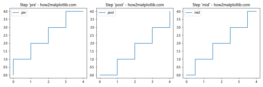
This example creates three subplots, each demonstrating a different ‘where’ option. You’ll notice how the steps are positioned differently in each plot.
Customizing Step Plots with matplotlib.pyplot.step()
The matplotlib.pyplot.step() function offers various ways to customize the appearance of your step plots. Let’s explore some of these options:
Changing Line Style and Color
You can modify the line style and color of your step plot using the ‘linestyle’ and ‘color’ parameters:
import matplotlib.pyplot as plt
import numpy as np

x = np.arange(10)
y = np.random.randint(0, 10, 10)

plt.step(x, y, linestyle='--', color='red', label='Customized Step Plot')
plt.xlabel('X-axis')
plt.ylabel('Y-axis')
plt.title('Customized Step Plot - how2matplotlib.com')
plt.legend()
plt.show()
Output:
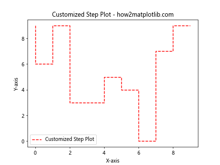
In this example, we’ve used a dashed line style (‘–‘) and set the color to red.
Adding Markers to Data Points
You can add markers to your data points using the ‘marker’ parameter:
import matplotlib.pyplot as plt
import numpy as np

x = np.arange(10)
y = np.random.randint(0, 10, 10)

plt.step(x, y, marker='o', label='Step Plot with Markers')
plt.xlabel('X-axis')
plt.ylabel('Y-axis')
plt.title('Step Plot with Markers - how2matplotlib.com')
plt.legend()
plt.show()
Output:
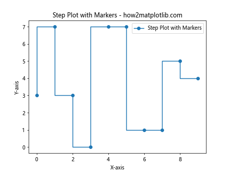
This example adds circular markers (‘o’) to each data point in the step plot.
Combining Step Plots with Other Plot Types
The matplotlib.pyplot.step() function can be combined with other plot types to create more complex visualizations. Let’s look at an example where we combine a step plot with a regular line plot:
import matplotlib.pyplot as plt
import numpy as np

x = np.arange(10)
y1 = np.random.randint(0, 10, 10)
y2 = np.random.randint(0, 10, 10)

plt.step(x, y1, label='Step Plot')
plt.plot(x, y2, label='Line Plot')
plt.xlabel('X-axis')
plt.ylabel('Y-axis')
plt.title('Combined Step and Line Plot - how2matplotlib.com')
plt.legend()
plt.show()
Output:
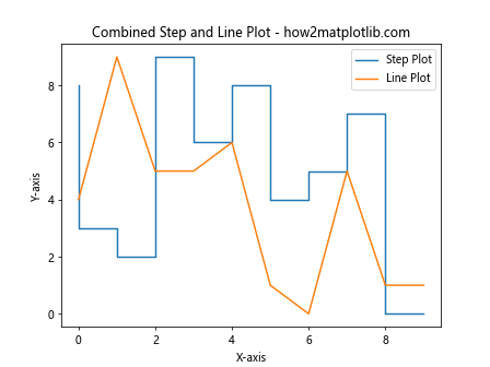
This example creates a visualization that includes both a step plot and a regular line plot, allowing for easy comparison between the two data series.
Using matplotlib.pyplot.step() for Time Series Data
Step plots are particularly useful for visualizing time series data, especially when the data changes at discrete intervals. Let’s create an example using datetime objects:
import matplotlib.pyplot as plt
import numpy as np
from datetime import datetime, timedelta

dates = [datetime(2023, 1, 1) + timedelta(days=i) for i in range(10)]
values = np.random.randint(0, 100, 10)

plt.step(dates, values, where='post', label='Daily Values')
plt.xlabel('Date')
plt.ylabel('Value')
plt.title('Daily Step Plot - how2matplotlib.com')
plt.legend()
plt.gcf().autofmt_xdate()  # Rotate and align the tick labels
plt.show()
Output:
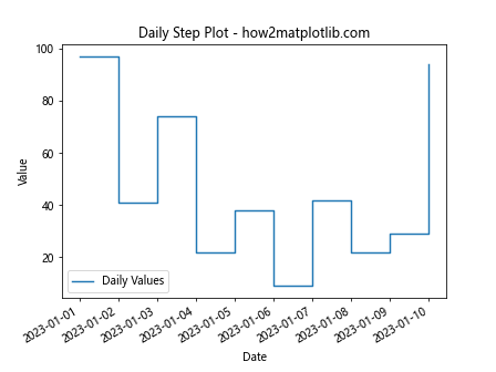
This example creates a step plot of daily values over a 10-day period. The ‘where’ parameter is set to ‘post’ to indicate that the value changes at the end of each day.
Creating Multiple Step Plots in a Single Figure
When working with multiple datasets, you might want to create multiple step plots in a single figure. Here’s how you can do that:
import matplotlib.pyplot as plt
import numpy as np

x = np.arange(10)
y1 = np.random.randint(0, 10, 10)
y2 = np.random.randint(0, 10, 10)

plt.step(x, y1, label='Dataset 1')
plt.step(x, y2, label='Dataset 2')
plt.xlabel('X-axis')
plt.ylabel('Y-axis')
plt.title('Multiple Step Plots - how2matplotlib.com')
plt.legend()
plt.show()
Output:
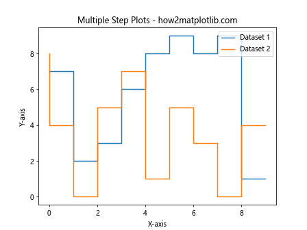
This example creates two step plots on the same axes, allowing for easy comparison between two datasets.
Customizing Axes with matplotlib.pyplot.step()
You can further customize your step plots by modifying the axes. Let’s look at an example where we set custom tick locations and labels:
import matplotlib.pyplot as plt
import numpy as np

x = np.arange(0, 10, 0.1)
y = np.sin(x)

plt.step(x, y, label='Sin(x) Step Plot')
plt.xlabel('X-axis')
plt.ylabel('Y-axis')
plt.title('Customized Axes Step Plot - how2matplotlib.com')
plt.xticks(np.arange(0, 11, 2))
plt.yticks(np.arange(-1, 1.1, 0.5))
plt.legend()
plt.grid(True)
plt.show()
Output:
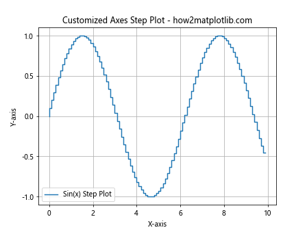
In this example, we’ve set custom tick locations for both the x and y axes, added a grid, and plotted a step version of a sine wave.
Using matplotlib.pyplot.step() with Pandas DataFrames
The matplotlib.pyplot.step() function works seamlessly with Pandas DataFrames, making it easy to visualize time series data stored in a DataFrame:
import matplotlib.pyplot as plt
import pandas as pd
import numpy as np

dates = pd.date_range(start='2023-01-01', periods=10, freq='D')
df = pd.DataFrame({'Date': dates, 'Value': np.random.randint(0, 100, 10)})

plt.step(df['Date'], df['Value'], where='post', label='DataFrame Values')
plt.xlabel('Date')
plt.ylabel('Value')
plt.title('Step Plot from DataFrame - how2matplotlib.com')
plt.legend()
plt.gcf().autofmt_xdate()  # Rotate and align the tick labels
plt.show()
Output:
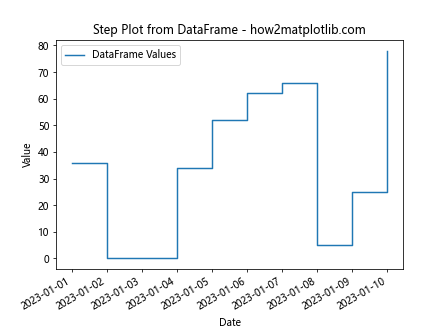
This example creates a step plot from a Pandas DataFrame containing date and value columns.
Handling Missing Data with matplotlib.pyplot.step()
When dealing with real-world data, you might encounter missing values. The matplotlib.pyplot.step() function can handle missing data gracefully:
import matplotlib.pyplot as plt
import numpy as np

x = np.arange(10)
y = np.random.randint(0, 10, 10)
y[3] = np.nan  # Introduce a missing value

plt.step(x, y, where='mid', label='Data with Missing Value')
plt.xlabel('X-axis')
plt.ylabel('Y-axis')
plt.title('Step Plot with Missing Data - how2matplotlib.com')
plt.legend()
plt.show()
In this example, we’ve introduced a missing value (NaN) in the y data. The matplotlib.pyplot.step() function will automatically handle this by not drawing a line for the missing data point.
Creating Filled Step Plots
You can create filled step plots using the ‘fill’ parameter in combination with matplotlib.pyplot.step():
import matplotlib.pyplot as plt
import numpy as np

x = np.arange(10)
y = np.random.randint(0, 10, 10)

plt.step(x, y, where='mid', label='Filled Step Plot', alpha=0.5)
plt.fill_between(x, y, step='mid', alpha=0.2)
plt.xlabel('X-axis')
plt.ylabel('Y-axis')
plt.title('Filled Step Plot - how2matplotlib.com')
plt.legend()
plt.show()
Output:
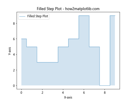
This example creates a filled step plot by using plt.fill_between() in combination with plt.step(). The ‘alpha’ parameter is used to control the transparency of the fill.
Using matplotlib.pyplot.step() for Cumulative Distributions
Step plots are excellent for visualizing cumulative distributions. Here’s an example:
import matplotlib.pyplot as plt
import numpy as np

data = np.random.normal(0, 1, 1000)
x = np.sort(data)
y = np.arange(len(data)) / float(len(data))

plt.step(x, y, label='Cumulative Distribution')
plt.xlabel('Value')
plt.ylabel('Cumulative Probability')
plt.title('Cumulative Distribution Step Plot - how2matplotlib.com')
plt.legend()
plt.show()
Output:
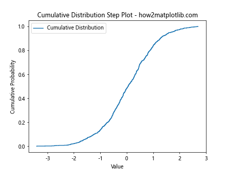
This example creates a step plot of the cumulative distribution function for a normal distribution.
Customizing Step Plots with Logarithmic Scales
For data that spans multiple orders of magnitude, using a logarithmic scale can be helpful. Here’s how you can create a step plot with a logarithmic y-axis:
import matplotlib.pyplot as plt
import numpy as np

x = np.arange(10)
y = np.exp(x)

plt.step(x, y, label='Exponential Data')
plt.yscale('log')
plt.xlabel('X-axis')
plt.ylabel('Y-axis (log scale)')
plt.title('Step Plot with Log Scale - how2matplotlib.com')
plt.legend()
plt.grid(True)
plt.show()
Output:
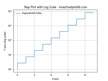
This example creates a step plot of exponential data and uses a logarithmic scale for the y-axis to better visualize the rapid growth.
Creating Horizontal Step Plots
While the default orientation for step plots is vertical, you can create horizontal step plots by swapping the x and y arguments and using plt.gca().invert_yaxis():
import matplotlib.pyplot as plt
import numpy as np

y = np.arange(10)
x = np.random.randint(0, 10, 10)

plt.step(x, y, where='mid', label='Horizontal Step Plot')
plt.gca().invert_yaxis()
plt.ylabel('Y-axis')
plt.xlabel('X-axis')
plt.title('Horizontal Step Plot - how2matplotlib.com')
plt.legend()
plt.show()
Output:
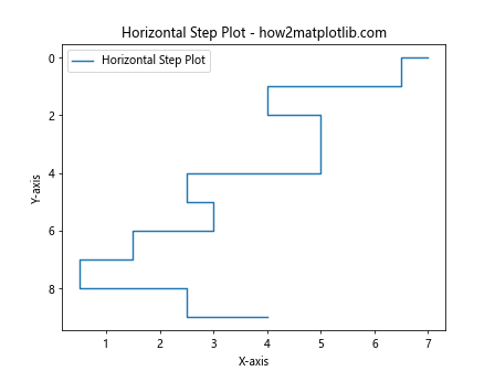
This example creates a horizontal step plot by swapping the x and y arguments and inverting the y-axis.
Using matplotlib.pyplot.step() with Subplots
When working with multiple datasets or comparing different aspects of your data, using subplots can be very helpful. Here’s an example of how to use matplotlib.pyplot.step() with subplots:
import matplotlib.pyplot as plt
import numpy as np

x = np.arange(10)
y1 = np.random.randint(0, 10, 10)
y2 = np.random.randint(0, 10, 10)

fig, (ax1, ax2) = plt.subplots(2, 1, figsize=(8, 8))

ax1.step(x, y1, where='pre', label='Dataset 1')
ax1.set_title('Subplot 1 - how2matplotlib.com')
ax1.legend()

ax2.step(x, y2, where='post', label='Dataset 2')
ax2.set_title('Subplot 2 - how2matplotlib.com')
ax2.legend()

plt.tight_layout()
plt.show()
Output:
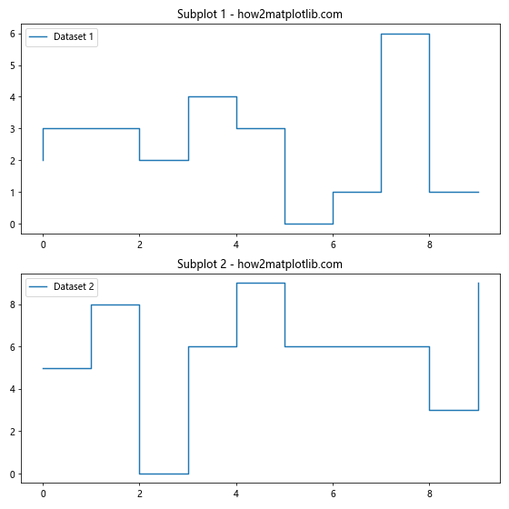
This example creates two subplots, each containing a different step plot. This allows for easy comparison between two datasets or different representations of the same data.
Animating Step Plots
You can create animated step plots to visualize how your data changes over time. Here’s a simple example using matplotlib’s animation functionality:
import matplotlib.pyplot as plt
import matplotlib.animation as animation
import numpy as np

fig, ax = plt.subplots()

x = np.arange(10)
y = np.random.randint(0, 10, 10)

line, = ax.step(x, y, where='mid', label='Animated Step Plot')
ax.set_xlim(0, 9)
ax.set_ylim(0, 10)
ax.set_title('Animated Step Plot - how2matplotlib.com')
ax.legend()

def update(frame):
    y = np.random.randint(0, 10, 10)
    line.set_ydata(y)
    return line,

ani = animation.FuncAnimation(fig, update, frames=100, interval=200, blit=True)
plt.show()
Output:
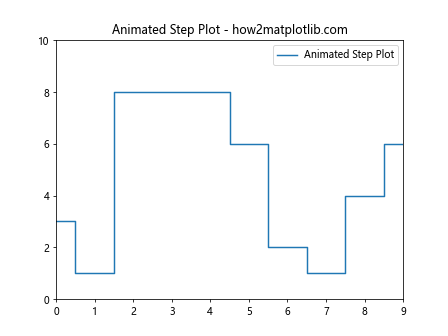
This example creates an animated step plot where the y values change randomly in each frame. Note that to actually see the animation, you’ll need to run this in an environment that supports matplotlib animations.
Conclusion
The matplotlib.pyplot.step() function is a versatile tool for creating step plots in Python. Whether you’re visualizing discrete changes in data, working with time series, or creating cumulative distribution plots, this function provides a powerful and flexible way to represent your data.
Throughout this comprehensive guide, we’ve explored various aspects of the matplotlib.pyplot.step() function, including its basic usage, customization options, and advanced applications. We’ve seen how to modify line styles and colors, add markers, combine step plots with other plot types, handle time series data, work with multiple datasets, customize axes, integrate with Pandas DataFrames, handle missing data, create filled step plots, visualize cumulative distributions, use logarithmic scales, create horizontal step plots, work with subplots, and even create animated step plots.
By mastering the matplotlib.pyplot.step() function, you can create clear and informative visualizations that effectively communicate discrete changes in your data. This function is particularly useful in fields such as finance, where stock prices change at discrete intervals, or in scientific applications where measurements are taken at specific time points.
As you continue to work with matplotlib.pyplot.step(), remember that the key to creating effective visualizations is to understand your data and choose the appropriate representation. Step plots are ideal for data that changes at discrete intervals, but they may not be the best choice for continuous data or data with very high frequency changes.
Here are some final tips to keep in mind when using matplotlib.pyplot.step():
- Always label your axes and provide a title for your plot. This helps viewers understand what they’re looking at.
Use the ‘where’ parameter thoughtfully. ‘pre’, ‘post’, and ‘mid’ can significantly change how your data is interpreted.
Combine step plots with other plot types when it makes sense to do so. This can provide additional context or allow for easier comparisons.
Don’t be afraid to customize your plots. Matplotlib offers a wide range of customization options that can help you create exactly the visualization you need.
When working with time series data, pay attention to the formatting of your date axis. The plt.gcf().autofmt_xdate() function can be very helpful for improving readability.
If you’re dealing with large datasets, consider using downsampling techniques to improve performance and readability of your step plots.
Always consider your audience when creating visualizations. What might be obvious to you may not be clear to others, so strive for clarity and simplicity in your plots.
To further illustrate the versatility of matplotlib.pyplot.step(), let’s look at one final example that combines several of the techniques we’ve discussed: