Comprehensive Guide to Using matplotlib.pyplot.semilogy() Function in Python for Data Visualization
matplotlib.pyplot.semilogy() function in Python is a powerful tool for creating semi-logarithmic plots. This function is part of the Matplotlib library, which is widely used for data visualization in Python. In this comprehensive guide, we’ll explore the matplotlib.pyplot.semilogy() function in depth, covering its usage, parameters, and various applications in data visualization.
Understanding the matplotlib.pyplot.semilogy() Function
The matplotlib.pyplot.semilogy() function is specifically designed to create plots with a logarithmic scale on the y-axis and a linear scale on the x-axis. This type of plot is particularly useful when dealing with data that spans multiple orders of magnitude on the y-axis, while maintaining a linear relationship on the x-axis.
Let’s start with a basic example to illustrate the usage of matplotlib.pyplot.semilogy():
import matplotlib.pyplot as plt
import numpy as np

x = np.linspace(0, 10, 100)
y = np.exp(x)

plt.semilogy(x, y)
plt.title('Basic semilogy plot - how2matplotlib.com')
plt.xlabel('X-axis (linear)')
plt.ylabel('Y-axis (logarithmic)')
plt.show()
Output:
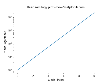
In this example, we create a simple semi-logarithmic plot using matplotlib.pyplot.semilogy(). The x-axis represents linear values from 0 to 10, while the y-axis shows the exponential function on a logarithmic scale.
Comparing Linear and Logarithmic Scales
To better understand the advantage of using matplotlib.pyplot.semilogy(), let’s compare a linear plot with a semi-logarithmic plot of the same data:
import matplotlib.pyplot as plt
import numpy as np

x = np.linspace(0, 5, 100)
y = np.exp(x)

fig, (ax1, ax2) = plt.subplots(1, 2, figsize=(12, 5))

ax1.plot(x, y)
ax1.set_title('Linear scale - how2matplotlib.com')
ax1.set_xlabel('X-axis')
ax1.set_ylabel('Y-axis')

ax2.semilogy(x, y)
ax2.set_title('Semi-logarithmic scale - how2matplotlib.com')
ax2.set_xlabel('X-axis')
ax2.set_ylabel('Y-axis (logarithmic)')

plt.tight_layout()
plt.show()
Output:
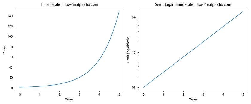
This example creates two subplots side by side, one with a linear scale and the other with a semi-logarithmic scale. The difference in how the data is represented becomes apparent, especially for exponential growth.
Plotting Multiple Datasets with matplotlib.pyplot.semilogy()
The matplotlib.pyplot.semilogy() function can be used to plot multiple datasets on the same graph. This is particularly useful when comparing different trends or data series:
import matplotlib.pyplot as plt
import numpy as np

x = np.linspace(0, 10, 100)
y1 = np.exp(x)
y2 = x**2
y3 = x**3

plt.semilogy(x, y1, label='exp(x)')
plt.semilogy(x, y2, label='x^2')
plt.semilogy(x, y3, label='x^3')

plt.title('Multiple datasets - how2matplotlib.com')
plt.xlabel('X-axis')
plt.ylabel('Y-axis (logarithmic)')
plt.legend()
plt.grid(True)
plt.show()
Output:
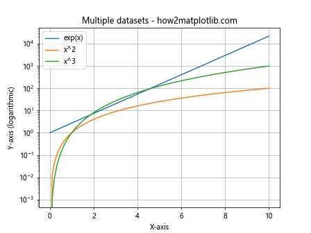
In this example, we plot three different functions (exponential, quadratic, and cubic) on the same semi-logarithmic plot. The legend helps to identify each curve.
Customizing Tick Labels in matplotlib.pyplot.semilogy()
When working with semi-logarithmic plots, you might want to customize the tick labels on the y-axis. Here’s an example of how to do this:
import matplotlib.pyplot as plt
import numpy as np

x = np.linspace(1, 10, 100)
y = np.exp(x)

fig, ax = plt.subplots()

ax.semilogy(x, y)
ax.set_title('Customized tick labels - how2matplotlib.com')
ax.set_xlabel('X-axis')
ax.set_ylabel('Y-axis (logarithmic)')

# Customize y-axis tick labels
y_ticks = [10**i for i in range(0, 5)]
ax.set_yticks(y_ticks)
ax.set_yticklabels([f'1e{i}' for i in range(0, 5)])

plt.grid(True)
plt.show()
Output:
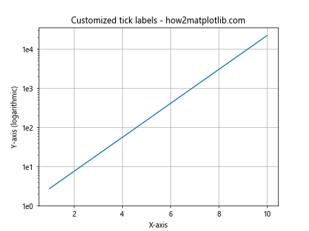
In this example, we manually set the y-axis tick locations and labels to display powers of 10 in scientific notation.
Using matplotlib.pyplot.semilogy() with Real-World Data
Let’s consider a real-world scenario where matplotlib.pyplot.semilogy() can be particularly useful. Suppose we’re analyzing the growth of a bacterial population over time:
import matplotlib.pyplot as plt
import numpy as np

time = np.array([0, 1, 2, 3, 4, 5, 6, 7, 8])
bacteria_count = np.array([100, 200, 400, 800, 1600, 3200, 6400, 12800, 25600])

plt.semilogy(time, bacteria_count, marker='o')
plt.title('Bacterial Growth - how2matplotlib.com')
plt.xlabel('Time (hours)')
plt.ylabel('Bacteria Count (logarithmic)')
plt.grid(True, which="both", ls="-", alpha=0.2)
plt.show()
Output:
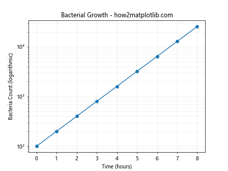
This example demonstrates how matplotlib.pyplot.semilogy() can effectively visualize exponential growth, such as bacterial population growth, which is difficult to represent clearly on a linear scale.
Combining matplotlib.pyplot.semilogy() with Other Plot Types
matplotlib.pyplot.semilogy() can be combined with other plot types to create more complex visualizations. Here’s an example that combines a semi-logarithmic plot with error bars:
import matplotlib.pyplot as plt
import numpy as np

x = np.linspace(1, 10, 10)
y = np.exp(x)
yerr = y * 0.1  # 10% error

plt.semilogy(x, y, 'bo-', label='Data')
plt.errorbar(x, y, yerr=yerr, fmt='none', ecolor='r', capsize=5)

plt.title('Semilogy plot with error bars - how2matplotlib.com')
plt.xlabel('X-axis')
plt.ylabel('Y-axis (logarithmic)')
plt.legend()
plt.grid(True)
plt.show()
Output:
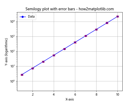
This example shows how to add error bars to a semi-logarithmic plot, which can be useful when dealing with experimental data that has associated uncertainties.
Using matplotlib.pyplot.semilogy() for Financial Data
Semi-logarithmic plots are often used in financial analysis, particularly for visualizing stock prices or market indices over time. Here’s an example:
import matplotlib.pyplot as plt
import numpy as np

years = np.arange(1990, 2021)
stock_price = 100 * (1.07 ** (years - 1990))  # Assuming 7% annual growth

plt.semilogy(years, stock_price, 'g-')
plt.title('Stock Price Growth (1990-2020) - how2matplotlib.com')
plt.xlabel('Year')
plt.ylabel('Stock Price (USD, logarithmic)')
plt.grid(True, which="both", ls="-", alpha=0.2)
plt.show()
Output:
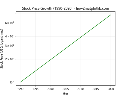
This example simulates the growth of a stock price over 30 years, assuming a 7% annual growth rate. The semi-logarithmic scale helps to visualize the percentage change over time more clearly than a linear scale would.
Handling Negative Values in matplotlib.pyplot.semilogy()
It’s important to note that matplotlib.pyplot.semilogy() cannot directly plot negative values on the y-axis, as logarithms are undefined for negative numbers. However, there are workarounds for visualizing data that includes negative values:
import matplotlib.pyplot as plt
import numpy as np

x = np.linspace(0, 10, 100)
y = np.sin(x) * np.exp(x)

plt.semilogy(x, np.abs(y))
plt.title('Absolute values in semilogy plot - how2matplotlib.com')
plt.xlabel('X-axis')
plt.ylabel('|Y| (logarithmic)')
plt.grid(True)

# Manually add sign information
for i, yi in enumerate(y):
    if yi < 0:
        plt.text(x[i], np.abs(yi), '-', ha='center', va='bottom')

plt.show()
Output:
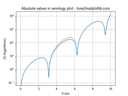
In this example, we plot the absolute values of a sinusoidal function multiplied by an exponential. We then manually add minus signs to indicate negative values.
Customizing the Appearance of matplotlib.pyplot.semilogy() Plots
matplotlib.pyplot.semilogy() plots can be further customized to enhance their appearance and readability. Here's an example that demonstrates various customization options:
import matplotlib.pyplot as plt
import numpy as np

x = np.linspace(1, 10, 100)
y1 = np.exp(x)
y2 = x**2

fig, ax = plt.subplots(figsize=(10, 6))

ax.semilogy(x, y1, 'b-', linewidth=2, label='exp(x)')
ax.semilogy(x, y2, 'r--', linewidth=2, label='x^2')

ax.set_title('Customized Semilogy Plot - how2matplotlib.com', fontsize=16)
ax.set_xlabel('X-axis', fontsize=12)
ax.set_ylabel('Y-axis (logarithmic)', fontsize=12)

ax.legend(fontsize=10)
ax.grid(True, which="both", ls="-", alpha=0.2)

ax.tick_params(axis='both', which='major', labelsize=10)

plt.tight_layout()
plt.show()
Output:
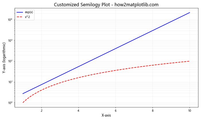
This example demonstrates how to customize various aspects of the plot, including line styles, colors, font sizes, grid appearance, and overall layout.
Using matplotlib.pyplot.semilogy() with Pandas DataFrames
matplotlib.pyplot.semilogy() can be easily integrated with Pandas DataFrames for data analysis and visualization:
import matplotlib.pyplot as plt
import pandas as pd
import numpy as np

# Create a sample DataFrame
dates = pd.date_range(start='2020-01-01', end='2020-12-31', freq='D')
data = pd.DataFrame({
    'Date': dates,
    'Value': np.exp(np.linspace(0, 5, len(dates)))
})

plt.figure(figsize=(12, 6))
plt.semilogy(data['Date'], data['Value'])
plt.title('Time Series Data - how2matplotlib.com')
plt.xlabel('Date')
plt.ylabel('Value (logarithmic)')
plt.grid(True, which="both", ls="-", alpha=0.2)
plt.xticks(rotation=45)
plt.tight_layout()
plt.show()
Output:
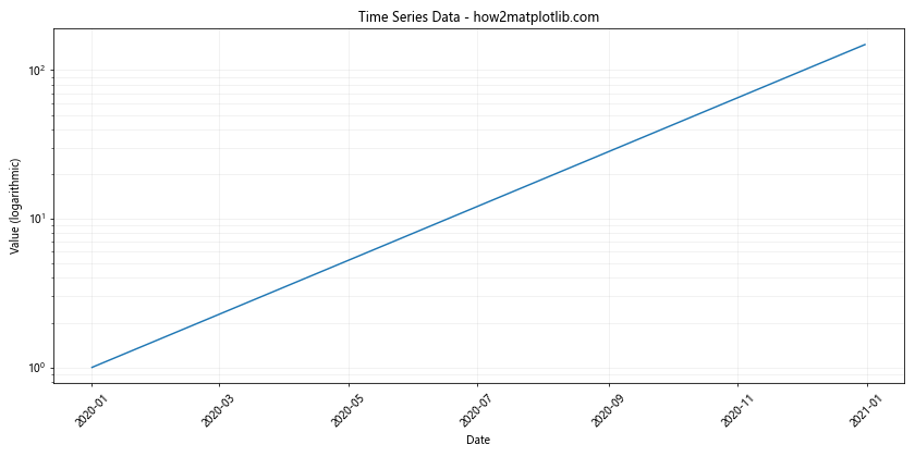
This example demonstrates how to use matplotlib.pyplot.semilogy() with a Pandas DataFrame containing time series data.
Comparing Multiple Y-axes with matplotlib.pyplot.semilogy()
Sometimes, you might need to plot data with different scales on the same graph. Here's how you can use matplotlib.pyplot.semilogy() with multiple y-axes:
import matplotlib.pyplot as plt
import numpy as np

x = np.linspace(0, 10, 100)
y1 = np.exp(x)
y2 = x**2

fig, ax1 = plt.subplots()

color = 'tab:blue'
ax1.set_xlabel('X-axis')
ax1.set_ylabel('exp(x)', color=color)
ax1.semilogy(x, y1, color=color)
ax1.tick_params(axis='y', labelcolor=color)

ax2 = ax1.twinx()  # instantiate a second axes that shares the same x-axis

color = 'tab:orange'
ax2.set_ylabel('x^2', color=color)
ax2.plot(x, y2, color=color)
ax2.tick_params(axis='y', labelcolor=color)

plt.title('Two scales - how2matplotlib.com')
fig.tight_layout()
plt.show()
Output:
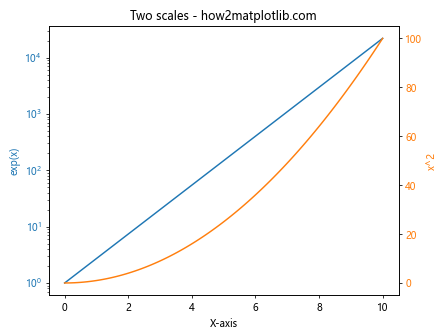
This example shows how to create a plot with two y-axes, one logarithmic (using semilogy) and one linear, allowing for the comparison of data with different scales.
Using matplotlib.pyplot.semilogy() for Scientific Data
Semi-logarithmic plots are commonly used in scientific fields to visualize data that spans multiple orders of magnitude. Here's an example that might be used in physics or astronomy:
import matplotlib.pyplot as plt
import numpy as np

# Planck's law for blackbody radiation
def planck(wav, T):
    h = 6.626e-34  # Planck constant
    c = 3.0e+8     # Speed of light
    k = 1.38e-23   # Boltzmann constant
    a = 2.0*h*c**2
    b = h*c/(wav*k*T)
    intensity = a / ((wav**5) * (np.exp(b) - 1.0))
    return intensity

wavelengths = np.linspace(1e-7, 1e-5, 1000)
T1, T2, T3 = 3000, 4000, 5000  # temperatures in Kelvin

plt.figure(figsize=(10, 6))
plt.semilogy(wavelengths, planck(wavelengths, T1), 'r-', label='3000 K')
plt.semilogy(wavelengths, planck(wavelengths, T2), 'g-', label='4000 K')
plt.semilogy(wavelengths, planck(wavelengths, T3), 'b-', label='5000 K')

plt.title("Planck's Law - Blackbody Radiation - how2matplotlib.com")
plt.xlabel('Wavelength (m)')
plt.ylabel('Spectral Radiance (W/sr/m^3)')
plt.legend()
plt.grid(True, which="both", ls="-", alpha=0.2)
plt.show()
Output:
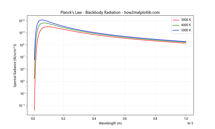
This example demonstrates the use of matplotlib.pyplot.semilogy() to plot Planck's law for blackbody radiation at different temperatures, which is a common application in astrophysicsand physics.
Animating matplotlib.pyplot.semilogy() Plots
matplotlib.pyplot.semilogy() can also be used in animations to visualize changing data over time. Here's an example of how to create a simple animation using semilogy:
import matplotlib.pyplot as plt
import numpy as np
from matplotlib.animation import FuncAnimation

fig, ax = plt.subplots()
x = np.linspace(0, 10, 100)
line, = ax.semilogy(x, np.exp(x))

def animate(i):
    line.set_ydata(np.exp(x + i/10))
    return line,

ani = FuncAnimation(fig, animate, frames=100, interval=50, blit=True)
plt.title('Animated semilogy plot - how2matplotlib.com')
plt.xlabel('X-axis')
plt.ylabel('Y-axis (logarithmic)')
plt.show()
Output:
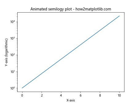
This example creates an animation of an exponential function shifting upwards over time, demonstrating how matplotlib.pyplot.semilogy() can be used in dynamic visualizations.
Handling Data with Zero Values in matplotlib.pyplot.semilogy()
When using matplotlib.pyplot.semilogy(), it's important to be aware that zero values cannot be plotted on a logarithmic scale. Here's an example of how to handle data that includes zero values:
import matplotlib.pyplot as plt
import numpy as np

x = np.linspace(0, 10, 11)
y = x**2

# Replace zero with a small positive value
y[y == 0] = 1e-10

plt.semilogy(x, y, 'bo-')
plt.title('Handling zero values - how2matplotlib.com')
plt.xlabel('X-axis')
plt.ylabel('Y-axis (logarithmic)')
plt.grid(True, which="both", ls="-", alpha=0.2)
plt.show()
Output:
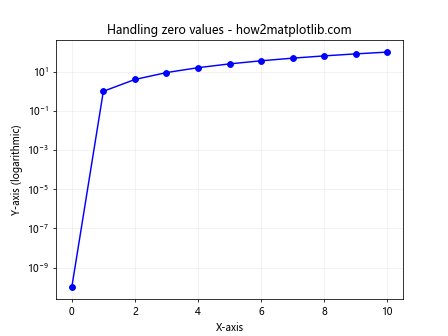
In this example, we replace zero values with a very small positive number to allow them to be plotted on the logarithmic scale.
Combining matplotlib.pyplot.semilogy() with Subplots
matplotlib.pyplot.semilogy() can be used effectively with subplots to compare different datasets or aspects of data:
import matplotlib.pyplot as plt
import numpy as np

x = np.linspace(1, 10, 100)

fig, (ax1, ax2) = plt.subplots(1, 2, figsize=(12, 5))

ax1.semilogy(x, np.exp(x), 'b-')
ax1.set_title('Exponential Growth - how2matplotlib.com')
ax1.set_xlabel('X-axis')
ax1.set_ylabel('Y-axis (logarithmic)')

ax2.semilogy(x, x**2, 'r-')
ax2.set_title('Quadratic Growth - how2matplotlib.com')
ax2.set_xlabel('X-axis')
ax2.set_ylabel('Y-axis (logarithmic)')

plt.tight_layout()
plt.show()
Output:
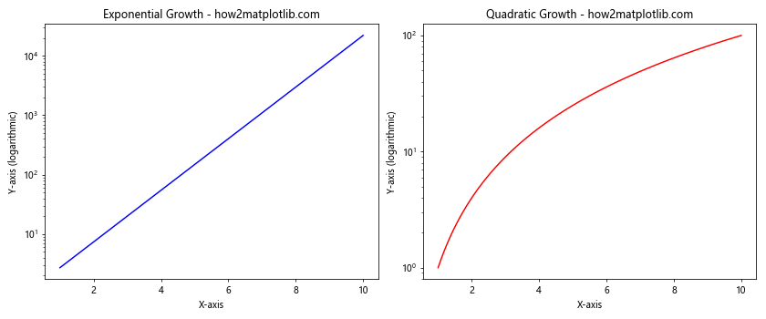
This example creates two subplots side by side, each using matplotlib.pyplot.semilogy() to display different growth patterns.
Using matplotlib.pyplot.semilogy() for Data Comparison
matplotlib.pyplot.semilogy() is particularly useful when comparing data that grows at different rates. Here's an example comparing linear, quadratic, and exponential growth:
import matplotlib.pyplot as plt
import numpy as np

x = np.linspace(1, 10, 100)
y1 = x
y2 = x**2
y3 = np.exp(x)

plt.semilogy(x, y1, 'b-', label='Linear')
plt.semilogy(x, y2, 'r-', label='Quadratic')
plt.semilogy(x, y3, 'g-', label='Exponential')

plt.title('Growth Comparison - how2matplotlib.com')
plt.xlabel('X-axis')
plt.ylabel('Y-axis (logarithmic)')
plt.legend()
plt.grid(True, which="both", ls="-", alpha=0.2)
plt.show()
Output:
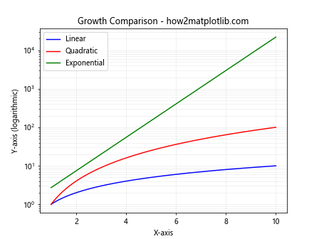
This example clearly shows the differences in growth rates between linear, quadratic, and exponential functions, which might be less apparent on a linear scale.
Conclusion
The matplotlib.pyplot.semilogy() function is a powerful tool for creating semi-logarithmic plots in Python. It's particularly useful for visualizing data that spans multiple orders of magnitude or exhibits exponential behavior. Throughout this comprehensive guide, we've explored various aspects of using matplotlib.pyplot.semilogy(), including:
- Basic usage and key parameters
- Comparing linear and logarithmic scales
- Plotting multiple datasets
- Customizing tick labels and plot appearance
- Handling real-world data and financial analysis
- Dealing with negative and zero values
- Integration with Pandas DataFrames
- Creating animations and subplots
- Applications in scientific data visualization
By mastering the matplotlib.pyplot.semilogy() function, you can create more effective and insightful visualizations for a wide range of data analysis tasks. Whether you're working in finance, science, engineering, or any field that deals with exponential growth or decay, matplotlib.pyplot.semilogy() provides a valuable tool for data representation and analysis.