Comprehensive Guide to Matplotlib.pyplot.plot() Function in Python
Matplotlib.pyplot.plot() function in Python is a fundamental tool for creating line plots in data visualization. This versatile function is part of the Matplotlib library, which is widely used for creating static, animated, and interactive visualizations in Python. The plot() function allows users to create various types of line plots, from simple single-line graphs to complex multi-line plots with customized styles and features. In this comprehensive guide, we’ll explore the Matplotlib.pyplot.plot() function in depth, covering its syntax, parameters, and numerous applications with practical examples.
Understanding the Basics of Matplotlib.pyplot.plot() Function
The Matplotlib.pyplot.plot() function is the cornerstone of line plotting in Matplotlib. It provides a simple and intuitive way to create line plots by connecting a series of points. The basic syntax of the plot() function is as follows:
import matplotlib.pyplot as plt

plt.plot(x, y)
plt.show()
In this basic example, ‘x’ and ‘y’ represent the data points to be plotted. The plot() function automatically connects these points with straight lines. Let’s look at a simple example to illustrate this:
import matplotlib.pyplot as plt

x = [1, 2, 3, 4, 5]
y = [2, 4, 6, 8, 10]

plt.plot(x, y)
plt.title("Simple Line Plot - how2matplotlib.com")
plt.xlabel("X-axis")
plt.ylabel("Y-axis")
plt.show()
Output:
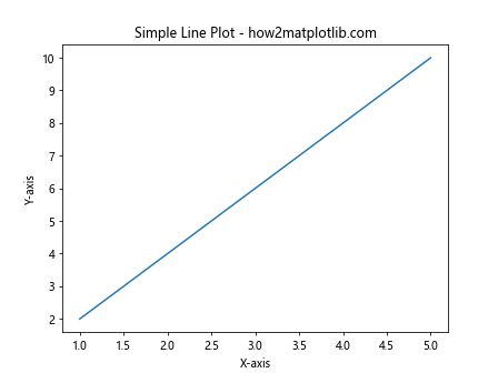
In this example, we create a simple line plot using the Matplotlib.pyplot.plot() function. We define two lists, ‘x’ and ‘y’, representing the x and y coordinates of our data points. The plot() function takes these lists as arguments and creates a line plot connecting the points. We also add a title and labels to the axes for better clarity.
Customizing Line Styles with Matplotlib.pyplot.plot()
One of the strengths of the Matplotlib.pyplot.plot() function is its ability to customize line styles. You can modify the color, line style, and marker style of your plots using various format strings. Here’s an example demonstrating different line styles:
import matplotlib.pyplot as plt

x = [1, 2, 3, 4, 5]
y1 = [1, 4, 9, 16, 25]
y2 = [1, 8, 27, 64, 125]

plt.plot(x, y1, 'r--', label='Square')
plt.plot(x, y2, 'b:', label='Cube')
plt.title("Customized Line Styles - how2matplotlib.com")
plt.xlabel("X-axis")
plt.ylabel("Y-axis")
plt.legend()
plt.show()
Output:
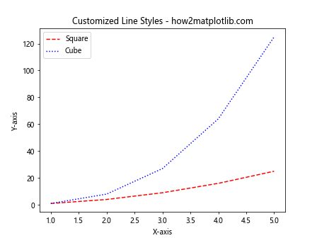
In this example, we use the Matplotlib.pyplot.plot() function to create two lines with different styles. The ‘r–‘ format string creates a red dashed line, while ‘b:’ creates a blue dotted line. We also add labels to each line and include a legend for better interpretation.
Multiple Plots with Matplotlib.pyplot.plot()
The Matplotlib.pyplot.plot() function allows you to create multiple plots on the same axes. This is particularly useful when comparing different datasets or visualizing related information. Here’s an example of creating multiple plots:
import matplotlib.pyplot as plt
import numpy as np

x = np.linspace(0, 10, 100)
y1 = np.sin(x)
y2 = np.cos(x)
y3 = np.tan(x)

plt.plot(x, y1, label='sin(x)')
plt.plot(x, y2, label='cos(x)')
plt.plot(x, y3, label='tan(x)')
plt.title("Multiple Trigonometric Functions - how2matplotlib.com")
plt.xlabel("X-axis")
plt.ylabel("Y-axis")
plt.legend()
plt.grid(True)
plt.show()
Output:
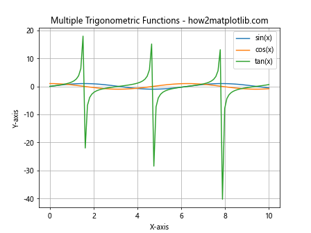
In this example, we use the Matplotlib.pyplot.plot() function to plot three trigonometric functions (sine, cosine, and tangent) on the same axes. We use NumPy to generate the x values and calculate the corresponding y values for each function. The plot() function is called three times, once for each function, with different labels. We also add a grid to the plot for better readability.
Customizing Markers with Matplotlib.pyplot.plot()
The Matplotlib.pyplot.plot() function allows you to add markers to your data points, which can be useful for emphasizing specific data points or making your plot more visually appealing. Here’s an example demonstrating different marker styles:
import matplotlib.pyplot as plt

x = [1, 2, 3, 4, 5]
y = [1, 4, 9, 16, 25]

plt.plot(x, y, 'ro-', markersize=10, linewidth=2, label='Square')
plt.plot(x, y, 'b^--', markersize=8, linewidth=1, label='Square (different style)')
plt.title("Customized Markers - how2matplotlib.com")
plt.xlabel("X-axis")
plt.ylabel("Y-axis")
plt.legend()
plt.show()
Output:
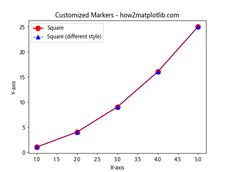
In this example, we use the Matplotlib.pyplot.plot() function to create two lines with different marker styles. The ‘ro-‘ format string creates red circular markers connected by solid lines, while ‘b^–‘ creates blue triangular markers connected by dashed lines. We also customize the marker size and line width for each plot.
Using Matplotlib.pyplot.plot() with Pandas DataFrames
The Matplotlib.pyplot.plot() function integrates seamlessly with Pandas DataFrames, making it easy to visualize data from structured datasets. Here’s an example of using plot() with a Pandas DataFrame:
import matplotlib.pyplot as plt
import pandas as pd

data = {
    'Year': [2015, 2016, 2017, 2018, 2019],
    'Sales': [100, 120, 140, 180, 200],
    'Expenses': [80, 90, 100, 110, 120]
}

df = pd.DataFrame(data)

plt.plot(df['Year'], df['Sales'], label='Sales')
plt.plot(df['Year'], df['Expenses'], label='Expenses')
plt.title("Sales vs Expenses - how2matplotlib.com")
plt.xlabel("Year")
plt.ylabel("Amount")
plt.legend()
plt.show()
Output:
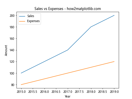
In this example, we create a Pandas DataFrame with sales and expenses data over several years. We then use the Matplotlib.pyplot.plot() function to create two line plots, one for sales and one for expenses, using the ‘Year’ column as the x-axis.
Creating Subplots with Matplotlib.pyplot.plot()
The Matplotlib.pyplot.plot() function can be used in conjunction with subplots to create multiple plots in a single figure. This is useful for comparing different datasets or visualizing related information side by side. Here’s an example:
import matplotlib.pyplot as plt
import numpy as np

x = np.linspace(0, 10, 100)
y1 = np.sin(x)
y2 = np.cos(x)

fig, (ax1, ax2) = plt.subplots(1, 2, figsize=(12, 5))

ax1.plot(x, y1)
ax1.set_title("Sine Function - how2matplotlib.com")
ax1.set_xlabel("X-axis")
ax1.set_ylabel("Y-axis")

ax2.plot(x, y2)
ax2.set_title("Cosine Function - how2matplotlib.com")
ax2.set_xlabel("X-axis")
ax2.set_ylabel("Y-axis")

plt.tight_layout()
plt.show()
Output:
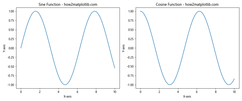
In this example, we create two subplots side by side using plt.subplots(). We then use the Matplotlib.pyplot.plot() function to create a sine plot in the first subplot and a cosine plot in the second subplot. This allows for easy comparison between the two trigonometric functions.
Customizing Colors in Matplotlib.pyplot.plot()
The Matplotlib.pyplot.plot() function offers extensive color customization options. You can specify colors using color names, hex codes, or RGB values. Here’s an example demonstrating different color specifications:
import matplotlib.pyplot as plt
import numpy as np

x = np.linspace(0, 10, 100)
y1 = np.sin(x)
y2 = np.cos(x)
y3 = np.tan(x)

plt.plot(x, y1, color='red', label='sin(x)')
plt.plot(x, y2, color='#00FF00', label='cos(x)')
plt.plot(x, y3, color=(0, 0, 1), label='tan(x)')
plt.title("Custom Colors in Plot - how2matplotlib.com")
plt.xlabel("X-axis")
plt.ylabel("Y-axis")
plt.legend()
plt.show()
Output:
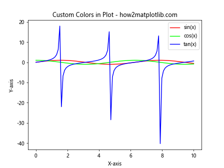
In this example, we use the Matplotlib.pyplot.plot() function to create three lines with different color specifications. The first line uses a color name (‘red’), the second uses a hex code (‘#00FF00’ for green), and the third uses an RGB tuple (0, 0, 1) for blue.
Adding Error Bars with Matplotlib.pyplot.plot()
The Matplotlib.pyplot.plot() function can be combined with plt.errorbar() to add error bars to your plots. This is particularly useful when dealing with data that has associated uncertainties. Here’s an example:
import matplotlib.pyplot as plt
import numpy as np

x = np.linspace(0, 10, 50)
y = np.sin(x)
yerr = 0.1 + 0.2 * np.random.rand(len(x))

plt.errorbar(x, y, yerr=yerr, fmt='o', label='Data with error bars')
plt.plot(x, y, 'r-', label='Sine curve')
plt.title("Error Bars in Plot - how2matplotlib.com")
plt.xlabel("X-axis")
plt.ylabel("Y-axis")
plt.legend()
plt.show()
Output:
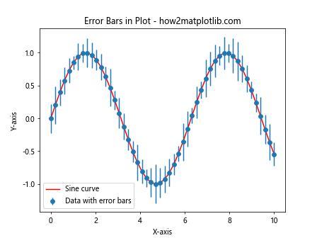
In this example, we use plt.errorbar() to create a scatter plot with error bars, and then use the Matplotlib.pyplot.plot() function to overlay a sine curve on the same axes. This combination allows for a clear visualization of both the data points with their uncertainties and the underlying trend.
Creating Filled Areas with Matplotlib.pyplot.plot()
The Matplotlib.pyplot.plot() function can be used in conjunction with plt.fill_between() to create filled areas between lines or curves. This is useful for visualizing ranges or confidence intervals. Here’s an example:
import matplotlib.pyplot as plt
import numpy as np

x = np.linspace(0, 10, 100)
y1 = np.sin(x)
y2 = np.sin(x) + 0.5

plt.plot(x, y1, 'b-', label='Lower bound')
plt.plot(x, y2, 'r-', label='Upper bound')
plt.fill_between(x, y1, y2, alpha=0.2)
plt.title("Filled Area Between Curves - how2matplotlib.com")
plt.xlabel("X-axis")
plt.ylabel("Y-axis")
plt.legend()
plt.show()
Output:
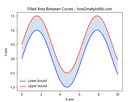
In this example, we use the Matplotlib.pyplot.plot() function to create two sine curves with an offset. We then use plt.fill_between() to fill the area between these curves, creating a shaded region. This technique is often used to represent confidence intervals or ranges of values.
Creating Step Plots with Matplotlib.pyplot.plot()
The Matplotlib.pyplot.plot() function can create step plots, which are useful for visualizing discrete changes in data. Here’s an example:
import matplotlib.pyplot as plt
import numpy as np

x = np.arange(10)
y = np.random.randint(0, 10, 10)

plt.step(x, y, where='pre', label='pre (default)')
plt.plot(x, y, 'o--', alpha=0.5, label='data points')
plt.title("Step Plot - how2matplotlib.com")
plt.xlabel("X-axis")
plt.ylabel("Y-axis")
plt.legend()
plt.show()
Output:
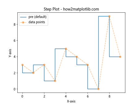
In this example, we use plt.step() (which is a wrapper around plot()) to create a step plot. The ‘where’ parameter determines where the step occurs: ‘pre’ means the step happens at the beginning of each interval. We also overlay the original data points using the Matplotlib.pyplot.plot() function for comparison.
Creating Polar Plots with Matplotlib.pyplot.plot()
The Matplotlib.pyplot.plot() function can be used to create polar plots, which are useful for visualizing directional or cyclical data. Here’s an example:
import matplotlib.pyplot as plt
import numpy as np

r = np.arange(0, 2, 0.01)
theta = 2 * np.pi * r

fig, ax = plt.subplots(subplot_kw={'projection': 'polar'})
ax.plot(theta, r)
ax.set_rticks([0.5, 1, 1.5, 2])
ax.set_title("Polar Plot - how2matplotlib.com")
plt.show()
Output:
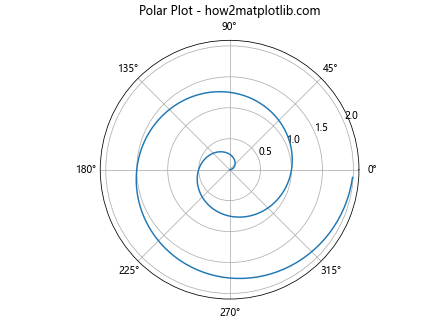
In this example, we create a polar plot using the Matplotlib.pyplot.plot() function. We set up the plot with a polar projection and then use plot() to create a spiral pattern. The radial ticks are customized using set_rticks().
Customizing Line Properties with Matplotlib.pyplot.plot()
The Matplotlib.pyplot.plot() function allows for detailed customization of line properties. You can adjust properties such as line width, dash style, and alpha (transparency). Here’s an example:
import matplotlib.pyplot as plt
import numpy as np

x = np.linspace(0, 10, 100)
y1 = np.sin(x)
y2 = np.cos(x)

plt.plot(x, y1, linewidth=2, linestyle='--', color='r', alpha=0.7, label='sin(x)')
plt.plot(x, y2, linewidth=3, linestyle='-.', color='b', alpha=0.5, label='cos(x)')
plt.title("Customized Line Properties - how2matplotlib.com")
plt.xlabel("X-axis")
plt.ylabel("Y-axis")
plt.legend()
plt.grid(True)
plt.show()
Output:
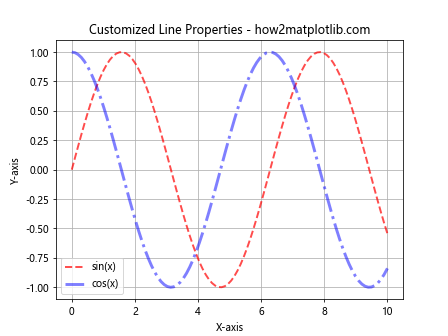
In this example, we use the Matplotlib.pyplot.plot() function to create two lines with customized properties. We adjust the line width, line style, color, and transparency (alpha) for each line. This level of customization allows for creating visually distinct and informative plots.
Creating Stacked Area Plots with Matplotlib.pyplot.plot()
The Matplotlib.pyplot.plot() function can be used in combination with plt.fill_between() to create stacked area plots. These are useful for visualizing cumulative data or parts of a whole over time. Here’s an example:
import matplotlib.pyplot as plt
import numpy as np
x = np.arange(10)
y1 = np.random.randint(1, 10, 10)
y2 = np.random.randint(1, 10, 10)
y3 = np.random.randint(1, 10, 10)
plt.plot(x, y1, 'r', label='Layer 1')
plt.fill_between(x, y1, color='r', alpha=0.3)
plt.plot(x, y1+y2, 'g', label='Layer 2')
plt.fill_between(x, y1, y1+y2, color='g', alpha=0.3)
plt.plot(x, y1+y2+y3, 'b', label='Layer 3')
plt.fill_between(x, y1+y2, y1+y2+y3, color='b', alpha=0.3)
plt.title("Stacked Area Plot - how2matplotlib.com")
plt.xlabel("X-axis")
plt.ylabel("Y-axis")
plt.legend()
plt.show()
```In this example, we use the Matplotlib.pyplot.plot() function to create the outlines of each layer, and then use plt.fill_between() to fill the areas between these lines. This creates a stacked area plot where each layer is represented by a different color.
Output:
 Function in Python")
## Creating Logarithmic Plots with Matplotlib.pyplot.plot()
The Matplotlib.pyplot.plot() function can be used with logarithmic scales, which is useful for visualizing data that spans several orders of magnitude. Here's an example:
```python
import matplotlib.pyplot as plt
import numpy as np
x = np.logspace(0, 5, 100)
y1 = x**2
y2 = x**3
plt.plot(x, y1, label='y = x^2')
plt.plot(x, y2, label='y = x^3')
plt.xscale('log')
plt.yscale('log')
plt.title("Logarithmic Plot - how2matplotlib.com")
plt.xlabel("X-axis (log scale)")
plt.ylabel("Y-axis (log scale)")
plt.legend()
plt.grid(True)
plt.show()
Output:
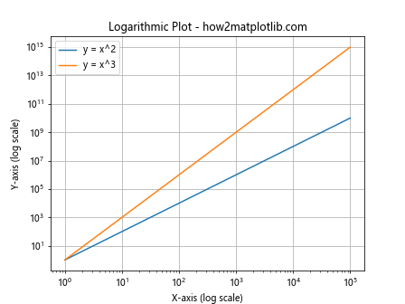
In this example, we use the Matplotlib.pyplot.plot() function to create two curves on logarithmic scales. We use np.logspace() to generate x values that are evenly spaced on a log scale, and then set both x and y axes to logarithmic scales using plt.xscale(‘log’) and plt.yscale(‘log’).
Creating Animated Plots with Matplotlib.pyplot.plot()
The Matplotlib.pyplot.plot() function can be used to create animated plots, which are useful for visualizing changing data over time. Here’s a simple example of creating an animated sine wave:
import matplotlib.pyplot as plt
import numpy as np
from matplotlib.animation import FuncAnimation

fig, ax = plt.subplots()
x = np.linspace(0, 2*np.pi, 100)
line, = ax.plot(x, np.sin(x))

def animate(i):
    line.set_ydata(np.sin(x + i/10))
    return line,

ani = FuncAnimation(fig, animate, frames=100, interval=50, blit=True)
plt.title("Animated Sine Wave - how2matplotlib.com")
plt.xlabel("X-axis")
plt.ylabel("Y-axis")
plt.show()
Output:
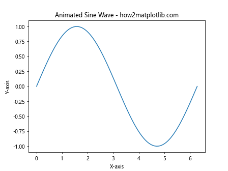
In this example, we create an initial plot using the Matplotlib.pyplot.plot() function. We then define an animation function that updates the y-data of the line in each frame. The FuncAnimation class is used to create the animation based on this function.
Creating 3D Line Plots with Matplotlib.pyplot.plot()
While the basic plot() function is 2D, Matplotlib also provides a 3D plotting capability. Here’s an example of creating a 3D line plot:
import matplotlib.pyplot as plt
import numpy as np
from mpl_toolkits.mplot3d import Axes3D

fig = plt.figure()
ax = fig.add_subplot(111, projection='3d')

t = np.linspace(0, 10, 100)
x = np.sin(t)
y = np.cos(t)
z = t

ax.plot(x, y, z)
ax.set_title("3D Line Plot - how2matplotlib.com")
ax.set_xlabel("X-axis")
ax.set_ylabel("Y-axis")
ax.set_zlabel("Z-axis")
plt.show()
Output:
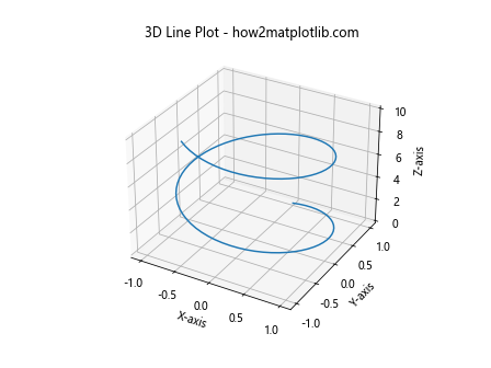
In this example, we create a 3D axes using the ‘projection’ parameter. We then use the plot() method of this 3D axes to create a 3D line plot. This creates a spiral in 3D space.
Conclusion
The Matplotlib.pyplot.plot() function is a powerful and versatile tool for creating line plots in Python. Its flexibility allows for a wide range of customizations and applications, from simple 2D plots to complex 3D visualizations and animations. By mastering the various parameters and techniques associated with the plot() function, you can create informative and visually appealing data visualizations for a variety of purposes.
Throughout this guide, we’ve explored numerous aspects of the Matplotlib.pyplot.plot() function, including:
- Basic usage and syntax
- Customizing line styles and colors
- Creating multiple plots on the same axes
- Adding markers to data points
- Integration with Pandas DataFrames
- Creating subplots
- Adding error bars
- Creating filled areas between curves
- Step plots for discrete data
- Polar plots for directional data
- Customizing line properties
- Stacked area plots
- Logarithmic plots
- Animated plots
- 3D line plots
Each of these applications demonstrates the versatility of the Matplotlib.pyplot.plot() function and its ability to adapt to various data visualization needs. Whether you’re working with simple datasets or complex, multi-dimensional data, the plot() function provides the tools necessary to create clear, informative, and visually appealing plots.