Comprehensive Guide to Using Matplotlib.pyplot.semilogx() in Python for Data Visualization
Matplotlib.pyplot.semilogx() in Python is a powerful function for creating semi-logarithmic plots. This article will provide an in-depth exploration of the Matplotlib.pyplot.semilogx() function, its usage, and various applications in data visualization. We’ll cover everything from basic usage to advanced customization techniques, accompanied by numerous examples to illustrate each concept.
Introduction to Matplotlib.pyplot.semilogx()
Matplotlib.pyplot.semilogx() is a function within the Matplotlib library that allows you to create semi-logarithmic plots. In these plots, the x-axis is scaled logarithmically while the y-axis remains linear. This type of visualization is particularly useful when dealing with data that spans several orders of magnitude on the x-axis but shows linear relationships on the y-axis.
Let’s start with a basic example of using Matplotlib.pyplot.semilogx():
import matplotlib.pyplot as plt
import numpy as np

x = np.logspace(0, 5, 100)
y = x**2

plt.semilogx(x, y)
plt.title('Basic Matplotlib.pyplot.semilogx() Example')
plt.xlabel('X-axis (log scale)')
plt.ylabel('Y-axis (linear scale)')
plt.text(10, 1e8, 'how2matplotlib.com', fontsize=12)
plt.show()
Output:
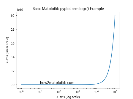
In this example, we create a semi-logarithmic plot of y = x^2. The x-axis is logarithmically scaled, while the y-axis remains linear. This allows us to visualize the quadratic relationship across a wide range of x values.
Understanding the Syntax of Matplotlib.pyplot.semilogx()
The basic syntax of Matplotlib.pyplot.semilogx() is as follows:
plt.semilogx(x, y, *args, **kwargs)
x: The x-coordinates of the data points.y: The y-coordinates of the data points.*args, **kwargs: Additional arguments and keyword arguments for customizing the plot.
Let’s explore a more detailed example to understand the syntax better:
import matplotlib.pyplot as plt
import numpy as np

x = np.logspace(0, 5, 100)
y1 = x
y2 = x**2
y3 = x**3

plt.semilogx(x, y1, 'r-', label='y = x')
plt.semilogx(x, y2, 'g--', label='y = x^2')
plt.semilogx(x, y3, 'b:', label='y = x^3')

plt.title('Multiple Lines with Matplotlib.pyplot.semilogx()')
plt.xlabel('X-axis (log scale)')
plt.ylabel('Y-axis (linear scale)')
plt.legend()
plt.text(10, 1e14, 'how2matplotlib.com', fontsize=12)
plt.show()
Output:
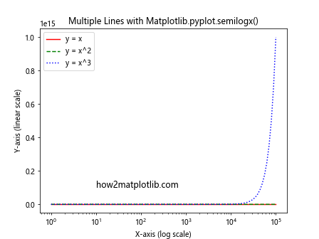
In this example, we plot three different functions (y = x, y = x^2, and y = x^3) on the same semi-logarithmic plot. We use different line styles and colors for each function and add a legend to distinguish between them.
Customizing Matplotlib.pyplot.semilogx() Plots
Matplotlib.pyplot.semilogx() offers various customization options to enhance the visual appeal and clarity of your plots. Let’s explore some of these options:
Adjusting Line Properties
You can customize the appearance of lines in your Matplotlib.pyplot.semilogx() plots by adjusting properties such as color, line style, and line width:
import matplotlib.pyplot as plt
import numpy as np

x = np.logspace(0, 5, 100)
y = x**2

plt.semilogx(x, y, color='purple', linestyle='--', linewidth=2)
plt.title('Customized Line in Matplotlib.pyplot.semilogx()')
plt.xlabel('X-axis (log scale)')
plt.ylabel('Y-axis (linear scale)')
plt.text(10, 1e8, 'how2matplotlib.com', fontsize=12)
plt.show()
Output:
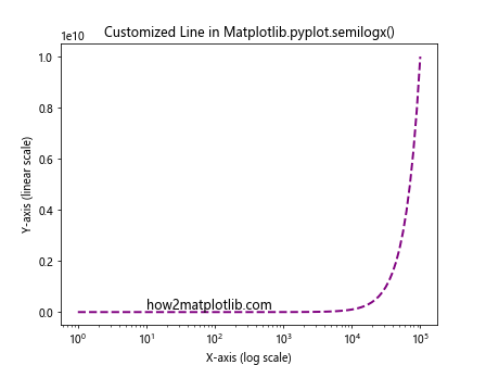
In this example, we set the line color to purple, use a dashed line style, and increase the line width to 2.
Adding Markers
You can add markers to your Matplotlib.pyplot.semilogx() plots to highlight specific data points:
import matplotlib.pyplot as plt
import numpy as np

x = np.logspace(0, 5, 20)
y = x**2

plt.semilogx(x, y, 'ro-', markersize=8)
plt.title('Matplotlib.pyplot.semilogx() with Markers')
plt.xlabel('X-axis (log scale)')
plt.ylabel('Y-axis (linear scale)')
plt.text(10, 1e8, 'how2matplotlib.com', fontsize=12)
plt.show()
Output:
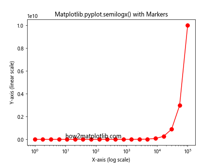
This example uses red circular markers (‘ro-‘) with a size of 8 to highlight the data points.
Customizing Axis Labels and Ticks
You can customize the axis labels and ticks in your Matplotlib.pyplot.semilogx() plots for better readability:
import matplotlib.pyplot as plt
import numpy as np

x = np.logspace(0, 5, 100)
y = x**2

plt.semilogx(x, y)
plt.title('Customized Axis Labels and Ticks in Matplotlib.pyplot.semilogx()')
plt.xlabel('X-axis (log scale)')
plt.ylabel('Y-axis (linear scale)')

plt.xticks([1, 10, 100, 1000, 10000, 100000], ['1', '10', '100', '1K', '10K', '100K'])
plt.yticks([0, 2e10, 4e10, 6e10, 8e10, 1e11], ['0', '2e10', '4e10', '6e10', '8e10', '1e11'])

plt.text(10, 5e10, 'how2matplotlib.com', fontsize=12)
plt.show()
Output:
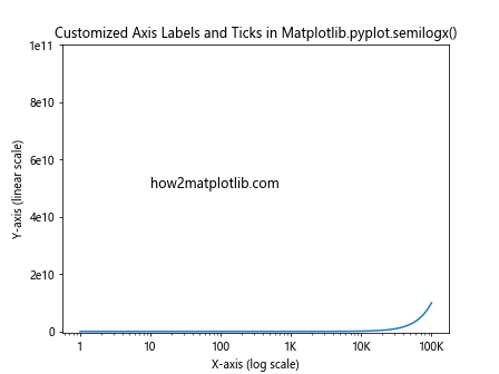
In this example, we customize the x-axis and y-axis tick labels to improve readability.
Advanced Techniques with Matplotlib.pyplot.semilogx()
Now that we’ve covered the basics, let’s explore some advanced techniques using Matplotlib.pyplot.semilogx().
Multiple Subplots
You can create multiple subplots using Matplotlib.pyplot.semilogx() to compare different datasets or visualize related information:
import matplotlib.pyplot as plt
import numpy as np

x = np.logspace(0, 5, 100)
y1 = x**2
y2 = x**3

fig, (ax1, ax2) = plt.subplots(1, 2, figsize=(12, 5))

ax1.semilogx(x, y1)
ax1.set_title('y = x^2')
ax1.set_xlabel('X-axis (log scale)')
ax1.set_ylabel('Y-axis (linear scale)')

ax2.semilogx(x, y2)
ax2.set_title('y = x^3')
ax2.set_xlabel('X-axis (log scale)')
ax2.set_ylabel('Y-axis (linear scale)')

plt.suptitle('Multiple Subplots with Matplotlib.pyplot.semilogx()')
plt.text(1, 1e15, 'how2matplotlib.com', fontsize=12)
plt.tight_layout()
plt.show()
Output:
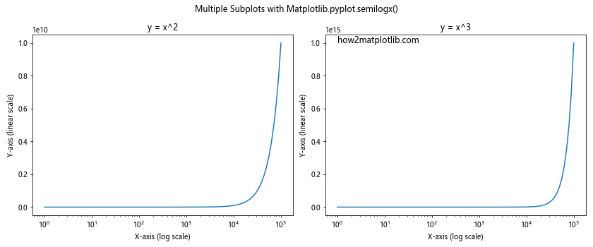
This example creates two subplots side by side, each showing a different function on a semi-logarithmic scale.
Combining with Other Plot Types
You can combine Matplotlib.pyplot.semilogx() with other plot types to create more complex visualizations:
import matplotlib.pyplot as plt
import numpy as np

x = np.logspace(0, 5, 100)
y1 = x**2
y2 = x**3

fig, (ax1, ax2) = plt.subplots(2, 1, figsize=(8, 10))

ax1.semilogx(x, y1, 'b-', label='y = x^2')
ax1.set_title('Matplotlib.pyplot.semilogx()')
ax1.set_xlabel('X-axis (log scale)')
ax1.set_ylabel('Y-axis (linear scale)')
ax1.legend()

ax2.plot(x, y2, 'r-', label='y = x^3')
ax2.set_title('Regular Plot')
ax2.set_xlabel('X-axis (linear scale)')
ax2.set_ylabel('Y-axis (linear scale)')
ax2.legend()

plt.suptitle('Combining Matplotlib.pyplot.semilogx() with Regular Plot')
plt.text(1, 1e15, 'how2matplotlib.com', fontsize=12)
plt.tight_layout()
plt.show()
Output:
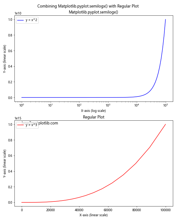
This example combines a semi-logarithmic plot using Matplotlib.pyplot.semilogx() with a regular linear plot to compare different representations of data.
Error Bars and Uncertainty
You can add error bars to your Matplotlib.pyplot.semilogx() plots to represent uncertainty in your data:
import matplotlib.pyplot as plt
import numpy as np

x = np.logspace(0, 2, 20)
y = x**2
yerr = y * 0.1  # 10% error

plt.semilogx(x, y, 'bo-')
plt.errorbar(x, y, yerr=yerr, fmt='none', ecolor='r', capsize=5)
plt.title('Matplotlib.pyplot.semilogx() with Error Bars')
plt.xlabel('X-axis (log scale)')
plt.ylabel('Y-axis (linear scale)')
plt.text(1, 8000, 'how2matplotlib.com', fontsize=12)
plt.show()
Output:
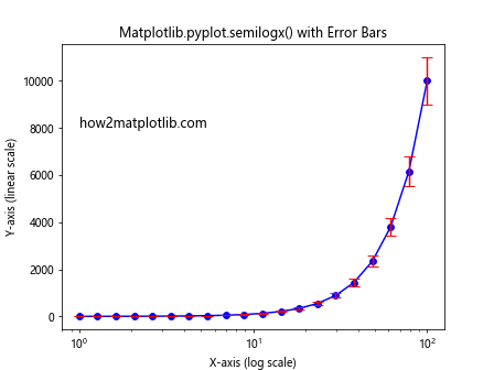
This example adds error bars to the data points in a semi-logarithmic plot, representing a 10% uncertainty in the y-values.
Practical Applications of Matplotlib.pyplot.semilogx()
Matplotlib.pyplot.semilogx() has numerous practical applications across various fields. Let’s explore some real-world scenarios where this function can be particularly useful.
Visualizing Exponential Growth
Semi-logarithmic plots are excellent for visualizing exponential growth, such as in population dynamics or compound interest:
import matplotlib.pyplot as plt
import numpy as np

years = np.arange(1, 101)
population = 1000 * (1.02 ** years)  # 2% annual growth

plt.semilogx(years, population)
plt.title('Population Growth over 100 Years')
plt.xlabel('Years')
plt.ylabel('Population')
plt.grid(True)
plt.text(10, 5000, 'how2matplotlib.com', fontsize=12)
plt.show()
Output:
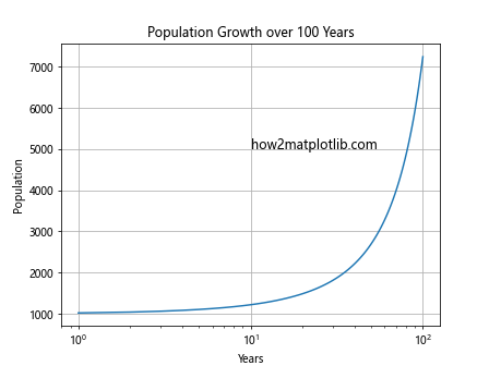
This example visualizes population growth over 100 years with a 2% annual growth rate. The semi-logarithmic scale helps to clearly show the exponential nature of the growth.
Analyzing Frequency Response in Signal Processing
In signal processing, Matplotlib.pyplot.semilogx() is often used to visualize frequency response:
import matplotlib.pyplot as plt
import numpy as np

freq = np.logspace(0, 5, 1000)
gain = 20 * np.log10(1 / np.sqrt(1 + (freq/1000)**2))

plt.semilogx(freq, gain)
plt.title('Frequency Response of a Low-Pass Filter')
plt.xlabel('Frequency (Hz)')
plt.ylabel('Gain (dB)')
plt.grid(True)
plt.text(10, -10, 'how2matplotlib.com', fontsize=12)
plt.show()
Output:
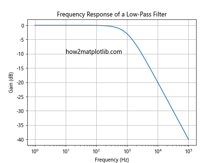
This example shows the frequency response of a simple low-pass filter. The semi-logarithmic scale allows for a clear visualization of the filter’s behavior across a wide range of frequencies.
Visualizing Power Laws in Physics
Many physical phenomena follow power laws, which are best visualized using semi-logarithmic or log-log plots:
import matplotlib.pyplot as plt
import numpy as np

x = np.logspace(-1, 3, 100)
y1 = x**(-1)  # Inverse relationship
y2 = x**(-2)  # Inverse square relationship

plt.semilogx(x, y1, 'b-', label='y = 1/x')
plt.semilogx(x, y2, 'r-', label='y = 1/x^2')
plt.title('Power Laws in Physics')
plt.xlabel('Distance')
plt.ylabel('Intensity')
plt.legend()
plt.grid(True)
plt.text(0.1, 8, 'how2matplotlib.com', fontsize=12)
plt.show()
Output:
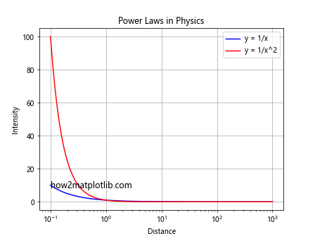
This example visualizes two common power laws in physics: the inverse relationship and the inverse square relationship. The semi-logarithmic scale helps to clearly show the differences between these relationships across a wide range of distances.
Best Practices for Using Matplotlib.pyplot.semilogx()
To make the most of Matplotlib.pyplot.semilogx(), consider the following best practices:
- Choose appropriate data ranges: Ensure that your x-axis data spans several orders of magnitude to take full advantage of the logarithmic scale.
Use clear labels and titles: Always include informative axis labels and a descriptive title to make your plot easily understandable.
Consider using a grid: Adding a grid can help readers estimate values more accurately on a logarithmic scale.
Use color and line styles effectively: When plotting multiple lines, use different colors and line styles to distinguish between them clearly.
Include a legend: If your plot contains multiple datasets, always include a legend to explain what each line represents.
Here’s an example incorporating these best practices: