Mastering Matplotlib.artist.Artist.set_sketch_params() in Python: A Comprehensive Guide
Matplotlib.artist.Artist.set_sketch_params() in Python is a powerful method that allows you to add sketch-like effects to your plots. This function is part of the Matplotlib library, which is widely used for creating static, animated, and interactive visualizations in Python. In this comprehensive guide, we’ll explore the ins and outs of Matplotlib.artist.Artist.set_sketch_params(), providing detailed explanations and numerous examples to help you master this versatile tool.
Understanding Matplotlib.artist.Artist.set_sketch_params()
Matplotlib.artist.Artist.set_sketch_params() is a method that belongs to the Artist class in Matplotlib. It’s used to set the sketch parameters for the artist, which can create a hand-drawn or sketch-like appearance for various plot elements. This function is particularly useful when you want to give your visualizations a more organic, less computer-generated look.
The basic syntax of Matplotlib.artist.Artist.set_sketch_params() is as follows:
import matplotlib.pyplot as plt
fig, ax = plt.subplots()
artist = ax.plot([1, 2, 3], [1, 2, 3])[0]
artist.set_sketch_params(scale=1, length=10, randomness=1)
plt.title("How to use set_sketch_params() - how2matplotlib.com")
plt.show()
Output:
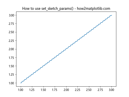
In this example, we create a simple line plot and apply sketch parameters to it. The scale
parameter controls the overall scale of the sketch effect, length
determines the length of the sketch strokes, and randomness
adds a random factor to the sketch effect.
Parameters of Matplotlib.artist.Artist.set_sketch_params()
Matplotlib.artist.Artist.set_sketch_params() accepts several parameters that allow you to fine-tune the sketch effect. Let’s explore each of these parameters in detail:
- scale: This parameter controls the overall scale of the sketch effect. A larger value will make the sketch effect more pronounced.
-
length: This parameter determines the length of the sketch strokes. Longer strokes can create a more exaggerated sketch effect.
-
randomness: This parameter adds a random factor to the sketch effect, making it look more natural and hand-drawn.
Let’s see how we can use these parameters in practice:
import matplotlib.pyplot as plt
fig, (ax1, ax2, ax3) = plt.subplots(1, 3, figsize=(15, 5))
# Default sketch params
line1 = ax1.plot([1, 2, 3], [1, 2, 3])[0]
line1.set_sketch_params()
ax1.set_title("Default - how2matplotlib.com")
# Increased scale
line2 = ax2.plot([1, 2, 3], [1, 2, 3])[0]
line2.set_sketch_params(scale=5)
ax2.set_title("Increased Scale - how2matplotlib.com")
# Increased length and randomness
line3 = ax3.plot([1, 2, 3], [1, 2, 3])[0]
line3.set_sketch_params(length=20, randomness=2)
ax3.set_title("Increased Length and Randomness - how2matplotlib.com")
plt.tight_layout()
plt.show()
Output:
In this example, we create three subplots to demonstrate the effect of different parameter settings. The first subplot uses the default sketch parameters, the second increases the scale, and the third increases both the length and randomness of the sketch effect.
Applying Matplotlib.artist.Artist.set_sketch_params() to Different Plot Types
Matplotlib.artist.Artist.set_sketch_params() can be applied to various types of plots and chart elements. Let’s explore how to use this method with different plot types:
Line Plots
Line plots are one of the most common types of charts, and Matplotlib.artist.Artist.set_sketch_params() can be used to give them a unique, hand-drawn appearance:
import matplotlib.pyplot as plt
import numpy as np
x = np.linspace(0, 10, 100)
y = np.sin(x)
fig, ax = plt.subplots()
line = ax.plot(x, y)[0]
line.set_sketch_params(scale=2, length=15, randomness=1.5)
ax.set_title("Sketchy Sine Wave - how2matplotlib.com")
plt.show()
Output:
In this example, we create a sine wave and apply sketch parameters to give it a hand-drawn look. The increased scale and length parameters make the sketch effect more noticeable, while the randomness parameter adds a natural variation to the line.
Scatter Plots
Scatter plots can also benefit from the sketch effect, giving data points a more organic appearance:
import matplotlib.pyplot as plt
import numpy as np
x = np.random.rand(50)
y = np.random.rand(50)
fig, ax = plt.subplots()
scatter = ax.scatter(x, y)
scatter.set_sketch_params(scale=3, length=10, randomness=2)
ax.set_title("Sketchy Scatter Plot - how2matplotlib.com")
plt.show()
Output:
Here, we create a scatter plot with random data points and apply sketch parameters to give them a hand-drawn appearance. The increased scale and randomness parameters make the points look less uniform and more organic.
Bar Charts
Bar charts can be given a sketch effect to create a more casual, informal look:
import matplotlib.pyplot as plt
categories = ['A', 'B', 'C', 'D']
values = [3, 7, 2, 5]
fig, ax = plt.subplots()
bars = ax.bar(categories, values)
for bar in bars:
bar.set_sketch_params(scale=2, length=15, randomness=1)
ax.set_title("Sketchy Bar Chart - how2matplotlib.com")
plt.show()
Output:
In this example, we create a simple bar chart and apply sketch parameters to each bar individually. This gives the chart a hand-drawn appearance while maintaining its readability.
Advanced Techniques with Matplotlib.artist.Artist.set_sketch_params()
Now that we’ve covered the basics, let’s explore some more advanced techniques using Matplotlib.artist.Artist.set_sketch_params():
Combining Sketch Effects with Colors
You can combine sketch effects with different colors to create visually striking plots:
import matplotlib.pyplot as plt
import numpy as np
x = np.linspace(0, 10, 100)
y1 = np.sin(x)
y2 = np.cos(x)
fig, ax = plt.subplots()
line1 = ax.plot(x, y1, color='red')[0]
line2 = ax.plot(x, y2, color='blue')[0]
line1.set_sketch_params(scale=2, length=15, randomness=1)
line2.set_sketch_params(scale=2, length=15, randomness=1)
ax.set_title("Sketchy Sine and Cosine - how2matplotlib.com")
plt.show()
Output:
In this example, we plot sine and cosine waves with different colors and apply the same sketch parameters to both. This creates a visually interesting plot that combines color and sketch effects.
Applying Sketch Effects to Fill Areas
You can also apply sketch effects to filled areas in your plots:
import matplotlib.pyplot as plt
import numpy as np
x = np.linspace(0, 10, 100)
y1 = np.sin(x)
y2 = np.cos(x)
fig, ax = plt.subplots()
fill = ax.fill_between(x, y1, y2, alpha=0.5)
fill.set_sketch_params(scale=3, length=20, randomness=2)
ax.set_title("Sketchy Filled Area - how2matplotlib.com")
plt.show()
Output:
Here, we create a filled area between sine and cosine waves and apply sketch parameters to it. This gives the filled area a hand-drawn, textured appearance.
Sketch Effects in 3D Plots
Matplotlib.artist.Artist.set_sketch_params() can also be applied to 3D plots:
import matplotlib.pyplot as plt
from mpl_toolkits.mplot3d import Axes3D
import numpy as np
fig = plt.figure()
ax = fig.add_subplot(111, projection='3d')
x = np.linspace(-5, 5, 100)
y = np.linspace(-5, 5, 100)
X, Y = np.meshgrid(x, y)
Z = np.sin(np.sqrt(X**2 + Y**2))
surface = ax.plot_surface(X, Y, Z, cmap='viridis')
surface.set_sketch_params(scale=2, length=15, randomness=1)
ax.set_title("Sketchy 3D Surface - how2matplotlib.com")
plt.show()
Output:
In this example, we create a 3D surface plot and apply sketch parameters to it. This gives the surface a unique, hand-drawn appearance while maintaining the 3D effect.
Best Practices for Using Matplotlib.artist.Artist.set_sketch_params()
When using Matplotlib.artist.Artist.set_sketch_params(), keep these best practices in mind:
- Use sketch effects judiciously: While sketch effects can make your plots more visually interesting, overusing them can make your visualizations hard to read or interpret.
-
Adjust parameters for different plot sizes: The effect of sketch parameters can vary depending on the size of your plot. You may need to adjust the scale, length, and randomness parameters for different plot sizes to achieve the desired effect.
-
Combine with other styling options: Sketch effects can be combined with other Matplotlib styling options, such as colors, line styles, and markers, to create unique and visually appealing plots.
-
Consider the context: Sketch effects may be more appropriate for informal presentations or creative projects, while more traditional styles might be better for formal scientific publications.
Let’s see an example that demonstrates these best practices:
import matplotlib.pyplot as plt
import numpy as np
# Create data
x = np.linspace(0, 10, 100)
y1 = np.sin(x)
y2 = np.cos(x)
# Create plot
fig, ax = plt.subplots(figsize=(10, 6))
# Plot lines with different styles and sketch effects
line1 = ax.plot(x, y1, color='red', linestyle='-', label='Sine')[0]
line2 = ax.plot(x, y2, color='blue', linestyle='--', label='Cosine')[0]
line1.set_sketch_params(scale=1.5, length=10, randomness=1)
line2.set_sketch_params(scale=1.5, length=10, randomness=1)
# Add markers with sketch effects
scatter1 = ax.scatter(x[::10], y1[::10], color='red', marker='o')
scatter2 = ax.scatter(x[::10], y2[::10], color='blue', marker='s')
scatter1.set_sketch_params(scale=2, length=5, randomness=1.5)
scatter2.set_sketch_params(scale=2, length=5, randomness=1.5)
# Customize the plot
ax.set_xlabel('X-axis')
ax.set_ylabel('Y-axis')
ax.set_title('Sine and Cosine with Sketch Effects - how2matplotlib.com')
ax.legend()
ax.grid(True, linestyle=':', alpha=0.7)
plt.tight_layout()
plt.show()
Output:
In this example, we combine different line styles, colors, and markers with sketch effects to create a visually interesting plot that remains clear and informative.
Troubleshooting Common Issues with Matplotlib.artist.Artist.set_sketch_params()
When working with Matplotlib.artist.Artist.set_sketch_params(), you might encounter some common issues. Here are some problems you might face and how to solve them:
Issue 1: Sketch Effect Not Visible
If you’ve applied sketch parameters but can’t see the effect, it might be due to the scale being too small or the plot being too large. Try increasing the scale parameter or adjusting the figure size:
import matplotlib.pyplot as plt
import numpy as np
x = np.linspace(0, 10, 100)
y = np.sin(x)
fig, (ax1, ax2) = plt.subplots(1, 2, figsize=(12, 5))
# Sketch effect not visible
line1 = ax1.plot(x, y)[0]
line1.set_sketch_params(scale=0.1, length=10, randomness=1)
ax1.set_title("Sketch Effect Not Visible - how2matplotlib.com")
# Increased scale to make sketch effect visible
line2 = ax2.plot(x, y)[0]
line2.set_sketch_params(scale=3, length=10, randomness=1)
ax2.set_title("Visible Sketch Effect - how2matplotlib.com")
plt.tight_layout()
plt.show()
Output:
In this example, we show two plots side by side. The first plot has a very small scale, making the sketch effect virtually invisible. The second plot has an increased scale, making the sketch effect clearly visible.
Issue 2: Sketch Effect Too Exaggerated
If the sketch effect is too pronounced and distorting your data, try reducing the scale, length, or randomness parameters:
import matplotlib.pyplot as plt
import numpy as np
x = np.linspace(0, 10, 100)
y = np.sin(x)
fig, (ax1, ax2) = plt.subplots(1, 2, figsize=(12, 5))
# Exaggerated sketch effect
line1 = ax1.plot(x, y)[0]
line1.set_sketch_params(scale=10, length=30, randomness=5)
ax1.set_title("Exaggerated Sketch Effect - how2matplotlib.com")
# Toned down sketch effect
line2 = ax2.plot(x, y)[0]
line2.set_sketch_params(scale=2, length=10, randomness=1)
ax2.set_title("Balanced Sketch Effect - how2matplotlib.com")
plt.tight_layout()
plt.show()
Output:
Here, we demonstrate an exaggerated sketch effect and a more balanced one. The first plot has high values for scale, length, and randomness, resulting in a distorted appearance. The second plot has more moderate values, creating a subtle sketch effect that enhances the plot without overwhelming it.
Issue 3: Inconsistent Sketch Effects
If you’re applying sketch effects to multiple elements and they appear inconsistent, make sure you’re using the same parameters for all elements:
import matplotlib.pyplot as plt
import numpy as np
categories = ['A', 'B', 'C', 'D']
values = [3, 7, 2, 5]
fig, (ax1, ax2) = plt.subplots(1, 2, figsize=(12, 5))
# Inconsistent sketch effects
bars1 = ax1.bar(categories, values)
for i, bar in enumerate(bars1):
bar.set_sketch_params(scale=i+1, length=10, randomness=1)
ax1.set_title("Inconsistent Sketch Effects - how2matplotlib.com")
# Consistent sketch effects
bars2 = ax2.bar(categories, values)
for bar in bars2:
bar.set_sketch_params(scale=2, length=10, randomness=1)
ax2.set_title("Consistent Sketch Effects - how2matplotlib.com")
plt.tight_layout()
plt.show()
Output:
In this example, we create two bar charts. The first chart has inconsistent sketch effects, with each bar having a different scale. The second chart applies the same sketch parameters to all bars, resulting in a more cohesive appearance.
Comparing Matplotlib.artist.Artist.set_sketch_params() with Other Styling Methods
While Matplotlib.artist.Artist.set_sketch_params() is a unique way to style your plots, it’s worth comparing it to other styling methods availablein Matplotlib. Let’s explore how set_sketch_params() compares to other styling techniques:
Comparison with Line Styles
Matplotlib offers various built-in line styles that can be used to create different visual effects. Here’s a comparison between set_sketch_params() and different line styles:
import matplotlib.pyplot as plt
import numpy as np
x = np.linspace(0, 10, 100)
y = np.sin(x)
fig, (ax1, ax2) = plt.subplots(1, 2, figsize=(12, 5))
# Using set_sketch_params()
line1 = ax1.plot(x, y)[0]
line1.set_sketch_params(scale=2, length=10, randomness=1)
ax1.set_title("set_sketch_params() - how2matplotlib.com")
# Using different line styles
styles = ['-', '--', '-.', ':']
for i, style in enumerate(styles):
ax2.plot(x, y + i*0.5, linestyle=style, label=f'Style: {style}')
ax2.legend()
ax2.set_title("Line Styles - how2matplotlib.com")
plt.tight_layout()
plt.show()
Output:
In this example, we compare a line with sketch effects to lines with different built-in styles. While line styles offer predefined patterns, set_sketch_params() provides a more organic, hand-drawn appearance.
Comparison with Markers
Markers are another way to add visual interest to your plots. Let’s compare set_sketch_params() with different marker styles:
import matplotlib.pyplot as plt
import numpy as np
x = np.linspace(0, 10, 20)
y = np.sin(x)
fig, (ax1, ax2) = plt.subplots(1, 2, figsize=(12, 5))
# Using set_sketch_params()
line1 = ax1.plot(x, y, 'o-')[0]
line1.set_sketch_params(scale=2, length=10, randomness=1)
ax1.set_title("set_sketch_params() - how2matplotlib.com")
# Using different markers
markers = ['o', 's', '^', 'D']
for i, marker in enumerate(markers):
ax2.plot(x, y + i*0.2, marker=marker, linestyle='', label=f'Marker: {marker}')
ax2.legend()
ax2.set_title("Markers - how2matplotlib.com")
plt.tight_layout()
plt.show()
Output:
This example compares a line plot with sketch effects to scatter plots with different marker styles. While markers can effectively highlight individual data points, set_sketch_params() can give the entire plot a unique, hand-drawn feel.
Customizing Matplotlib.artist.Artist.set_sketch_params() for Different Plot Elements
Matplotlib.artist.Artist.set_sketch_params() can be applied to various plot elements, each with its own considerations. Let’s explore how to customize sketch effects for different components of a plot:
Customizing Axes
You can apply sketch effects to the axes of your plot to give them a hand-drawn appearance:
import matplotlib.pyplot as plt
import numpy as np
fig, ax = plt.subplots()
# Plot some data
x = np.linspace(0, 10, 100)
y = np.sin(x)
ax.plot(x, y)
# Apply sketch effect to axes
for spine in ax.spines.values():
spine.set_sketch_params(scale=2, length=15, randomness=1)
ax.set_title("Sketchy Axes - how2matplotlib.com")
plt.show()
Output:
In this example, we apply sketch effects to the spines of the axes, giving them a hand-drawn look while keeping the data plot itself clean.
Customizing Text Elements
You can also apply sketch effects to text elements in your plot:
import matplotlib.pyplot as plt
fig, ax = plt.subplots()
# Add text with sketch effect
text = ax.text(0.5, 0.5, "Sketchy Text", ha='center', va='center', fontsize=20)
text.set_sketch_params(scale=5, length=20, randomness=2)
ax.set_title("Sketchy Text - how2matplotlib.com")
plt.axis('off')
plt.show()
Output:
This example demonstrates how to apply sketch effects to text elements, creating a hand-written appearance for labels or annotations in your plot.
Customizing Legends
Legends can also benefit from sketch effects:
import matplotlib.pyplot as plt
import numpy as np
x = np.linspace(0, 10, 100)
y1 = np.sin(x)
y2 = np.cos(x)
fig, ax = plt.subplots()
line1 = ax.plot(x, y1, label='Sine')[0]
line2 = ax.plot(x, y2, label='Cosine')[0]
line1.set_sketch_params(scale=2, length=10, randomness=1)
line2.set_sketch_params(scale=2, length=10, randomness=1)
legend = ax.legend()
frame = legend.get_frame()
frame.set_sketch_params(scale=2, length=15, randomness=1)
ax.set_title("Sketchy Legend - how2matplotlib.com")
plt.show()
Output:
In this example, we apply sketch effects to both the plotted lines and the legend frame, creating a cohesive hand-drawn look for the entire plot.
Advanced Applications of Matplotlib.artist.Artist.set_sketch_params()
Now that we’ve covered the basics and some intermediate techniques, let’s explore some advanced applications of Matplotlib.artist.Artist.set_sketch_params():
Creating a Sketch-Style Dashboard
You can use set_sketch_params() to create an entire dashboard with a hand-drawn aesthetic:
import matplotlib.pyplot as plt
import numpy as np
def apply_sketch(artist):
artist.set_sketch_params(scale=2, length=10, randomness=1)
fig, ((ax1, ax2), (ax3, ax4)) = plt.subplots(2, 2, figsize=(12, 10))
# Line plot
x = np.linspace(0, 10, 100)
line = ax1.plot(x, np.sin(x))[0]
apply_sketch(line)
ax1.set_title("Sine Wave")
# Bar plot
categories = ['A', 'B', 'C', 'D']
values = [3, 7, 2, 5]
bars = ax2.bar(categories, values)
for bar in bars:
apply_sketch(bar)
ax2.set_title("Bar Chart")
# Scatter plot
x = np.random.rand(50)
y = np.random.rand(50)
scatter = ax3.scatter(x, y)
apply_sketch(scatter)
ax3.set_title("Scatter Plot")
# Pie chart
sizes = [15, 30, 45, 10]
pie = ax4.pie(sizes)
for wedge in pie[0]:
apply_sketch(wedge)
ax4.set_title("Pie Chart")
fig.suptitle("Sketch-Style Dashboard - how2matplotlib.com", fontsize=16)
plt.tight_layout()
plt.show()
Output:
This example creates a dashboard with four different types of plots, all styled with sketch effects to create a cohesive, hand-drawn appearance.
Animated Sketch Effects
You can create animated sketch effects by changing the sketch parameters over time:
import matplotlib.pyplot as plt
import numpy as np
from matplotlib.animation import FuncAnimation
fig, ax = plt.subplots()
x = np.linspace(0, 10, 100)
line, = ax.plot(x, np.sin(x))
def update(frame):
line.set_sketch_params(scale=frame/10, length=10, randomness=1)
return line,
ani = FuncAnimation(fig, update, frames=range(1, 51), interval=100, blit=True)
ax.set_title("Animated Sketch Effect - how2matplotlib.com")
plt.show()
Output:
This animation gradually increases the scale of the sketch effect, creating a dynamic, evolving appearance for the plot.
Conclusion
Matplotlib.artist.Artist.set_sketch_params() is a powerful tool for adding unique, hand-drawn effects to your plots. Throughout this comprehensive guide, we’ve explored its basic usage, advanced techniques, and best practices. We’ve seen how it can be applied to various plot types and elements, and how it compares to other styling methods in Matplotlib.