Comprehensive Guide to Matplotlib.pyplot.pcolor() Function in Python
Matplotlib.pyplot.pcolor() function in Python is a powerful tool for creating pseudocolor plots, also known as color mesh plots. This function is part of the Matplotlib library, which is widely used for data visualization in Python. The pcolor() function allows you to create 2D color-coded plots where the color of each cell represents a value in your data. In this comprehensive guide, we’ll explore the Matplotlib.pyplot.pcolor() function in depth, covering its syntax, parameters, and various use cases with practical examples.
Understanding the Basics of Matplotlib.pyplot.pcolor()
The Matplotlib.pyplot.pcolor() function is primarily used to create pseudocolor plots from 2D arrays. It’s particularly useful when you want to visualize data that can be represented as a grid or matrix. The function maps each value in your data to a color, creating a visual representation of the data’s distribution and patterns.
Let’s start with a basic example to understand how the Matplotlib.pyplot.pcolor() function works:
import numpy as np
import matplotlib.pyplot as plt

# Create sample data
data = np.random.rand(10, 10)

# Create the plot
plt.figure(figsize=(8, 6))
plt.pcolor(data)
plt.colorbar()
plt.title('Basic Pseudocolor Plot - how2matplotlib.com')
plt.show()
Output:
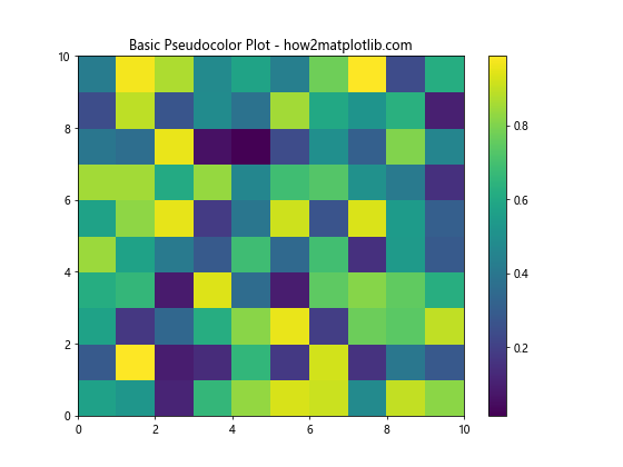
In this example, we create a 10×10 array of random values using NumPy. We then use plt.pcolor(data) to create the pseudocolor plot. The plt.colorbar() function adds a color scale to the plot, showing the mapping between colors and values.
Customizing Matplotlib.pyplot.pcolor() Plots
The Matplotlib.pyplot.pcolor() function offers various parameters to customize your plots. Let’s explore some of these options:
Changing the Colormap
You can change the colormap used in your plot using the ‘cmap’ parameter:
import numpy as np
import matplotlib.pyplot as plt

data = np.random.rand(15, 15)

plt.figure(figsize=(10, 8))
plt.pcolor(data, cmap='viridis')
plt.colorbar()
plt.title('Pseudocolor Plot with Viridis Colormap - how2matplotlib.com')
plt.show()
Output:
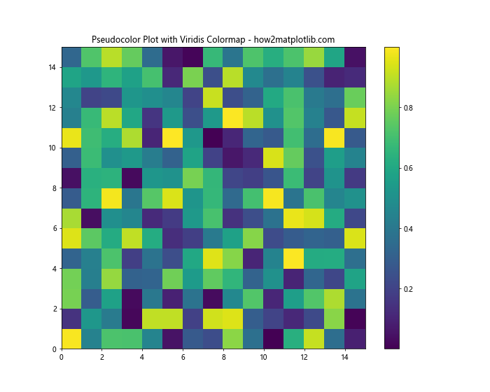
This example uses the ‘viridis’ colormap, which is often preferred for its perceptual uniformity and accessibility.
Setting Custom Color Limits
You can control the range of values mapped to colors using the ‘vmin’ and ‘vmax’ parameters:
import numpy as np
import matplotlib.pyplot as plt

data = np.random.rand(12, 12)

plt.figure(figsize=(8, 6))
plt.pcolor(data, cmap='coolwarm', vmin=0.2, vmax=0.8)
plt.colorbar()
plt.title('Pseudocolor Plot with Custom Color Limits - how2matplotlib.com')
plt.show()
Output:
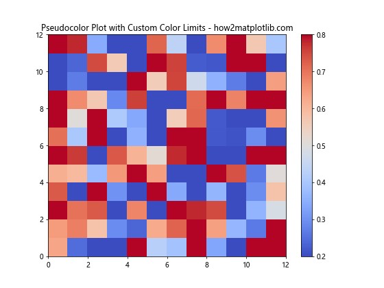
In this example, we set the color mapping to range from 0.2 to 0.8, which can help highlight specific ranges in your data.
Using Matplotlib.pyplot.pcolor() with Non-uniform Grids
The Matplotlib.pyplot.pcolor() function can also handle non-uniform grids. This is useful when your data points are not evenly spaced:
import numpy as np
import matplotlib.pyplot as plt

x = np.array([0, 1, 2, 3, 4, 5])
y = np.array([0, 2, 3, 4, 6, 8])
data = np.random.rand(5, 5)

plt.figure(figsize=(10, 8))
plt.pcolor(x, y, data)
plt.colorbar()
plt.title('Pseudocolor Plot with Non-uniform Grid - how2matplotlib.com')
plt.xlabel('X-axis')
plt.ylabel('Y-axis')
plt.show()
Output:

In this example, we provide separate x and y arrays to define the grid. The pcolor() function automatically handles the non-uniform spacing.
Combining Matplotlib.pyplot.pcolor() with Other Plot Elements
You can combine pcolor() plots with other Matplotlib elements to create more informative visualizations:
import numpy as np
import matplotlib.pyplot as plt

x = np.linspace(0, 2*np.pi, 100)
y = np.linspace(0, 2*np.pi, 100)
X, Y = np.meshgrid(x, y)
Z = np.sin(X) * np.cos(Y)

plt.figure(figsize=(12, 8))
plt.pcolor(X, Y, Z, cmap='RdBu')
plt.colorbar()
plt.contour(X, Y, Z, colors='k', linewidths=0.5)
plt.title('Pseudocolor Plot with Contour Lines - how2matplotlib.com')
plt.xlabel('X-axis')
plt.ylabel('Y-axis')
plt.show()
Output:
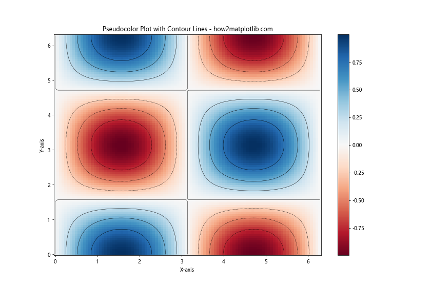
This example combines a pcolor() plot with contour lines, providing additional information about the data’s structure.
Handling Missing Data in Matplotlib.pyplot.pcolor()
When dealing with real-world data, you might encounter missing values. The Matplotlib.pyplot.pcolor() function can handle this situation:
import numpy as np
import matplotlib.pyplot as plt

data = np.random.rand(10, 10)
data[3:7, 3:7] = np.nan  # Set some values to NaN

plt.figure(figsize=(8, 6))
plt.pcolor(data, cmap='viridis')
plt.colorbar()
plt.title('Pseudocolor Plot with Missing Data - how2matplotlib.com')
plt.show()
Output:
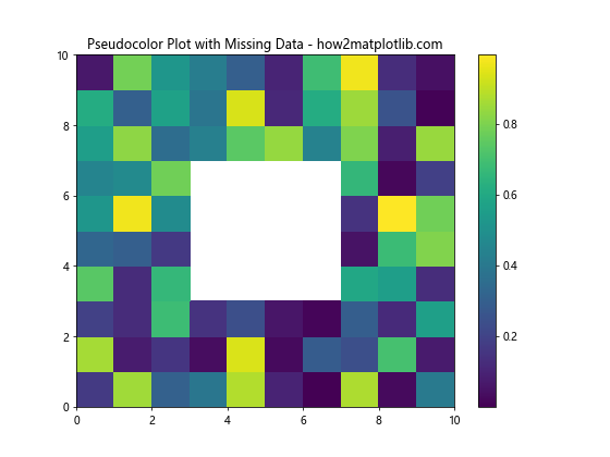
In this example, we set a block of values to NaN (Not a Number). The pcolor() function will leave these cells blank in the plot.
Creating Animated Pseudocolor Plots with Matplotlib.pyplot.pcolor()
You can use the Matplotlib.pyplot.pcolor() function to create animated plots, which can be useful for visualizing time-series data:
import numpy as np
import matplotlib.pyplot as plt
from matplotlib.animation import FuncAnimation

fig, ax = plt.subplots(figsize=(8, 6))
data = np.random.rand(10, 10)
mesh = ax.pcolor(data, cmap='viridis')
plt.colorbar(mesh)

def update(frame):
    data = np.random.rand(10, 10)
    mesh.set_array(data.ravel())
    return mesh,

ani = FuncAnimation(fig, update, frames=50, interval=200, blit=True)
plt.title('Animated Pseudocolor Plot - how2matplotlib.com')
plt.show()
Output:
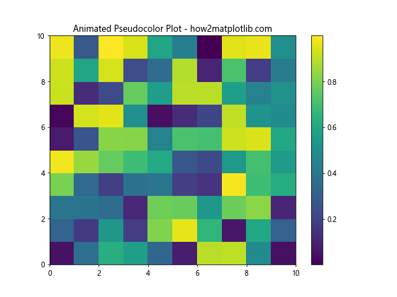
This example creates an animation where the pseudocolor plot updates with new random data every 200 milliseconds.
Using Matplotlib.pyplot.pcolor() for Image Processing
The pcolor() function can be useful in image processing tasks, such as visualizing image filters:
import numpy as np
import matplotlib.pyplot as plt

# Create a simple image
image = np.zeros((20, 20))
image[5:15, 5:15] = 1

# Apply a simple filter
kernel = np.array([[0.1, 0.1, 0.1],
                   [0.1, 0.2, 0.1],
                   [0.1, 0.1, 0.1]])
filtered = np.zeros_like(image)
for i in range(1, image.shape[0]-1):
    for j in range(1, image.shape[1]-1):
        filtered[i, j] = np.sum(image[i-1:i+2, j-1:j+2] * kernel)

fig, (ax1, ax2) = plt.subplots(1, 2, figsize=(12, 5))
ax1.pcolor(image, cmap='gray')
ax1.set_title('Original Image - how2matplotlib.com')
ax2.pcolor(filtered, cmap='gray')
ax2.set_title('Filtered Image - how2matplotlib.com')
plt.show()
Output:
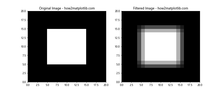
This example demonstrates how pcolor() can be used to visualize the effect of applying a simple smoothing filter to an image.
Creating Heatmaps with Matplotlib.pyplot.pcolor()
The pcolor() function is often used to create heatmaps, which are useful for visualizing correlation matrices or other types of tabular data:
import numpy as np
import matplotlib.pyplot as plt

# Create a correlation matrix
data = np.array([[1, 0.8, 0.3, -0.2],
                 [0.8, 1, 0.5, 0.1],
                 [0.3, 0.5, 1, 0.7],
                 [-0.2, 0.1, 0.7, 1]])

plt.figure(figsize=(8, 6))
plt.pcolor(data, cmap='RdBu', vmin=-1, vmax=1)
plt.colorbar()
plt.title('Correlation Heatmap - how2matplotlib.com')
plt.xticks(np.arange(0.5, len(data), 1), ['A', 'B', 'C', 'D'])
plt.yticks(np.arange(0.5, len(data), 1), ['A', 'B', 'C', 'D'])
plt.show()
Output:
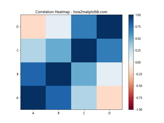
This example creates a heatmap from a correlation matrix, using the ‘RdBu’ colormap to represent positive and negative correlations.
Visualizing Geographical Data with Matplotlib.pyplot.pcolor()
The pcolor() function can be used to visualize geographical data, such as temperature maps:
import numpy as np
import matplotlib.pyplot as plt

# Create sample temperature data
lat = np.linspace(30, 60, 30)
lon = np.linspace(-120, -60, 40)
LON, LAT = np.meshgrid(lon, lat)
temp = 15 + 8*np.sin((LAT-45)/15) + 3*np.cos((LON+90)/30)

plt.figure(figsize=(12, 8))
plt.pcolor(LON, LAT, temp, cmap='coolwarm')
plt.colorbar(label='Temperature (°C)')
plt.title('Temperature Map - how2matplotlib.com')
plt.xlabel('Longitude')
plt.ylabel('Latitude')
plt.show()
Output:
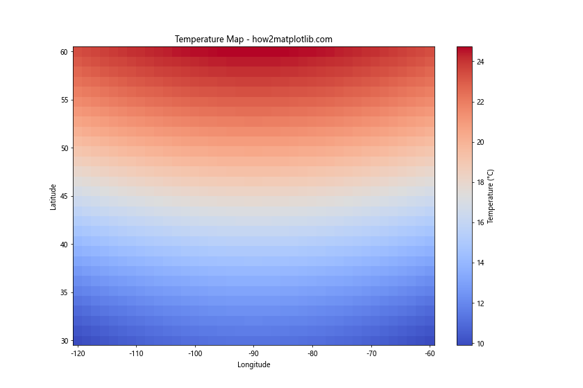
This example creates a simple temperature map using pcolor(), demonstrating how it can be used with geographical coordinates.
Advanced Customization of Matplotlib.pyplot.pcolor() Plots
For more advanced visualizations, you can customize various aspects of the pcolor() plot:
import numpy as np
import matplotlib.pyplot as plt

data = np.random.rand(20, 20)

fig, ax = plt.subplots(figsize=(10, 8))
mesh = ax.pcolor(data, cmap='viridis', edgecolors='k', linewidths=0.5)
plt.colorbar(mesh, label='Value')
ax.set_title('Advanced Customized Pseudocolor Plot - how2matplotlib.com')
ax.set_xlabel('X-axis')
ax.set_ylabel('Y-axis')
ax.set_xticks(np.arange(0.5, 20.5, 1))
ax.set_yticks(np.arange(0.5, 20.5, 1))
ax.set_xticklabels(range(1, 21))
ax.set_yticklabels(range(1, 21))
ax.grid(True, which='minor', color='w', linestyle='-', linewidth=0.5)
plt.show()
Output:
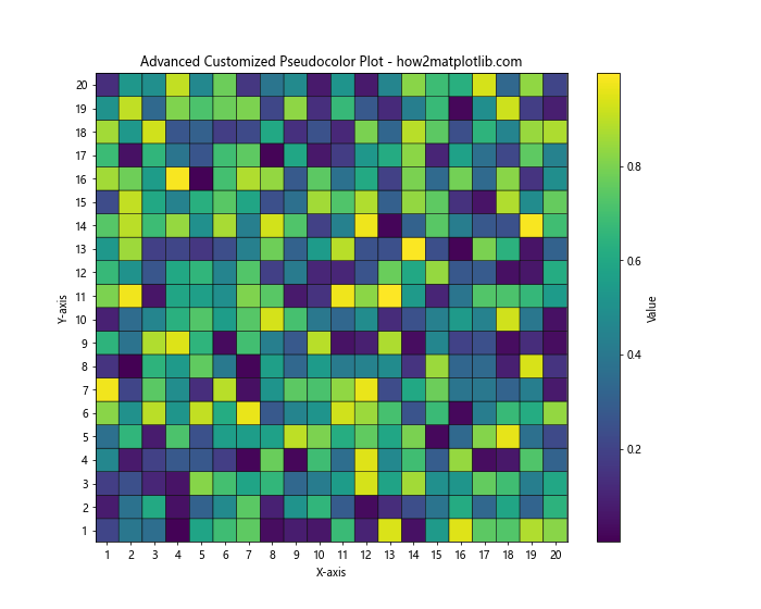
This example demonstrates how to add grid lines, customize tick labels, and add edge colors to the cells in the pcolor() plot.
Comparing Matplotlib.pyplot.pcolor() with Other Similar Functions
Matplotlib offers several functions similar to pcolor(), such as pcolormesh() and imshow(). Let’s compare them:
import numpy as np
import matplotlib.pyplot as plt

data = np.random.rand(50, 50)

fig, (ax1, ax2, ax3) = plt.subplots(1, 3, figsize=(18, 6))

ax1.pcolor(data, cmap='viridis')
ax1.set_title('pcolor() - how2matplotlib.com')

ax2.pcolormesh(data, cmap='viridis')
ax2.set_title('pcolormesh() - how2matplotlib.com')

ax3.imshow(data, cmap='viridis', aspect='auto')
ax3.set_title('imshow() - how2matplotlib.com')

plt.tight_layout()
plt.show()
Output:
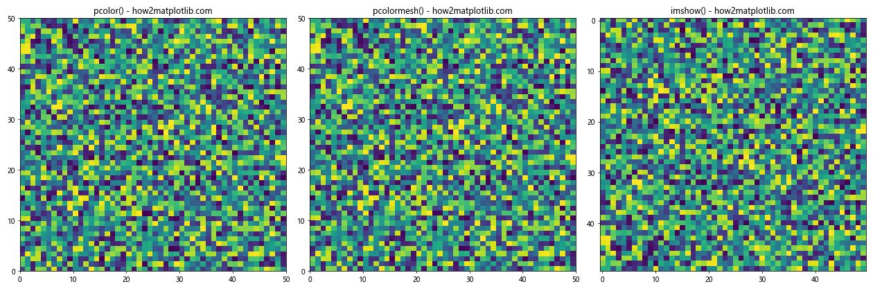
This example compares pcolor(), pcolormesh(), and imshow(). While they produce similar outputs, pcolormesh() is often faster for large datasets, and imshow() is typically used for image data.
Using Matplotlib.pyplot.pcolor() with Logarithmic Scales
For data that spans multiple orders of magnitude, using a logarithmic color scale can be beneficial:
import numpy as np
import matplotlib.pyplot as plt
from matplotlib.colors import LogNorm

data = np.random.rand(20, 20) * 1000

plt.figure(figsize=(10, 8))
plt.pcolor(data, norm=LogNorm(vmin=data.min(), vmax=data.max()), cmap='viridis')
plt.colorbar(label='Value (log scale)')
plt.title('Pseudocolor Plot with Logarithmic Color Scale - how2matplotlib.com')
plt.show()
Output:
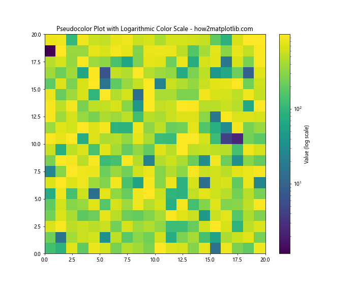
This example uses a logarithmic color scale, which can help visualize data with a wide range of values.
Creating 3D Surface Plots with Matplotlib.pyplot.pcolor()
While pcolor() creates 2D plots, you can combine it with 3D plotting to create surface plots:
import numpy as np
import matplotlib.pyplot as plt
from mpl_toolkits.mplot3d import Axes3D

x = np.linspace(-5, 5, 100)
y = np.linspace(-5, 5, 100)
X, Y = np.meshgrid(x, y)
Z = np.sin(np.sqrt(X**2 + Y**2))

fig = plt.figure(figsize=(12, 8))
ax = fig.add_subplot(111, projection='3d')
surf = ax.plot_surface(X, Y, Z, cmap='viridis')
fig.colorbar(surf)
ax.set_title('3D Surface Plot - how2matplotlib.com')
plt.show()
Output:
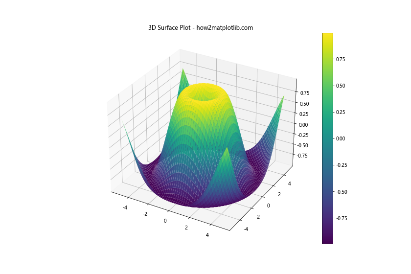
This example creates a 3D surface plot, which can be thought of as an extension of the 2D pcolor() plot into three dimensions.
Conclusion
The Matplotlib.pyplot.pcolor() function is a versatile tool for creating pseudocolor plots in Python. It offers a wide range of customization options and can be used in various contexts, from simple data visualization to complex scientific plotting. By mastering the pcolor() function, you can create informative and visually appealing plots that effectively communicate your data’s patterns and distributions.
Throughout this guide, we’ve explored various aspects of the Matplotlib.pyplot.pcolor() function, including basic usage, customization options, handling different types of data, and combining it with other Matplotlib features. We’ve also compared it with similar functions and demonstrated its use in different scenarios, such as image processing, geographical data visualization, and creating heatmaps.