Comprehensive Guide to Using Matplotlib.pyplot.loglog() Function in Python for Data Visualization
Matplotlib.pyplot.loglog() function in Python is a powerful tool for creating logarithmic plots in data visualization. This function is part of the Matplotlib library, which is widely used for creating static, animated, and interactive visualizations in Python. The loglog() function specifically allows users to create plots where both the x-axis and y-axis are scaled logarithmically. This is particularly useful when dealing with data that spans several orders of magnitude or when you want to visualize relationships between variables that follow power laws.
In this comprehensive guide, we’ll explore the Matplotlib.pyplot.loglog() function in Python, its syntax, parameters, and various use cases. We’ll also provide numerous examples to illustrate how to effectively use this function for different types of data visualization tasks.
Understanding the Basics of Matplotlib.pyplot.loglog() Function in Python
The Matplotlib.pyplot.loglog() function in Python is designed to create a plot with logarithmic scaling on both the x-axis and y-axis. This type of plot is particularly useful when dealing with data that spans several orders of magnitude or when you want to visualize relationships between variables that follow power laws.
Let’s start with a simple example to demonstrate the basic usage of the loglog() function:
import matplotlib.pyplot as plt
import numpy as np

x = np.logspace(0, 5, 100)
y = x**2

plt.loglog(x, y, label='y = x^2')
plt.title('Basic loglog plot - how2matplotlib.com')
plt.xlabel('x')
plt.ylabel('y')
plt.legend()
plt.grid(True)
plt.show()
Output:
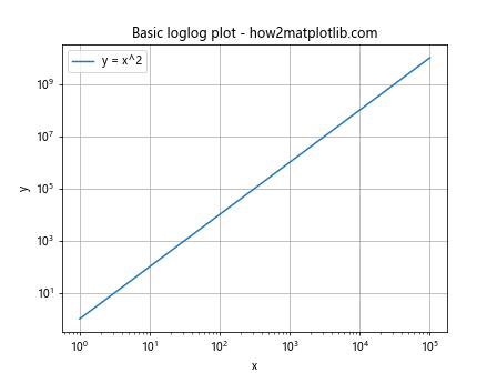
In this example, we create a loglog plot of y = x^2. The np.logspace() function is used to generate x values that are evenly spaced on a log scale. The loglog() function then plots these values with logarithmic scaling on both axes.
Syntax and Parameters of Matplotlib.pyplot.loglog() Function in Python
The Matplotlib.pyplot.loglog() function in Python has a flexible syntax that allows for various customizations. Here’s the basic syntax:
plt.loglog(*args, **kwargs)
The function accepts the following main parameters:
- x: The x-coordinates of the data points.
- y: The y-coordinates of the data points.
- basex: The base of the logarithm for the x-axis (default is 10).
- basey: The base of the logarithm for the y-axis (default is 10).
- subsx: The number of minor ticks between each major tick on the x-axis.
- subsy: The number of minor ticks between each major tick on the y-axis.
- Various keyword arguments for customizing the plot appearance.
Let’s look at an example that demonstrates the use of some of these parameters:
import matplotlib.pyplot as plt
import numpy as np

x = np.logspace(0, 5, 100)
y = x**2

plt.loglog(x, y, basex=2, basey=2, subsx=[2, 3, 4, 5, 6, 7], subsy=[2, 3, 4, 5, 6, 7])
plt.title('Customized loglog plot - how2matplotlib.com')
plt.xlabel('x (base 2)')
plt.ylabel('y (base 2)')
plt.grid(True)
plt.show()
In this example, we set the base of both axes to 2 and specify custom minor tick locations.
Using Matplotlib.pyplot.loglog() Function in Python for Comparing Multiple Datasets
One of the strengths of the Matplotlib.pyplot.loglog() function in Python is its ability to compare multiple datasets on the same plot. This is particularly useful when you want to visualize how different variables or functions behave across a wide range of scales.
Here’s an example that compares three different power law relationships:
import matplotlib.pyplot as plt
import numpy as np

x = np.logspace(0, 5, 100)
y1 = x
y2 = x**2
y3 = x**3

plt.loglog(x, y1, label='y = x')
plt.loglog(x, y2, label='y = x^2')
plt.loglog(x, y3, label='y = x^3')
plt.title('Comparing power laws - how2matplotlib.com')
plt.xlabel('x')
plt.ylabel('y')
plt.legend()
plt.grid(True)
plt.show()
Output:
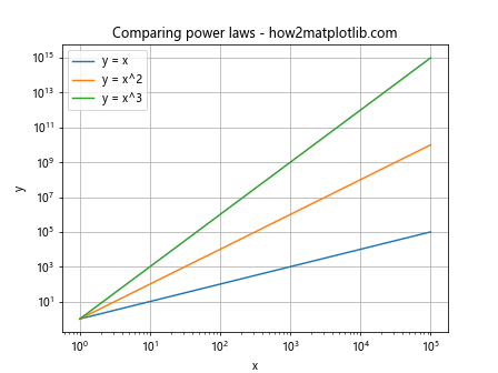
This example clearly shows how different power law relationships appear as straight lines with different slopes on a log-log plot.
Customizing Line Styles and Colors with Matplotlib.pyplot.loglog() Function in Python
The Matplotlib.pyplot.loglog() function in Python allows for extensive customization of line styles and colors. This is crucial for creating visually appealing and informative plots, especially when comparing multiple datasets.
Here’s an example that demonstrates various line style and color customizations:
import matplotlib.pyplot as plt
import numpy as np

x = np.logspace(0, 5, 100)
y1 = x
y2 = x**2
y3 = x**3

plt.loglog(x, y1, 'r-', linewidth=2, label='y = x')
plt.loglog(x, y2, 'g--', linewidth=2, label='y = x^2')
plt.loglog(x, y3, 'b:', linewidth=2, label='y = x^3')
plt.title('Customized line styles - how2matplotlib.com')
plt.xlabel('x')
plt.ylabel('y')
plt.legend()
plt.grid(True)
plt.show()
Output:
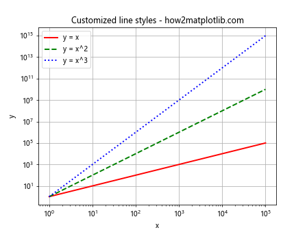
In this example, we use different colors (‘r’ for red, ‘g’ for green, ‘b’ for blue) and line styles (‘-‘ for solid, ‘–‘ for dashed, ‘:’ for dotted) to distinguish between the different datasets.
Adding Markers to Plots with Matplotlib.pyplot.loglog() Function in Python
Adding markers to your plots can help highlight specific data points or make the plot easier to read. The Matplotlib.pyplot.loglog() function in Python supports various marker styles.
Here’s an example that demonstrates the use of markers:
import matplotlib.pyplot as plt
import numpy as np

x = np.logspace(0, 5, 10)
y1 = x
y2 = x**2

plt.loglog(x, y1, 'ro-', markersize=8, label='y = x')
plt.loglog(x, y2, 'bs--', markersize=8, label='y = x^2')
plt.title('Loglog plot with markers - how2matplotlib.com')
plt.xlabel('x')
plt.ylabel('y')
plt.legend()
plt.grid(True)
plt.show()
Output:
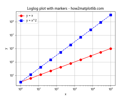
In this example, we use ‘ro-‘ to create red circles connected by a solid line, and ‘bs–‘ to create blue squares connected by a dashed line.
Handling Negative Values with Matplotlib.pyplot.loglog() Function in Python
One challenge when using the Matplotlib.pyplot.loglog() function in Python is handling negative values, as logarithms are only defined for positive numbers. However, there are ways to work around this limitation.
Here’s an example that demonstrates how to handle negative values:
import matplotlib.pyplot as plt
import numpy as np

x = np.linspace(-10, 10, 100)
y = x**3

plt.loglog(np.abs(x), np.abs(y), label='|y| = |x|^3')
plt.title('Handling negative values - how2matplotlib.com')
plt.xlabel('|x|')
plt.ylabel('|y|')
plt.legend()
plt.grid(True)
plt.show()
Output:
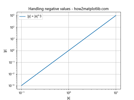
In this example, we take the absolute value of both x and y before plotting. This allows us to visualize the relationship even when the original data contains negative values.
Using Matplotlib.pyplot.loglog() Function in Python for Scientific Notation
When dealing with very large or very small numbers, scientific notation can be more readable. The Matplotlib.pyplot.loglog() function in Python can be configured to display axis labels in scientific notation.
Here’s an example:
import matplotlib.pyplot as plt
import numpy as np

x = np.logspace(0, 20, 100)
y = x**2

plt.loglog(x, y)
plt.title('Scientific notation - how2matplotlib.com')
plt.xlabel('x')
plt.ylabel('y')
plt.ticklabel_format(style='sci', axis='both', scilimits=(0,0))
plt.grid(True)
plt.show()
In this example, we use plt.ticklabel_format() to set the tick labels to scientific notation for both axes.
Creating Subplots with Matplotlib.pyplot.loglog() Function in Python
Sometimes, you may want to create multiple loglog plots side by side for comparison. The Matplotlib.pyplot.loglog() function in Python can be used in conjunction with subplots to achieve this.
Here’s an example:
import matplotlib.pyplot as plt
import numpy as np

x = np.logspace(0, 5, 100)
y1 = x
y2 = x**2

fig, (ax1, ax2) = plt.subplots(1, 2, figsize=(12, 5))

ax1.loglog(x, y1)
ax1.set_title('y = x - how2matplotlib.com')
ax1.set_xlabel('x')
ax1.set_ylabel('y')
ax1.grid(True)

ax2.loglog(x, y2)
ax2.set_title('y = x^2 - how2matplotlib.com')
ax2.set_xlabel('x')
ax2.set_ylabel('y')
ax2.grid(True)

plt.tight_layout()
plt.show()
Output:
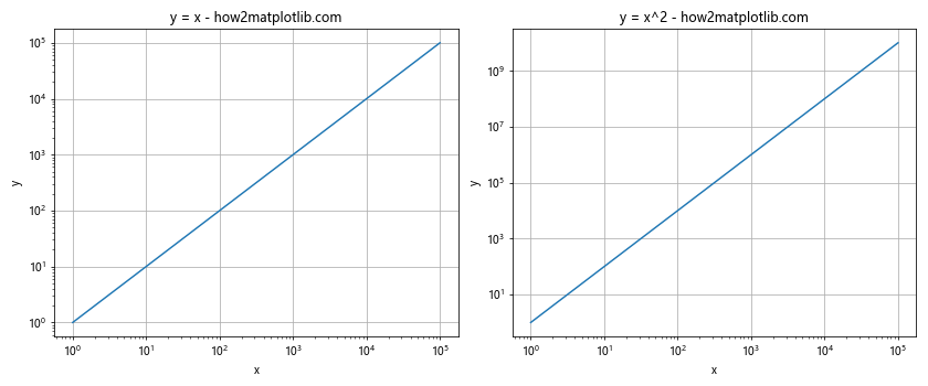
This example creates two loglog plots side by side, allowing for easy comparison between different relationships.
Customizing Tick Labels with Matplotlib.pyplot.loglog() Function in Python
The Matplotlib.pyplot.loglog() function in Python allows for extensive customization of tick labels. This can be useful for improving the readability of your plots or for highlighting specific values.
Here’s an example that demonstrates custom tick labels:
import matplotlib.pyplot as plt
import numpy as np

x = np.logspace(0, 5, 100)
y = x**2

fig, ax = plt.subplots()

ax.loglog(x, y)
ax.set_title('Custom tick labels - how2matplotlib.com')
ax.set_xlabel('x')
ax.set_ylabel('y')

ax.set_xticks([1, 10, 100, 1000, 10000])
ax.set_xticklabels(['1', '10', '100', '1K', '10K'])
ax.set_yticks([1, 1e2, 1e4, 1e6, 1e8])
ax.set_yticklabels(['1', '100', '10K', '1M', '100M'])

ax.grid(True)
plt.show()
Output:
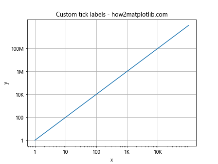
In this example, we use set_xticks() and set_yticks() to specify the tick locations, and set_xticklabels() and set_yticklabels() to set custom labels for these ticks.
Adding a Colorbar with Matplotlib.pyplot.loglog() Function in Python
When working with datasets that have an additional dimension beyond x and y, adding a colorbar to your loglog plot can be very informative. The Matplotlib.pyplot.loglog() function in Python can be used in conjunction with scatter plots and colorbars to visualize this additional dimension.
Here’s an example:
import matplotlib.pyplot as plt
import numpy as np

x = np.logspace(0, 5, 100)
y = x**2
z = np.log10(x)

fig, ax = plt.subplots()

scatter = ax.scatter(x, y, c=z, cmap='viridis')
ax.set_xscale('log')
ax.set_yscale('log')
ax.set_title('Loglog plot with colorbar - how2matplotlib.com')
ax.set_xlabel('x')
ax.set_ylabel('y')

cbar = plt.colorbar(scatter)
cbar.set_label('log10(x)')

plt.grid(True)
plt.show()
Output:
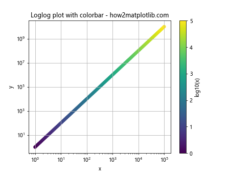
In this example, we use scatter() to create a scatter plot where the color of each point is determined by the log10 of x. We then add a colorbar to show the mapping between colors and values.
Using Matplotlib.pyplot.loglog() Function in Python for Error Bars
When dealing with experimental data, it’s often important to include error bars in your plots. The Matplotlib.pyplot.loglog() function in Python can be used in conjunction with errorbar() to create loglog plots with error bars.
Here’s an example:
import matplotlib.pyplot as plt
import numpy as np

x = np.logspace(0, 2, 20)
y = x**2
yerr = 0.1 * y

plt.figure(figsize=(10, 6))
plt.errorbar(x, y, yerr=yerr, fmt='o', capsize=5)
plt.xscale('log')
plt.yscale('log')
plt.title('Loglog plot with error bars - how2matplotlib.com')
plt.xlabel('x')
plt.ylabel('y')
plt.grid(True)
plt.show()
Output:
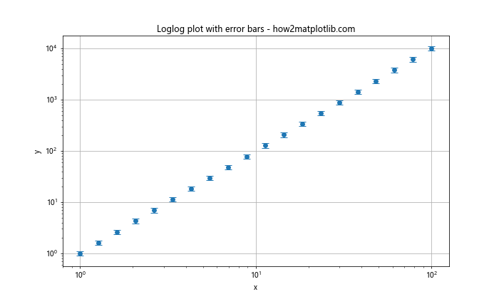
In this example, we use errorbar() to create a loglog plot with error bars. The fmt=’o’ argument specifies that we want to use circular markers, and capsize=5 sets the size of the error bar caps.
Creating Filled Plots with Matplotlib.pyplot.loglog() Function in Python
The Matplotlib.pyplot.loglog() function in Python can be used to create filled plots, which can be useful for visualizing ranges or confidence intervals.
Here’s an example:
import matplotlib.pyplot as plt
import numpy as np

x = np.logspace(0, 2, 100)
y1 = x**1.5
y2 = x**2.5

plt.figure(figsize=(10, 6))
plt.loglog(x, y1, 'b-', label='Lower bound')
plt.loglog(x, y2, 'r-', label='Upper bound')
plt.fill_between(x, y1, y2, alpha=0.2)
plt.title('Filled loglog plot - how2matplotlib.com')
plt.xlabel('x')
plt.ylabel('y')
plt.legend()
plt.grid(True)
plt.show()
Output:
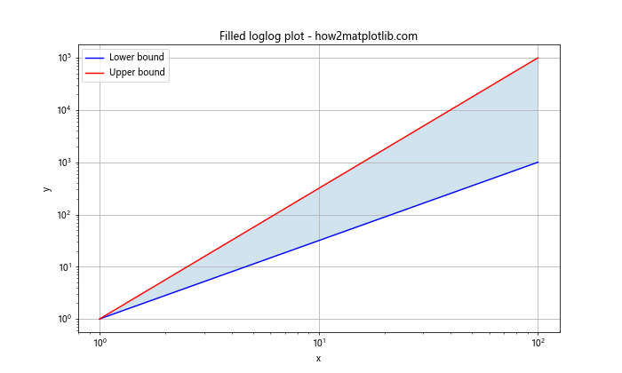
In this example, we use fill_between() to create a filled area between two curves on a loglog plot. The alpha parameter is used to set the transparency of the filled area.
Using Matplotlib.pyplot.loglog() Function in Python for Histogram Visualization
While the Matplotlib.pyplot.loglog() function in Python is typically used for scatter or line plots, it can also be applied to histograms to visualize distributions that span several orders of magnitude.
Here’s an example:
import matplotlib.pyplot as plt
import numpy as np

data = np.random.lognormal(0, 2, 1000)

plt.figure(figsize=(10, 6))
counts, bins, _ = plt.hist(data, bins=50)
plt.close()

plt.loglog(bins[:-1], counts)
plt.title('Loglog histogram - how2matplotlib.com')
plt.xlabel('Value')
plt.ylabel('Count')
plt.grid(True)
plt.show()
Output:
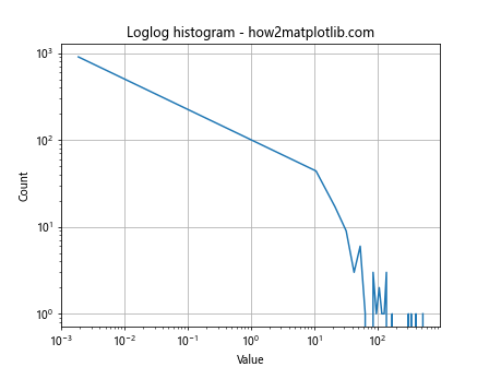
In this example, we first create a histogram of lognormally distributed data. We then plot the bin edges and counts on a loglog scale, which can help reveal power-law relationships in the data distribution.
Combining Matplotlib.pyplot.loglog() Function in Python with Other Plot Types
The Matplotlib.pyplot.loglog() function in Python can be combined with other types of plots to create more complex visualizations. For example, you might want to include a linear plot alongside a loglog plot for comparison.
Here’s an example:
import matplotlib.pyplot as plt
import numpy as np

x = np.logspace(0, 2, 100)
y= x**2

fig, (ax1, ax2) = plt.subplots(1, 2, figsize=(12, 5))

ax1.loglog(x, y)
ax1.set_title('Loglog plot - how2matplotlib.com')
ax1.set_xlabel('x')
ax1.set_ylabel('y')
ax1.grid(True)

ax2.plot(x, y)
ax2.set_title('Linear plot - how2matplotlib.com')
ax2.set_xlabel('x')
ax2.set_ylabel('y')
ax2.grid(True)

plt.tight_layout()
plt.show()
Output:
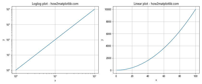
In this example, we create two subplots side by side: one using loglog scaling and the other using linear scaling. This allows for easy comparison of how the same data appears under different scaling.
Using Matplotlib.pyplot.loglog() Function in Python for Time Series Data
The Matplotlib.pyplot.loglog() function in Python can be particularly useful for visualizing time series data, especially when the data spans long periods or shows exponential growth.
Here’s an example using fictional stock price data:
import matplotlib.pyplot as plt
import numpy as np
import pandas as pd

dates = pd.date_range(start='1/1/2000', end='1/1/2020', freq='Y')
prices = 100 * (1.1 ** np.arange(len(dates)))  # 10% annual growth

plt.figure(figsize=(10, 6))
plt.loglog(dates, prices, 'bo-')
plt.title('Stock Price Growth - how2matplotlib.com')
plt.xlabel('Year')
plt.ylabel('Price ($)')
plt.grid(True)
plt.show()
Output:
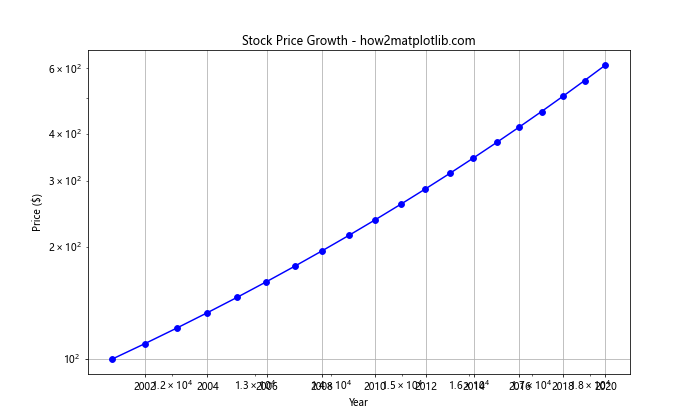
In this example, we create a loglog plot of stock prices over time. The loglog scale helps to visualize the exponential growth more clearly than a linear scale would.
Handling Missing Data with Matplotlib.pyplot.loglog() Function in Python
When working with real-world data, you may encounter missing values. The Matplotlib.pyplot.loglog() function in Python can handle this, but you need to be careful about how you preprocess your data.
Here’s an example of how to handle missing data:
import matplotlib.pyplot as plt
import numpy as np

x = np.logspace(0, 2, 20)
y = x**2
y[5:10] = np.nan  # Introduce some missing values

plt.figure(figsize=(10, 6))
plt.loglog(x, y, 'bo-', where='finite')
plt.title('Loglog plot with missing data - how2matplotlib.com')
plt.xlabel('x')
plt.ylabel('y')
plt.grid(True)
plt.show()
In this example, we introduce some NaN values into our y data. By using the where=’finite’ argument in the loglog() function, we tell Matplotlib to only plot the finite values and skip over the NaNs.
Using Matplotlib.pyplot.loglog() Function in Python for Curve Fitting
The Matplotlib.pyplot.loglog() function in Python can be very useful when performing curve fitting, especially for power law relationships. Here’s an example that demonstrates curve fitting on a loglog plot:
import matplotlib.pyplot as plt
import numpy as np
from scipy.optimize import curve_fit

def power_law(x, a, b):
    return a * np.power(x, b)

x = np.logspace(0, 2, 50)
y = 2 * x**1.5 + np.random.normal(0, 0.1, 50)

popt, _ = curve_fit(power_law, x, y)

plt.figure(figsize=(10, 6))
plt.loglog(x, y, 'bo', label='Data')
plt.loglog(x, power_law(x, *popt), 'r-', label=f'Fit: y={popt[0]:.2f}x^{popt[1]:.2f}')
plt.title('Curve Fitting on Loglog Plot - how2matplotlib.com')
plt.xlabel('x')
plt.ylabel('y')
plt.legend()
plt.grid(True)
plt.show()
Output:
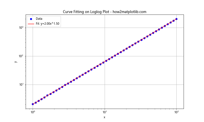
In this example, we generate some noisy data following a power law, then use scipy’s curve_fit function to fit a power law to this data. The results are plotted on a loglog scale, which helps to visualize the power law relationship.
Conclusion
The Matplotlib.pyplot.loglog() function in Python is a powerful tool for visualizing data that spans several orders of magnitude or follows power law relationships. Throughout this comprehensive guide, we’ve explored various aspects of using this function, from basic usage to advanced techniques.
We’ve seen how to customize the appearance of loglog plots, handle negative and missing values, combine loglog plots with other visualization techniques, and use loglog plots for various types of data analysis tasks. We’ve also provided numerous examples to illustrate these concepts, each with detailed explanations.