Comprehensive Guide to Matplotlib.pyplot.figlegend() Function in Python: How to Create and Customize Figure-Level Legends
Matplotlib.pyplot.figlegend() function in Python is a powerful tool for creating figure-level legends in data visualization. This function allows you to add a single legend to an entire figure, rather than individual axes. In this comprehensive guide, we’ll explore the Matplotlib.pyplot.figlegend() function in depth, covering its usage, parameters, and various customization options. We’ll also provide numerous examples to illustrate how to effectively use this function in your data visualization projects.
Understanding the Basics of Matplotlib.pyplot.figlegend()
The Matplotlib.pyplot.figlegend() function is part of the pyplot module in Matplotlib, a popular data visualization library in Python. This function is specifically designed to create a legend for an entire figure, which can be particularly useful when working with multiple subplots or when you want a single legend to represent all the data in your figure.
Let’s start with a basic example to demonstrate how to use the Matplotlib.pyplot.figlegend() function:
import matplotlib.pyplot as plt
import numpy as np

# Generate sample data
x = np.linspace(0, 10, 100)
y1 = np.sin(x)
y2 = np.cos(x)

# Create a figure with two subplots
fig, (ax1, ax2) = plt.subplots(1, 2, figsize=(10, 4))

# Plot data on the subplots
ax1.plot(x, y1, label='Sine')
ax2.plot(x, y2, label='Cosine')

# Add a figure-level legend
fig.legend(loc='upper center', bbox_to_anchor=(0.5, 1.05),
           ncol=2, fancybox=True, shadow=True)

plt.suptitle('Trigonometric Functions - how2matplotlib.com')
plt.tight_layout()
plt.show()
Output:
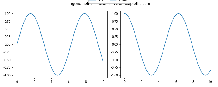
In this example, we create a figure with two subplots, plot sine and cosine functions on separate axes, and then use Matplotlib.pyplot.figlegend() to add a single legend for both plots at the figure level. The legend is positioned above the figure using the bbox_to_anchor parameter.
Key Parameters of Matplotlib.pyplot.figlegend()
The Matplotlib.pyplot.figlegend() function offers several parameters to customize the appearance and behavior of the legend. Let’s explore some of the most important ones:
handlesandlabels: These parameters allow you to specify the legend entries manually.loc: Determines the location of the legend within the figure.bbox_to_anchor: Allows fine-tuning of the legend position.ncol: Specifies the number of columns in the legend.fontsize: Sets the font size of the legend text.title: Adds a title to the legend.frameon: Controls whether the legend frame is drawn.fancybox: Adds a rounded box around the legend.shadow: Adds a shadow effect to the legend.framealpha: Sets the alpha transparency of the legend frame.
Let’s see an example that demonstrates the use of these parameters:
import matplotlib.pyplot as plt
import numpy as np

# Generate sample data
x = np.linspace(0, 10, 100)
y1 = np.sin(x)
y2 = np.cos(x)
y3 = np.tan(x)

# Create a figure with three subplots
fig, (ax1, ax2, ax3) = plt.subplots(1, 3, figsize=(15, 4))

# Plot data on the subplots
ax1.plot(x, y1, label='Sine')
ax2.plot(x, y2, label='Cosine')
ax3.plot(x, y3, label='Tangent')

# Add a figure-level legend with custom parameters
fig.legend(loc='lower center', bbox_to_anchor=(0.5, -0.15),
           ncol=3, fontsize=12, title='Trigonometric Functions',
           title_fontsize=14, frameon=True, fancybox=True,
           shadow=True, framealpha=0.8)

plt.suptitle('Advanced Trigonometry - how2matplotlib.com', fontsize=16)
plt.tight_layout()
plt.show()
Output:

In this example, we create a figure with three subplots and use Matplotlib.pyplot.figlegend() to add a customized legend at the bottom of the figure. We’ve used various parameters to control the appearance and position of the legend.
Positioning the Legend with Matplotlib.pyplot.figlegend()
One of the most important aspects of using Matplotlib.pyplot.figlegend() is positioning the legend correctly within your figure. The loc and bbox_to_anchor parameters play a crucial role in this.
The loc parameter accepts various string values or numerical codes to specify the general location of the legend. Some common options include:
- ‘upper right’: 1
- ‘upper left’: 2
- ‘lower left’: 3
- ‘lower right’: 4
- ‘right’: 5
- ‘center left’: 6
- ‘center right’: 7
- ‘lower center’: 8
- ‘upper center’: 9
- ‘center’: 10
The bbox_to_anchor parameter allows for more precise positioning. It accepts a tuple of (x, y) coordinates, where (0, 0) is the lower-left corner of the figure, and (1, 1) is the upper-right corner.
Let’s see an example that demonstrates different legend positions:
import matplotlib.pyplot as plt
import numpy as np

def plot_with_legend(loc, bbox_to_anchor):
    x = np.linspace(0, 10, 100)
    y1 = np.sin(x)
    y2 = np.cos(x)

    fig, ax = plt.subplots(figsize=(8, 6))
    ax.plot(x, y1, label='Sine')
    ax.plot(x, y2, label='Cosine')

    fig.legend(loc=loc, bbox_to_anchor=bbox_to_anchor,
               title=f'Legend Position: {loc}')

    plt.title(f'Legend Positioning - how2matplotlib.com')
    plt.tight_layout()
    plt.show()

# Example positions
plot_with_legend('upper right', None)
plot_with_legend('lower left', None)
plot_with_legend('center right', (1, 0.5))
plot_with_legend('lower center', (0.5, -0.1))
This example creates four separate plots, each demonstrating a different legend position using Matplotlib.pyplot.figlegend(). The plot_with_legend function allows us to easily experiment with different loc and bbox_to_anchor values.
Customizing Legend Appearance with Matplotlib.pyplot.figlegend()
Matplotlib.pyplot.figlegend() offers various options to customize the appearance of the legend. Let’s explore some of these customization options:
Changing Legend Style
You can modify the legend’s style by adjusting parameters such as fancybox, shadow, and frameon:
import matplotlib.pyplot as plt
import numpy as np

x = np.linspace(0, 10, 100)
y1 = np.sin(x)
y2 = np.cos(x)

fig, ax = plt.subplots(figsize=(8, 6))
ax.plot(x, y1, label='Sine')
ax.plot(x, y2, label='Cosine')

fig.legend(loc='upper right', fancybox=True, shadow=True, framealpha=0.7,
           title='Customized Legend Style')

plt.title('Legend Style Customization - how2matplotlib.com')
plt.tight_layout()
plt.show()
Output:
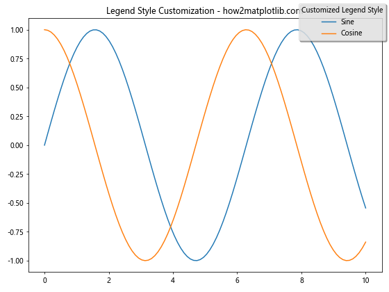
This example demonstrates how to create a legend with a rounded box (fancybox=True), a shadow effect (shadow=True), and semi-transparent background (framealpha=0.7).
Adjusting Legend Size and Font
You can control the size of the legend and its font properties:
import matplotlib.pyplot as plt
import numpy as np

x = np.linspace(0, 10, 100)
y1 = np.sin(x)
y2 = np.cos(x)

fig, ax = plt.subplots(figsize=(8, 6))
ax.plot(x, y1, label='Sine')
ax.plot(x, y2, label='Cosine')

fig.legend(loc='upper right', fontsize=12, title='Trigonometric Functions',
           title_fontsize=14, markerscale=1.5)

plt.title('Legend Size and Font Customization - how2matplotlib.com')
plt.tight_layout()
plt.show()
Output:
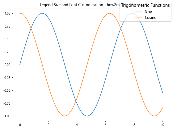
In this example, we set the font size of the legend text (fontsize=12), the title font size (title_fontsize=14), and increase the size of the legend markers (markerscale=1.5).
Handling Multiple Legends with Matplotlib.pyplot.figlegend()
When working with complex figures containing multiple subplots, Matplotlib.pyplot.figlegend() can be particularly useful for creating a single, unified legend. Let’s explore how to handle multiple legends effectively:
Combining Legends from Multiple Subplots
import matplotlib.pyplot as plt
import numpy as np

x = np.linspace(0, 10, 100)
y1 = np.sin(x)
y2 = np.cos(x)
y3 = np.tan(x)
y4 = np.exp(x)

fig, ((ax1, ax2), (ax3, ax4)) = plt.subplots(2, 2, figsize=(12, 10))

ax1.plot(x, y1, label='Sine')
ax2.plot(x, y2, label='Cosine')
ax3.plot(x, y3, label='Tangent')
ax4.plot(x, y4, label='Exponential')

handles, labels = [], []
for ax in fig.axes:
    for h, l in zip(*ax.get_legend_handles_labels()):
        handles.append(h)
        labels.append(l)

fig.legend(handles, labels, loc='center right', bbox_to_anchor=(1.1, 0.5),
           title='Combined Legend')

plt.suptitle('Multiple Subplots with Combined Legend - how2matplotlib.com')
plt.tight_layout()
plt.show()
Output:
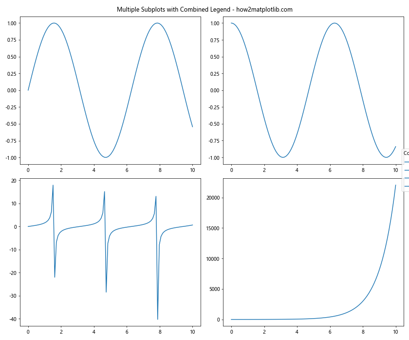
This example demonstrates how to combine legends from multiple subplots into a single figure-level legend using Matplotlib.pyplot.figlegend().
Creating Separate Legends for Different Data Types
Sometimes, you may want to group legend entries by data type or category:
import matplotlib.pyplot as plt
import numpy as np

x = np.linspace(0, 10, 100)
y1 = np.sin(x)
y2 = np.cos(x)
y3 = x**2
y4 = x**3

fig, (ax1, ax2) = plt.subplots(1, 2, figsize=(12, 5))

trig_lines = ax1.plot(x, y1, 'r-', x, y2, 'b-')
poly_lines = ax2.plot(x, y3, 'g-', x, y4, 'm-')

fig.legend(trig_lines, ['Sine', 'Cosine'], loc='upper left', bbox_to_anchor=(0.1, 1),
           title='Trigonometric Functions')
fig.legend(poly_lines, ['Quadratic', 'Cubic'], loc='upper right', bbox_to_anchor=(0.9, 1),
           title='Polynomial Functions')

plt.suptitle('Separate Legends for Different Data Types - how2matplotlib.com')
plt.tight_layout()
plt.show()
Output:
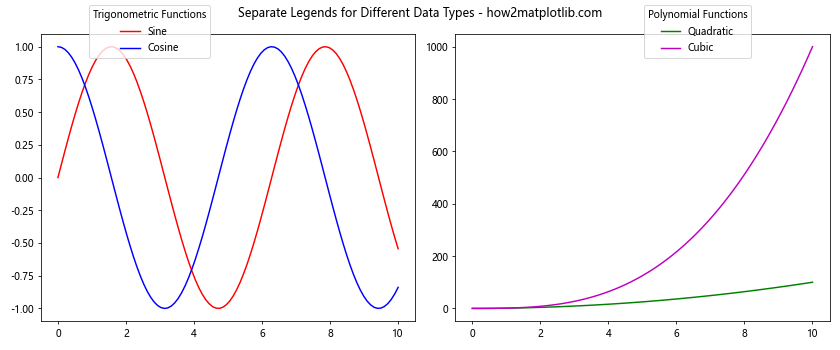
In this example, we create two separate legends using Matplotlib.pyplot.figlegend(), one for trigonometric functions and another for polynomial functions.
Advanced Techniques with Matplotlib.pyplot.figlegend()
Let’s explore some advanced techniques and use cases for Matplotlib.pyplot.figlegend():
Creating a Legend for a Subset of Plot Elements
Sometimes, you may want to create a legend for only a subset of the plot elements:
import matplotlib.pyplot as plt
import numpy as np

x = np.linspace(0, 10, 100)
y1 = np.sin(x)
y2 = np.cos(x)
y3 = np.tan(x)

fig, ax = plt.subplots(figsize=(8, 6))
line1 = ax.plot(x, y1, 'r-', label='Sine')
line2 = ax.plot(x, y2, 'b-', label='Cosine')
line3 = ax.plot(x, y3, 'g-', label='Tangent')

# Create a legend for only sine and cosine
fig.legend([line1[0], line2[0]], ['Sine', 'Cosine'], loc='upper right',
           title='Selected Functions')

plt.title('Legend for Subset of Plot Elements - how2matplotlib.com')
plt.tight_layout()
plt.show()
Output:
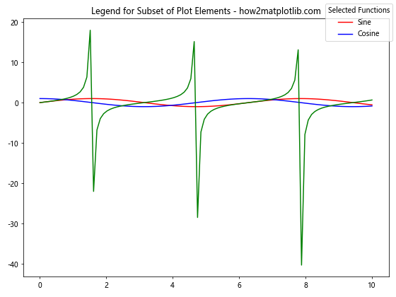
This example demonstrates how to create a legend for only a subset of the plotted lines using Matplotlib.pyplot.figlegend().
Using Custom Legend Entries
You can create custom legend entries that don’t correspond directly to plot elements:
import matplotlib.pyplot as plt
import numpy as np
from matplotlib.lines import Line2D

x = np.linspace(0, 10, 100)
y1 = np.sin(x)
y2 = np.cos(x)

fig, ax = plt.subplots(figsize=(8, 6))
ax.plot(x, y1, 'r-')
ax.plot(x, y2, 'b-')

custom_lines = [Line2D([0], [0], color='r', lw=2),
                Line2D([0], [0], color='b', lw=2),
                Line2D([0], [0], color='g', lw=2, linestyle='--')]

fig.legend(custom_lines, ['Sine', 'Cosine', 'Custom Entry'],
           loc='upper right', title='Custom Legend Entries')

plt.title('Custom Legend Entries - how2matplotlib.com')
plt.tight_layout()
plt.show()
Output:
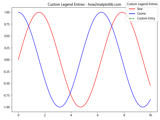
This example shows how to create custom legend entries using Line2D objects with Matplotlib.pyplot.figlegend().
Handling Legend Overlaps and Spacing
When working with Matplotlib.pyplot.figlegend(), you may encounter situations where the legend overlaps with plot elements or other figure components. Here are some techniques to handle these issues:
Adjusting Figure Layout
You can use plt.tight_layout() with additional parameters to make room for the legend:
import matplotlib.pyplot as plt
import numpy as np

x = np.linspace(0, 10, 100)
y1 = np.sin(x)
y2 = np.cos(x)

fig, ax = plt.subplots(figsize=(8, 6))
ax.plot(x, y1, label='Sine')
ax.plot(x, y2, label='Cosine')

fig.legend(loc='upper center', bbox_to_anchor=(0.5, 1.15),
           ncol=2, title='Trigonometric Functions')

plt.title('Adjusted Layout for Legend - how2matplotlib.com')
plt.tight_layout(rect=[0, 0, 1, 0.9])  # Adjust the top margin
plt.show()
Output:
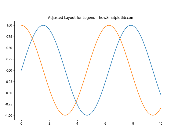
In this example, we use plt.tight_layout(rect=[0, 0, 1, 0.9]) to adjust the top margin of the figure, making room for the legend.
Using Gridspec for Complex Layouts
For more complex layouts, you can use GridSpec to allocate space for the legend:
import matplotlib.pyplot as plt
import numpy as```python
import matplotlib.pyplot as plt
import numpy as np
from matplotlib.gridspec import GridSpec

x = np.linspace(0, 10, 100)
y1 = np.sin(x)
y2 = np.cos(x)

fig = plt.figure(figsize=(10, 8))
gs = GridSpec(3, 1, height_ratios=[1, 4, 1])

ax1 = fig.add_subplot(gs[1])
ax1.plot(x, y1, label='Sine')
ax1.plot(x, y2, label='Cosine')

legend_ax = fig.add_subplot(gs[0])
legend_ax.axis('off')
legend_ax.legend(*ax1.get_legend_handles_labels(), loc='center', ncol=2,
                 title='Trigonometric Functions')

plt.suptitle('Using GridSpec for Legend Placement - how2matplotlib.com')
plt.tight_layout()
plt.show()
This example uses GridSpec to create a dedicated space for the legend above the main plot, ensuring no overlap with the plot elements.
Animating Legends with Matplotlib.pyplot.figlegend()
Matplotlib.pyplot.figlegend() can also be used in animated plots. Here’s an example of how to create an animated plot with a updating legend:
import matplotlib.pyplot as plt
import numpy as np
from matplotlib.animation import FuncAnimation

fig, ax = plt.subplots(figsize=(8, 6))
x = np.linspace(0, 2*np.pi, 100)
line, = ax.plot(x, np.sin(x))

def update(frame):
    line.set_ydata(np.sin(x + frame/10))
    fig.legend([line], [f'Sin(x + {frame/10:.2f})'],
               loc='upper right', title='Animated Legend')
    return line,

ani = FuncAnimation(fig, update, frames=np.linspace(0, 2*np.pi, 128),
                    blit=True, interval=50)

plt.title('Animated Plot with Updating Legend - how2matplotlib.com')
plt.tight_layout()
plt.show()
Output:
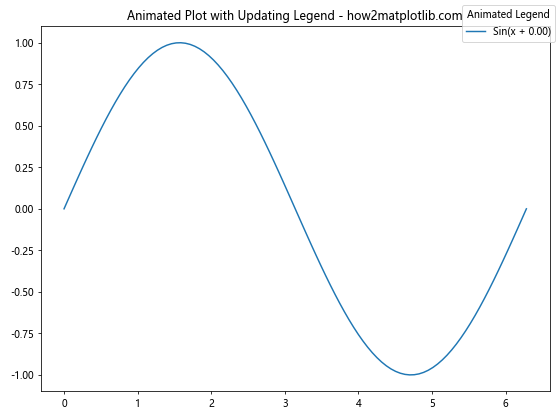
This example creates an animated sine wave with a legend that updates to show the current phase shift.
Handling Large Numbers of Legend Entries
When dealing with plots that have many elements, the legend can become cluttered. Here are some strategies to handle large numbers of legend entries using Matplotlib.pyplot.figlegend():
Using Multiple Columns
import matplotlib.pyplot as plt
import numpy as np

x = np.linspace(0, 10, 100)
fig, ax = plt.subplots(figsize=(12, 8))

for i in range(10):
    ax.plot(x, np.sin(x + i*0.5), label=f'Sin(x + {i*0.5:.1f})')

fig.legend(loc='lower center', ncol=5, title='Multiple Sine Waves')

plt.title('Large Legend with Multiple Columns - how2matplotlib.com')
plt.tight_layout()
plt.show()
Output:
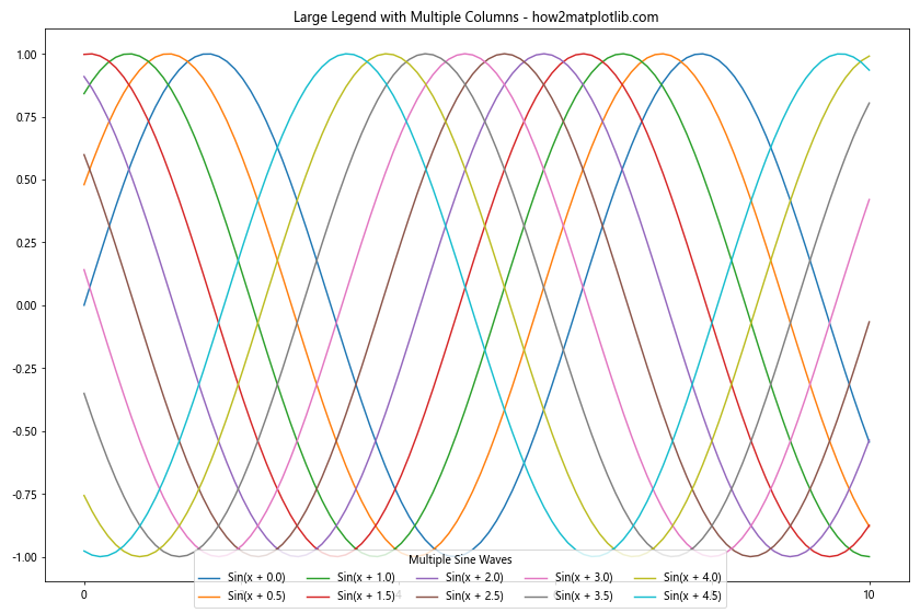
This example demonstrates how to use the ncol parameter to create a multi-column legend for a large number of plot elements.
Creating a Scrollable Legend
For an extremely large number of entries, you might want to create a scrollable legend:
import matplotlib.pyplot as plt
import numpy as np
from matplotlib.backends.backend_qt5agg import FigureCanvasQTAgg as FigureCanvas
from PyQt5.QtWidgets import QApplication, QWidget, QVBoxLayout, QScrollArea
import sys

class ScrollableWindow(QWidget):
    def __init__(self, fig):
        QWidget.__init__(self)
        layout = QVBoxLayout(self)
        self.canvas = FigureCanvas(fig)
        scroll = QScrollArea(self)
        scroll.setWidget(self.canvas)
        layout.addWidget(scroll)

x = np.linspace(0, 10, 100)
fig, ax = plt.subplots(figsize=(8, 6))

for i in range(30):
    ax.plot(x, np.sin(x + i*0.2), label=f'Sin(x + {i*0.2:.1f})')

fig.legend(loc='center left', bbox_to_anchor=(1, 0.5), title='Many Sine Waves')

plt.title('Scrollable Legend for Many Entries - how2matplotlib.com')
plt.tight_layout()

app = QApplication(sys.argv)
main = ScrollableWindow(fig)
main.show()
sys.exit(app.exec_())
This example creates a scrollable window for a figure with a large legend using PyQt5. Note that you’ll need to have PyQt5 installed to run this example.
Customizing Legend Markers and Labels
Matplotlib.pyplot.figlegend() allows for extensive customization of legend markers and labels. Here are some advanced techniques:
Custom Markers and Colors
import matplotlib.pyplot as plt
import numpy as np

x = np.linspace(0, 10, 100)
y1 = np.sin(x)
y2 = np.cos(x)
y3 = np.tan(x)

fig, ax = plt.subplots(figsize=(8, 6))
ax.plot(x, y1, 'r-', x, y2, 'b--', x, y3, 'g:')

custom_lines = [plt.Line2D([0], [0], color='r', lw=2),
                plt.Line2D([0], [0], color='b', lw=2, linestyle='--'),
                plt.Line2D([0], [0], color='g', lw=2, linestyle=':')]

fig.legend(custom_lines, ['Sine', 'Cosine', 'Tangent'],
           loc='upper right', title='Custom Markers')

plt.title('Legend with Custom Markers - how2matplotlib.com')
plt.tight_layout()
plt.show()
Output:
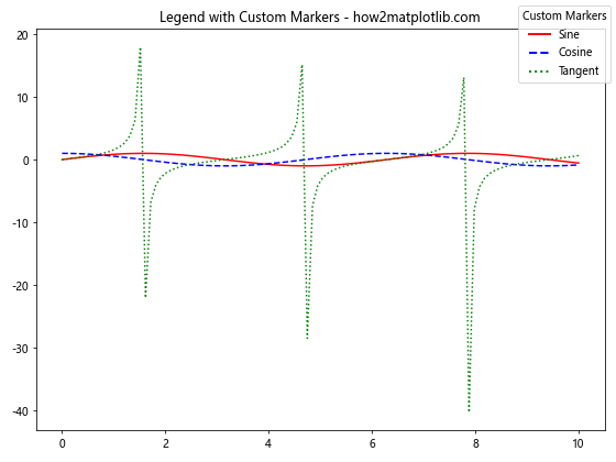
This example demonstrates how to create custom line styles and colors for legend entries.
Adding Images to Legend
You can even add images to your legend:
import matplotlib.pyplot as plt
import numpy as np
from matplotlib.offsetbox import OffsetImage, AnnotationBbox

x = np.linspace(0, 10, 100)
y1 = np.sin(x)
y2 = np.cos(x)

fig, ax = plt.subplots(figsize=(8, 6))
ax.plot(x, y1, 'r-', label='Sine')
ax.plot(x, y2, 'b-', label='Cosine')

# Create a small sine wave image
x_small = np.linspace(0, 2*np.pi, 20)
y_small = np.sin(x_small)
sine_img = ax.plot(x_small, y_small, 'r-')
plt.close()

# Add the image to the legend
img = OffsetImage(sine_img[0].figure, zoom=0.2)
img_box = AnnotationBbox(img, (0, 0), frameon=False)
img_box.set_clip_on(False)

handles, labels = ax.get_legend_handles_labels()
handles.append(img_box)
labels.append('Sine Wave')

fig.legend(handles, labels, loc='upper right', title='Functions')

plt.title('Legend with Images - how2matplotlib.com')
plt.tight_layout()
plt.show()
This example adds a small image of a sine wave to the legend alongside the regular line plot entries.
Best Practices for Using Matplotlib.pyplot.figlegend()
When working with Matplotlib.pyplot.figlegend(), keep these best practices in mind:
- Use figure-level legends for consistency across subplots.
- Position the legend carefully to avoid overlapping with plot elements.
- Use
bbox_to_anchorfor fine-tuned positioning. - Adjust figure size and layout to accommodate the legend.
- Use
ncolparameter for better organization of multiple legend entries. - Customize legend appearance to match your plot style.
- Consider using a scrollable legend for a large number of entries.
- Use custom markers and colors to enhance legend readability.
- Add a title to the legend for clarity.
- Ensure legend text is legible by adjusting font size and style.
Troubleshooting Common Issues with Matplotlib.pyplot.figlegend()
When using Matplotlib.pyplot.figlegend(), you might encounter some common issues. Here are some problems and their solutions:
Legend Overlapping with Plot
If the legend overlaps with your plot, try adjusting its position:
import matplotlib.pyplot as plt
import numpy as np

x = np.linspace(0, 10, 100)
y1 = np.sin(x)
y2 = np.cos(x)

fig, ax = plt.subplots(figsize=(8, 6))
ax.plot(x, y1, label='Sine')
ax.plot(x, y2, label='Cosine')

fig.legend(loc='center left', bbox_to_anchor=(1, 0.5))

plt.title('Avoiding Legend Overlap - how2matplotlib.com')
plt.tight_layout()
plt.show()
Output:
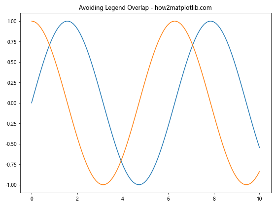
This example places the legend outside the plot area to avoid overlap.
Missing Legend Entries
If some legend entries are missing, ensure all plotted elements have labels:
import matplotlib.pyplot as plt
import numpy as np

x = np.linspace(0, 10, 100)
y1 = np.sin(x)
y2 = np.cos(x)

fig, ax = plt.subplots(figsize=(8, 6))
ax.plot(x, y1, label='Sine')
ax.plot(x, y2, label='Cosine')
ax.scatter(x[::10], y1[::10], color='r', label='Sine Points')

fig.legend(loc='upper right')

plt.title('Ensuring All Elements Have Labels - how2matplotlib.com')
plt.tight_layout()
plt.show()
Output:
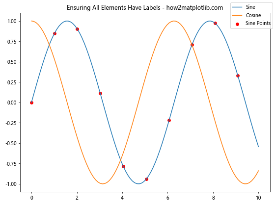
This example ensures all plotted elements (lines and scatter points) have labels for the legend.
Conclusion
Matplotlib.pyplot.figlegend() is a powerful function that allows you to create and customize figure-level legends in your data visualizations. Throughout this comprehensive guide, we’ve explored various aspects of using this function, from basic usage to advanced techniques.
We’ve covered key parameters, positioning strategies, customization options, and methods for handling multiple legends and large numbers of entries. We’ve also looked at how to integrate Matplotlib.pyplot.figlegend() with animated plots and how to troubleshoot common issues.
By mastering Matplotlib.pyplot.figlegend(), you can create more informative and visually appealing plots, effectively communicating your data insights. Remember to experiment with different options and always consider the overall design and readability of your visualizations when using legends.