Comprehensive Guide to Using Matplotlib.axis.XAxis.set_tick_params() in Python for Data Visualization
Matplotlib.axis.XAxis.set_tick_params() in Python is a powerful method for customizing the appearance of tick marks and labels on the x-axis of a plot. This function is an essential tool for data scientists and analysts who want to create professional-looking visualizations. In this comprehensive guide, we’ll explore the various ways to use Matplotlib.axis.XAxis.set_tick_params() to enhance your plots and make them more informative and visually appealing.
Understanding Matplotlib.axis.XAxis.set_tick_params()
Matplotlib.axis.XAxis.set_tick_params() is a method that allows you to set parameters for tick marks and labels on the x-axis of a Matplotlib plot. This function is part of the Matplotlib library, which is widely used for creating static, animated, and interactive visualizations in Python.
The set_tick_params() method provides a wide range of customization options, including:
- Changing the color of tick marks and labels
- Adjusting the size and direction of tick marks
- Modifying the font properties of tick labels
- Controlling the visibility of tick marks and labels
Let’s start with a basic example to demonstrate how to use Matplotlib.axis.XAxis.set_tick_params():
import matplotlib.pyplot as plt

# Create a simple plot
fig, ax = plt.subplots()
ax.plot([1, 2, 3, 4], [1, 4, 2, 3])

# Customize x-axis tick parameters
ax.xaxis.set_tick_params(color='red', labelcolor='blue', labelsize=12, direction='out')

plt.title('How to use Matplotlib.axis.XAxis.set_tick_params() - how2matplotlib.com')
plt.show()
Output:
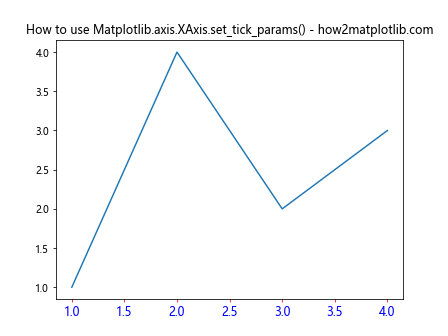
In this example, we create a simple line plot and then use set_tick_params() to customize the x-axis tick marks and labels. We set the tick color to red, the label color to blue, the label size to 12, and the tick direction to ‘out’.
Customizing Tick Colors
One of the most common uses of Matplotlib.axis.XAxis.set_tick_params() is to change the colors of tick marks and labels. This can be particularly useful when you want to match the tick colors with your plot’s color scheme or improve visibility against different backgrounds.
Here’s an example that demonstrates how to set different colors for tick marks and labels:
import matplotlib.pyplot as plt
import numpy as np

x = np.linspace(0, 10, 100)
y = np.sin(x)

fig, ax = plt.subplots()
ax.plot(x, y)

ax.xaxis.set_tick_params(color='green', labelcolor='purple')

plt.title('Customizing Tick Colors with Matplotlib.axis.XAxis.set_tick_params() - how2matplotlib.com')
plt.show()
Output:
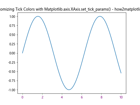
In this example, we set the tick mark color to green and the label color to purple. This creates a visually striking contrast between the tick marks and labels.
Adjusting Tick Size and Length
Matplotlib.axis.XAxis.set_tick_params() also allows you to control the size and length of tick marks. This can be useful for emphasizing certain aspects of your plot or for accommodating different plot sizes.
Here’s an example that demonstrates how to adjust tick size and length:
import matplotlib.pyplot as plt
import numpy as np

x = np.linspace(0, 10, 100)
y = np.cos(x)

fig, ax = plt.subplots()
ax.plot(x, y)

ax.xaxis.set_tick_params(width=2, length=10, labelsize=14)

plt.title('Adjusting Tick Size and Length with Matplotlib.axis.XAxis.set_tick_params() - how2matplotlib.com')
plt.show()
Output:
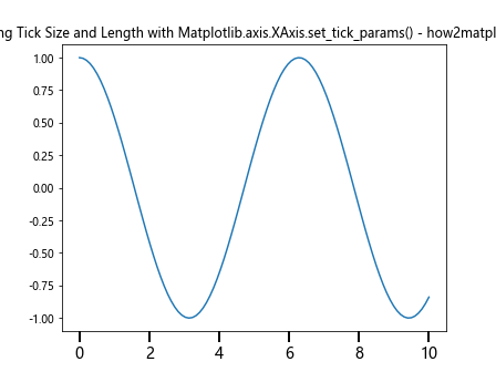
In this example, we set the tick width to 2, the length to 10, and the label size to 14. This creates more prominent tick marks and larger labels, which can be helpful for presentations or when dealing with dense data.
Controlling Tick Direction
The direction of tick marks can significantly impact the overall look of your plot. Matplotlib.axis.XAxis.set_tick_params() allows you to easily change the tick direction.
Here’s an example that shows how to set tick direction:
import matplotlib.pyplot as plt
import numpy as np

x = np.linspace(0, 10, 100)
y = np.tan(x)

fig, ax = plt.subplots()
ax.plot(x, y)

ax.xaxis.set_tick_params(direction='in', length=6, width=2, colors='r', grid_color='r', grid_alpha=0.5)

plt.title('Controlling Tick Direction with Matplotlib.axis.XAxis.set_tick_params() - how2matplotlib.com')
plt.show()
Output:
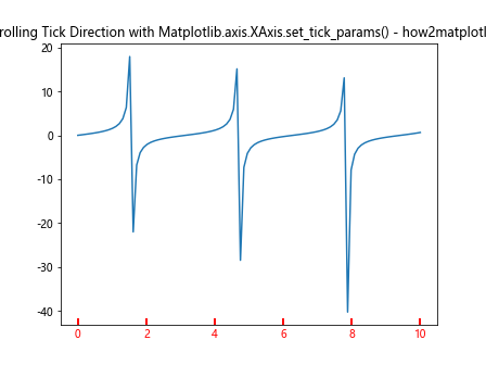
In this example, we set the tick direction to ‘in’, which makes the tick marks point inwards towards the plot. We also customize the length, width, and color of the tick marks, as well as the color and transparency of the grid lines.
Modifying Tick Label Properties
Matplotlib.axis.XAxis.set_tick_params() provides several options for customizing tick labels. You can change the font size, style, weight, and more.
Here’s an example that demonstrates how to modify tick label properties:
import matplotlib.pyplot as plt
import numpy as np

x = np.linspace(0, 10, 100)
y = np.exp(x)

fig, ax = plt.subplots()
ax.plot(x, y)

ax.xaxis.set_tick_params(labelsize=12, labelcolor='green', labelrotation=45, labelfontweight='bold')

plt.title('Modifying Tick Label Properties with Matplotlib.axis.XAxis.set_tick_params() - how2matplotlib.com')
plt.show()
In this example, we set the label size to 12, color to green, rotation to 45 degrees, and font weight to bold. This creates distinctive and easily readable tick labels.
Controlling Tick Visibility
Sometimes, you may want to hide either the tick marks or the labels. Matplotlib.axis.XAxis.set_tick_params() makes this easy to accomplish.
Here’s an example that shows how to control tick visibility:
import matplotlib.pyplot as plt
import numpy as np

x = np.linspace(0, 10, 100)
y = np.log(x)

fig, ax = plt.subplots()
ax.plot(x, y)

ax.xaxis.set_tick_params(labelbottom=False, bottom=False)

plt.title('Controlling Tick Visibility with Matplotlib.axis.XAxis.set_tick_params() - how2matplotlib.com')
plt.show()
Output:
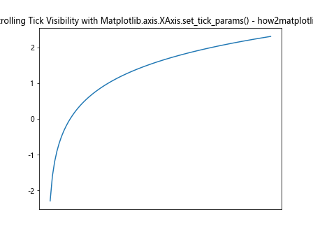
In this example, we set both ‘labelbottom’ and ‘bottom’ to False, which hides both the tick labels and the tick marks on the x-axis.
Customizing Major and Minor Ticks
Matplotlib.axis.XAxis.set_tick_params() allows you to customize major and minor ticks separately. This can be useful for creating more detailed or hierarchical axis representations.
Here’s an example that demonstrates how to customize major and minor ticks:
import matplotlib.pyplot as plt
import numpy as np

x = np.linspace(0, 10, 100)
y = x**2

fig, ax = plt.subplots()
ax.plot(x, y)

ax.xaxis.set_tick_params(which='major', length=10, width=2, color='red')
ax.xaxis.set_tick_params(which='minor', length=5, width=1, color='blue')

ax.xaxis.set_minor_locator(plt.MultipleLocator(0.5))

plt.title('Customizing Major and Minor Ticks with Matplotlib.axis.XAxis.set_tick_params() - how2matplotlib.com')
plt.show()
Output:
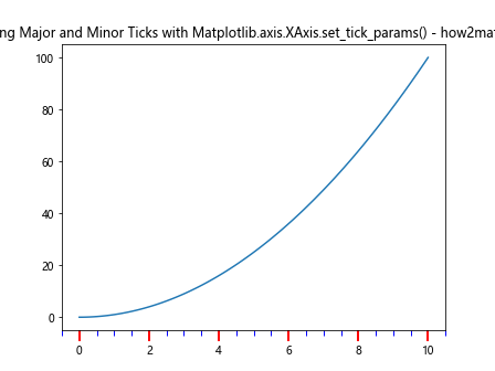
In this example, we set different properties for major and minor ticks. Major ticks are longer, thicker, and red, while minor ticks are shorter, thinner, and blue. We also use the MultipleLocator to set minor ticks at intervals of 0.5.
Using set_tick_params() with Multiple Subplots
When working with multiple subplots, you can use Matplotlib.axis.XAxis.set_tick_params() to customize each subplot individually or apply the same settings to all subplots.
Here’s an example that shows how to use set_tick_params() with multiple subplots:
import matplotlib.pyplot as plt
import numpy as np

x = np.linspace(0, 10, 100)
y1 = np.sin(x)
y2 = np.cos(x)

fig, (ax1, ax2) = plt.subplots(2, 1, figsize=(8, 8))

ax1.plot(x, y1)
ax2.plot(x, y2)

ax1.xaxis.set_tick_params(labelcolor='red', labelsize=12)
ax2.xaxis.set_tick_params(labelcolor='blue', labelsize=12)

plt.suptitle('Using set_tick_params() with Multiple Subplots - how2matplotlib.com')
plt.show()
Output:
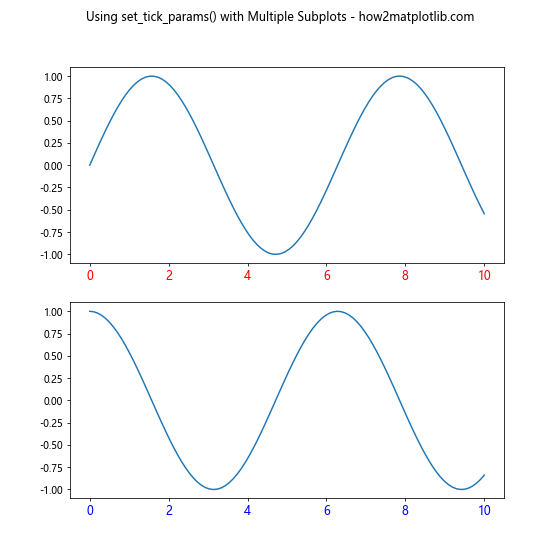
In this example, we create two subplots and customize the x-axis tick labels for each subplot separately. The top subplot has red labels, while the bottom subplot has blue labels.
Combining set_tick_params() with Other Axis Customizations
Matplotlib.axis.XAxis.set_tick_params() can be used in conjunction with other axis customization methods to create highly tailored plots.
Here’s an example that combines set_tick_params() with other axis customizations:
import matplotlib.pyplot as plt
import numpy as np

x = np.linspace(0, 10, 100)
y = np.sin(x) * np.exp(-x/10)

fig, ax = plt.subplots()
ax.plot(x, y)

ax.xaxis.set_tick_params(labelsize=12, colors='navy')
ax.set_xlabel('X-axis Label', fontsize=14, fontweight='bold')
ax.set_xlim(0, 10)
ax.grid(True, linestyle='--', alpha=0.7)

plt.title('Combining set_tick_params() with Other Axis Customizations - how2matplotlib.com')
plt.show()
Output:
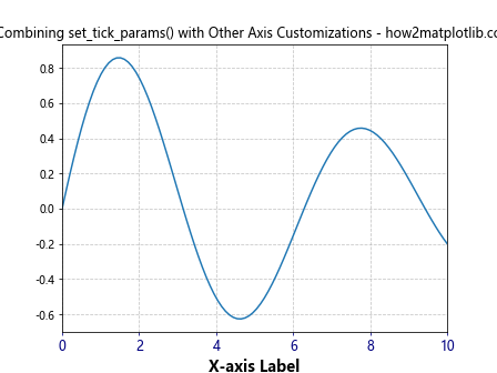
In this example, we use set_tick_params() to customize the tick labels, and then use other methods like set_xlabel(), set_xlim(), and grid() to further customize the plot.
Using set_tick_params() with Different Plot Types
Matplotlib.axis.XAxis.set_tick_params() can be used with various types of plots, not just line plots. Let’s look at how to use it with a bar plot:
import matplotlib.pyplot as plt
import numpy as np

categories = ['A', 'B', 'C', 'D', 'E']
values = [3, 7, 2, 5, 8]

fig, ax = plt.subplots()
ax.bar(categories, values)

ax.xaxis.set_tick_params(rotation=45, labelsize=12, colors='green')

plt.title('Using set_tick_params() with Bar Plot - how2matplotlib.com')
plt.tight_layout()
plt.show()
Output:
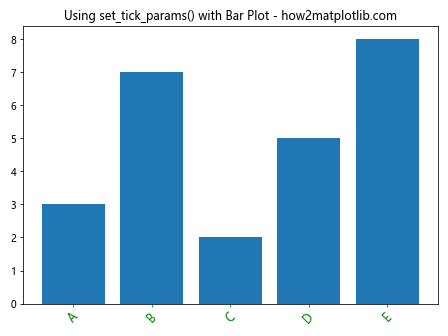
In this example, we create a bar plot and use set_tick_params() to rotate the x-axis labels by 45 degrees, increase their size, and change their color to green.
Customizing Tick Marks for Logarithmic Scales
When working with logarithmic scales, Matplotlib.axis.XAxis.set_tick_params() can be particularly useful for creating clear and informative axis labels.
Here’s an example that demonstrates how to customize tick marks for a logarithmic scale:
import matplotlib.pyplot as plt
import numpy as np

x = np.logspace(0, 3, 50)
y = x**2

fig, ax = plt.subplots()
ax.loglog(x, y)

ax.xaxis.set_tick_params(which='both', labelsize=10, colors='purple')
ax.xaxis.set_major_formatter(plt.FuncFormatter(lambda x, p: f'{x:.0f}'))

plt.title('Customizing Tick Marks for Logarithmic Scales - how2matplotlib.com')
plt.show()
Output:
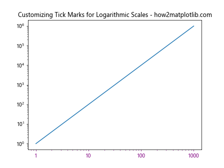
In this example, we create a log-log plot and use set_tick_params() to customize both major and minor tick marks. We also use a FuncFormatter to display tick labels as integers.
Using set_tick_params() with Date Axes
When working with time series data, Matplotlib.axis.XAxis.set_tick_params() can be used to customize date-based axes.
Here’s an example that shows how to use set_tick_params() with date axes:
import matplotlib.pyplot as plt
import numpy as np
from datetime import datetime, timedelta

dates = [datetime(2023, 1, 1) + timedelta(days=i) for i in range(100)]
values = np.cumsum(np.random.randn(100))

fig, ax = plt.subplots(figsize=(10, 6))
ax.plot(dates, values)

ax.xaxis.set_tick_params(rotation=45, ha='right', labelsize=10)
fig.autofmt_xdate()

plt.title('Using set_tick_params() with Date Axes - how2matplotlib.com')
plt.tight_layout()
plt.show()
In this example, we create a time series plot and use set_tick_params() to rotate the date labels and adjust their alignment. We also use fig.autofmt_xdate() to automatically format the date labels for better readability.
Customizing Tick Parameters for 3D Plots
Matplotlib.axis.XAxis.set_tick_params() can also be used with 3D plots to customize the appearance of axes in three-dimensional space.
Here’s an example that demonstrates how to use set_tick_params() with a 3D plot:
import matplotlib.pyplot as plt
import numpy as np

fig = plt.figure()
ax = fig.add_subplot(111, projection='3d')

x = np.linspace(-5, 5, 100)
y = np.linspace(-5, 5, 100)
X, Y = np.meshgrid(x, y)
Z = np.sin(np.sqrt(X**2 + Y**2))

surf = ax.plot_surface(X, Y, Z, cmap='viridis')

ax.xaxis.set_tick_params(labelsize=8, colors='red')
ax.yaxis.set_tick_params(labelsize=8, colors='green')
ax.zaxis.set_tick_params(labelsize=8, colors='blue')

plt.title('Customizing Tick Parameters for 3D Plots - how2matplotlib.com')
plt.show()
Output:
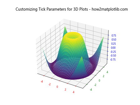
In this example, we create a 3D surface plot and use set_tick_params() to customize the tick labels for each axis separately, giving each axis a different color.
Using set_tick_params() with Polar Plots
Matplotlib.axis.XAxis.set_tick_params() can be used to customize the appearance of polar plots as well.
Here’s an example that shows how to use set_tick_params() with a polar plot:
import matplotlib.pyplot as plt
import numpy as np

r = np.arange(0, 2, 0.01)
theta = 2 * np.pi * r

fig, ax = plt.subplots(subplot_kw={'projection': 'polar'})
ax.plot(theta, r)

ax.xaxis.set_tick_params(labelsize=10, colors='purple')
ax.yaxis.set_tick_params(labelsize=8, colors='orange')

plt.title('Using set_tick_params() with Polar Plots - how2matplotlib.com')
plt.show()
Output:
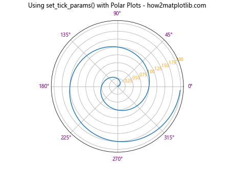
In this example, we create a polar plot and use set_tick_params() to customize the appearance of both the angular (theta) and radial axes.
Applying Different Styles to Alternate Tick Labels
You can use Matplotlib.axis.XAxis.set_tick_params() to apply different styles to alternate tick labels, creating a visually interesting pattern.
Here’s an example that demonstrates how to apply different styles to alternate tick labels:
import matplotlib.pyplot as plt
import numpy as np

x = np.linspace(0, 10, 11)
y = x**2

fig, ax = plt.subplots()
ax.plot(x, y)

for i, label in enumerate(ax.get_xticklabels()):
    if i % 2 == 0:
        label.set_color('red')
        label.set_fontweight('bold')
    else:
        label.set_color('blue')
        label.set_fontsize(8)

ax.xaxis.set_tick_params(which='major', length=10, width=2)

plt.title('Applying Different Styles to Alternate Tick Labels - how2matplotlib.com')
plt.show()
Output:
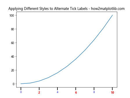
In this example, we iterate through the x-axis tick labels and apply different styles to even and odd-indexed labels. We then use set_tick_params() to adjust the length and width of the major tick marks.
Using set_tick_params() with Colorbar Axes
When working with colorbars in Matplotlib, you can use set_tick_params() to customize the appearance of the colorbar axis.
Here’s an example that shows how to use set_tick_params() with a colorbar:
import matplotlib.pyplot as plt
import numpy as np

data = np.random.rand(10, 10)

fig, ax = plt.subplots()
im = ax.imshow(data, cmap='viridis')

cbar = fig.colorbar(im)
cbar.ax.yaxis.set_tick_params(labelsize=10, colors='purple', length=5, width=2)

plt.title('Using set_tick_params() with Colorbar Axes - how2matplotlib.com')
plt.show()
Output:
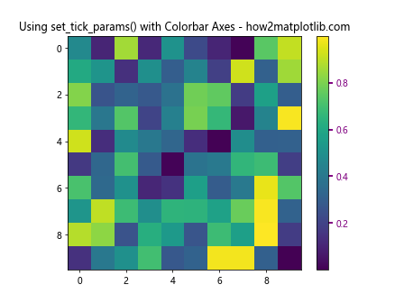
In this example, we create a heatmap and add a colorbar. We then use set_tick_params() to customize the appearance of the colorbar’s y-axis tick marks and labels.
Customizing Tick Parameters for Shared Axes
When working with subplots that share axes, you can use Matplotlib.axis.XAxis.set_tick_params() to customize the appearance of the shared axis.
Here’s an example that demonstrates how to customize tick parameters for shared axes:
import matplotlib.pyplot as plt
import numpy as np

x = np.linspace(0, 10, 100)
y1 = np.sin(x)
y2 = np.cos(x)

fig, (ax1, ax2) = plt.subplots(2, 1, sharex=True)

ax1.plot(x, y1)
ax2.plot(x, y2)

ax2.xaxis.set_tick_params(labelsize=12, colors='red', rotation=45)

plt.suptitle('Customizing Tick Parameters for Shared Axes - how2matplotlib.com')
plt.tight_layout()
plt.show()
Output:
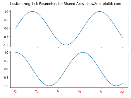
In this example, we create two subplots that share the x-axis. We then use set_tick_params() to customize the appearance of the shared x-axis tick marks and labels.
Using set_tick_params() with Custom Tick Locators
Matplotlib.axis.XAxis.set_tick_params() can be used in conjunction with custom tick locators to create highly customized axis representations.
Here’s an example that demonstrates how to use set_tick_params() with a custom tick locator:
import matplotlib.pyplot as plt
import numpy as np
from matplotlib.ticker import MultipleLocator

x = np.linspace(0, 10, 100)
y = np.sin(x)

fig, ax = plt.subplots()
ax.plot(x, y)

ax.xaxis.set_major_locator(MultipleLocator(2))
ax.xaxis.set_minor_locator(MultipleLocator(0.5))

ax.xaxis.set_tick_params(which='major', length=10, width=2, colors='red')
ax.xaxis.set_tick_params(which='minor', length=5, width=1, colors='blue')

plt.title('Using set_tick_params() with Custom Tick Locators - how2matplotlib.com')
plt.show()
Output:
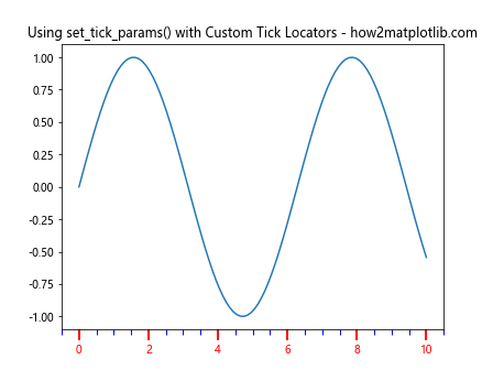
In this example, we use MultipleLocator to set custom major and minor tick locations, and then use set_tick_params() to style these ticks differently.
Animating Tick Parameters
You can use Matplotlib.axis.XAxis.set_tick_params() in animations to create dynamic changes in tick appearance.
Here’s an example that demonstrates how to animate tick parameters:
import matplotlib.pyplot as plt
import numpy as np
from matplotlib.animation import FuncAnimation

fig, ax = plt.subplots()
x = np.linspace(0, 10, 100)
line, = ax.plot(x, np.sin(x))

def update(frame):
    line.set_ydata(np.sin(x + frame / 10))
    ax.xaxis.set_tick_params(labelsize=10 + frame % 10, colors=plt.cm.viridis(frame / 100))
    return line,

ani = FuncAnimation(fig, update, frames=100, interval=50, blit=True)

plt.title('Animating Tick Parameters - how2matplotlib.com')
plt.show()
Output:
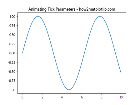
In this example, we create an animation where the tick label size and color change over time. Note that to actually see the animation, you would need to run this in an environment that supports animation rendering.
Conclusion
Matplotlib.axis.XAxis.set_tick_params() is a versatile and powerful method for customizing the appearance of tick marks and labels in Matplotlib plots. Throughout this comprehensive guide, we’ve explored various ways to use this function to enhance the visual appeal and readability of your data visualizations.
We’ve covered a wide range of applications, from basic customization of tick colors and sizes to more advanced techniques like customizing logarithmic scales, working with date axes, and even animating tick parameters. We’ve also seen how set_tick_params() can be used with different types of plots, including line plots, bar plots, 3D plots, and polar plots.