Comprehensive Guide to Using Matplotlib.axis.Tick.get_rasterized() in Python
Matplotlib.axis.Tick.get_rasterized() in Python is an essential method for managing the rasterization of tick marks in Matplotlib plots. This comprehensive guide will explore the intricacies of this function, its usage, and its impact on data visualization. We’ll delve into various aspects of Matplotlib.axis.Tick.get_rasterized() in Python, providing detailed explanations and practical examples to help you master this powerful tool.
Understanding Matplotlib.axis.Tick.get_rasterized() in Python
Matplotlib.axis.Tick.get_rasterized() in Python is a method that returns the rasterization status of a tick mark. Rasterization is the process of converting vector graphics into a raster image, which is composed of pixels. This method is particularly useful when working with complex plots or when you need to optimize the rendering of your visualizations.
Let’s start with a simple example to demonstrate how to use Matplotlib.axis.Tick.get_rasterized() in Python:
import matplotlib.pyplot as plt

fig, ax = plt.subplots()
ax.plot([1, 2, 3, 4], [1, 4, 2, 3], label='how2matplotlib.com')
tick = ax.xaxis.get_major_ticks()[0]
rasterized = tick.get_rasterized()
print(f"Tick rasterized: {rasterized}")
plt.show()
Output:

In this example, we create a simple line plot and then access the first major tick on the x-axis. We use the get_rasterized() method to check if the tick is rasterized. By default, ticks are not rasterized, so this will typically return False.
The Importance of Matplotlib.axis.Tick.get_rasterized() in Python
Understanding the rasterization status of tick marks is crucial for several reasons:
- Performance optimization: Rasterized elements can be rendered more quickly, especially in complex plots.
- File size management: Rasterized elements can result in smaller file sizes when saving plots.
- Visual consistency: Knowing the rasterization status helps maintain a consistent look across different output formats.
Let’s explore a more complex example that demonstrates the importance of Matplotlib.axis.Tick.get_rasterized() in Python:
import matplotlib.pyplot as plt
import numpy as np

fig, (ax1, ax2) = plt.subplots(1, 2, figsize=(12, 5))

# Plot 1: Non-rasterized
x = np.linspace(0, 10, 1000)
y = np.sin(x) * np.exp(-x/10)
ax1.plot(x, y, label='how2matplotlib.com')
ax1.set_title('Non-rasterized Plot')

# Plot 2: Rasterized
ax2.plot(x, y, label='how2matplotlib.com', rasterized=True)
ax2.set_title('Rasterized Plot')

for ax in (ax1, ax2):
    tick = ax.xaxis.get_major_ticks()[0]
    rasterized = tick.get_rasterized()
    ax.text(0.5, -0.1, f"Tick rasterized: {rasterized}", transform=ax.transAxes, ha='center')

plt.tight_layout()
plt.show()
Output:
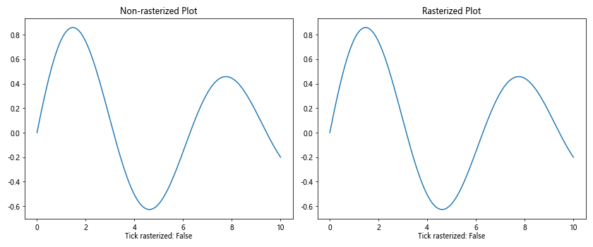
In this example, we create two plots: one with non-rasterized elements and another with rasterized elements. We then use Matplotlib.axis.Tick.get_rasterized() in Python to check the rasterization status of the first major tick on each x-axis and display this information below each plot.
Controlling Rasterization with Matplotlib.axis.Tick.get_rasterized() in Python
While Matplotlib.axis.Tick.get_rasterized() in Python is primarily used to retrieve the rasterization status, it’s often used in conjunction with other methods to control rasterization. Let’s explore how to set and get the rasterization status:
import matplotlib.pyplot as plt

fig, ax = plt.subplots()
ax.plot([1, 2, 3, 4], [1, 4, 2, 3], label='how2matplotlib.com')

tick = ax.xaxis.get_major_ticks()[0]
print(f"Initial rasterization status: {tick.get_rasterized()}")

tick.set_rasterized(True)
print(f"After setting rasterized to True: {tick.get_rasterized()}")

tick.set_rasterized(False)
print(f"After setting rasterized to False: {tick.get_rasterized()}")

plt.show()
Output:
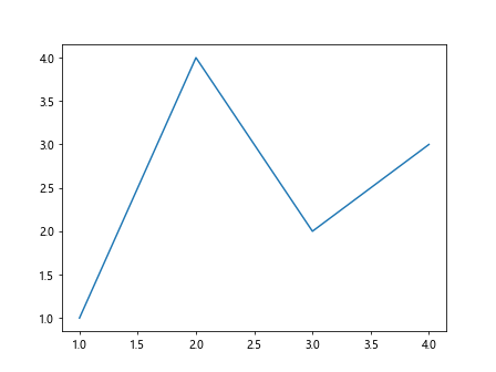
In this example, we demonstrate how to use Matplotlib.axis.Tick.get_rasterized() in Python to check the rasterization status before and after changing it with the set_rasterized() method.
Matplotlib.axis.Tick.get_rasterized() in Python and Custom Tick Formatting
When working with custom tick formatting, it’s important to understand how rasterization affects the appearance of your ticks. Let’s explore this with an example:
import matplotlib.pyplot as plt
import numpy as np

def custom_formatter(x, pos):
    return f"Value: {x:.2f}"

fig, (ax1, ax2) = plt.subplots(1, 2, figsize=(12, 5))

x = np.linspace(0, 10, 100)
y = np.sin(x)

ax1.plot(x, y, label='how2matplotlib.com')
ax1.xaxis.set_major_formatter(plt.FuncFormatter(custom_formatter))
ax1.set_title('Non-rasterized Custom Ticks')

ax2.plot(x, y, label='how2matplotlib.com', rasterized=True)
ax2.xaxis.set_major_formatter(plt.FuncFormatter(custom_formatter))
ax2.set_title('Rasterized Custom Ticks')

for ax in (ax1, ax2):
    for tick in ax.xaxis.get_major_ticks():
        tick.set_rasterized(ax == ax2)
    tick = ax.xaxis.get_major_ticks()[0]
    rasterized = tick.get_rasterized()
    ax.text(0.5, -0.1, f"Tick rasterized: {rasterized}", transform=ax.transAxes, ha='center')

plt.tight_layout()
plt.show()
Output:
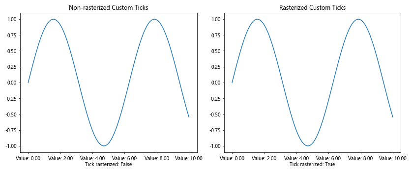
In this example, we create custom tick labels using a formatter function. We then compare the appearance of these custom ticks in both rasterized and non-rasterized scenarios, using Matplotlib.axis.Tick.get_rasterized() in Python to verify the rasterization status.
Matplotlib.axis.Tick.get_rasterized() in Python and Interactive Plots
When creating interactive plots, the rasterization status of tick marks can affect performance and appearance. Let’s explore this with an example using Matplotlib’s interactive features:
import matplotlib.pyplot as plt
import numpy as np
from matplotlib.widgets import Slider

fig, ax = plt.subplots(figsize=(8, 6))
plt.subplots_adjust(bottom=0.25)

x = np.linspace(0, 10, 1000)
y = np.sin(x)
line, = ax.plot(x, y, label='how2matplotlib.com')

ax_slider = plt.axes([0.1, 0.1, 0.8, 0.03])
slider = Slider(ax_slider, 'Frequency', 0.1, 10, valinit=1)

def update(val):
    freq = slider.val
    line.set_ydata(np.sin(freq * x))
    fig.canvas.draw_idle()

slider.on_changed(update)

for tick in ax.xaxis.get_major_ticks() + ax.yaxis.get_major_ticks():
    tick.set_rasterized(True)

tick = ax.xaxis.get_major_ticks()[0]
rasterized = tick.get_rasterized()
ax.text(0.5, -0.2, f"Tick rasterized: {rasterized}", transform=ax.transAxes, ha='center')

plt.show()
Output:
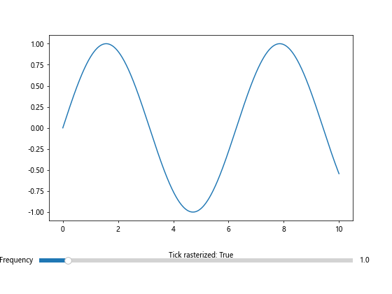
In this example, we create an interactive plot with a slider to control the frequency of a sine wave. We rasterize the tick marks to potentially improve performance during interactions. We use Matplotlib.axis.Tick.get_rasterized() in Python to verify the rasterization status of the ticks.
Matplotlib.axis.Tick.get_rasterized() in Python and Subplots
When working with multiple subplots, you may want to control the rasterization of tick marks independently for each subplot. Let’s explore this with an example:
import matplotlib.pyplot as plt
import numpy as np

fig, axs = plt.subplots(2, 2, figsize=(12, 10))
axs = axs.flatten()

x = np.linspace(0, 10, 1000)
y = np.sin(x) * np.exp(-x/10)

for i, ax in enumerate(axs):
    ax.plot(x, y, label=f'Plot {i+1} - how2matplotlib.com')
    ax.set_title(f'Subplot {i+1}')

    rasterize = i % 2 == 0
    for tick in ax.xaxis.get_major_ticks() + ax.yaxis.get_major_ticks():
        tick.set_rasterized(rasterize)

    tick = ax.xaxis.get_major_ticks()[0]
    rasterized = tick.get_rasterized()
    ax.text(0.5, -0.1, f"Tick rasterized: {rasterized}", transform=ax.transAxes, ha='center')

plt.tight_layout()
plt.show()
Output:
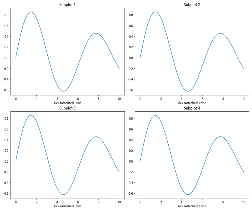
In this example, we create four subplots and alternate the rasterization status of the tick marks between them. We use Matplotlib.axis.Tick.get_rasterized() in Python to verify the rasterization status for each subplot.
Matplotlib.axis.Tick.get_rasterized() in Python and Custom Tick Locations
When working with custom tick locations, it’s important to understand how rasterization affects these custom ticks. Let’s explore this with an example:
import matplotlib.pyplot as plt
import numpy as np

fig, (ax1, ax2) = plt.subplots(1, 2, figsize=(12, 5))

x = np.linspace(0, 10, 100)
y = np.sin(x)

ax1.plot(x, y, label='how2matplotlib.com')
ax1.set_xticks([0, np.pi, 2*np.pi, 3*np.pi])
ax1.set_xticklabels(['0', 'π', '2π', '3π'])
ax1.set_title('Non-rasterized Custom Ticks')

ax2.plot(x, y, label='how2matplotlib.com', rasterized=True)
ax2.set_xticks([0, np.pi, 2*np.pi, 3*np.pi])
ax2.set_xticklabels(['0', 'π', '2π', '3π'])
ax2.set_title('Rasterized Custom Ticks')

for ax in (ax1, ax2):
    for tick in ax.xaxis.get_major_ticks():
        tick.set_rasterized(ax == ax2)
    tick = ax.xaxis.get_major_ticks()[0]
    rasterized = tick.get_rasterized()
    ax.text(0.5, -0.1, f"Tick rasterized: {rasterized}", transform=ax.transAxes, ha='center')

plt.tight_layout()
plt.show()
Output:
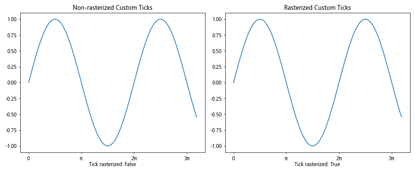
In this example, we create custom tick locations and labels for a sine wave plot. We compare the appearance of these custom ticks in both rasterized and non-rasterized scenarios, using Matplotlib.axis.Tick.get_rasterized() in Python to verify the rasterization status.
Matplotlib.axis.Tick.get_rasterized() in Python and Logarithmic Scales
When working with logarithmic scales, the rasterization of tick marks can have a significant impact on the readability of your plot. Let’s explore this with an example:
import matplotlib.pyplot as plt
import numpy as np

fig, (ax1, ax2) = plt.subplots(1, 2, figsize=(12, 5))

x = np.logspace(0, 5, 100)
y = x**2

ax1.loglog(x, y, label='how2matplotlib.com')
ax1.set_title('Non-rasterized Log-Log Plot')

ax2.loglog(x, y, label='how2matplotlib.com', rasterized=True)
ax2.set_title('Rasterized Log-Log Plot')

for ax in (ax1, ax2):
    for tick in ax.xaxis.get_major_ticks() + ax.yaxis.get_major_ticks():
        tick.set_rasterized(ax == ax2)
    tick = ax.xaxis.get_major_ticks()[0]
    rasterized = tick.get_rasterized()
    ax.text(0.5, -0.1, f"Tick rasterized: {rasterized}", transform=ax.transAxes, ha='center')

plt.tight_layout()
plt.show()
Output:
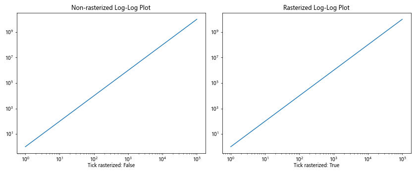
In this example, we create two log-log plots: one with non-rasterized elements and another with rasterized elements. We use Matplotlib.axis.Tick.get_rasterized() in Python to check the rasterization status of the ticks in both plots.
Matplotlib.axis.Tick.get_rasterized() in Python and 3D Plots
Rasterization can also be applied to tick marks in 3D plots. Let’s explore this with an example:
import matplotlib.pyplot as plt
import numpy as np
from mpl_toolkits.mplot3d import Axes3D

fig = plt.figure(figsize=(12, 5))
ax1 = fig.add_subplot(121, projection='3d')
ax2 = fig.add_subplot(122, projection='3d')

x = np.linspace(-5, 5, 100)
y = np.linspace(-5, 5, 100)
X, Y = np.meshgrid(x, y)
Z = np.sin(np.sqrt(X**2 + Y**2))

ax1.plot_surface(X, Y, Z, cmap='viridis', label='how2matplotlib.com')
ax1.set_title('Non-rasterized 3D Plot')

surf = ax2.plot_surface(X, Y, Z, cmap='viridis', label='how2matplotlib.com', rasterized=True)
ax2.set_title('Rasterized 3D Plot')

for ax in (ax1, ax2):
    for axis in [ax.xaxis, ax.yaxis, ax.zaxis]:
        for tick in axis.get_major_ticks():
            tick.set_rasterized(ax == ax2)
    tick = ax.xaxis.get_major_ticks()[0]
    rasterized = tick.get_rasterized()
    ax.text2D(0.5, -0.1, f"Tick rasterized: {rasterized}", transform=ax.transAxes, ha='center')

plt.tight_layout()
plt.show()
Output:
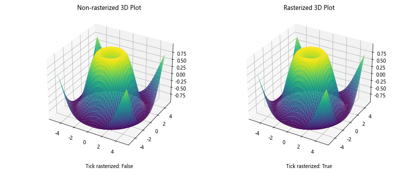
In this example, we create two 3D surface plots: one with non-rasterized elements and another with rasterized elements. We use Matplotlib.axis.Tick.get_rasterized() in Python to check the rasterization status of the ticks in both plots.
Matplotlib.axis.Tick.get_rasterized() in Python and Color Mapping
When working with color-mapped plots, the rasterization of tick marks can affect the overall appearance. Let’s explore this with an example:
import matplotlib.pyplot as plt
import numpy as np

fig, (ax1, ax2) = plt.subplots(1, 2, figsize=(12, 5))

x = np.linspace(0, 10, 100)
y = np.linspace(0, 10, 100)
X, Y = np.meshgrid(x, y)
Z = np.sin(X) * np.cos(Y)

im1 = ax1.imshow(Z, extent=[0, 10, 0, 10], origin='lower', cmap='viridis')
ax1.set_title('Non-rasterized Color Map')
fig.colorbar(im1, ax=ax1)

im2 = ax2.imshow(Z, extent=[0, 10, 0, 10], origin='lower', cmap='viridis', rasterized=True)
ax2.set_title('Rasterized Color Map')
fig.colorbar(im2, ax=ax2)

for ax in (ax1, ax2):
    for tick in ax.xaxis.get_major_ticks() + ax.yaxis.get_major_ticks():
        tick.set_rasterized(ax == ax2)
    tick = ax.xaxis.get_major_ticks()[0]
    rasterized = tick.get_rasterized()
    ax.text(0.5, -0.1, f"Tick rasterized: {rasterized}", transform=ax.transAxes, ha='center')

plt.tight_layout()
plt.show()
Output:
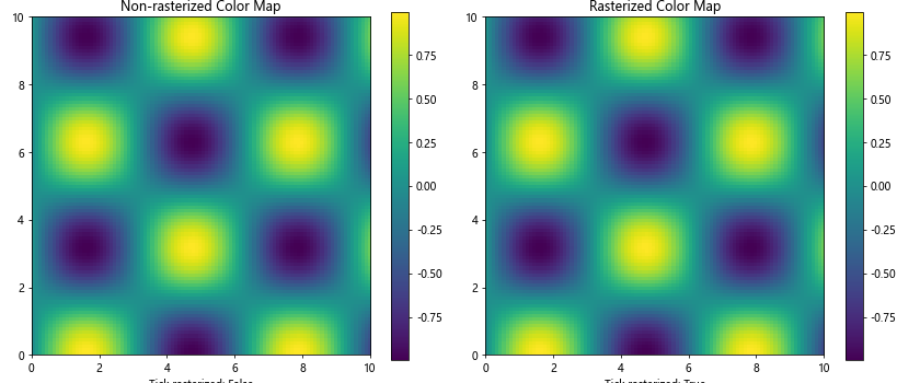
In this example, we create two color-mapped plots: one with non-rasterized elements and another with rasterized elements. We use Matplotlib.axis.Tick.get_rasterized() in Python to check the rasterization status of the ticks in both plots.
Matplotlib.axis.Tick.get_rasterized() in Python and Polar Plots
Rasterization can also be applied to tick marks in polar plots. Let’s explore this with an example:
import matplotlib.pyplot as plt
import numpy as np

fig, (ax1, ax2) = plt.subplots(1, 2, figsize=(12, 5), subplot_kw=dict(projection='polar'))

r = np.linspace(0, 1, 100)
theta = 2 * np.pi * r

ax1.plot(theta, r, label='how2matplotlib.com')
ax1.set_title('Non-rasterized Polar Plot')

ax2.plot(theta, r, label='how2matplotlib.com', rasterized=True)
ax2.set_title('Rasterized Polar Plot')

for ax in (ax1, ax2):
    for tick in ax.xaxis.get_major_ticks() + ax.yaxis.get_major_ticks():
        tick.set_rasterized(ax == ax2)
    tick = ax.xaxis.get_major_ticks()[0]
    rasterized = tick.get_rasterized()
    ax.text(0.5, -0.1, f"Tick rasterized: {rasterized}", transform=ax.transAxes, ha='center')

plt.tight_layout()
plt.show()
Output:
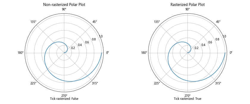
In this example, we create two polar plots: one with non-rasterized elements and another with rasterized elements. We use Matplotlib.axis.Tick.get_rasterized() in Python to check the rasterization status of the ticks in both plots.
Conclusion
Matplotlib.axis.Tick.get_rasterized() in Python is a powerful tool for managing the rasterization of tick marks in Matplotlib plots. Throughout this comprehensive guide, we’ve explored various aspects of this method and its applications in different types of plots.
We’ve seen how Matplotlib.axis.Tick.get_rasterized() in Python can be used to check the rasterization status of tick marks, which is crucial for optimizing plot performance, managing file sizes, and maintaining visual consistency across different output formats.