How to Master Matplotlib Text Color: A Comprehensive Guide
Matplotlib text color is an essential aspect of data visualization that can greatly enhance the readability and aesthetics of your plots. In this comprehensive guide, we’ll explore various techniques and methods to manipulate text color in Matplotlib, providing you with the knowledge and tools to create visually appealing and informative charts and graphs.
Understanding the Basics of Matplotlib Text Color
Before diving into the more advanced techniques, it’s crucial to understand the fundamentals of Matplotlib text color. Matplotlib offers several ways to set the color of text elements in your plots, including titles, labels, annotations, and legends.
Let’s start with a simple example to demonstrate how to set the color of a plot title:
import matplotlib.pyplot as plt

plt.figure(figsize=(8, 6))
plt.title("Welcome to how2matplotlib.com", color='red')
plt.plot([1, 2, 3, 4], [1, 4, 2, 3])
plt.show()
Output:
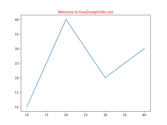
In this example, we set the color of the title to red using the color parameter in the plt.title() function. This is one of the most straightforward ways to apply Matplotlib text color to your plots.
Exploring Color Options in Matplotlib
Matplotlib provides a wide range of color options for text elements. You can use named colors, RGB tuples, hex color codes, or even custom color maps. Let’s explore these options with some examples:
Using Named Colors
Matplotlib recognizes a variety of named colors that you can use to set text color:
import matplotlib.pyplot as plt

fig, ax = plt.subplots(figsize=(10, 6))
ax.set_title("Exploring Colors on how2matplotlib.com", fontsize=16)
ax.text(0.1, 0.9, "Red Text", color='red', fontsize=14, transform=ax.transAxes)
ax.text(0.1, 0.7, "Blue Text", color='blue', fontsize=14, transform=ax.transAxes)
ax.text(0.1, 0.5, "Green Text", color='green', fontsize=14, transform=ax.transAxes)
ax.text(0.1, 0.3, "Purple Text", color='purple', fontsize=14, transform=ax.transAxes)
ax.text(0.1, 0.1, "Orange Text", color='orange', fontsize=14, transform=ax.transAxes)
plt.show()
Output:
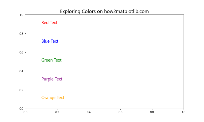
In this example, we use different named colors for each text element. Matplotlib supports a wide range of color names, making it easy to choose the right color for your text.
Using RGB Tuples
For more precise control over colors, you can use RGB tuples:
import matplotlib.pyplot as plt

fig, ax = plt.subplots(figsize=(10, 6))
ax.set_title("RGB Colors on how2matplotlib.com", fontsize=16)
ax.text(0.1, 0.8, "Custom Red", color=(1, 0, 0), fontsize=14, transform=ax.transAxes)
ax.text(0.1, 0.6, "Custom Green", color=(0, 0.8, 0), fontsize=14, transform=ax.transAxes)
ax.text(0.1, 0.4, "Custom Blue", color=(0, 0, 1), fontsize=14, transform=ax.transAxes)
ax.text(0.1, 0.2, "Custom Purple", color=(0.5, 0, 0.5), fontsize=14, transform=ax.transAxes)
plt.show()
Output:
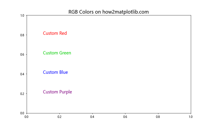
RGB tuples allow you to specify exact color values, giving you fine-grained control over the Matplotlib text color.
Using Hex Color Codes
Hex color codes are another popular way to specify colors in Matplotlib:
import matplotlib.pyplot as plt

fig, ax = plt.subplots(figsize=(10, 6))
ax.set_title("Hex Colors on how2matplotlib.com", fontsize=16)
ax.text(0.1, 0.8, "Teal", color='#008080', fontsize=14, transform=ax.transAxes)
ax.text(0.1, 0.6, "Coral", color='#FF7F50', fontsize=14, transform=ax.transAxes)
ax.text(0.1, 0.4, "Gold", color='#FFD700', fontsize=14, transform=ax.transAxes)
ax.text(0.1, 0.2, "Indigo", color='#4B0082', fontsize=14, transform=ax.transAxes)
plt.show()
Output:
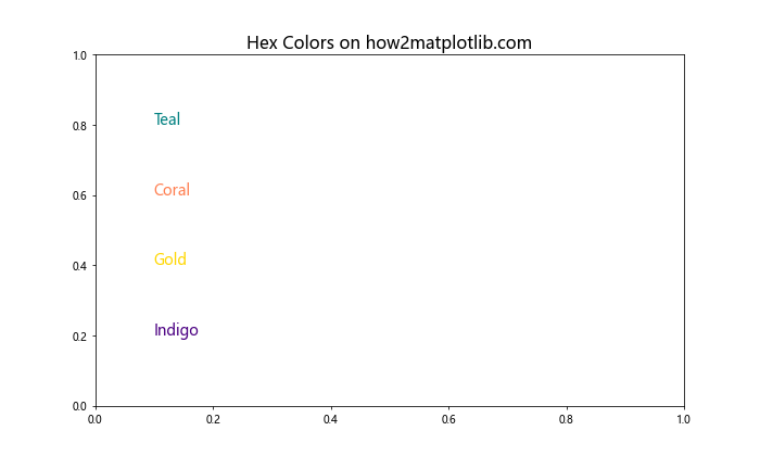
Hex color codes provide a wide range of color options and are particularly useful when you need to match specific brand colors or maintain consistency across different platforms.
Advanced Techniques for Matplotlib Text Color
Now that we’ve covered the basics, let’s explore some more advanced techniques for manipulating Matplotlib text color.
Using Color Maps
Color maps can be an effective way to apply a range of colors to your text elements:
import matplotlib.pyplot as plt
import numpy as np

fig, ax = plt.subplots(figsize=(10, 6))
ax.set_title("Color Map Text on how2matplotlib.com", fontsize=16)

cmap = plt.get_cmap('viridis')
for i in range(10):
    color = cmap(i/10)
    ax.text(0.1, 1 - (i+1)*0.09, f"Color {i+1}", color=color, fontsize=14, transform=ax.transAxes)

plt.show()
Output:
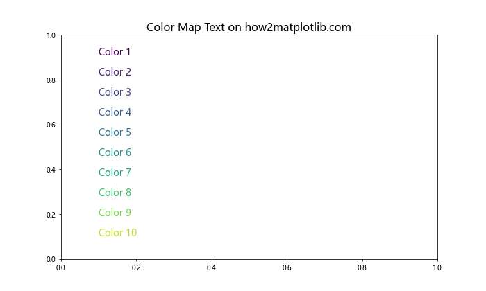
This example demonstrates how to use a color map to create a gradient of text colors. This can be particularly useful when you want to represent a range of values or categories with different text colors.
Applying Alpha Transparency
You can also add transparency to your text colors using the alpha parameter:
import matplotlib.pyplot as plt

fig, ax = plt.subplots(figsize=(10, 6))
ax.set_title("Transparent Text on how2matplotlib.com", fontsize=16)

for i in range(5):
    alpha = (i + 1) / 5
    ax.text(0.1, 0.9 - i*0.2, f"Alpha: {alpha:.2f}", color='blue', alpha=alpha, fontsize=14, transform=ax.transAxes)

plt.show()
Output:
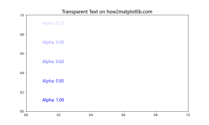
This example shows how to create text with varying levels of transparency, which can be useful for layering text or creating visual hierarchies.
Customizing Text Color in Different Plot Elements
Matplotlib text color can be applied to various elements of your plots. Let’s explore how to customize the color of different text elements.
Axis Labels
Customizing the color of axis labels can help draw attention to specific aspects of your plot:
import matplotlib.pyplot as plt
import numpy as np

x = np.linspace(0, 10, 100)
y = np.sin(x)

fig, ax = plt.subplots(figsize=(10, 6))
ax.plot(x, y)
ax.set_title("Customized Axis Labels on how2matplotlib.com", fontsize=16)
ax.set_xlabel("X-axis", color='red', fontsize=14)
ax.set_ylabel("Y-axis", color='blue', fontsize=14)
plt.show()
Output:
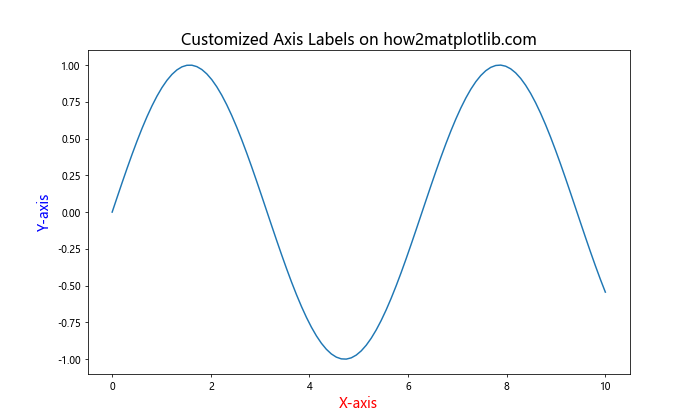
In this example, we set different colors for the x-axis and y-axis labels, making them stand out from the rest of the plot.
Legend Text
Customizing the color of legend text can help differentiate between different data series:
import matplotlib.pyplot as plt
import numpy as np

x = np.linspace(0, 10, 100)
y1 = np.sin(x)
y2 = np.cos(x)

fig, ax = plt.subplots(figsize=(10, 6))
ax.plot(x, y1, label='Sine')
ax.plot(x, y2, label='Cosine')
ax.set_title("Customized Legend Text on how2matplotlib.com", fontsize=16)
legend = ax.legend()
legend.get_texts()[0].set_color('red')
legend.get_texts()[1].set_color('blue')
plt.show()
Output:
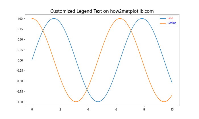
This example demonstrates how to set different colors for each legend entry, making it easier for viewers to associate the legend with the corresponding plot elements.
Annotations
Annotations are often used to highlight specific points or regions in a plot. Customizing their color can make them more noticeable:
import matplotlib.pyplot as plt
import numpy as np

x = np.linspace(0, 10, 100)
y = np.sin(x)

fig, ax = plt.subplots(figsize=(10, 6))
ax.plot(x, y)
ax.set_title("Colored Annotations on how2matplotlib.com", fontsize=16)
ax.annotate('Peak', xy=(np.pi/2, 1), xytext=(np.pi/2 + 1, 1.2),
            arrowprops=dict(facecolor='red', shrink=0.05),
            color='red', fontsize=14)
ax.annotate('Trough', xy=(3*np.pi/2, -1), xytext=(3*np.pi/2 + 1, -1.2),
            arrowprops=dict(facecolor='blue', shrink=0.05),
            color='blue', fontsize=14)
plt.show()
Output:
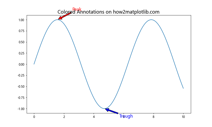
In this example, we use different colors for annotations highlighting the peak and trough of a sine wave, making these important features stand out.
Dynamic Text Color Based on Data
Sometimes, you may want to change the Matplotlib text color dynamically based on your data. Let’s explore a few techniques to achieve this.
Color Based on Value
You can set the text color based on the value it represents:
import matplotlib.pyplot as plt
import numpy as np

data = np.random.randn(10)
fig, ax = plt.subplots(figsize=(10, 6))
ax.set_title("Dynamic Text Color on how2matplotlib.com", fontsize=16)

for i, value in enumerate(data):
    color = 'red' if value < 0 else 'green'
    ax.text(i, value, f'{value:.2f}', color=color, ha='center', va='bottom')

ax.set_xlim(-1, 10)
ax.set_ylim(min(data) - 0.5, max(data) + 0.5)
plt.show()
Output:
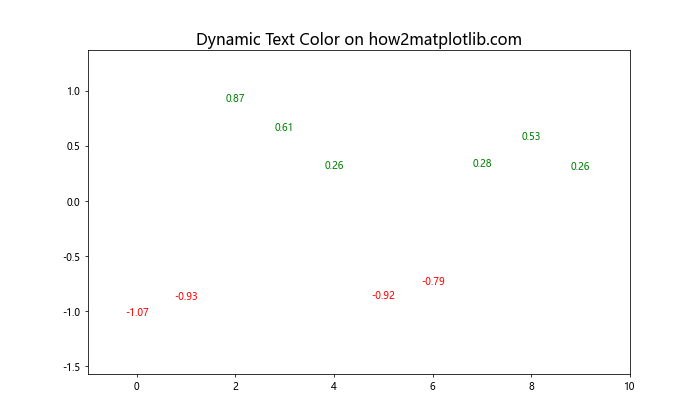
This example changes the text color based on whether the value is positive or negative, providing a quick visual cue about the data.
Color Based on Threshold
You can also set color thresholds for your data:
import matplotlib.pyplot as plt
import numpy as np

data = np.random.uniform(0, 100, 20)
fig, ax = plt.subplots(figsize=(12, 6))
ax.set_title("Threshold-based Text Color on how2matplotlib.com", fontsize=16)

def get_color(value):
    if value < 33:
        return 'green'
    elif value < 66:
        return 'orange'
    else:
        return 'red'

for i, value in enumerate(data):
    color = get_color(value)
    ax.text(i, value, f'{value:.1f}', color=color, ha='center', va='bottom')

ax.set_xlim(-1, 20)
ax.set_ylim(0, 110)
plt.show()
Output:
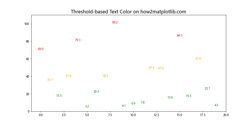
This example uses a function to determine the text color based on value thresholds, allowing for more complex color mapping.
Handling Text Color in Different Plot Types
Different types of plots may require different approaches to Matplotlib text color. Let's explore a few common plot types and how to handle text color in each.
Bar Charts
In bar charts, you might want to customize the color of bar labels:
import matplotlib.pyplot as plt
import numpy as np

categories = ['A', 'B', 'C', 'D', 'E']
values = np.random.randint(10, 100, 5)

fig, ax = plt.subplots(figsize=(10, 6))
bars = ax.bar(categories, values)
ax.set_title("Bar Chart with Colored Labels on how2matplotlib.com", fontsize=16)

for bar in bars:
    height = bar.get_height()
    ax.text(bar.get_x() + bar.get_width()/2, height,
            f'{height}',
            ha='center', va='bottom',
            color='red' if height > 50 else 'blue')

plt.show()
Output:
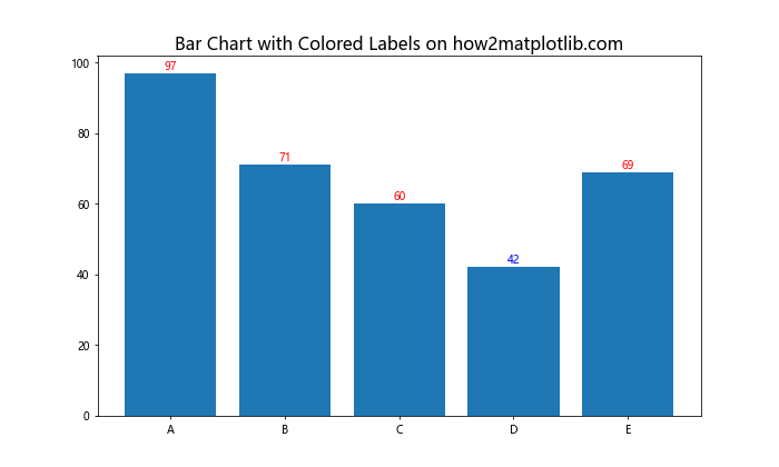
This example sets the color of bar labels based on the value they represent, making it easy to identify high and low values.
Scatter Plots
In scatter plots, you might want to color the point labels based on a third variable:
import matplotlib.pyplot as plt
import numpy as np

x = np.random.rand(20)
y = np.random.rand(20)
sizes = np.random.rand(20) * 1000

fig, ax = plt.subplots(figsize=(10, 6))
scatter = ax.scatter(x, y, s=sizes, c=sizes, cmap='viridis')
ax.set_title("Scatter Plot with Colored Labels on how2matplotlib.com", fontsize=16)

for i, (x_val, y_val, size) in enumerate(zip(x, y, sizes)):
    ax.text(x_val, y_val, f'{i}',
            color='white' if size > 500 else 'black',
            ha='center', va='center')

plt.colorbar(scatter)
plt.show()
Output:
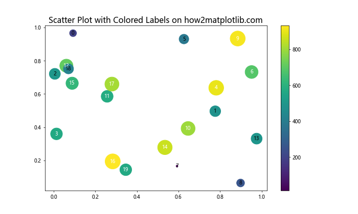
This example colors the point labels based on the size of the scatter points, ensuring good contrast with the underlying points.
Heatmaps
For heatmaps, you might want to adjust the text color based on the cell color for better readability:
import matplotlib.pyplot as plt
import numpy as np

data = np.random.rand(5, 5)
fig, ax = plt.subplots(figsize=(10, 8))
im = ax.imshow(data, cmap='YlOrRd')
ax.set_title("Heatmap with Adaptive Text Color on how2matplotlib.com", fontsize=16)

for i in range(5):
    for j in range(5):
        text = ax.text(j, i, f'{data[i, j]:.2f}',
                       ha="center", va="center", color="black")

        # Change text color to white for dark cells
        if data[i, j] > 0.7:
            text.set_color('white')

plt.colorbar(im)
plt.show()
Output:
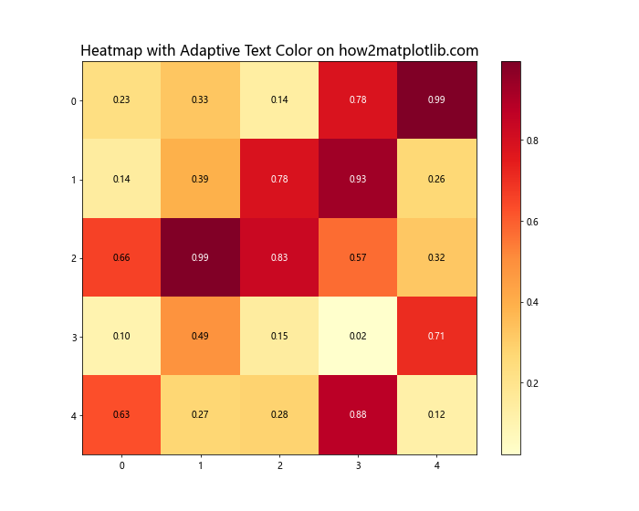
This example changes the text color to white for cells with high values, ensuring that the text remains readable regardless of the cell color.
Best Practices for Using Matplotlib Text Color
When working with Matplotlib text color, it's important to follow some best practices to ensure your visualizations are effective and accessible. Here are some tips to keep in mind:
- Contrast: Ensure that your text color contrasts well with the background. Poor contrast can make text difficult to read.
Consistency: Use consistent colors for similar elements throughout your visualization. This helps create a cohesive look and makes your plot easier to understand.
Color-blindness: Consider using color schemes that are friendly to color-blind viewers. Avoid relying solely on color to convey important information.
Simplicity: Don't overuse colors. Too many different colors can make your plot look cluttered and confusing.
Purpose: Use color purposefully. Each color choice should have a reason behind it, whether it's to highlight important information or to create visual groupings.
Let's look at an example that incorporates these best practices: