Matplotlib Subplots with Different Sizes: A Comprehensive Guide
Matplotlib subplots with different sizes are a powerful feature in data visualization that allows you to create complex layouts with multiple plots of varying dimensions. This article will explore the various aspects of creating and customizing subplots with different sizes using Matplotlib, providing detailed explanations and numerous code examples.
Understanding Matplotlib Subplots with Different Sizes
Matplotlib subplots with different sizes offer flexibility in arranging multiple plots within a single figure. This feature is particularly useful when you want to emphasize certain plots or when dealing with data that requires different aspect ratios. By using subplots with different sizes, you can create visually appealing and informative visualizations that effectively communicate your data.
Let’s start with a basic example of creating subplots with different sizes:
import matplotlib.pyplot as plt
import numpy as np

# Create a figure with a 2x2 grid of subplots
fig = plt.figure(figsize=(12, 8))

# Create subplots with different sizes
ax1 = plt.subplot2grid((3, 3), (0, 0), colspan=2, rowspan=2)
ax2 = plt.subplot2grid((3, 3), (0, 2), rowspan=3)
ax3 = plt.subplot2grid((3, 3), (2, 0))
ax4 = plt.subplot2grid((3, 3), (2, 1))

# Generate sample data
x = np.linspace(0, 10, 100)
y1 = np.sin(x)
y2 = np.cos(x)
y3 = np.exp(-x/10)
y4 = x**2

# Plot data on each subplot
ax1.plot(x, y1, label='Sine')
ax2.plot(x, y2, label='Cosine')
ax3.plot(x, y3, label='Exponential')
ax4.plot(x, y4, label='Quadratic')

# Add labels and titles
ax1.set_title('Sine Wave - how2matplotlib.com')
ax2.set_title('Cosine Wave - how2matplotlib.com')
ax3.set_title('Exponential Decay - how2matplotlib.com')
ax4.set_title('Quadratic Function - how2matplotlib.com')

# Add legends
for ax in [ax1, ax2, ax3, ax4]:
    ax.legend()

# Adjust layout
plt.tight_layout()

# Show the plot
plt.show()
Output:
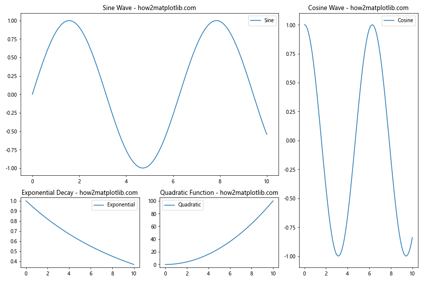
In this example, we create a figure with a 2×2 grid of subplots using plt.subplot2grid(). The subplots have different sizes:
ax1spans 2 columns and 2 rowsax2spans 1 column and 3 rowsax3andax4each occupy a single cell
We then plot different functions on each subplot, add titles and legends, and adjust the layout using plt.tight_layout().
Creating Matplotlib Subplots with Different Sizes Using GridSpec
GridSpec is a powerful tool in Matplotlib that allows for more flexible subplot arrangements. It’s particularly useful when creating subplots with different sizes. Let’s explore how to use GridSpec to create a complex layout:
import matplotlib.pyplot as plt
import matplotlib.gridspec as gridspec
import numpy as np

# Create a figure
fig = plt.figure(figsize=(12, 8))

# Create GridSpec
gs = gridspec.GridSpec(3, 3)

# Create subplots with different sizes
ax1 = fig.add_subplot(gs[0, :2])
ax2 = fig.add_subplot(gs[:, 2])
ax3 = fig.add_subplot(gs[1:, 0])
ax4 = fig.add_subplot(gs[1:, 1])

# Generate sample data
x = np.linspace(0, 10, 100)
y1 = np.sin(x)
y2 = np.cos(x)
y3 = np.exp(-x/10)
y4 = x**2

# Plot data on each subplot
ax1.plot(x, y1, label='Sine - how2matplotlib.com')
ax2.plot(x, y2, label='Cosine - how2matplotlib.com')
ax3.plot(x, y3, label='Exponential - how2matplotlib.com')
ax4.plot(x, y4, label='Quadratic - how2matplotlib.com')

# Add titles
ax1.set_title('Sine Wave')
ax2.set_title('Cosine Wave')
ax3.set_title('Exponential Decay')
ax4.set_title('Quadratic Function')

# Add legends
for ax in [ax1, ax2, ax3, ax4]:
    ax.legend()

# Adjust layout
plt.tight_layout()

# Show the plot
plt.show()
Output:
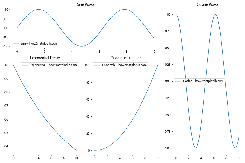
In this example, we use gridspec.GridSpec(3, 3) to create a 3×3 grid. We then create subplots with different sizes using fig.add_subplot() and specifying the grid positions:
ax1spans the top row and first two columnsax2spans all rows in the last columnax3spans the bottom two rows of the first columnax4spans the bottom two rows of the second column
This approach offers more flexibility in arranging subplots compared to the previous method.
Customizing Matplotlib Subplots with Different Sizes
When working with subplots of different sizes, it’s often necessary to customize various aspects of the plots to ensure they look good together. Let’s explore some customization options:
import matplotlib.pyplot as plt
import matplotlib.gridspec as gridspec
import numpy as np

# Create a figure
fig = plt.figure(figsize=(14, 10))

# Create GridSpec with different column widths and row heights
gs = gridspec.GridSpec(3, 3, width_ratios=[1, 2, 1], height_ratios=[2, 1, 1])

# Create subplots with different sizes
ax1 = fig.add_subplot(gs[0, :2])
ax2 = fig.add_subplot(gs[:, 2])
ax3 = fig.add_subplot(gs[1:, 0])
ax4 = fig.add_subplot(gs[1:, 1])

# Generate sample data
x = np.linspace(0, 10, 100)
y1 = np.sin(x)
y2 = np.cos(x)
y3 = np.exp(-x/10)
y4 = x**2

# Plot data on each subplot with custom styles
ax1.plot(x, y1, 'r-', linewidth=2, label='Sine - how2matplotlib.com')
ax2.plot(x, y2, 'b--', linewidth=2, label='Cosine - how2matplotlib.com')
ax3.plot(x, y3, 'g-.', linewidth=2, label='Exponential - how2matplotlib.com')
ax4.plot(x, y4, 'm:', linewidth=2, label='Quadratic - how2matplotlib.com')

# Customize titles and labels
ax1.set_title('Sine Wave', fontsize=16, fontweight='bold')
ax2.set_title('Cosine Wave', fontsize=16, fontweight='bold')
ax3.set_title('Exponential Decay', fontsize=16, fontweight='bold')
ax4.set_title('Quadratic Function', fontsize=16, fontweight='bold')

for ax in [ax1, ax2, ax3, ax4]:
    ax.set_xlabel('X-axis', fontsize=12)
    ax.set_ylabel('Y-axis', fontsize=12)
    ax.legend(fontsize=10)
    ax.grid(True, linestyle='--', alpha=0.7)

# Customize tick labels
for ax in [ax1, ax2, ax3, ax4]:
    ax.tick_params(axis='both', which='major', labelsize=10)

# Add a main title to the figure
fig.suptitle('Matplotlib Subplots with Different Sizes - how2matplotlib.com', fontsize=20, fontweight='bold')

# Adjust layout
plt.tight_layout()
plt.subplots_adjust(top=0.93)  # Adjust top margin for main title

# Show the plot
plt.show()
Output:
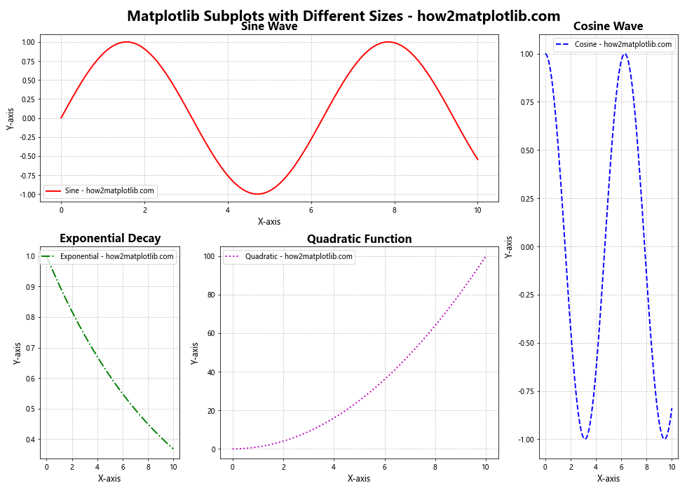
In this example, we’ve added several customizations:
- We use
width_ratiosandheight_ratiosinGridSpecto set different widths and heights for columns and rows. - Each subplot uses a different line style and color.
- We customize the titles, labels, and legend fonts.
- Grid lines are added to each subplot.
- Tick label sizes are adjusted.
- A main title is added to the entire figure using
fig.suptitle().
These customizations help to create a more polished and professional-looking visualization.
Handling Different Data Types in Matplotlib Subplots with Different Sizes
When working with subplots of different sizes, you may need to handle various types of data and plot styles. Let’s create an example that demonstrates this:
import matplotlib.pyplot as plt
import matplotlib.gridspec as gridspec
import numpy as np

# Create a figure
fig = plt.figure(figsize=(16, 12))

# Create GridSpec with different column widths and row heights
gs = gridspec.GridSpec(3, 3, width_ratios=[1.5, 1, 1], height_ratios=[1, 1.5, 1])

# Create subplots with different sizes
ax1 = fig.add_subplot(gs[0, :2])
ax2 = fig.add_subplot(gs[0, 2])
ax3 = fig.add_subplot(gs[1, :])
ax4 = fig.add_subplot(gs[2, 0])
ax5 = fig.add_subplot(gs[2, 1:])

# Generate sample data
x = np.linspace(0, 10, 100)
y1 = np.sin(x)
y2 = np.cos(x)

# 1. Line plot
ax1.plot(x, y1, 'r-', label='Sine - how2matplotlib.com')
ax1.plot(x, y2, 'b--', label='Cosine - how2matplotlib.com')
ax1.set_title('Line Plot')
ax1.legend()

# 2. Scatter plot
n = 50
x = np.random.rand(n)
y = np.random.rand(n)
colors = np.random.rand(n)
sizes = 1000 * np.random.rand(n)
ax2.scatter(x, y, c=colors, s=sizes, alpha=0.5)
ax2.set_title('Scatter Plot - how2matplotlib.com')

# 3. Bar plot
categories = ['A', 'B', 'C', 'D', 'E']
values = [3, 7, 2, 5, 8]
ax3.bar(categories, values)
ax3.set_title('Bar Plot - how2matplotlib.com')

# 4. Pie chart
sizes = [15, 30, 45, 10]
labels = ['Apples', 'Bananas', 'Cherries', 'Dates']
ax4.pie(sizes, labels=labels, autopct='%1.1f%%', startangle=90)
ax4.set_title('Pie Chart - how2matplotlib.com')

# 5. Heatmap
data = np.random.rand(10, 10)
im = ax5.imshow(data, cmap='viridis')
ax5.set_title('Heatmap - how2matplotlib.com')
plt.colorbar(im, ax=ax5)

# Adjust layout
plt.tight_layout()

# Show the plot
plt.show()
Output:
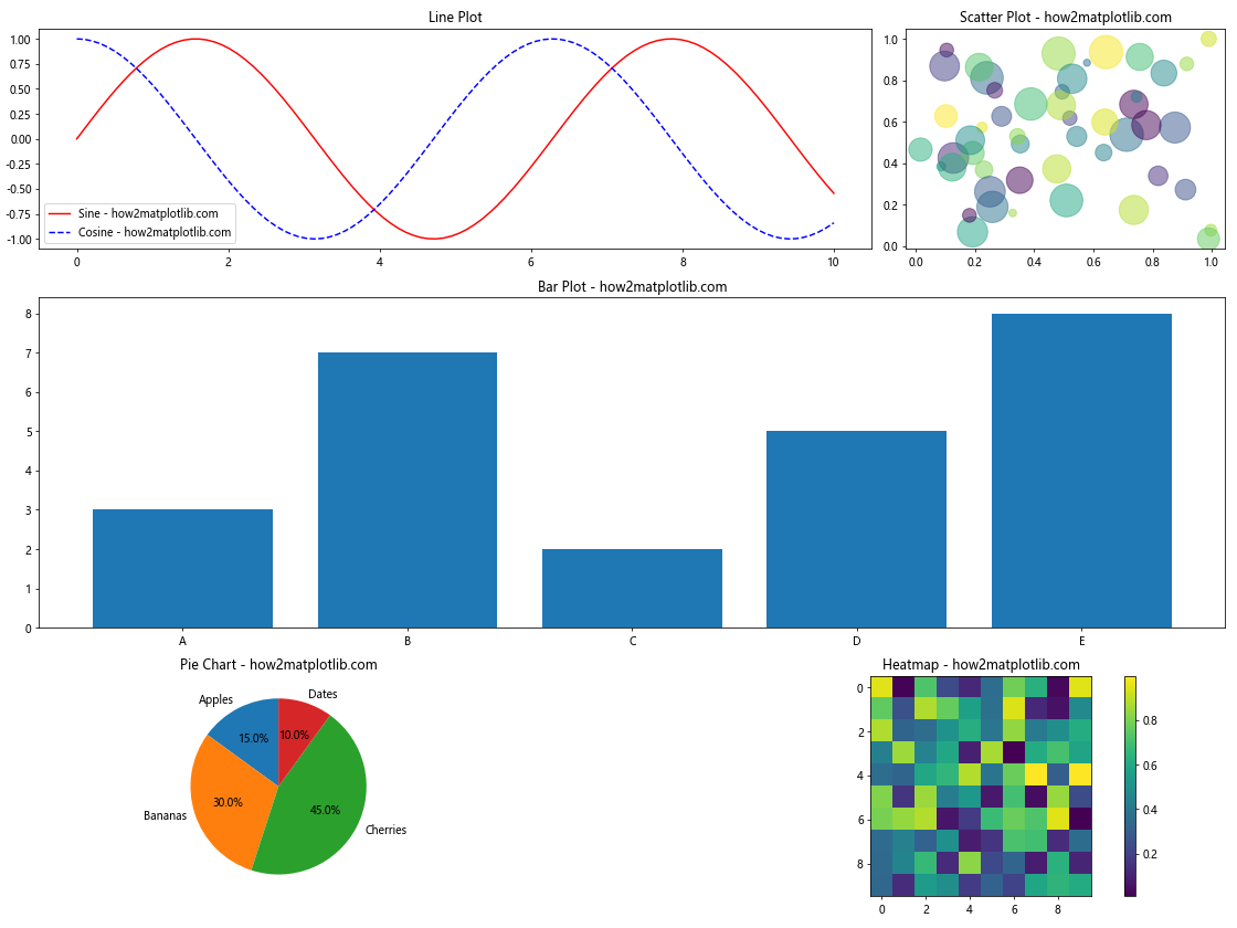
In this example, we create five subplots of different sizes, each displaying a different type of plot:
- A line plot2. A scatter plot
- A bar plot
- A pie chart
- A heatmap
This example demonstrates how to handle various data types and plot styles within a single figure using subplots of different sizes. Each subplot is customized to best represent its specific data type.
Advanced Techniques for Matplotlib Subplots with Different Sizes
Let’s explore some advanced techniques for creating and manipulating subplots with different sizes.
1. Nested Subplots
You can create nested subplots within larger subplots for even more complex layouts:
import matplotlib.pyplot as plt
import matplotlib.gridspec as gridspec
import numpy as np

# Create a figure
fig = plt.figure(figsize=(16, 12))

# Create outer GridSpec
outer_gs = gridspec.GridSpec(2, 2, width_ratios=[2, 1], height_ratios=[1, 2])

# Create subplots
ax1 = fig.add_subplot(outer_gs[0, 0])
ax2 = fig.add_subplot(outer_gs[0, 1])
ax3 = fig.add_subplot(outer_gs[1, 1])

# Create nested GridSpec for the bottom-left cell
inner_gs = gridspec.GridSpecFromSubplotSpec(2, 2, subplot_spec=outer_gs[1, 0])
ax4 = fig.add_subplot(inner_gs[0, 0])
ax5 = fig.add_subplot(inner_gs[0, 1])
ax6 = fig.add_subplot(inner_gs[1, :])

# Generate sample data
x = np.linspace(0, 10, 100)
y1 = np.sin(x)
y2 = np.cos(x)
y3 = np.tan(x)
y4 = x**2
y5 = np.sqrt(x)
y6 = np.exp(-x/5)

# Plot data on each subplot
ax1.plot(x, y1, label='Sine - how2matplotlib.com')
ax2.plot(x, y2, label='Cosine - how2matplotlib.com')
ax3.plot(x, y3, label='Tangent - how2matplotlib.com')
ax4.plot(x, y4, label='Quadratic - how2matplotlib.com')
ax5.plot(x, y5, label='Square Root - how2matplotlib.com')
ax6.plot(x, y6, label='Exponential - how2matplotlib.com')

# Add titles and legends
for ax in [ax1, ax2, ax3, ax4, ax5, ax6]:
    ax.set_title(ax.get_ylabel().split(' - ')[0])
    ax.legend()

# Adjust layout
plt.tight_layout()

# Show the plot
plt.show()
Output:
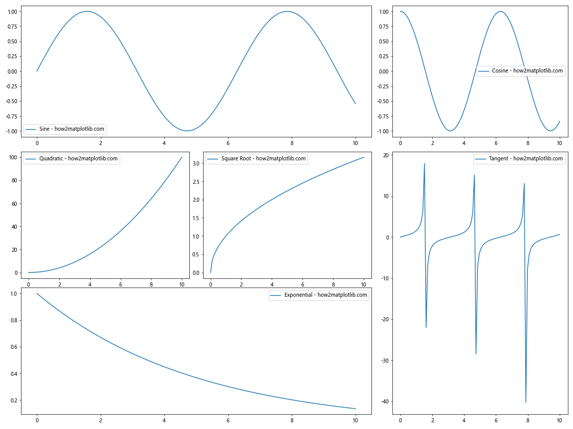
This example creates a 2×2 grid of subplots, with the bottom-left cell further divided into three nested subplots. This technique allows for very flexible and complex layouts.
2. Spanning Subplots Across Multiple Cells
You can create subplots that span multiple cells in both directions:
import matplotlib.pyplot as plt
import matplotlib.gridspec as gridspec
import numpy as np

# Create a figure
fig = plt.figure(figsize=(16, 12))

# Create GridSpec
gs = gridspec.GridSpec(3, 4)

# Create subplots
ax1 = fig.add_subplot(gs[0, :2])
ax2 = fig.add_subplot(gs[0, 2:])
ax3 = fig.add_subplot(gs[1:, :2])
ax4 = fig.add_subplot(gs[1, 2])
ax5 = fig.add_subplot(gs[1, 3])
ax6 = fig.add_subplot(gs[2, 2:])

# Generate sample data
x = np.linspace(0, 10, 100)
y1 = np.sin(x)
y2 = np.cos(x)
y3 = np.tan(x)
y4 = x**2
y5 = np.sqrt(x)
y6 = np.exp(-x/5)

# Plot data on each subplot
ax1.plot(x, y1, label='Sine - how2matplotlib.com')
ax2.plot(x, y2, label='Cosine - how2matplotlib.com')
ax3.plot(x, y3, label='Tangent - how2matplotlib.com')
ax4.plot(x, y4, label='Quadratic - how2matplotlib.com')
ax5.plot(x, y5, label='Square Root - how2matplotlib.com')
ax6.plot(x, y6, label='Exponential - how2matplotlib.com')

# Add titles and legends
for ax in [ax1, ax2, ax3, ax4, ax5, ax6]:
    ax.set_title(ax.get_ylabel().split(' - ')[0])
    ax.legend()

# Adjust layout
plt.tight_layout()

# Show the plot
plt.show()
Output:
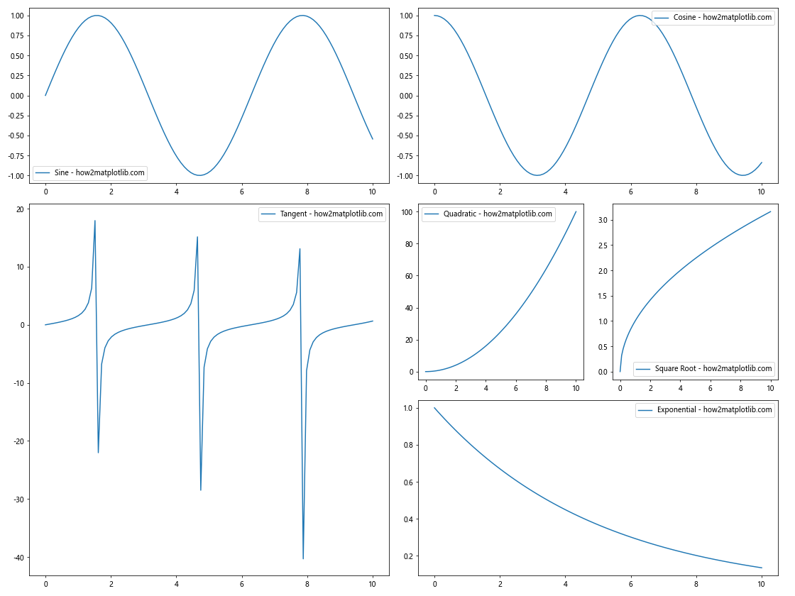
This example creates subplots that span multiple cells in both horizontal and vertical directions, allowing for a mix of large and small plots within the same figure.
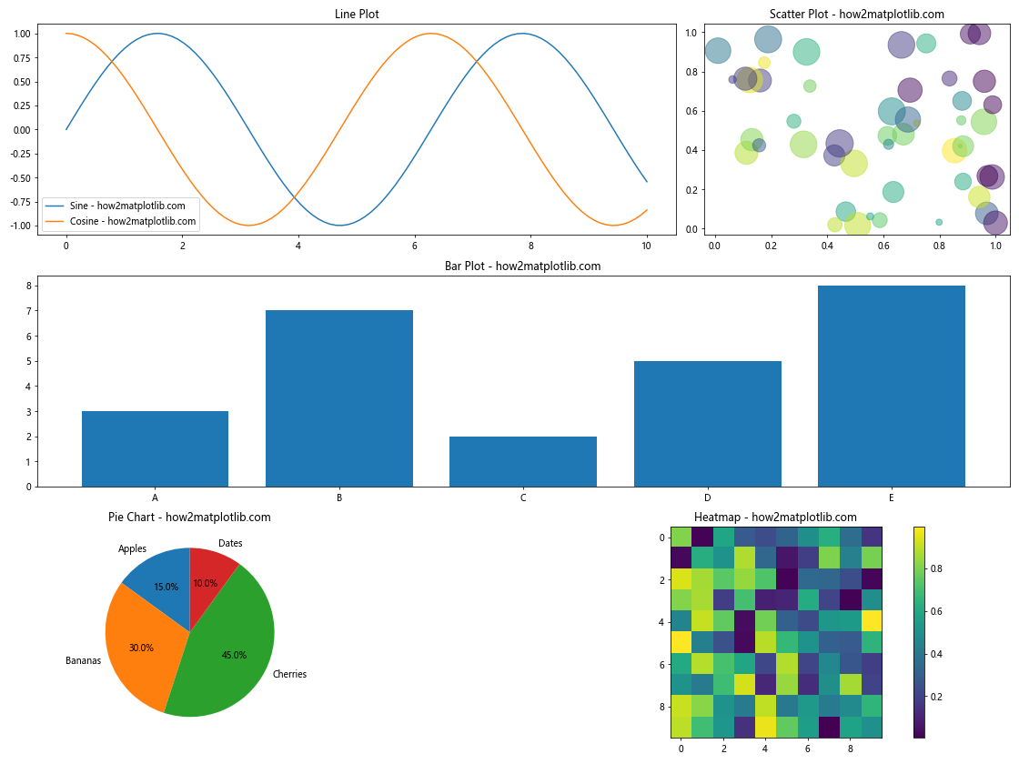
Handling Different Types of Data in Matplotlib Subplots with Different Sizes
When working with subplots of different sizes, you may need to visualize various types of data. Let’s create an example that combines different types of plots:
import matplotlib.pyplot as plt
import matplotlib.gridspec as gridspec
import numpy as np
import pandas as pd

# Create a figure
fig = plt.figure(figsize=(16, 12))

# Create GridSpec
gs = gridspec.GridSpec(3, 3, width_ratios=[1.5, 1, 1], height_ratios=[1, 1.5, 1])

# Create subplots
ax1 = fig.add_subplot(gs[0, :2])
ax2 = fig.add_subplot(gs[0, 2])
ax3 = fig.add_subplot(gs[1, :])
ax4 = fig.add_subplot(gs[2, 0])
ax5 = fig.add_subplot(gs[2, 1:])

# 1. Line plot
x = np.linspace(0, 10, 100)
y1 = np.sin(x)
y2 = np.cos(x)
ax1.plot(x, y1, label='Sine - how2matplotlib.com')
ax1.plot(x, y2, label='Cosine - how2matplotlib.com')
ax1.set_title('Line Plot')
ax1.legend()

# 2. Scatter plot
n = 50
x = np.random.rand(n)
y = np.random.rand(n)
colors = np.random.rand(n)
sizes = 1000 * np.random.rand(n)
ax2.scatter(x, y, c=colors, s=sizes, alpha=0.5)
ax2.set_title('Scatter Plot - how2matplotlib.com')

# 3. Bar plot with error bars
categories = ['A', 'B', 'C', 'D', 'E']
values = [3, 7, 2, 5, 8]
errors = [0.5, 1, 0.3, 0.8, 1.2]
ax3.bar(categories, values, yerr=errors, capsize=5)
ax3.set_title('Bar Plot with Error Bars - how2matplotlib.com')

# 4. Pie chart
sizes = [15, 30, 45, 10]
labels = ['Apples', 'Bananas', 'Cherries', 'Dates']
ax4.pie(sizes, labels=labels, autopct='%1.1f%%', startangle=90)
ax4.set_title('Pie Chart - how2matplotlib.com')

# 5. Heatmap
data = np.random.rand(10, 10)
im = ax5.imshow(data, cmap='viridis')
ax5.set_title('Heatmap - how2matplotlib.com')
plt.colorbar(im, ax=ax5)

# Adjust layout
plt.tight_layout()

# Show the plot
plt.show()
Output:
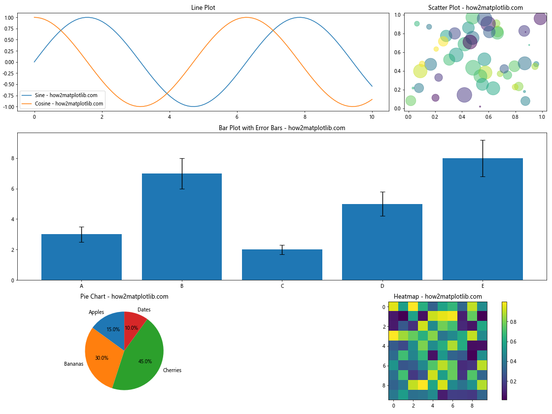
This example demonstrates how to create a complex figure with subplots of different sizes, each containing a different type of plot:
- A line plot with multiple series
- A scatter plot with varying point sizes and colors
- A bar plot with error bars
- A pie chart
- A heatmap with a color bar
By combining these different plot types, you can create rich, informative visualizations that effectively communicate various aspects of your data.
Customizing Axes and Ticks in Matplotlib Subplots with Different Sizes
When working with subplots of different sizes, it’s often necessary to customize the axes and ticks to ensure consistency and readability. Let’s explore some techniques for this:
import matplotlib.pyplot as plt
import matplotlib.gridspec as gridspec
import numpy as np

# Create a figure
fig = plt.figure(figsize=(16, 12))

# Create GridSpec
gs = gridspec.GridSpec(2, 2, width_ratios=[2, 1], height_ratios=[1, 2])

# Create subplots
ax1 = fig.add_subplot(gs[0, 0])
ax2 = fig.add_subplot(gs[0, 1])
ax3 = fig.add_subplot(gs[1, 0])
ax4 = fig.add_subplot(gs[1, 1])

# Generate sample data
x = np.linspace(0, 10, 100)
y1 = np.sin(x)
y2 = np.cos(x)
y3 = np.exp(-x/5)
y4 = x**2

# Plot data on each subplot
ax1.plot(x, y1, label='Sine - how2matplotlib.com')
ax2.plot(x, y2, label='Cosine - how2matplotlib.com')
ax3.plot(x, y3, label='Exponential - how2matplotlib.com')
ax4.plot(x, y4, label='Quadratic - how2matplotlib.com')

# Customize axes and ticks
for ax in [ax1, ax2, ax3, ax4]:
    # Set axis labels
    ax.set_xlabel('X-axis', fontsize=12)
    ax.set_ylabel('Y-axis', fontsize=12)

    # Customize tick labels
    ax.tick_params(axis='both', which='major', labelsize=10)

    # Add grid lines
    ax.grid(True, linestyle='--', alpha=0.7)

    # Set axis limits
    ax.set_xlim(0, 10)

    # Add a legend
    ax.legend(fontsize=10)

# Customize specific subplots
ax1.set_title('Sine Wave', fontsize=14, fontweight='bold')
ax1.set_ylim(-1.5, 1.5)

ax2.set_title('Cosine Wave', fontsize=14, fontweight='bold')
ax2.set_ylim(-1.5, 1.5)

ax3.set_title('Exponential Decay', fontsize=14, fontweight='bold')
ax3.set_yscale('log')
ax3.set_ylim(0.01, 1.5)

ax4.set_title('Quadratic Function', fontsize=14, fontweight='bold')
ax4.set_yscale('log')
ax4.set_ylim(0.1, 100)

# Add a main title to the figure
fig.suptitle('Customized Axes and Ticks - how2matplotlib.com', fontsize=16, fontweight='bold')

# Adjust layout
plt.tight_layout()
plt.subplots_adjust(top=0.93)  # Adjust top margin for main title

# Show the plot
plt.show()
Output:
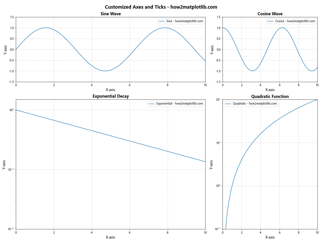
In this example, we’ve applied several customizations to the axes and ticks:
- We set consistent font sizes for axis labels and tick labels across all subplots.
- Grid lines are added to all subplots for better readability.
- X-axis limits are set consistently for all subplots.
- Legends are added to each subplot with a consistent font size.
- Y-axis scales are customized for different plots (linear for sine and cosine, logarithmic for exponential and quadratic).
- Y-axis limits are adjusted to best display each function.
- Titles are added to each subplot with consistent formatting.
- A main title is added to the entire figure.
These customizations help to create a cohesive and professional-looking figure, even with subplots of different sizes and content.
Combining Different Plot Types in Matplotlib Subplots with Different Sizes
Sometimes, you may want to combine different types of plots within a single figure using subplots of different sizes. Here’s an example that demonstrates this:
import matplotlib.pyplot as plt
import numpy as np
import pandas as pd

# Create a figure with subplots of different sizes
fig = plt.figure(figsize=(16, 12))
gs = fig.add_gridspec(3, 3)

# Line plot
ax1 = fig.add_subplot(gs[0, :2])
x = np.linspace(0, 10, 100)
y1 = np.sin(x)
y2 = np.cos(x)
ax1.plot(x, y1, label='Sine - how2matplotlib.com')
ax1.plot(x, y2, label='Cosine - how2matplotlib.com')
ax1.set_title('Line Plot')
ax1.legend()

# Scatter plot
ax2 = fig.add_subplot(gs[0, 2])
n = 50
x = np.random.rand(n)
y = np.random.rand(n)
colors = np.random.rand(n)
sizes = 1000 * np.random.rand(n)
ax2.scatter(x, y, c=colors, s=sizes, alpha=0.5)
ax2.set_title('Scatter Plot - how2matplotlib.com')

# Bar plot
ax3 = fig.add_subplot(gs[1, :])
categories = ['A', 'B', 'C', 'D', 'E']
values = [3, 7, 2, 5, 8]
ax3.bar(categories, values)
ax3.set_title('Bar Plot - how2matplotlib.com')

# Pie chart
ax4 = fig.add_subplot(gs[2, 0])
sizes = [15, 30, 45, 10]
labels = ['Apples', 'Bananas', 'Cherries', 'Dates']
ax4.pie(sizes, labels=labels, autopct='%1.1f%%', startangle=90)
ax4.set_title('Pie Chart - how2matplotlib.com')

# Heatmap
ax5 = fig.add_subplot(gs[2, 1:])
data = np.random.rand(10, 10)
im = ax5.imshow(data, cmap='viridis')
ax5.set_title('Heatmap - how2matplotlib.com')
plt.colorbar(im, ax=ax5)

# Adjust layout
plt.tight_layout()

# Show the plot
plt.show()
Output:
This example combines five different types of plots within a single figure, using subplots of different sizes:
- A line plot showing sine and cosine waves
- A scatter plot with points of varying size and color
- A bar plot
- A pie chart
- A heatmap with a color bar
Each subplot is sized and positioned differently to create an informative and visually appealing layout. This approach allows you to present diverse data types and visualizations in a single, cohesive figure.
Animating Matplotlib Subplots with Different Sizes
Animation can add an extra dimension to your visualizations, even when working with subplots of different sizes. Here’s an example of how to create an animated plot:
import matplotlib.pyplot as plt
import matplotlib.animation as animation
import numpy as np

# Set up the figure and subplots
fig = plt.figure(figsize=(12, 8))
gs = fig.add_gridspec(2, 2)
ax1 = fig.add_subplot(gs[0, :])
ax2 = fig.add_subplot(gs[1, 0])
ax3 = fig.add_subplot(gs[1, 1])

# Initialize data
t = np.linspace(0, 10, 100)
x = np.sin(t)
y = np.cos(t)

# Create line objects
line1, = ax1.plot([], [], lw=2)
line2, = ax2.plot([], [], lw=2)
scatter = ax3.scatter([], [])

# Set up plot limits and labels
ax1.set_xlim(0, 10)
ax1.set_ylim(-1.5, 1.5)
ax1.set_title('Sine Wave - how2matplotlib.com')

ax2.set_xlim(-1.5, 1.5)
ax2.set_ylim(-1.5, 1.5)
ax2.set_title('Phase Plot - how2matplotlib.com')

ax3.set_xlim(-1.5, 1.5)
ax3.set_ylim(-1.5, 1.5)
ax3.set_title('Scatter Plot - how2matplotlib.com')

# Animation function
def animate(i):
    line1.set_data(t[:i], x[:i])
    line2.set_data(x[:i], y[:i])
    scatter.set_offsets(np.c_[x[:i], y[:i]])
    return line1, line2, scatter

# Create animation
anim = animation.FuncAnimation(fig, animate, frames=len(t), interval=50, blit=True)

plt.tight_layout()
plt.show()
Output:
This example creates an animated plot with three subplots of different sizes:
- The top subplot shows a sine wave being drawn over time.
- The bottom-left subplot shows a phase plot of sine vs. cosine.
- The bottom-right subplot shows the same data as a scatter plot.
The animation function updates all three subplots simultaneously, creating a dynamic visualization of the relationship between sine and cosine functions.
Matplotlib Subplots with Different Sizes Conclusion
Matplotlib subplots with different sizes offer a powerful way to create complex, informative visualizations. By combining various plot types, handling different data types, and applying customizations, you can create figures that effectively communicate your data and insights.
Throughout this article, we’ve explored numerous techniques and examples, including:
- Creating basic subplots with different sizes using
subplot2gridandGridSpec - Customizing subplot layouts, axes, and ticks
- Handling different types of data, including time series
- Creating interactive plots with ipywidgets
- Combining different plot types within a single figure
- Handling large datasets with optimized visualization techniques
- Creating animated plots with subplots of different sizes
By mastering these techniques, you’ll be able to create sophisticated, professional-quality visualizations that make the most of Matplotlib’s capabilities. Remember to always consider your data and audience when designing your plots, and don’t hesitate to experiment with different layouts and customizations to find the most effective way to present your information.
As you continue to work with Matplotlib subplots of different sizes, keep in mind that the key to creating great visualizations is practice and iteration. Don’t be afraid to try new approaches and refine your plots based on feedback and your evolving understanding of your data.