Exploring Matplotlib Linestyle Options: A Comprehensive Guide
Matplotlib linestyle options provide a powerful way to customize the appearance of lines in your plots. This comprehensive guide will delve deep into the various linestyle options available in Matplotlib, demonstrating how to use them effectively to create visually appealing and informative plots.
Understanding Matplotlib Linestyle Options
Matplotlib offers a wide range of linestyle options that allow you to control the appearance of lines in your plots. These options include solid lines, dashed lines, dotted lines, and various combinations of these styles. By mastering these options, you can create plots that effectively communicate your data and enhance the visual appeal of your visualizations.
Let’s start with a basic example that demonstrates how to use different linestyle options:
import matplotlib.pyplot as plt
import numpy as np

x = np.linspace(0, 10, 100)
y1 = np.sin(x)
y2 = np.cos(x)
y3 = np.tan(x)

plt.figure(figsize=(10, 6))
plt.plot(x, y1, linestyle='-', label='Solid')
plt.plot(x, y2, linestyle='--', label='Dashed')
plt.plot(x, y3, linestyle=':', label='Dotted')

plt.title('Matplotlib Linestyle Options - how2matplotlib.com')
plt.xlabel('X-axis')
plt.ylabel('Y-axis')
plt.legend()
plt.grid(True)

plt.show()
Output:
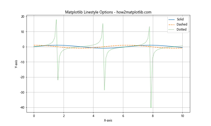
In this example, we’ve created three different lines using different linestyle options: solid (‘-‘), dashed (‘–‘), and dotted (‘:’). These are just a few of the many linestyle options available in Matplotlib.
Basic Matplotlib Linestyle Options
Matplotlib provides several basic linestyle options that you can use to customize your plots. Let’s explore each of these options in detail:
- Solid Line (‘-‘)
- Dashed Line (‘–‘)
- Dotted Line (‘:’)
- Dash-Dot Line (‘-.’)
Here’s an example that demonstrates all of these basic linestyle options:
import matplotlib.pyplot as plt
import numpy as np

x = np.linspace(0, 10, 100)
y1 = np.sin(x)
y2 = np.cos(x)
y3 = np.tan(x)
y4 = np.sinh(x)

plt.figure(figsize=(12, 8))
plt.plot(x, y1, linestyle='-', label='Solid')
plt.plot(x, y2, linestyle='--', label='Dashed')
plt.plot(x, y3, linestyle=':', label='Dotted')
plt.plot(x, y4, linestyle='-.', label='Dash-Dot')

plt.title('Basic Matplotlib Linestyle Options - how2matplotlib.com')
plt.xlabel('X-axis')
plt.ylabel('Y-axis')
plt.legend()
plt.grid(True)

plt.show()
Output:
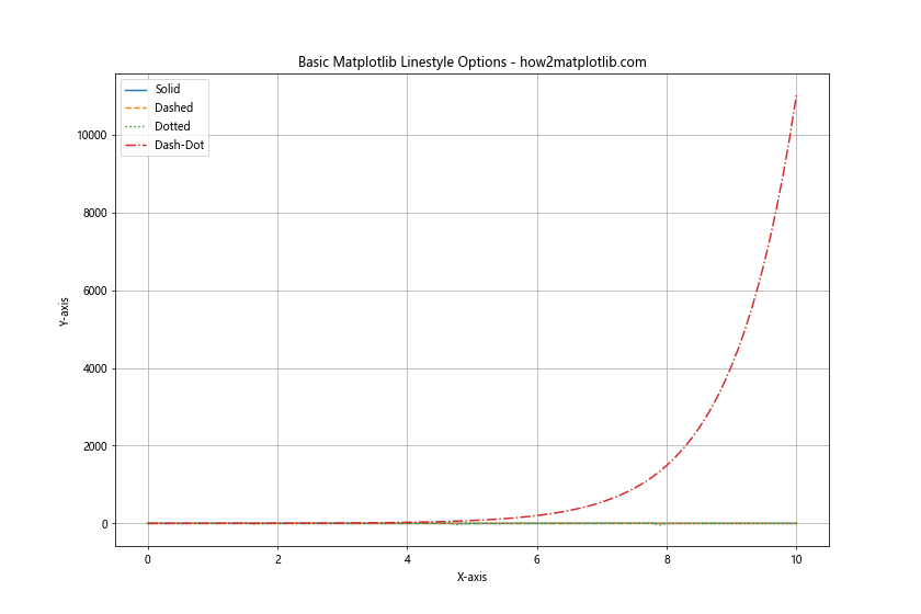
This example creates four different lines, each with a different basic linestyle option. The solid line is created using ‘-‘, the dashed line with ‘–‘, the dotted line with ‘:’, and the dash-dot line with ‘-.’.
Advanced Matplotlib Linestyle Options
In addition to the basic linestyle options, Matplotlib also provides more advanced options for customizing line appearances. These include:
- Custom dash sequences
- Combining line styles with markers
- Using RGB tuples for custom colors
- Adjusting line width
Let’s explore each of these advanced options with examples:
Custom Dash Sequences
You can create custom dash sequences by specifying a tuple of on/off lengths:
import matplotlib.pyplot as plt
import numpy as np

x = np.linspace(0, 10, 100)
y = np.sin(x)

plt.figure(figsize=(10, 6))
plt.plot(x, y, linestyle=(0, (5, 5)), label='Equal on/off')
plt.plot(x, y + 1, linestyle=(0, (5, 1)), label='Long on, short off')
plt.plot(x, y - 1, linestyle=(0, (1, 5)), label='Short on, long off')

plt.title('Custom Dash Sequences - how2matplotlib.com')
plt.xlabel('X-axis')
plt.ylabel('Y-axis')
plt.legend()
plt.grid(True)

plt.show()
Output:
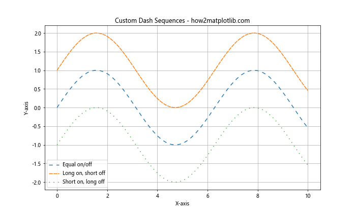
In this example, we’ve created three lines with custom dash sequences. The first line has equal on and off lengths, the second has a long on and short off pattern, and the third has a short on and long off pattern.
Combining Line Styles with Markers
You can combine line styles with markers to create even more distinctive plots:
import matplotlib.pyplot as plt
import numpy as np

x = np.linspace(0, 10, 20)
y = np.sin(x)

plt.figure(figsize=(10, 6))
plt.plot(x, y, linestyle='--', marker='o', label='Dashed with circles')
plt.plot(x, y + 0.5, linestyle=':', marker='s', label='Dotted with squares')
plt.plot(x, y - 0.5, linestyle='-.', marker='^', label='Dash-dot with triangles')

plt.title('Line Styles with Markers - how2matplotlib.com')
plt.xlabel('X-axis')
plt.ylabel('Y-axis')
plt.legend()
plt.grid(True)

plt.show()
Output:
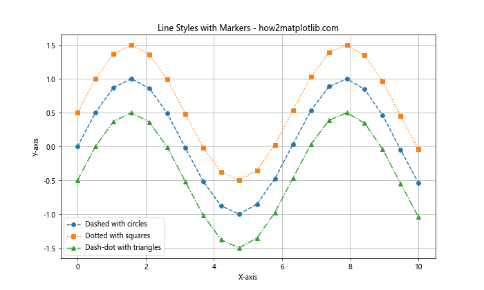
This example demonstrates how to combine different line styles with various marker types to create visually distinct lines.
Using RGB Tuples for Custom Colors
You can use RGB tuples to specify custom colors for your lines:
import matplotlib.pyplot as plt
import numpy as np

x = np.linspace(0, 10, 100)
y = np.sin(x)

plt.figure(figsize=(10, 6))
plt.plot(x, y, linestyle='-', color=(0.8, 0.2, 0.1), label='Custom Red')
plt.plot(x, y + 0.5, linestyle='--', color=(0.1, 0.8, 0.2), label='Custom Green')
plt.plot(x, y - 0.5, linestyle=':', color=(0.2, 0.1, 0.8), label='Custom Blue')

plt.title('Custom Colors with RGB Tuples - how2matplotlib.com')
plt.xlabel('X-axis')
plt.ylabel('Y-axis')
plt.legend()
plt.grid(True)

plt.show()
Output:
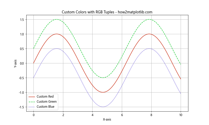
In this example, we’ve used RGB tuples to specify custom colors for each line. The values in the tuples represent the intensity of red, green, and blue respectively, ranging from 0 to 1.
Adjusting Line Width
You can adjust the width of lines using the linewidth or lw parameter:
import matplotlib.pyplot as plt
import numpy as np

x = np.linspace(0, 10, 100)
y = np.sin(x)

plt.figure(figsize=(10, 6))
plt.plot(x, y, linestyle='-', linewidth=1, label='Thin')
plt.plot(x, y + 0.5, linestyle='--', linewidth=3, label='Medium')
plt.plot(x, y - 0.5, linestyle=':', linewidth=5, label='Thick')

plt.title('Adjusting Line Width - how2matplotlib.com')
plt.xlabel('X-axis')
plt.ylabel('Y-axis')
plt.legend()
plt.grid(True)

plt.show()
Output:
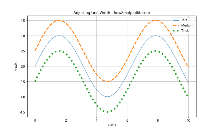
This example shows how to create lines with different widths using the linewidth parameter.
Combining Multiple Linestyle Options
One of the powerful features of Matplotlib is the ability to combine multiple linestyle options to create highly customized lines. Let’s explore some examples of how to do this:
Combining Color, Style, and Width
import matplotlib.pyplot as plt
import numpy as np

x = np.linspace(0, 10, 100)
y = np.sin(x)

plt.figure(figsize=(10, 6))
plt.plot(x, y, linestyle='--', color='red', linewidth=2, label='Red Dashed')
plt.plot(x, y + 0.5, linestyle=':', color='green', linewidth=3, label='Green Dotted')
plt.plot(x, y - 0.5, linestyle='-.', color='blue', linewidth=1.5, label='Blue Dash-Dot')

plt.title('Combining Color, Style, and Width - how2matplotlib.com')
plt.xlabel('X-axis')
plt.ylabel('Y-axis')
plt.legend()
plt.grid(True)

plt.show()
Output:
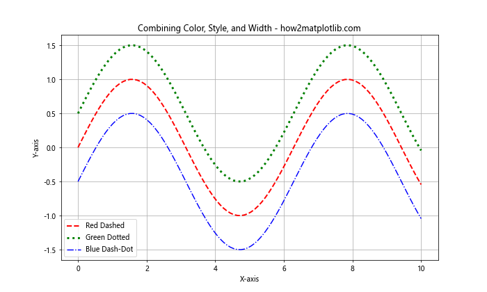
In this example, we’ve combined different colors, line styles, and line widths to create visually distinct lines.
Using Named Colors with Custom Styles
Matplotlib provides a wide range of named colors that you can use in combination with custom line styles:
import matplotlib.pyplot as plt
import numpy as np

x = np.linspace(0, 10, 100)
y = np.sin(x)

plt.figure(figsize=(10, 6))
plt.plot(x, y, linestyle=(0, (5, 5)), color='darkviolet', label='Dark Violet')
plt.plot(x, y + 0.5, linestyle=(0, (3, 1, 1, 1)), color='limegreen', label='Lime Green')
plt.plot(x, y - 0.5, linestyle=(0, (3, 5, 1, 5)), color='orangered', label='Orange Red')

plt.title('Named Colors with Custom Styles - how2matplotlib.com')
plt.xlabel('X-axis')
plt.ylabel('Y-axis')
plt.legend()
plt.grid(True)

plt.show()
Output:
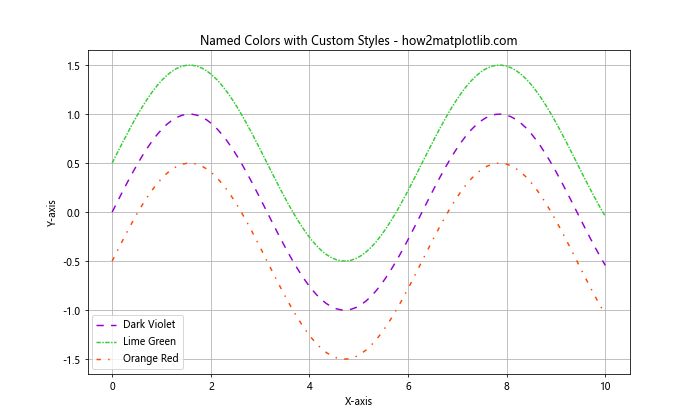
This example demonstrates how to use named colors in combination with custom dash sequences to create unique line styles.
Linestyle Options for Different Plot Types
Matplotlib linestyle options can be applied to various types of plots. Let’s explore how to use these options with different plot types:
Step Plot
import matplotlib.pyplot as plt
import numpy as np

x = np.linspace(0, 10, 20)
y = np.sin(x)

plt.figure(figsize=(10, 6))
plt.step(x, y, linestyle=':', where='pre', label='Pre-step')
plt.step(x, y + 0.5, linestyle='--', where='mid', label='Mid-step')
plt.step(x, y - 0.5, linestyle='-.', where='post', label='Post-step')

plt.title('Step Plot with Different Linestyles - how2matplotlib.com')
plt.xlabel('X-axis')
plt.ylabel('Y-axis')
plt.legend()
plt.grid(True)

plt.show()
Output:
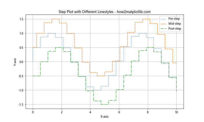
This example demonstrates how to apply different linestyles to step plots.
Scatter Plot with Connecting Lines
import matplotlib.pyplot as plt
import numpy as np

x = np.linspace(0, 10, 20)
y = np.sin(x) + np.random.normal(0, 0.1, size=len(x))

plt.figure(figsize=(10, 6))
plt.plot(x, y, linestyle='--', color='gray', zorder=1)
plt.scatter(x, y, c='red', s=50, zorder=2, label='Data Points')

plt.title('Scatter Plot with Connecting Lines - how2matplotlib.com')
plt.xlabel('X-axis')
plt.ylabel('Y-axis')
plt.legend()
plt.grid(True)

plt.show()
Output:
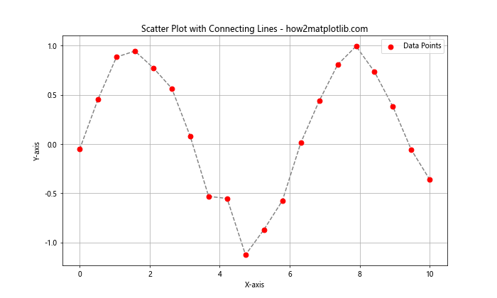
This example shows how to create a scatter plot with connecting lines using a custom linestyle.
Advanced Techniques with Matplotlib Linestyle Options
Let’s explore some advanced techniques for using Matplotlib linestyle options:
Creating a Custom Linestyle Cycler
You can create a custom linestyle cycler to automatically cycle through different line styles:
import matplotlib.pyplot as plt
import numpy as np
from cycler import cycler

x = np.linspace(0, 10, 100)
y1 = np.sin(x)
y2 = np.cos(x)
y3 = np.tan(x)

custom_cycler = cycler(linestyle=['-', '--', ':', '-.'])

plt.figure(figsize=(10, 6))
plt.rc('axes', prop_cycle=custom_cycler)

plt.plot(x, y1, label='sin(x)')
plt.plot(x, y2, label='cos(x)')
plt.plot(x, y3, label='tan(x)')

plt.title('Custom Linestyle Cycler - how2matplotlib.com')
plt.xlabel('X-axis')
plt.ylabel('Y-axis')
plt.legend()
plt.grid(True)

plt.show()
Output:
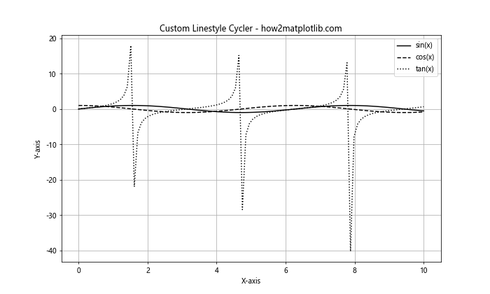
This example demonstrates how to create a custom linestyle cycler that automatically applies different line styles to each plot.
Using Linestyles in Subplots
You can apply different linestyles to subplots:
import matplotlib.pyplot as plt
import numpy as np

x = np.linspace(0, 10, 100)
y1 = np.sin(x)
y2 = np.cos(x)

fig, (ax1, ax2) = plt.subplots(2, 1, figsize=(10, 8))

ax1.plot(x, y1, linestyle='--', color='red')
ax1.set_title('Subplot 1: Sin(x) - how2matplotlib.com')
ax1.set_xlabel('X-axis')
ax1.set_ylabel('Y-axis')
ax1.grid(True)

ax2.plot(x, y2, linestyle=':', color='blue')
ax2.set_title('Subplot 2: Cos(x) - how2matplotlib.com')
ax2.set_xlabel('X-axis')
ax2.set_ylabel('Y-axis')
ax2.grid(True)

plt.tight_layout()
plt.show()
Output:
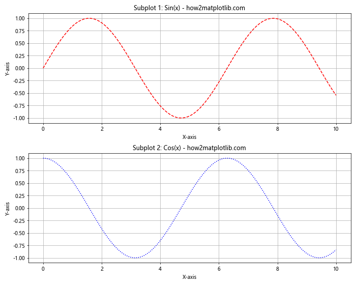
This example shows how to apply different linestyles to different subplots.
Creating a Custom Dash Pattern
You can create complex custom dash patterns:
import matplotlib.pyplot as plt
import numpy as np

x = np.linspace(0, 10, 100)
y = np.sin(x)

plt.figure(figsize=(10, 6))
plt.plot(x, y, linestyle=(0, (5, 1, 1, 1, 1, 1)), linewidth=2, label='Custom Dash')

plt.title('Custom Dash Pattern - how2matplotlib.com')
plt.xlabel('X-axis')
plt.ylabel('Y-axis')
plt.legend()
plt.grid(True)

plt.show()
Output:
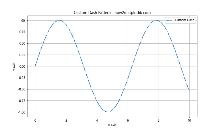
This example demonstrates how to create a complex custom dash pattern using a tuple of on/off lengths.
Linestyle Options for Specific Plot Elements
Matplotlib allows you to apply linestyle options to specific plot elements. Let’s explore some examples:
Customizing Grid Lines
You can customize the style of grid lines:
import matplotlib.pyplot as plt
import numpy as np

x = np.linspace(0, 10, 100)
y = np.sin(x)

plt.figure(figsize=(10, 6))
plt.plot(x, y)

plt.grid(True, linestyle='--', color='gray', alpha=0.7)

plt.title('Customized Grid Lines - how2matplotlib.com')
plt.xlabel('X-axis')
plt.ylabel('Y-axis')

plt.show()
Output:
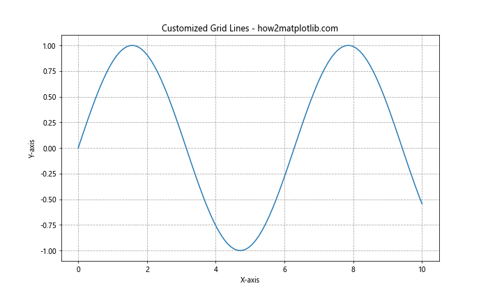
This example shows how to customize the style of grid lines using the linestyle parameter in the grid() function.
Styling Axis Lines
You can apply custom styles to axis lines:
import matplotlib.pyplot as plt
import numpy as np

x = np.linspace(0, 10, 100)
y = np.sin(x)

fig, ax = plt.subplots(figsize=(10, 6))
ax.plot(x, y)

ax.spines['top'].set_visible(False)
ax.spines['right'].set_visible(False)
ax.spines['bottom'].set_linestyle(':')
ax.spines['left'].set_linestyle('--')

plt.title('Styled Axis Lines - how2matplotlib.com')
plt.xlabel('X-axis')
plt.ylabel('Y-axis')

plt.show()
Output:
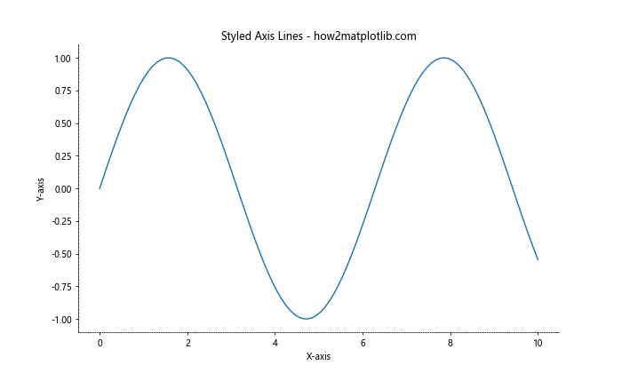
This example demonstrates how to apply different linestyles to the axis lines (spines) of the plot.
Customizing Legend Frame
You can customize the style of the legend frame:
import matplotlib.pyplot as plt
import numpy as np

x = np.linspace(0, 10, 100)
y1 = np.sin(x)
y2 = np.cos(x)

plt.figure(figsize=(10, 6))
plt.plot(x, y1, label='Sin(x)')
plt.plot(x, y2, label='Cos(x)')

legend = plt.legend()
frame = legend.get_frame()
frame.set_linestyle(':')
frame.set_edgecolor('gray')

plt.title('Customized Legend Frame - how2matplotlib.com')
plt.xlabel('X-axis')
plt.ylabel('Y-axis')

plt.show()
Output:
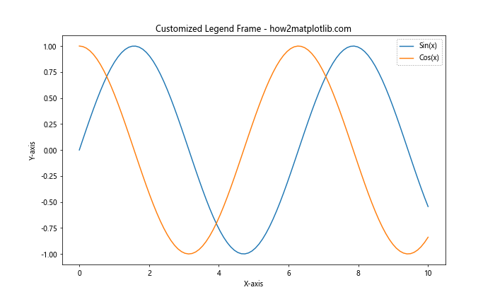
This example shows how to customize the linestyle of the legend frame.
Linestyle Options in 3D Plots
Matplotlib linestyle options can also be applied to 3D plots. Let’s explore some examples:
3D Line Plot with Custom Styles
import matplotlib.pyplot as plt
import numpy as np

fig = plt.figure(figsize=(10, 8))
ax = fig.add_subplot(111, projection='3d')

t = np.linspace(0, 10, 100)
x = np.sin(t)
y = np.cos(t)
z = t

ax.plot(x, y, z, linestyle='--', label='Dashed')
ax.plot(x, y, z+2, linestyle=':', label='Dotted')
ax.plot(x, y, z-2, linestyle='-.', label='Dash-Dot')

ax.set_title('3D Line Plot with Custom Styles - how2matplotlib.com')
ax.set_xlabel('X-axis')
ax.set_ylabel('Y-axis')
ax.set_zlabel('Z-axis')
ax.legend()

plt.show()
Output:
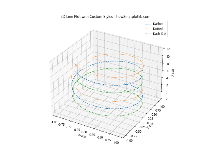
This example demonstrates how to apply different linestyles to 3D line plots.
3D Surface Plot with Wireframe
import matplotlib.pyplot as plt
import numpy as np

fig = plt.figure(figsize=(10, 8))
ax = fig.add_subplot(111, projection='3d')

x = np.arange(-5, 5, 0.25)
y = np.arange(-5, 5, 0.25)
x, y = np.meshgrid(x, y)
r = np.sqrt(x**2 + y**2)
z = np.sin(r)

surf = ax.plot_surface(x, y, z, cmap='viridis')
wire = ax.plot_wireframe(x, y, z, color='black', linestyle=':', linewidth=0.5)

ax.set_title('3D Surface Plot with Wireframe - how2matplotlib.com')
ax.set_xlabel('X-axis')
ax.set_ylabel('Y-axis')
ax.set_zlabel('Z-axis')

plt.show()
Output:
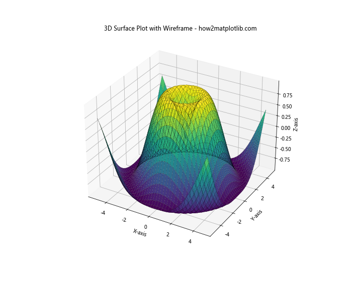
This example shows how to create a 3D surface plot with a wireframe overlay using a custom linestyle.
Animating Linestyle Changes
You can create animations that demonstrate changes in linestyle. Here’s an example:
import matplotlib.pyplot as plt
import numpy as np
from matplotlib.animation import FuncAnimation

fig, ax = plt.subplots(figsize=(10, 6))
x = np.linspace(0, 10, 100)
line, = ax.plot(x, np.sin(x), linestyle='-')

def update(frame):
    linestyles = ['-', '--', ':', '-.']
    line.set_linestyle(linestyles[frame % len(linestyles)])
    return line,

ani = FuncAnimation(fig, update, frames=20, interval=500, blit=True)

plt.title('Animated Linestyle Changes - how2matplotlib.com')
plt.xlabel('X-axis')
plt.ylabel('Y-axis')

plt.show()
Output:
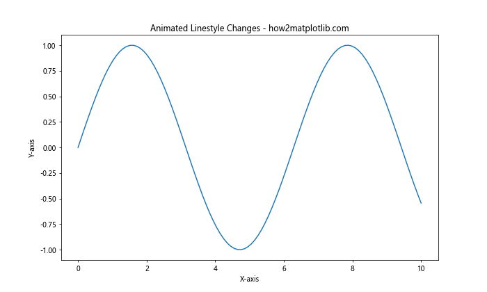
This example creates an animation that cycles through different linestyles for a sine wave plot.
Best Practices for Using Matplotlib Linestyle Options
When using Matplotlib linestyle options, it’s important to follow some best practices to ensure your plots are clear and effective:
- Use consistent linestyles: When creating multiple plots or lines within a single plot, use consistent linestyles to represent similar data or categories.
Choose appropriate line widths: Adjust line widths to ensure visibility without overwhelming other plot elements.
Combine linestyles with colors: Use a combination of linestyles and colors to differentiate between multiple lines, especially when plotting many datasets.
Consider color blindness: When choosing colors and linestyles, consider color-blind viewers by using distinct linestyles in addition to colors.
Use legends effectively: Always include a legend when using multiple linestyles, and ensure the legend entries clearly describe each line.
Avoid overcomplication: While Matplotlib offers many customization options, avoid overcomplicating your plots. Sometimes, simpler is better.
Match linestyles to data types: Use solid lines for continuous data and dashed or dotted lines for discrete or interpolated data.
Test for readability: Always check your plots for readability, especially when using custom dash patterns or complex linestyles.
Here’s an example that demonstrates some of these best practices: