Introduction to Matplotlib Pyplot
Matplotlib is a powerful Python library for creating static, animated, and interactive visualizations in Python. Pyplot is a matplotlib module that provides a simple way to create plots in Python. In this article, we will explore the various functionalities of Matplotlib Pyplot and how to create different types of plots using it.
1. Basic Plot
The most basic plot that you can create using Matplotlib Pyplot is a line plot. To create a simple line plot, you just need to provide the x and y values to plot() function. Let’s see an example:
import matplotlib.pyplot as plt

x = [1, 2, 3, 4, 5]
y = [2, 3, 5, 7, 11]

plt.plot(x, y)
plt.xlabel('X Axis')
plt.ylabel('Y Axis')
plt.title('Simple Line Plot')
plt.show()
Output:
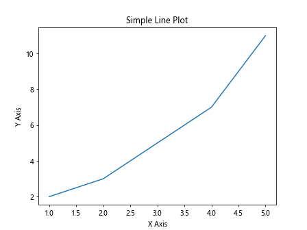
In the above example, we are creating a simple line plot with x and y values and then adding labels to the x and y axes with the xlabel() and ylabel() functions.
2. Scatter Plot
A scatter plot is used to visualize the relationship between two variables. To create a scatter plot, you can use the scatter() function. Let’s see an example:
import matplotlib.pyplot as plt

x = [1, 2, 3, 4, 5]
y = [2, 3, 5, 7, 11]

plt.scatter(x, y, color='red')
plt.xlabel('X Axis')
plt.ylabel('Y Axis')
plt.title('Scatter Plot')
plt.show()
Output:
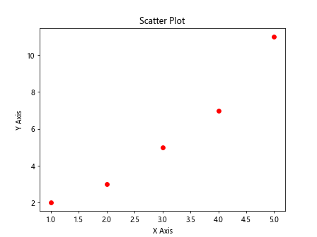
In the above example, we are creating a scatter plot with x and y values and setting the color of the markers to red using the color parameter.
3. Bar Plot
A bar plot is used to compare different categories of data. To create a bar plot, you can use the bar() function. Let’s see an example:
import matplotlib.pyplot as plt

x = ['A', 'B', 'C', 'D', 'E']
y = [10, 20, 30, 40, 50]

plt.bar(x, y, color='green')
plt.xlabel('Categories')
plt.ylabel('Values')
plt.title('Bar Plot')
plt.show()
Output:
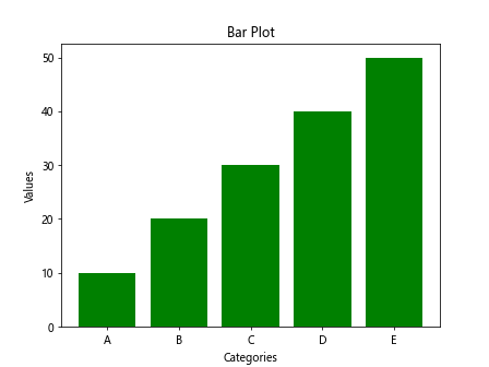
In the above example, we are creating a bar plot with categories on the x-axis and values on the y-axis and setting the color of the bars to green.
4. Histogram
A histogram is used to visualize the distribution of data. To create a histogram, you can use the hist() function. Let’s see an example:
import matplotlib.pyplot as plt
import numpy as np

data = np.random.randn(1000)

plt.hist(data, bins=30, color='blue')
plt.xlabel('Values')
plt.ylabel('Frequency')
plt.title('Histogram')
plt.show()
Output:
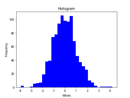
In the above example, we are creating a histogram of 1000 random data points with 30 bins and setting the color of the bars to blue.
5. Pie Chart
A pie chart is used to show the proportion of different categories in a dataset. To create a pie chart, you can use the pie() function. Let’s see an example:
import matplotlib.pyplot as plt

sizes = [40, 30, 20, 10]
labels = ['A', 'B', 'C', 'D']

plt.pie(sizes, labels=labels, autopct='%1.1f%%', startangle=140)
plt.axis('equal')
plt.title('Pie Chart')
plt.show()
Output:
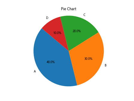
In the above example, we are creating a pie chart with sizes of different categories, labels for each category, and specifying the format for autopct as percentage with one decimal point.
6. Subplots
Subplots allow you to create multiple plots in the same figure. You can use the subplot() function to create subplots. Let’s see an example:
import matplotlib.pyplot as plt

x = [1, 2, 3, 4, 5]
y1 = [2, 3, 5, 7, 11]
y2 = [1, 4, 9, 16, 25]

plt.subplot(1, 2, 1)
plt.plot(x, y1)
plt.title('Subplot 1')

plt.subplot(1, 2, 2)
plt.plot(x, y2)
plt.title('Subplot 2')

plt.show()
Output:
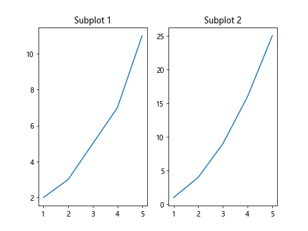
In the above example, we are creating two subplots in the same figure with different sets of x and y values.
7. Customizing Plots
You can customize your plots by changing various properties like line styles, markers, colors, etc. Let’s see an example where we customize a line plot:
import matplotlib.pyplot as plt

x = [1, 2, 3, 4, 5]
y = [2, 3, 5, 7, 11]

plt.plot(x, y, linestyle='--', marker='o', color='purple')
plt.xlabel('X Axis')
plt.ylabel('Y Axis')
plt.title('Customized Line Plot')
plt.show()
Output:
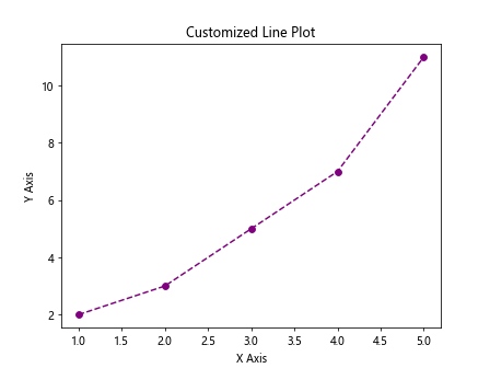
In the above example, we are customizing a line plot by changing the line style to dashed, adding circle markers, and setting the color to purple.
8. Adding Annotations
You can add annotations to your plots to provide additional information or highlight specific points. Let’s see an example where we add annotations to a scatter plot:
import matplotlib.pyplot as plt

x = [1, 2, 3, 4, 5]
y = [2, 3, 5, 7, 11]

plt.scatter(x, y)
plt.xlabel('X Axis')
plt.ylabel('Y Axis')
plt.title('Scatter Plot with Annotations')

for i, txt in enumerate(y):
    plt.annotate(f'{txt}', (x[i], y[i]))

plt.show()
Output:
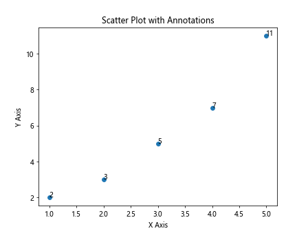
In the above example, we are adding annotations to a scatter plot showing the y values at each point.
9. Saving Plots
You can save your plots as image files in different formats like PNG, JPEG, PDF, etc. Let’s see an example where we save a plot as a PNG file:
import matplotlib.pyplot as plt

x = [1, 2, 3, 4, 5]
y = [2, 3, 5, 7, 11]

plt.plot(x, y)
plt.xlabel('X Axis')
plt.ylabel('Y Axis')
plt.title('Line Plot')
plt.savefig('line_plot.png')
In the above example, we are saving a line plot as a PNG file called line_plot.png.
10. Adding Legends
You can add legends to your plots to provide information about the different elements in the plot. Let’s see an example where we add legends to a line plot:
import matplotlib.pyplot as plt

x = [1, 2, 3, 4, 5]
y1 = [2, 3, 5, 7, 11]
y2 = [1, 4, 9, 16, 25]

plt.plot(x, y1, label='Line 1')
plt.plot(x, y2, label='Line 2')
plt.xlabel('X Axis')
plt.ylabel('Y Axis')
plt.title('Line Plot with Legends')
plt.legend()
plt.show()
Output:
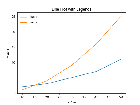
In the above example, we are adding legends to a line plot to show the different lines in the plot.
matplotlib pyplot Conclusion
In this article, we have covered some of the basic functionalities of Matplotlib Pyplot and how to create different types of plots using it. Matplotlib is a versatile library that provides a wide range of options for customizing and visualizing data in Python. With practice and experimentation, you can create beautiful and informative plots for your data analysis and visualization tasks using Matplotlib Pyplot.