Matplotlib Scatterplot
Matplotlib is a powerful library for creating visualizations in Python. One of the most common types of plots used in data visualization is the scatterplot. Scatterplots are used to display relationships between two variables and can help identify patterns and trends in the data. In this article, we will dive into how to create scatterplots using Matplotlib.
Basic Scatterplot
The simplest scatterplot can be created using the scatter() function in Matplotlib. Let’s create a basic scatterplot using randomly generated data.
import matplotlib.pyplot as plt
import numpy as np

# Generate random data
x = np.random.rand(100)
y = np.random.rand(100)

plt.scatter(x, y)
plt.xlabel('X')
plt.ylabel('Y')
plt.title('Basic Scatterplot')
plt.show()
Output:
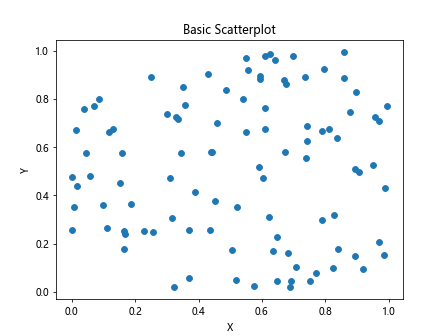
The above code generates 100 random data points for x and y and creates a scatterplot. Running this code will display a scatterplot with random data points on the X and Y axes.
Customizing Scatterplot
You can customize the appearance of the scatterplot by passing additional arguments to the scatter() function. Let’s create a scatterplot with custom marker colors and sizes.
import matplotlib.pyplot as plt
import numpy as np

x = np.random.rand(100)
y = np.random.rand(100)
colors = np.random.rand(100)  # generate random color values
sizes = 1000 * np.random.rand(100)  # generate random sizes

plt.scatter(x, y, c=colors, s=sizes, alpha=0.5)  # alpha controls the transparency
plt.xlabel('X')
plt.ylabel('Y')
plt.title('Customized Scatterplot')
plt.show()
Output:
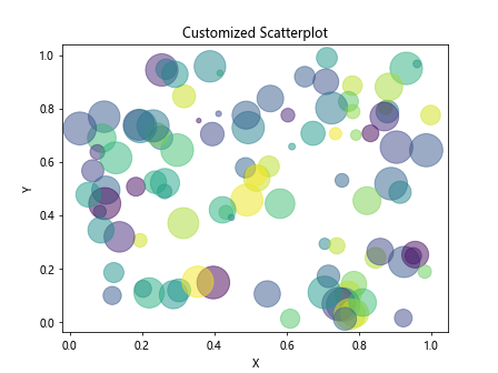
In the above code, we generate random colors and sizes for each data point and pass them to the scatter() function. Running this code will display a scatterplot with customized marker colors and sizes.
Scatterplot with Labels
You can add labels to the data points in a scatterplot to provide additional information. Let’s create a scatterplot with labels for each data point.
import matplotlib.pyplot as plt
import numpy as np

x = np.random.rand(10)
y = np.random.rand(10)
labels = ['Point1', 'Point2', 'Point3', 'Point4', 'Point5', 'Point6', 'Point7', 'Point8', 'Point9', 'Point10']

plt.scatter(x, y)
for i, label in enumerate(labels):
    plt.text(x[i], y[i], label, fontsize=12, ha='center', va='bottom')

plt.xlabel('X')
plt.ylabel('Y')
plt.title('Scatterplot with Labels')
plt.show()
Output:
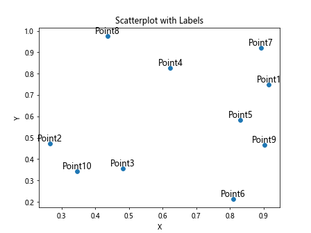
The above code generates 10 random data points with labels and displays them in a scatterplot with labels for each data point.
Scatterplot with Colorbar
You can add a colorbar to a scatterplot to show the mapping of values to colors. Let’s create a scatterplot with a colorbar using randomly generated data.
import matplotlib.pyplot as plt
import numpy as np

x = np.random.rand(100)
y = np.random.rand(100)
colors = np.random.rand(100)  # generate random color values

plt.scatter(x, y, c=colors, cmap='viridis')
plt.colorbar()
plt.xlabel('X')
plt.ylabel('Y')
plt.title('Scatterplot with Colorbar')
plt.show()
Output:
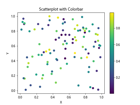
In the above code, we generate random colors for each data point and use the cmap argument to specify the color map for the scatterplot. Running this code will display a scatterplot with a colorbar showing the mapping of values to colors.
Scatterplot with Different Markers
You can use different markers in a scatterplot to differentiate between different groups of data points. Let’s create a scatterplot with different markers for two sets of data points.
import matplotlib.pyplot as plt
import numpy as np

x1 = np.random.rand(50)
y1 = np.random.rand(50)
x2 = np.random.rand(50)
y2 = np.random.rand(50)

plt.scatter(x1, y1, marker='o', label='Group 1')
plt.scatter(x2, y2, marker='s', label='Group 2')
plt.xlabel('X')
plt.ylabel('Y')
plt.title('Scatterplot with Different Markers')
plt.legend()
plt.show()
Output:
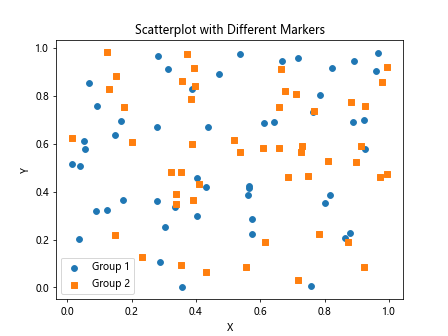
In the above code, we create two sets of random data points and use different markers for each set of data points. Running this code will display a scatterplot with different markers for two groups of data points.
Scatterplot with Regression Line
You can add a regression line to a scatterplot to show the relationship between the variables. Let’s create a scatterplot with a regression line using randomly generated data.
import matplotlib.pyplot as plt
import numpy as np
from numpy.polynomial.polynomial import polyfit

x = np.random.rand(100)
y = 2 * x + 1 + np.random.normal(size=100)

plt.scatter(x, y)
b, m = polyfit(x, y, 1)
plt.plot(x, b + m*x, '-', color='red')  # add regression line
plt.xlabel('X')
plt.ylabel('Y')
plt.title('Scatterplot with Regression Line')
plt.show()
Output:
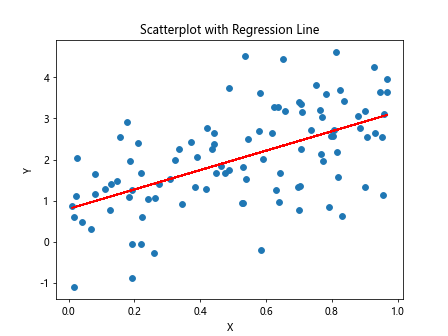
In the above code, we generate random data points for x and y with a linear relationship. We then calculate the regression line using the polyfit() function and add it to the scatterplot.
Scatterplot with Annotations
You can add annotations to specific data points in a scatterplot to highlight important information. Let’s create a scatterplot with annotations for specific data points.
import matplotlib.pyplot as plt
import numpy as np

x = np.random.rand(10)
y = np.random.rand(10)
labels = ['Point1', 'Point2', 'Point3', 'Point4', 'Point5', 'Point6', 'Point7', 'Point8', 'Point9', 'Point10']

plt.scatter(x, y)
for i, label in enumerate(labels):
    plt.text(x[i], y[i], label, fontsize=12, ha='center', va='bottom')

plt.annotate('Max Value', (np.max(x), np.max(y)), xytext=(np.max(x)-0.2, np.max(y)+0.1),
             arrowprops=dict(facecolor='black', shrink=0.05))
plt.xlabel('X')
plt.ylabel('Y')
plt.title('Scatterplot with Annotations')
plt.show()
Output:
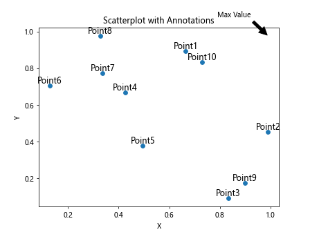
In the above code, we generate 10 random data points with labels and add an annotation for the maximum value in the scatterplot. Running this code will display a scatterplot with annotations for specific data points.
Scatterplot Subplots
You can create subplots in a scatterplot to visualize multiple sets of data. Let’s create a scatterplot with subplots using randomly generated data.
import matplotlib.pyplot as plt
import numpy as np

x = np.random.rand(100)
y1 = 2 * x + 1 + np.random.normal(size=100)
y2 = -2 * x - 1 + np.random.normal(size=100)

fig, axs = plt.subplots(1, 2)
axs[0].scatter(x, y1)
axs[1].scatter(x, y2)
axs[0].set_title('Subplot 1')
axs[1].set_title('Subplot 2')
plt.show()
Output:
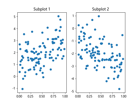
In the above code, we generate random data points for x, y1, and y2 and create subplots to visualize the two sets of data. Running this code will display a scatterplot with subplots.
Scatterplot with Trendline
You can add a trendline to a scatterplot to show the trend in the data. Let’s create a scatterplot with a trendline using randomly generated data.
import matplotlib.pyplot as plt
import numpy as np
from scipy import stats

x = np.random.rand(100)
y = 2 * x + 1 + np.random.normal(size=100)

plt.scatter(x, y)
slope, intercept, r_value, p_value, std_err = stats.linregress(x, y)
plt.plot(x, slope * x + intercept, color='red')  # add trendline
plt.xlabel('X')
plt.ylabel('Y')
plt.title('Scatterplot with Trendline')
plt.show()
Output:
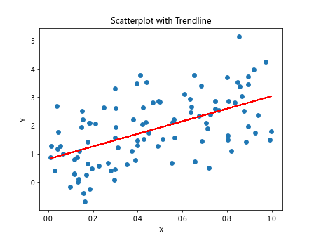
In the abovecode, we generate random data points for x and y with a linear relationship. We then calculate the trendline using the linregress() function from the scipy.stats module and add it to the scatterplot.
Scatterplot with Log Scale
You can display data on a log scale in a scatterplot to visualize relationships in data with a wide range of values. Let’s create a scatterplot with a log scale on the X-axis using randomly generated data.
import matplotlib.pyplot as plt
import numpy as np

x = np.random.rand(100) * 100
y = np.random.rand(100)

plt.scatter(x, y)
plt.xscale('log')
plt.xlabel('X (Log Scale)')
plt.ylabel('Y')
plt.title('Scatterplot with Log Scale')
plt.show()
Output:
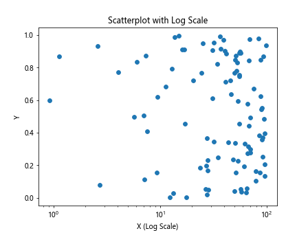
In the above code, we generate random data points for x and y and set the X-axis to display on a log scale. Running this code will display a scatterplot with a log scale on the X-axis.
Scatterplot with Hexbin
You can use hexbin plots as an alternative to scatterplots for visualizing the density of data points in a plot. Let’s create a hexbin plot using randomly generated data.
import matplotlib.pyplot as plt
import numpy as np

x = np.random.randn(1000)
y = np.random.randn(1000)

plt.hexbin(x, y, gridsize=30, cmap='YlGnBu')
plt.colorbar()
plt.xlabel('X')
plt.ylabel('Y')
plt.title('Hexbin Plot')
plt.show()
Output:
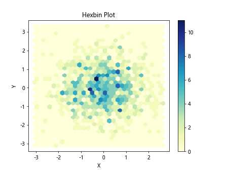
In the above code, we generate random data points for x and y and create a hexbin plot to visualize the density of data points. Running this code will display a hexbin plot with a colorbar.
Scatterplot with Different Marker Sizes
You can use different marker sizes in a scatterplot to represent different values of a variable. Let’s create a scatterplot with different marker sizes based on a third variable using randomly generated data.
import matplotlib.pyplot as plt
import numpy as np

x = np.random.rand(100)
y = np.random.rand(100)
sizes = np.random.rand(100) * 1000

plt.scatter(x, y, s=sizes)
plt.xlabel('X')
plt.ylabel('Y')
plt.title('Scatterplot with Different Marker Sizes')
plt.show()
Output:
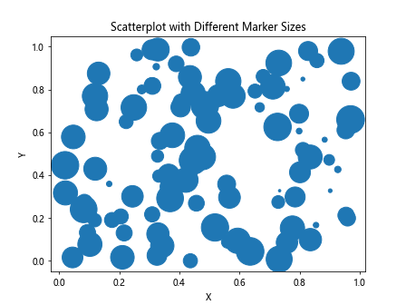
In the above code, we generate random data points for x and y and assign random sizes to the markers based on a third variable. Running this code will display a scatterplot with different marker sizes.
Scatterplot with Line of Best Fit
You can add a line of best fit to a scatterplot to visualize the relationship between two variables. Let’s create a scatterplot with a line of best fit using randomly generated data.
import matplotlib.pyplot as plt
import numpy as np

x = np.random.rand(100)
y = 2 * x + 1 + np.random.normal(size=100)

plt.scatter(x, y)
coefficients = np.polyfit(x, y, 1)
poly = np.poly1d(coefficients)
plt.plot(x, poly(x), color='red')  # add line of best fit
plt.xlabel('X')
plt.ylabel('Y')
plt.title('Scatterplot with Line of Best Fit')
plt.show()
Output:
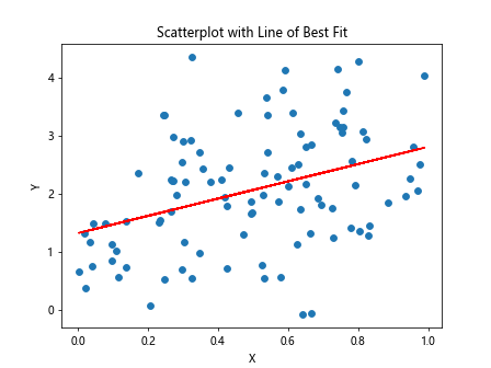
In the above code, we generate random data points for x and y with a linear relationship and calculate the line of best fit using the polyfit() function. Running this code will display a scatterplot with a line of best fit.
Matplotlib Scatterplot Conclusion
In this article, we explored various aspects of creating scatterplots using Matplotlib in Python. We covered basic scatterplots, customization, labels, colorbars, markers, regression lines, annotations, subplots, trendlines, log scale, hexbin plots, marker sizes, and lines of best fit in scatterplots. Scatterplots are an essential tool for visualizing relationships in data and identifying patterns and trends. By mastering the techniques discussed in this article, you can create compelling scatterplots for your data visualization projects.