Matplotlib Line Plot
Matplotlib is a powerful plotting library in Python that allows you to create high-quality visualizations. One of the basic types of plots that you can create with Matplotlib is a line plot. In this article, we will explore how to create line plots using Matplotlib.
Getting Started
Before we can create line plots with Matplotlib, we need to install the library. If you haven’t already installed Matplotlib, you can do so using pip:
pip install matplotlib
Once you have Matplotlib installed, you can start creating line plots.
Basic Line Plot
Let’s start with a simple example of creating a line plot with some random data points.
import matplotlib.pyplot as plt
import numpy as np

x = np.arange(0, 10, 1)
y = np.random.rand(10)

plt.plot(x, y)
plt.xlabel('X-axis')
plt.ylabel('Y-axis')
plt.title('Basic Line Plot')
plt.show()
Output:
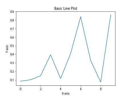
In this example, we generate a sequence of numbers using numpy.arange() for the x-axis and random values for the y-axis. We then plot these points using plt.plot() and add labels and a title to the plot.
Customizing Line Plots
You can customize various aspects of the line plot, such as the line color, line style, and marker style. Let’s see how we can do this:
import matplotlib.pyplot as plt
import numpy as np

x = np.arange(0, 10, 1)
y1 = np.random.rand(10)
y2 = np.random.rand(10)

plt.plot(x, y1, color='red', linestyle='dashed', marker='o', label='Line 1')
plt.plot(x, y2, color='blue', linestyle='dashdot', marker='x', label='Line 2')
plt.xlabel('X-axis')
plt.ylabel('Y-axis')
plt.title('Customized Line Plot')
plt.legend()
plt.show()
Output:
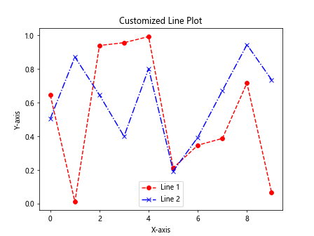
In this example, we plot two lines with different colors, line styles, and marker styles. We also add a legend to differentiate between the two lines.
Multiple Line Plots
You can create multiple line plots on the same figure by calling plt.plot() multiple times. Let’s plot three lines on the same figure:
import matplotlib.pyplot as plt
import numpy as np

x = np.arange(0, 10, 1)
y1 = np.random.rand(10)
y2 = np.random.rand(10)
y3 = np.random.rand(10)

plt.plot(x, y1, label='Line 1')
plt.plot(x, y2, label='Line 2')
plt.plot(x, y3, label='Line 3')
plt.xlabel('X-axis')
plt.ylabel('Y-axis')
plt.title('Multiple Line Plots')
plt.legend()
plt.show()
Output:
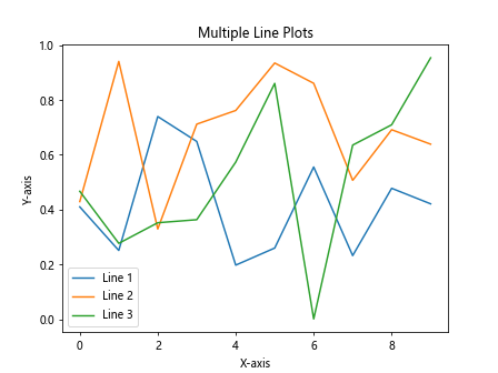
In this example, we plot three lines on the same plot by calling plt.plot() for each line.
Adding Annotations
You can add annotations such as text or arrows to your line plots to provide additional information. Let’s add a text annotation to a line plot:
import matplotlib.pyplot as plt
import numpy as np

x = np.arange(0, 10, 1)
y = np.random.rand(10)

plt.plot(x, y)
plt.xlabel('X-axis')
plt.ylabel('Y-axis')
plt.title('Line Plot with Annotation')
plt.annotate('Max', xy=(np.argmax(y), np.max(y)), xytext=(5, 0.5),
             arrowprops=dict(facecolor='black', shrink=0.05))
plt.show()
Output:
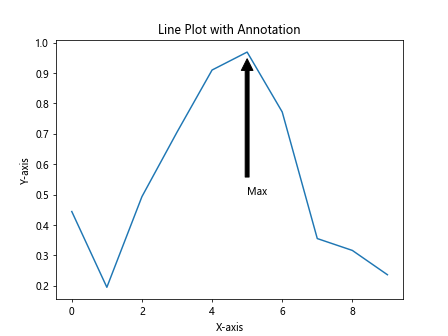
In this example, we add an annotation to mark the maximum value in the plot using plt.annotate().
Subplots
You can create multiple subplots within the same figure using Matplotlib. Let’s create a figure with two subplots, each containing a line plot:
import matplotlib.pyplot as plt
import numpy as np

fig, axes = plt.subplots(2)
x = np.arange(0, 10, 1)
y1 = np.random.rand(10)
y2 = np.random.rand(10)

axes[0].plot(x, y1, color='red', linestyle='dashed', marker='o')
axes[0].set_title('Plot 1')

axes[1].plot(x, y2, color='blue', linestyle='dashdot', marker='x')
axes[1].set_title('Plot 2')

plt.tight_layout()
plt.show()
Output:
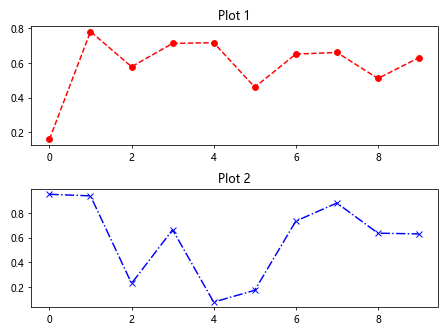
In this example, we create a figure with two subplots and plot different data on each subplot.
Saving Plots
You can save your line plots as image files using Matplotlib. Let’s save a line plot as a PNG file:
import matplotlib.pyplot as plt
import numpy as np

x = np.arange(0, 10, 1)
y = np.random.rand(10)

plt.plot(x, y)
plt.xlabel('X-axis')
plt.ylabel('Y-axis')
plt.title('Line Plot')
plt.savefig('line_plot.png')
This code snippet will save the line plot as a PNG file named line_plot.png.
Changing Plot Style
Matplotlib provides a variety of built-in plot styles that you can use to change the appearance of your plots. Let’s see how to change the plot style to a different theme:
import matplotlib.pyplot as plt
import numpy as np

plt.style.use('ggplot')  # Change the plot style to 'ggplot'

x = np.arange(0, 10, 1)
y = np.random.rand(10)

plt.plot(x, y)
plt.xlabel('X-axis')
plt.ylabel('Y-axis')
plt.title('Line Plot with ggplot Style')
plt.show()
Output:
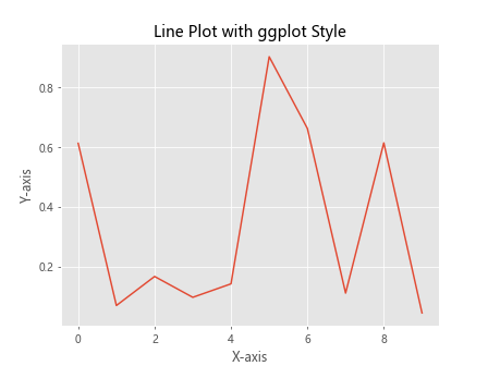
In this example, we change the plot style to ggplot using plt.style.use().
Plotting Functions
You can plot mathematical functions using Matplotlib. Let’s plot a sine function on a line plot:
import matplotlib.pyplot as plt
import numpy as np

x = np.linspace(0, 2*np.pi, 100)
y = np.sin(x)

plt.plot(x, y)
plt.xlabel('X-axis')
plt.ylabel('Y-axis')
plt.title('Sine Function Plot')
plt.show()
Output:
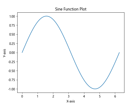
In this example, we plot the sine function using numpy.sin() and plot it on a line plot.
Bar Plot as Line Plot
You can create a bar plot using Matplotlib and convert it into a line plot by connecting the tops of the bars. Let’s create a bar plot and convert it into a line plot:
import matplotlib.pyplot as plt
import numpy as np

x = np.arange(1, 6)
y = np.random.randint(1, 10, 5)

plt.bar(x, y)
plt.plot(x, y, color='red', marker='o')
plt.xlabel('X-axis')
plt.ylabel('Y-axis')
plt.title('Bar Plot as Line Plot')
plt.show()
Output:
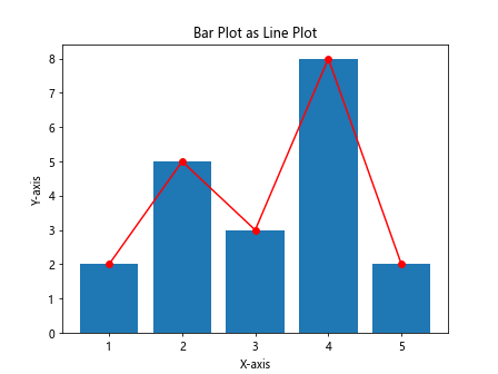
In this example, we first create a bar plot using plt.bar() and then convert it into a line plot by connecting the tops of the bars.
Plotting Data from a CSV File
You can plot data from a CSV file using Matplotlib. Let’s load data from a CSV file and plot it on a line plot:
import pandas as pd
import matplotlib.pyplot as plt
import numpy as np

data = pd.read_csv('data.csv')
x = data['X']
y = data['Y']

plt.plot(x, y)
plt.xlabel('X-axis')
plt.ylabel('Y-axis')
plt.title('Data from CSV File')
plt.show()
In this example, we load data from a CSV file using pandas.read_csv() and plot it on a line plot.
Plotting Time Series Data
Matplotlib can be used to plot time series data. Let’s plot a time series on a line plot:
import matplotlib.pyplot as plt
import numpy as np
import pandas as pd

data = pd.read_csv('timeseries.csv')
data['Date'] = pd.to_datetime(data['Date'])

plt.plot(data['Date'], data['Value'])
plt.xlabel('Date')
plt.ylabel('Value')
plt.title('Time Series Plot')
plt.show()
In this example, we load time series data from a CSV file and plot it on a line plot.
Using Annotations with Dates
If you are plotting time series data, you might want to add annotations with dates. Let’s add a text annotation with a date to a time series plot:
import matplotlib.pyplot as plt
import numpy as np
import pandas as pd

data = pd.read_csv('timeseries.csv')
data['Date'] = pd.to_datetime(data['Date'])

plt.plot(data['Date'], data['Value'])
plt.xlabel('Date')
plt.ylabel('Value')
plt.title('Time Series Plot with Date Annotation')
plt.annotate('Anomaly', xy=('2022-01-15', 20), xytext=('2022-02-01', 25),
             arrowprops=dict(facecolor='black', shrink=0.05))
plt.show()
In this example, we add a text annotation with a date to mark an anomaly in the time series plot.
Plotting 3D Line Plot
Matplotlib can also be used to create 3D line plots. Let’s plot a 3D line plot:
import matplotlib.pyplot as plt
import numpy as np
from mpl_toolkits.mplot3d import Axes3D

fig = plt.figure()
ax = fig.add_subplot(111, projection='3d')

x = np.linspace(-5, 5, 100)
y = np.sin(x)
z = np.cos(x)

ax.plot(x, y, z)
ax.set_xlabel('X-axis')
ax.set_ylabel('Y-axis')
ax.set_zlabel('Z-axis')
ax.set_title('3D Line Plot')
plt.show()
Output:
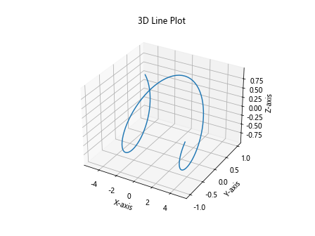
In this example, we create a 3D line plot with the x, y, and z axes.
Matplotlib Line Plot Conclusion
In this article, we have explored how to create line plots using Matplotlib in Python. We covered basic line plots, customizing line plots, multiple line plots, annotations, subplots, saving plots, changing plot styles, plotting functions, converting bar plots to line plots, plotting data from CSV files, plotting time series data, adding annotations with dates, and creating 3D line plots. Matplotlib provides a wide range of options for creating informative and visually appealing line plots for data visualization. Experiment with the examples provided to further enhance your understanding and skills in creating line plots with Matplotlib.