Matplotlib line graph
Matplotlib is a popular Python library for creating static, animated, and interactive visualizations in Python. One common type of visualization that Matplotlib can create is line graphs. Line graphs are excellent for showing trends over time or relationships between quantitative variables. In this article, we will explore how to create line graphs using Matplotlib.
Basic Line Graph
To create a basic line graph using Matplotlib, you first need to import the library and then use the plot function to plot the data points. Here is an example code snippet that demonstrates how to create a basic line graph:
import matplotlib.pyplot as plt

# Data for the x-axis
x = [1, 2, 3, 4, 5]
# Data for the y-axis
y = [2, 3, 5, 7, 11]

# Create a line graph
plt.plot(x, y)

# Add labels and title
plt.xlabel('x-axis')
plt.ylabel('y-axis')
plt.title('Basic Line Graph')

# Display the graph
plt.show()
Output:
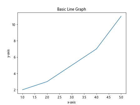
When you run the above code, you should see a simple line graph with the data points connected by lines.
Customizing Line Styles
You can customize the appearance of the lines in the line graph by specifying different line styles, colors, and markers. Here is an example code snippet that demonstrates how to customize the line style:
import matplotlib.pyplot as plt

# Data for the x-axis
x = [1, 2, 3, 4, 5]
# Data for the y-axis
y = [2, 3, 5, 7, 11]

# Create a line graph with a dashed line
plt.plot(x, y, linestyle='--')

# Add labels and title
plt.xlabel('x-axis')
plt.ylabel('y-axis')
plt.title('Line Graph with Dashed Line')

# Display the graph
plt.show()
Output:
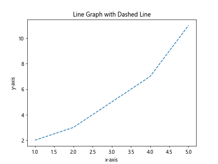
In the above code, we set the linestyle parameter to '--' to create a dashed line in the line graph.
Multiple Lines on the Same Graph
You can plot multiple lines on the same graph by calling the plot function multiple times. Here is an example code snippet that demonstrates how to plot multiple lines on the same graph:
import matplotlib.pyplot as plt

# Data for the x-axis
x = [1, 2, 3, 4, 5]
# Data for the y-axis
y1 = [2, 3, 5, 7, 11]
y2 = [1, 4, 9, 16, 25]

# Create two line graphs on the same plot
plt.plot(x, y1, label='Line 1')
plt.plot(x, y2, label='Line 2')

# Add labels and title
plt.xlabel('x-axis')
plt.ylabel('y-axis')
plt.title('Multiple Lines on the Same Graph')
plt.legend()

# Display the graph
plt.show()
Output:
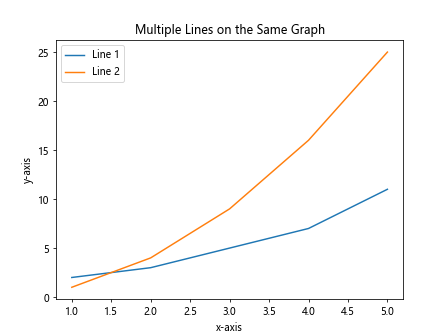
In the above code, we plot two lines on the same graph and add a legend to distinguish between the lines.
Customizing Line Colors
You can customize the colors of the lines in the line graph by specifying different color codes. Here is an example code snippet that demonstrates how to customize the line colors:
import matplotlib.pyplot as plt

# Data for the x-axis
x = [1, 2, 3, 4, 5]
# Data for the y-axis
y = [2, 3, 5, 7, 11]

# Create a line graph with a blue line
plt.plot(x, y, color='b')

# Add labels and title
plt.xlabel('x-axis')
plt.ylabel('y-axis')
plt.title('Line Graph with Blue Line')

# Display the graph
plt.show()
Output:
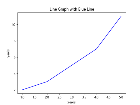
In the above code, we set the color parameter to 'b' to create a blue line in the line graph.
Changing Line Width
You can customize the width of the lines in the line graph by specifying the linewidth parameter. Here is an example code snippet that demonstrates how to change the line width:
import matplotlib.pyplot as plt

# Data for the x-axis
x = [1, 2, 3, 4, 5]
# Data for the y-axis
y = [2, 3, 5, 7, 11]

# Create a line graph with a thicker line
plt.plot(x, y, linewidth=2)

# Add labels and title
plt.xlabel('x-axis')
plt.ylabel('y-axis')
plt.title('Line Graph with Thicker Line')

# Display the graph
plt.show()
Output:
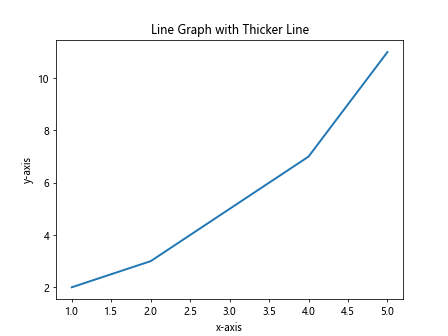
In the above code, we set the linewidth parameter to 2 to create a thicker line in the line graph.
Adding Gridlines
You can add gridlines to the line graph to help readers better understand the data. Here is an example code snippet that demonstrates how to add gridlines:
import matplotlib.pyplot as plt

# Data for the x-axis
x = [1, 2, 3, 4, 5]
# Data for the y-axis
y = [2, 3, 5, 7, 11]

# Create a line graph with gridlines
plt.plot(x, y)
plt.grid(True)

# Add labels and title
plt.xlabel('x-axis')
plt.ylabel('y-axis')
plt.title('Line Graph with Gridlines')

# Display the graph
plt.show()
Output:
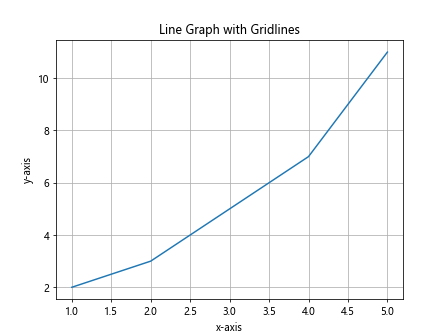
In the above code, we call the grid function with the True parameter to add gridlines to the graph.
Adding Annotations
You can add annotations to the line graph to highlight specific data points or trends. Here is an example code snippet that demonstrates how to add annotations:
import matplotlib.pyplot as plt

# Data for the x-axis
x = [1, 2, 3, 4, 5]
# Data for the y-axis
y = [2, 3, 5, 7, 11]

# Create a line graph
plt.plot(x, y)

# Add annotations for data points
for i, j in zip(x, y):
    plt.text(i, j, f'{j}', ha='center', va='bottom')

# Add labels and title
plt.xlabel('x-axis')
plt.ylabel('y-axis')
plt.title('Line Graph with Annotations')

# Display the graph
plt.show()
Output:
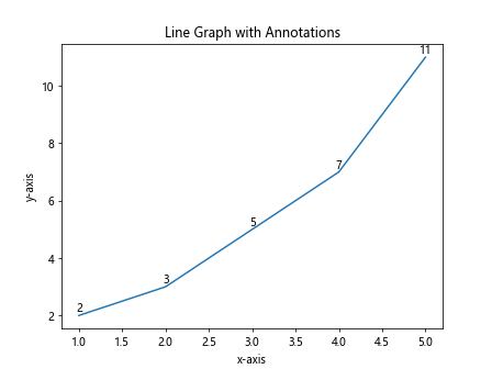
In the above code, we use the text function to add annotations for each data point in the line graph.
Creating Subplots
You can create multiple subplots within the same figure to compare different line graphs. Here is an example code snippet that demonstrates how to create subplots:
import matplotlib.pyplot as plt

# Data for the x-axis
x = [1, 2, 3, 4, 5]
# Data for the y-axis
y1 = [2, 3, 5, 7, 11]
y2 = [1, 4, 9, 16, 25]

# Create subplots
plt.subplot(2, 1, 1)
plt.plot(x, y1)
plt.title('Subplot 1')

plt.subplot(2, 1, 2)
plt.plot(x, y2)
plt.title('Subplot 2')

# Display the subplots
plt.tight_layout()
plt.show()
Output:
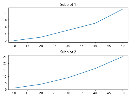
In the above code, we create two subplots within the same figure to compare two different line graphs.
Non-Linear Scales
You can use non-linear scales for the x-axis or y-axis in the line graph to better visualize the data. Here is an example code snippet that demonstrates how to use a logarithmic scale for the y-axis:
import matplotlib.pyplot as plt

# Data for the x-axis
x = [1, 2, 3, 4, 5]
# Data for the y-axis
y = [2, 4, 8, 16, 32]

# Create a line graph with a logarithmic y-axis scale
plt.plot(x, y)
plt.yscale('log')

# Add labels and title
plt.xlabel('x-axis')
plt.ylabel('y-axis')
plt.title('Line Graph with Logarithmic Y-Axis Scale')

# Display the graph
plt.show()
Output:
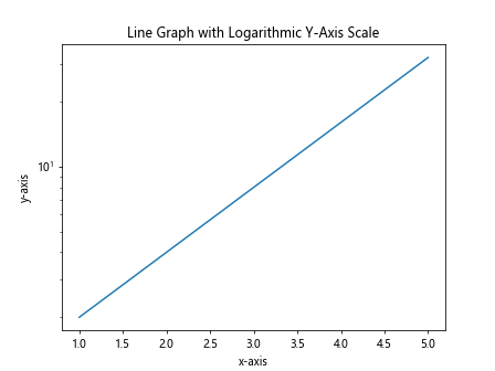
In the above code, we set the y-axis scale to log using the yscale function to create a line graph with a logarithmic y-axis scale.
Adding Legend
You can add a legend to the line graph to explain the data series or lines. Here is an example code snippet that demonstrates how to add a legend:
import matplotlib.pyplot as plt

# Data for the x-axis
x = [1, 2, 3, 4, 5]
# Data for the y-axis
y1 = [2, 3, 5, 7, 11]
y2 = [1, 4, 9, 16, 25]

# Create two line graphs on the same plot
plt.plot(x, y1, label='Line 1')
plt.plot(x, y2, label='Line 2')

# Add labels and title
plt.xlabel('x-axis')
plt.ylabel('y-axis')
plt.title('Line Graph with Legend')
plt.legend()

# Display the graph
plt.show()
Output:

In the above code, we use the legend function to add a legend to the line graph to explain the different data series.
Save Line Graph to File
You can save the line graph as an image file for later use or sharing. Here is an example code snippet that demonstrates how to save a line graph as a PNG file:
import matplotlib.pyplot as plt

# Data for the x-axis
x = [1, 2, 3, 4, 5]
# Data for the y-axis
y = [2, 3, 5, 7, 11]

# Create a line graph
plt.plot(x, y)

# Add labels and title
plt.xlabel('x-axis')
plt.ylabel('y-axis')
plt.title('Line Graph')

# Save the graph as a PNG file
plt.savefig('line_graph.png')

# Display the graph
plt.show()
Output:
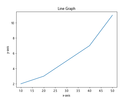
In the above code, we use the savefig function to save the line graph as a PNG file with the filename line_graph.png.
Overlaying Line Graphs
You can overlay multiple line graphs on the same plot to show different trends or relationships. Here is an example code snippet that demonstrates how to overlay line graphs:
import matplotlib.pyplot as plt

# Data for the x-axis
x = [1, 2, 3, 4, 5]
# Data for the y-axis
y1 = [2, 3, 5, 7, 11]
y2 = [1, 4, 9, 16, 25]

# Create a line graph for y1
plt.plot(x, y1, label='Line 1')

# Overlay a line graph for y2
plt.plot(x, y2, label='Line 2')

# Add labels and title
plt.xlabel('x-axis')
plt.ylabel('y-axis')
plt.title('Overlaid Line Graphs')
plt.legend()

# Display the graph
plt.show()
Output:
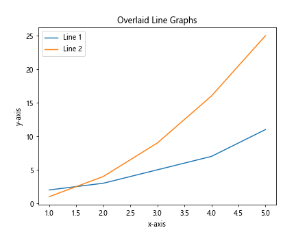
In the above code, we overlay two line graphs on the same plot to show different trends in the data.
Handling Missing Data
You can handle missing data in line graphs by specifying NaN (Not a Number) values. Here is an example code snippet that demonstrates how to handle missing data:
import matplotlib.pyplot as plt
import numpy as np

# Data for the x-axis
x = [1, 2, 3, 4, 5]
# Data for the y-axis
y = [2, np.nan, 5, 7, 11]

# Create a line graph with missing data
plt.plot(x, y)

# Add labels and title
plt.xlabel('x-axis')
plt.ylabel('y-axis')
plt.title('Line Graph with Missing Data')

# Display the graph
plt.show()
Output:
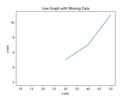
In the above code, we use np.nan to represent missing data in the y-axis values.
Logarithmic X-axis Scale
You can use a logarithmic scale for the x-axis in the line graph to better visualize exponential data. Here is an example code snippet that demonstrates how to use a logarithmic x-axis scale:
import matplotlib.pyplot as plt

# Data for the x-axis
x = [1, 10, 100, 1000, 10000]
# Data for the y-axis
y = [2, 3, 5, 7, 11]

# Create a line graph with a logarithmic x-axis scale
plt.plot(x, y)
plt.xscale('log')

# Add labels and title
plt.xlabel('x-axis')
plt.ylabel('y-axis')
plt.title('Line Graph with Logarithmic X-Axis Scale')

# Display the graph
plt.show()
Output:
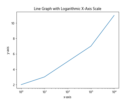
In the above code, we set the x-axis scale to log using the xscale function to create a line graph with a logarithmic x-axis scale.
Setting Axis Limits
You can set custom axis limits to focus on specific ranges of the data. Here is an example code snippet that demonstrates how to set custom axis limits:
import matplotlib.pyplot as plt

# Data for the x-axis
x = [1, 2, 3, 4, 5]
# Data for the y-axis
y = [2, 3, 5, 7, 11]

# Create a line graph
plt.plot(x, y)

# Set custom axis limits
plt.xlim(2, 4)
plt.ylim(3, 8)

# Add labels and title
plt.xlabel('x-axis')
plt.ylabel('y-axis')
plt.title('Line Graph with Custom Axis Limits')

# Display the graph
plt.show()
Output:
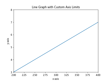
In the above code, we use the xlim and ylim functions to set custom limits for the x-axis and y-axis, respectively.
Smoothing Line Graphs
You can smooth out line graphs by applying a moving average or interpolation to the data points. Here is an example code snippet that demonstrates how to smooth line graphs:
import matplotlib.pyplot as plt
import numpy as np

# Data for the x-axis
x = np.linspace(0, 10, 100)
# Data for the y-axis
y = np.sin(x)

# Create a line graph
plt.plot(x, y, label='Original')

# Smooth the line graph by applying a moving average
y_smooth = np.convolve(y, np.ones(10)/10, mode='same')
plt.plot(x, y_smooth, label='Smoothed')

# Add labels and title
plt.xlabel('x-axis')
plt.ylabel('y-axis')
plt.title('Smoothed Line Graph')
plt.legend()

# Display the graph
plt.show()
Output:
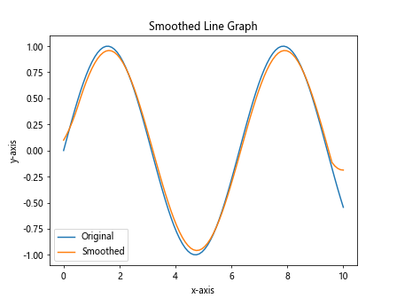
In the above code, we apply a moving average filter to the data points to smooth out the line graph.
Adding Trendlines
You can add trendlines to line graphs to show the overall trend in the data. Here is an example code snippet that demonstrates how to add trendlines:
import matplotlib.pyplot as plt
import numpy as np

# Data for the x-axis
x = np.linspace(0, 10, 100)
# Data for the y-axis
y = 2*x + np.random.normal(0, 1, 100)

# Create a line graph
plt.plot(x, y, label='Data Points')

# Add a linear trendline
m, b = np.polyfit(x, y, 1)
plt.plot(x, m*x + b, label='Trendline', color='r')

# Add labels and title
plt.xlabel('x-axis')
plt.ylabel('y-axis')
plt.title('Line Graph with Trendline')
plt.legend()

# Display the graph
plt.show()
Output:
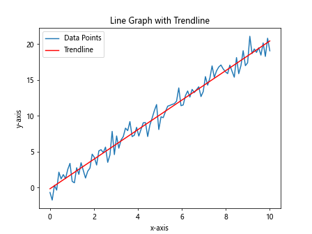
In the above code, we use linear regression to fit a trendline to the data points and plot it on the line graph.
Conclusion
In this article, we have explored various aspects of creating line graphs using Matplotlib in Python. We have covered basic line graphs, customizing line styles, multiple lines on the same graph, customizing line colors, changing line width, adding gridlines, annotations, subplots, non-linear scales, legends, saving graphs to files, overlaying line graphs, handling missing data, logarithmic scales, setting axis limits, smoothing graphs, and adding trendlines. By understanding these concepts and applying them in your visualizations, you can effectively communicate your data and insights to your audience.
Remember to experiment with different parameters, styles, and settings to create visually appealing and informative line graphs for your data analysis and visualization projects. Matplotlib offers a wide range of customization options to tailor your graphs to suit your specific requirements. Explore the official Matplotlib documentation for more advanced techniques andfeatures that can further enhance your line graphs.
Adding Data Markers
You can add data markers to your line graph to highlight the individual data points. This can make it easier for viewers to identify specific data points in the graph. Here is an example code snippet that demonstrates how to add data markers:
import matplotlib.pyplot as plt

# Data for the x-axis
x = [1, 2, 3, 4, 5]
# Data for the y-axis
y = [2, 3, 5, 7, 11]

# Create a line graph with data markers
plt.plot(x, y, marker='o', linestyle='-', color='b', label='Data Points')

# Add labels and title
plt.xlabel('x-axis')
plt.ylabel('y-axis')
plt.title('Line Graph with Data Markers')
plt.legend()

# Display the graph
plt.show()
Output:
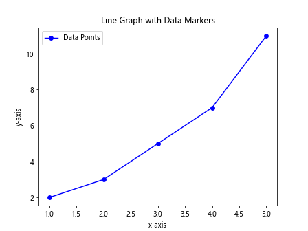
In the above code, we use the marker parameter in the plot function to specify the shape of the data markers (in this case, circles).
Adding Annotations
You can add text annotations to your line graph to provide additional context or information about specific data points or trends. Annotations can help viewers better understand the data presented in the graph. Here is an example code snippet that demonstrates how to add annotations:
import matplotlib.pyplot as plt

# Data for the x-axis
x = [1, 2, 3, 4, 5]
# Data for the y-axis
y = [2, 3, 5, 7, 11]

# Create a line graph
plt.plot(x, y, label='Data Points')

# Add text annotations
plt.annotate('Start', (x[0], y[0]), textcoords="offset points", xytext=(0,10), ha='center')
plt.annotate('End', (x[-1], y[-1]), textcoords="offset points", xytext=(0,10), ha='center')

# Add labels and title
plt.xlabel('x-axis')
plt.ylabel('y-axis')
plt.title('Line Graph with Annotations')
plt.legend()

# Display the graph
plt.show()
Output:
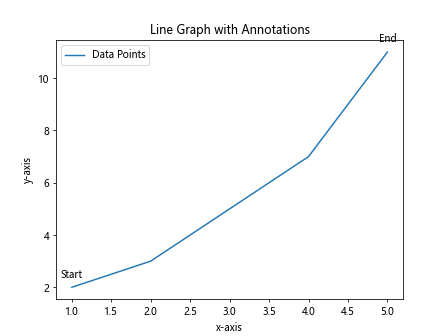
In the above code, we use the annotate function to add text annotations at specific data points on the line graph.
Customizing Line Styles
You can customize the line style in your line graph to differentiate between multiple data series or to emphasize specific trends. Matplotlib offers a wide range of line styles that you can use. Here is an example code snippet that demonstrates how to customize line styles:
import matplotlib.pyplot as plt

# Data for the x-axis
x = [1, 2, 3, 4, 5]
# Data for the y-axis
y1 = [2, 3, 5, 7, 11]
y2 = [1, 4, 9, 16, 25]

# Create a line graph with custom line styles
plt.plot(x, y1, linestyle='--', color='b', label='Line 1')
plt.plot(x, y2, linestyle=':', color='r', label='Line 2')

# Add labels and title
plt.xlabel('x-axis')
plt.ylabel('y-axis')
plt.title('Line Graph with Custom Line Styles')
plt.legend()

# Display the graph
plt.show()
Output:
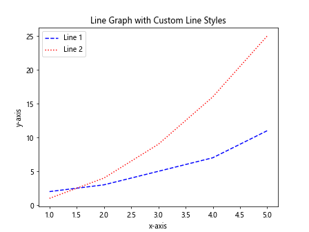
In the above code, we use the linestyle parameter in the plot function to specify different line styles for each data series.