Matplotlib Line
Matplotlib is a powerful Python library for creating static, animated, and interactive visualizations. One of the fundamental elements in creating plots and charts with Matplotlib is the ability to draw lines. In this article, we will explore how to create different types of lines using Matplotlib.
Basic Line Plot
The most basic type of line plot in Matplotlib is a simple line connecting a series of points. Let’s start by creating a basic line plot with randomly generated data.
import matplotlib.pyplot as plt
import numpy as np

x = np.linspace(0, 10, 100)
y = np.sin(x)

plt.plot(x, y)
plt.xlabel('X Axis')
plt.ylabel('Y Axis')
plt.title('Basic Line Plot')
plt.show()
Output:
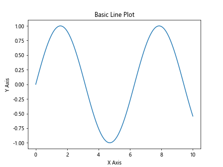
In this example, we create an array x of 100 points between 0 and 10, and compute the sine of each point to get the y values. We then use the plt.plot() function to create a line plot.
Customizing Line Styles
Matplotlib allows you to customize the style of the lines in your plots. You can change properties such as line color, width, style, and marker style. Let’s create a line plot with custom line styles.
import matplotlib.pyplot as plt
import numpy as np

x = np.linspace(0, 10, 100)
y = np.cos(x)

plt.plot(x, y, color='red', linewidth=2, linestyle='--', marker='o')
plt.xlabel('X Axis')
plt.ylabel('Y Axis')
plt.title('Custom Line Style')
plt.show()
Output:
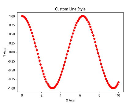
In this example, we set the line color to red, line width to 2, line style to dashed (--), and marker style to circle (o).
Multiple Lines on the Same Plot
You can plot multiple lines on the same plot by calling the plt.plot() function multiple times. Let’s create a plot with two lines representing different mathematical functions.
import matplotlib.pyplot as plt
import numpy as np

x = np.linspace(0, 10, 100)
y1 = np.sin(x)
y2 = np.cos(x)

plt.plot(x, y1, label='Sin(x)')
plt.plot(x, y2, label='Cos(x)')
plt.legend()
plt.xlabel('X Axis')
plt.ylabel('Y Axis')
plt.title('Multiple Lines Plot')
plt.show()
Output:
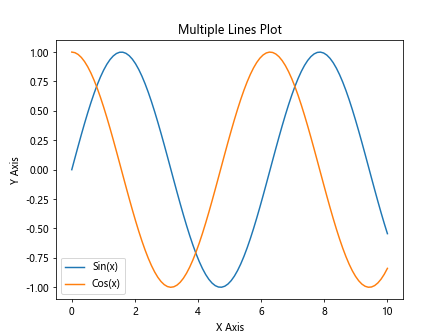
In this example, we plot the sine and cosine functions on the same plot by calling plt.plot() twice and providing a label for each line. We then use plt.legend() to display a legend.
Line Plot with Error Bars
In some cases, you may want to visualize data with uncertainty using error bars. Matplotlib provides a way to add error bars to line plots. Let’s create a line plot with error bars.
import matplotlib.pyplot as plt
import numpy as np

x = np.linspace(0, 10, 10)
y = np.exp(x)
errors = 0.1 * y

plt.errorbar(x, y, yerr=errors, fmt='-o')
plt.xlabel('X Axis')
plt.ylabel('Y Axis')
plt.title('Line Plot with Error Bars')
plt.show()
Output:
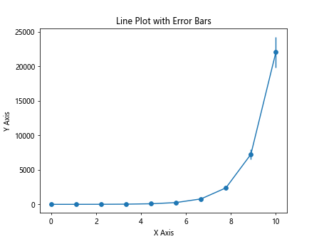
In this example, we create an array errors representing the uncertainties in our data and use the plt.errorbar() function to plot the data with error bars.
Highlighting Points on the Line
You can highlight specific points on a line by using markers. Matplotlib provides a wide range of marker styles that you can use to distinguish individual data points. Let’s create a line plot with highlighted points.
import matplotlib.pyplot as plt
import numpy as np

x = np.linspace(0, 10, 100)
y = np.tan(x)

plt.plot(x, y, marker='s', markevery=[10, 30, 50, 70, 90], markerfacecolor='red', markersize=8)
plt.xlabel('X Axis')
plt.ylabel('Y Axis')
plt.title('Line Plot with Highlighted Points')
plt.show()
Output:
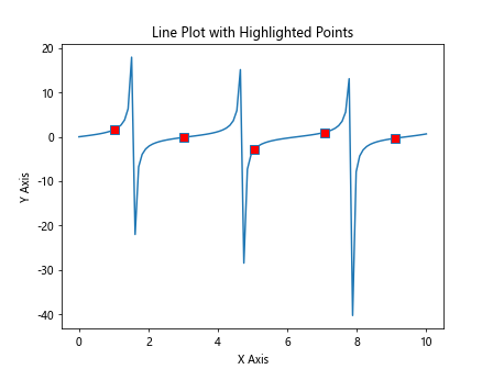
In this example, we use square markers (s) with different face colors to highlight specific points on the line.
Annotating the Plot
You can add annotations to your line plots to provide additional information about the data. Annotations can include text, arrows, and shapes. Let’s create a line plot with annotations.
import matplotlib.pyplot as plt
import numpy as np

x = np.linspace(0, 10, 100)
y = np.arctan(x)

plt.plot(x, y)
plt.annotate('Maximum', xy=(np.pi/2, 1.0), xytext=(np.pi/2 + 1, 1.5),
             arrowprops=dict(facecolor='black', shrink=0.05))
plt.xlabel('X Axis')
plt.ylabel('Y Axis')
plt.title('Line Plot with Annotation')
plt.show()
Output:
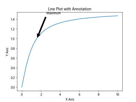
In this example, we add an annotation to indicate the maximum point on the line plot. We use plt.annotate() to specify the text, arrow properties, and annotation position.
Adding Grid Lines
Grid lines can help visually align data points on a plot. You can add grid lines to your line plots using Matplotlib. Let’s create a line plot with grid lines.
import matplotlib.pyplot as plt
import numpy as np

x = np.linspace(0, 10, 100)
y = np.sqrt(x)

plt.plot(x, y)
plt.grid(True)
plt.xlabel('X Axis')
plt.ylabel('Y Axis')
plt.title('Line Plot with Grid Lines')
plt.show()
Output:
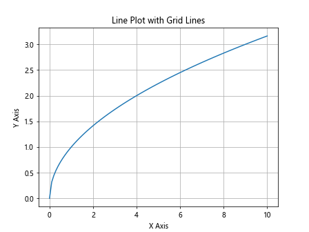
In this example, we use plt.grid(True) to enable grid lines on the plot.
Subplots with Multiple Lines
You can create subplots in Matplotlib to display multiple plots in a single figure. Let’s create a figure with two subplots, each containing a line plot.
import matplotlib.pyplot as plt
import numpy as np

x = np.linspace(0, 5, 100)
y1 = np.sin(x)
y2 = np.cos(x)

fig, axs = plt.subplots(2)
fig.suptitle('Subplots with Multiple Lines')

axs[0].plot(x, y1, color='blue')
axs[0].set_title('Sine Function')

axs[1].plot(x, y2, color='red')
axs[1].set_title('Cosine Function')

plt.show()
Output:
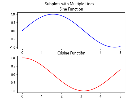
In this example, we create a figure with two subplots using plt.subplots(2), and plot the sine and cosine functions in each subplot.
Logarithmic Scale
Matplotlib allows you to create plots with logarithmic scales on the axes. This can be useful for visualizing data that covers a large range of values. Let’s create a line plot with a logarithmic y-axis.
import matplotlib.pyplot as plt
import numpy as np

x = np.linspace(0.1, 10, 100)
y = np.exp(x)

plt.plot(x, y)
plt.yscale('log')
plt.xlabel('X Axis')
plt.ylabel('Y Axis (log scale)')
plt.title('Line Plot with Logarithmic Scale')
plt.show()
Output:
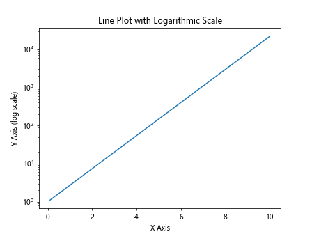
In this example, we use plt.yscale('log') to set the y-axis to a logarithmic scale for better visualization.
Saving Plots to File
You can save your Matplotlib plots to various file formats such as PNG, JPEG, PDF, and SVG. Let’s create a line plot and save it to a PNG file.
import matplotlib.pyplot as plt
import numpy as np

x = np.linspace(0, 10, 100)
y = np.tanh(x)

plt.plot(x, y)
plt.xlabel('X Axis')
plt.ylabel('Y Axis')
plt.title('Line Plot')
plt.savefig('line_plot.png')
In this example, we use plt.savefig() to save the line plot to a PNG file named line_plot.png.
Matplotlib Line Conclusion
In this article, we have explored how to create different types of line plots using Matplotlib. We have covered basic line plots, customizing line styles, plotting multiple lines on the same plot, adding error bars, highlighting points on the line, annotating the plot, adding grid lines, creating subplots with multiple lines, using logarithmic scales, and saving plots to file. Matplotlib offers a wide range of customization options for creating visually appealing line plots for data visualization. Experiment with the provided examples and explore further to create your own unique line plots using Matplotlib.