Introduction to Matplotlib and Pip
Matplotlib is a popular Python library used for creating static, interactive, and animated visualizations in Python. It provides a flexible and powerful framework for creating complex plots and graphics. In this article, we will explore how to install Matplotlib using pip, a package management system in Python.
1. Installing Matplotlib using Pip
To install Matplotlib using pip, you can use the following command in your terminal:
pip install matplotlib
This command will download and install the latest version of Matplotlib and its dependencies on your system.
2. Basic Plotting with Matplotlib
You can create simple plots using Matplotlib by importing the necessary modules and using the plot function. Here’s a basic example:
import matplotlib.pyplot as plt

x = [1, 2, 3, 4, 5]
y = [2, 4, 6, 8, 10]

plt.plot(x, y)
plt.show()
Output:
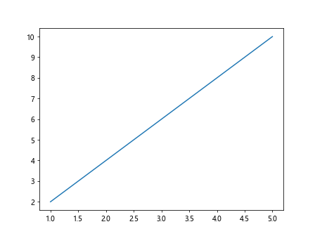
In this example, we create a simple line plot with x and y coordinates. The plot function is used to plot the data and show function is used to display the plot.
3. Customizing Plots
Matplotlib allows you to customize your plots by adding labels, titles, legends, colors, and more. Here’s an example:
import matplotlib.pyplot as plt

x = [1, 2, 3, 4, 5]
y = [2, 4, 6, 8, 10]

plt.plot(x, y, color='red', linestyle='dashed', marker='o', markersize=8, label='Line 1')
plt.xlabel('X-axis')
plt.ylabel('Y-axis')
plt.title('Customized Plot')
plt.legend()
plt.show()
Output:
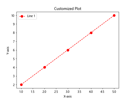
In this example, we customize the plot by changing the line color, style, marker, and size. We also add labels for the x and y axes, a title for the plot, and a legend for the line.
4. Subplots
You can create multiple plots in the same figure using subplots in Matplotlib. Here’s an example:
import matplotlib.pyplot as plt

x = [1, 2, 3, 4, 5]
y = [2, 4, 6, 8, 10]

plt.subplot(1, 2, 1)
plt.plot(x, y, color='blue')
plt.title('Plot 1')

plt.subplot(1, 2, 2)
plt.plot(y, x, color='green')
plt.title('Plot 2')

plt.show()
Output:
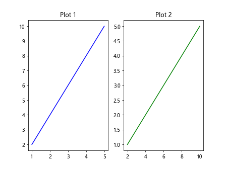
In this example, we use the subplot function to create two plots side by side in the same figure. Each subplot contains a different plot with a different color and title.
5. Bar Plots
Matplotlib can also be used to create bar plots to visualize categorical data. Here’s an example:
import matplotlib.pyplot as plt

x = [1, 2, 3, 4, 5]
y = [2, 4, 6, 8, 10]

categories = ['A', 'B', 'C', 'D']
values = [10, 20, 15, 25]

plt.bar(categories, values, color='orange')
plt.xlabel('Categories')
plt.ylabel('Values')
plt.title('Bar Plot')
plt.show()
Output:
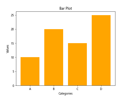
In this example, we create a bar plot with categorical data. The bar function is used to plot the bars, and labels are added for the x and y axes, as well as a title for the plot.
6. Scatter Plots
Scatter plots are useful for visualizing the relationship between two variables. Matplotlib allows you to create scatter plots easily. Here’s an example:
import numpy as np
import matplotlib.pyplot as plt

x = np.random.rand(100)
y = np.random.rand(100)
colors = np.random.rand(100)
sizes = 1000 * np.random.rand(100)

plt.scatter(x, y, c=colors, s=sizes, alpha=0.5)
plt.colorbar()
plt.show()
Output:
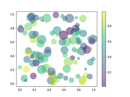
In this example, we generate random data and create a scatter plot with colored points and different sizes. The scatter function is used to create the scatter plot, and a colorbar is added to show the color scale.
7. Histograms
Histograms are used to visualize the distribution of data. Matplotlib provides a simple way to create histograms in Python. Here’s an example:
import numpy as np
import matplotlib.pyplot as plt

data = np.random.randn(1000)

plt.hist(data, bins=30, color='purple', alpha=0.7)
plt.xlabel('Value')
plt.ylabel('Frequency')
plt.title('Histogram')
plt.show()
Output:
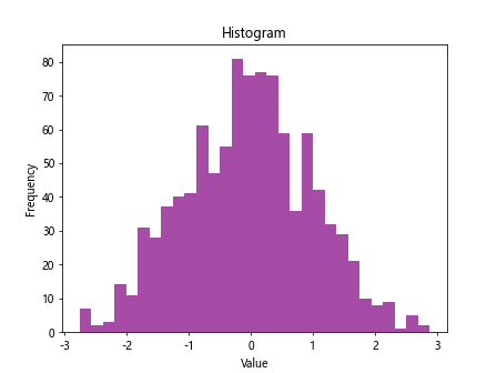
In this example, we generate random data and create a histogram with 30 bins. The hist function is used to create the histogram, and labels are added for the x and y axes, as well as a title for the plot.
8. Pie Charts
Matplotlib also supports the creation of pie charts to represent data as slices of a circle. Here’s an example:
import numpy as np
import matplotlib.pyplot as plt

sizes = [30, 20, 25, 15, 10]
labels = ['A', 'B', 'C', 'D', 'E']

plt.pie(sizes, labels=labels, autopct='%1.1f%%', colors=['gold', 'yellowgreen', 'lightcoral', 'lightskyblue', 'red'])
plt.axis('equal')
plt.title('Pie Chart')
plt.show()
Output:
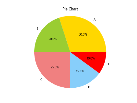
In this example, we create a pie chart with data represented as slices of a circle. The pie function is used to create the pie chart, and labels are added to the slices, along with percentages and colors.
9. 3D Plots
Matplotlib supports the creation of 3D plots to visualize data in three-dimensional space. Here’s an example:
from mpl_toolkits.mplot3d import Axes3D
import numpy as np
import matplotlib.pyplot as plt

fig = plt.figure()
ax = fig.add_subplot(111, projection='3d')

x = np.random.randn(100)
y = np.random.randn(100)
z = np.random.randn(100)

ax.scatter(x, y, z, c='r', marker='o')
plt.show()
In this example, we create a 3D scatter plot with random data in three-dimensional space. The scatter function is used with the Axes3D module to create the 3D plot.
10. Saving Plots
You can save your Matplotlib plots as image files using the savefig function. Here’s an example:
plt.plot(x, y)
plt.savefig('plot.png')
In this example, we save the plot as a PNG image file named plot.png using the savefig function. You can also save plots in other formats such as JPG, PDF, and SVG.
Conclusion
In this article, we have introduced the basics of Matplotlib and demonstrated how to install Matplotlib using pip. We have explored various types of plots such as line plots, bar plots, scatter plots, histograms, pie charts, and 3D plots. Matplotlib provides a wide range of customization options to create professional-looking plots for data visualization in Python. It is a powerful tool for creating high-quality visualizations in Python for data analysis, scientific research, and more.
Remember that Matplotlib is just one of many libraries available for data visualization in Python. Experiment with different libraries and techniques to find the best one for your specific visualization needs.