How to Create and Customize Matplotlib Pie Chart Legends: A Comprehensive Guide
Matplotlib pie chart legend is an essential component when creating informative and visually appealing pie charts using the popular Python plotting library Matplotlib. In this comprehensive guide, we’ll explore various aspects of creating and customizing legends for pie charts in Matplotlib. We’ll cover everything from basic legend creation to advanced customization techniques, providing you with the knowledge and tools to enhance your data visualization skills.
Understanding Matplotlib Pie Charts and Legends
Before diving into the specifics of Matplotlib pie chart legends, it’s important to understand the basics of pie charts and their legends. A pie chart is a circular statistical graphic divided into slices to illustrate numerical proportions. Each slice represents a category of data, and the size of the slice corresponds to that category’s proportion of the whole.
A legend in a Matplotlib pie chart serves as a key to interpret the chart, providing labels and explanations for each slice. It helps viewers understand what each color or pattern in the pie chart represents, making the visualization more informative and easier to comprehend.
Let’s start with a simple example of creating a pie chart with a legend using Matplotlib:
import matplotlib.pyplot as plt

# Data for the pie chart
sizes = [30, 25, 20, 15, 10]
labels = ['A', 'B', 'C', 'D', 'E']

# Create the pie chart
plt.pie(sizes, labels=labels, autopct='%1.1f%%')

# Add a title
plt.title('Simple Pie Chart with Legend - how2matplotlib.com')

# Add a legend
plt.legend(title='Categories')

# Show the plot
plt.show()
Output:
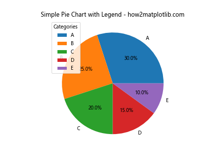
In this example, we create a basic pie chart with five slices, each representing a different category. The plt.legend() function is used to add a legend to the chart, which displays the labels for each slice.
Customizing Matplotlib Pie Chart Legends
Now that we have a basic understanding of Matplotlib pie chart legends, let’s explore various ways to customize them to enhance the visual appeal and informativeness of our charts.
Customizing Legend Appearance
You can customize various aspects of the Matplotlib pie chart legend’s appearance, such as font size, color, and style. Here’s an example showcasing different legend appearance customizations:
import matplotlib.pyplot as plt

sizes = [30, 25, 20, 15, 10]
labels = ['A', 'B', 'C', 'D', 'E']

fig, (ax1, ax2) = plt.subplots(1, 2, figsize=(12, 6))

# Custom legend appearance
ax1.pie(sizes, labels=labels, autopct='%1.1f%%')
ax1.legend(title='Custom Legend', title_fontsize=14, fontsize=12,
           fancybox=True, shadow=True, ncol=2)
ax1.set_title('Custom Legend Appearance - how2matplotlib.com')

# Colored legend
colors = ['#ff9999', '#66b3ff', '#99ff99', '#ffcc99', '#ff99cc']
ax2.pie(sizes, labels=labels, colors=colors, autopct='%1.1f%%')
legend = ax2.legend(title='Colored Legend', loc='center left', bbox_to_anchor=(1, 0.5))
for text, color in zip(legend.get_texts(), colors):
    text.set_color(color)
ax2.set_title('Colored Legend - how2matplotlib.com')

plt.tight_layout()
plt.show()
Output:
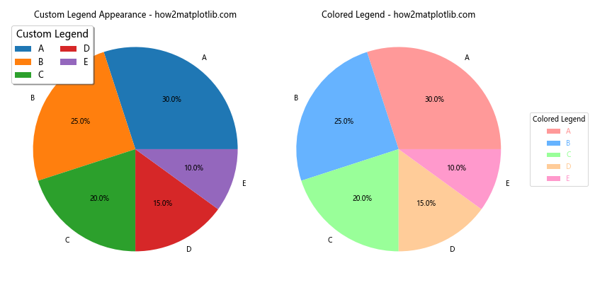
In this example, we demonstrate two types of legend customizations. The first pie chart shows a legend with a custom title font size, text font size, a fancy box, and a shadow effect. The second pie chart displays a colored legend where each label matches the color of its corresponding slice.
Adding Icons or Symbols to Legend
You can enhance your Matplotlib pie chart legend by adding custom icons or symbols. This can make your legend more visually appealing and easier to interpret. Here’s an example of how to add custom markers to your legend:
import matplotlib.pyplot as plt
from matplotlib.lines import Line2D

sizes = [30, 25, 20, 15, 10]
labels = ['A', 'B', 'C', 'D', 'E']
colors = ['#ff9999', '#66b3ff', '#99ff99', '#ffcc99', '#ff99cc']

fig, ax = plt.subplots(figsize=(8, 6))

ax.pie(sizes, labels=labels, colors=colors, autopct='%1.1f%%')

# Create custom legend elements
legend_elements = [Line2D([0], [0], marker='o', color='w', markerfacecolor=color,
                          markersize=10, label=label)
                   for color, label in zip(colors, labels)]

# Add the custom legend
ax.legend(handles=legend_elements, title='Categories with Icons',
          loc='center left', bbox_to_anchor=(1, 0.5))

ax.set_title('Pie Chart with Custom Legend Icons - how2matplotlib.com')
plt.tight_layout()
plt.show()
Output:
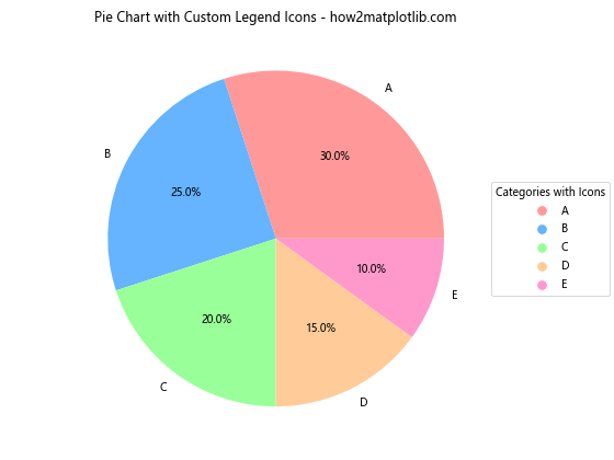
In this example, we create custom legend elements using Line2D objects. Each element consists of a colored marker (circle) and its corresponding label. This approach allows for more flexibility in designing your legend.
Multiple Legends for a Single Pie Chart
In some cases, you might want to display multiple legends for a single Matplotlib pie chart. This can be useful when you need to show different aspects of your data. Here’s an example of how to create a pie chart with two legends:
import matplotlib.pyplot as plt

sizes = [30, 25, 20, 15, 10]
labels = ['A', 'B', 'C', 'D', 'E']
colors = ['#ff9999', '#66b3ff', '#99ff99', '#ffcc99', '#ff99cc']
categories = ['Category 1', 'Category 2', 'Category 1', 'Category 2', 'Category 1']

fig, ax = plt.subplots(figsize=(10, 6))

wedges, texts, autotexts = ax.pie(sizes, labels=labels, colors=colors, autopct='%1.1f%%')

# First legend for labels
ax.legend(wedges, labels, title="Labels", loc="center left", bbox_to_anchor=(1, 0.5))

# Second legend for categories
ax.legend(wedges[:2], categories[:2], title="Categories", loc="lower left", bbox_to_anchor=(1, 0))

ax.set_title('Pie Chart with Multiple Legends - how2matplotlib.com')
plt.tight_layout()
plt.show()
Output:
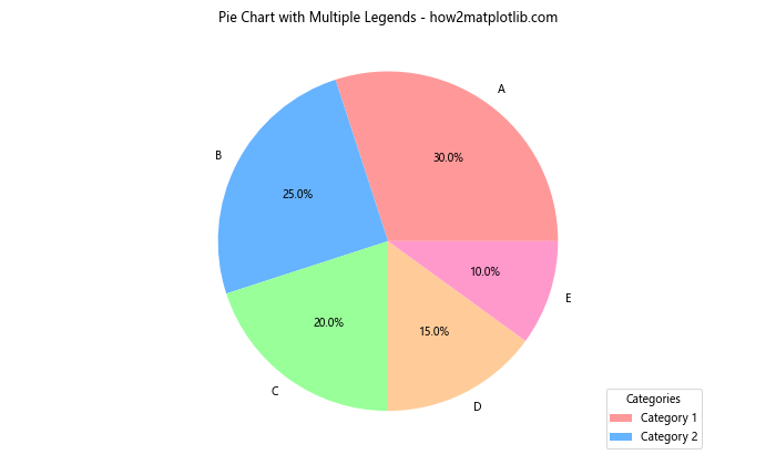
In this example, we create two separate legends for the same pie chart. The first legend shows the labels for each slice, while the second legend displays the categories to which the slices belong.
Advanced Techniques for Matplotlib Pie Chart Legends
Now that we’ve covered the basics of customizing Matplotlib pie chart legends, let’s explore some advanced techniques to further enhance your visualizations.
Creating a Legend for Nested Pie Charts
Nested pie charts, also known as sunburst charts, can be an effective way to display hierarchical data. Here’s an example of how to create a nested pie chart with a legend using Matplotlib:
import matplotlib.pyplot as plt
import numpy as np

# Data for the nested pie chart
sizes_outer = [30, 30, 40]
sizes_inner = [15, 15, 10, 20, 25, 15]
labels_outer = ['Group A', 'Group B', 'Group C']
labels_inner = ['A1', 'A2', 'B1', 'B2', 'C1', 'C2']
colors_outer = ['#ff9999', '#66b3ff', '#99ff99']
colors_inner = ['#ffcccc', '#ff6666', '#99ccff', '#3399ff', '#ccffcc', '#66ff66']

fig, ax = plt.subplots(figsize=(10, 8))

# Outer pie chart
wedges_outer, texts_outer, autotexts_outer = ax.pie(sizes_outer, labels=labels_outer, colors=colors_outer,
                                                    autopct='%1.1f%%', pctdistance=0.85, radius=1)

# Inner pie chart
wedges_inner, texts_inner, autotexts_inner = ax.pie(sizes_inner, labels=labels_inner, colors=colors_inner,
                                                    autopct='%1.1f%%', pctdistance=0.75, radius=0.7)

# Create a legend for both charts
legend_elements = [plt.Rectangle((0,0),1,1, facecolor=color, edgecolor='none') for color in colors_outer + colors_inner]
legend_labels = labels_outer + labels_inner

ax.legend(legend_elements, legend_labels, title='Groups and Subgroups',
          loc='center left', bbox_to_anchor=(1, 0.5))

ax.set_title('Nested Pie Chart with Legend - how2matplotlib.com')
plt.tight_layout()
plt.show()
Output:
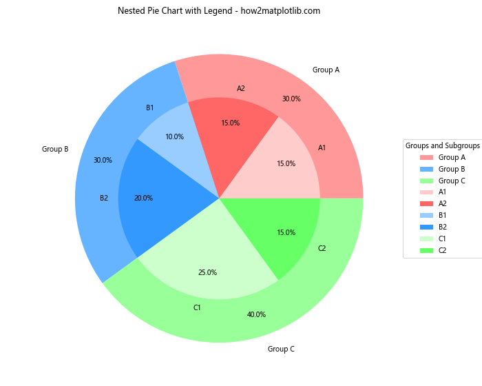
This example creates a nested pie chart with an outer ring representing main groups and an inner ring representing subgroups. The legend includes both the main groups and subgroups, providing a comprehensive key for the entire chart.
Creating a Legend for Pie Charts with Exploded Slices
Exploded pie charts can help emphasize certain slices by separating them from the main pie. Here’s an example of how to create an exploded pie chart with a legend:
import matplotlib.pyplot as plt

sizes = [30, 25, 20, 15, 10]
labels = ['A', 'B', 'C', 'D', 'E']
colors = ['#ff9999', '#66b3ff', '#99ff99', '#ffcc99', '#ff99cc']
explode = (0.1, 0, 0, 0, 0)  # Explode the first slice

fig, ax = plt.subplots(figsize=(8, 6))

wedges, texts, autotexts = ax.pie(sizes, explode=explode, labels=labels, colors=colors,
                                  autopct='%1.1f%%', shadow=True, startangle=90)

ax.legend(wedges, labels, title="Categories", loc="center left", bbox_to_anchor=(1, 0.5))

ax.set_title('Exploded Pie Chart with Legend - how2matplotlib.com')
plt.tight_layout()
plt.show()
Output:
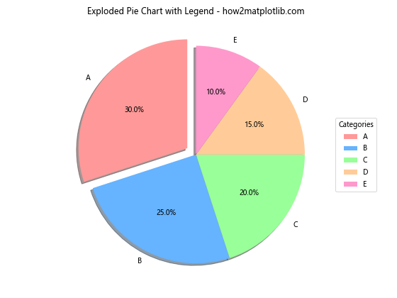
In this example, we create an exploded pie chart where the first slice is separated from the others. The legend is positioned to the right of the chart and includes all categories.
Customizing Legend Markers
You can further customize your Matplotlib pie chart legend by using different marker shapes for each category. Here’s an example:
import matplotlib.pyplot as plt
from matplotlib.lines import Line2D

sizes = [30, 25, 20, 15, 10]
labels = ['A', 'B', 'C', 'D', 'E']
colors = ['#ff9999', '#66b3ff', '#99ff99', '#ffcc99', '#ff99cc']
markers = ['o', 's', '^', 'D', 'p']

fig, ax = plt.subplots(figsize=(8, 6))

ax.pie(sizes, labels=labels, colors=colors, autopct='%1.1f%%')

# Create custom legend elements with different markers
legend_elements = [Line2D([0], [0], marker=marker, color='w', markerfacecolor=color,
                          markersize=10, label=label)
                   for marker, color, label in zip(markers, colors, labels)]

# Add the custom legend
ax.legend(handles=legend_elements, title='Categories with Custom Markers',
          loc='center left', bbox_to_anchor=(1, 0.5))

ax.set_title('Pie Chart with Custom Legend Markers - how2matplotlib.com')
plt.tight_layout()
plt.show()
Output:
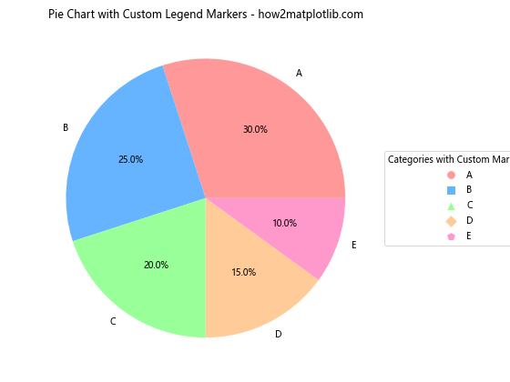
This example demonstrates how to use different marker shapes (circle, square, triangle, diamond, and pentagon) for each category in the legend, making it easier to distinguish between different slices.
Creating an Interactive Legend
While Matplotlib itself doesn’t provide built-in interactivity, you can use it in conjunction with libraries like ipywidgets to create interactive legends for your pie charts. Here’s an example of how to create a simple interactive legend using ipywidgets in a Jupyter notebook:
import matplotlib.pyplot as plt
import ipywidgets as widgets
from IPython.display import display

sizes = [30, 25, 20, 15, 10]
labels = ['A', 'B', 'C', 'D', 'E']
colors = ['#ff9999', '#66b3ff', '#99ff99', '#ffcc99', '#ff99cc']

fig, ax = plt.subplots(figsize=(8, 6))

wedges, texts, autotexts = ax.pie(sizes, labels=labels, colors=colors, autopct='%1.1f%%')

ax.set_title('Interactive Pie Chart Legend - how2matplotlib.com')

# Create checkboxes for each category
checkboxes = [widgets.Checkbox(value=True, description=label) for label in labels]

# Function to update the pie chart based on checkbox states
def update_chart(change):
    visible_sizes = [size for size, checkbox in zip(sizes, checkboxes) if checkbox.value]
    visible_labels = [label for label, checkbox in zip(labels, checkboxes) if checkbox.value]
    visible_colors = [color for color, checkbox in zip(colors, checkboxes) if checkbox.value]

    ax.clear()
    ax.pie(visible_sizes, labels=visible_labels, colors=visible_colors, autopct='%1.1f%%')
    ax.set_title('Interactive Pie Chart Legend - how2matplotlib.com')
    fig.canvas.draw_idle()

# Connect the update function to each checkbox
for checkbox in checkboxes:
    checkbox.observe(update_chart, names='value')

# Display the checkboxes and the plot
display(widgets.VBox(checkboxes))
plt.tight_layout()
plt.show()
This example creates an interactive legend using checkboxes. Users can toggle categories on and off, and the pie chart updates accordingly. Note that this code is designed to work in a Jupyter notebook environment.
Best Practices for Matplotlib Pie Chart Legends
When working with Matplotlib pie chart legends, it’s important to follow some best practices to ensure your visualizations are clear, informative, and visually appealing. Here are some tips to keep in mind:
- Keep it simple: Don’t overcrowd your legend with too many categories. If you have many slices, consider grouping smaller categories into an “Other” category.
Use consistent colors: Choose a color scheme that is visually appealing and ensures good contrast between slices.
Position the legend carefully: Place the legend where it doesn’t obscure important parts of the chart but is still easily readable.
Use clear and concise labels: Keep your legend labels short and descriptive.
Consider using percentages: Including percentages in your legend can provide additional context.
Here’s an example that demonstrates these best practices: