How to Solve Matplotlib Pie Chart Labels Overlap: A Comprehensive Guide
Matplotlib pie chart labels overlap is a common issue that many data visualization enthusiasts encounter when creating pie charts using the popular Python library Matplotlib. This article will delve deep into the various aspects of this problem and provide numerous solutions to ensure your pie chart labels are clear, legible, and visually appealing. We’ll explore different techniques to handle matplotlib pie chart labels overlap, from simple adjustments to more advanced customization options.
Understanding Matplotlib Pie Chart Labels Overlap
Before we dive into the solutions, it’s essential to understand why matplotlib pie chart labels overlap occurs. When creating pie charts with Matplotlib, the default behavior is to place labels radially around the pie. However, if there are many slices or if some slices are very small, the labels can overlap, making them difficult to read and reducing the overall effectiveness of the visualization.
Let’s start with a basic example that demonstrates the matplotlib pie chart labels overlap problem:
import matplotlib.pyplot as plt

# Data for the pie chart
sizes = [15, 30, 45, 10]
labels = ['A', 'B', 'C', 'D']

# Create a pie chart
plt.pie(sizes, labels=labels)
plt.title('Matplotlib Pie Chart Labels Overlap Example - how2matplotlib.com')
plt.axis('equal')
plt.show()
Output:
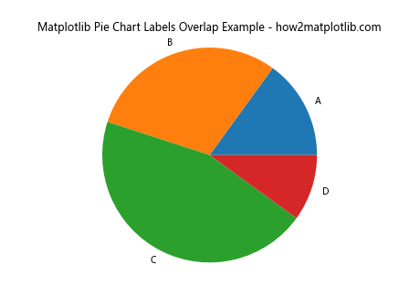
In this example, we create a simple pie chart with four slices. While this basic chart may not show significant matplotlib pie chart labels overlap, it serves as a starting point for our exploration.
Adjusting Label Positions to Reduce Matplotlib Pie Chart Labels Overlap
One of the simplest ways to address matplotlib pie chart labels overlap is to adjust the position of the labels. Matplotlib provides several parameters that allow you to control label placement.
Using the ‘labeldistance’ Parameter
The ‘labeldistance’ parameter determines how far from the center of the pie the labels are placed. By increasing this value, you can push the labels further out, potentially reducing overlap:
import matplotlib.pyplot as plt

sizes = [15, 30, 45, 10]
labels = ['A', 'B', 'C', 'D']

plt.pie(sizes, labels=labels, labeldistance=1.2)
plt.title('Adjusted Label Distance - how2matplotlib.com')
plt.axis('equal')
plt.show()
Output:
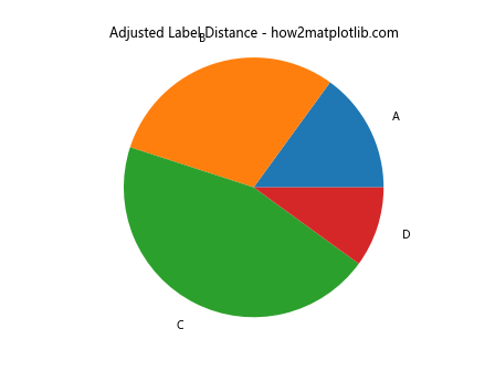
In this example, we set ‘labeldistance’ to 1.2, which moves the labels slightly further from the pie chart’s center, potentially reducing matplotlib pie chart labels overlap.
Utilizing the ‘pctdistance’ Parameter
The ‘pctdistance’ parameter controls the radial distance at which the percentage labels are drawn:
import matplotlib.pyplot as plt

sizes = [15, 30, 45, 10]
labels = ['A', 'B', 'C', 'D']

plt.pie(sizes, labels=labels, autopct='%1.1f%%', pctdistance=0.8)
plt.title('Adjusted Percentage Label Distance - how2matplotlib.com')
plt.axis('equal')
plt.show()
Output:
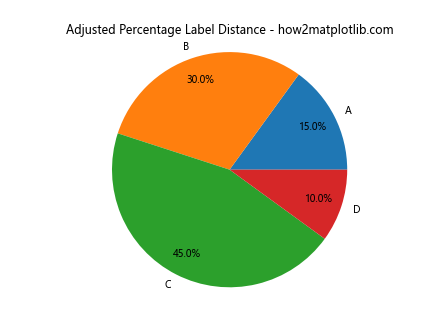
By setting ‘pctdistance’ to 0.8, we move the percentage labels closer to the center of the pie, which can help reduce matplotlib pie chart labels overlap with the outer labels.
Utilizing Matplotlib’s Legend to Address Pie Chart Labels Overlap
Another approach to solve matplotlib pie chart labels overlap is to use a legend instead of direct labels. This method works particularly well when you have many categories or long label names:
import matplotlib.pyplot as plt

sizes = [15, 30, 45, 10]
labels = ['Category A', 'Category B', 'Category C', 'Category D']
colors = ['#ff9999', '#66b3ff', '#99ff99', '#ffcc99']

fig, ax = plt.subplots()
wedges, texts, autotexts = ax.pie(sizes, colors=colors, autopct='%1.1f%%',
                                  textprops=dict(color="w"))

ax.legend(wedges, labels, title="Categories", loc="center left", bbox_to_anchor=(1, 0, 0.5, 1))

plt.title('Pie Chart with Legend - how2matplotlib.com')
plt.axis('equal')
plt.tight_layout()
plt.show()
Output:
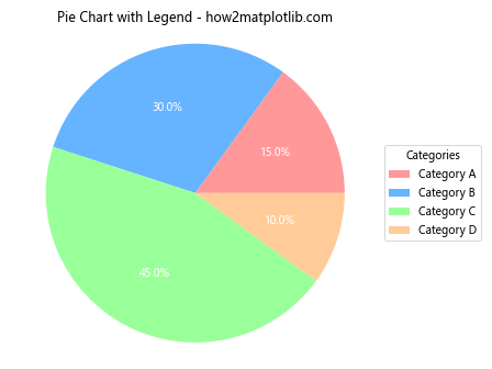
In this example, we’ve removed the labels from the pie chart itself and instead created a legend. This approach completely eliminates matplotlib pie chart labels overlap while still providing all the necessary information.
Adjusting Font Size to Minimize Matplotlib Pie Chart Labels Overlap
Sometimes, simply reducing the font size of the labels can help alleviate matplotlib pie chart labels overlap:
import matplotlib.pyplot as plt

sizes = [15, 30, 45, 10]
labels = ['Category A', 'Category B', 'Category C', 'Category D']

plt.pie(sizes, labels=labels, autopct='%1.1f%%', textprops={'fontsize': 8})
plt.title('Pie Chart with Smaller Font Size - how2matplotlib.com')
plt.axis('equal')
plt.show()
Output:
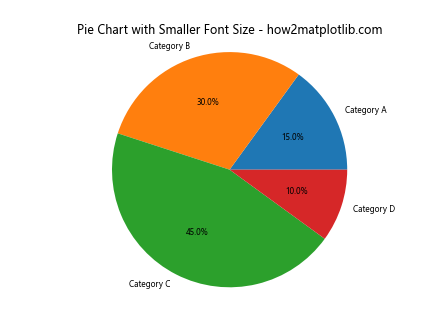
In this example, we’ve set the font size to 8 points, which can help reduce matplotlib pie chart labels overlap in cases where the default size is too large.
Using Matplotlib’s Wedgeprops to Create Space for Labels
Another technique to address matplotlib pie chart labels overlap is to reduce the size of the pie chart itself, leaving more room for labels:
import matplotlib.pyplot as plt

sizes = [15, 30, 45, 10]
labels = ['Category A', 'Category B', 'Category C', 'Category D']

plt.pie(sizes, labels=labels, autopct='%1.1f%%',
        wedgeprops=dict(width=0.5), startangle=90)
plt.title('Pie Chart with Reduced Size - how2matplotlib.com')
plt.axis('equal')
plt.show()
Output:
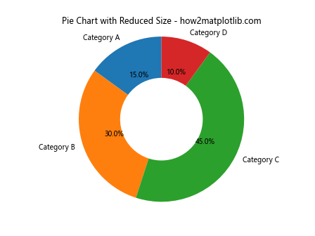
By setting ‘width’ in wedgeprops, we create a donut chart, which can provide more space around the edges for labels, potentially reducing matplotlib pie chart labels overlap.
Implementing a Custom Function to Handle Label Positioning
For more complex cases of matplotlib pie chart labels overlap, you might need to implement a custom function to position labels intelligently:
import matplotlib.pyplot as plt
import numpy as np

def adjust_labels(texts, theta, r):
    for i, t in enumerate(texts):
        x = r * np.cos(theta[i])
        y = r * np.sin(theta[i])

        # Adjust horizontal alignment based on which side of the pie the label is on
        ha = 'left' if x >= 0 else 'right'

        # Adjust vertical alignment based on whether the label is above or below the pie
        va = 'bottom' if y >= 0 else 'top'

        t.set_ha(ha)
        t.set_va(va)

        # Move the label slightly away from the pie
        offset = 0.1
        t.set_position((x + np.sign(x) * offset, y + np.sign(y) * offset))

sizes = [15, 30, 45, 10]
labels = ['Category A', 'Category B', 'Category C', 'Category D']

fig, ax = plt.subplots()
wedges, texts, autotexts = ax.pie(sizes, labels=labels, autopct='%1.1f%%')

# Calculate the angles for each wedge
theta = [((w.theta2 + w.theta1) / 2) / 180 * np.pi for w in wedges]

# Adjust label positions
adjust_labels(texts, theta, 1.2)
adjust_labels(autotexts, theta, 0.8)

plt.title('Pie Chart with Custom Label Positioning - how2matplotlib.com')
plt.axis('equal')
plt.show()
Output:
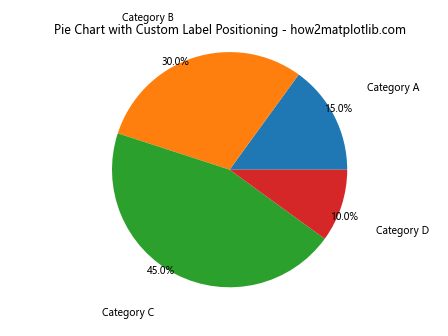
This custom function adjusts the position and alignment of labels based on their position around the pie, helping to reduce matplotlib pie chart labels overlap.
Utilizing Matplotlib’s Axes to Create Subplots
Another approach to handle matplotlib pie chart labels overlap is to create subplots, with one subplot for the pie chart and another for the labels:
import matplotlib.pyplot as plt

sizes = [15, 30, 45, 10]
labels = ['Category A', 'Category B', 'Category C', 'Category D']
colors = ['#ff9999', '#66b3ff', '#99ff99', '#ffcc99']

fig, (ax1, ax2) = plt.subplots(1, 2, figsize=(12, 6))

# Pie chart
wedges, texts, autotexts = ax1.pie(sizes, colors=colors, autopct='%1.1f%%',
                                   textprops=dict(color="w"))
ax1.set_title('Pie Chart - how2matplotlib.com')

# Labels
ax2.axis('off')
y = 1
for i, label in enumerate(labels):
    ax2.text(0, y, f'{label}: {sizes[i]}%', fontsize=12, color=colors[i])
    y -= 0.2

ax2.set_title('Labels')

plt.tight_layout()
plt.show()
Output:
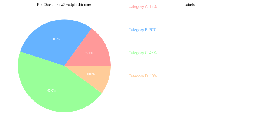
This approach completely separates the pie chart from its labels, eliminating any possibility of matplotlib pie chart labels overlap.
Implementing a Circular Layout for Labels
For cases with many categories and severe matplotlib pie chart labels overlap, a circular layout for labels can be an effective solution:
import matplotlib.pyplot as plt
import numpy as np

def circular_layout(sizes, labels, colors):
    fig, ax = plt.subplots(figsize=(10, 10))

    # Create a circle for the pie chart
    circle = plt.Circle((0, 0), 0.7, fc='white')

    # Create the pie chart
    wedges, texts = ax.pie(sizes, colors=colors, startangle=90,
                           wedgeprops=dict(width=0.3, edgecolor='white'))

    # Add the circle to cover the center
    ax.add_artist(circle)

    # Calculate positions for labels
    angles = np.linspace(0, 2*np.pi, len(labels), endpoint=False)

    # Plot labels in a circular layout
    for i, (label, angle) in enumerate(zip(labels, angles)):
        x = 1.1 * np.cos(angle)
        y = 1.1 * np.sin(angle)
        ax.text(x, y, f'{label}\n{sizes[i]}%', ha='center', va='center')

    ax.set_aspect('equal')
    ax.set_title('Circular Layout for Pie Chart Labels - how2matplotlib.com')
    plt.axis('off')
    plt.tight_layout()
    plt.show()

# Example usage
sizes = [15, 30, 45, 10, 20, 25, 5]
labels = ['A', 'B', 'C', 'D', 'E', 'F', 'G']
colors = plt.cm.Spectral(np.linspace(0, 1, len(sizes)))

circular_layout(sizes, labels, colors)
This approach creates a circular layout for labels around the pie chart, effectively handling matplotlib pie chart labels overlap even with many categories.
Using Matplotlib’s Text Rotation to Optimize Label Placement
Rotating text can sometimes help in reducing matplotlib pie chart labels overlap:
import matplotlib.pyplot as plt

sizes = [15, 30, 45, 10]
labels = ['Category A', 'Category B', 'Category C', 'Category D']

fig, ax = plt.subplots()
wedges, texts, autotexts = ax.pie(sizes, labels=labels, autopct='%1.1f%%')

for text in texts:
    text.set_rotation(20)
for autotext in autotexts:
    autotext.set_rotation(20)

plt.title('Pie Chart with Rotated Labels - how2matplotlib.com')
plt.axis('equal')
plt.show()
Output:
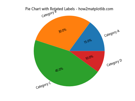
In this example, we rotate all labels by 20 degrees, which can help in some cases of matplotlib pie chart labels overlap.
Implementing a Hierarchical Pie Chart to Handle Many Categories
For datasets with many categories that cause severe matplotlib pie chart labels overlap, a hierarchical pie chart can be an effective solution:
import matplotlib.pyplot as plt
import numpy as np

def hierarchical_pie(sizes, labels, colors, title):
    fig, ax = plt.subplots(figsize=(10, 10))

    # Sort sizes and get indices
    sorted_indices = np.argsort(sizes)[::-1]
    sizes = np.array(sizes)[sorted_indices]
    labels = np.array(labels)[sorted_indices]
    colors = np.array(colors)[sorted_indices]

    # Split into two groups
    threshold = len(sizes) // 2
    sizes1, labels1, colors1 = sizes[:threshold], labels[:threshold], colors[:threshold]
    sizes2, labels2, colors2 = sizes[threshold:], labels[threshold:], colors[threshold:]

    # Create the main pie
    wedges1, texts1, autotexts1 = ax.pie(sizes1, labels=labels1, colors=colors1,
                                         autopct='%1.1f%%', pctdistance=0.8,
                                         wedgeprops=dict(width=0.5))

    # Create the inner pie
    wedges2, texts2, autotexts2 = ax.pie(sizes2, labels=labels2, colors=colors2,
                                         autopct='%1.1f%%', pctdistance=0.75,
                                         wedgeprops=dict(width=0.3), radius=0.5)

    plt.setp(autotexts1 + autotexts2, size=8, weight="bold")
    ax.set_title(title)

    plt.show()

# Example usage
sizes = [15, 30, 45, 10, 20, 25, 5, 8, 12, 18]
labels = ['A', 'B', 'C', 'D', 'E', 'F', 'G', 'H', 'I', 'J']
colors = plt.cm.Spectral(np.linspace(0, 1, len(sizes)))

hierarchical_pie(sizes, labels, colors, 'Hierarchical Pie Chart - how2matplotlib.com')
This hierarchical pie chart approach helps manage matplotlib pie chart labels overlap by splitting the data into two concentric pie charts, with the larger categories on the outer ring and smaller categories on the inner ring.
Utilizing Matplotlib’s Annotations for Custom Label Placement
For more precise control over label placement to avoid matplotlib pie chart labels overlap, we can use Matplotlib’s annotation feature:
import matplotlib.pyplot as plt
import numpy as np

def custom_autopct(pct):
    return f'{pct:.1f}%' if pct > 5 else ''

sizes = [15, 30, 45, 10]
labels = ['Category A', 'Category B', 'Category C', 'Category D']
colors = ['#ff9999', '#66b3ff', '#99ff99', '#ffcc99']

fig, ax = plt.subplots(figsize=(10, 8))

wedges, texts, autotexts = ax.pie(sizes, colors=colors, autopct=custom_autopct,
                                  startangle=90, pctdistance=0.85)

# Add annotations
for i, (wedge, label) in enumerate(zip(wedges, labels)):
    ang = (wedge.theta2 - wedge.theta1) / 2. + wedge.theta1
    y = np.sin(np.deg2rad(ang))
    x = np.cos(np.deg2rad(ang))

    horizontalalignment = {-1: "right", 1: "left"}[int(np.sign(x))]
    connectionstyle = f"angle,angleA=0,angleB={ang}"

    ax.annotate(label, xy=(x, y), xytext=(1.35*np.sign(x), 1.4*y),
                horizontalalignment=horizontalalignment,
                arrowprops=dict(arrowstyle="-", connectionstyle=connectionstyle))

plt.title('Pie Chart with Custom Annotations - how2matplotlib.com')
ax.set_aspect('equal')
plt.show()
Output:
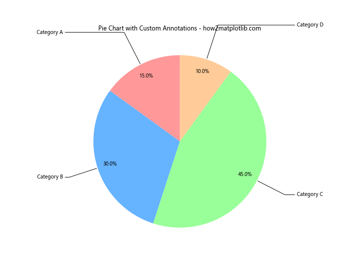
This approach uses annotations to place labels at custom positions around the pie chart, providing fine-grained control to avoid matplotlib pie chart labels overlap.
Implementing a Sunburst Chart as an Alternative to Pie Charts
When dealing with hierarchical data and severe matplotlib pie chart labels overlap, a sunburst chart can be an excellent alternative:
import matplotlib.pyplot as plt
import numpy as np

def sunburst(nodes, total=np.pi * 2, offset=0, level=0, ax=None):
    if ax is None:
        fig, ax = plt.subplots(figsize=(10, 10))
        ax.set_aspect('equal')

    if level == 0 and len(nodes) == 1:
        ax.text(0, 0, nodes[0]['id'], ha='center', va='center')
        return

    for node in nodes:
        if total == 0:
            continue

        value = node['value']
        ratio = value / total
        angle = ratio * 2 * np.pi

        # Compute start and end angles
        start = offset
        end = offset + angle

        # Compute inner and outer radii
        inner = level
        outer = level + 1

        # Plot wedge
        wedge = plt.matplotlib.patches.Wedge(
            center=(0, 0),
            r=outer,
            theta1=np.degrees(start),
            theta2=np.degrees(end),
            width=outer - inner,
        )
        ax.add_patch(wedge)

        # Add label
        mid_angle = start + angle / 2
        x = (inner + outer) / 2 * np.cos(mid_angle)
        y = (inner + outer) / 2 * np.sin(mid_angle)
        ax.text(x, y, node['id'], ha='center', va='center')

        # Recursively plot children
        if 'children' in node:
            sunburst(node['children'], total=value, offset=start, level=level + 1, ax=ax)

        offset += angle

# Example usage
data = {
    'id': 'root',
    'children': [
        {'id': 'A', 'value': 20, 'children': [
            {'id': 'A1', 'value': 10},
            {'id': 'A2', 'value': 10}
        ]},
        {'id': 'B', 'value': 30, 'children': [
            {'id': 'B1', 'value': 15},
            {'id': 'B2', 'value': 15}
        ]},
        {'id': 'C', 'value': 50, 'children': [
            {'id': 'C1', 'value': 25},
            {'id': 'C2', 'value': 25}
        ]}
    ]
}

fig, ax = plt.subplots(figsize=(10, 10))
sunburst([data], ax=ax)
ax.set_title('Sunburst Chart - how2matplotlib.com')
plt.axis('off')
plt.show()
Output:
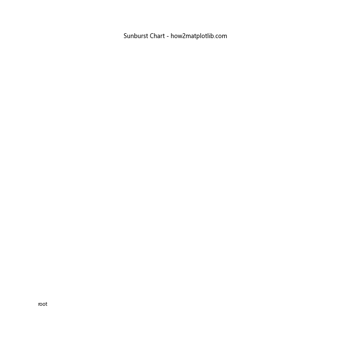
This sunburst chart provides a hierarchical view of the data, effectively handling cases where a traditional pie chart would suffer from severe matplotlib pie chart labels overlap.
Using Matplotlib’s Polar Projection for Radial Charts
Another alternative to traditional pie charts that can help avoid matplotlib pie chart labels overlap is a radial chart using Matplotlib’s polar projection:
import matplotlib.pyplot as plt
import numpy as np

categories = ['Category A', 'Category B', 'Category C', 'Category D', 'Category E']
values = [4, 3, 5, 2, 4]

# Compute angle for each category
angles = np.linspace(0, 2*np.pi, len(categories), endpoint=False)

# Close the plot by appending the first value to the end
values = np.concatenate((values, [values[0]]))
angles = np.concatenate((angles, [angles[0]]))

# Create the plot
fig, ax = plt.subplots(figsize=(6, 6), subplot_kw=dict(projection='polar'))

ax.plot(angles, values)
ax.fill(angles, values, alpha=0.3)

# Set the labels
ax.set_xticks(angles[:-1])
ax.set_xticklabels(categories)

ax.set_title('Radial Chart - how2matplotlib.com')
plt.show()
Output:
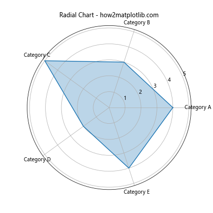
This radial chart approach spreads the categories around a circle, effectively avoiding the matplotlib pie chart labels overlap issue while still showing the relative sizes of each category.
Matplotlib pie chart labels overlap Conclusion
Matplotlib pie chart labels overlap is a common challenge when creating data visualizations, but as we’ve seen, there are numerous strategies to address this issue. From simple adjustments like changing label distance and font size, to more advanced techniques like using external labels, legends, or alternative chart types, there’s a solution for every scenario.
Remember that the best approach depends on your specific data and visualization needs. Experiment with these different techniques to find the one that works best for your particular use case. By mastering these methods, you’ll be able to create clear, readable, and visually appealing pie charts that effectively communicate your data insights without suffering from matplotlib pie chart labels overlap.