Comprehensive Guide to Matplotlib Markers List: Enhancing Data Visualization
Matplotlib markers list is an essential aspect of data visualization in Python. Markers are symbols used to highlight specific data points on a plot, making it easier for viewers to interpret and analyze the information presented. This comprehensive guide will explore the various types of markers available in Matplotlib, their customization options, and how to effectively use them in your plots.
Introduction to Matplotlib Markers List
Matplotlib, a popular plotting library in Python, offers a wide range of markers to enhance your data visualizations. The matplotlib markers list includes various shapes, sizes, and styles that can be used to represent data points on scatter plots, line plots, and other types of charts. Understanding and utilizing these markers effectively can significantly improve the clarity and impact of your visualizations.
Let’s start with a simple example to demonstrate the use of markers in Matplotlib:
import matplotlib.pyplot as plt

x = [1, 2, 3, 4, 5]
y = [2, 4, 6, 8, 10]

plt.plot(x, y, marker='o', label='Data Points')
plt.title('Simple Plot with Markers - how2matplotlib.com')
plt.xlabel('X-axis')
plt.ylabel('Y-axis')
plt.legend()
plt.show()
Output:
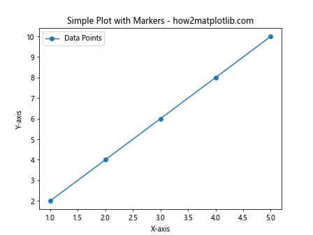
In this example, we use the circular marker ‘o’ to highlight the data points on a simple line plot. The marker parameter in the plt.plot() function allows us to specify the desired marker shape.
Types of Markers in Matplotlib Markers List
The matplotlib markers list includes a variety of marker shapes, each represented by a unique character or symbol. Here’s a comprehensive list of available markers:
- ‘o’ – Circle
- ‘.’ – Point
- ‘,’ – Pixel
- ‘v’ – Triangle down
- ‘^’ – Triangle up
- ‘<' - Triangle left
- ‘>’ – Triangle right
- ‘1’ – Tri down
- ‘2’ – Tri up
- ‘3’ – Tri left
- ‘4’ – Tri right
- ‘s’ – Square
- ‘p’ – Pentagon
- ‘*’ – Star
- ‘h’ – Hexagon1
- ‘H’ – Hexagon2
- ‘+’ – Plus
- ‘x’ – X
- ‘D’ – Diamond
- ‘d’ – Thin diamond
- ‘|’ – Vertical line
- ‘_’ – Horizontal line
Let’s create a plot showcasing all these markers:
import matplotlib.pyplot as plt

markers = ['o', '.', ',', 'v', '^', '<', '>', '1', '2', '3', '4', 's', 'p', '*', 'h', 'H', '+', 'x', 'D', 'd', '|', '_']
x = range(len(markers))
y = [i * 2 for i in x]

fig, ax = plt.subplots(figsize=(12, 6))

for i, marker in enumerate(markers):
    ax.plot(i, y[i], marker=marker, markersize=10, linestyle='None', label=f"'{marker}'")

ax.set_title('Matplotlib Markers List - how2matplotlib.com')
ax.set_xlabel('Marker Index')
ax.set_ylabel('Y-axis')
ax.legend(ncol=4, bbox_to_anchor=(1.05, 1), loc='upper left')
plt.tight_layout()
plt.show()
Output:
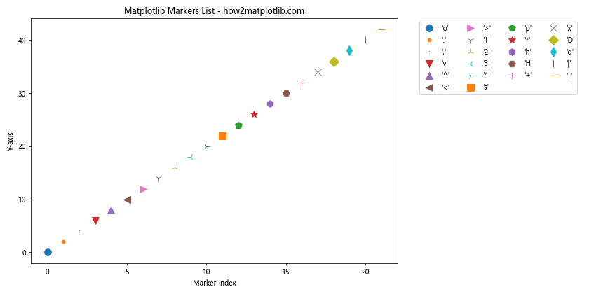
This example creates a plot displaying all the available markers in the matplotlib markers list. Each marker is plotted as a single point with its corresponding label.
Customizing Markers in Matplotlib
The matplotlib markers list not only provides various shapes but also allows for extensive customization. You can modify the size, color, and other properties of markers to suit your visualization needs.
Marker Size
You can adjust the size of markers using the markersize or ms parameter:
import matplotlib.pyplot as plt

x = [1, 2, 3, 4, 5]
y = [2, 4, 6, 8, 10]

plt.plot(x, y, marker='o', markersize=12, label='Large Markers')
plt.plot(x, y, marker='s', ms=6, label='Small Markers')
plt.title('Customizing Marker Size - how2matplotlib.com')
plt.xlabel('X-axis')
plt.ylabel('Y-axis')
plt.legend()
plt.show()
Output:
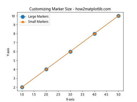
This example demonstrates how to create plots with different marker sizes using both the markersize and ms parameters.
Marker Color
You can change the color of markers using the markerfacecolor (or mfc) and markeredgecolor (or mec) parameters:
import matplotlib.pyplot as plt

x = [1, 2, 3, 4, 5]
y = [2, 4, 6, 8, 10]

plt.plot(x, y, marker='o', markerfacecolor='red', markeredgecolor='blue', markersize=12, label='Custom Colors')
plt.title('Customizing Marker Colors - how2matplotlib.com')
plt.xlabel('X-axis')
plt.ylabel('Y-axis')
plt.legend()
plt.show()
Output:
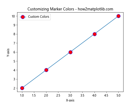
This example shows how to create markers with custom face and edge colors.
Marker Style
You can combine different marker styles with line styles using the linestyle parameter:
import matplotlib.pyplot as plt

x = [1, 2, 3, 4, 5]
y = [2, 4, 6, 8, 10]

plt.plot(x, y, marker='o', linestyle='--', label='Dashed Line with Markers')
plt.plot(x, y, marker='s', linestyle=':', label='Dotted Line with Markers')
plt.title('Combining Markers with Line Styles - how2matplotlib.com')
plt.xlabel('X-axis')
plt.ylabel('Y-axis')
plt.legend()
plt.show()
Output:
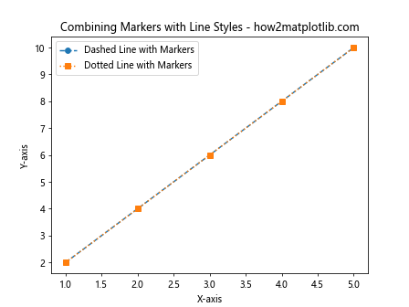
This example demonstrates how to combine markers with different line styles.
Advanced Marker Customization
The matplotlib markers list offers even more advanced customization options for creating unique and eye-catching visualizations.
Custom Marker Shapes
You can create custom marker shapes using Path objects:
import matplotlib.pyplot as plt
import matplotlib.path as mpath

star = mpath.Path.unit_regular_star(5)
circle = mpath.Path.unit_circle()
custom_marker = mpath.Path(vertices=star.vertices, codes=star.codes)

x = [1, 2, 3, 4, 5]
y = [2, 4, 6, 8, 10]

plt.plot(x, y, marker=custom_marker, markersize=20, label='Custom Star Marker')
plt.title('Custom Marker Shape - how2matplotlib.com')
plt.xlabel('X-axis')
plt.ylabel('Y-axis')
plt.legend()
plt.show()
Output:
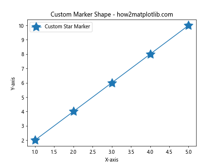
This example creates a custom star-shaped marker using the Path object.
Marker Fill Styles
You can control the fill style of markers using the fillstyle parameter:
import matplotlib.pyplot as plt

x = [1, 2, 3, 4, 5]
y = [2, 4, 6, 8, 10]

fill_styles = ['full', 'left', 'right', 'bottom', 'top', 'none']

for i, style in enumerate(fill_styles):
    plt.plot(x, [y_val + i*2 for y_val in y], marker='o', fillstyle=style, markersize=15, label=f'Fill Style: {style}')

plt.title('Marker Fill Styles - how2matplotlib.com')
plt.xlabel('X-axis')
plt.ylabel('Y-axis')
plt.legend()
plt.show()
Output:
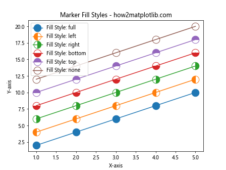
This example demonstrates various fill styles available for markers in the matplotlib markers list.
Using Markers in Different Plot Types
The matplotlib markers list can be utilized in various types of plots to enhance data visualization. Let’s explore how to use markers in different plot types.
Scatter Plots
Scatter plots are one of the most common applications of markers:
import matplotlib.pyplot as plt
import numpy as np

x = np.random.rand(50)
y = np.random.rand(50)
colors = np.random.rand(50)
sizes = 1000 * np.random.rand(50)

plt.scatter(x, y, c=colors, s=sizes, alpha=0.5, marker='o')
plt.title('Scatter Plot with Markers - how2matplotlib.com')
plt.xlabel('X-axis')
plt.ylabel('Y-axis')
plt.colorbar(label='Color Scale')
plt.show()
Output:
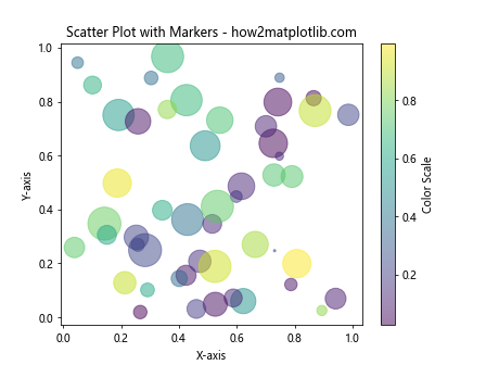
This example creates a scatter plot with circular markers, where the color and size of each marker represent additional dimensions of data.
Line Plots with Multiple Datasets
You can use different markers to distinguish between multiple datasets in a line plot:
import matplotlib.pyplot as plt
import numpy as np

x = np.linspace(0, 10, 10)
y1 = np.sin(x)
y2 = np.cos(x)

plt.plot(x, y1, marker='o', label='Sin(x)')
plt.plot(x, y2, marker='s', label='Cos(x)')
plt.title('Line Plot with Multiple Datasets - how2matplotlib.com')
plt.xlabel('X-axis')
plt.ylabel('Y-axis')
plt.legend()
plt.grid(True)
plt.show()
Output:
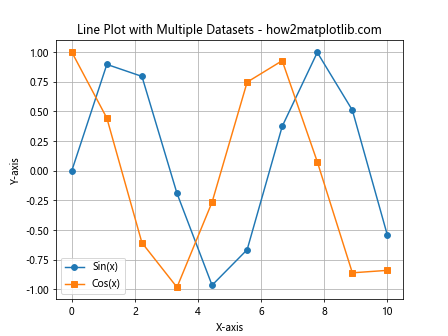
This example shows how to use different markers to distinguish between two datasets (sine and cosine functions) in a line plot.
Error Bars with Markers
Markers can be combined with error bars to provide a comprehensive view of data uncertainty:
import matplotlib.pyplot as plt
import numpy as np

x = np.linspace(0, 10, 5)
y = np.exp(-x/10.0)
error = 0.1 + 0.2 * np.sqrt(x)

plt.errorbar(x, y, yerr=error, fmt='o', markersize=8, capsize=5, label='Data with Error Bars')
plt.title('Error Bars with Markers - how2matplotlib.com')
plt.xlabel('X-axis')
plt.ylabel('Y-axis')
plt.legend()
plt.show()
Output:
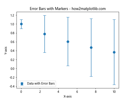
This example demonstrates how to use markers in combination with error bars to represent data points and their associated uncertainties.
Marker Sizing Based on Data
The matplotlib markers list allows you to dynamically size markers based on your data:
import matplotlib.pyplot as plt
import numpy as np

x = np.random.rand(20)
y = np.random.rand(20)
sizes = np.random.rand(20) * 1000

plt.scatter(x, y, s=sizes, alpha=0.5, marker='o')
plt.title('Marker Sizing Based on Data - how2matplotlib.com')
plt.xlabel('X-axis')
plt.ylabel('Y-axis')
plt.colorbar(label='Size Scale')
plt.show()
Output:
In this example, the size of each marker is determined by the sizes array, allowing for representation of an additional dimension of data through marker size.
Combining Multiple Marker Types
You can use different markers from the matplotlib markers list within the same plot to represent various categories or data types:
import matplotlib.pyplot as plt
import numpy as np

x = np.linspace(0, 10, 10)
y1 = np.sin(x)
y2 = np.cos(x)
y3 = np.tan(x)

plt.plot(x, y1, marker='o', label='Sin(x)')
plt.plot(x, y2, marker='s', label='Cos(x)')
plt.plot(x, y3, marker='^', label='Tan(x)')
plt.title('Multiple Marker Types in One Plot - how2matplotlib.com')
plt.xlabel('X-axis')
plt.ylabel('Y-axis')
plt.legend()
plt.grid(True)
plt.show()
Output:
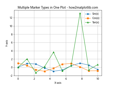
This example demonstrates how to use different marker types to distinguish between multiple datasets in a single plot.
Marker Rotation
You can rotate markers for additional customization:
import matplotlib.pyplot as plt
import numpy as np

x = np.linspace(0, 10, 10)
y = np.sin(x)

for i, (xi, yi) in enumerate(zip(x, y)):
    plt.plot(xi, yi, marker=(3, 0, i*30), markersize=15, linestyle='None')

plt.title('Rotated Markers - how2matplotlib.com')
plt.xlabel('X-axis')
plt.ylabel('Y-axis')
plt.show()
Output:
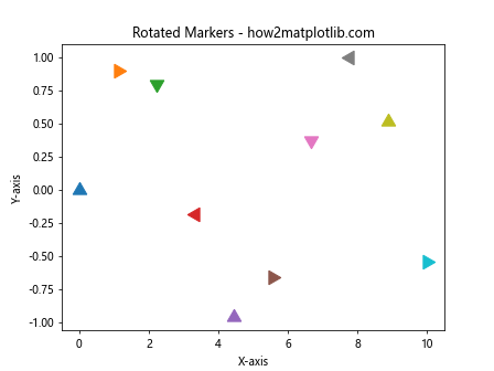
This example shows how to create rotated triangle markers, where the rotation angle increases for each data point.
Marker Edge Width
You can adjust the edge width of markers for emphasis:
import matplotlib.pyplot as plt
import numpy as np

x = np.linspace(0, 10, 5)
y = np.exp(-x/10.0)

plt.plot(x, y, marker='o', markersize=15, markeredgewidth=2, markerfacecolor='none', markeredgecolor='red', linestyle='None', label='Hollow Markers')
plt.title('Markers with Custom Edge Width - how2matplotlib.com')
plt.xlabel('X-axis')
plt.ylabel('Y-axis')
plt.legend()
plt.show()
Output:
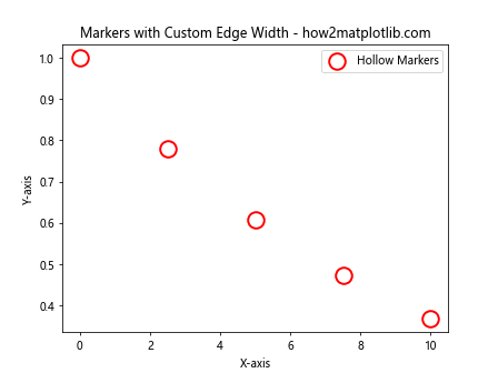
This example demonstrates how to create hollow markers with a custom edge width.
Marker Transparency
You can adjust the transparency of markers using the alpha parameter:
import matplotlib.pyplot as plt
import numpy as np

x = np.random.rand(50)
y = np.random.rand(50)

plt.scatter(x, y, marker='o', s=200, alpha=0.5, label='Semi-transparent Markers')
plt.title('Markers with Transparency - how2matplotlib.com')
plt.xlabel('X-axis')
plt.ylabel('Y-axis')
plt.legend()
plt.show()
Output:
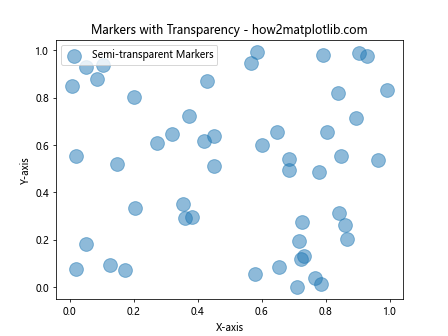
This example shows how to create semi-transparent markers in a scatter plot.
Matplotlib markers list Conclusion
The matplotlib markers list provides a powerful set of tools for enhancing data visualizations in Python. By understanding and effectively utilizing the various marker types, customization options, and advanced techniques discussed in this guide, you can create more informative and visually appealing plots.
Remember that the key to effective data visualization is choosing the right markers and customizations that best represent your data and convey your message clearly. Experiment with different marker types, sizes, colors, and styles to find the perfect combination for your specific visualization needs.