Using Matplotlib Logarithmic Scale
In this article, we will explore how to use logarithmic scale in Matplotlib, a popular plotting library in Python. Logarithmic scale is useful when dealing with data that spans several orders of magnitude, as it helps to visualize the data more clearly.
Creating a Basic Plot with Logarithmic Scale
import matplotlib.pyplot as plt
import numpy as np

x = np.arange(1, 10, 0.1)
y = x ** 2

plt.figure()
plt.plot(x, y)
plt.yscale('log')
plt.show()
Output:
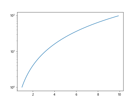
In the above example, we create a basic plot with x values from 1 to 10 and y values as x squared. We then set the y-axis scale to logarithmic using plt.yscale('log').
Adding Logarithmic Scale to Both Axes
import matplotlib.pyplot as plt
import numpy as np

x = np.arange(1, 10, 0.1)
y = x ** 2

plt.figure()
plt.plot(x, y)
plt.xscale('log')
plt.yscale('log')
plt.show()
Output:

To apply logarithmic scale to both x and y axes, we use plt.xscale('log') in addition to plt.yscale('log').
Customizing Logarithmic Axis Ticks
import matplotlib.pyplot as plt
import numpy as np

x = np.arange(1, 10, 0.1)
y = x ** 2

plt.figure()
plt.plot(x, y)
plt.yscale('log')
plt.gca().yaxis.set_major_formatter(plt.ScalarFormatter())
plt.gca().yaxis.set_minor_formatter(plt.ScalarFormatter())
plt.show()
Output:
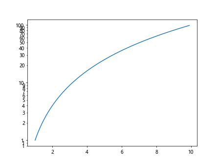
In this example, we customize the y-axis ticks using plt.gca().yaxis.set_major_formatter(plt.ScalarFormatter()) and plt.gca().yaxis.set_minor_formatter(plt.ScalarFormatter()).
Creating a Log-Log Plot
import matplotlib.pyplot as plt
import numpy as np

x = np.arange(1, 10, 0.1)
y = x ** 2

plt.figure()
plt.plot(x, y)
plt.xscale('log')
plt.yscale('log')
plt.show()
Output:
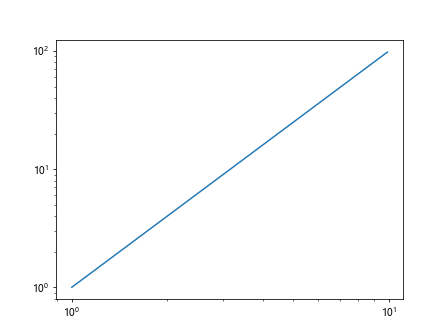
A log-log plot is created by setting both x and y axes to logarithmic scale using plt.xscale('log') and plt.yscale('log').
Showing Gridlines on Logarithmic Scale
import matplotlib.pyplot as plt
import numpy as np

x = np.arange(1, 10, 0.1)
y = x ** 2

plt.figure()
plt.plot(x, y)
plt.yscale('log')
plt.grid(True, which="both", ls="--")
plt.show()
Output:
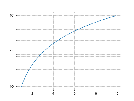
To display gridlines on a plot with logarithmic scale, we use plt.grid(True, which="both", ls="--").
Using Logarithmic Scale with Scatter Plot
import matplotlib.pyplot as plt
import numpy as np

x = np.random.rand(100)
y = np.random.rand(100)

plt.figure()
plt.scatter(x, y)
plt.xscale('log')
plt.yscale('log')
plt.show()
Output:
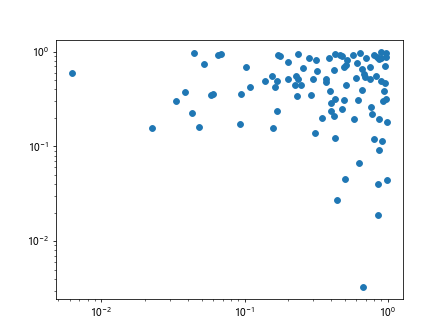
Logarithmic scale can also be applied to scatter plots, as shown in the above example.
Logarithmic Scale for Histogram
import matplotlib.pyplot as plt
import numpy as np

data = np.random.exponential(scale=1, size=1000)

plt.figure()
plt.hist(data, bins=30)
plt.yscale('log')
plt.show()
Output:
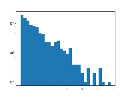
A histogram with logarithmic scale can be plotted by using plt.hist along with plt.yscale('log').
Logarithmic Scale for Bar Plot
import matplotlib.pyplot as plt
import numpy as np

x = np.arange(5)
y = np.random.randint(1, 100, size=5)

plt.figure()
plt.bar(x, y)
plt.yscale('log')
plt.show()
Output:
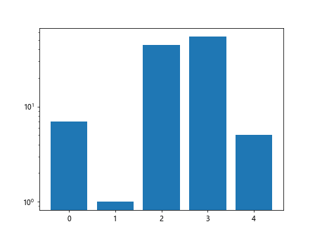
Bar plots can also utilize logarithmic scale for better visualization of data with varying magnitude.
Logarithmic Scale for Multiple Plots
import matplotlib.pyplot as plt
import numpy as np

x = np.arange(1, 10, 0.1)
y1 = x ** 2
y2 = x ** 3

plt.figure()
plt.plot(x, y1)
plt.plot(x, y2)
plt.yscale('log')
plt.show()
Output:
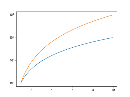
When plotting multiple lines on the same plot, logarithmic scale can be applied to better compare the data.
Logarithmic Scale for Polar Plot
import matplotlib.pyplot as plt
import numpy as np

ax = plt.subplot(111, projection='polar')
theta = np.linspace(0, 2*np.pi, 100)
r = np.ones(100)

plt.figure()
ax.plot(theta, r)
ax.set_yscale('log')
plt.show()
Even polar plots can benefit from logarithmic scale, as shown in the above example.
Conclusion
In this article, we have covered various examples of using logarithmic scale in Matplotlib. From basic plots to specialized plots like scatter plots and polar plots, logarithmic scale can be a powerful tool for visualizing data across different orders of magnitude. By incorporating logarithmic scale in your plots, you can effectively convey the magnitude and relationships within your data.