Matplotlib Log Scale Y Axis
In this article, we will explore how to use a log scale for the y-axis in Matplotlib. Using a logarithmic scale can be helpful when dealing with data that spans several orders of magnitude. This feature is particularly useful for scientific data visualization.
1. Basic Line Plot with Log Scale Y Axis
import matplotlib.pyplot as plt
import numpy as np
x = np.linspace(0.1, 10, 100)
y = np.exp(x)
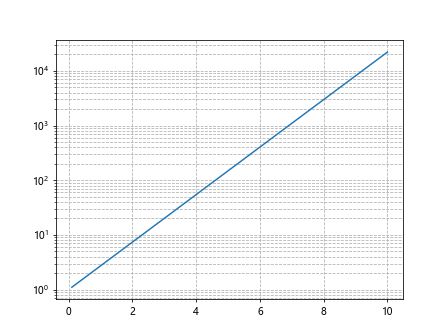
plt.plot(x, y)
plt.yscale('log')
plt.show()
Output:
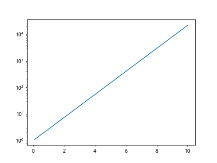
In this example, we create a basic line plot using NumPy to generate data points. We then set the y-axis to log scale using plt.yscale('log').
2. Scatter Plot with Log Scale Y Axis
import matplotlib.pyplot as plt
import numpy as np

x = np.random.rand(100)
y = np.exp(x)

plt.scatter(x, y)
plt.yscale('log')
plt.show()
Output:
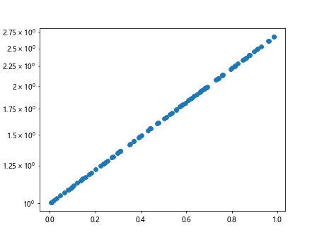
This example demonstrates how to create a scatter plot with a log scale y-axis. We use random data points for demonstration purposes.
3. Bar Chart with Log Scale Y Axis
import matplotlib.pyplot as plt
import numpy as np

x = np.arange(1, 6)
y = np.exp(x)

plt.bar(x, y)
plt.yscale('log')
plt.show()
Output:
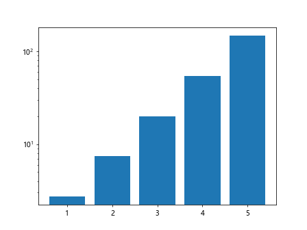
In this example, we create a bar chart with the y-axis set to log scale. The x-values represent categories, while the y-values are exponentially increasing.
4. Customizing Log Scale Ticks
import matplotlib.pyplot as plt
import numpy as np

x = np.linspace(0.1, 10, 100)
y = np.exp(x)

plt.plot(x, y)
plt.yscale('log')
plt.gca().yaxis.set_major_formatter(plt.ScalarFormatter())
plt.show()
Output:
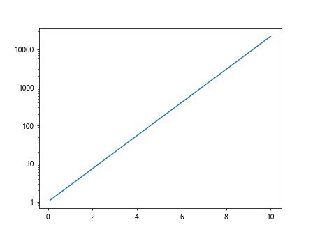
In this code snippet, we customize the log scale ticks using plt.gca().yaxis.set_major_formatter(plt.ScalarFormatter()). This will display the tick labels in a scalar format.
5. Log Scale Y Axis with Error Bars
import matplotlib.pyplot as plt
import numpy as np

x = np.arange(1, 6)
y = np.exp(x)
error = y * 0.1  # 10% error

plt.errorbar(x, y, yerr=error)
plt.yscale('log')
plt.show()
Output:
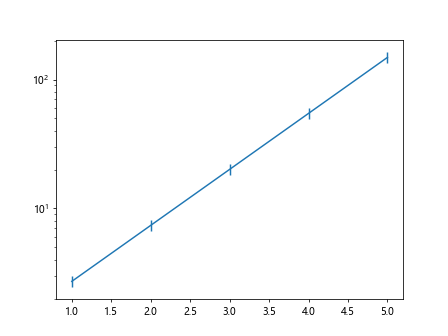
This example shows how to create a plot with error bars on a log scale y-axis. We calculate the error bars as 10% of the y-values.
6. Using Twin Axes for Log Scale Y Axis
import matplotlib.pyplot as plt
import numpy as np

x = np.linspace(0.1, 10, 100)
y1 = np.exp(x)
y2 = np.exp(2*x)

fig, ax1 = plt.subplots()

ax1.plot(x, y1, 'b-')
ax1.set_yscale('log')

ax2 = ax1.twinx()
ax2.plot(x, y2, 'r-')
ax2.set_yscale('linear')

plt.show()
Output:
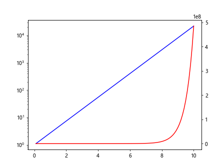
In this example, we create a plot with two y-axes: one in log scale and the other in linear scale. This technique is useful for comparing data with vastly different scales.
7. Log Scale Y Axis with Annotations
import matplotlib.pyplot as plt
import numpy as np

x = np.linspace(0.1, 10, 100)
y = np.exp(x)

plt.plot(x, y)
plt.yscale('log')
plt.text(5, 100, 'Example Annotation', fontsize=12, ha='center')
plt.show()
Output:
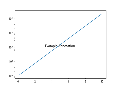
Here, we add an annotation to the plot with the text “Example Annotation” at coordinates (5, 100). The plot has a log scale y-axis.
8. Stacked Bar Chart with Log Scale Y Axis
import matplotlib.pyplot as plt
import numpy as np

x = np.arange(1, 6)
y1 = np.exp(x)
y2 = np.exp(2*x)

plt.bar(x, y1, label='Data 1')
plt.bar(x, y2, bottom=y1, label='Data 2')
plt.yscale('log')
plt.legend()
plt.show()
Output:
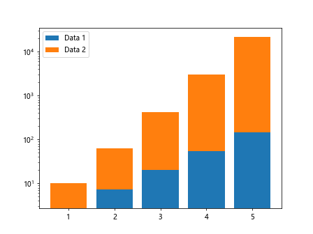
In this code snippet, we create a stacked bar chart with a log scale y-axis. The second set of data points is stacked on top of the first set.
9. Log Scale Y Axis with Gridlines
import matplotlib.pyplot as plt
import numpy as np

x = np.linspace(0.1, 10, 100)
y = np.exp(x)

plt.plot(x, y)
plt.yscale('log')
plt.grid(True, which='both', linestyle='--')
plt.show()
Output:
This example demonstrates how to add gridlines to a plot with a log scale y-axis. The gridlines are shown with a dashed line style.
10. Histogram with Log Scale Y Axis
import matplotlib.pyplot as plt
import numpy as np

data = np.random.exponential(scale=1, size=1000)

plt.hist(data, bins=30)
plt.yscale('log')
plt.show()
Output:
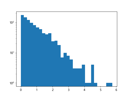
In this example, we create a histogram of exponential random data with a log scale y-axis. The logarithmic scale is especially useful for visualizing data distributions.
Conclusion
In this article, we have explored how to utilize a log scale for the y-axis in Matplotlib. We covered various types of plots, customizations, annotations, twin axes, and more. Using a log scale can enhance the visualization of data that spans multiple orders of magnitude, making it easier to interpret and analyze. Experiment with these examples in your own projects to harness the power of logarithmic scaling in your plots.