Matplotlib Log Plot
Matplotlib is a powerful library for creating visualizations in Python. One common type of plot that you may need to create is a log plot, where one or both axes are displayed in logarithmic scale. In this article, we will explore how to create log plots using Matplotlib in Python.
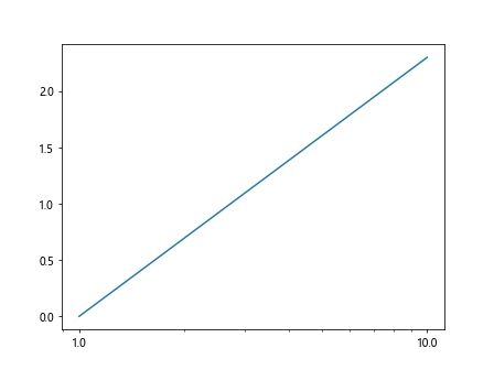
1. Basic Log Plot
To create a basic log plot in Matplotlib, you can simply set the scale of the x or y-axis to ‘log’. Here is an example of how to create a simple log plot:
import matplotlib.pyplot as plt
import numpy as np

x = np.linspace(1, 10, 100)
y = np.log(x)

plt.plot(x, y)
plt.xscale('log')

plt.show()
Output:
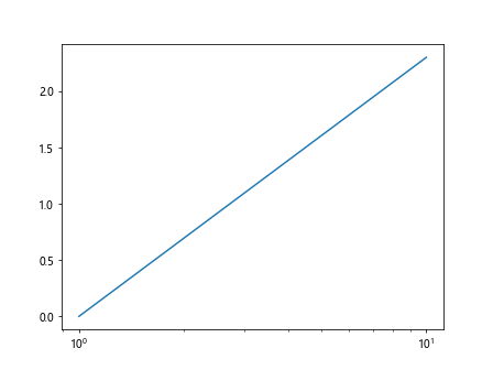
In the above example, we generate data points for x values from 1 to 10, and calculate the logarithm of each x value for the y values. Then, we plot the data and set the x-axis to logarithmic scale using plt.xscale('log').
2. Log Plot with Error Bars
You can also create a log plot with error bars in Matplotlib. Here is an example showing how to do this:
import matplotlib.pyplot as plt
import numpy as np

x = np.linspace(1, 10, 10)
y = np.log(x)
error = np.random.rand(10) * 0.1

plt.errorbar(x, y, yerr=error, fmt='o')
plt.yscale('log')

plt.show()
Output:
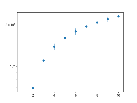
In this example, we generate some random error values and create an error bar plot with logarithmic scale on the y-axis.
3. Log Plot with Multiple Data Series
You can create a log plot with multiple data series in Matplotlib by plotting each series separately and specifying the log scale for the axis. Here is an example:
import matplotlib.pyplot as plt
import numpy as np

x = np.linspace(1, 10, 100)
y1 = np.log(x)
y2 = np.log(x) + 1

plt.plot(x, y1, label='Series 1')
plt.plot(x, y2, label='Series 2')
plt.yscale('log')
plt.legend()

plt.show()
Output:
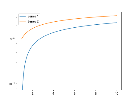
In this example, we plot two series of data with logarithmic scale on the y-axis and add a legend to differentiate the two series.
4. Log Log Plot
A log log plot is a plot where both the x and y axes are displayed in logarithmic scale. Here is an example of how to create a log log plot in Matplotlib:
import matplotlib.pyplot as plt
import numpy as np

x = np.linspace(1, 100, 100)
y = np.power(x, 2)

plt.plot(x, y)
plt.xscale('log')
plt.yscale('log')

plt.show()
Output:
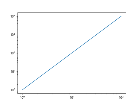
In this example, we generate data points for x values from 1 to 100, and calculate the square of each x value for the y values. We then plot the data with both x and y axes set to logarithmic scale.
5. Log Plot with Custom Tick Labels
You can customize the tick labels on a log plot in Matplotlib by setting the tick formatter for the axis. Here is an example showing how to do this:
import matplotlib.pyplot as plt
import numpy as np

x = np.linspace(1, 10, 100)
y = np.log(x)

plt.plot(x, y)
plt.xscale('log')
plt.gca().xaxis.set_major_formatter(plt.ScalarFormatter())

plt.show()
Output:
In this example, we create a simple log plot and set the x-axis tick labels to use a ScalarFormatter for better readability.
6. Log Plot with Grid Lines
You can add grid lines to a log plot in Matplotlib to make it easier to read. Here is an example showing how to do this:
import matplotlib.pyplot as plt
import numpy as np

x = np.linspace(1, 10, 100)
y = np.log(x)

plt.plot(x, y)
plt.xscale('log')
plt.grid(True, which='both', linestyle='--', linewidth=0.5)

plt.show()
Output:
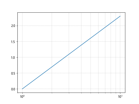
In this example, we create a log plot and add grid lines with a dashed line style for both major and minor ticks.
7. Log Plot with Annotations
You can annotate data points on a log plot in Matplotlib to provide additional information. Here is an example showing how to do this:
import matplotlib.pyplot as plt
import numpy as np

x = np.linspace(1, 10, 10)
y = np.log(x)
annotations = ['Point {}'.format(i) for i in range(10)]

plt.plot(x, y, 'o')
plt.yscale('log')

for i, txt in enumerate(annotations):
    plt.annotate(txt, (x[i], y[i]))

plt.show()
Output:
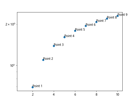
In this example, we create a log plot with data points indicated by circles and add annotations for each data point.
8. Log Plot with Custom Colors
You can customize the colors of the lines or markers in a log plot in Matplotlib. Here is an example showing how to create a log plot with custom colors:
import matplotlib.pyplot as plt
import numpy as np

x = np.linspace(1, 10, 100)
y = np.log(x)

plt.plot(x, y, color='red')

plt.show()
Output:
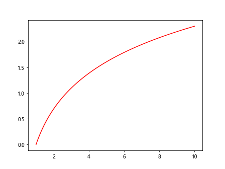
In this example, we create a log plot with the line colored in red. You can also specify other colors such as ‘blue’, ‘green’, ‘cyan’, etc.
9. Log Plot with Custom Line Styles
You can also customize the line style in a log plot in Matplotlib. Here is an example showing how to create a log plot with a dashed line style:
import matplotlib.pyplot as plt
import numpy as np

x = np.linspace(1, 10, 100)
y = np.log(x)

plt.plot(x, y, linestyle='--')

plt.show()
Output:
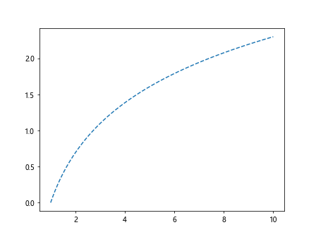
In this example, we create a log plot with a dashed line style. You can also use other line styles such as ‘-‘, ‘:’, ‘-.’, etc.
10. Log Plot with Different Marker Styles
You can use different marker styles to represent data points in a log plot in Matplotlib. Here is an example showing some common marker styles:
import matplotlib.pyplot as plt
import numpy as np

x = np.linspace(1, 10, 10)
y = np.log(x)

plt.plot(x, y, marker='o', label='Circle')
plt.plot(x, y + 1, marker='s', label='Square')
plt.plot(x, y + 2, marker='^', label='Triangle')

plt.legend()

plt.show()
Output:
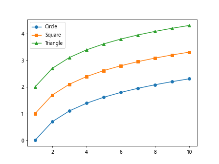
In this example, we create a log plot with three different marker styles – circles, squares, and triangles. You can use other marker styles available in Matplotlib.
Conclusion
In this article, we have covered how to create log plots in Matplotlib in Python. We have explored different types of log plots, including basic log plots, log plots with error bars, log plots with multiple data series, log log plots, and customizing log plots with annotations, colors, line styles, and markers. By following these examples, you can effectively visualize your data in a logarithmic scale using Matplotlib.