How to Master Matplotlib Linestyles: A Comprehensive Guide
Matplotlib linestyles are an essential aspect of data visualization in Python. Understanding and effectively using matplotlib linestyles can significantly enhance the clarity and aesthetics of your plots. This comprehensive guide will delve deep into the world of matplotlib linestyles, exploring various techniques, customization options, and best practices to help you create stunning visualizations.
Introduction to Matplotlib Linestyles
Matplotlib linestyles define the appearance of lines in plots. They determine how lines are drawn, whether they are solid, dashed, dotted, or a combination of these styles. Matplotlib offers a wide range of linestyle options, allowing you to customize your plots to suit your specific needs and preferences.
Let’s start with a simple example to demonstrate the basic usage of matplotlib linestyles:
import matplotlib.pyplot as plt
import numpy as np

x = np.linspace(0, 10, 100)
y = np.sin(x)

plt.plot(x, y, linestyle='-', label='Solid')
plt.plot(x, y + 1, linestyle='--', label='Dashed')
plt.plot(x, y + 2, linestyle=':', label='Dotted')
plt.plot(x, y + 3, linestyle='-.', label='Dash-dot')

plt.title('Basic Matplotlib Linestyles - how2matplotlib.com')
plt.legend()
plt.show()
Output:
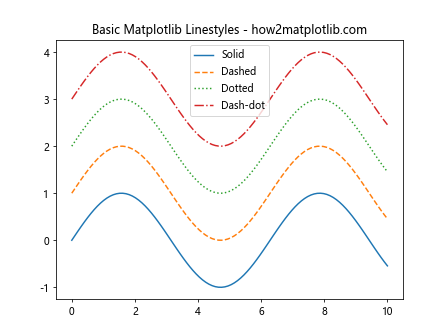
In this example, we’ve demonstrated four basic matplotlib linestyles: solid, dashed, dotted, and dash-dot. Each line is plotted with a different linestyle to showcase the variety of options available.
Understanding Matplotlib Linestyle Syntax
Matplotlib linestyles can be specified using various syntaxes. Let’s explore the different ways to define linestyles:
- String shortcuts: ‘-‘, ‘–‘, ‘:’, ‘-.’
- Full names: ‘solid’, ‘dashed’, ‘dotted’, ‘dashdot’
- Tuple syntax: (offset, (on, off, on, off, …))
Here’s an example demonstrating these different syntaxes:
import matplotlib.pyplot as plt
import numpy as np

x = np.linspace(0, 10, 100)
y = np.sin(x)

plt.plot(x, y, linestyle='-', label='String shortcut')
plt.plot(x, y + 1, linestyle='dashed', label='Full name')
plt.plot(x, y + 2, linestyle=(0, (5, 5)), label='Tuple syntax')

plt.title('Matplotlib Linestyle Syntax - how2matplotlib.com')
plt.legend()
plt.show()
Output:
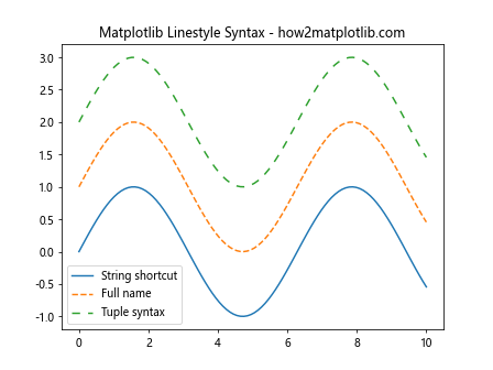
This example shows how to use string shortcuts, full names, and tuple syntax to define matplotlib linestyles. The tuple syntax (0, (5, 5)) creates a dashed line with 5-point on and 5-point off segments.
Customizing Matplotlib Linestyles
Matplotlib offers extensive customization options for linestyles. You can adjust various parameters to create unique and visually appealing lines. Let’s explore some of these customization options:
Line Width
The line width can be adjusted using the linewidth or lw parameter:
import matplotlib.pyplot as plt
import numpy as np

x = np.linspace(0, 10, 100)
y = np.sin(x)

plt.plot(x, y, linestyle='-', linewidth=1, label='1pt')
plt.plot(x, y + 1, linestyle='-', linewidth=2, label='2pt')
plt.plot(x, y + 2, linestyle='-', linewidth=4, label='4pt')

plt.title('Matplotlib Linestyle Width - how2matplotlib.com')
plt.legend()
plt.show()
Output:
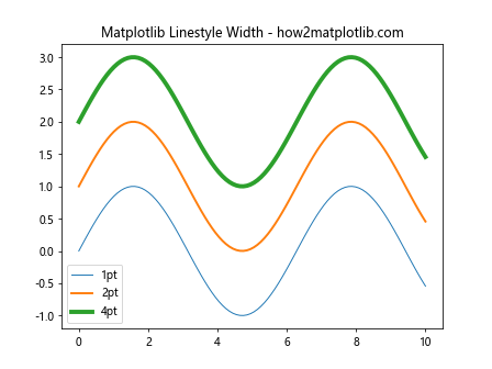
This example demonstrates how to adjust the line width using the linewidth parameter. Thicker lines can be useful for emphasizing certain data or improving visibility in large plots.
Line Color
You can change the color of lines using the color parameter:
import matplotlib.pyplot as plt
import numpy as np

x = np.linspace(0, 10, 100)
y = np.sin(x)

plt.plot(x, y, linestyle='-', color='red', label='Red')
plt.plot(x, y + 1, linestyle='-', color='#00FF00', label='Green (hex)')
plt.plot(x, y + 2, linestyle='-', color=(0, 0, 1), label='Blue (RGB)')

plt.title('Matplotlib Linestyle Colors - how2matplotlib.com')
plt.legend()
plt.show()
Output:
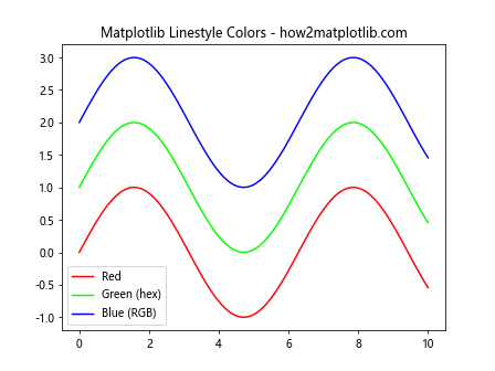
This example shows how to set line colors using color names, hexadecimal codes, and RGB tuples. Matplotlib supports a wide range of color specifications, allowing for precise control over the appearance of your plots.
Custom Dash Patterns
You can create custom dash patterns using the tuple syntax:
import matplotlib.pyplot as plt
import numpy as np

x = np.linspace(0, 10, 100)
y = np.sin(x)

plt.plot(x, y, linestyle=(0, (5, 5)), label='Equal on-off')
plt.plot(x, y + 1, linestyle=(0, (5, 2, 1, 2)), label='Complex pattern')
plt.plot(x, y + 2, linestyle=(0, (1, 1)), label='Dotted')

plt.title('Custom Matplotlib Linestyles - how2matplotlib.com')
plt.legend()
plt.show()
Output:
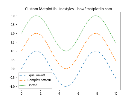
This example demonstrates how to create custom dash patterns using the tuple syntax. The first number in the tuple represents the offset, while the second tuple defines the on-off pattern of the dashes.
Advanced Matplotlib Linestyle Techniques
Now that we’ve covered the basics, let’s explore some advanced techniques for working with matplotlib linestyles:
Combining Multiple Linestyles
You can combine multiple linestyles in a single plot to represent different data series or highlight specific features:
import matplotlib.pyplot as plt
import numpy as np

x = np.linspace(0, 10, 100)
y1 = np.sin(x)
y2 = np.cos(x)

plt.plot(x, y1, linestyle='-', label='Sin')
plt.plot(x, y2, linestyle='--', label='Cos')
plt.plot(x, y1 + y2, linestyle=':', label='Sum')

plt.title('Combined Matplotlib Linestyles - how2matplotlib.com')
plt.legend()
plt.show()
Output:
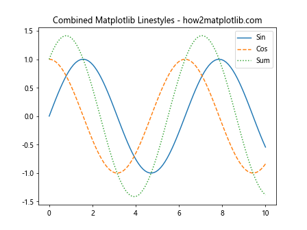
This example shows how to use different linestyles for multiple data series in the same plot. This technique can help distinguish between different types of data or highlight relationships between variables.
Linestyle Cycling
Matplotlib can automatically cycle through different linestyles for multiple plots:
import matplotlib.pyplot as plt
import numpy as np

x = np.linspace(0, 10, 100)
linestyles = ['-', '--', ':', '-.']

for i in range(4):
    plt.plot(x, np.sin(x + i), linestyle=linestyles[i % len(linestyles)], label=f'Line {i+1}')

plt.title('Matplotlib Linestyle Cycling - how2matplotlib.com')
plt.legend()
plt.show()
Output:
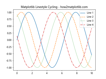
This example demonstrates how to cycle through a list of linestyles for multiple plots. This technique is useful when you have many data series and want to automatically assign different linestyles to each.
Linestyles in Subplots
You can apply different linestyles to subplots for more complex visualizations:
import matplotlib.pyplot as plt
import numpy as np

x = np.linspace(0, 10, 100)
y = np.sin(x)

fig, (ax1, ax2) = plt.subplots(1, 2, figsize=(12, 5))

ax1.plot(x, y, linestyle='-', label='Solid')
ax1.plot(x, y + 1, linestyle='--', label='Dashed')
ax1.set_title('Subplot 1 - how2matplotlib.com')
ax1.legend()

ax2.plot(x, y, linestyle=':', label='Dotted')
ax2.plot(x, y + 1, linestyle='-.', label='Dash-dot')
ax2.set_title('Subplot 2 - how2matplotlib.com')
ax2.legend()

plt.tight_layout()
plt.show()
Output:
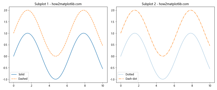
This example shows how to apply different linestyles to subplots. This technique is useful for comparing different aspects of your data or presenting multiple related visualizations side by side.
Matplotlib Linestyles for Different Plot Types
Matplotlib linestyles can be applied to various types of plots. Let’s explore how to use linestyles with different plot types:
Line Plots
We’ve already seen several examples of linestyles in line plots. Here’s another example with multiple lines and custom styles:
import matplotlib.pyplot as plt
import numpy as np

x = np.linspace(0, 10, 100)
y1 = np.sin(x)
y2 = np.cos(x)
y3 = np.tan(x)

plt.plot(x, y1, linestyle='-', label='Sin')
plt.plot(x, y2, linestyle='--', label='Cos')
plt.plot(x, y3, linestyle=':', label='Tan')

plt.title('Matplotlib Linestyles in Line Plots - how2matplotlib.com')
plt.legend()
plt.ylim(-5, 5)  # Limit y-axis for better visibility
plt.show()
Output:
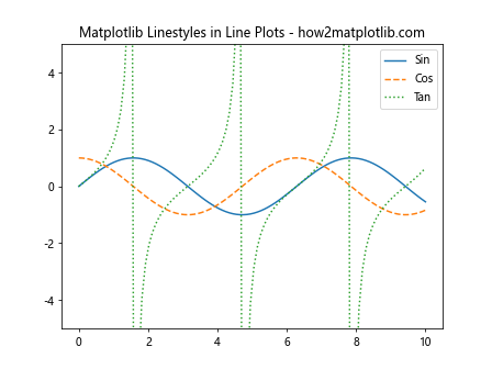
This example demonstrates how to use different linestyles for multiple line plots on the same axes. The different styles help distinguish between the sine, cosine, and tangent functions.
Scatter Plots
While scatter plots typically use markers instead of lines, you can combine them with lines using linestyles:
import matplotlib.pyplot as plt
import numpy as np

x = np.linspace(0, 10, 20)
y = np.sin(x) + np.random.normal(0, 0.1, x.shape)

plt.scatter(x, y, label='Data points')
plt.plot(x, np.sin(x), linestyle='--', color='red', label='Sine curve')

plt.title('Matplotlib Linestyles in Scatter Plots - how2matplotlib.com')
plt.legend()
plt.show()
Output:
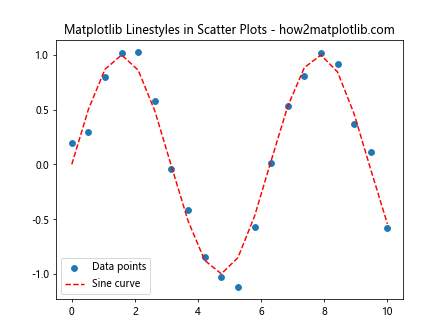
This example shows how to combine a scatter plot with a line plot using a custom linestyle. The dashed line represents the underlying sine function, while the scattered points show the noisy data.
Step Plots
Step plots can also benefit from custom linestyles:
import matplotlib.pyplot as plt
import numpy as np

x = np.linspace(0, 10, 15)
y = np.sin(x)

plt.step(x, y, linestyle='-', where='pre', label='Pre-step')
plt.step(x, y + 1, linestyle='--', where='post', label='Post-step')
plt.step(x, y + 2, linestyle=':', where='mid', label='Mid-step')

plt.title('Matplotlib Linestyles in Step Plots - how2matplotlib.com')
plt.legend()
plt.show()
Output:
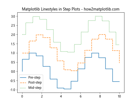
This example demonstrates how to apply different linestyles to step plots. The where parameter determines where the step occurs (before, after, or at the midpoint of each x-value).
Matplotlib Linestyles for Data Analysis
Matplotlib linestyles can be particularly useful in data analysis tasks. Let’s explore some common scenarios:
Trend Lines
You can use linestyles to distinguish between data points and trend lines:
import matplotlib.pyplot as plt
import numpy as np
from scipy import stats

x = np.linspace(0, 10, 50)
y = 2 * x + 1 + np.random.normal(0, 1, x.shape)

slope, intercept, r_value, p_value, std_err = stats.linregress(x, y)
line = slope * x + intercept

plt.scatter(x, y, label='Data')
plt.plot(x, line, color='red', linestyle='--', label='Trend line')

plt.title('Matplotlib Linestyles for Trend Lines - how2matplotlib.com')
plt.legend()
plt.show()
Output:
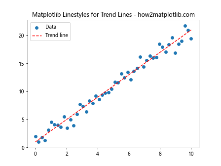
This example shows how to use a dashed linestyle for a trend line in a scatter plot. The different styles help distinguish between the actual data points and the fitted line.
Confidence Intervals
Linestyles can be used to represent confidence intervals or error bounds:
import matplotlib.pyplot as plt
import numpy as np

x = np.linspace(0, 10, 100)
y = np.sin(x)
y_err = 0.1 + 0.1 * np.random.random(x.shape)

plt.plot(x, y, label='Mean')
plt.fill_between(x, y - y_err, y + y_err, alpha=0.3, label='Error')
plt.plot(x, y - y_err, linestyle=':', color='red', label='Lower bound')
plt.plot(x, y + y_err, linestyle=':', color='red', label='Upper bound')

plt.title('Matplotlib Linestyles for Confidence Intervals - how2matplotlib.com')
plt.legend()
plt.show()
Output:
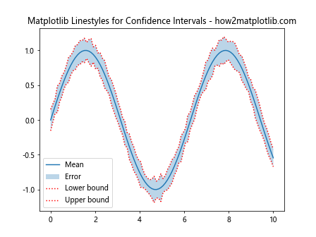
This example demonstrates how to use dotted linestyles to represent the upper and lower bounds of a confidence interval. The shaded area represents the full interval, while the dotted lines highlight the boundaries.
Best Practices for Using Matplotlib Linestyles
To make the most of matplotlib linestyles, consider the following best practices:
- Consistency: Use consistent linestyles throughout your visualization for clarity.
- Contrast: Ensure that different linestyles are easily distinguishable from each other.
- Purpose: Choose linestyles that serve a specific purpose, such as highlighting trends or distinguishing between data series.
- Accessibility: Consider color-blind friendly options when combining colors and linestyles.
- Simplicity: Avoid using too many different linestyles in a single plot, as it can become confusing.
Here’s an example that demonstrates these best practices:
import matplotlib.pyplot as plt
import numpy as np

x = np.linspace(0, 10, 100)
y1 = np.sin(x)
y2 = np.cos(x)
y3 = np.sin(x) * np.exp(-0.1 * x)

plt.plot(x, y1, linestyle='-', color='blue', label='Sin')
plt.plot(x, y2, linestyle='--', color='red', label='Cos')
plt.plot(x, y3, linestyle=':', color='green', label='Damped Sin')

plt.title('Best Practices for Matplotlib Linestyles - how2matplotlib.com')
plt.legend()
plt.grid(True, linestyle='-.')
plt.show()
Output:
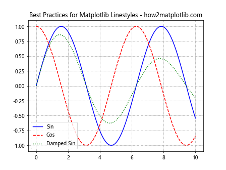
This example follows best practices by using consistent, contrasting, and purposeful linestyles. The grid uses a different linestyle to avoid confusion with the data lines.
Troubleshooting Common Matplotlib Linestyle Issues
When working with matplotlib linestyles, you may encounter some common issues. Here are some problems and their solutions:
Issue 1: Linestyles Not Appearing
If your linestyles are not appearing as expected, check the following:
- Ensure that you’re using the correct syntax for specifying linestyles.
- Check if the line width is set to a visible value.
- Verify that the color of the line contrasts with the background.
Here’s an example that demonstrates these points:
import matplotlib.pyplot as plt
import numpy as np

x = np.linspace(0, 10, 100)
y = np.sin(x)

plt.plot(x, y, linestyle='--', linewidth=2, color='black')
plt.title('Troubleshooting Matplotlib Linestyles - how2matplotlib.com')
plt.show()
Output:
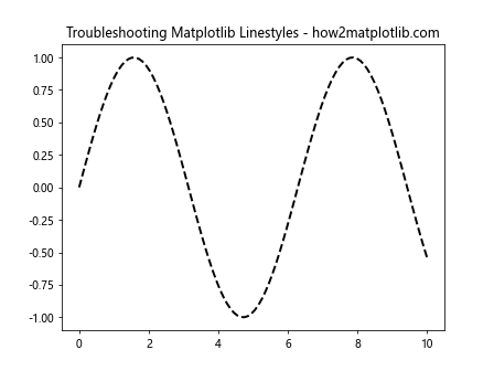
This example uses a clear linestyle specification, a visible line width, and a contrasting color to ensure the linestyle is visible.
Issue 2: Inconsistent Linestyles
If your linestyles appear inconsistent across different plots, consider using a style sheet or defining a custom style function:
import matplotlib.pyplot as plt
import numpy as np

def custom_style(ax):
    ax.grid(True, linestyle=':')
    ax.spines['top'].set_visible(False)
    ax.spines['right'].set_visible(False)

x = np.linspace(0, 10, 100)
y1 = np.sin(x)
y2 = np.cos(x)

fig, (ax1, ax2) = plt.subplots(1, 2, figsize=(12, 5))

ax1.plot(x, y1, linestyle='--')
custom_style(ax1)
ax1.set_title('Subplot 1 - how2matplotlib.com')

ax2.plot(x, y2, linestyle='--')
custom_style(ax2)
ax2.set_title('Subplot 2 - how2matplotlib.com')

plt.tight_layout()
plt.show()
Output:
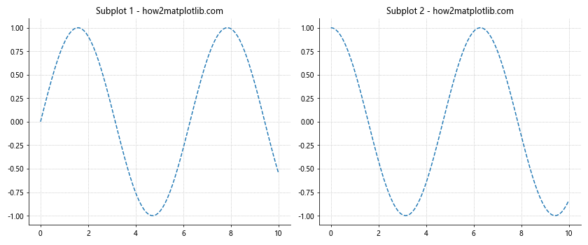
This example demonstrates how to use a custom style function to ensure consistent linestyles and plot appearance across multiple subplots.
Issue 3: Linestyles in Legends
Sometimes, linestyles may not appear correctly in legends. To address this, you can use the handlelength parameter:
import matplotlib.pyplot as plt
import numpy as np

x = np.linspace(0, 10, 100)
y1 = np.sin(x)
y2 = np.cos(x)

plt.plot(x, y1, linestyle='--', label='Dashed')
plt.plot(x, y2, linestyle=':', label='Dotted')

plt.title('Linestyles in Legends - how2matplotlib.com')
plt.legend(handlelength=3)
plt.show()
Output:
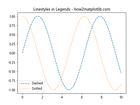
This example uses the handlelength parameter to ensure that the linestyles are clearly visible in the legend.
Advanced Matplotlib Linestyle Techniques
Let’s explore some advanced techniques for working with matplotlib linestyles:
Custom Line Drawing
You can create custom line drawings using the Line2D object:
import matplotlib.pyplot as plt
from matplotlib.lines import Line2D

fig, ax = plt.subplots()

custom_line = Line2D([0, 1, 2, 3], [0, 1, 0, 1], linestyle=(0, (5, 5, 1, 5)), linewidth=2, color='red')
ax.add_line(custom_line)

ax.set_xlim(0, 3)
ax.set_ylim(0, 1.5)
ax.set_title('Custom Line Drawing - how2matplotlib.com')
plt.show()
Output:
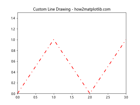
This example demonstrates how to create a custom line with a complex dash pattern using the Line2D object.
Animated Linestyles
You can create animated linestyles using matplotlib’s animation features:
import matplotlib.pyplot as plt
import matplotlib.animation as animation
import numpy as np

fig, ax = plt.subplots()
x = np.linspace(0, 10, 100)
line, = ax.plot(x, np.sin(x), linestyle='--')

def animate(i):
    line.set_ydata(np.sin(x + i/10))
    return line,

ani = animation.FuncAnimation(fig, animate, frames=100, interval=50, blit=True)
plt.title('Animated Linestyles - how2matplotlib.com')
plt.show()
Output:
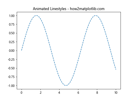
This example creates an animated plot with a dashed linestyle. The sine wave appears to move due to the animation.
Linestyles in 3D Plots
Matplotlib linestyles can also be applied to 3D plots:
import matplotlib.pyplot as plt
import numpy as np

fig = plt.figure()
ax = fig.add_subplot(111, projection='3d')

t = np.linspace(0, 10, 100)
x = np.cos(t)
y = np.sin(t)
z = t

ax.plot(x, y, z, linestyle='--', label='Helix')
ax.legend()

plt.title('3D Plot with Linestyles - how2matplotlib.com')
plt.show()
Output:
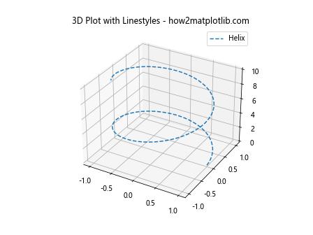
This example demonstrates how to apply a dashed linestyle to a 3D helix plot.
Matplotlib Linestyles and Object-Oriented Interface
While we’ve primarily used the pyplot interface in our examples, matplotlib also offers an object-oriented interface that provides more fine-grained control over plot elements. Let’s explore how to work with linestyles using this interface:
import matplotlib.pyplot as plt
import numpy as np

fig, ax = plt.subplots()

x = np.linspace(0, 10, 100)
y1 = np.sin(x)
y2 = np.cos(x)

line1, = ax.plot(x, y1)
line2, = ax.plot(x, y2)

line1.set_linestyle('--')
line2.set_linestyle(':')

ax.set_title('Object-Oriented Linestyles - how2matplotlib.com')
plt.show()
Output:
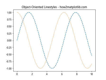
This example demonstrates how to set linestyles using the object-oriented interface. The set_linestyle() method allows you to change the linestyle of individual line objects.
Combining Matplotlib Linestyles with Other Plot Properties
Linestyles can be combined with other plot properties to create more informative and visually appealing visualizations. Let’s explore some combinations:
Linestyles and Markers
You can combine linestyles with markers to highlight specific data points:
import matplotlib.pyplot as plt
import numpy as np

x = np.linspace(0, 10, 20)
y = np.sin(x)

plt.plot(x, y, linestyle='--', marker='o', markersize=8, label='Sin')
plt.title('Linestyles and Markers - how2matplotlib.com')
plt.legend()
plt.show()
Output:
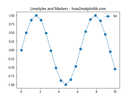
This example combines a dashed linestyle with circular markers to create a plot that shows both the overall trend and individual data points.
Linestyles and Colormaps
You can use colormaps to create gradients along a line with a specific linestyle:
import matplotlib.pyplot as plt
import numpy as np

x = np.linspace(0, 10, 100)
y = np.sin(x)

plt.scatter(x, y, c=x, cmap='viridis', s=50)
plt.plot(x, y, linestyle=':', color='red', alpha=0.5)

plt.title('Linestyles and Colormaps - how2matplotlib.com')
plt.colorbar(label='X value')
plt.show()
Output:
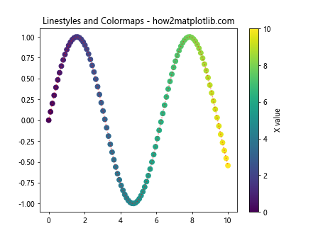
This example uses a dotted linestyle for the overall trend, while the scatter plot uses a colormap to show the progression of x-values.
Matplotlib Linestyles in Different Visualization Libraries
While we’ve focused on matplotlib, it’s worth noting that many other visualization libraries in the Python ecosystem build upon or interface with matplotlib. Let’s briefly look at how linestyles are handled in some of these libraries:
Seaborn
Seaborn is a statistical data visualization library built on top of matplotlib. It provides a high-level interface for drawing attractive statistical graphics. Here’s an example of using linestyles in seaborn:
import seaborn as sns
import matplotlib.pyplot as plt
import numpy as np

sns.set_style("whitegrid")

x = np.linspace(0, 10, 100)
y1 = np.sin(x)
y2 = np.cos(x)

sns.lineplot(x=x, y=y1, linestyle='--', label='Sin')
sns.lineplot(x=x, y=y2, linestyle=':', label='Cos')

plt.title('Seaborn Linestyles - how2matplotlib.com')
plt.show()
Output:
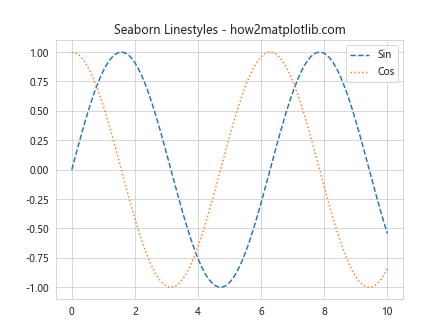
This example demonstrates how to use matplotlib linestyles within a seaborn plot.
Plotly
Plotly is another popular visualization library that can export matplotlib figures. While it has its own syntax for linestyles, you can convert matplotlib figures to Plotly:
import matplotlib.pyplot as plt
import numpy as np
from plotly.tools import mpl_to_plotly

x = np.linspace(0, 10, 100)
y = np.sin(x)

fig, ax = plt.subplots()
ax.plot(x, y, linestyle='--')
ax.set_title('Matplotlib to Plotly - how2matplotlib.com')

plotly_fig = mpl_to_plotly(fig)
plotly_fig.show()
This example creates a matplotlib figure with a dashed linestyle and converts it to a Plotly figure.
Matplotlib linestyles Conclusion
Matplotlib linestyles are a powerful tool for enhancing your data visualizations. From basic line plots to complex custom styles, understanding and effectively using linestyles can significantly improve the clarity and aesthetics of your plots. By mastering the various techniques and best practices we’ve covered in this comprehensive guide, you’ll be well-equipped to create stunning and informative visualizations using matplotlib.
Remember to experiment with different combinations of linestyles, colors, and other plot properties to find the most effective way to represent your data. Whether you’re creating simple line plots or complex multi-panel figures, matplotlib linestyles offer the flexibility and control you need to bring your data to life.