How to Master Matplotlib Linestyle Dotted: A Comprehensive Guide
Matplotlib linestyle dotted is a powerful feature in the popular Python plotting library Matplotlib. This article will explore the various aspects of using dotted linestyles in Matplotlib, providing detailed explanations and examples to help you master this technique. Whether you’re a beginner or an experienced data visualization enthusiast, this guide will equip you with the knowledge to create stunning dotted line plots using Matplotlib.
Understanding Matplotlib Linestyle Dotted
Matplotlib linestyle dotted is a line style option that allows you to create dotted lines in your plots. This style is particularly useful when you want to distinguish between different data series or emphasize certain aspects of your visualization. The dotted linestyle in Matplotlib can be customized in various ways, including dot size, spacing, and color.
Let’s start with a simple example to demonstrate how to create a basic plot with a dotted linestyle:
import matplotlib.pyplot as plt
import numpy as np

x = np.linspace(0, 10, 100)
y = np.sin(x)

plt.figure(figsize=(8, 6))
plt.plot(x, y, linestyle='dotted', linewidth=2, color='blue', label='how2matplotlib.com')
plt.title('Matplotlib Linestyle Dotted Example')
plt.xlabel('X-axis')
plt.ylabel('Y-axis')
plt.legend()
plt.grid(True)
plt.show()
Output:
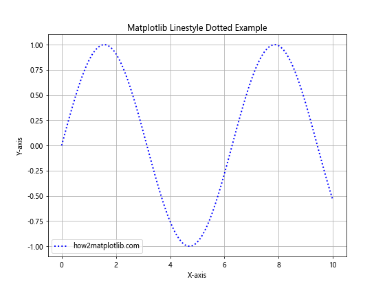
In this example, we create a simple sine wave plot using Matplotlib linestyle dotted. The linestyle='dotted' parameter sets the line style to dotted. We also set the line width and color for better visibility.
Customizing Matplotlib Linestyle Dotted
One of the strengths of Matplotlib linestyle dotted is its flexibility. You can customize various aspects of the dotted line to suit your specific needs. Let’s explore some of these customization options:
Adjusting Dot Spacing
You can control the spacing between dots in a Matplotlib linestyle dotted plot using the dashes parameter. Here’s an example:
import matplotlib.pyplot as plt
import numpy as np

x = np.linspace(0, 10, 100)
y = np.cos(x)

plt.figure(figsize=(8, 6))
plt.plot(x, y, linestyle=(0, (1, 5)), linewidth=2, color='red', label='how2matplotlib.com')
plt.title('Matplotlib Linestyle Dotted with Custom Spacing')
plt.xlabel('X-axis')
plt.ylabel('Y-axis')
plt.legend()
plt.grid(True)
plt.show()
Output:
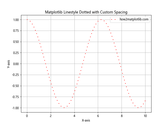
In this example, we use linestyle=(0, (1, 5)) to create a dotted line with custom spacing. The first number (0) represents the dash length, and the second tuple (1, 5) represents the dot length and space between dots, respectively.
Changing Dot Size
To change the size of the dots in a Matplotlib linestyle dotted plot, you can adjust the markersize parameter. Here’s an example:
import matplotlib.pyplot as plt
import numpy as np

x = np.linspace(0, 10, 50)
y = np.exp(-x/3)

plt.figure(figsize=(8, 6))
plt.plot(x, y, linestyle='dotted', marker='o', markersize=8, linewidth=2, color='green', label='how2matplotlib.com')
plt.title('Matplotlib Linestyle Dotted with Custom Dot Size')
plt.xlabel('X-axis')
plt.ylabel('Y-axis')
plt.legend()
plt.grid(True)
plt.show()
Output:
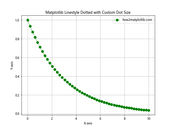
In this example, we use marker='o' to explicitly set the marker style to dots, and markersize=8 to increase the size of the dots.
Using Different Colors for Dots and Lines
Matplotlib linestyle dotted allows you to set different colors for the dots and the connecting lines. Here’s how you can achieve this effect:
import matplotlib.pyplot as plt
import numpy as np

x = np.linspace(0, 10, 30)
y = x**2

plt.figure(figsize=(8, 6))
plt.plot(x, y, linestyle='dotted', marker='o', markersize=10, linewidth=2, color='purple', markerfacecolor='orange', markeredgecolor='red', label='how2matplotlib.com')
plt.title('Matplotlib Linestyle Dotted with Different Colors')
plt.xlabel('X-axis')
plt.ylabel('Y-axis')
plt.legend()
plt.grid(True)
plt.show()
Output:
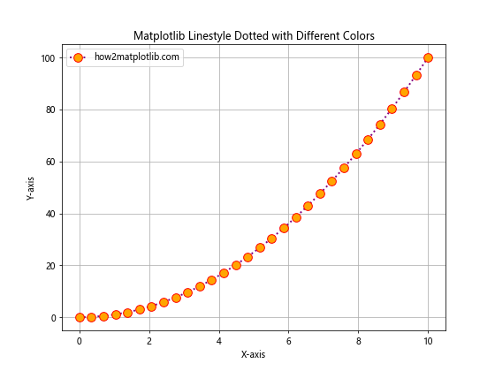
In this example, we use color='purple' for the line color, markerfacecolor='orange' for the dot fill color, and markeredgecolor='red' for the dot edge color.
Combining Matplotlib Linestyle Dotted with Other Styles
Matplotlib linestyle dotted can be combined with other line styles to create more complex and visually appealing plots. Let’s explore some combinations:
Dotted and Dashed Lines
You can create a plot that combines dotted and dashed lines to represent different data series:
import matplotlib.pyplot as plt
import numpy as np

x = np.linspace(0, 10, 100)
y1 = np.sin(x)
y2 = np.cos(x)

plt.figure(figsize=(8, 6))
plt.plot(x, y1, linestyle='dotted', linewidth=2, color='blue', label='Dotted (how2matplotlib.com)')
plt.plot(x, y2, linestyle='dashed', linewidth=2, color='red', label='Dashed (how2matplotlib.com)')
plt.title('Matplotlib Linestyle Dotted and Dashed Combination')
plt.xlabel('X-axis')
plt.ylabel('Y-axis')
plt.legend()
plt.grid(True)
plt.show()
Output:
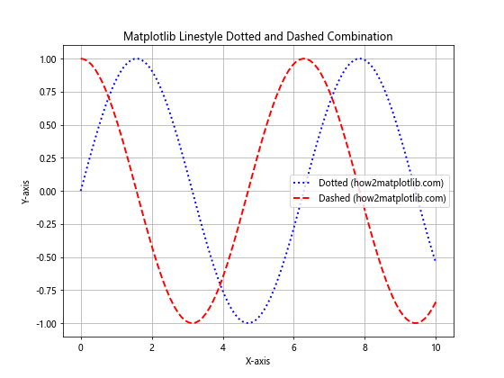
This example demonstrates how to use Matplotlib linestyle dotted alongside a dashed line style to differentiate between two data series.
Dotted Lines with Markers
Combining Matplotlib linestyle dotted with markers can help emphasize specific data points:
import matplotlib.pyplot as plt
import numpy as np

x = np.linspace(0, 10, 20)
y = np.log(x + 1)

plt.figure(figsize=(8, 6))
plt.plot(x, y, linestyle='dotted', marker='s', markersize=8, linewidth=2, color='green', label='how2matplotlib.com')
plt.title('Matplotlib Linestyle Dotted with Markers')
plt.xlabel('X-axis')
plt.ylabel('Y-axis')
plt.legend()
plt.grid(True)
plt.show()
Output:
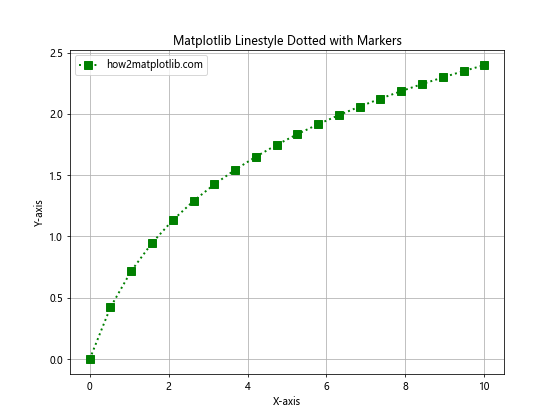
In this example, we use Matplotlib linestyle dotted with square markers (marker='s') to highlight specific data points along the dotted line.
Advanced Techniques with Matplotlib Linestyle Dotted
Now that we’ve covered the basics, let’s explore some advanced techniques using Matplotlib linestyle dotted:
Creating Multi-Line Plots with Different Dotted Styles
You can create plots with multiple lines, each using a different dotted style:
import matplotlib.pyplot as plt
import numpy as np

x = np.linspace(0, 10, 100)
y1 = np.sin(x)
y2 = np.sin(2*x)
y3 = np.sin(3*x)

plt.figure(figsize=(10, 6))
plt.plot(x, y1, linestyle=(0, (1, 1)), linewidth=2, color='blue', label='Style 1 (how2matplotlib.com)')
plt.plot(x, y2, linestyle=(0, (1, 5)), linewidth=2, color='red', label='Style 2 (how2matplotlib.com)')
plt.plot(x, y3, linestyle=(0, (5, 5)), linewidth=2, color='green', label='Style 3 (how2matplotlib.com)')
plt.title('Matplotlib Linestyle Dotted - Multiple Styles')
plt.xlabel('X-axis')
plt.ylabel('Y-axis')
plt.legend()
plt.grid(True)
plt.show()
Output:
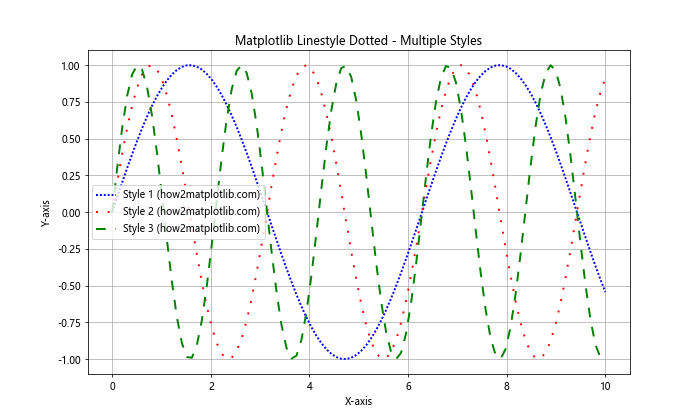
This example demonstrates how to use different dotted line styles in a single plot to distinguish between multiple data series.
Animating Dotted Lines
You can create animated plots using Matplotlib linestyle dotted. Here’s a simple example of an animated sine wave with a dotted line:
import matplotlib.pyplot as plt
import numpy as np
from matplotlib.animation import FuncAnimation

fig, ax = plt.subplots(figsize=(8, 6))
x = np.linspace(0, 2*np.pi, 100)
line, = ax.plot(x, np.sin(x), linestyle='dotted', linewidth=2, color='blue', label='how2matplotlib.com')

def animate(i):
    line.set_ydata(np.sin(x + i/10))
    return line,

ani = FuncAnimation(fig, animate, frames=100, interval=50, blit=True)
plt.title('Animated Matplotlib Linestyle Dotted')
plt.xlabel('X-axis')
plt.ylabel('Y-axis')
plt.legend()
plt.grid(True)
plt.show()
Output:
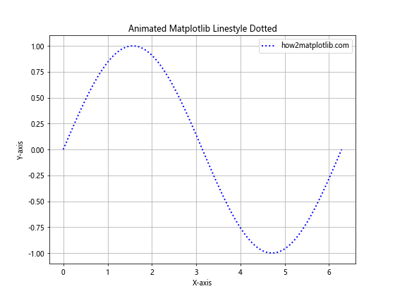
This example creates an animated sine wave using Matplotlib linestyle dotted. The animation updates the y-values of the dotted line to create a moving wave effect.
Using Dotted Lines in Subplots
Matplotlib linestyle dotted can be used effectively in subplots to compare different datasets:
import matplotlib.pyplot as plt
import numpy as np

x = np.linspace(0, 10, 100)
y1 = np.sin(x)
y2 = np.cos(x)
y3 = np.tan(x)
y4 = np.exp(-x/5)

fig, ((ax1, ax2), (ax3, ax4)) = plt.subplots(2, 2, figsize=(12, 10))

ax1.plot(x, y1, linestyle='dotted', linewidth=2, color='blue', label='how2matplotlib.com')
ax1.set_title('Sin(x)')
ax1.legend()

ax2.plot(x, y2, linestyle='dotted', linewidth=2, color='red', label='how2matplotlib.com')
ax2.set_title('Cos(x)')
ax2.legend()

ax3.plot(x, y3, linestyle='dotted', linewidth=2, color='green', label='how2matplotlib.com')
ax3.set_title('Tan(x)')
ax3.legend()

ax4.plot(x, y4, linestyle='dotted', linewidth=2, color='purple', label='how2matplotlib.com')
ax4.set_title('Exp(-x/5)')
ax4.legend()

plt.tight_layout()
plt.show()
Output:
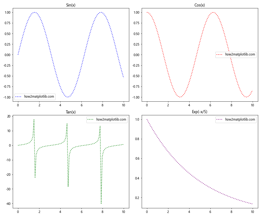
This example demonstrates how to use Matplotlib linestyle dotted in a 2×2 subplot layout, allowing for easy comparison of different functions.
Best Practices for Using Matplotlib Linestyle Dotted
When working with Matplotlib linestyle dotted, it’s important to follow some best practices to ensure your plots are clear and effective:
- Choose appropriate dot spacing: The spacing between dots should be suitable for the scale of your data and the size of your plot.
Use color effectively: Select colors that contrast well with your background and other plot elements.
Combine with other styles judiciously: While combining dotted lines with other styles can be effective, be careful not to overcomplicate your plots.
Consider line width: Adjust the line width to ensure your dotted lines are visible and distinct.
Use legends: Always include legends to explain what each dotted line represents.
Let’s see an example that incorporates these best practices: