Matplotlib Line of Best Fit
Matplotlib is a widely used Python library for creating visualizations. One of its key features is the ability to fit a line of best fit to a scatter plot using linear regression. This line represents the overall trend in the data and helps in understanding the relationship between the variables.
In this article, we will explore how to create a line of best fit in Matplotlib, and walk through various code examples to illustrate its implementation.
Installing Matplotlib
Before we dive into the code, let’s make sure Matplotlib is installed. You can install it using pip, the Python package manager, with the following command:
pip install matplotlib
If you prefer using Anaconda, you can install Matplotlib using the following command:
conda install matplotlib
Now that we have Matplotlib installed, let’s move on to creating a line of best fit!
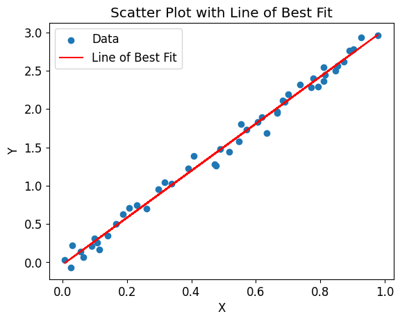
Example 1: Basic Scatter Plot with Line of Best Fit
Let’s start with a simple example to understand the basics. We will create a scatter plot and then fit a line of best fit using linear regression.
import matplotlib.pyplot as plt
import numpy as np

# Generate random data
x = np.random.rand(50)
y = 3 * x + np.random.normal(0, 0.1, 50)

# Fit a line of best fit
coefficients = np.polyfit(x, y, 1)
poly = np.poly1d(coefficients)

# Scatter plot
plt.scatter(x, y, label='Data')

# Line of best fit
plt.plot(x, poly(x), color='red', label='Line of Best Fit')

# Labels and title
plt.xlabel('X')
plt.ylabel('Y')
plt.title('Scatter Plot with Line of Best Fit')

# Legend
plt.legend()

# Display the plot
plt.show()
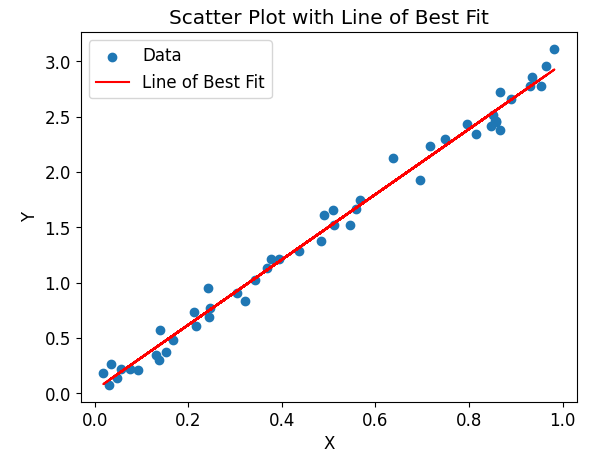
Output:
The code will generate a scatter plot with randomly generated data points and a line of best fit represented by the red line. The plot will include labels for the x-axis and y-axis, a title, and a legend.
Example 2: Changing Line Style and Color
Matplotlib allows you to customize the appearance of the line of best fit. You can change the line style, color, and width to suit your needs.
import matplotlib.pyplot as plt
import numpy as np

# Generate random data
x = np.random.rand(50)
y = 3 * x + np.random.normal(0, 0.1, 50)

# Fit a line of best fit
coefficients = np.polyfit(x, y, 1)
poly = np.poly1d(coefficients)

# Scatter plot
plt.scatter(x, y, label='Data')

# Line of best fit with custom style and color
plt.plot(x, poly(x), color='green', linestyle='--', linewidth=2, label='Line of Best Fit')

# Labels and title
plt.xlabel('X')
plt.ylabel('Y')
plt.title('Scatter Plot with Custom Line Style and Color')

# Legend
plt.legend()

# Display the plot
plt.show()
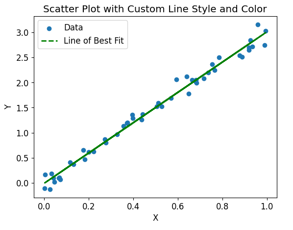
Output:
The code will generate a scatter plot with a custom line of best fit. The line will be green, dashed, and have a width of 2.
Example 3: Adding Error Bars to Data
Another useful feature in data visualization is to represent the uncertainty in the measurements using error bars. Matplotlib allows us to easily include error bars in a scatter plot.
import matplotlib.pyplot as plt
import numpy as np

# Generate random data
x = np.random.rand(50)
y = 3 * x + np.random.normal(0, 0.1, 50)
y_error = np.random.normal(0, 0.05, 50)

# Fit a line of best fit
coefficients = np.polyfit(x, y, 1)
poly = np.poly1d(coefficients)

# Scatter plot with error bars
plt.errorbar(x, y, yerr=y_error, fmt='o', label='Data')

# Line of best fit
plt.plot(x, poly(x), color='red', label='Line of Best Fit')

# Labels and title
plt.xlabel('X')
plt.ylabel('Y')
plt.title('Scatter Plot with Error Bars')

# Legend
plt.legend()

# Display the plot
plt.show()
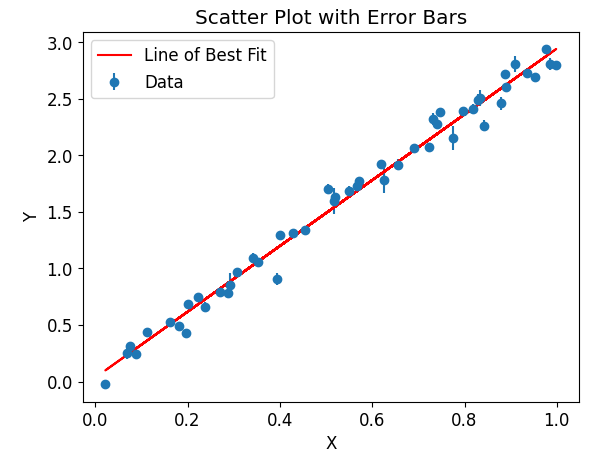
Output:
The code will generate a scatter plot with error bars representing the uncertainty in the measurements. The error bars are shown as vertical lines above and below each data point.
Example 4: Multiple Scatters Plots with Lines of Best Fit
Matplotlib allows us to create multiple scatter plots with their respective lines of best fit in a single figure. This can be useful when comparing different datasets or analyzing subsets of the data.
import matplotlib.pyplot as plt
import numpy as np

# Generate random data
x1 = np.random.rand(50)
y1 = 3 * x1 + np.random.normal(0, 0.1, 50)

x2 = np.random.rand(50)
y2 = 2 * x2 + np.random.normal(0, 0.1, 50)

# Fit lines of best fit
coefficients1 = np.polyfit(x1, y1, 1)
poly1 = np.poly1d(coefficients1)

coefficients2 = np.polyfit(x2, y2, 1)
poly2 = np.poly1d(coefficients2)

# Scatter plots and lines of best fit
plt.scatter(x1, y1, label='Data 1')
plt.plot(x1, poly1(x1), color='red', label='Line of Best Fit 1')

plt.scatter(x2, y2, label='Data 2')
plt.plot(x2, poly2(x2), color='blue', linestyle='--', label='Line of Best Fit 2')

# Labels and title
plt.xlabel('X')
plt.ylabel('Y')
plt.title('Multiple Scatter Plots with Lines of Best Fit')

# Legend
plt.legend()

# Display the plot
plt.show()
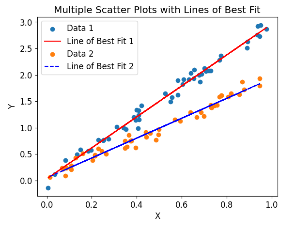
Output:
The code will generate a figure with two scatter plots, each accompanied by its respective line of best fit. The first data set is represented by blue points and a red line, while the second data set is represented by orange points and a dashed blue line.
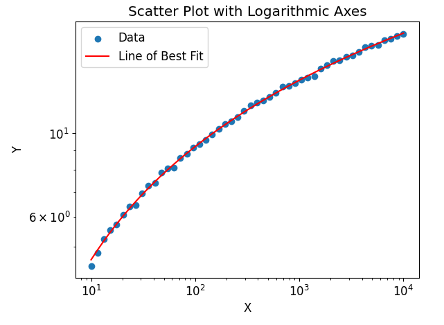
Example 5: Logarithmic Axes
Sometimes, it is necessary to visualize data on logarithmic scales. Matplotlib allows us to easily set logarithmic axes in order to better represent relationships that span a large range of values.
import matplotlib.pyplot as plt
import numpy as np

# Generate random data
x = np.logspace(1, 4, 50)
y = 2 * np.log(x) + np.random.normal(0, 0.1, 50)

# Fit a line of best fit
coefficients = np.polyfit(np.log(x), y, 1)
poly = np.poly1d(coefficients)

# Scatter plot with logarithmic axes
plt.scatter(x, y, label='Data')

# Line of best fit
plt.plot(x, poly(np.log(x)), color='red', label='Line of Best Fit')

# Logarithmic axes
plt.xscale('log')
plt.yscale('log')

# Labels and title
plt.xlabel('X')
plt.ylabel('Y')
plt.title('Scatter Plot with Logarithmic Axes')

# Legend
plt.legend()

# Display the plot
plt.show()
Output:
The code will generate a scatter plot with logarithmic axes. Both the x-axis and y-axis are scaled logarithmically, allowing the visualization of data across several orders of magnitude.
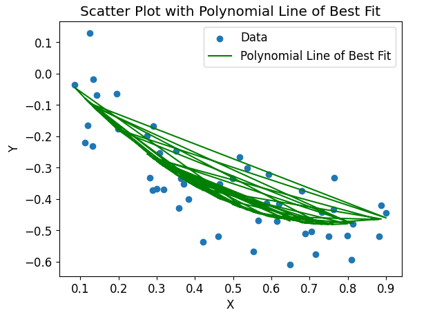
Example 6: Polynomial Line of Best Fit
In addition to linear regression, Matplotlib also allows us to fit higher-order polynomials to the data. This can be useful when the relationship between the variables is not strictly linear.
import matplotlib.pyplot as plt
import numpy as np

# Generate random data
x = np.random.rand(50)
y = 0.5 * x**2 - x + np.random.normal(0, 0.1, 50)

# Fit a polynomial line of best fit
coefficients = np.polyfit(x, y, 2)
poly = np.poly1d(coefficients)

# Scatter plot
plt.scatter(x, y, label='Data')

# Polynomial line of best fit
plt.plot(x, poly(x), color='green', label='Polynomial Line of Best Fit')

# Labels and title
plt.xlabel('X')
plt.ylabel('Y')
plt.title('Scatter Plot with Polynomial Line of Best Fit')

# Legend
plt.legend()

# Display the plot
plt.show()
Output:
The code will generate a scatter plot with a polynomial line of best fit. The line represents a quadratic relationship between the variables and is shown in green.
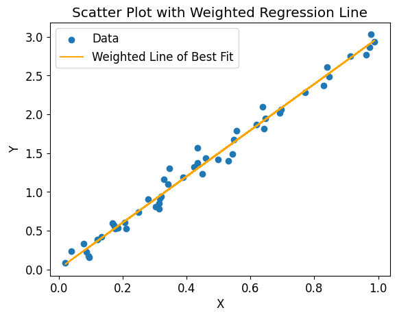
Example 7: Weighted Regression Line
Sometimes the data points in a scatter plot may have different weights or uncertainties. Matplotlib allows us to perform weighted regression, where the data points with higher weights contribute more to the line of best fit.
import matplotlib.pyplot as plt
import numpy as np

# Generate random data
x = np.random.rand(50)
y = 3 * x + np.random.normal(0, 0.1, 50)
weights = np.random.rand(50)

# Fit a weighted regression line of best fit
coefficients, residuals, rank, singular_values, rcond = np.polyfit(x, y, 1, w=weights, full=True)
poly = np.poly1d(coefficients)

# Scatter plot
plt.scatter(x, y, label='Data')

# Weighted regression line of best fit
plt.plot(x, poly(x), color='orange', label='Weighted Line of Best Fit')

# Labels and title
plt.xlabel('X')
plt.ylabel('Y')
plt.title('Scatter Plot with Weighted Regression Line')

# Legend
plt.legend()

# Display the plot
plt.show()
Output:
The code will generate a scatter plot with a weighted regression line of best fit. The line represents the relationship between the variables, giving more importance to the data points with higher weights.
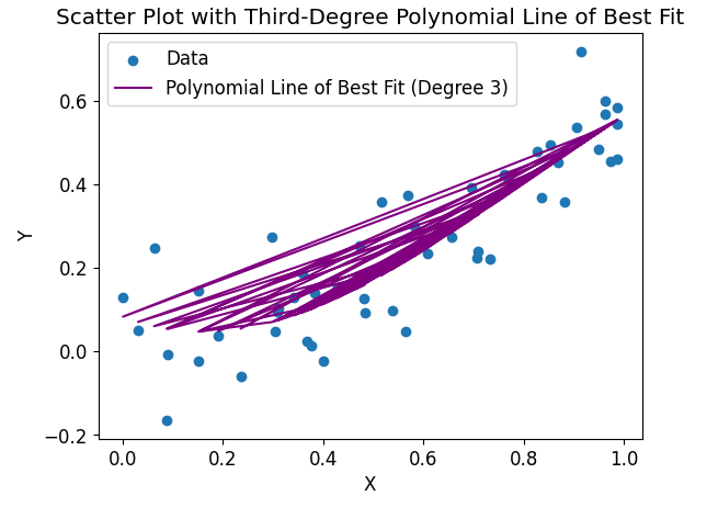
Example 8: Choosing a Higher-Order Polynomial
When fitting a line of best fit, we can choose a higher-order polynomial if the relationship between the variables is not adequately captured by a straight line. Matplotlib allows us to specify the degree of the polynomial we want to fit.
import matplotlib.pyplot as plt
import numpy as np

# Generate random data
x = np.random.rand(50)
y = 0.1 * x**3 + 0.5 * x**2 + np.random.normal(0, 0.1, 50)

# Fit a third-degree polynomial line of best fit
coefficients = np.polyfit(x, y, 3)
poly = np.poly1d(coefficients)

# Scatter plot
plt.scatter(x, y, label='Data')

# Third-degree polynomial line of best fit
plt.plot(x, poly(x), color='purple', label='Polynomial Line of Best Fit (Degree 3)')

# Labels and title
plt.xlabel('X')
plt.ylabel('Y')
plt.title('Scatter Plot with Third-Degree Polynomial Line of Best Fit')

# Legend
plt.legend()

# Display the plot
plt.show()
Output:
The code will generate a scatter plot with a third-degree polynomial line of best fit. The line captures a more complex relationship, represented by the curvature in the data.
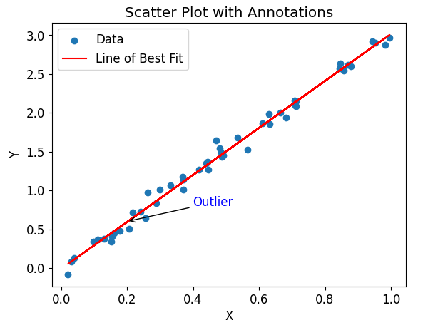
Example 9: Adding Annotations to the Plot
Matplotlib allows us to add annotations to the plot, such as text or arrows, to provide additional information or highlight specific features in the data.
import matplotlib.pyplot as plt
import numpy as np

# Generate random data
x = np.random.rand(50)
y = 3 * x + np.random.normal(0, 0.1, 50)

# Fit a line of best fit
coefficients = np.polyfit(x, y, 1)
poly = np.poly1d(coefficients)

# Scatter plot
plt.scatter(x, y, label='Data')

# Line of best fit
plt.plot(x, poly(x), color='red', label='Line of Best Fit')

# Add annotations
plt.annotate('Outlier', xy=(0.2, 0.6), xytext=(0.4, 0.8),
             arrowprops={'arrowstyle': '->'}, color='blue')

# Labels and title
plt.xlabel('X')
plt.ylabel('Y')
plt.title('Scatter Plot with Annotations')

# Legend
plt.legend()

# Display the plot
plt.show()
Output:
The code will generate a scatter plot with a line of best fit and an annotation. The annotation is represented by a blue arrow pointing from the coordinates (0.2, 0.6) to (0.4, 0.8), indicating an outlier in the data.
Example 10: Saving the Plot to a File
Matplotlib provides a convenient way to save the generated plots as image files in various formats, such as PNG, PDF, or SVG. This can be useful for further analysis or sharing the visualizations.
import matplotlib.pyplot as plt
import numpy as np

# Generate random data
x = np.random.rand(50)
y = 3 * x + np.random.normal(0, 0.1, 50)

# Fit a line of best fit
coefficients = np.polyfit(x, y, 1)
poly = np.poly1d(coefficients)

# Scatter plot
plt.scatter(x, y, label='Data')

# Line of best fit
plt.plot(x, poly(x), color='red', label='Line of Best Fit')

# Labels and title
plt.xlabel('X')
plt.ylabel('Y')
plt.title('Scatter Plot with Line of Best Fit')

# Legend
plt.legend()

# Save the plot as a PNG file
plt.savefig('line_of_best_fit.png')

# Display the plot
plt.show()
Output:
The code will generate a scatter plot with a line of best fit and save it as a PNG file named line_of_best_fit.png in the working directory.
Matplotlib Line of Best Fit Conclusion
In this article, we explored how to create a line of best fit in Matplotlib using various code examples. We covered basic scatter plots with lines of best fit, customization options, adding error bars, multiple scatter plots, logarithmic axes, polynomial lines of best fit, weighted regression, annotations, and saving the plots to files.
Matplotlib provides a powerful and flexible way to analyze and visualize data, and fitting a line of best fit allows us to understand the underlying relationships between variables. Whether it’s a simple linear regression or a more complex polynomial fit, Matplotlib’s capabilities make it an invaluable tool for data visualization and analysis.