How to Create and Customize Matplotlib Legend in Subplot
Matplotlib legend in subplot is an essential feature for creating informative and visually appealing data visualizations. This article will provide a detailed exploration of how to effectively use and customize legends within subplots using Matplotlib. We’ll cover various aspects of Matplotlib legend in subplot, including placement, styling, and advanced techniques to enhance your plots.
Understanding Matplotlib Legend in Subplot
Matplotlib legend in subplot is a crucial component of data visualization that helps viewers interpret the information presented in a graph. When working with subplots, adding legends becomes even more important as it allows you to distinguish between multiple data series across different plots. Let’s start by examining the basics of creating a Matplotlib legend in subplot.
Basic Legend Creation in Subplot
To create a basic Matplotlib legend in subplot, you first need to create a figure with subplots and plot your data. Then, you can add a legend to each subplot using the legend() method. Here’s a simple example:
import matplotlib.pyplot as plt
import numpy as np

# Create data
x = np.linspace(0, 10, 100)
y1 = np.sin(x)
y2 = np.cos(x)

# Create figure and subplots
fig, (ax1, ax2) = plt.subplots(1, 2, figsize=(10, 4))

# Plot data in subplots
ax1.plot(x, y1, label='Sine')
ax2.plot(x, y2, label='Cosine')

# Add legends to subplots
ax1.legend()
ax2.legend()

# Set titles
ax1.set_title('Sine Wave - how2matplotlib.com')
ax2.set_title('Cosine Wave - how2matplotlib.com')

plt.tight_layout()
plt.show()
Output:
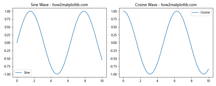
In this example, we create two subplots side by side, plot sine and cosine waves, and add a legend to each subplot. The label parameter in the plot() function is used to specify the text that appears in the legend.
Advanced Legend Customization in Subplot
Matplotlib legend in subplot offers various customization options to enhance the appearance and functionality of your legends. Let’s explore some advanced techniques for legend customization.
Styling Legend Text and Box
You can customize the appearance of the legend text and box using various parameters. Here’s an example demonstrating text and box styling:
import matplotlib.pyplot as plt
import numpy as np

x = np.linspace(0, 10, 100)
y1 = np.sin(x)
y2 = np.cos(x)

fig, ax = plt.subplots(figsize=(8, 6))

ax.plot(x, y1, label='Sine')
ax.plot(x, y2, label='Cosine')

ax.legend(fontsize=12, frameon=True, facecolor='lightgray', edgecolor='black',
          title='Legend Title', title_fontsize=14)

ax.set_title('Styled Legend - how2matplotlib.com')
plt.show()
Output:
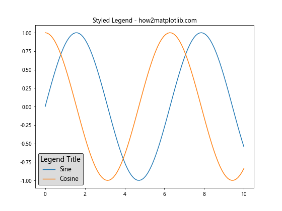
In this example, we customize the legend’s font size, add a frame, set the background color, add an edge color, and include a title with a custom font size.
Multiple Columns in Legend
For subplots with many data series, you might want to organize the legend entries into multiple columns. Here’s how you can achieve this:
import matplotlib.pyplot as plt
import numpy as np

x = np.linspace(0, 10, 100)

fig, ax = plt.subplots(figsize=(10, 6))

for i in range(6):
    ax.plot(x, np.sin(x + i), label=f'Sine {i+1}')

ax.legend(ncol=3, loc='upper center', bbox_to_anchor=(0.5, -0.05))

ax.set_title('Multi-column Legend - how2matplotlib.com')
plt.tight_layout()
plt.show()
Output:
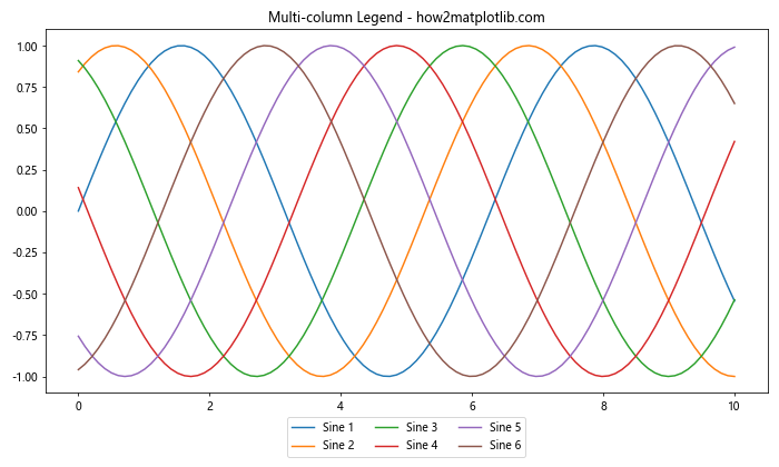
This example creates a subplot with six sine waves and organizes the legend entries into three columns. The ncol parameter specifies the number of columns, while bbox_to_anchor is used to position the legend below the plot.
Legend for Multiple Subplots
Sometimes, you may want to create a single legend for multiple subplots. Here’s how you can achieve this:
import matplotlib.pyplot as plt
import numpy as np

x = np.linspace(0, 10, 100)
y1 = np.sin(x)
y2 = np.cos(x)

fig, (ax1, ax2) = plt.subplots(1, 2, figsize=(12, 5))

line1, = ax1.plot(x, y1, label='Sine')
line2, = ax2.plot(x, y2, label='Cosine')

fig.legend(handles=[line1, line2], loc='upper center', ncol=2)

ax1.set_title('Subplot 1 - how2matplotlib.com')
ax2.set_title('Subplot 2 - how2matplotlib.com')

plt.tight_layout()
plt.show()
Output:
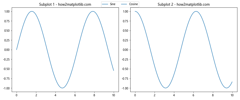
In this example, we create two subplots and add a single legend for both at the top of the figure. The handles parameter is used to specify which lines should be included in the legend.
Handling Overlapping Legends in Subplots
When working with Matplotlib legend in subplot, you may encounter situations where legends overlap with the plot content or with each other. Let’s explore some techniques to handle overlapping legends.
Adjusting Subplot Layout
One way to handle overlapping legends is to adjust the layout of your subplots. You can use plt.tight_layout() or manually adjust the spacing between subplots. Here’s an example:
import matplotlib.pyplot as plt
import numpy as np

x = np.linspace(0, 10, 100)
y1 = np.sin(x)
y2 = np.cos(x)

fig, (ax1, ax2) = plt.subplots(1, 2, figsize=(12, 5))

ax1.plot(x, y1, label='Sine')
ax2.plot(x, y2, label='Cosine')

ax1.legend(loc='lower right')
ax2.legend(loc='lower left')

ax1.set_title('Subplot 1 - how2matplotlib.com')
ax2.set_title('Subplot 2 - how2matplotlib.com')

plt.tight_layout(pad=3.0)
plt.show()
Output:
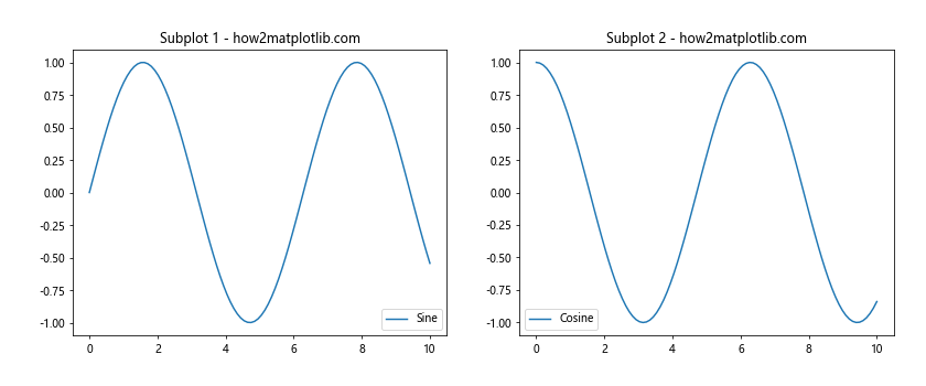
In this example, we use plt.tight_layout(pad=3.0) to add extra padding around the subplots, preventing legend overlap.
Using bbox_to_anchor for Precise Positioning
For more precise control over legend positioning, you can use the bbox_to_anchor parameter. This allows you to place the legend outside the plot area if needed. Here’s an example:
import matplotlib.pyplot as plt
import numpy as np

x = np.linspace(0, 10, 100)
y1 = np.sin(x)
y2 = np.cos(x)

fig, (ax1, ax2) = plt.subplots(1, 2, figsize=(12, 5))

ax1.plot(x, y1, label='Sine')
ax2.plot(x, y2, label='Cosine')

ax1.legend(bbox_to_anchor=(0.5, -0.15), loc='upper center')
ax2.legend(bbox_to_anchor=(0.5, -0.15), loc='upper center')

ax1.set_title('Subplot 1 - how2matplotlib.com')
ax2.set_title('Subplot 2 - how2matplotlib.com')

plt.tight_layout()
plt.show()
Output:
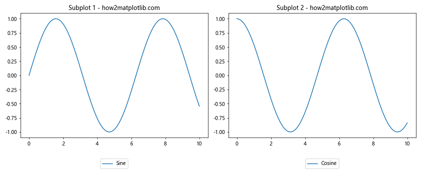
In this example, we position the legends below each subplot using bbox_to_anchor.
Creating Custom Legend Entries
Matplotlib legend in subplot allows you to create custom legend entries that may not correspond directly to plotted data. This can be useful for adding explanatory text or symbols to your legend.
Adding Text-Only Legend Entries
You can add text-only entries to your legend using ax.plot() with an empty line style. Here’s an example:
import matplotlib.pyplot as plt
import numpy as np

x = np.linspace(0, 10, 100)
y = np.sin(x)

fig, ax = plt.subplots(figsize=(8, 6))

ax.plot(x, y, label='Sine Wave')
ax.plot([], [], ' ', label='Custom Text')

ax.legend()
ax.set_title('Legend with Custom Text - how2matplotlib.com')
plt.show()
Output:
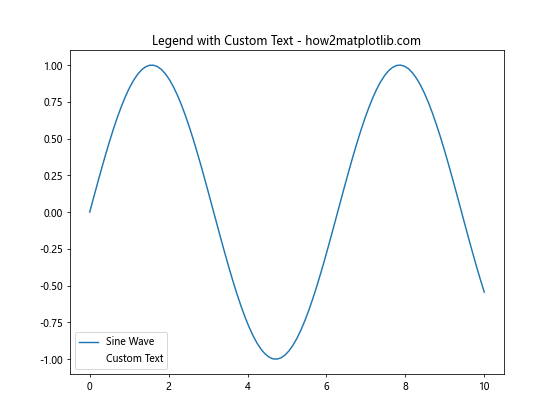
In this example, we add a custom text entry to the legend using ax.plot([], [], ' ', label='Custom Text').
Creating Legend Entries with Custom Markers
You can also create legend entries with custom markers or symbols. Here’s how:
import matplotlib.pyplot as plt
import numpy as np

x = np.linspace(0, 10, 100)
y = np.sin(x)

fig, ax = plt.subplots(figsize=(8, 6))

ax.plot(x, y, label='Sine Wave')
ax.plot([], [], marker='o', color='red', ls='', label='Custom Marker')
ax.plot([], [], marker='s', color='green', ls='', label='Another Marker')

ax.legend()
ax.set_title('Legend with Custom Markers - how2matplotlib.com')
plt.show()
Output:
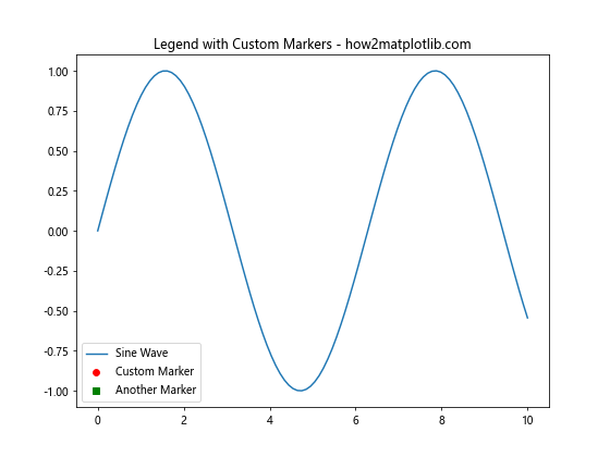
This example adds two custom marker entries to the legend using empty lines with specified markers.
Handling Large Numbers of Legend Entries
When working with Matplotlib legend in subplot, you may encounter situations where you have a large number of legend entries. This can make your legend cluttered and difficult to read. Let’s explore some techniques to handle this situation.
Grouping Legend Entries
Another approach to handling many legend entries is to group them into categories. Here’s an example:
import matplotlib.pyplot as plt
import numpy as np

x = np.linspace(0, 10, 100)

fig, ax = plt.subplots(figsize=(10, 6))

for i in range(10):
    if i < 5:
        ax.plot(x, np.sin(x + i/5), label=f'Group A - {i+1}')
    else:
        ax.plot(x, np.cos(x + i/5), label=f'Group B - {i+1}')

handles, labels = ax.get_legend_handles_labels()
grouped_handles = [handles[:5], handles[5:]]
grouped_labels = ['Group A', 'Group B']

ax.legend(grouped_handles, grouped_labels)
ax.set_title('Grouped Legend Entries - how2matplotlib.com')
plt.show()
Output:
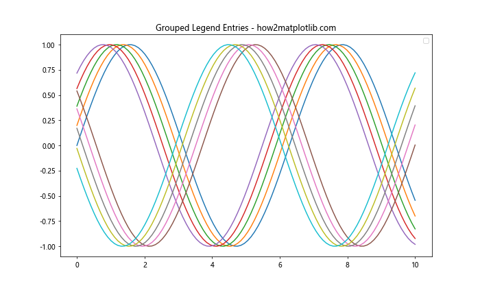
In this example, we group the legend entries into two categories, simplifying the legend while still providing information about the data series.
Advanced Legend Styling Techniques
Matplotlib legend in subplot offers various advanced styling options to make your legends more visually appealing and informative. Let's explore some of these techniques.
Using Custom Colors and Markers
You can customize the colors and markers used in your legend to match your plot style or to highlight specific information. Here's an example:
import matplotlib.pyplot as plt
import numpy as np

x = np.linspace(0, 10, 100)
y1 = np.sin(x)
y2 = np.cos(x)

fig, ax = plt.subplots(figsize=(8, 6))

ax.plot(x, y1, color='red', linestyle='-', label='Sine')
ax.plot(x, y2, color='blue', linestyle='--', label='Cosine')

ax.legend(markerfirst=False, numpoints=1, markerscale=1.5)

ax.set_title('Custom Colors and Markers - how2matplotlib.com')
plt.show()
Output:
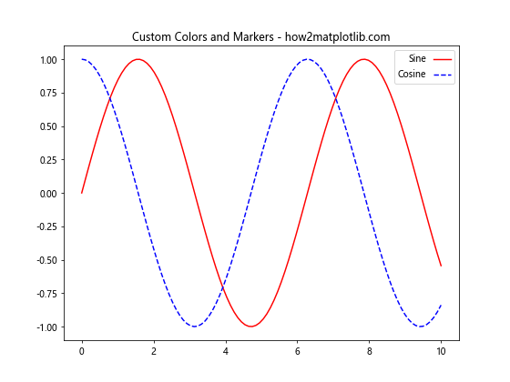
In this example, we use custom colors and line styles for the plots and customize the legend appearance using markerfirst, numpoints, and markerscale parameters.
Adding a Shadow to the Legend
You can add a shadow effect to your legend to make it stand out from the plot background. Here's how:
import matplotlib.pyplot as plt
import numpy as np

x = np.linspace(0, 10, 100)
y1 = np.sin(x)
y2 = np.cos(x)

fig, ax = plt.subplots(figsize=(8, 6))

ax.plot(x, y1, label='Sine')
ax.plot(x, y2, label='Cosine')

ax.legend(shadow=True, fancybox=True)

ax.set_title('Legend with Shadow - how2matplotlib.com')
plt.show()
Output:
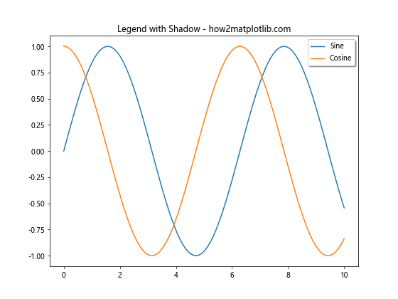
This example adds a shadow effect to the legend using the shadow parameter and rounds the corners with fancybox.
Handling Legend in 3D Subplots
Matplotlib legend in subplot can also be used with 3D plots. However, legend placement in 3D plots requires some special considerations. Let's explore how to handle legends in 3D subplots.
Basic 3D Subplot with Legend
Here's an example of creating a 3D subplot with a legend:
import matplotlib.pyplot as plt
import numpy as np

fig = plt.figure(figsize=(10, 8))
ax = fig.add_subplot(111, projection='3d')

t = np.linspace(0, 10, 100)
x = np.sin(t)
y = np.cos(t)
z = t

ax.plot(x, y, z, label='3D Curve')
ax.legend()

ax.set_xlabel('X axis')
ax.set_ylabel('Y axis')
ax.set_zlabel('Z axis')
ax.set_title('3D Subplot with Legend - how2matplotlib.com')

plt.show()
Output:
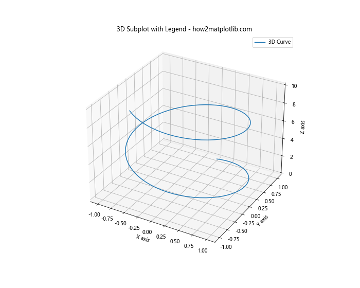
In this example, we create a 3D subplot and add a legend using the legend() method. The legend is automatically placed in a suitable location.
Customizing Legend Position in 3D Subplots
Positioning the legend in 3D subplots can be tricky. Here's an example of how to place the legend outside the 3D plot:
import matplotlib.pyplot as plt
import numpy as np

fig = plt.figure(figsize=(12, 8))
ax = fig.add_subplot(111, projection='3d')

t = np.linspace(0, 10, 100)
x1, y1, z1 = np.sin(t), np.cos(t), t
x2, y2, z2 = np.sin(2*t), np.cos(2*t), 2*t

ax.plot(x1, y1, z1, label='Curve 1')
ax.plot(x2, y2, z2, label='Curve 2')

ax.set_xlabel('X axis')
ax.set_ylabel('Y axis')
ax.set_zlabel('Z axis')
ax.set_title('3D Subplot with Custom Legend Position - how2matplotlib.com')

plt.legend(bbox_to_anchor=(1.05, 1), loc='upper left')
plt.tight_layout()
plt.show()
Output:
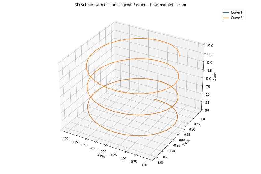
In this example, we use bbox_to_anchor to position the legend outside the 3D plot area.
Creating Legends for Multiple Data Types
Matplotlib legend in subplot can handle multiple data types in a single plot. Let's explore how to create legends for plots that combine different types of data visualization.
Combining Line Plots and Scatter Plots
Here's an example of creating a legend for a subplot that combines line plots and scatter plots:
import matplotlib.pyplot as plt
import numpy as np

x = np.linspace(0, 10, 100)
y1 = np.sin(x)
y2 = np.cos(x)

fig, ax = plt.subplots(figsize=(10, 6))

line, = ax.plot(x, y1, label='Sine (Line)')
scatter = ax.scatter(x[::10], y2[::10], c='red', label='Cosine (Scatter)')

ax.legend()
ax.set_title('Combined Line and Scatter Plot - how2matplotlib.com')
plt.show()
Output:
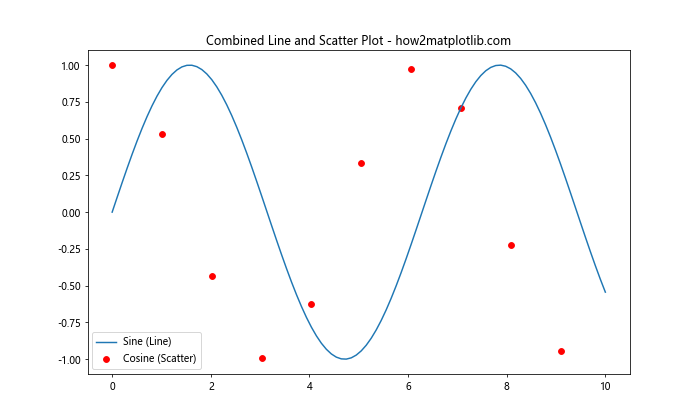
In this example, we create a line plot for the sine function and a scatter plot for the cosine function, then add a legend that includes both.
Adding Bar Plots to the Mix
Let's extend the previous example to include a bar plot:
import matplotlib.pyplot as plt
import numpy as np

x = np.linspace(0, 10, 20)
y1 = np.sin(x)
y2 = np.cos(x)
y3 = np.exp(-x/10)

fig, ax = plt.subplots(figsize=(12, 6))

line, = ax.plot(x, y1, label='Sine (Line)')
scatter = ax.scatter(x, y2, c='red', label='Cosine (Scatter)')
bars = ax.bar(x, y3, width=0.2, alpha=0.5, label='Exponential (Bar)')

ax.legend()
ax.set_title('Combined Line, Scatter, and Bar Plot - how2matplotlib.com')
plt.show()
Output:
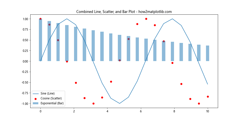
This example combines a line plot, scatter plot, and bar plot in a single subplot, with a legend that includes all three data types.
Handling Color-Mapped Data in Legends
When working with color-mapped data, such as heatmaps or scatter plots with varying colors, you may want to include a color bar in your legend. Let's explore how to handle this with Matplotlib legend in subplot.
Adding a Color Bar to the Legend
Here's an example of how to add a color bar to your legend for a scatter plot with varying colors:
import matplotlib.pyplot as plt
import numpy as np

x = np.random.rand(100)
y = np.random.rand(100)
colors = np.random.rand(100)

fig, ax = plt.subplots(figsize=(10, 6))

scatter = ax.scatter(x, y, c=colors, cmap='viridis')
line, = ax.plot([0, 1], [0, 1], 'r-', label='Line')

legend1 = ax.legend(handles=[line], loc='upper left')
ax.add_artist(legend1)

cbar = plt.colorbar(scatter)
cbar.set_label('Color Value')

ax.set_title('Scatter Plot with Color Bar - how2matplotlib.com')
plt.show()
Output:
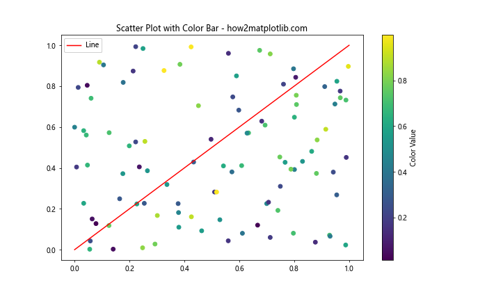
In this example, we create a scatter plot with points colored according to a color map, add a regular line to the plot, and include both a traditional legend and a color bar.
Creating Interactive Legends
Matplotlib legend in subplot can be made interactive, allowing users to toggle the visibility of plot elements by clicking on legend entries. Let's explore how to create interactive legends.
Toggle Plot Visibility with Legend
Here's an example of how to create an interactive legend that toggles the visibility of plot elements:
import matplotlib.pyplot as plt
import numpy as np

x = np.linspace(0, 10, 100)
y1 = np.sin(x)
y2 = np.cos(x)
y3 = np.tan(x)

fig, ax = plt.subplots(figsize=(10, 6))

lines = []
lines.append(ax.plot(x, y1, label='Sine')[0])
lines.append(ax.plot(x, y2, label='Cosine')[0])
lines.append(ax.plot(x, y3, label='Tangent')[0])

leg = ax.legend(fancybox=True, shadow=True)

lined = {}  # Will map legend lines to original lines.
for legline, origline in zip(leg.get_lines(), lines):
    legline.set_picker(True)  # Enable picking on the legend line.
    lined[legline] = origline

def on_pick(event):
    # On the pick event, find the original line corresponding to the legend
    # proxy line, and toggle its visibility.
    legline = event.artist
    origline = lined[legline]
    visible = not origline.get_visible()
    origline.set_visible(visible)
    # Change the alpha on the line in the legend so we can see what lines
    # have been toggled.
    legline.set_alpha(1.0 if visible else 0.2)
    fig.canvas.draw()

fig.canvas.mpl_connect('pick_event', on_pick)

ax.set_title('Interactive Legend - how2matplotlib.com')
plt.show()
Output:
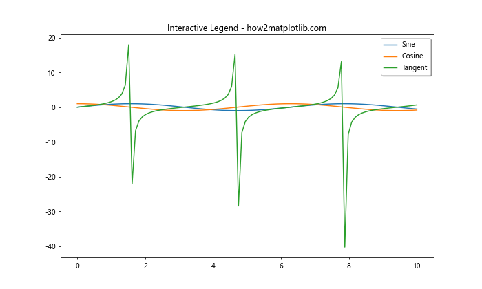
This example creates an interactive legend where clicking on a legend entry toggles the visibility of the corresponding plot element.
Handling Legends in Subplots with Shared Axes
When working with subplots that share axes, you may want to create a single legend that applies to all subplots. Let's explore how to handle this situation.
Creating a Shared Legend for Subplots
Here's an example of how to create a shared legend for subplots with shared axes:
import matplotlib.pyplot as plt
import numpy as np

x = np.linspace(0, 10, 100)
y1 = np.sin(x)
y2 = np.cos(x)

fig, (ax1, ax2) = plt.subplots(2, 1, figsize=(10, 8), sharex=True)

line1, = ax1.plot(x, y1, 'b-', label='Sine')
line2, = ax2.plot(x, y2, 'r-', label='Cosine')

ax1.set_title('Subplot 1 - how2matplotlib.com')
ax2.set_title('Subplot 2 - how2matplotlib.com')

fig.legend(handles=[line1, line2], loc='upper right', bbox_to_anchor=(1, 0.95))

plt.tight_layout()
plt.show()
Output:
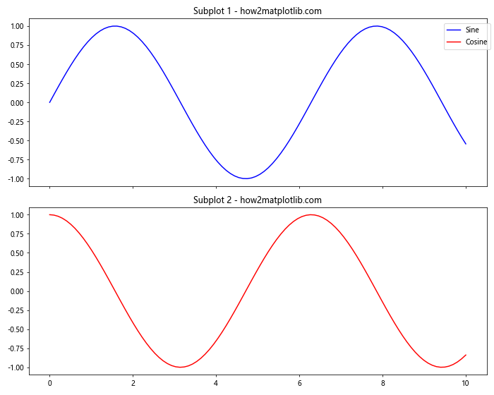
In this example, we create two subplots with shared x-axes and add a single legend that applies to both subplots.
Conclusion
Matplotlib legend in subplot is a powerful tool for enhancing the clarity and informativeness of your data visualizations. Throughout this article, we've explored various aspects of creating and customizing legends in subplots, from basic usage to advanced techniques.
We've covered topics such as:
- Basic legend creation in subplots
- Customizing legend location and appearance
- Handling overlapping legends
- Creating custom legend entries
- Dealing with large numbers of legend entries
- Advanced styling techniques
- Handling legends in 3D subplots
- Creating legends for multiple data types
- Adding color bars to legends
- Creating interactive legends
- Handling legends in subplots with shared axes