Matplotlib Label Line
Matplotlib is a popular data visualization library in Python that provides a wide range of functions to create different types of plots and charts. One essential aspect of data visualization is the ability to annotate and label specific elements in a plot. In matplotlib, label lines can be added to plots to indicate important information or provide additional context.
Label lines are essentially text labels that are attached to a specific point or position in a plot. They can be used to highlight key data points, add descriptions, or provide explanations for different elements in the plot. By using label lines effectively, you can enhance the clarity and understanding of your visualizations.
In this article, we will explore various methods to add label lines in matplotlib. Each method will be accompanied by code examples and the resulting plot illustrations.
Method 1: Annotation with plt.text()
One simple way to add label lines in matplotlib is by using the plt.text() function. This function allows you to specify the coordinates and text for the label line. Here’s an example:
import matplotlib.pyplot as plt

# Create data
x = [1, 2, 3, 4, 5]
y = [2, 4, 6, 8, 10]

# Create plot
plt.plot(x, y)

# Add label line
plt.text(3, 7, "Important Point", ha='center', va='center')

# Show plot
plt.show()
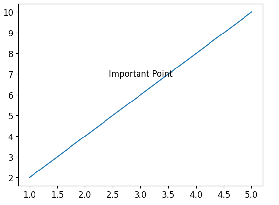
In this example, we first create a simple line plot using the plt.plot() function. Then, we use plt.text() to add a label line at coordinates (3, 7) with the text “Important Point”. The ha and va parameters specify the horizontal and vertical alignment of the text, respectively.
When executed, this code will generate a plot with a label line that points to the specified coordinates and displays the given text.
Method 2: Annotation with plt.annotate()
Another method to add label lines in matplotlib is by using the plt.annotate() function. This function provides more flexibility in terms of positioning the label line relative to the plot and data points. Here’s an example:
import matplotlib.pyplot as plt

# Create data
x = [1, 2, 3, 4, 5]
y = [2, 4, 6, 8, 10]

# Create plot
plt.plot(x, y)

# Add label line
plt.annotate("Important Point", xy=(3, 7), xytext=(2, 9),
             arrowprops=dict(facecolor='black', arrowstyle='->'))

# Show plot
plt.show()
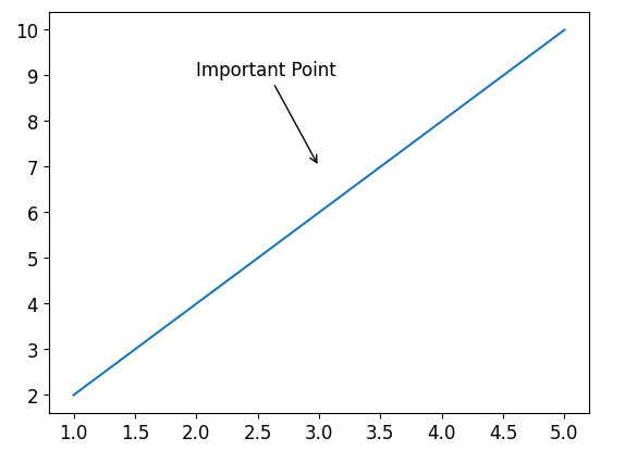
In this example, we use the plt.annotate() function to add a label line. The xy parameter specifies the coordinates of the data point that we want to annotate, and the xytext parameter specifies the coordinates of the text annotation. The arrowprops parameter is used to customize the appearance of the arrow that connects the annotation to the data point.
When executed, this code will generate a plot with a label line pointing from the data point (3, 7) to the specified text annotation position (2, 9).
Method 3: Annotation with Arrow Connection
We can also add label lines with an arrow connection using the annotate function in matplotlib. This provides a visually appealing way to link a specific point to the corresponding label. Here’s an example:
import matplotlib.pyplot as plt

# Create data
x = [1, 2, 3, 4, 5]
y = [2, 4, 6, 8, 10]

# Create plot
plt.plot(x, y)

# Add label line with arrow connection
plt.annotate("Important Point", xy=(3, 7), xytext=(3, 9),
             arrowprops=dict(facecolor='black', arrowstyle='->'))

# Show plot
plt.show()
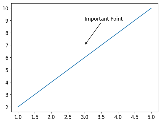
In this example, we use the plt.annotate() function along with the arrowprops parameter. By specifying the arrowstyle as '->', we can create an arrow connection between the data point (3, 7) and the text annotation position (3, 9).
When executed, this code will generate a plot with a label line connected to the data point, forming an arrow that points towards the text annotation.
Method 4: Label Lines on Bar Charts
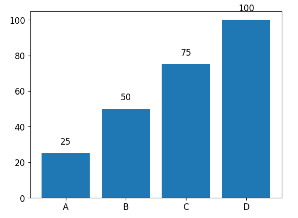
In addition to line plots, label lines can also be added to bar charts in matplotlib. This is particularly useful to provide contextual information for specific bars. Here’s an example:
import matplotlib.pyplot as plt

# Create data
categories = ['A', 'B', 'C', 'D']
values = [25, 50, 75, 100]

# Create bar chart
plt.bar(categories, values)

# Add label lines
for i, value in enumerate(values):
    plt.text(i, value + 5, str(value), ha='center')

# Show plot
plt.show()
In this example, we create a simple bar chart using the plt.bar() function. To add label lines, we use a for loop to iterate over each bar’s value. The plt.text() function is then used to add label lines at a slight distance above each bar, displaying the respective value.
When executed, this code will generate a bar chart with label lines added above each bar, indicating their corresponding values.
Method 5: Pie Chart with Label Lines
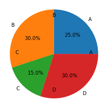
Label lines can also be added to pie charts in matplotlib. This is a helpful way to create informative visualizations by providing additional details about the proportions of different sections. Here’s an example:
import matplotlib.pyplot as plt
import numpy as np

# Create data
labels = ['A', 'B', 'C', 'D']
sizes = [25, 30, 15, 30]

# Create pie chart
plt.pie(sizes, labels=labels, autopct='%1.1f%%')

# Add label lines
for i, label in enumerate(labels):
    angle = (i / len(labels)) * 360
    x = 1.2 * 0.7 * np.cos(np.deg2rad(angle))
    y = 1.2 * 0.7 * np.sin(np.deg2rad(angle))
    plt.text(x, y, label, ha='center')

# Show plot
plt.show()
In this example, we first create a pie chart using the plt.pie() function. To add label lines, we use a for loop to iterate over each label. The plt.text() function is then used to add label lines at specific coordinates around the pie chart. The x and y variables are calculated based on the angle to ensure the labels are positioned correctly.
When executed, this code will generate a pie chart with label lines connecting each section to its corresponding label.
Method 6: Label Multiple Lines
There may be cases when you want to label multiple lines in a single plot. Matplotlib provides various options to accomplish this. Here’s an example:
import matplotlib.pyplot as plt

# Create data
x = [1, 2, 3, 4, 5]
y1 = [2, 4, 6, 8, 10]
y2 = [1, 3, 5, 7, 9]

# Create plot
plt.plot(x, y1, label='Line 1')
plt.plot(x, y2, label='Line 2')

# Add label lines to each line
plt.text(3, 7, "Line 1 Annotation", ha='center', va='center')
plt.text(4, 5, "Line 2 Annotation", ha='center', va='center')

# Show plot
plt.legend()
plt.show()
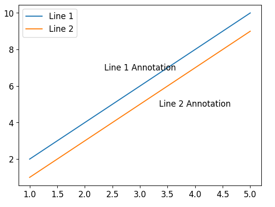
In this example, we create two lines on the same plot using the plt.plot() function. To add label lines, we use the plt.text() function twice, specifying the coordinates and text for each line’s label line.
When executed, this code will generate a plot with two lines labeled separately using label lines.
