How to Create Dashed Grid Lines in Matplotlib: A Comprehensive Guide
Matplotlib grid dashed lines are an essential feature for creating clear and visually appealing plots. In this comprehensive guide, we’ll explore various techniques and customization options for implementing dashed grid lines using Matplotlib. Whether you’re a beginner or an experienced data scientist, this article will provide you with valuable insights and practical examples to enhance your data visualization skills.
Understanding Matplotlib Grid and Dashed Lines
Before diving into the specifics of creating dashed grid lines in Matplotlib, it’s crucial to understand the basics of both grids and dashed lines in this powerful plotting library.
What is a Matplotlib Grid?
A Matplotlib grid is a set of horizontal and vertical lines that divide the plot area into smaller sections. Grids help in reading and interpreting data points more accurately by providing visual reference lines. By default, Matplotlib doesn’t display grid lines, but they can be easily added to improve the readability of your plots.
What are Dashed Lines in Matplotlib?
Dashed lines in Matplotlib are non-continuous lines that consist of a series of dashes or dots. They are often used to distinguish different types of lines or to create visual separation between elements in a plot. Dashed lines can be customized in terms of their dash pattern, length, and spacing.
Combining Grids and Dashed Lines
When we talk about Matplotlib grid dashed lines, we’re referring to the use of dashed lines for the grid in a plot. This combination can create a subtle yet effective background that doesn’t overpower the main data being displayed.
Basic Implementation of Matplotlib Grid Dashed Lines
Let’s start with a basic example of how to create a plot with dashed grid lines using Matplotlib.
import matplotlib.pyplot as plt
import numpy as np

# Generate sample data
x = np.linspace(0, 10, 100)
y = np.sin(x)

# Create the plot
plt.figure(figsize=(10, 6))
plt.plot(x, y, label='sin(x)')

# Add dashed grid lines
plt.grid(linestyle='--', linewidth=0.5)

# Customize the plot
plt.title('Sine Wave with Dashed Grid Lines - how2matplotlib.com')
plt.xlabel('X-axis')
plt.ylabel('Y-axis')
plt.legend()

# Display the plot
plt.show()
Output:
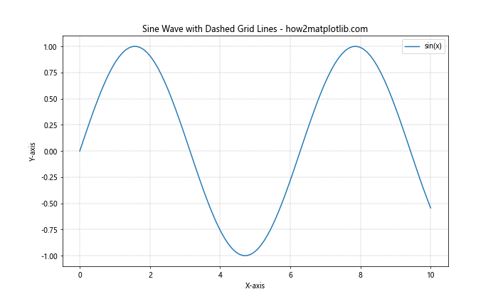
In this example, we’ve created a simple sine wave plot and added dashed grid lines using the plt.grid() function. The linestyle='--' parameter sets the grid lines to be dashed, while linewidth=0.5 makes them thinner for a less obtrusive appearance.
Customizing Matplotlib Grid Dashed Lines
Matplotlib offers various options to customize the appearance of dashed grid lines. Let’s explore some of these customization techniques.
Changing Dash Patterns
You can modify the dash pattern of the grid lines using different linestyle options:
import matplotlib.pyplot as plt
import numpy as np

x = np.linspace(0, 10, 100)
y = np.cos(x)

plt.figure(figsize=(12, 8))
plt.plot(x, y, label='cos(x)')

# Customize dash pattern
plt.grid(linestyle='-.', linewidth=0.5)

plt.title('Cosine Wave with Dash-Dot Grid Lines - how2matplotlib.com')
plt.xlabel('X-axis')
plt.ylabel('Y-axis')
plt.legend()

plt.show()
Output:
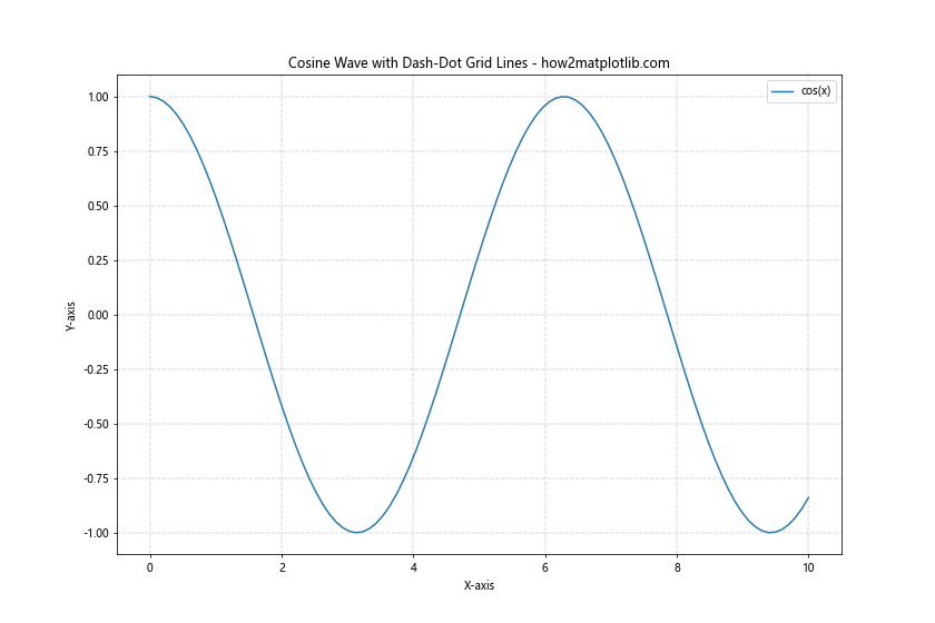
In this example, we’ve used linestyle='-.' to create a dash-dot pattern for the grid lines.
Adjusting Grid Line Color
You can change the color of the dashed grid lines to better suit your plot’s color scheme:
import matplotlib.pyplot as plt
import numpy as np

x = np.linspace(0, 10, 100)
y = np.exp(-x/10) * np.sin(x)

plt.figure(figsize=(10, 6))
plt.plot(x, y, label='Damped Sine Wave')

# Customize grid color
plt.grid(linestyle='--', linewidth=0.5, color='red', alpha=0.5)

plt.title('Damped Sine Wave with Colored Dashed Grid - how2matplotlib.com')
plt.xlabel('X-axis')
plt.ylabel('Y-axis')
plt.legend()

plt.show()
Output:
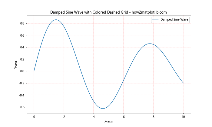
Here, we’ve set the grid color to red with color='red' and added some transparency with alpha=0.5.
Controlling Grid Density
You can adjust the density of the grid lines by specifying which tick marks should have grid lines:
import matplotlib.pyplot as plt
import numpy as np

x = np.linspace(0, 10, 100)
y = x**2

plt.figure(figsize=(10, 6))
plt.plot(x, y, label='x^2')

# Customize grid density
plt.grid(linestyle='--', which='major', color='gray', alpha=0.5)
plt.grid(linestyle=':', which='minor', color='gray', alpha=0.3)
plt.minorticks_on()

plt.title('Quadratic Function with Major and Minor Grid Lines - how2matplotlib.com')
plt.xlabel('X-axis')
plt.ylabel('Y-axis')
plt.legend()

plt.show()
Output:
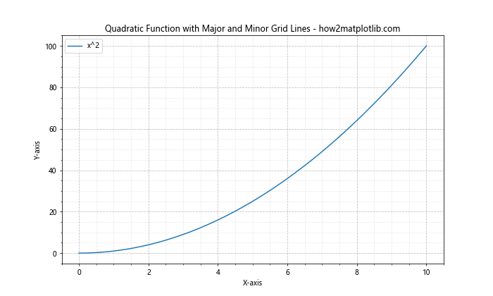
In this example, we’ve added both major and minor grid lines with different styles and colors.
Advanced Techniques for Matplotlib Grid Dashed Lines
Now that we’ve covered the basics, let’s explore some more advanced techniques for working with Matplotlib grid dashed lines.
Using Axis Objects for Grid Customization
Instead of using the global plt.grid() function, you can customize grid lines for individual axes:
import matplotlib.pyplot as plt
import numpy as np

fig, (ax1, ax2) = plt.subplots(2, 1, figsize=(10, 8))

x = np.linspace(0, 10, 100)
y1 = np.sin(x)
y2 = np.cos(x)

ax1.plot(x, y1, label='sin(x)')
ax2.plot(x, y2, label='cos(x)')

# Customize grid for each axis
ax1.grid(linestyle='--', color='blue', alpha=0.5)
ax2.grid(linestyle=':', color='red', alpha=0.5)

ax1.set_title('Sine Wave with Blue Dashed Grid - how2matplotlib.com')
ax2.set_title('Cosine Wave with Red Dotted Grid - how2matplotlib.com')

for ax in (ax1, ax2):
    ax.set_xlabel('X-axis')
    ax.set_ylabel('Y-axis')
    ax.legend()

plt.tight_layout()
plt.show()
Output:
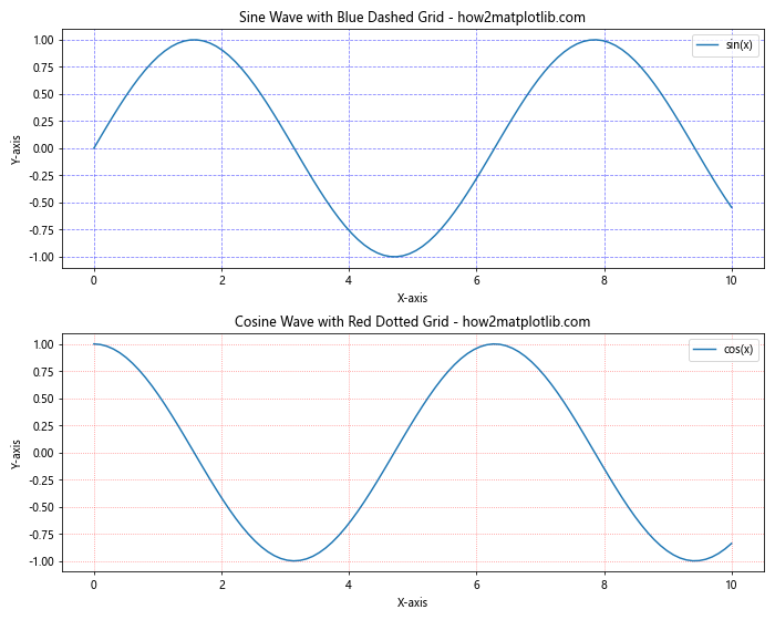
This example demonstrates how to create different grid styles for multiple subplots.
Creating Custom Dash Patterns
You can create custom dash patterns using a sequence of on-off lengths:
import matplotlib.pyplot as plt
import numpy as np

x = np.linspace(0, 10, 100)
y = np.tan(x)

plt.figure(figsize=(10, 6))
plt.plot(x, y, label='tan(x)')

# Create custom dash pattern
custom_dashes = (0, (5, 2, 1, 2))  # 5 points on, 2 off, 1 on, 2 off
plt.grid(linestyle=custom_dashes, linewidth=1, color='green', alpha=0.5)

plt.title('Tangent Function with Custom Dashed Grid - how2matplotlib.com')
plt.xlabel('X-axis')
plt.ylabel('Y-axis')
plt.legend()

plt.ylim(-5, 5)  # Limit y-axis for better visibility
plt.show()
Output:
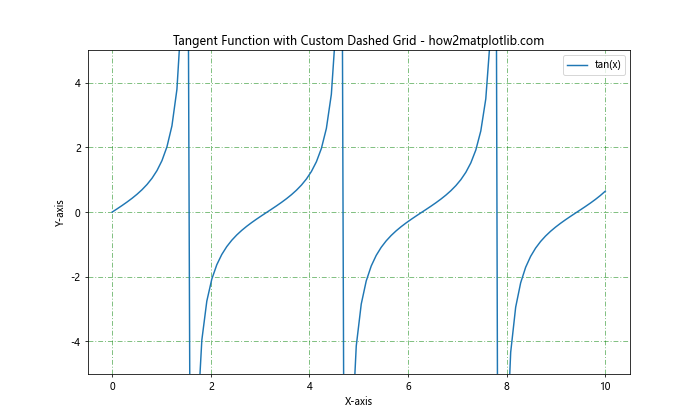
This example uses a custom dash pattern for the grid lines, creating a unique visual effect.
Combining Solid and Dashed Grid Lines
You can create a hybrid grid with solid lines in one direction and dashed lines in the other:
import matplotlib.pyplot as plt
import numpy as np

x = np.linspace(0, 10, 100)
y = np.log(x + 1)

fig, ax = plt.subplots(figsize=(10, 6))
ax.plot(x, y, label='log(x+1)')

# Create hybrid grid
ax.grid(axis='x', linestyle='--', color='gray', alpha=0.5)
ax.grid(axis='y', linestyle='-', color='gray', alpha=0.5)

ax.set_title('Logarithmic Function with Hybrid Grid - how2matplotlib.com')
ax.set_xlabel('X-axis')
ax.set_ylabel('Y-axis')
ax.legend()

plt.show()
Output:
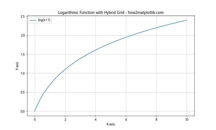
This example shows how to create a grid with dashed vertical lines and solid horizontal lines.
Matplotlib Grid Dashed Lines in Different Plot Types
Let’s explore how to implement dashed grid lines in various types of plots commonly used in data visualization.
Scatter Plots with Dashed Grid Lines
import matplotlib.pyplot as plt
import numpy as np

np.random.seed(42)
x = np.random.rand(50)
y = np.random.rand(50)

plt.figure(figsize=(10, 6))
plt.scatter(x, y, alpha=0.7)

plt.grid(linestyle='--', color='gray', alpha=0.5)

plt.title('Scatter Plot with Dashed Grid Lines - how2matplotlib.com')
plt.xlabel('X-axis')
plt.ylabel('Y-axis')

plt.show()
Output:
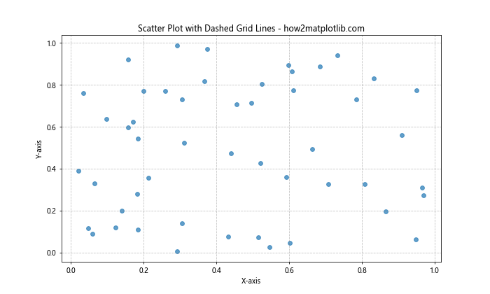
This example demonstrates how to add dashed grid lines to a scatter plot.
Bar Charts with Dashed Grid Lines
import matplotlib.pyplot as plt
import numpy as np

categories = ['A', 'B', 'C', 'D', 'E']
values = np.random.randint(10, 100, 5)

plt.figure(figsize=(10, 6))
plt.bar(categories, values)

plt.grid(axis='y', linestyle='--', color='gray', alpha=0.5)

plt.title('Bar Chart with Dashed Grid Lines - how2matplotlib.com')
plt.xlabel('Categories')
plt.ylabel('Values')

plt.show()
Output:
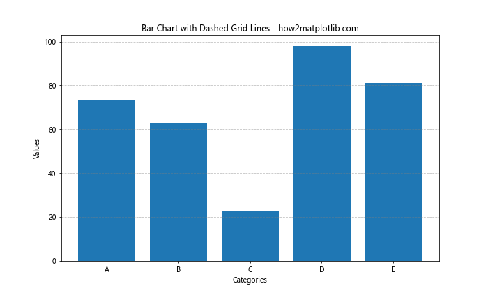
This example shows how to add dashed grid lines to a bar chart, with grid lines only on the y-axis.
Pie Charts with Dashed Grid Lines
import matplotlib.pyplot as plt

sizes = [30, 25, 20, 15, 10]
labels = ['A', 'B', 'C', 'D', 'E']

fig, ax = plt.subplots(figsize=(10, 6))
ax.pie(sizes, labels=labels, autopct='%1.1f%%', startangle=90)

# Add a circle at the center to create a donut chart
center_circle = plt.Circle((0,0), 0.70, fc='white')
ax.add_artist(center_circle)

# Add dashed grid lines
ax.grid(linestyle='--', color='gray', alpha=0.5)

ax.set_title('Pie Chart with Dashed Grid Lines - how2matplotlib.com')

plt.show()
Output:
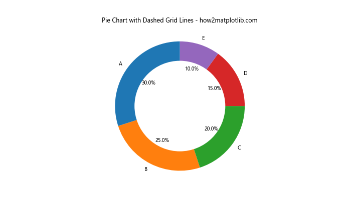
This example demonstrates how to add dashed grid lines to a pie chart, creating an interesting visual effect.
Matplotlib Grid Dashed Lines in 3D Plots
Dashed grid lines can also be applied to 3D plots in Matplotlib. Let’s explore some examples.
3D Surface Plot with Dashed Grid Lines
import matplotlib.pyplot as plt
import numpy as np
from mpl_toolkits.mplot3d import Axes3D

fig = plt.figure(figsize=(12, 8))
ax = fig.add_subplot(111, projection='3d')

x = np.arange(-5, 5, 0.25)
y = np.arange(-5, 5, 0.25)
X, Y = np.meshgrid(x, y)
Z = np.sin(np.sqrt(X**2 + Y**2))

surf = ax.plot_surface(X, Y, Z, cmap='viridis')

# Add dashed grid lines
ax.grid(linestyle='--', color='gray', alpha=0.5)

ax.set_title('3D Surface Plot with Dashed Grid Lines - how2matplotlib.com')
ax.set_xlabel('X-axis')
ax.set_ylabel('Y-axis')
ax.set_zlabel('Z-axis')

plt.show()
Output:
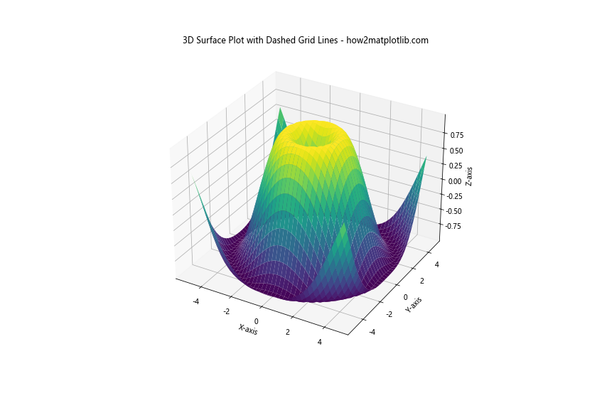
This example shows how to add dashed grid lines to a 3D surface plot.
3D Scatter Plot with Dashed Grid Lines
import matplotlib.pyplot as plt
import numpy as np
from mpl_toolkits.mplot3d import Axes3D

fig = plt.figure(figsize=(12, 8))
ax = fig.add_subplot(111, projection='3d')

n = 100
x = np.random.rand(n)
y = np.random.rand(n)
z = np.random.rand(n)

ax.scatter(x, y, z, c=z, cmap='viridis')

# Add dashed grid lines
ax.grid(linestyle='--', color='gray', alpha=0.5)

ax.set_title('3D Scatter Plot with Dashed Grid Lines - how2matplotlib.com')
ax.set_xlabel('X-axis')
ax.set_ylabel('Y-axis')
ax.set_zlabel('Z-axis')

plt.show()
Output:
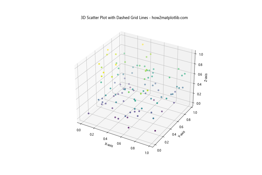
This example demonstrates how to add dashed grid lines to a 3D scatter plot.
Best Practices for Using Matplotlib Grid Dashed Lines
When working with Matplotlib grid dashed lines, it’s important to follow some best practices to ensure your plots are both visually appealing and informative.
- Choose appropriate line styles: Use dashed lines that are visible but not overpowering. Thin lines with a moderate dash length often work well.
Consider color and contrast: Choose grid line colors that provide enough contrast with your data but don’t distract from it. Light grays or muted colors are often good choices.
Use alpha for transparency: Applying some transparency to your grid lines can help them blend better with the plot while still providing reference points.
Adjust grid density: Use major and minor grid lines judiciously. Too many grid lines can clutter your plot, while too few may not provide enough reference points.
Customize for different plot types: Adapt your grid style to complement different types of plots. For example, bar charts might benefit from vertical grid lines only.
Maintain consistency: If you’re creating multiple plots for a report or presentation, try to maintain a consistent grid style across all of them.
Consider the data range: Adjust your grid spacing based on the range of your data to provide meaningful reference points.
Use axis-specific customization: Take advantage of Matplotlib’s ability to customize grid lines for individual axes when working with subplots or complex visualizations.
Troubleshooting Common Issues with Matplotlib Grid Dashed Lines
When working with Matplotlib grid dashed lines, you might encounter some common issues. Here are some problems and their solutions: