How to Use Matplotlib Grid Behind Bars: A Comprehensive Guide
Matplotlib grid behind bars is a powerful feature that can significantly enhance the readability and visual appeal of your bar charts. This article will explore various aspects of implementing and customizing grids behind bars in Matplotlib, providing you with the knowledge and tools to create professional-looking visualizations.
Understanding Matplotlib Grid Behind Bars
Matplotlib grid behind bars refers to the practice of adding gridlines to the background of a bar chart, positioned behind the bars themselves. This technique can help viewers more easily interpret the data represented by the bars, especially when dealing with precise values or comparisons between multiple categories.
To illustrate this concept, let’s start with a simple example:
import matplotlib.pyplot as plt
import numpy as np

categories = ['A', 'B', 'C', 'D']
values = [25, 40, 30, 55]

fig, ax = plt.subplots(figsize=(8, 6))
ax.bar(categories, values)
ax.grid(axis='y', linestyle='--', alpha=0.7, zorder=0)
ax.set_title('Matplotlib Grid Behind Bars - how2matplotlib.com')
plt.show()
Output:
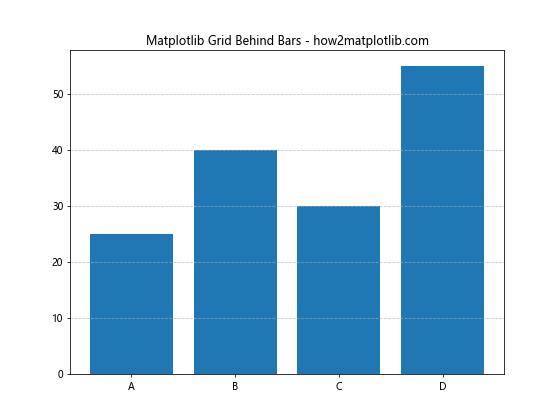
In this example, we create a basic bar chart and add a horizontal grid behind the bars. The zorder=0 parameter ensures that the grid appears behind the bars.
Benefits of Using Matplotlib Grid Behind Bars
Implementing a grid behind bars in your Matplotlib charts offers several advantages:
- Improved readability: Gridlines make it easier to estimate the values represented by each bar.
- Enhanced visual appeal: A well-designed grid can make your chart look more professional and polished.
- Better data interpretation: Grids can help viewers make more accurate comparisons between different categories or data points.
- Flexibility: Matplotlib offers numerous customization options for grids, allowing you to tailor them to your specific needs.
Customizing Matplotlib Grid Behind Bars
Matplotlib provides a wide range of options for customizing the appearance of grids behind bars. Let’s explore some of these options:
Adjusting Grid Line Style
You can modify the style of grid lines using the linestyle parameter:
import matplotlib.pyplot as plt
import numpy as np

categories = ['Product A', 'Product B', 'Product C', 'Product D']
values = [35, 50, 40, 65]

fig, ax = plt.subplots(figsize=(10, 6))
ax.bar(categories, values)
ax.grid(axis='y', linestyle=':', color='gray', alpha=0.5, zorder=0)
ax.set_title('Customized Grid Line Style - how2matplotlib.com')
plt.show()
Output:
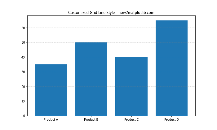
In this example, we use dotted lines (:) for the grid and set the color to gray with reduced opacity.
Changing Grid Line Color
You can easily change the color of the grid lines:
import matplotlib.pyplot as plt
import numpy as np

categories = ['Jan', 'Feb', 'Mar', 'Apr']
values = [100, 120, 90, 110]

fig, ax = plt.subplots(figsize=(8, 6))
ax.bar(categories, values)
ax.grid(axis='y', color='blue', alpha=0.3, zorder=0)
ax.set_title('Blue Grid Lines - how2matplotlib.com')
plt.show()
Output:
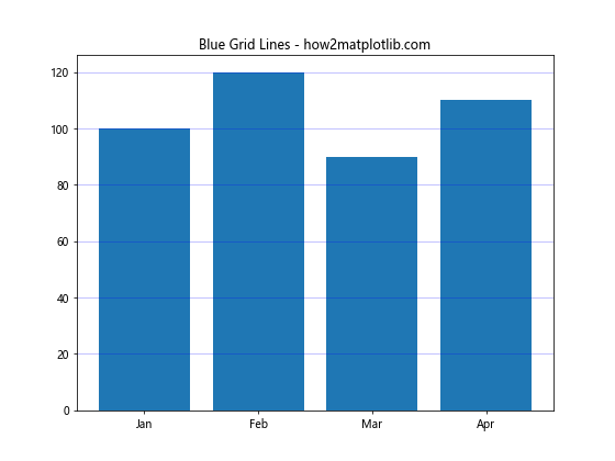
This code creates a bar chart with light blue grid lines behind the bars.
Adding Both Horizontal and Vertical Grid Lines
You can include both horizontal and vertical grid lines in your chart:
import matplotlib.pyplot as plt
import numpy as np

categories = ['Q1', 'Q2', 'Q3', 'Q4']
values = [200, 250, 220, 280]

fig, ax = plt.subplots(figsize=(10, 6))
ax.bar(categories, values)
ax.grid(True, linestyle='--', color='gray', alpha=0.5, zorder=0)
ax.set_title('Horizontal and Vertical Grid Lines - how2matplotlib.com')
plt.show()
Output:
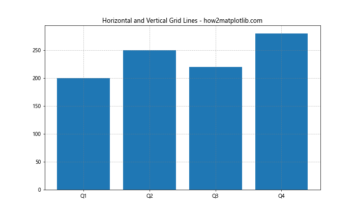
This example adds both horizontal and vertical grid lines to the chart.
Advanced Techniques for Matplotlib Grid Behind Bars
Now that we’ve covered the basics, let’s explore some more advanced techniques for working with Matplotlib grid behind bars.
Using Major and Minor Grid Lines
Matplotlib allows you to create both major and minor grid lines, which can be useful for more precise data interpretation:
import matplotlib.pyplot as plt
import numpy as np

categories = ['Category A', 'Category B', 'Category C', 'Category D']
values = [75, 90, 85, 95]

fig, ax = plt.subplots(figsize=(10, 6))
ax.bar(categories, values)
ax.grid(which='major', axis='y', linestyle='-', color='black', alpha=0.3, zorder=0)
ax.grid(which='minor', axis='y', linestyle=':', color='gray', alpha=0.2, zorder=0)
ax.minorticks_on()
ax.set_title('Major and Minor Grid Lines - how2matplotlib.com')
plt.show()
Output:
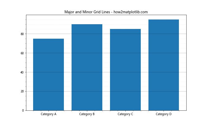
This code creates a bar chart with both major (solid) and minor (dotted) grid lines.
Customizing Grid for Different Axes
In some cases, you might want to apply different grid styles to the x and y axes:
import matplotlib.pyplot as plt
import numpy as np

categories = ['Group 1', 'Group 2', 'Group 3', 'Group 4']
values = [40, 60, 50, 70]

fig, ax = plt.subplots(figsize=(10, 6))
ax.bar(categories, values)
ax.grid(axis='y', linestyle='--', color='blue', alpha=0.3, zorder=0)
ax.grid(axis='x', linestyle=':', color='red', alpha=0.2, zorder=0)
ax.set_title('Different Grid Styles for X and Y Axes - how2matplotlib.com')
plt.show()
Output:
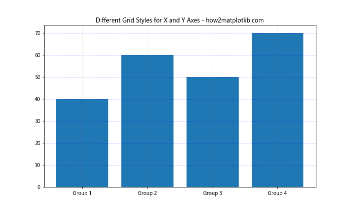
This example uses different styles and colors for the x and y axis grid lines.
Creating a Stacked Bar Chart with Grid
Matplotlib grid behind bars can also be applied to stacked bar charts:
import matplotlib.pyplot as plt
import numpy as np

categories = ['A', 'B', 'C', 'D']
values1 = [20, 35, 30, 35]
values2 = [25, 25, 20, 30]

fig, ax = plt.subplots(figsize=(10, 6))
ax.bar(categories, values1, label='Series 1')
ax.bar(categories, values2, bottom=values1, label='Series 2')
ax.grid(axis='y', linestyle='--', alpha=0.7, zorder=0)
ax.set_title('Stacked Bar Chart with Grid - how2matplotlib.com')
ax.legend()
plt.show()
Output:
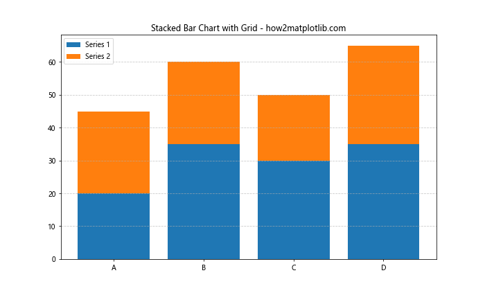
This code creates a stacked bar chart with a grid behind the bars.
Best Practices for Using Matplotlib Grid Behind Bars
To make the most of Matplotlib grid behind bars, consider the following best practices:
- Keep it subtle: Use light colors and appropriate opacity to ensure the grid doesn’t overpower the data.
- Match your style: Align the grid style with the overall design of your visualization.
- Use grids purposefully: Only include grid lines when they genuinely enhance data interpretation.
- Consider your data range: Adjust the grid interval to match the scale of your data.
- Test different options: Experiment with various grid styles to find what works best for your specific chart.
Let’s implement some of these best practices in an example:
import matplotlib.pyplot as plt
import numpy as np

categories = ['Product X', 'Product Y', 'Product Z']
values = [150, 230, 180]

fig, ax = plt.subplots(figsize=(10, 6))
ax.bar(categories, values, color='skyblue', edgecolor='navy')
ax.grid(axis='y', linestyle='--', color='gray', alpha=0.3, zorder=0)
ax.set_title('Sales by Product - how2matplotlib.com', fontsize=16)
ax.set_ylabel('Sales ($)', fontsize=12)
ax.tick_params(axis='both', which='major', labelsize=10)
plt.show()
Output:
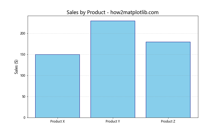
This example demonstrates a clean, professional-looking bar chart with a subtle grid that enhances readability without overwhelming the data.
Combining Matplotlib Grid Behind Bars with Other Chart Elements
Matplotlib grid behind bars can be effectively combined with other chart elements to create more informative visualizations. Let’s explore some combinations:
Adding Data Labels
You can add data labels to your bars while maintaining the grid in the background:
import matplotlib.pyplot as plt
import numpy as np

categories = ['A', 'B', 'C', 'D']
values = [45, 70, 60, 80]

fig, ax = plt.subplots(figsize=(10, 6))
bars = ax.bar(categories, values)
ax.grid(axis='y', linestyle='--', alpha=0.7, zorder=0)

for bar in bars:
    height = bar.get_height()
    ax.text(bar.get_x() + bar.get_width()/2., height,
            f'{height}',
            ha='center', va='bottom')

ax.set_title('Bar Chart with Data Labels and Grid - how2matplotlib.com')
plt.show()
Output:
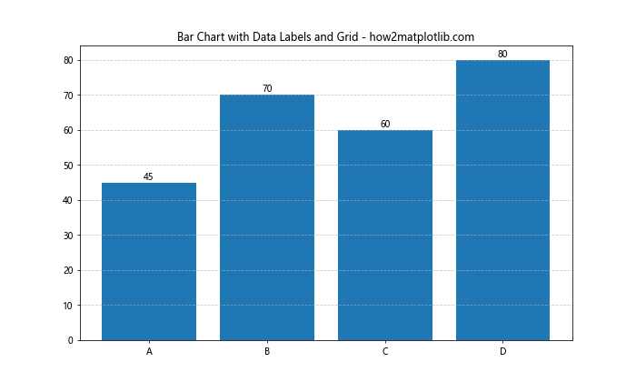
This code adds data labels above each bar while keeping the grid in the background.
Incorporating Error Bars
Error bars can be added to your chart along with the grid:
import matplotlib.pyplot as plt
import numpy as np

categories = ['Group A', 'Group B', 'Group C', 'Group D']
values = [30, 45, 40, 50]
errors = [3, 4, 2, 5]

fig, ax = plt.subplots(figsize=(10, 6))
ax.bar(categories, values, yerr=errors, capsize=5)
ax.grid(axis='y', linestyle='--', alpha=0.7, zorder=0)
ax.set_title('Bar Chart with Error Bars and Grid - how2matplotlib.com')
plt.show()
Output:
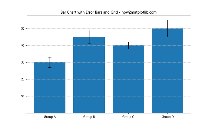
This example includes error bars for each data point, with the grid still visible behind the bars.
Handling Multiple Datasets with Matplotlib Grid Behind Bars
When working with multiple datasets, Matplotlib grid behind bars can help maintain clarity and readability. Let’s look at some examples:
Grouped Bar Chart
import matplotlib.pyplot as plt
import numpy as np

categories = ['A', 'B', 'C', 'D']
values1 = [20, 35, 30, 35]
values2 = [25, 32, 34, 20]

x = np.arange(len(categories))
width = 0.35

fig, ax = plt.subplots(figsize=(12, 6))
rects1 = ax.bar(x - width/2, values1, width, label='Group 1')
rects2 = ax.bar(x + width/2, values2, width, label='Group 2')

ax.set_ylabel('Values')
ax.set_title('Grouped Bar Chart with Grid - how2matplotlib.com')
ax.set_xticks(x)
ax.set_xticklabels(categories)
ax.legend()

ax.grid(axis='y', linestyle='--', alpha=0.7, zorder=0)

plt.show()
Output:
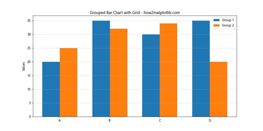
This code creates a grouped bar chart with two datasets, using a grid to help compare values across groups.
Multi-Series Bar Chart with Shared Y-axis
import matplotlib.pyplot as plt
import numpy as np

categories = ['Category 1', 'Category 2', 'Category 3']
series1 = [10, 15, 12]
series2 = [8, 11, 13]
series3 = [12, 9, 14]

x = np.arange(len(categories))
width = 0.25

fig, ax = plt.subplots(figsize=(12, 6))
rects1 = ax.bar(x - width, series1, width, label='Series 1')
rects2 = ax.bar(x, series2, width, label='Series 2')
rects3 = ax.bar(x + width, series3, width, label='Series 3')

ax.set_ylabel('Values')
ax.set_title('Multi-Series Bar Chart with Shared Y-axis and Grid - how2matplotlib.com')
ax.set_xticks(x)
ax.set_xticklabels(categories)
ax.legend()

ax.grid(axis='y', linestyle='--', alpha=0.7, zorder=0)

plt.show()
Output:
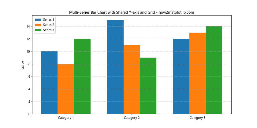
This example shows a multi-series bar chart with three datasets sharing the same y-axis, using a grid to facilitate comparisons.
Adapting Matplotlib Grid Behind Bars for Different Chart Types
While we’ve primarily focused on vertical bar charts, Matplotlib grid behind bars can be adapted for various chart types. Let’s explore some alternatives:
Horizontal Bar Chart
import matplotlib.pyplot as plt
import numpy as np

categories = ['Category A', 'Category B', 'Category C', 'Category D', 'Category E']
values = [45, 60, 55, 70, 50]

fig, ax = plt.subplots(figsize=(10, 6))
ax.barh(categories, values)
ax.grid(axis='x', linestyle='--', alpha=0.7, zorder=0)
ax.set_title('Horizontal Bar Chart with Grid - how2matplotlib.com')
plt.show()
Output:
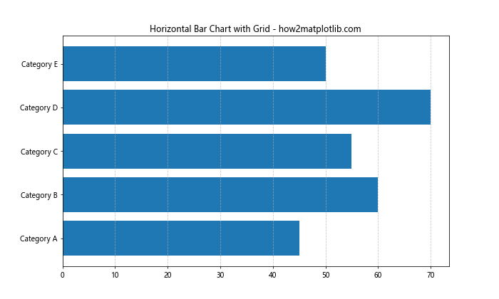
This code creates a horizontal bar chart with a vertical grid behind the bars.
Mixed Chart Types
You can combine different chart types while using a grid:
import matplotlib.pyplot as plt
import numpy as np

categories = ['Jan', 'Feb', 'Mar', 'Apr', 'May']
bar_values = [20, 25, 30, 28, 35]
line_values = [22, 27, 29, 32, 33]

fig, ax = plt.subplots(figsize=(12, 6))
ax.bar(categories, bar_values, alpha=0.7, label='Bar Data')
ax.plot(categories, line_values, color='red', marker='o', label='Line Data')
ax.grid(True, linestyle='--', alpha=0.7, zorder=0)
ax.set_title('Mixed Chart Types with Grid - how2matplotlib.com')
ax.legend()
plt.show()
Output:
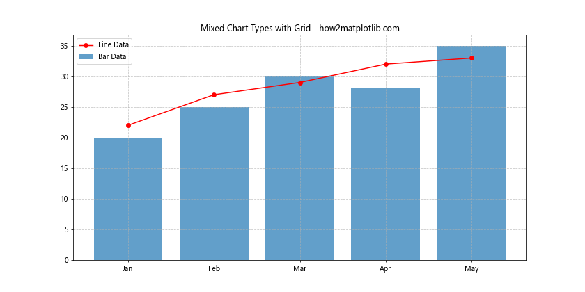
This example combines a bar chart with a line plot, using a grid to enhance readability for both data series.
Troubleshooting Common Issues with Matplotlib Grid Behind Bars
When working with Matplotlib grid behind bars, you might encounter some common issues. Here are some problems and their solutions:
Grid Appearing in Front of Bars
If your grid is appearing in front of the bars instead of behind them, make sure to set the zorder parameter correctly:
import matplotlib.pyplot as plt
import numpy as np

categories = ['A', 'B', 'C', 'D']
values = [30, 45, 40, 50]

fig, ax = plt.subplots(figsize=(10, 6))
ax.bar(categories, values, zorder=2)
ax.grid(axis='y', linestyle='--', alpha=0.7, zorder=1)
ax.set_title('Grid Behind Bars - Correct zorder - how2matplotlib.com')
plt.show()
Output:
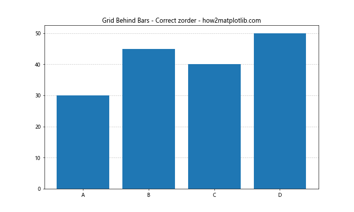
In this example, we set the zorder of the grid to 1 and the bars to 2, ensuring the grid appears behind the bars.
Grid Lines Not Aligning with Tick Marks
If your grid lines don’t align with the tick marks, you may need to adjust the tick locator:
import matplotlib.pyplot as plt
import numpy as np

categories = ['Category 1', 'Category 2', 'Category 3', 'Category 4']
values = [25, 40, 35, 50]

fig, ax = plt.subplots(figsize=(10, 6))
ax.bar(categories, values)
ax.grid(axis='y', linestyle='--', alpha=0.7, zorder=0)
ax.yaxis.set_major_locator(plt.MultipleLocator(10))
ax.set_title('Grid Aligned with Tick Marks - how2matplotlib.com')
plt.show()
Output:
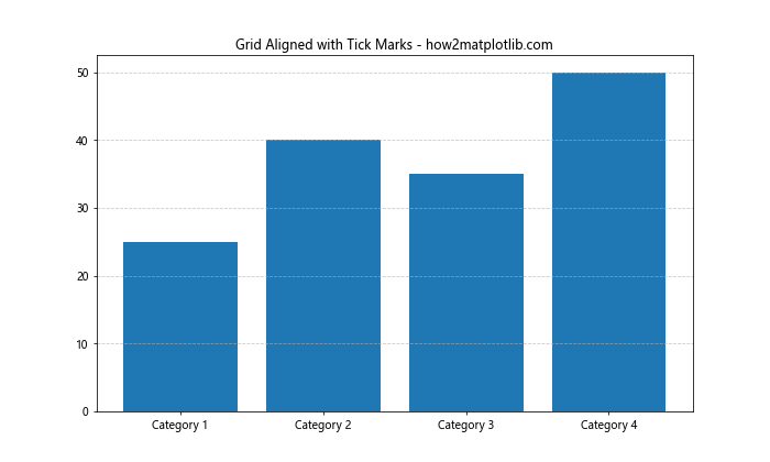
This code uses MultipleLocator to ensure that the grid lines align with the tick marks on the y-axis.
Advanced Customization of Matplotlib Grid Behind Bars
For those looking to push the boundaries of what’s possible with Matplotlib grid behind bars, here are some advanced customization techniques:
Custom Grid Patterns
You can create custom grid patterns using a combination of major and minor grid lines:
import matplotlib.pyplot as plt
import numpy as np

categories = ['A', 'B', 'C', 'D', 'E']
values = [45, 60, 55, 70, 50]

fig, ax = plt.subplots(figsize=(12, 6))
ax.bar(categories, values)

ax.grid(which='major', axis='y', linestyle='-', color='black', alpha=0.3, zorder=0)
ax.grid(which='minor', axis='y', linestyle=':', color='gray', alpha=0.2, zorder=0)
ax.set_yticks(np.arange(0, max(values)+10, 20))
ax.set_yticks(np.arange(0, max(values)+10, 5), minor=True)

ax.set_title('Custom Grid Pattern - how2matplotlib.com')
plt.show()
Output:
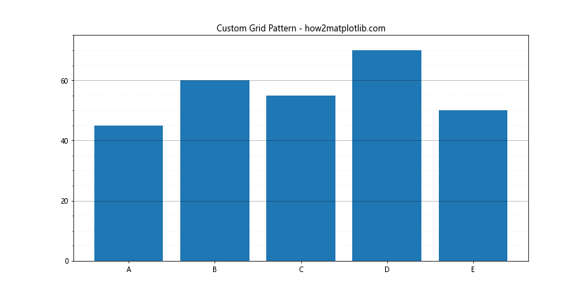
This example creates a custom grid pattern with major lines every 20 units and minor lines every 5 units.
Gradient Background with Grid
You can combine a gradient background with a grid for a unique visual effect:
import matplotlib.pyplot as plt
import numpy as np
from matplotlib.colors import LinearSegmentedColormap

categories = ['Category A', 'Category B', 'Category C', 'Category D']
values = [35, 50, 45, 60]

fig, ax = plt.subplots(figsize=(12, 6))

# Create gradient background
cmap = LinearSegmentedColormap.from_list("", ["lightblue", "white"])
ax.imshow([[0,1], [0,1]], cmap=cmap, interpolation='bicubic', extent=[ax.get_xlim()[0], ax.get_xlim()[1], ax.get_ylim()[0], ax.get_ylim()[1]], aspect='auto', zorder=0)

ax.bar(categories, values, zorder=2)
ax.grid(axis='y', linestyle='--', color='gray', alpha=0.5, zorder=1)
ax.set_title('Gradient Background with Grid - how2matplotlib.com')
plt.show()
Output:
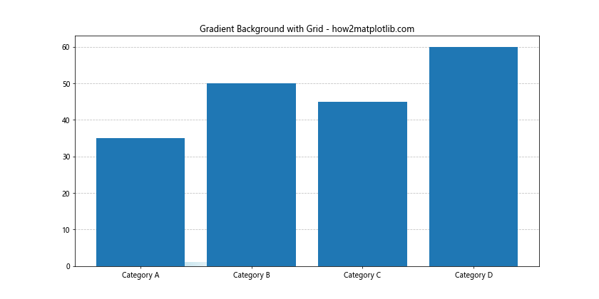
This code creates a gradient background from light blue to white, with the grid and bars overlaid on top.
Matplotlib Grid Behind Bars in Real-World Applications
Let’s explore how Matplotlib grid behind bars can be applied in real-world scenarios:
Financial Data Visualization
import matplotlib.pyplot as plt
import numpy as np

months = ['Jan', 'Feb', 'Mar', 'Apr', 'May', 'Jun']
revenue = [100000, 120000, 115000, 130000, 140000, 135000]
expenses = [80000, 90000, 85000, 95000, 100000, 105000]

fig, ax = plt.subplots(figsize=(12, 6))
x = np.arange(len(months))
width = 0.35

ax.bar(x - width/2, revenue, width, label='Revenue', color='green', alpha=0.7)
ax.bar(x + width/2, expenses, width, label='Expenses', color='red', alpha=0.7)

ax.set_ylabel('Amount ($)')
ax.set_title('Monthly Revenue vs Expenses - how2matplotlib.com')
ax.set_xticks(x)
ax.set_xticklabels(months)
ax.legend()

ax.grid(axis='y', linestyle='--', alpha=0.7, zorder=0)
ax.yaxis.set_major_formatter(plt.FuncFormatter(lambda x, p: format(int(x), ',')))

plt.show()
Output:
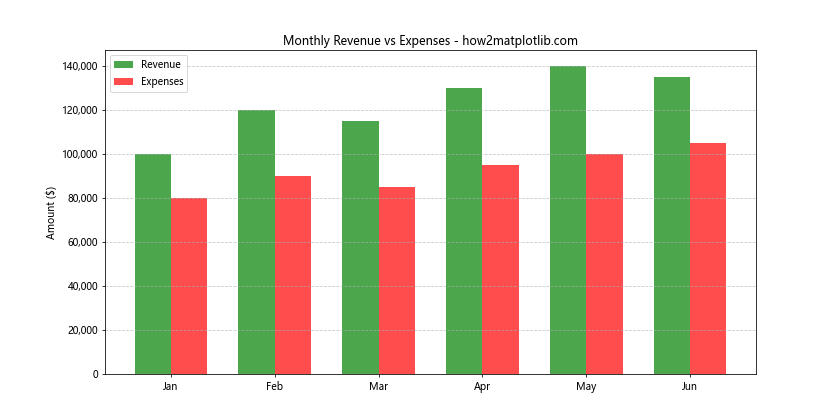
This example visualizes monthly revenue and expenses, using a grid to help compare values across months and between the two categories.
Scientific Data Representation
import matplotlib.pyplot as plt
import numpy as np

experiments = ['Exp 1', 'Exp 2', 'Exp 3', 'Exp 4']
results = [0.75, 0.82, 0.79, 0.88]
errors = [0.05, 0.03, 0.04, 0.02]

fig, ax = plt.subplots(figsize=(10, 6))
ax.bar(experiments, results, yerr=errors, capsize=5, alpha=0.7)
ax.grid(axis='y', linestyle='--', alpha=0.7, zorder=0)

ax.set_ylim(0, 1)
ax.set_ylabel('Success Rate')
ax.set_title('Experiment Results with Error Bars - how2matplotlib.com')

plt.show()
Output:
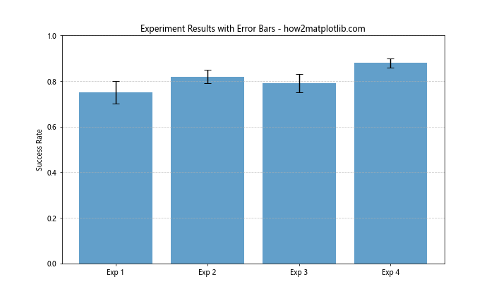
This code visualizes scientific experiment results with error bars, using a grid to facilitate precise reading of success rates.
Matplotlib grid behind bars Conclusion
Matplotlib grid behind bars is a powerful tool for enhancing the readability and visual appeal of your bar charts. By mastering the techniques and best practices outlined in this article, you can create professional-looking visualizations that effectively communicate your data.
Remember to experiment with different grid styles, colors, and combinations to find what works best for your specific data and audience. Whether you’re working on financial reports, scientific papers, or general data analysis, the ability to skillfully implement Matplotlib grid behind bars will set your visualizations apart.