Mastering Matplotlib.figure.Figure.align_labels() in Python
Matplotlib.figure.Figure.align_labels() in Python is a powerful method that allows you to align labels across multiple subplots within a figure. This function is particularly useful when working with complex visualizations that involve multiple subplots, each with its own labels. By using Matplotlib.figure.Figure.align_labels(), you can ensure that your labels are neatly aligned, creating a more professional and visually appealing presentation of your data.
In this comprehensive guide, we’ll explore the ins and outs of Matplotlib.figure.Figure.align_labels() in Python, providing you with detailed explanations, practical examples, and best practices for using this function effectively in your data visualization projects.
Understanding Matplotlib.figure.Figure.align_labels() in Python
Matplotlib.figure.Figure.align_labels() is a method that belongs to the Figure class in Matplotlib. Its primary purpose is to align the x-labels and y-labels of all subplots within a figure. This alignment is particularly useful when you have multiple subplots with varying label lengths or when you want to ensure a consistent appearance across all subplots.
The basic syntax for using Matplotlib.figure.Figure.align_labels() in Python is as follows:
import matplotlib.pyplot as plt

fig = plt.figure()
# Create subplots and add content
fig.align_labels()
plt.show()
Let’s break down this syntax and explore how Matplotlib.figure.Figure.align_labels() works in more detail.
Creating a Figure with Multiple Subplots
Before we can use Matplotlib.figure.Figure.align_labels() in Python, we need to create a figure with multiple subplots. Here’s an example of how to do this:
import matplotlib.pyplot as plt
import numpy as np

fig, (ax1, ax2) = plt.subplots(2, 1, figsize=(8, 6))

x = np.linspace(0, 10, 100)
y1 = np.sin(x)
y2 = np.cos(x)

ax1.plot(x, y1, label='Sine Wave')
ax1.set_title('Sine Wave - how2matplotlib.com')
ax1.set_xlabel('X-axis')
ax1.set_ylabel('Amplitude')
ax1.legend()

ax2.plot(x, y2, label='Cosine Wave')
ax2.set_title('Cosine Wave - how2matplotlib.com')
ax2.set_xlabel('X-axis')
ax2.set_ylabel('Amplitude')
ax2.legend()

plt.tight_layout()
plt.show()
Output:

In this example, we’ve created a figure with two subplots, one showing a sine wave and the other showing a cosine wave. Each subplot has its own title, x-label, y-label, and legend.
Applying Matplotlib.figure.Figure.align_labels() in Python
Now that we have our figure with multiple subplots, let’s apply Matplotlib.figure.Figure.align_labels() to align the labels:
import matplotlib.pyplot as plt
import numpy as np

fig, (ax1, ax2) = plt.subplots(2, 1, figsize=(8, 6))

x = np.linspace(0, 10, 100)
y1 = np.sin(x)
y2 = np.cos(x)

ax1.plot(x, y1, label='Sine Wave')
ax1.set_title('Sine Wave - how2matplotlib.com')
ax1.set_xlabel('X-axis')
ax1.set_ylabel('Amplitude')
ax1.legend()

ax2.plot(x, y2, label='Cosine Wave')
ax2.set_title('Cosine Wave - how2matplotlib.com')
ax2.set_xlabel('X-axis')
ax2.set_ylabel('Amplitude')
ax2.legend()

plt.tight_layout()
fig.align_labels()
plt.show()
Output:
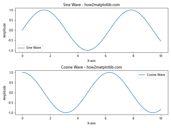
In this example, we’ve added the fig.align_labels() call just before plt.show(). This ensures that all labels are aligned across the subplots.
Advanced Techniques with Matplotlib.figure.Figure.align_labels() in Python
Now that we’ve covered the basics, let’s explore some advanced techniques for using Matplotlib.figure.Figure.align_labels() in Python.
Aligning Labels in Grid Layouts
Matplotlib.figure.Figure.align_labels() works well with grid layouts. Here’s an example:
import matplotlib.pyplot as plt
import numpy as np

fig = plt.figure(figsize=(12, 8))
gs = fig.add_gridspec(2, 2)

ax1 = fig.add_subplot(gs[0, 0])
ax2 = fig.add_subplot(gs[0, 1])
ax3 = fig.add_subplot(gs[1, :])

x = np.linspace(0, 10, 100)
y1 = np.sin(x)
y2 = np.cos(x)
y3 = np.tan(x)

ax1.plot(x, y1)
ax1.set_title('Sine Wave - how2matplotlib.com')
ax1.set_xlabel('X-axis')
ax1.set_ylabel('Amplitude')

ax2.plot(x, y2)
ax2.set_title('Cosine Wave - how2matplotlib.com')
ax2.set_xlabel('X-axis')
ax2.set_ylabel('Amplitude')

ax3.plot(x, y3)
ax3.set_title('Tangent Wave - how2matplotlib.com')
ax3.set_xlabel('X-axis')
ax3.set_ylabel('Amplitude')

plt.tight_layout()
fig.align_labels()
plt.show()
Output:
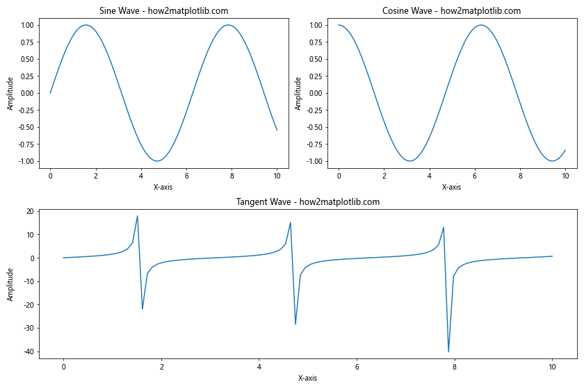
In this example, we’ve created a grid layout with three subplots of different sizes. Matplotlib.figure.Figure.align_labels() aligns the labels across all subplots, regardless of their size or position.
Aligning Labels with Shared Axes
When working with shared axes, Matplotlib.figure.Figure.align_labels() in Python can still be useful. Here’s an example:
import matplotlib.pyplot as plt
import numpy as np

fig, (ax1, ax2) = plt.subplots(2, 1, figsize=(8, 6), sharex=True)

x = np.linspace(0, 10, 100)
y1 = np.sin(x)
y2 = np.cos(x)

ax1.plot(x, y1)
ax1.set_title('Sine Wave - how2matplotlib.com')
ax1.set_ylabel('Amplitude')

ax2.plot(x, y2)
ax2.set_title('Cosine Wave - how2matplotlib.com')
ax2.set_xlabel('X-axis')
ax2.set_ylabel('Amplitude')

plt.tight_layout()
fig.align_labels()
plt.show()
Output:
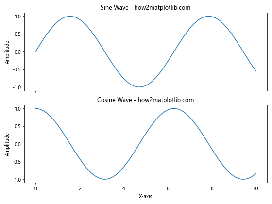
In this example, we’ve used sharex=True to create subplots with a shared x-axis. Matplotlib.figure.Figure.align_labels() ensures that the y-labels are aligned, even though only the bottom subplot has an x-label.
Best Practices for Using Matplotlib.figure.Figure.align_labels() in Python
To get the most out of Matplotlib.figure.Figure.align_labels() in Python, consider the following best practices:
- Always call
plt.tight_layout()beforefig.align_labels()to ensure proper spacing between subplots. - Use consistent label sizes and fonts across subplots for the best alignment results.
- When working with complex layouts, consider aligning labels for specific axes (e.g.,
axis='x'oraxis='y') rather than all axes at once. - Experiment with different figure sizes to find the optimal layout for your aligned labels.
Common Pitfalls and How to Avoid Them
When using Matplotlib.figure.Figure.align_labels() in Python, be aware of these common pitfalls:
- Forgetting to call
plt.tight_layout()beforefig.align_labels(), which can result in overlapping labels. - Applying
fig.align_labels()to figures with only one subplot, which has no effect. - Using inconsistent label sizes or fonts across subplots, which can lead to suboptimal alignment.
To avoid these pitfalls, always follow the best practices mentioned earlier and double-check your code for consistency.
Matplotlib.figure.Figure.align_labels() in Python: Real-World Applications
Now that we’ve covered the technical aspects of Matplotlib.figure.Figure.align_labels() in Python, let’s explore some real-world applications where this function can be particularly useful.
Comparing Multiple Time Series
When comparing multiple time series, aligned labels can greatly improve the readability of your plots. Here’s an example:
import matplotlib.pyplot as plt
import numpy as np
import pandas as pd

# Generate sample data
dates = pd.date_range(start='2023-01-01', end='2023-12-31', freq='D')
data1 = np.cumsum(np.random.randn(len(dates))) + 100
data2 = np.cumsum(np.random.randn(len(dates))) + 200
data3 = np.cumsum(np.random.randn(len(dates))) + 300

fig, (ax1, ax2, ax3) = plt.subplots(3, 1, figsize=(10, 12))

ax1.plot(dates, data1)
ax1.set_title('Stock A - how2matplotlib.com')
ax1.set_ylabel('Price')

ax2.plot(dates, data2)
ax2.set_title('Stock B - how2matplotlib.com')
ax2.set_ylabel('Price')

ax3.plot(dates, data3)
ax3.set_title('Stock C - how2matplotlib.com')
ax3.set_xlabel('Date')
ax3.set_ylabel('Price')

plt.tight_layout()
fig.align_labels()
plt.show()
Output:
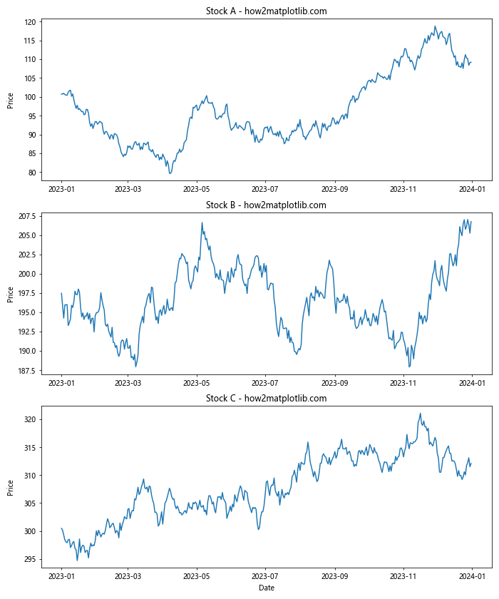
In this example, we’ve created three subplots showing the price trends of different stocks. Matplotlib.figure.Figure.align_labels() ensures that the y-axis labels (“Price”) are perfectly aligned, making it easier to compare the scales across the different plots.
Visualizing Scientific Data
Matplotlib.figure.Figure.align_labels() in Python is particularly useful when visualizing scientific data with multiple related plots. Here’s an example:
import matplotlib.pyplot as plt
import numpy as np

fig, ((ax1, ax2), (ax3, ax4)) = plt.subplots(2, 2, figsize=(12, 10))

x = np.linspace(0, 10, 100)
y1 = np.sin(x)
y2 = np.cos(x)
y3 = np.tan(x)
y4 = np.exp(-x/10) * np.sin(x)

ax1.plot(x, y1)
ax1.set_title('Sine Wave - how2matplotlib.com')
ax1.set_xlabel('Time (s)')
ax1.set_ylabel('Amplitude')

ax2.plot(x, y2)
ax2.set_title('Cosine Wave - how2matplotlib.com')
ax2.set_xlabel('Time (s)')
ax2.set_ylabel('Amplitude')

ax3.plot(x, y3)
ax3.set_title('Tangent Wave - how2matplotlib.com')
ax3.set_xlabel('Time (s)')
ax3.set_ylabel('Amplitude')

ax4.plot(x, y4)
ax4.set_title('Damped Sine Wave - how2matplotlib.com')
ax4.set_xlabel('Time (s)')
ax4.set_ylabel('Amplitude')

plt.tight_layout()
fig.align_labels()
plt.show()
Output:
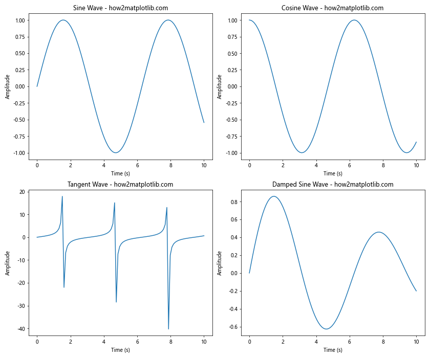
In this example, we’ve created four subplots showing different waveforms. Matplotlib.figure.Figure.align_labels() ensures that all x-labels and y-labels are perfectly aligned, creating a professional-looking figure suitable for scientific publications.
Advanced Customization with Matplotlib.figure.Figure.align_labels() in Python
While Matplotlib.figure.Figure.align_labels() in Python is powerful on its own, you can combine it with other Matplotlib features for even more advanced customization.
Combining with Colorbar Alignment
When working with plots that include colorbars, you can use Matplotlib.figure.Figure.align_labels() in conjunction with colorbar alignment. Here’s an example:
import matplotlib.pyplot as plt
import numpy as np

fig, (ax1, ax2) = plt.subplots(2, 1, figsize=(8, 10))

x = np.linspace(0, 10, 100)
y = np.linspace(0, 10, 100)
X, Y = np.meshgrid(x, y)
Z1 = np.sin(X) * np.cos(Y)
Z2 = np.cos(X) * np.sin(Y)

im1 = ax1.imshow(Z1, extent=[0, 10, 0, 10], origin='lower', aspect='auto')
ax1.set_title('Sin(X) * Cos(Y) - how2matplotlib.com')
ax1.set_xlabel('X-axis')
ax1.set_ylabel('Y-axis')
cbar1 = fig.colorbar(im1, ax=ax1)
cbar1.set_label('Intensity')

im2 = ax2.imshow(Z2, extent=[0, 10, 0, 10], origin='lower', aspect='auto')
ax2.set_title('Cos(X) * Sin(Y) - how2matplotlib.com')
ax2.set_xlabel('X-axis')
ax2.set_ylabel('Y-axis')
cbar2 = fig.colorbar(im2, ax=ax2)
cbar2.set_label('Intensity')

plt.tight_layout()
fig.align_labels()
fig.align_xlabels()
fig.align_ylabels()
plt.show()
Output:
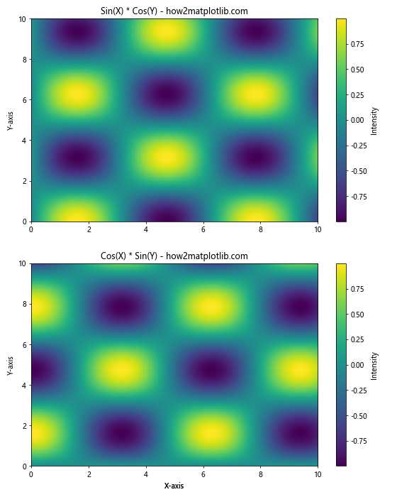
In this example, we’ve created two subplots with colorbars. We’ve used Matplotlib.figure.Figure.align_labels() to align the main labels, and then used fig.align_xlabels() and fig.align_ylabels() to ensure that the colorbar labels are also aligned.
Aligning Labels with Different Subplot Sizes
Matplotlib.figure.Figure.align_labels() in Python can handle subplots of different sizes. Here’s an example:
import matplotlib.pyplot as plt
import numpy as np

fig = plt.figure(figsize=(12, 8))
gs = fig.add_gridspec(2, 3)

ax1 = fig.add_subplot(gs[0, :2])
ax2 = fig.add_subplot(gs[0, 2])
ax3 = fig.add_subplot(gs[1, :])

x = np.linspace(0, 10, 100)
y1 = np.sin(x)
y2 = np.cos(x)
y3 = np.tan(x)

ax1.plot(x, y1)
ax1.set_title('Sine Wave - how2matplotlib.com')
ax1.set_xlabel('X-axis')
ax1.set_ylabel('Amplitude')

ax2.plot(x, y2)
ax2.set_title('Cosine Wave - how2matplotlib.com')
ax2.set_xlabel('X-axis')
ax2.set_ylabel('Amplitude')

ax3.plot(x, y3)
ax3.set_title('Tangent Wave - how2matplotlib.com')
ax3.set_xlabel('X-axis')
ax3.set_ylabel('Amplitude')

plt.tight_layout()
fig.align_labels()
plt.show()
Output:
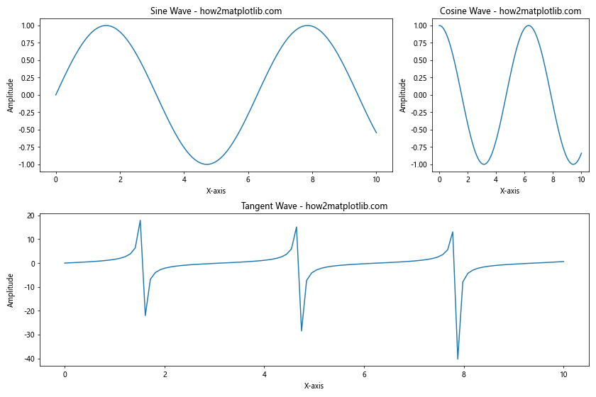
In this example, we’ve created three subplots of different sizes using GridSpec. Matplotlib.figure.Figure.align_labels() ensures that all labels are aligned, regardless of the subplot sizes.
Troubleshooting Matplotlib.figure.Figure.align_labels() in Python
While Matplotlib.figure.Figure.align_labels() is generally straightforward to use, you may encounter some issues. Here are some common problems and their solutions:
Labels Not Aligning Properly
If your labels are not aligning properly, try the following:
- Ensure you’re calling
plt.tight_layout()beforefig.align_labels(). - Check that your figure size is appropriate for the number and arrangement of subplots.
- Make sure all labels have consistent font sizes and styles.
Here’s an example of how to address these issues:
import matplotlib.pyplot as plt
import numpy as np

fig, (ax1, ax2) = plt.subplots(2, 1, figsize=(8, 8))

x = np.linspace(0, 10, 100)
y1 = np.sin(x)
y2 = np.cos(x)

ax1.plot(x, y1)
ax1.set_title('Sine Wave - how2matplotlib.com', fontsize=12)
ax1.set_xlabel('X-axis', fontsize=10)
ax1.set_ylabel('Amplitude', fontsize=10)

ax2.plot(x, y2)
ax2.set_title('Cosine Wave - how2matplotlib.com', fontsize=12)
ax2.set_xlabel('X-axis', fontsize=10)
ax2.set_ylabel('Amplitude', fontsize=10)

plt.tight_layout()
fig.align_labels()
plt.show()
Output:
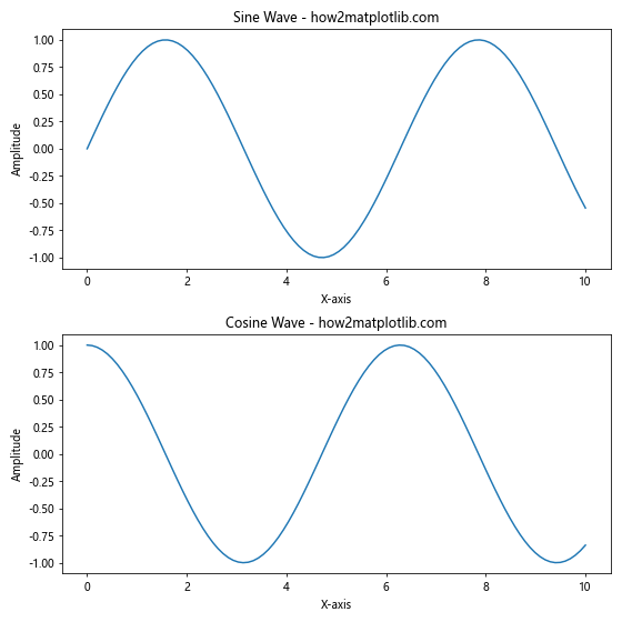
In this example, we’ve ensured consistent font sizes and called plt.tight_layout() before fig.align_labels().
Overlapping Labels
If you’re experiencing overlapping labels, try adjusting the figure size or reducing the number of subplots. Here’s an example:
import matplotlib.pyplot as plt
import numpy as np

fig, (ax1, ax2, ax3) = plt.subplots(3, 1, figsize=(8, 12))

x = np.linspace(0, 10, 100)
y1 = np.sin(x)
y2 = np.cos(x)
y3 = np.tan(x)

ax1.plot(x, y1)
ax1.set_title('Sine Wave - how2matplotlib.com')
ax1.set_xlabel('X-axis')
ax1.set_ylabel('Amplitude')

ax2.plot(x, y2)
ax2.set_title('Cosine Wave - how2matplotlib.com')
ax2.set_xlabel('X-axis')
ax2.set_ylabel('Amplitude')

ax3.plot(x, y3)
ax3.set_title('Tangent Wave - how2matplotlib.com')
ax3.set_xlabel('X-axis')
ax3.set_ylabel('Amplitude')

plt.tight_layout(h_pad=2)  # Increase vertical spacing between subplots
fig.align_labels()
plt.show()
Output:
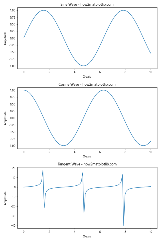
In this example, we’ve increased the figure height and added extra padding between subplots to prevent overlapping labels.
Conclusion: Mastering Matplotlib.figure.Figure.align_labels() in Python
Matplotlib.figure.Figure.align_labels() in Python is a powerful tool for creating professional-looking visualizations with multiple subplots. By aligning labels across your plots, you can improve the readability and aesthetic appeal of your figures.
Throughout this comprehensive guide, we’ve explored the basics of using Matplotlib.figure.Figure.align_labels(), advanced techniques for customization, real-world applications, and troubleshooting tips. By mastering this function, you’ll be able to create more polished and visually appealing data visualizations in your Python projects.
Remember to always consider the overall layout of your figure, use consistent styling across subplots, and experiment with different configurations to achieve the best results. With practice and attention to detail, you’ll be able to leverage Matplotlib.figure.Figure.align_labels() to create stunning visualizations that effectively communicate your data insights.