Matplotlib Cheat Sheet
Matplotlib is a powerful visualization library in Python that allows you to create a wide range of plots and charts. In this cheat sheet, we will explore some of the most commonly used functions and techniques in Matplotlib.
Getting Started
To begin using Matplotlib, you first need to import the matplotlib.pyplot module. This module provides a simple interface for creating and customizing plots.
import matplotlib.pyplot as plt
Line Plot
One of the simplest types of plots you can create with Matplotlib is a line plot. Here’s an example of how to create a simple line plot using the plot function:
import matplotlib.pyplot as plt

# Create some data
x = [1, 2, 3, 4, 5]
y = [2, 3, 5, 7, 11]

# Plot the data
plt.plot(x, y)

# Add labels and title
plt.xlabel('X-axis')
plt.ylabel('Y-axis')
plt.title('Simple Line Plot')

# Display the plot
plt.show()
Output:

Scatter Plot
Scatter plots are useful for visualizing the relationship between two variables. Here’s an example of how to create a scatter plot using the scatter function:
import matplotlib.pyplot as plt

# Create some data
x = [1, 2, 3, 4, 5]
y = [2, 3, 5, 7, 11]

# Plot the data
plt.scatter(x, y)

# Add labels and title
plt.xlabel('X-axis')
plt.ylabel('Y-axis')
plt.title('Simple Scatter Plot')

# Display the plot
plt.show()
Output:

Bar Plot
Bar plots are great for comparing categorical data. Here’s an example of how to create a bar plot using the bar function:
import matplotlib.pyplot as plt

# Create some data
labels = ['A', 'B', 'C', 'D', 'E']
values = [10, 20, 15, 25, 30]

# Plot the data
plt.bar(labels, values)

# Add labels and title
plt.xlabel('Category')
plt.ylabel('Value')
plt.title('Simple Bar Plot')

# Display the plot
plt.show()
Output:

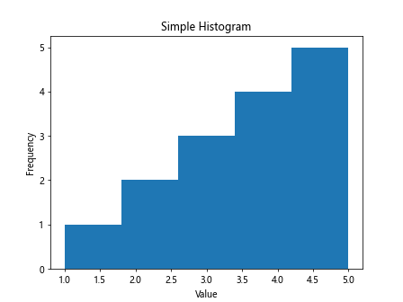
Histogram
Histograms are useful for visualizing the distribution of a single variable. Here’s an example of how to create a histogram using the hist function:
import matplotlib.pyplot as plt

# Create some data
data = [1, 2, 2, 3, 3, 3, 4, 4, 4, 4, 5, 5, 5, 5, 5]

# Plot the data
plt.hist(data, bins=5)

# Add labels and title
plt.xlabel('Value')
plt.ylabel('Frequency')
plt.title('Simple Histogram')

# Display the plot
plt.show()
Output:
Subplots
You can create multiple plots in the same figure using subplots. Here’s an example of how to create subplots using the subplot function:
import matplotlib.pyplot as plt

# Create some data
x = [1, 2, 3, 4, 5]
y1 = [2, 3, 5, 7, 11]
y2 = [1, 4, 9, 16, 25]

# Create subplots
plt.subplot(1, 2, 1)
plt.plot(x, y1)
plt.title('Plot 1')

plt.subplot(1, 2, 2)
plt.plot(x, y2)
plt.title('Plot 2')

# Display the plots
plt.show()
Output:

Customizing Plots
Matplotlib allows you to customize your plots in many ways. Here are some examples of how to customize your plots:
Changing Colors
You can specify the color of the plot using the color parameter:
import matplotlib.pyplot as plt

x = [1, 2, 3, 4, 5]
y = [2, 3, 5, 7, 11]

plt.plot(x, y, color='red') # Change the color to red
plt.show()
Output:

Adding Gridlines
You can add gridlines to your plot using the grid function:
import matplotlib.pyplot as plt

x = [1, 2, 3, 4, 5]
y = [2, 3, 5, 7, 11]

plt.plot(x, y)
plt.grid(True) # Add gridlines
plt.show()
Output:

Adding Legends
You can add a legend to your plot using the legend function:
import matplotlib.pyplot as plt

x = [1, 2, 3, 4, 5]
y = [2, 3, 5, 7, 11]

plt.plot(x, y, label='Line 1')
plt.legend()
plt.show()
Output:

Changing Line Styles
You can change the style of the line in your plot using the linestyle parameter:
import matplotlib.pyplot as plt

x = [1, 2, 3, 4, 5]
y = [2, 3, 5, 7, 11]

plt.plot(x, y, linestyle='--') # Change the line style to dashed
plt.show()
Output:

Saving Plots
You can save your plots as image files using the savefig function. Here’s an example of how to save a plot as a PNG file:
import matplotlib.pyplot as plt

x = [1, 2, 3, 4, 5]
y = [2, 3, 5, 7, 11]

plt.plot(x, y)
plt.savefig('plot.png')
Matplotlib Cheat Sheet Conclusion
Matplotlib is a versatile library that allows you to create a wide range of plots and charts. In this cheat sheet, we’ve covered some of the most commonly used functions and techniques in Matplotlib. By exploring and experimenting with these examples, you’ll be well on your way to creating beautiful and informative visualizations with Matplotlib.