Matplotlib Capsize
Matplotlib is a powerful library in Python used for creating visualizations and plots. One common feature of Matplotlib plots is the ability to add error bars, which visually represent the uncertainty or variability in a dataset. Capsize refers to the length of the caps at the end of each error bar. In this article, we will explore how to customize the capsize in Matplotlib plots.
Basic Error Bar Plot with Default Capsize
import matplotlib.pyplot as plt
import numpy as np

x = np.arange(1, 6)
y = np.array([3, 5, 4, 6, 7])
error = np.array([0.5, 0.3, 0.2, 0.4, 0.6])

plt.errorbar(x, y, yerr=error, fmt='o', capsize=5)
plt.show()
Output:
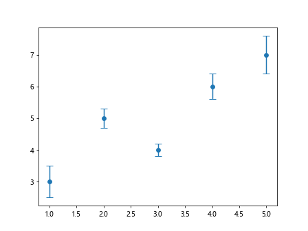
In the above example, we create a simple line plot with error bars. The capsize=5 argument specifies the length of the caps at the end of each error bar.
Changing Capsize in Error Bar Plot
import matplotlib.pyplot as plt
import numpy as np

x = np.arange(1, 6)
y = np.array([3, 5, 4, 6, 7])
error = np.array([0.5, 0.3, 0.2, 0.4, 0.6])

plt.errorbar(x, y, yerr=error, fmt='o', capsize=10)
plt.show()
Output:
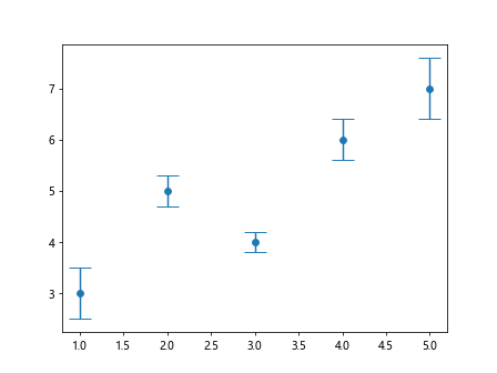
In this example, we have increased the capsize to 10, resulting in longer caps at the end of each error bar.
Using Capsize with Different Marker Styles
import matplotlib.pyplot as plt
import numpy as np

x = np.arange(1, 6)
y = np.array([3, 5, 4, 6, 7])
error = np.array([0.5, 0.3, 0.2, 0.4, 0.6])

plt.errorbar(x, y, yerr=error, fmt='s', capsize=8)
plt.show()
Output:
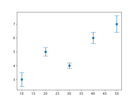
Here, we have changed the marker style to 's' (square) while keeping the capsize at 8.
Customizing Cap Colour and Line Style
import matplotlib.pyplot as plt
import numpy as np

x = np.arange(1, 6)
y = np.array([3, 5, 4, 6, 7])
error = np.array([0.5, 0.3, 0.2, 0.4, 0.6])

plt.errorbar(x, y, yerr=error, fmt='o', capsize=6, capthick=2, capstyle='projecting', ecolor='red')
plt.show()
In this example, we have changed the cap thickness to 2, capstyle to 'projecting', and cap color to 'red' while keeping the default error bar style.
Varying Capsize Based on Error Magnitude
import matplotlib.pyplot as plt
import numpy as np

x = np.arange(1, 6)
y = np.array([3, 5, 4, 6, 7])
error = np.array([0.5, 0.3, 0.2, 0.4, 0.6])

sizes = np.abs(error) * 20

plt.errorbar(x, y, yerr=error, fmt='o', capsize=sizes)
plt.show()
Here, we set the capsize based on the magnitude of the error values. Larger errors correspond to longer caps.
Conditional Capsize Based on Data Value
import matplotlib.pyplot as plt
import numpy as np

x = np.arange(1, 6)
y = np.array([3, 5, 4, 6, 7])
error = np.array([0.5, 0.3, 0.2, 0.4, 0.6])

sizes = np.where(y > 5, 10, 5)

plt.errorbar(x, y, yerr=error, fmt='o', capsize=sizes)
plt.show()
In this example, we set the capsize to 10 for data points where y is greater than 5, and 5 otherwise.
Setting Capsize to Zero
import matplotlib.pyplot as plt
import numpy as np

x = np.arange(1, 6)
y = np.array([3, 5, 4, 6, 7])
error = np.array([0.5, 0.3, 0.2, 0.4, 0.6])

plt.errorbar(x, y, yerr=error, fmt='o', capsize=0)
plt.show()
Output:
By setting capsize to 0, the caps at the end of each error bar are removed.
Using Capsize with Horizontal Error Bars
import matplotlib.pyplot as plt
import numpy as np

x = np.arange(1, 6)
y = np.array([3, 5, 4, 6, 7])
error = np.array([0.5, 0.3, 0.2, 0.4, 0.6])

plt.errorbar(y, x, xerr=error, fmt='o', capsize=7)
plt.show()
Output:
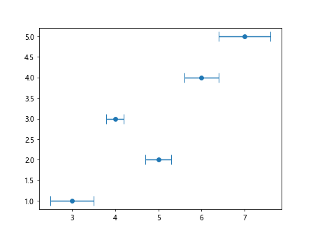
In this example, we create a horizontal error bar plot and customize the capsize.
Adding Capsize to Bar Plot
import matplotlib.pyplot as plt
import numpy as np

x = np.arange(1, 6)
y = np.array([3, 5, 4, 6, 7])
error = np.array([0.5, 0.3, 0.2, 0.4, 0.6])

plt.bar(x, y, yerr=error, capsize=6)
plt.show()
Output:
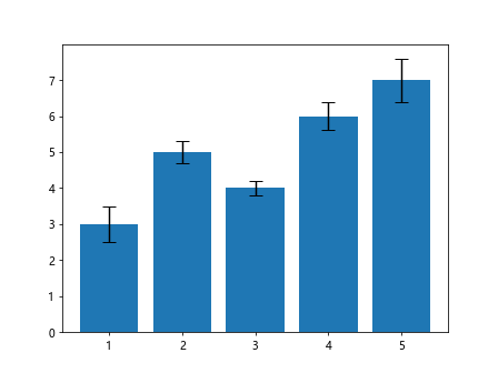
Here, we add error bars with caps to a simple bar plot.
Changing Capsize in Scatter Plot
import matplotlib.pyplot as plt
import numpy as np

x = np.arange(1, 6)
y = np.array([3, 5, 4, 6, 7])
error = np.array([0.5, 0.3, 0.2, 0.4, 0.6])

plt.scatter(x, y, yerr=error, s=100, edgecolor='black', capsize=8)
plt.show()
In this example, we create a scatter plot with error bars and customize the capsize.
Adjusting Capsize in Subplots
import matplotlib.pyplot as plt
import numpy as np

x = np.arange(1, 6)
y = np.array([3, 5, 4, 6, 7])
error = np.array([0.5, 0.3, 0.2, 0.4, 0.6])

fig, axs = plt.subplots(1, 2, figsize=(10, 4))

axs[0].errorbar(x, y, yerr=error, fmt='o', capsize=5)
axs[1].errorbar(x, y, yerr=error, fmt='o', capsize=10)

plt.show()
Output:
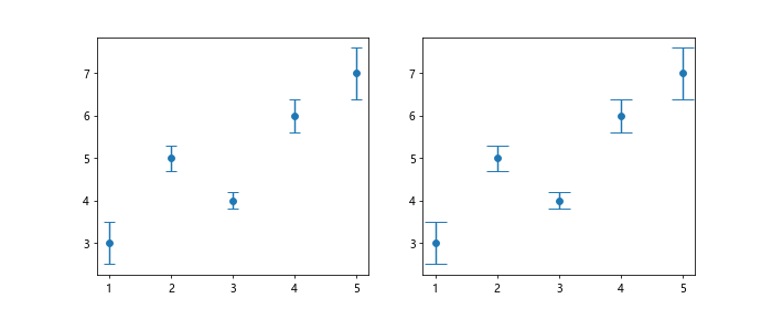
Here, we create subplots with different cap sizes for error bars.
Customizing Capsize in Line Plot
import matplotlib.pyplot as plt
import numpy as np
x = np.arange(1, 6)
y = np.array([3, 5, 4, 6, 7])
error = np.array([0.5, 0.3, 0.2, 0.4, 0.6])
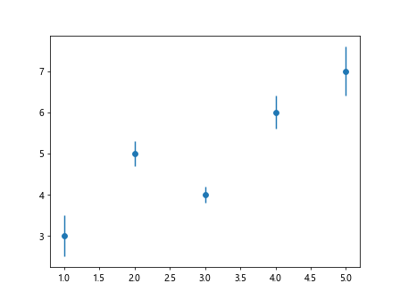
plt.plot(x, y, linestyle='--', marker='o', markersize=8, capsize=6)
plt.show()
In this example, we add error bars with caps to a line plot and customize the capsize.
Varying Capsize Based on Marker Size
import matplotlib.pyplot as plt
import numpy as np

x = np.arange(1, 6)
y = np.array([3, 5, 4, 6, 7])
error = np.array([0.5, 0.3, 0.2, 0.4, 0.6])

plt.errorbar(x, y, yerr=error, fmt='o', markersize=10, capsize=error*20)
plt.show()
Here, we set the capsize based on the marker size in the error bar plot.
Adjusting Capsize in Fill Between Plot
import matplotlib.pyplot as plt
import numpy as np

x = np.arange(1, 6)
y = np.array([3, 5, 4, 6, 7])
error = np.array([0.5, 0.3, 0.2, 0.4, 0.6])

plt.fill_between(x, y-error, y+error, color='skyblue', alpha=0.4, capsize=5)
plt.show()
In this example, we use fill_between to create a filled plot with error bars and customized capsize.
Customizing Capsize in Stacked Bar Plot
import matplotlib.pyplot as plt
import numpy as np

x = np.arange(1, 6)
y = np.array([3, 5, 4, 6, 7])
error = np.array([0.5, 0.3, 0.2, 0.4, 0.6])

y2 = np.array([2, 4, 3, 5, 6])

plt.bar(x, y, yerr=error, label='Group 1', capsize=6)
plt.bar(x, y2, yerr=error, label='Group 2', bottom=y, capsize=8)
plt.legend()
plt.show()
Output:
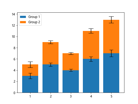
Here, we create a stacked bar plot with error bars and adjust the capsize for each group.
Adding Capsize to Box Plot
import matplotlib.pyplot as plt
import numpy as np

x = np.arange(1, 6)
y = np.array([3, 5, 4, 6, 7])
error = np.array([0.5, 0.3, 0.2, 0.4, 0.6])

data = [np.random.normal(0, std, 100) for std in range(1, 6)]

plt.boxplot(data, positions=range(1, 6), patch_artist=True, capsize=7)
plt.show()
In this example, we create a box plot with error bars and set the capsize for the whiskers.
Changing Capsize in Histogram Plot
import matplotlib.pyplot as plt
import numpy as np

x = np.arange(1, 6)
y = np.array([3, 5, 4, 6, 7])
error = np.array([0.5, 0.3, 0.2, 0.4, 0.6])

plt.hist(y, bins=5, edgecolor='black', linewidth=1.2, capsize=4)
plt.show()
Here, we customize the capsize in a histogram plot of the given dataset.
Using Capsize with 3D Scatter Plot
from mpl_toolkits.mplot3d import Axes3D
import matplotlib.pyplot as plt
import numpy as np

x = np.arange(1, 6)
y = np.array([3, 5, 4, 6, 7])
error = np.array([0.5, 0.3, 0.2, 0.4, 0.6])

z = np.array([1, 2, 3, 4, 5])

fig = plt.figure()
ax = fig.add_subplot(111, projection='3d')

ax.errorbar(x, y, z, xerr=error, yerr=error, zerr=error, fmt='o', capsize=6)
plt.show()
Output:
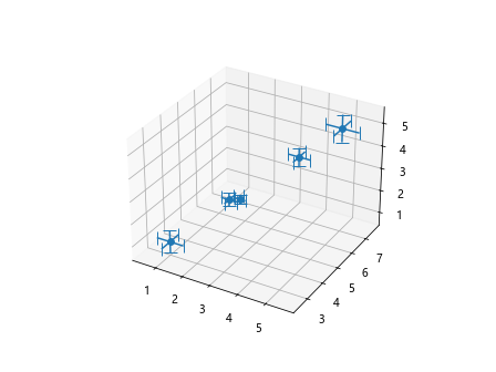
In this example, we create a 3D scatter plot with error bars and adjust the capsize.
Customizing Capsize in Contour Plot
import matplotlib.pyplot as plt
import numpy as np

x = np.arange(1, 6)
y = np.array([3, 5, 4, 6, 7])
error = np.array([0.5, 0.3, 0.2, 0.4, 0.6])

x = np.linspace(-2, 2, 100)
y = np.linspace(-2, 2, 100)
X, Y = np.meshgrid(x, y)
Z = np.sin(X) * np.cos(Y)

plt.errorbar(X, Y, yerr=0.1, xerr=0.1, fmt='o', capsize=5)
plt.contour(X, Y, Z, cmap='coolwarm')
plt.colorbar()
plt.show()
Here, we add error bars with caps to a contour plot and customize the capsize for the error bars.
In conclusion, the capsize parameter in Matplotlib allows us to control the length of the caps at the end of each error bar, providing additional flexibility and customization options when creating visualizations. By experimenting with different capsize values and styles, we can enhance the clarity and aesthetics of our plots. I hope this article has provided you with a comprehensive understanding of how to use and customize capsize in Matplotlib.