How to Create Matplotlib Boxplots with Multiple Columns: A Comprehensive Guide
Matplotlib boxplot multiple columns is a powerful visualization technique that allows you to compare distributions across different categories or groups. This article will provide an in-depth exploration of creating boxplots with multiple columns using Matplotlib, one of the most popular data visualization libraries in Python. We’ll cover various aspects of matplotlib boxplot multiple columns, from basic concepts to advanced customization options.
Understanding Matplotlib Boxplot Multiple Columns
Matplotlib boxplot multiple columns is a feature that enables you to create side-by-side boxplots for different variables or groups within your dataset. This visualization technique is particularly useful when you want to compare the distribution of multiple variables or groups simultaneously. By using matplotlib boxplot multiple columns, you can easily identify differences in central tendencies, spread, and potential outliers across different categories.
Let’s start with a simple example to illustrate the concept of matplotlib boxplot multiple columns:
import matplotlib.pyplot as plt
import numpy as np

# Generate sample data
data1 = np.random.normal(0, 1, 100)
data2 = np.random.normal(1, 1.5, 100)
data3 = np.random.normal(-1, 0.5, 100)

# Create a figure and axis
fig, ax = plt.subplots(figsize=(10, 6))

# Create boxplot with multiple columns
ax.boxplot([data1, data2, data3], labels=['Data 1', 'Data 2', 'Data 3'])

# Set title and labels
ax.set_title('Matplotlib Boxplot Multiple Columns - how2matplotlib.com')
ax.set_xlabel('Datasets')
ax.set_ylabel('Values')

plt.show()
Output:
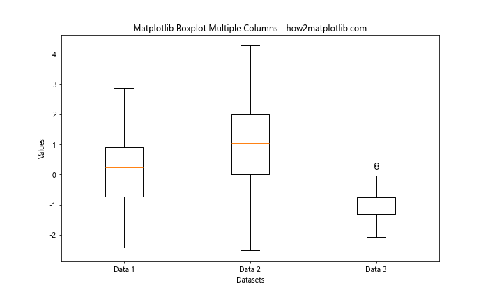
In this example, we create three datasets with different distributions and use matplotlib boxplot multiple columns to visualize them side by side. This allows us to easily compare the median, quartiles, and potential outliers of each dataset.
Creating Basic Matplotlib Boxplot Multiple Columns
To create a basic matplotlib boxplot multiple columns, you need to provide a list of data arrays to the boxplot() function. Each array represents a column in your boxplot. Let’s explore this concept with another example:
import matplotlib.pyplot as plt
import numpy as np

# Generate sample data
np.random.seed(42)
data = [np.random.normal(0, std, 100) for std in range(1, 4)]

# Create a figure and axis
fig, ax = plt.subplots(figsize=(10, 6))

# Create boxplot with multiple columns
ax.boxplot(data)

# Set title and labels
ax.set_title('Basic Matplotlib Boxplot Multiple Columns - how2matplotlib.com')
ax.set_xlabel('Columns')
ax.set_ylabel('Values')

# Add custom x-axis labels
ax.set_xticklabels(['Column 1', 'Column 2', 'Column 3'])

plt.show()
Output:
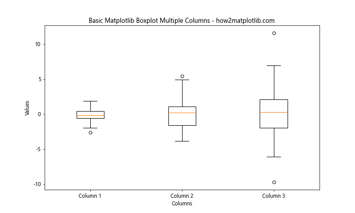
In this example, we create three datasets with increasing standard deviations and use matplotlib boxplot multiple columns to visualize them. We also demonstrate how to add custom x-axis labels to each column.
Customizing Matplotlib Boxplot Multiple Columns
Matplotlib provides various options to customize your boxplots. Let’s explore some of these customization options for matplotlib boxplot multiple columns:
Modifying Whisker Properties
You can customize the appearance of the whiskers in your matplotlib boxplot multiple columns using the whiskerprops parameter:
import matplotlib.pyplot as plt
import numpy as np

# Generate sample data
np.random.seed(42)
data = [np.random.normal(0, std, 100) for std in range(1, 4)]

# Create a figure and axis
fig, ax = plt.subplots(figsize=(10, 6))

# Create boxplot with multiple columns and custom whisker properties
ax.boxplot(data, whiskerprops=dict(linestyle='--', linewidth=2, color='red'))

# Set title and labels
ax.set_title('Customized Whiskers in Matplotlib Boxplot Multiple Columns - how2matplotlib.com')
ax.set_xlabel('Columns')
ax.set_ylabel('Values')

plt.show()
Output:
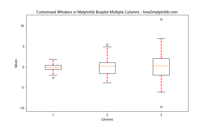
In this example, we set the whiskers to be dashed red lines with increased line width.
Adjusting Cap Properties
You can modify the appearance of the caps (the horizontal lines at the end of the whiskers) in your matplotlib boxplot multiple columns using the capprops parameter:
import matplotlib.pyplot as plt
import numpy as np

# Generate sample data
np.random.seed(42)
data = [np.random.normal(0, std, 100) for std in range(1, 4)]

# Create a figure and axis
fig, ax = plt.subplots(figsize=(10, 6))

# Create boxplot with multiple columns and custom cap properties
ax.boxplot(data, capprops=dict(color='green', linewidth=2))

# Set title and labels
ax.set_title('Customized Caps in Matplotlib Boxplot Multiple Columns - how2matplotlib.com')
ax.set_xlabel('Columns')
ax.set_ylabel('Values')

plt.show()
Output:
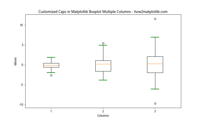
In this example, we set the caps to be green with increased line width.
Adding Notches to Matplotlib Boxplot Multiple Columns
Notches in boxplots can be used to compare medians between different groups. If the notches of two boxes do not overlap, it suggests that the medians are significantly different. Let’s add notches to our matplotlib boxplot multiple columns:
import matplotlib.pyplot as plt
import numpy as np

# Generate sample data
np.random.seed(42)
data = [np.random.normal(0, std, 100) for std in range(1, 4)]

# Create a figure and axis
fig, ax = plt.subplots(figsize=(10, 6))

# Create boxplot with multiple columns and notches
ax.boxplot(data, notch=True, patch_artist=True)

# Set title and labels
ax.set_title('Matplotlib Boxplot Multiple Columns with Notches - how2matplotlib.com')
ax.set_xlabel('Columns')
ax.set_ylabel('Values')

plt.show()
Output:
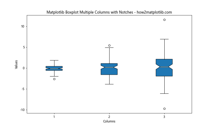
In this example, we add notches to our boxplots by setting notch=True. We also use patch_artist=True to fill the boxes with color.
Handling Outliers in Matplotlib Boxplot Multiple Columns
By default, matplotlib boxplot multiple columns display outliers as individual points. You can customize how outliers are displayed or choose to remove them entirely:
import matplotlib.pyplot as plt
import numpy as np

# Generate sample data with outliers
np.random.seed(42)
data = [np.random.normal(0, 1, 100) for _ in range(3)]
for d in data:
    d[0] = 10  # Add an outlier

# Create a figure and axis
fig, ax = plt.subplots(figsize=(10, 6))

# Create boxplot with multiple columns and custom outlier properties
ax.boxplot(data, flierprops=dict(marker='o', markerfacecolor='red', markersize=8))

# Set title and labels
ax.set_title('Matplotlib Boxplot Multiple Columns with Custom Outliers - how2matplotlib.com')
ax.set_xlabel('Columns')
ax.set_ylabel('Values')

plt.show()
Output:
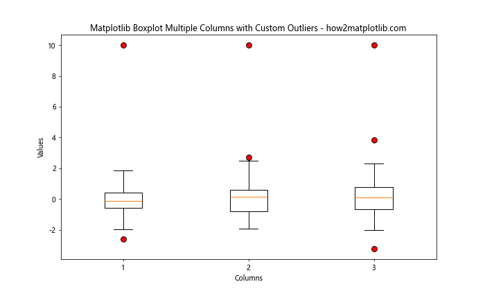
In this example, we customize the appearance of outliers by setting the flierprops parameter. We change the marker style, color, and size of the outliers.
Creating Horizontal Matplotlib Boxplot Multiple Columns
While vertical boxplots are more common, you can also create horizontal matplotlib boxplot multiple columns:
import matplotlib.pyplot as plt
import numpy as np

# Generate sample data
np.random.seed(42)
data = [np.random.normal(0, std, 100) for std in range(1, 4)]

# Create a figure and axis
fig, ax = plt.subplots(figsize=(10, 6))

# Create horizontal boxplot with multiple columns
ax.boxplot(data, vert=False)

# Set title and labels
ax.set_title('Horizontal Matplotlib Boxplot Multiple Columns - how2matplotlib.com')
ax.set_ylabel('Columns')
ax.set_xlabel('Values')

plt.show()
Output:
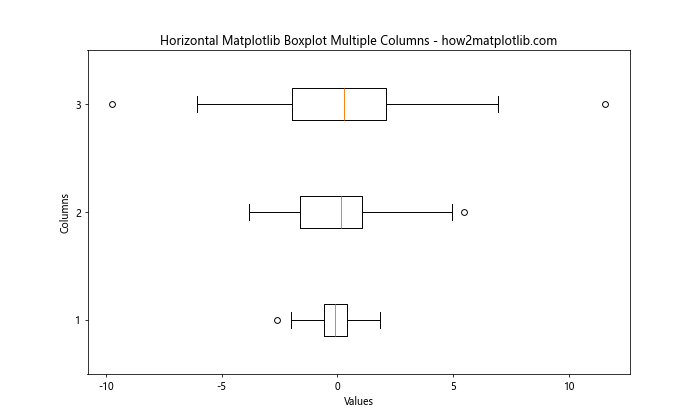
In this example, we create a horizontal boxplot by setting vert=False in the boxplot() function.
Adding a Legend to Matplotlib Boxplot Multiple Columns
Adding a legend to your matplotlib boxplot multiple columns can help viewers understand what each column represents:
import matplotlib.pyplot as plt
import numpy as np

# Generate sample data
np.random.seed(42)
data = [np.random.normal(0, std, 100) for std in range(1, 4)]

# Create a figure and axis
fig, ax = plt.subplots(figsize=(10, 6))

# Create boxplot with multiple columns
bp = ax.boxplot(data, patch_artist=True)

# Customize box colors
colors = ['lightblue', 'lightgreen', 'lightpink']
for patch, color in zip(bp['boxes'], colors):
    patch.set_facecolor(color)

# Set title and labels
ax.set_title('Matplotlib Boxplot Multiple Columns with Legend - how2matplotlib.com')
ax.set_xlabel('Columns')
ax.set_ylabel('Values')

# Add legend
ax.legend([bp['boxes'][0], bp['boxes'][1], bp['boxes'][2]],
          ['Group 1', 'Group 2', 'Group 3'],
          loc='upper right')

plt.show()
Output:
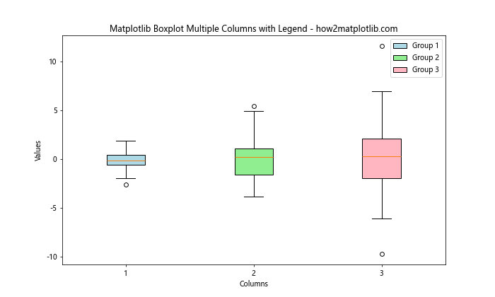
In this example, we create a legend by using the box patches as handles and providing custom labels for each group.
Comparing Multiple Groups with Matplotlib Boxplot Multiple Columns
Matplotlib boxplot multiple columns are particularly useful when comparing multiple groups or categories. Let’s create an example that compares the performance of different algorithms across multiple datasets:
import matplotlib.pyplot as plt
import numpy as np

# Generate sample data
np.random.seed(42)
algorithms = ['Algorithm A', 'Algorithm B', 'Algorithm C']
datasets = ['Dataset 1', 'Dataset 2', 'Dataset 3']

data = [[np.random.normal(0, std, 100) for std in range(1, 4)] for _ in range(3)]

# Create a figure and axis
fig, ax = plt.subplots(figsize=(12, 6))

# Create boxplot with multiple columns
positions = range(1, len(datasets) * 3, 3)
bp = ax.boxplot(data[0], positions=positions, widths=0.6, patch_artist=True)
bp2 = ax.boxplot(data[1], positions=[p + 1 for p in positions], widths=0.6, patch_artist=True)
bp3 = ax.boxplot(data[2], positions=[p + 2 for p in positions], widths=0.6, patch_artist=True)

# Customize colors
colors = ['lightblue', 'lightgreen', 'lightpink']
for bplot in (bp, bp2, bp3):
    for patch, color in zip(bplot['boxes'], colors):
        patch.set_facecolor(color)

# Set title and labels
ax.set_title('Comparing Algorithms with Matplotlib Boxplot Multiple Columns - how2matplotlib.com')
ax.set_xlabel('Datasets')
ax.set_ylabel('Performance')

# Set x-axis ticks and labels
ax.set_xticks([p + 1 for p in positions])
ax.set_xticklabels(datasets)

# Add legend
ax.legend([bp['boxes'][0], bp2['boxes'][0], bp3['boxes'][0]], algorithms, loc='upper right')

plt.show()
Output:
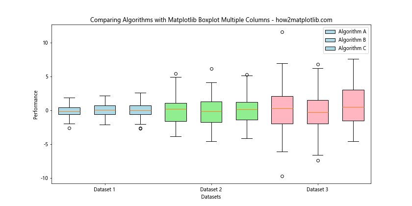
In this example, we create a complex matplotlib boxplot multiple columns visualization that compares the performance of three algorithms across three datasets. We use different colors for each algorithm and position the boxplots side by side for easy comparison.
Adding Statistical Annotations to Matplotlib Boxplot Multiple Columns
To provide more insight into your data, you can add statistical annotations to your matplotlib boxplot multiple columns. Let’s create an example that adds mean values to each boxplot:
import matplotlib.pyplot as plt
import numpy as np

# Generate sample data
np.random.seed(42)
data = [np.random.normal(0, std, 100) for std in range(1, 4)]

# Create a figure and axis
fig, ax = plt.subplots(figsize=(10, 6))

# Create boxplot with multiple columns
bp = ax.boxplot(data)

# Add mean values as annotations
means = [np.mean(d) for d in data]
for i, mean in enumerate(means):
    ax.text(i + 1, mean, f'Mean: {mean:.2f}',
            horizontalalignment='center', verticalalignment='bottom')

# Set title and labels
ax.set_title('Matplotlib Boxplot Multiple Columns with Mean Annotations - how2matplotlib.com')
ax.set_xlabel('Columns')
ax.set_ylabel('Values')

plt.show()
Output:
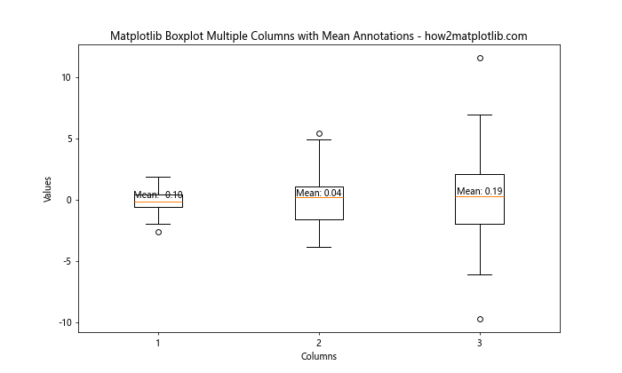
In this example, we calculate the mean value for each dataset and add it as a text annotation above each boxplot.
Creating Grouped Matplotlib Boxplot Multiple Columns
When dealing with multiple categories and groups, you can create grouped matplotlib boxplot multiple columns:
import matplotlib.pyplot as plt
import numpy as np

# Generate sample data
np.random.seed(42)
categories = ['Category A', 'Category B', 'Category C']
groups = ['Group 1', 'Group 2']

data = [[np.random.normal(0, std, 100) for std in range(1, 4)] for _ in range(2)]

# Create a figure and axis
fig, ax = plt.subplots(figsize=(12, 6))

# Create grouped boxplot with multiple columns
positions = range(1, len(categories) * 3, 3)
bp1 = ax.boxplot([d for d in data[0]], positions=positions, widths=0.6, patch_artist=True)
bp2 = ax.boxplot([d for d in data[1]], positions=[p + 1 for p in positions], widths=0.6, patch_artist=True)

# Customize colors
colors = ['lightblue', 'lightgreen']
for bplot, color in zip((bp1, bp2), colors):
    for patch in bplot['boxes']:
        patch.set_facecolor(color)

# Set title and labels
ax.set_title('Grouped Matplotlib Boxplot Multiple Columns - how2matplotlib.com')
ax.set_xlabel('Categories')
ax.set_ylabel('Values')

# Set x-axis ticks and labels
ax.set_xticks([p + 0.5 for p in positions])
ax.set_xticklabels(categories)

# Add legend
ax.legend([bp1['boxes'][0], bp2['boxes'][0]], groups, loc='upper right')

plt.show()
Output:
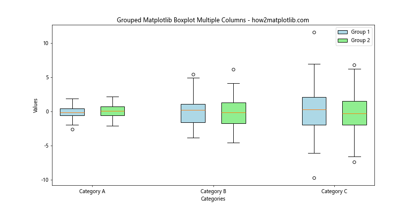
In this example, we create a grouped matplotlib boxplot multiple columns visualization that compares two groups across three categories. We position the boxplots side by side within each category for easy comparison.
Combining Matplotlib Boxplot Multiple Columns with Other Plot Types
You can combine matplotlib boxplot multiple columns with other plot types to create more informative visualizations. Let’s create an example that combines boxplots with scatter plots:
import matplotlib.pyplot as plt
import numpy as np

# Generate sample data
np.random.seed(42)
data = [np.random.normal(0, std, 100) for std in range(1, 4)]

# Create a figure and axis
fig, ax = plt.subplots(figsize=(12, 6))

# Create boxplot with multiple columns
bp = ax.boxplot(data, patch_artist=True)

# Customize box colors
colors = ['lightblue', 'lightgreen', 'lightpink']
for patch, color in zip(bp['boxes'], colors):
    patch.set_facecolor(color)

# Add scatter plots
for i, d in enumerate(data):
    x = np.random.normal(i + 1, 0.04, len(d))
    ax.scatter(x, d, alpha=0.5)

# Set title and labels
ax.set_title('Matplotlib Boxplot Multiple Columns with Scatter Plots - how2matplotlib.com')
ax.set_xlabel('Columns')
ax.set_ylabel('Values')

plt.show()
Output:
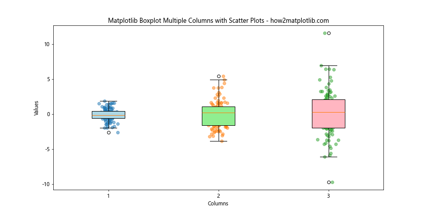
In this example, we combine matplotlib boxplot multiple columns with scatter plots to show both the distribution and individual data points for each column.
Creating Violin Plots as an Alternative to Matplotlib Boxplot Multiple Columns
While matplotlib boxplot multiple columns are great for showing key statistics, violin plots can provide a more detailed view of the data distribution. Let’s create a violin plot as an alternative:
import matplotlib.pyplot as plt
import numpy as np

# Generate sample data
np.random.seed(42)
data = [np.random.normal(0, std, 100) for std in range(1, 4)]

# Create a figure and axis
fig, ax = plt.subplots(figsize=(12, 6))

# Create violin plot
vp = ax.violinplot(data, showmeans=True, showextrema=True, showmedians=True)

# Customize colors
for body in vp['bodies']:
    body.set_facecolor('lightblue')
    body.set_edgecolor('navy')
    body.set_alpha(0.7)

# Set title and labels
ax.set_title('Violin Plot as an Alternative to Matplotlib Boxplot Multiple Columns - how2matplotlib.com')
ax.set_xlabel('Columns')
ax.set_ylabel('Values')

# Set x-axis ticks and labels
ax.set_xticks([1, 2, 3])
ax.set_xticklabels(['Column 1', 'Column 2', 'Column 3'])

plt.show()
Output:
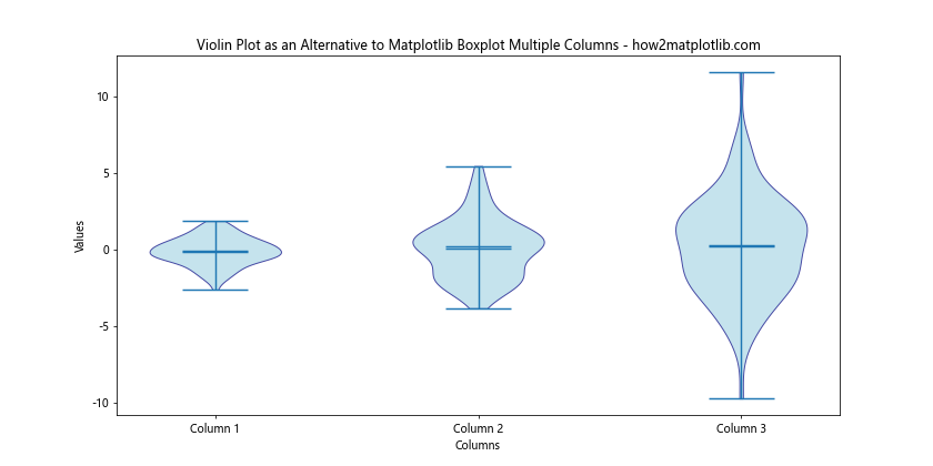
This example creates a violin plot that shows the full distribution of each dataset, along with key statistics like the mean, median, and extrema.
Handling Missing Data in Matplotlib Boxplot Multiple Columns
When dealing with real-world data, you may encounter missing values. Let’s see how to handle missing data in matplotlib boxplot multiple columns:
import matplotlib.pyplot as plt
import numpy as np

# Generate sample data with missing values
np.random.seed(42)
data = [np.random.normal(0, std, 100) for std in range(1, 4)]
data[1][10:20] = np.nan  # Add some missing values

# Create a figure and axis
fig, ax = plt.subplots(figsize=(12, 6))

# Create boxplot with multiple columns, ignoring nan values
bp = ax.boxplot(data, patch_artist=True, notch=True)

# Customize colors
colors = ['lightblue', 'lightgreen', 'lightpink']
for patch, color in zip(bp['boxes'], colors):
    patch.set_facecolor(color)

# Set title and labels
ax.set_title('Matplotlib Boxplot Multiple Columns with Missing Data - how2matplotlib.com')
ax.set_xlabel('Columns')
ax.set_ylabel('Values')

plt.show()
Output:
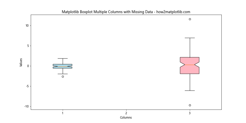
In this example, we introduce some missing values (NaN) to one of the datasets. Matplotlib automatically handles these missing values by excluding them from the boxplot calculations.
Creating Subplots with Matplotlib Boxplot Multiple Columns
For more complex comparisons, you might want to create multiple subplots, each containing matplotlib boxplot multiple columns. Here’s an example:
import matplotlib.pyplot as plt
import numpy as np

# Generate sample data
np.random.seed(42)
data1 = [np.random.normal(0, std, 100) for std in range(1, 4)]
data2 = [np.random.normal(1, std, 100) for std in range(1, 4)]

# Create a figure with two subplots
fig, (ax1, ax2) = plt.subplots(1, 2, figsize=(16, 6))

# Create boxplot with multiple columns for the first subplot
bp1 = ax1.boxplot(data1, patch_artist=True)
ax1.set_title('Dataset 1 - how2matplotlib.com')
ax1.set_xlabel('Columns')
ax1.set_ylabel('Values')

# Create boxplot with multiple columns for the second subplot
bp2 = ax2.boxplot(data2, patch_artist=True)
ax2.set_title('Dataset 2 - how2matplotlib.com')
ax2.set_xlabel('Columns')
ax2.set_ylabel('Values')

# Customize colors
colors = ['lightblue', 'lightgreen', 'lightpink']
for bplot in (bp1, bp2):
    for patch, color in zip(bplot['boxes'], colors):
        patch.set_facecolor(color)

# Adjust layout and show the plot
plt.tight_layout()
plt.show()
Output:
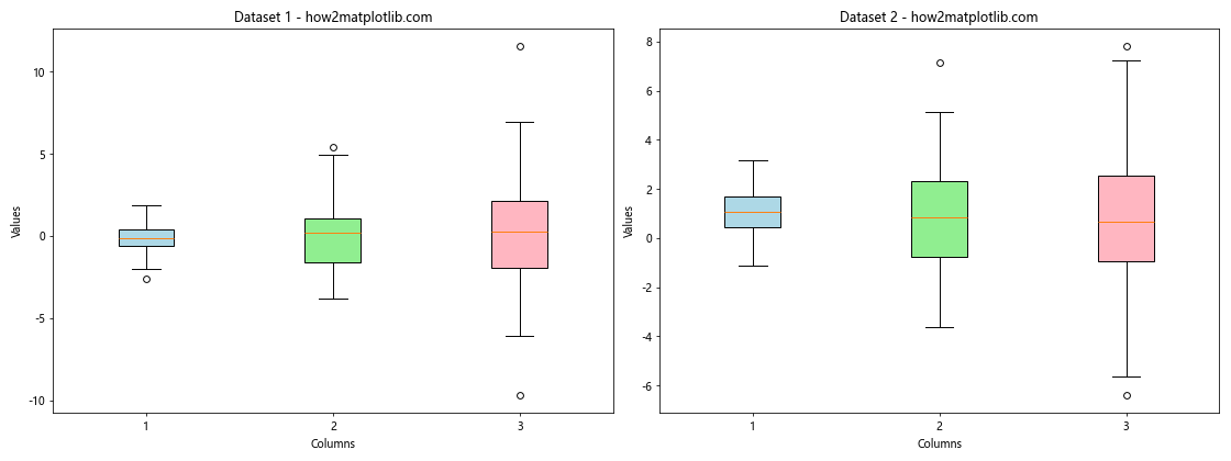
This example creates two subplots, each containing a matplotlib boxplot multiple columns visualization for different datasets.
Adding Error Bars to Matplotlib Boxplot Multiple Columns
While boxplots already show the spread of data, you might want to add additional error bars to highlight specific confidence intervals or standard errors:
import matplotlib.pyplot as plt
import numpy as np
from scipy import stats

# Generate sample data
np.random.seed(42)
data = [np.random.normal(0, std, 100) for std in range(1, 4)]

# Calculate means and standard errors
means = [np.mean(d) for d in data]
ses = [stats.sem(d) for d in data]

# Create a figure and axis
fig, ax = plt.subplots(figsize=(12, 6))

# Create boxplot with multiple columns
bp = ax.boxplot(data, patch_artist=True)

# Add error bars
ax.errorbar(range(1, len(data) + 1), means, yerr=ses, fmt='o', color='red',
            capsize=5, capthick=2, label='Mean ± SE')

# Customize colors
colors = ['lightblue', 'lightgreen', 'lightpink']
for patch, color in zip(bp['boxes'], colors):
    patch.set_facecolor(color)

# Set title and labels
ax.set_title('Matplotlib Boxplot Multiple Columns with Error Bars - how2matplotlib.com')
ax.set_xlabel('Columns')
ax.set_ylabel('Values')

# Add legend
ax.legend()

plt.show()
Output:
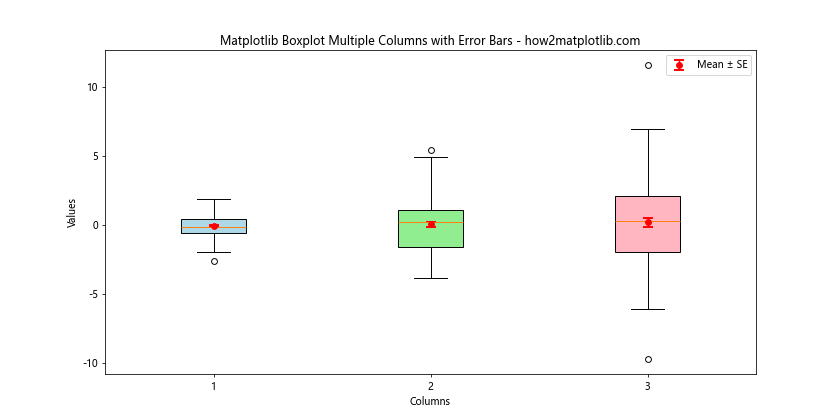
In this example, we add error bars to show the mean and standard error for each dataset, in addition to the boxplot representation.
Matplotlib boxplot multiple columns Conclusion
Matplotlib boxplot multiple columns is a versatile and powerful tool for visualizing and comparing distributions across different categories or groups. Throughout this article, we’ve explored various aspects of creating and customizing matplotlib boxplot multiple columns, from basic plots to advanced techniques and interactive visualizations.
We’ve covered topics such as customizing box colors, modifying whisker properties, handling outliers, creating horizontal boxplots, adding legends and statistical annotations, grouping boxplots, combining with other plot types, and handling missing data. We’ve also explored alternatives like violin plots and demonstrated how to create interactive visualizations.
By mastering these techniques, you’ll be able to create informative and visually appealing matplotlib boxplot multiple columns that effectively communicate your data insights. Remember to experiment with different customization options and combine various techniques to create the most suitable visualization for your specific dataset and audience.