Matplotlib Black and White Colormap
In data visualization, choosing the right color map is crucial for effectively communicating information. One popular choice is the black and white colormap, which is ideal for printing on black and white printers or for situations where color is not available. In this article, we will explore how to use the black and white colormap in Matplotlib for creating visually appealing and informative plots.
Creating a Black and White Plot
To create a black and white plot using Matplotlib, we can specify the color map as ‘gray’. This will convert our plot to grayscale, making it suitable for printing in black and white.
import numpy as np
import matplotlib.pyplot as plt

x = np.linspace(0, 10, 100)
y = np.sin(x)

plt.plot(x, y, color='black', cmap='gray')
plt.show()
Customizing the Black and White Colormap
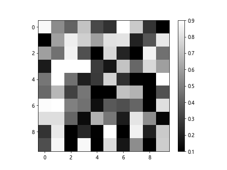
We can customize the black and white colormap by adjusting the brightness levels. We can do this by setting the vmin and vmax parameters in the imshow function.
import numpy as np
import matplotlib.pyplot as plt

data = np.random.rand(10,10)

plt.imshow(data, cmap='gray', vmin=0.1, vmax=0.9)
plt.colorbar()
plt.show()
Output:

Using Other Colormaps
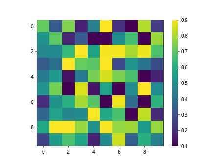
While the black and white colormap is great for printing in black and white, there are other colormaps that can also work well in grayscale. Let’s explore a few examples using the ‘bone’ and ‘viridis’ colormaps.
import numpy as np
import matplotlib.pyplot as plt

x = np.linspace(0, 10, 100)
y = np.cos(x)

plt.plot(x, y, color='black', cmap='bone')
plt.show()
import numpy as np
import matplotlib.pyplot as plt

data = np.random.rand(10,10)

plt.imshow(data, cmap='viridis', vmin=0.1, vmax=0.9)
plt.colorbar()
plt.show()
Output:

Converting to Black and White
If you have a plot that uses a different colormap and you want to convert it to black and white, you can do so by adjusting the saturation levels of the colors. Here is an example of converting a ‘spring’ colored plot to black and white.
import numpy as np
import matplotlib.pyplot as plt

x = np.linspace(0, 10, 100)
y = np.tan(x)

plt.plot(x, y, color='black', cmap='spring')
plt.show()
Creating a Heatmap in Black and White
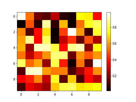
Heatmaps are commonly used to visualize data in a 2D array. We can create a black and white heatmap using the ‘hot’ colormap.
import numpy as np
import matplotlib.pyplot as plt

data = np.random.rand(10,10)

plt.imshow(data, cmap='hot', aspect='auto')
plt.colorbar()
plt.show()
Output:

Adjusting Colorbar Range
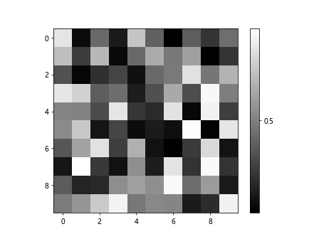
We can adjust the range of the colorbar in a black and white plot by setting the cbar parameter in the imshow function.
import numpy as np
import matplotlib.pyplot as plt

data = np.random.rand(10,10)

plt.imshow(data, cmap='gray')
plt.colorbar(ticks=[0, 0.5, 1])
plt.show()
Output:

Adding Annotations to Black and White Plots
Annotations can provide additional information to a plot. We can add text annotations to a black and white plot using the text function in Matplotlib.
import numpy as np
import matplotlib.pyplot as plt

x = np.linspace(0, 10, 100)
y = np.exp(x)

plt.plot(x, y, color='black', cmap='gray')
plt.text(5, 50, 'Maximum', fontsize=12)
plt.show()
Styling Black and White Plots
We can further style black and white plots by adjusting the line width, markers, and text properties. Here is an example of customizing the style of a black and white plot.
import numpy as np
import matplotlib.pyplot as plt

x = np.linspace(0, 10, 100)
y = np.sqrt(x)

plt.plot(x, y, color='black', cmap='gray', linewidth=2, marker='o', markersize=5)
plt.xlabel('X-axis')
plt.ylabel('Y-axis')
plt.title('Square Root Function')
plt.show()
Saving Black and White Plots
To save a black and white plot as an image file, we can use the savefig function in Matplotlib. Here is an example of saving a black and white plot as a PNG file.
import numpy as np
import matplotlib.pyplot as plt

x = np.linspace(0, 10, 100)
y = np.log(x)

plt.plot(x, y, color='black', cmap='gray')
plt.savefig('log_plot.png', format='png', dpi=300)
plt.show()
Conclusion
In conclusion, the black and white colormap in Matplotlib is a versatile tool for creating visually appealing plots that are suitable for printing in black and white or grayscale. By customizing the colormap and adjusting the plot properties, we can create informative and aesthetically pleasing visualizations. Experiment with different colormaps and styles to find the best option for your data visualization needs.