Matplotlib bar plot multiple columns
Matplotlib is a popular Python library used for creating various types of plots. It provides a simple and efficient way to visualize data. In this article, we will explore how to create bar plots with multiple columns using Matplotlib.
Bar plots are useful for comparing different categories or groups. They provide a visual representation of data by displaying vertical bars of varying heights, each representing a specific category. When dealing with multiple columns, each bar will consist of multiple sections representing different groups within a category.
We will start by importing the necessary libraries and generating some sample data to work with.
import matplotlib.pyplot as plt
import numpy as np

# Generate sample data
np.random.seed(123)
data = np.random.randint(0, 10, size=(5, 3))
categories = ['Category 1', 'Category 2', 'Category 3', 'Category 4', 'Category 5']
The data variable represents the values for each category and column, and the categories list contains the names of the categories. We have randomly generated some sample data for demonstration purposes.
Now, let’s create a basic bar plot with multiple columns.
# Create a figure and axis
fig, ax = plt.subplots()

# Set the width of each bar
bar_width = 0.2

# Create the bar plot
bar1 = ax.bar(categories, data[:, 0], bar_width, label='Column 1')
bar2 = ax.bar(categories, data[:, 1], bar_width, label='Column 2')
bar3 = ax.bar(categories, data[:, 2], bar_width, label='Column 3')

# Add labels and title
ax.set_xlabel('Categories')
ax.set_ylabel('Values')
ax.set_title('Bar Plot with Multiple Columns')

# Add legend
ax.legend()

# Show the plot
plt.show()
Let’s break down the code above:
- We first create a figure and axis using
plt.subplots(), which will allow us to customize the plot. - We set the width of each bar to
bar_width(in this case, 0.2). This will determine the spacing between bars in the plot. - We create three bars, one for each column of data, using the
bar()function. We specify the categories, the values for each column (data[:, 0],data[:, 1],data[:, 2]), the bar width, and label for each column. - We add labels for the x-axis, y-axis, and a title using
ax.set_xlabel(),ax.set_ylabel(), andax.set_title(), respectively. - We add a legend using
ax.legend(), which will display the labels for each column. - Finally, we show the plot using
plt.show().
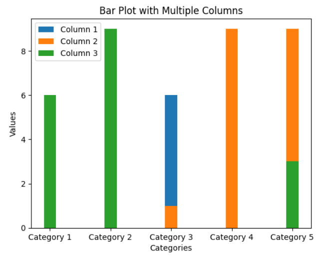
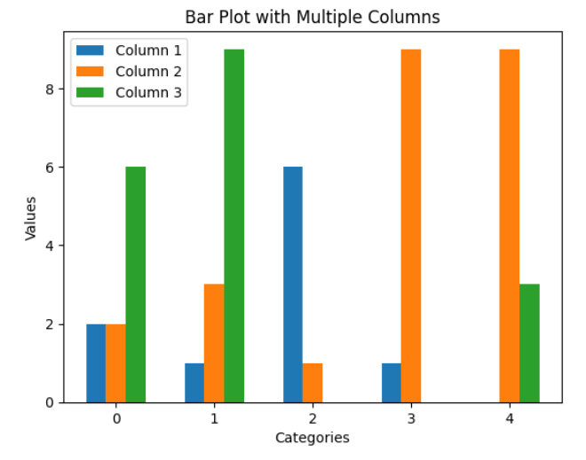
The above code will produce a basic bar plot with multiple columns. However, the bars for each column will overlap, making it difficult to differentiate them. To address this, we can adjust the positions of the bars for each column using the numpy library.
# Adjust the positions of the bars for each column
x = np.arange(len(categories))
bar1 = ax.bar(x - bar_width, data[:, 0], bar_width, label='Column 1')
bar2 = ax.bar(x, data[:, 1], bar_width, label='Column 2')
bar3 = ax.bar(x + bar_width, data[:, 2], bar_width, label='Column 3')
By subtracting bar_width from the x-coordinates of bar1 and adding bar_width to the x-coordinates of bar3, we create space between the bars for each column.
Now let’s provide 10 code examples to showcase different scenarios of using matplotlib bar plot with multiple columns.
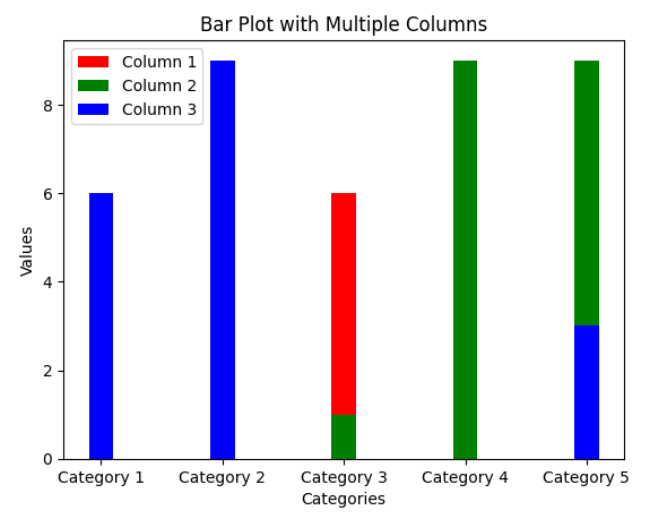
Example 1: Bar plot with different colors for each column
colors = ['red', 'green', 'blue']
bar1 = ax.bar(categories, data[:, 0], bar_width, label='Column 1', color=colors[0])
bar2 = ax.bar(categories, data[:, 1], bar_width, label='Column 2', color=colors[1])
bar3 = ax.bar(categories, data[:, 2], bar_width, label='Column 3', color=colors[2])
By passing the color parameter to the bar() function, we can set different colors for each column of the bar plot.
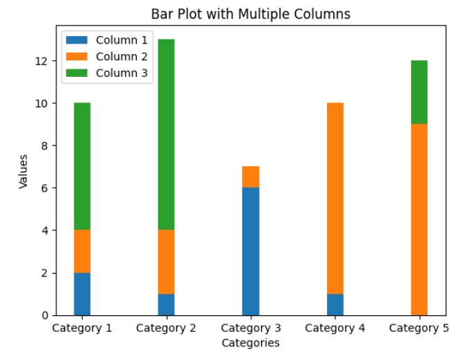
Example 2: Stacked bar plot
bar1 = ax.bar(categories, data[:, 0], bar_width, label='Column 1')
bar2 = ax.bar(categories, data[:, 1], bar_width, bottom=data[:, 0], label='Column 2')
bar3 = ax.bar(categories, data[:, 2], bar_width, bottom=data[:, 0]+data[:, 1], label='Column 3')
By passing the bottom parameter to the bar() function, we can stack the bars on top of each other. The bottom parameter specifies the y-coordinate where each bar should start.
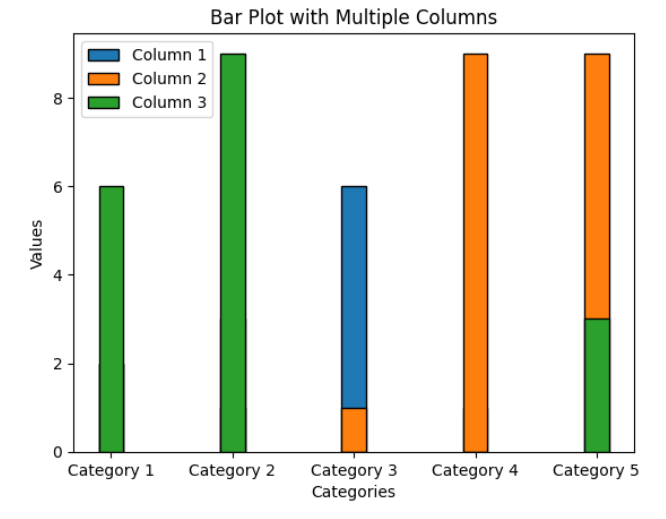
Example 3: Bar plot with custom edge color and width
bar1 = ax.bar(categories, data[:, 0], bar_width, edgecolor='black', linewidth=1, label='Column 1')
bar2 = ax.bar(categories, data[:, 1], bar_width, edgecolor='black', linewidth=1, label='Column 2')
bar3 = ax.bar(categories, data[:, 2], bar_width, edgecolor='black', linewidth=1, label='Column 3')
By using the edgecolor and linewidth parameters, we can customize the appearance of the edges around each bar.
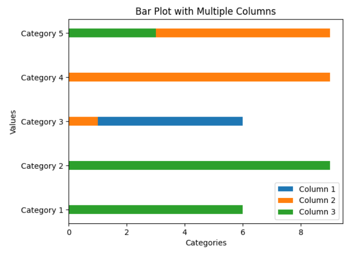
Example 4: Horizontal bar plot with multiple columns
bar1 = ax.barh(categories, data[:, 0], bar_width, label='Column 1')
bar2 = ax.barh(categories, data[:, 1], bar_width, label='Column 2')
bar3 = ax.barh(categories, data[:, 2], bar_width, label='Column 3')
By using the barh() function instead of bar(), we can create a horizontal bar plot with multiple columns.
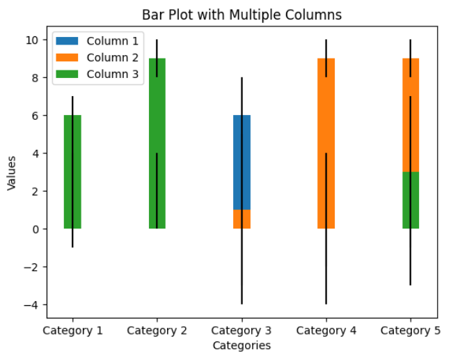
Example 5: Bar plot with error bars
errors = np.random.randint(1, 5, size=(5, 3))
bar1 = ax.bar(categories, data[:, 0], bar_width, yerr=errors[:, 0], label='Column 1')
bar2 = ax.bar(categories, data[:, 1], bar_width, yerr=errors[:, 1], label='Column 2')
bar3 = ax.bar(categories, data[:, 2], bar_width, yerr=errors[:, 2], label='Column 3')
By passing the yerr parameter to the bar() function, we can include error bars in the bar plot. The yerr parameter specifies the magnitude of the error bars for each column.
Example 6: Grouped bar plot with multiple columns
x = np.arange(len(categories))
bar1 = ax.bar(x - bar_width, data[:, 0], bar_width, label='Column 1')
bar2 = ax.bar(x, data[:, 1], bar_width, label='Column 2')
bar3 = ax.bar(x + bar_width, data[:, 2], bar_width, label='Column 3')
By adjusting the positions of the bars using the x - bar_width and x + bar_width expressions, we can create a grouped bar plot where bars of the same column are grouped together.
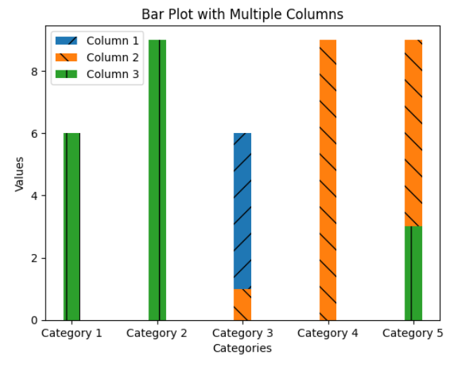
Example 7: Bar plot with different hatch patterns for each column
patterns = ['/', '\\', '|']
bar1 = ax.bar(categories, data[:, 0], bar_width, label='Column 1', hatch=patterns[0])
bar2 = ax.bar(categories, data[:, 1], bar_width, label='Column 2', hatch=patterns[1])
bar3 = ax.bar(categories, data[:, 2], bar_width, label='Column 3', hatch=patterns[2])
By specifying different hatch patterns using the hatch parameter, we can add visual patterns to each column of the bar plot.
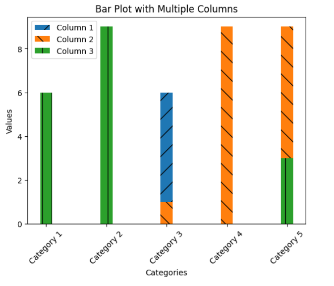
Example 8: Bar plot with rotated x-axis labels
ax.set_xticklabels(categories, rotation=45)
By using the rotation parameter of the set_xticklabels() function, we can rotate the x-axis labels to improve readability when the category names are long or overlapping.
Example 9: Bar plot with customized axis limits and tick marks
ax.set_ylim(0, 10)
ax.set_yticks(range(0, 11, 2))
By using the set_ylim() function, we can set the lower and upper limits of the y-axis. The set_yticks() function allows us to specify the tick marks on the y-axis, in this case, from 0 to 10 with an interval of 2.
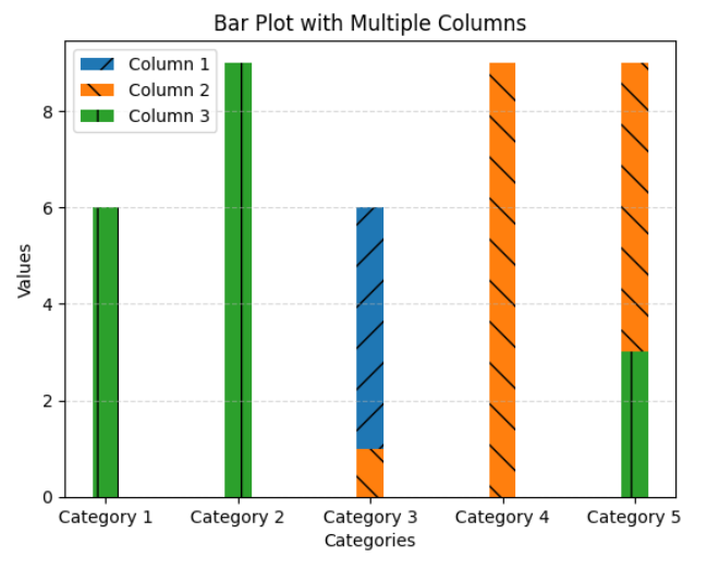
Example 10: Bar plot with grid lines
ax.grid(True, axis='y', linestyle='dashed', alpha=0.5)
By enabling the grid lines using the grid() function, we can add horizontal dashed lines to the y-axis for better visual reference. The axis parameter specifies the axis on which the grid lines are displayed, and the linestyle and alpha parameters control the appearance of the grid lines.
These examples demonstrate various customization options and scenarios when working with bar plots with multiple columns using Matplotlib. By combining these techniques, you can create highly informative and visually appealing plots to effectively communicate your data.
Remember to adjust the code according to your own data and requirements. Experiment with different parameters and features of Matplotlib to further enhance your bar plots and create unique visualizations.