How to Solve Matplotlib Bar Chart Labels Overlap: A Comprehensive Guide
Matplotlib bar chart labels overlap is a common issue that many data visualization enthusiasts encounter when creating bar charts using the popular Python library Matplotlib. This article will delve deep into the various techniques and strategies to effectively handle and resolve the problem of overlapping labels in Matplotlib bar charts. We’ll explore different approaches, provide numerous code examples, and offer detailed explanations to help you create clear, readable, and visually appealing bar charts without the hassle of overlapping labels.
Understanding Matplotlib Bar Chart Labels Overlap
Before we dive into the solutions, it’s crucial to understand why matplotlib bar chart labels overlap occurs in the first place. When creating bar charts with Matplotlib, especially those with a large number of categories or long labels, the default settings may cause the labels to overlap, making them difficult to read and interpret. This issue is particularly prevalent when dealing with:
- Bar charts with many categories
- Charts with long category labels
- Horizontal bar charts with limited vertical space
- Vertical bar charts with limited horizontal space
Let’s start with a basic example that demonstrates the matplotlib bar chart labels overlap problem:
import matplotlib.pyplot as plt

categories = ['Category A', 'Category B', 'Category C', 'Category D', 'Category E', 'Category F', 'Category G', 'Category H', 'Category I', 'Category J']
values = [25, 40, 30, 55, 45, 60, 35, 50, 20, 40]

plt.figure(figsize=(10, 6))
plt.bar(categories, values)
plt.xlabel('Categories')
plt.ylabel('Values')
plt.title('Bar Chart with Overlapping Labels - how2matplotlib.com')
plt.xticks(rotation=0)
plt.tight_layout()
plt.show()
Output:
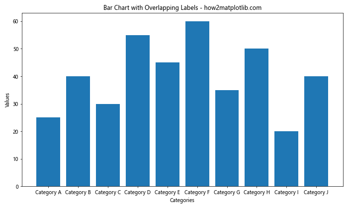
In this example, we create a simple bar chart with 10 categories. As you can see, the default settings cause the x-axis labels to overlap, making them difficult to read. Now that we’ve identified the problem, let’s explore various solutions to address matplotlib bar chart labels overlap.
Rotating Labels to Prevent Overlap
One of the simplest and most effective ways to handle matplotlib bar chart labels overlap is to rotate the labels. By changing the angle of the labels, we can often fit more text without overlap. Here’s an example of how to implement this solution:
import matplotlib.pyplot as plt

categories = ['Category A', 'Category B', 'Category C', 'Category D', 'Category E', 'Category F', 'Category G', 'Category H', 'Category I', 'Category J']
values = [25, 40, 30, 55, 45, 60, 35, 50, 20, 40]

plt.figure(figsize=(10, 6))
plt.bar(categories, values)
plt.xlabel('Categories')
plt.ylabel('Values')
plt.title('Bar Chart with Rotated Labels - how2matplotlib.com')
plt.xticks(rotation=45, ha='right')
plt.tight_layout()
plt.show()
Output:
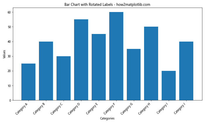
In this example, we’ve added the rotation=45 parameter to the plt.xticks() function, which rotates the labels by 45 degrees. The ha='right' parameter aligns the labels to the right, improving readability. This simple adjustment can often resolve matplotlib bar chart labels overlap issues for many charts.
Adjusting Figure Size to Accommodate Labels
Another effective strategy to address matplotlib bar chart labels overlap is to adjust the figure size. By increasing the width of the figure, we can create more space for the labels. Here’s how you can implement this solution:
import matplotlib.pyplot as plt

categories = ['Category A', 'Category B', 'Category C', 'Category D', 'Category E', 'Category F', 'Category G', 'Category H', 'Category I', 'Category J']
values = [25, 40, 30, 55, 45, 60, 35, 50, 20, 40]

plt.figure(figsize=(16, 6))  # Increased width from 10 to 16
plt.bar(categories, values)
plt.xlabel('Categories')
plt.ylabel('Values')
plt.title('Bar Chart with Adjusted Figure Size - how2matplotlib.com')
plt.xticks(rotation=0)
plt.tight_layout()
plt.show()
Output:
In this example, we’ve increased the width of the figure from 10 to 16 inches using the figsize parameter. This additional horizontal space allows the labels to be displayed without overlap, even without rotation.
Using Horizontal Bar Charts to Avoid Label Overlap
When dealing with long category labels or a large number of categories, switching to a horizontal bar chart can be an effective solution to matplotlib bar chart labels overlap. Horizontal bar charts provide more space for labels on the y-axis. Here’s an example:
import matplotlib.pyplot as plt

categories = ['Very Long Category A', 'Extremely Long Category B', 'Incredibly Long Category C', 'Unbelievably Long Category D', 'Exceptionally Long Category E']
values = [25, 40, 30, 55, 45]

plt.figure(figsize=(10, 6))
plt.barh(categories, values)
plt.xlabel('Values')
plt.ylabel('Categories')
plt.title('Horizontal Bar Chart to Avoid Label Overlap - how2matplotlib.com')
plt.tight_layout()
plt.show()
Output:
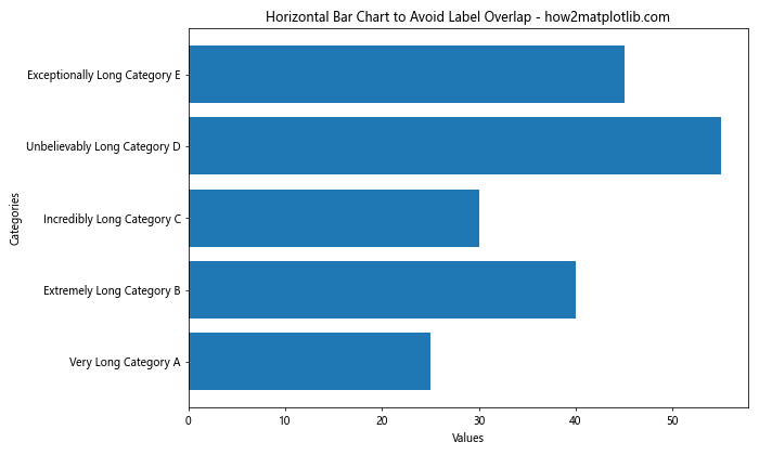
In this example, we use plt.barh() instead of plt.bar() to create a horizontal bar chart. This orientation provides ample space for long category labels without any overlap.
Wrapping Long Labels to Prevent Overlap
For situations where you have long labels but prefer to keep a vertical bar chart, wrapping the labels can be an effective solution to matplotlib bar chart labels overlap. Here’s how you can implement label wrapping:
import matplotlib.pyplot as plt
import textwrap

categories = ['Very Long Category A', 'Extremely Long Category B', 'Incredibly Long Category C', 'Unbelievably Long Category D', 'Exceptionally Long Category E']
values = [25, 40, 30, 55, 45]

def wrap_labels(labels, max_width=10):
    return ['\n'.join(textwrap.wrap(label, max_width)) for label in labels]

wrapped_categories = wrap_labels(categories)

plt.figure(figsize=(12, 6))
plt.bar(wrapped_categories, values)
plt.xlabel('Categories')
plt.ylabel('Values')
plt.title('Bar Chart with Wrapped Labels - how2matplotlib.com')
plt.xticks(rotation=0)
plt.tight_layout()
plt.show()
Output:
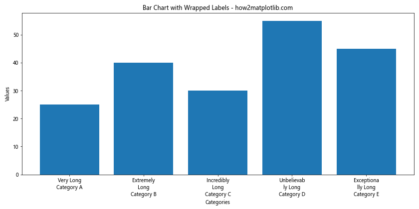
In this example, we define a wrap_labels function that uses the textwrap module to wrap long labels. We then apply this function to our category labels before plotting. This approach allows us to maintain a vertical bar chart while preventing matplotlib bar chart labels overlap.
Using Abbreviated Labels with a Legend
Another strategy to combat matplotlib bar chart labels overlap is to use abbreviated labels on the chart itself and provide a full legend for reference. This approach works well when you have many categories with long names. Here’s an example:
import matplotlib.pyplot as plt

categories = ['Very Long Category A', 'Extremely Long Category B', 'Incredibly Long Category C', 'Unbelievably Long Category D', 'Exceptionally Long Category E']
values = [25, 40, 30, 55, 45]

abbreviated_categories = [f'Cat {chr(65+i)}' for i in range(len(categories))]

plt.figure(figsize=(10, 6))
bars = plt.bar(abbreviated_categories, values)
plt.xlabel('Categories')
plt.ylabel('Values')
plt.title('Bar Chart with Abbreviated Labels and Legend - how2matplotlib.com')

# Create legend
plt.legend(bars, categories, title='Full Category Names', loc='center left', bbox_to_anchor=(1, 0.5))

plt.tight_layout()
plt.show()
Output:
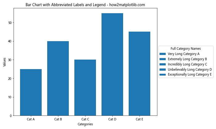
In this example, we create abbreviated labels for the x-axis and use the full category names in a legend placed to the right of the chart. This approach eliminates matplotlib bar chart labels overlap while still providing all the necessary information.
Staggering Labels to Prevent Overlap
Staggering labels is another effective technique to address matplotlib bar chart labels overlap, especially useful when you have a moderate number of categories. This approach alternates the position of labels between two levels. Here’s how you can implement it:
import matplotlib.pyplot as plt
import numpy as np

categories = ['Category A', 'Category B', 'Category C', 'Category D', 'Category E', 'Category F', 'Category G', 'Category H']
values = [25, 40, 30, 55, 45, 60, 35, 50]

x = np.arange(len(categories))
width = 0.8

fig, ax = plt.subplots(figsize=(12, 6))
bars = ax.bar(x, values, width)

ax.set_xlabel('Categories')
ax.set_ylabel('Values')
ax.set_title('Bar Chart with Staggered Labels - how2matplotlib.com')

ax.set_xticks(x)
ax.set_xticklabels(categories)

for i, tick in enumerate(ax.get_xticklabels()):
    tick.set_y(-(i % 2) * 0.02)

plt.tight_layout()
plt.show()
Output:
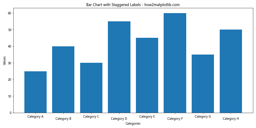
In this example, we use a loop to adjust the y-position of every other label, creating a staggered effect that prevents matplotlib bar chart labels overlap.
Using Angled Labels with Alignment
While we’ve already discussed rotating labels, combining rotation with proper alignment can further improve readability and prevent matplotlib bar chart labels overlap. Here’s an advanced example that demonstrates this technique:
import matplotlib.pyplot as plt

categories = ['Category A', 'Category B', 'Category C', 'Category D', 'Category E', 'Category F', 'Category G', 'Category H', 'Category I', 'Category J']
values = [25, 40, 30, 55, 45, 60, 35, 50, 20, 40]

plt.figure(figsize=(12, 6))
plt.bar(categories, values)
plt.xlabel('Categories')
plt.ylabel('Values')
plt.title('Bar Chart with Angled and Aligned Labels - how2matplotlib.com')

plt.xticks(rotation=45, ha='right', rotation_mode='anchor')
plt.subplots_adjust(bottom=0.2)

plt.tight_layout()
plt.show()
Output:
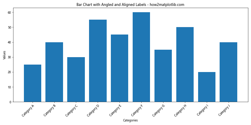
In this example, we use a 45-degree rotation for the labels, but we also set ha='right' for horizontal alignment and rotation_mode='anchor' to ensure the labels are properly positioned. The plt.subplots_adjust(bottom=0.2) call provides extra space at the bottom of the plot to accommodate the angled labels.
Implementing a Scrollable X-axis
For situations where you have an extremely large number of categories, implementing a scrollable x-axis can be an innovative solution to matplotlib bar chart labels overlap. While Matplotlib doesn’t natively support scrollable axes, we can simulate this effect using a slider. Here’s an example:
import matplotlib.pyplot as plt
from matplotlib.widgets import Slider

categories = [f'Category {i}' for i in range(50)]
values = [i * 2 for i in range(50)]

fig, ax = plt.subplots(figsize=(12, 6))
plt.subplots_adjust(bottom=0.25)

bar_container = ax.bar(categories[:10], values[:10])
ax.set_xlabel('Categories')
ax.set_ylabel('Values')
ax.set_title('Scrollable Bar Chart - how2matplotlib.com')

ax_slider = plt.axes([0.1, 0.1, 0.8, 0.03])
slider = Slider(ax_slider, 'Position', 0, 40, valinit=0, valstep=1)

def update(val):
    pos = int(slider.val)
    ax.clear()
    ax.bar(categories[pos:pos+10], values[pos:pos+10])
    ax.set_xlabel('Categories')
    ax.set_ylabel('Values')
    ax.set_title('Scrollable Bar Chart - how2matplotlib.com')
    ax.set_xticklabels(categories[pos:pos+10], rotation=45, ha='right')
    fig.canvas.draw_idle()

slider.on_changed(update)

plt.show()
Output:
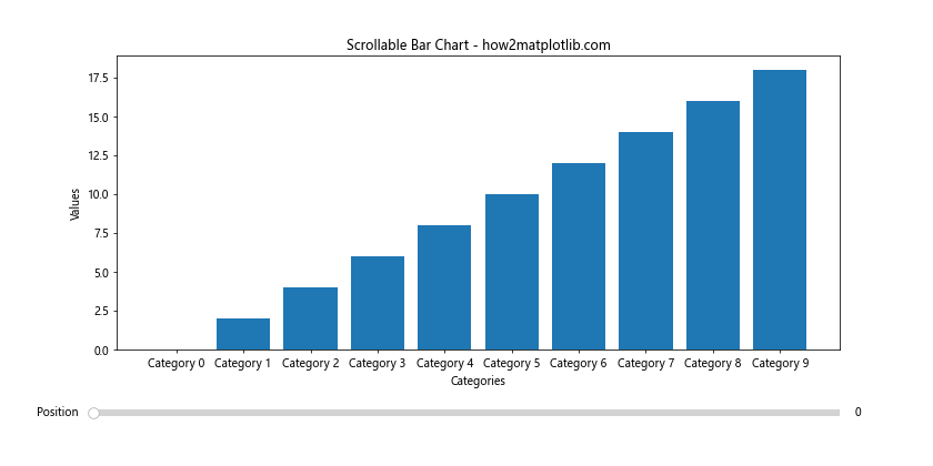
In this example, we create a bar chart that displays only 10 categories at a time, with a slider that allows the user to scroll through all 50 categories. This approach effectively eliminates matplotlib bar chart labels overlap while still allowing access to all data points.
Using Logarithmic Scale for Wide Range of Values
When dealing with a wide range of values in your bar chart, using a logarithmic scale can help prevent matplotlib bar chart labels overlap by compressing the scale. This approach is particularly useful when you have both very small and very large values. Here’s an example:
import matplotlib.pyplot as plt
import numpy as np

categories = ['Cat A', 'Cat B', 'Cat C', 'Cat D', 'Cat E']
values = [10, 100, 1000, 10000, 100000]

plt.figure(figsize=(10, 6))
plt.bar(categories, values)
plt.xlabel('Categories')
plt.ylabel('Values (log scale)')
plt.title('Bar Chart with Logarithmic Scale - how2matplotlib.com')
plt.yscale('log')
plt.tight_layout()
plt.show()
Output:
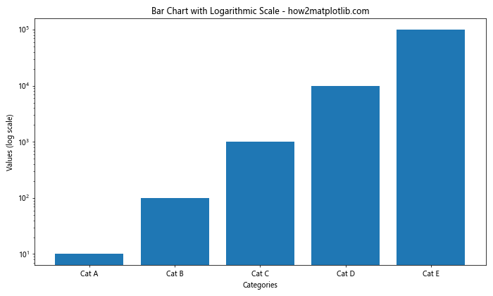
In this example, we use plt.yscale('log') to set the y-axis to a logarithmic scale. This compresses the scale, allowing all bars to be visible without overlapping, even with a wide range of values.
Implementing Custom Tick Locators
Custom tick locators can be an effective solution to matplotlib bar chart labels overlap, especially when dealing with date-based or numerical x-axis labels. Here’s an example using date-based labels:
import matplotlib.pyplot as plt
import matplotlib.dates as mdates
from datetime import datetime, timedelta

start_date = datetime(2023, 1, 1)
dates = [start_date + timedelta(days=i) for i in range(30)]
values = [i * 2 for i in range(30)]

plt.figure(figsize=(12, 6))
plt.bar(dates, values)
plt.xlabel('Dates')
plt.ylabel('Values')
plt.title('Bar Chart with Custom Date Tick Locator - how2matplotlib.com')

plt.gca().xaxis.set_major_locator(mdates.WeekdayLocator(byweekday=mdates.MO))
plt.gca().xaxis.set_major_formatter(mdates.DateFormatter('%Y-%m-%d'))

plt.gcf().autofmt_xdate()
plt.tight_layout()
plt.show()
Output:
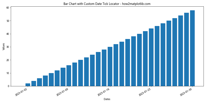
In this example, we use mdates.WeekdayLocator to place ticks only on Mondays, and mdates.DateFormatter to format the date labels. This approach reduces the number of labels, effectively preventing matplotlib bar chart labels overlap.
Using Nested Categories with Grouped Bar Charts
When dealing with multiple categories and subcategories, using grouped bar charts can help prevent matplotlib bar chart labels overlap while presenting complex data. Here’s an example:
import matplotlib.pyplot as plt
import numpy as np

categories = ['Group A', 'Group B', 'Group C', 'Group D']
sub_categories = ['Sub 1', 'Sub 2', 'Sub 3']

data = np.random.randint(10, 50, size=(len(categories), len(sub_categories)))

x = np.arange(len(categories))
width = 0.25

fig, ax = plt.subplots(figsize=(12, 6))

for i in range(len(sub_categories)):
    ax.bar(x + i*width, data[:, i], width, label=sub_categories[i])

ax.set_xlabel('Categories')
ax.set_ylabel('Values')
ax.set_title('Grouped Bar Chart with Nested Categories - how2matplotlib.com')
ax.set_xticks(x + width)
ax.set_xticklabels(categories)
ax.legend()

plt.tight_layout()
plt.show()
Output:
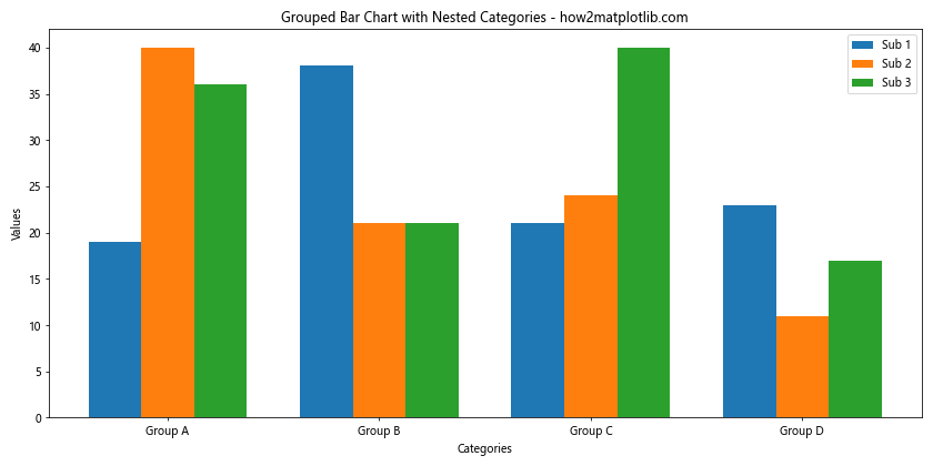
In this example, we create a grouped bar chart with main categories on the x-axis and subcategories represented by different colored bars within each group. This approach allows for the presentation of complex, multi-level data without matplotlib bar chart labels overlap.
Implementing a Circular Bar Chart
For a unique solution to matplotlib bar chart labels overlap, especially when dealing with cyclical data or a large number of categories, consider implementing a circular bar chart. Here’s an example:
import matplotlib.pyplot as plt
import numpy as np

categories = [f'Cat {i}' for i in range(24)]
values = np.random.randint(10, 100, 24)

fig, ax = plt.subplots(figsize=(10, 10), subplot_kw=dict(projection='polar'))

theta = np.linspace(0, 2*np.pi, len(categories), endpoint=False)
width = 2*np.pi / len(categories)

bars = ax.bar(theta, values, width=width, bottom=30)

ax.set_xticks(theta)
ax.set_xticklabels(categories)
ax.set_title('Circular Bar Chart - how2matplotlib.com')

plt.tight_layout()
plt.show()
Output:
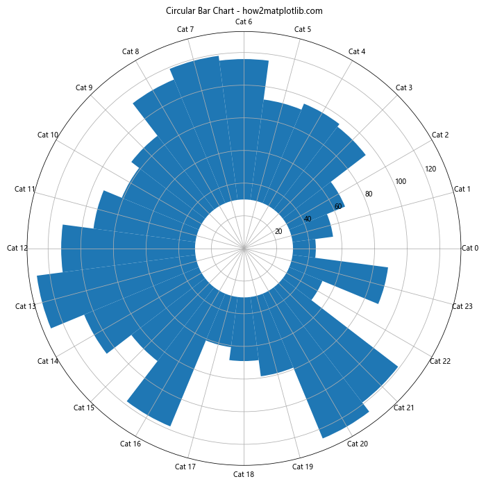
In this circular bar chart, we use a polar projection to arrange the bars in a circle. This layout naturally accommodates a large number of categories without matplotlib bar chart labels overlap, as the labels are distributed around the circumference of the circle.
Using Color-coded Labels for Better Readability
When dealing with matplotlib bar chart labels overlap, using color-coded labels can improve readability and help distinguish between different categories. Here’s an example:
import matplotlib.pyplot as plt
import numpy as np

categories = ['Category A', 'Category B', 'Category C', 'Category D', 'Category E']
values = [25, 40, 30, 55, 45]
colors = ['#FF9999', '#66B2FF', '#99FF99', '#FFCC99', '#FF99CC']

plt.figure(figsize=(10, 6))
bars = plt.bar(categories, values, color=colors)
plt.xlabel('Categories')
plt.ylabel('Values')
plt.title('Bar Chart with Color-coded Labels - how2matplotlib.com')

for bar, category in zip(bars, categories):
    plt.text(bar.get_x() + bar.get_width()/2, -5, category,
             ha='center', va='top', rotation=45, color=bar.get_facecolor(),
             fontweight='bold')

plt.xticks([])  # Remove x-axis ticks
plt.ylim(bottom=-10)  # Extend y-axis to make room for labels

plt.tight_layout()
plt.show()
Output:
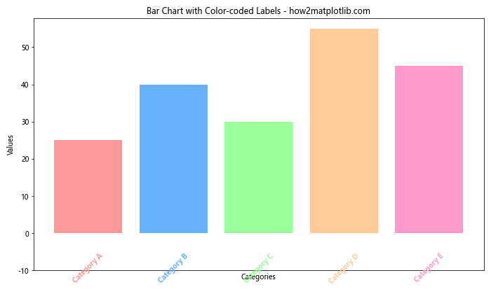
In this example, we assign a unique color to each bar and its corresponding label. The labels are placed below the x-axis and colored to match their bars, which helps prevent matplotlib bar chart labels overlap while maintaining clear category identification.
Implementing a Multi-level Bar Chart
For complex datasets with hierarchical categories, a multi-level bar chart can be an effective solution to matplotlib bar chart labels overlap. Here’s an example:
import matplotlib.pyplot as plt
import numpy as np

main_categories = ['Group A', 'Group B', 'Group C']
sub_categories = ['Sub 1', 'Sub 2', 'Sub 3', 'Sub 4']

data = np.random.randint(10, 50, size=(len(main_categories), len(sub_categories)))

fig, ax = plt.subplots(figsize=(12, 6))

x = np.arange(len(main_categories))
width = 0.2
multiplier = 0

for attribute, measurement in zip(sub_categories, data.T):
    offset = width * multiplier
    rects = ax.bar(x + offset, measurement, width, label=attribute)
    ax.bar_label(rects, padding=3)
    multiplier += 1

ax.set_ylabel('Values')
ax.set_title('Multi-level Bar Chart - how2matplotlib.com')
ax.set_xticks(x + width, main_categories)
ax.legend(loc='upper left', ncols=4)
ax.set_ylim(0, 60)

plt.tight_layout()
plt.show()
Output:
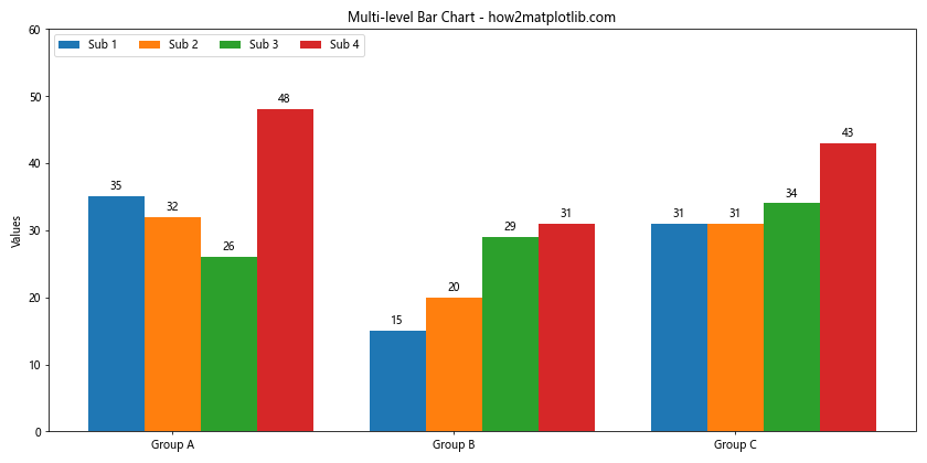
This multi-level bar chart displays main categories on the x-axis, with subcategories represented by grouped bars. This approach allows for the presentation of complex hierarchical data without matplotlib bar chart labels overlap.
Using Annotations Instead of X-axis Labels
Another creative solution to matplotlib bar chart labels overlap is to use annotations instead of traditional x-axis labels. This approach allows for more flexibility in label placement. Here’s an example:
import matplotlib.pyplot as plt

categories = ['Very Long Category A', 'Extremely Long Category B', 'Incredibly Long Category C', 'Unbelievably Long Category D', 'Exceptionally Long Category E']
values = [25, 40, 30, 55, 45]

fig, ax = plt.subplots(figsize=(12, 6))
bars = ax.bar(range(len(categories)), values)

ax.set_xlabel('Categories')
ax.set_ylabel('Values')
ax.set_title('Bar Chart with Annotated Labels - how2matplotlib.com')

ax.set_xticks([])  # Remove x-axis ticks

for i, (bar, category) in enumerate(zip(bars, categories)):
    ax.annotate(category,
                xy=(bar.get_x() + bar.get_width() / 2, 0),
                xytext=(0, -20),
                textcoords="offset points",
                ha='center', va='top',
                rotation=45,
                wrap=True)

plt.tight_layout()
plt.subplots_adjust(bottom=0.2)
plt.show()
Output:
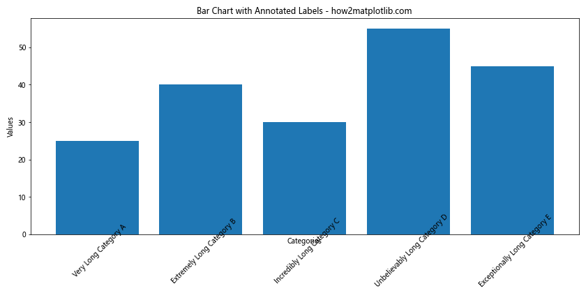
In this example, we use ax.annotate() to place labels below each bar. This method gives us precise control over label placement and rotation, effectively preventing matplotlib bar chart labels overlap.
Matplotlib bar chart labels overlap Conclusion
Matplotlib bar chart labels overlap is a common challenge in data visualization, but as we’ve seen, there are numerous strategies to address this issue. From simple solutions like rotating labels and adjusting figure size, to more advanced techniques like implementing scrollable axes or circular bar charts, the key is to choose the approach that best fits your specific data and visualization needs.
Remember, the goal is not just to prevent overlap, but to create clear, readable, and visually appealing charts that effectively communicate your data. Experiment with these different techniques and combine them as needed to achieve the best results for your particular use case.