How to Create and Customize Matplotlib Bar Chart Colors: A Comprehensive Guide
Matplotlib bar chart color is an essential aspect of data visualization that can significantly enhance the readability and appeal of your graphs. This comprehensive guide will explore various techniques and methods to create and customize matplotlib bar chart colors, providing you with the tools to make your visualizations stand out. From basic color assignments to advanced gradient effects, we’ll cover everything you need to know about matplotlib bar chart colors.
Understanding the Basics of Matplotlib Bar Chart Colors
Matplotlib bar chart color is a fundamental concept in data visualization. When creating bar charts using matplotlib, you have the ability to control the colors of individual bars or groups of bars. This control allows you to highlight specific data points, create visually appealing charts, and convey information more effectively.
Let’s start with a simple example of creating a bar chart with basic colors:
import matplotlib.pyplot as plt

categories = ['A', 'B', 'C', 'D']
values = [10, 20, 15, 25]

plt.figure(figsize=(8, 6))
plt.bar(categories, values, color=['red', 'green', 'blue', 'yellow'])
plt.title('Basic Matplotlib Bar Chart Color Example - how2matplotlib.com')
plt.xlabel('Categories')
plt.ylabel('Values')
plt.show()
Output:
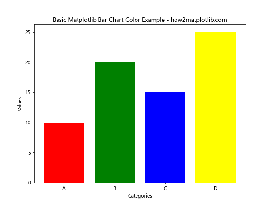
In this example, we’ve created a simple bar chart with four bars, each assigned a different color. The color parameter in the plt.bar() function allows us to specify the colors for each bar individually or as a group.
Exploring Color Options for Matplotlib Bar Charts
Matplotlib offers a wide range of color options for bar charts. You can use named colors, RGB values, hexadecimal codes, or even color maps to define the colors of your bars. Let’s explore these options in more detail.
Using Named Colors
Matplotlib provides a set of predefined color names that you can use to color your bar charts. Here’s an example:
import matplotlib.pyplot as plt

categories = ['Product A', 'Product B', 'Product C', 'Product D']
sales = [1500, 1200, 1800, 1000]

plt.figure(figsize=(10, 6))
plt.bar(categories, sales, color=['crimson', 'forestgreen', 'dodgerblue', 'gold'])
plt.title('Sales by Product - Named Colors - how2matplotlib.com')
plt.xlabel('Products')
plt.ylabel('Sales ($)')
plt.show()
Output:
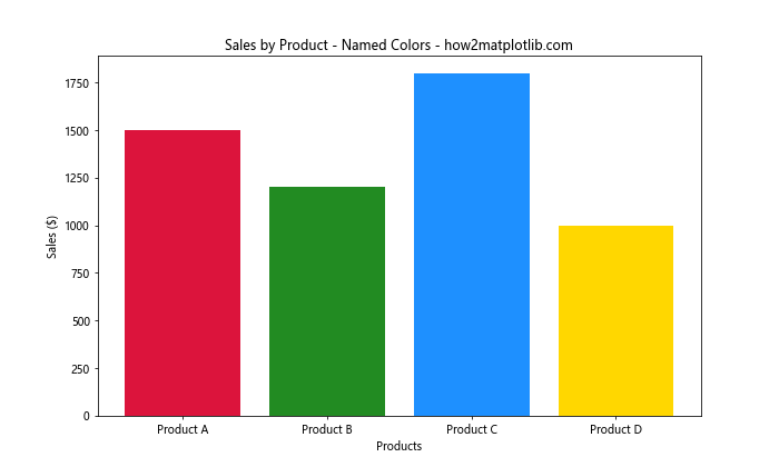
In this example, we’ve used named colors like ‘crimson’, ‘forestgreen’, ‘dodgerblue’, and ‘gold’ to color our bars. Matplotlib recognizes a wide variety of color names, giving you plenty of options to choose from.
Using RGB Values
For more precise control over colors, you can use RGB (Red, Green, Blue) values. RGB values are specified as tuples of three numbers between 0 and 1. Here’s an example:
import matplotlib.pyplot as plt

categories = ['Q1', 'Q2', 'Q3', 'Q4']
revenue = [5000, 6000, 5500, 7000]

plt.figure(figsize=(10, 6))
plt.bar(categories, revenue, color=[(0.8, 0.2, 0.2), (0.2, 0.8, 0.2), (0.2, 0.2, 0.8), (0.8, 0.8, 0.2)])
plt.title('Quarterly Revenue - RGB Colors - how2matplotlib.com')
plt.xlabel('Quarters')
plt.ylabel('Revenue ($)')
plt.show()
Output:
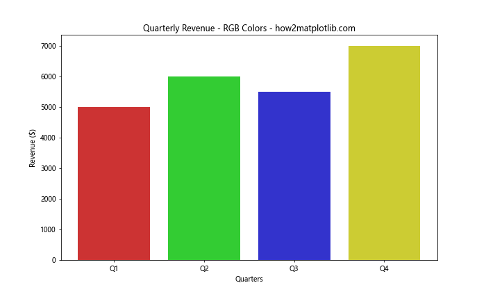
In this example, we’ve used RGB values to define custom colors for each bar. The values (0.8, 0.2, 0.2) represent a shade of red, (0.2, 0.8, 0.2) a shade of green, and so on.
Using Hexadecimal Color Codes
Another popular method for specifying colors is using hexadecimal color codes. These codes provide a wide range of color options and are widely used in web design. Here’s how you can use them in matplotlib:
import matplotlib.pyplot as plt

categories = ['Category 1', 'Category 2', 'Category 3', 'Category 4']
values = [35, 45, 30, 50]

plt.figure(figsize=(10, 6))
plt.bar(categories, values, color=['#FF6B6B', '#4ECDC4', '#45B7D1', '#FFA07A'])
plt.title('Data Visualization with Hex Colors - how2matplotlib.com')
plt.xlabel('Categories')
plt.ylabel('Values')
plt.show()
Output:
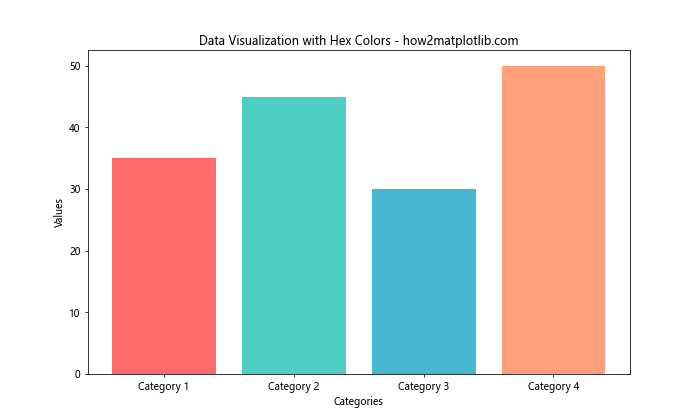
In this example, we’ve used hexadecimal color codes to define the colors of our bars. Each code represents a specific color, giving you precise control over the appearance of your chart.
Creating Grouped Bar Charts with Different Colors
Grouped bar charts are useful for comparing multiple categories across different groups. When creating grouped bar charts, you can use different colors to distinguish between the groups. Here’s an example:
import matplotlib.pyplot as plt
import numpy as np

categories = ['Group A', 'Group B', 'Group C']
men_means = [20, 35, 30]
women_means = [25, 32, 34]

x = np.arange(len(categories))
width = 0.35

fig, ax = plt.subplots(figsize=(10, 6))
rects1 = ax.bar(x - width/2, men_means, width, label='Men', color='#3498db')
rects2 = ax.bar(x + width/2, women_means, width, label='Women', color='#e74c3c')

ax.set_ylabel('Scores')
ax.set_title('Scores by Group and Gender - how2matplotlib.com')
ax.set_xticks(x)
ax.set_xticklabels(categories)
ax.legend()

plt.show()
Output:
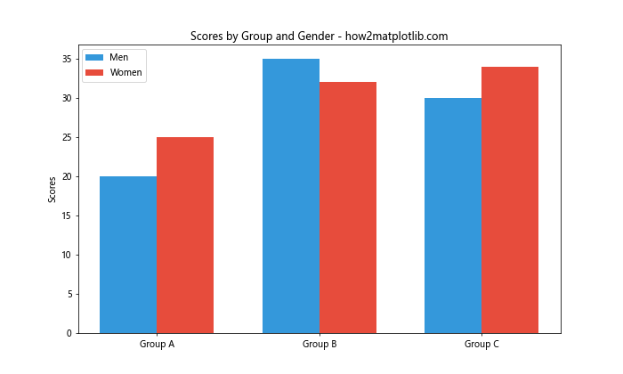
In this example, we’ve created a grouped bar chart comparing scores between men and women across three groups. We’ve used different colors for each gender to make the comparison clear.
Customizing Bar Edge Colors
In addition to the fill color, you can also customize the edge color of the bars in your chart. This can be useful for adding definition to your bars or creating a specific visual effect. Here’s how you can do it:
import matplotlib.pyplot as plt

categories = ['Category A', 'Category B', 'Category C', 'Category D']
values = [15, 30, 25, 40]

plt.figure(figsize=(10, 6))
plt.bar(categories, values, color='skyblue', edgecolor='navy', linewidth=2)
plt.title('Bar Chart with Custom Edge Colors - how2matplotlib.com')
plt.xlabel('Categories')
plt.ylabel('Values')
plt.show()
Output:
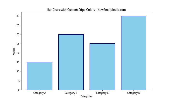
In this example, we’ve set the fill color of the bars to ‘skyblue’ and the edge color to ‘navy’. The linewidth parameter controls the thickness of the edge.
Creating Stacked Bar Charts with Multiple Colors
Stacked bar charts are useful for showing the composition of each category. You can use different colors for each component of the stack to make the chart more informative. Here’s an example:
import matplotlib.pyplot as plt

categories = ['A', 'B', 'C', 'D']
values1 = [10, 15, 12, 18]
values2 = [5, 8, 10, 6]
values3 = [8, 6, 7, 9]

plt.figure(figsize=(10, 6))
plt.bar(categories, values1, color='#FF9999', label='Component 1')
plt.bar(categories, values2, bottom=values1, color='#66B2FF', label='Component 2')
plt.bar(categories, values3, bottom=[i+j for i,j in zip(values1, values2)], color='#99FF99', label='Component 3')

plt.title('Stacked Bar Chart with Multiple Colors - how2matplotlib.com')
plt.xlabel('Categories')
plt.ylabel('Values')
plt.legend()
plt.show()
Output:
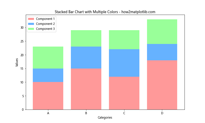
In this example, we’ve created a stacked bar chart with three components, each represented by a different color. The bottom parameter is used to stack the bars on top of each other.
Using Color to Highlight Specific Bars
Sometimes you may want to draw attention to specific bars in your chart. You can do this by using a different color for those bars. Here’s an example:
import matplotlib.pyplot as plt

categories = ['A', 'B', 'C', 'D', 'E', 'F']
values = [10, 15, 12, 18, 20, 14]
colors = ['#3498db' if value < 15 else '#e74c3c' for value in values]

plt.figure(figsize=(10, 6))
plt.bar(categories, values, color=colors)
plt.title('Bar Chart with Highlighted Values - how2matplotlib.com')
plt.xlabel('Categories')
plt.ylabel('Values')
plt.show()
Output:
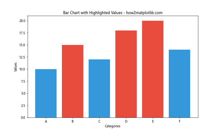
In this example, we've colored bars with values less than 15 in blue and bars with values 15 or greater in red. This helps to quickly identify which categories exceed a certain threshold.
Creating Gradient Color Effects
You can create a gradient color effect in your bar charts to make them more visually appealing. Here's an example of how to create a gradient effect using a colormap:
import matplotlib.pyplot as plt
import numpy as np

categories = ['A', 'B', 'C', 'D', 'E', 'F', 'G', 'H']
values = np.random.randint(10, 50, size=8)

plt.figure(figsize=(12, 6))
bars = plt.bar(categories, values)

# Create color map
cm = plt.cm.get_cmap('coolwarm')

# Color bars based on their height
for i, bar in enumerate(bars):
    bar.set_color(cm(i / len(bars)))

plt.title('Bar Chart with Gradient Color Effect - how2matplotlib.com')
plt.xlabel('Categories')
plt.ylabel('Values')
plt.colorbar(plt.cm.ScalarMappable(cmap=cm))
plt.show()
In this example, we've used the 'coolwarm' colormap to create a gradient effect across our bars. The color of each bar is determined by its position in the chart.
Customizing Bar Chart Colors Based on Data Values
You can also customize the colors of your bar chart based on the data values themselves. This can be particularly useful for highlighting trends or patterns in your data. Here's an example:
import matplotlib.pyplot as plt
import numpy as np

categories = ['A', 'B', 'C', 'D', 'E']
values = [15, -7, 10, -3, 22]

plt.figure(figsize=(10, 6))
bars = plt.bar(categories, values)

for bar in bars:
    if bar.get_height() < 0:
        bar.set_color('#FF9999')
    else:
        bar.set_color('#66B2FF')

plt.title('Bar Chart with Colors Based on Values - how2matplotlib.com')
plt.xlabel('Categories')
plt.ylabel('Values')
plt.axhline(y=0, color='k', linestyle='-', linewidth=0.5)
plt.show()
Output:
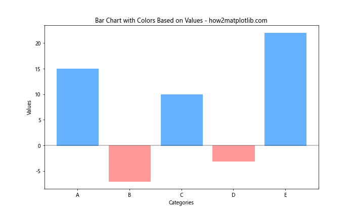
In this example, we've colored negative values in red and positive values in blue. This makes it easy to distinguish between positive and negative values at a glance.
Using Alpha Values for Transparency
Adding transparency to your bar charts can be useful when you have overlapping bars or when you want to create a softer visual effect. You can control transparency using the alpha parameter. Here's an example:
import matplotlib.pyplot as plt
import numpy as np

categories = ['A', 'B', 'C', 'D']
values1 = [10, 15, 12, 18]
values2 = [12, 14, 16, 13]

x = np.arange(len(categories))
width = 0.35

plt.figure(figsize=(10, 6))
plt.bar(x - width/2, values1, width, alpha=0.7, color='#3498db', label='Group 1')
plt.bar(x + width/2, values2, width, alpha=0.7, color='#e74c3c', label='Group 2')

plt.title('Bar Chart with Transparency - how2matplotlib.com')
plt.xlabel('Categories')
plt.ylabel('Values')
plt.xticks(x, categories)
plt.legend()
plt.show()
Output:
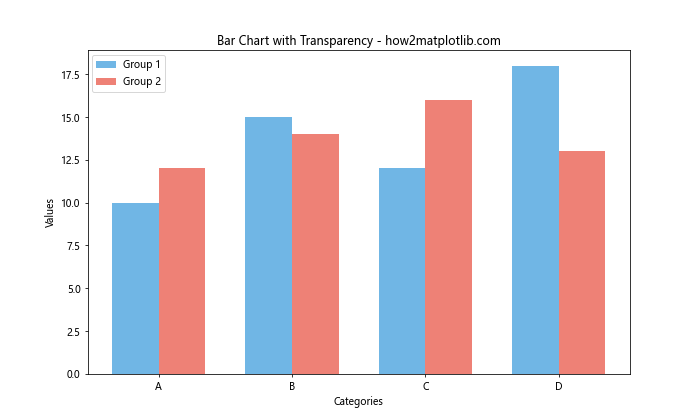
In this example, we've set the alpha value to 0.7 for both sets of bars, making them slightly transparent. This can be particularly useful when bars overlap or when you want to create a softer visual effect.
Creating a Diverging Bar Chart
A diverging bar chart is useful for comparing values above and below a central point (often zero). You can use different colors to represent positive and negative values. Here's an example:
import matplotlib.pyplot as plt
import numpy as np

categories = ['A', 'B', 'C', 'D', 'E', 'F', 'G', 'H']
values = [15, -7, 10, -3, 22, -5, 8, -12]

plt.figure(figsize=(12, 6))
bars = plt.bar(categories, values)

for bar in bars:
    if bar.get_height() < 0:
        bar.set_color('#FF9999')
    else:
        bar.set_color('#66B2FF')

plt.title('Diverging Bar Chart - how2matplotlib.com')
plt.xlabel('Categories')
plt.ylabel('Values')
plt.axhline(y=0, color='k', linestyle='-', linewidth=0.5)
plt.show()
Output:
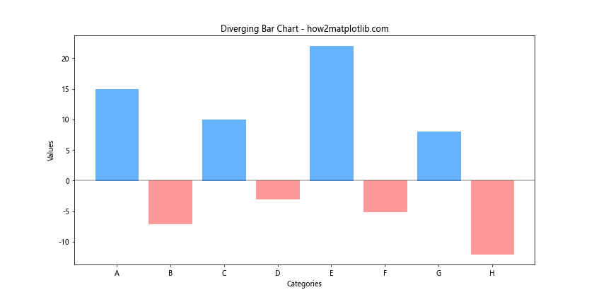
In this example, we've created a diverging bar chart where positive values are colored blue and negative values are colored red. The horizontal line at y=0 helps to clearly separate positive and negative values.
Using Color to Represent Data Categories
When dealing with categorical data, you can use different colors to represent different categories. This can make your chart more informative and easier to read. Here's an example:
import matplotlib.pyplot as plt
import numpy as np

categories = ['A', 'B', 'C', 'D', 'E', 'F', 'G', 'H']
values = np.random.randint(10, 50, size=8)
colors = plt.cm.Set3(np.linspace(0, 1, len(categories)))

plt.figure(figsize=(12, 6))
bars = plt.bar(categories, values, color=colors)

plt.title('Bar Chart with Categorical Colors -how2matplotlib.com')
plt.xlabel('Categories')
plt.ylabel('Values')
plt.show()
Output:
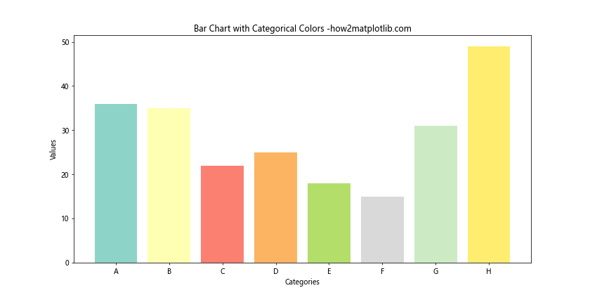
In this example, we've used the 'Set3' colormap to assign a unique color to each category. This can be particularly useful when you have a large number of categories and want to make each one distinct.
Creating a Horizontal Bar Chart with Custom Colors
While we've focused on vertical bar charts so far, horizontal bar charts can be just as effective and can be customized in similar ways. Here's an example of a horizontal bar chart with custom colors:
import matplotlib.pyplot as plt

categories = ['Category A', 'Category B', 'Category C', 'Category D', 'Category E']
values = [25, 40, 30, 55, 45]
colors = ['#FF9999', '#66B2FF', '#99FF99', '#FFCC99', '#FF99CC']

plt.figure(figsize=(10, 6))
plt.barh(categories, values, color=colors)
plt.title('Horizontal Bar Chart with Custom Colors - how2matplotlib.com')
plt.xlabel('Values')
plt.ylabel('Categories')
plt.show()
Output:
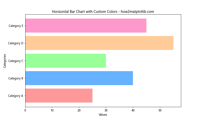
In this example, we've created a horizontal bar chart using plt.barh() instead of plt.bar(). We've assigned a unique color to each bar using a custom color palette.
Using Color to Represent Data Density
When dealing with a large number of categories, you can use color intensity to represent data density. This can be achieved by mapping your data values to a color gradient. Here's an example:
import matplotlib.pyplot as plt
import numpy as np

categories = [f'Cat {i}' for i in range(1, 21)]
values = np.random.randint(10, 100, size=20)

plt.figure(figsize=(14, 8))
bars = plt.bar(categories, values)

# Create color map
cm = plt.cm.get_cmap('YlOrRd')

# Color bars based on their height
for bar in bars:
    bar.set_color(cm(bar.get_height() / max(values)))

plt.title('Bar Chart with Color Representing Data Density - how2matplotlib.com')
plt.xlabel('Categories')
plt.ylabel('Values')
plt.xticks(rotation=45, ha='right')
plt.colorbar(plt.cm.ScalarMappable(cmap=cm))
plt.tight_layout()
plt.show()
In this example, we've used the 'YlOrRd' (Yellow to Orange to Red) colormap to represent data density. Bars with higher values are colored more intensely, while bars with lower values have lighter colors.
Creating a Multi-Colored Single Bar
Sometimes, you might want to represent multiple components within a single bar. This can be achieved by creating a stacked bar chart with a single category. Here's an example:
import matplotlib.pyplot as plt

components = ['Component A', 'Component B', 'Component C', 'Component D']
values = [15, 30, 25, 20]
colors = ['#FF9999', '#66B2FF', '#99FF99', '#FFCC99']

plt.figure(figsize=(8, 6))
plt.bar('Total', values[0], color=colors[0], label=components[0])
bottom = values[0]
for i in range(1, len(components)):
    plt.bar('Total', values[i], bottom=bottom, color=colors[i], label=components[i])
    bottom += values[i]

plt.title('Multi-Colored Single Bar - how2matplotlib.com')
plt.ylabel('Value')
plt.legend()
plt.show()
Output:
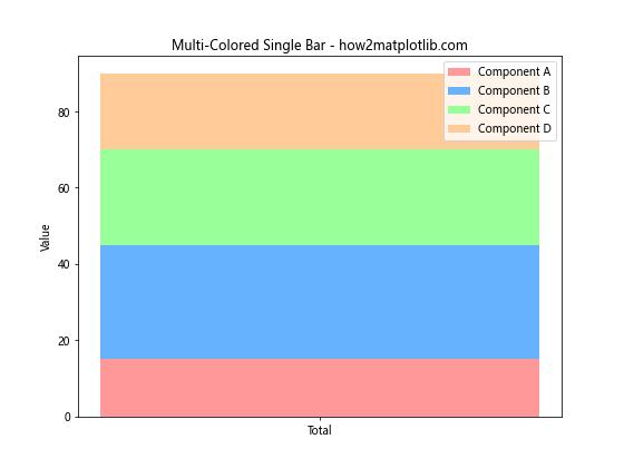
In this example, we've created a single bar that represents four different components, each with its own color. This can be useful for showing the composition of a total value.
Using Hatching Patterns with Colors
In addition to colors, you can use hatching patterns to further distinguish between bars or to add texture to your chart. Here's an example that combines colors with hatching patterns:
import matplotlib.pyplot as plt

categories = ['A', 'B', 'C', 'D']
values = [25, 40, 30, 55]
colors = ['#FF9999', '#66B2FF', '#99FF99', '#FFCC99']
hatches = ['/', '\\', 'x', 'o']

plt.figure(figsize=(10, 6))
bars = plt.bar(categories, values, color=colors)

for bar, hatch in zip(bars, hatches):
    bar.set_hatch(hatch)

plt.title('Bar Chart with Colors and Hatching Patterns - how2matplotlib.com')
plt.xlabel('Categories')
plt.ylabel('Values')
plt.show()
Output:
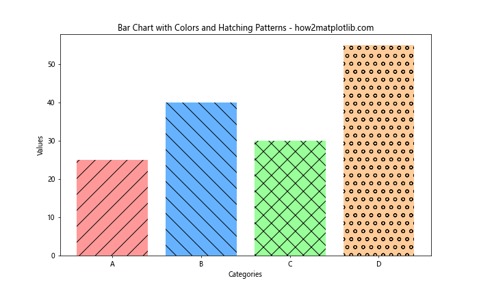
In this example, we've assigned both a color and a hatching pattern to each bar. This can be particularly useful when you need to print your chart in black and white, as the hatching patterns will still distinguish between the bars even without color.
Creating a Color-Coded Stacked Bar Chart
When creating stacked bar charts, you can use colors to represent different categories across all stacks. This can help in comparing the same category across different groups. Here's an example:
import matplotlib.pyplot as plt
import numpy as np

categories = ['Group A', 'Group B', 'Group C', 'Group D']
product1 = [20, 35, 30, 25]
product2 = [25, 32, 34, 20]
product3 = [15, 15, 17, 22]

plt.figure(figsize=(10, 6))
bottom = np.zeros(4)

for data, color in zip([product1, product2, product3], ['#FF9999', '#66B2FF', '#99FF99']):
    plt.bar(categories, data, bottom=bottom, color=color)
    bottom += data

plt.title('Color-Coded Stacked Bar Chart - how2matplotlib.com')
plt.xlabel('Groups')
plt.ylabel('Values')
plt.legend(['Product 1', 'Product 2', 'Product 3'])
plt.show()
Output:
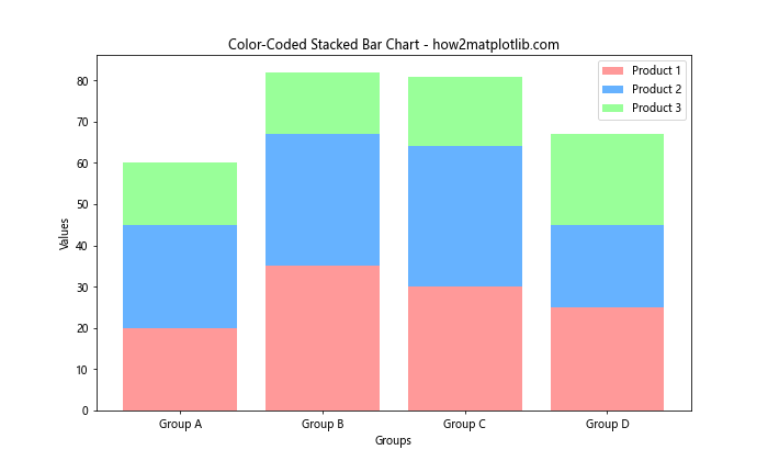
In this example, we've created a stacked bar chart where each product is represented by a consistent color across all groups. This makes it easy to compare the performance of each product across different groups.
Matplotlib bar chart color Conclusion
Matplotlib bar chart color is a powerful tool for enhancing your data visualizations. By mastering the various techniques for customizing bar chart colors, you can create more informative, appealing, and effective charts. From basic color assignments to advanced techniques like gradient effects and color mapping, the possibilities are vast.
Remember that while colors can greatly enhance your charts, it's important to use them judiciously. Always consider your audience and the purpose of your visualization when choosing colors. Aim for clarity and readability above all else.
As you continue to work with matplotlib bar chart colors, don't be afraid to experiment with different color schemes and techniques. The more you practice, the more skilled you'll become at creating impactful visualizations that effectively communicate your data.